From a business perspective, our expense management module has become quite meaningful now. We have created specific views, added multiple operation buttons and constraints. However, our user interface is still somewhat rough. We hope to add some colors to the list view and make certain fields and buttons show or hide based on conditions. For example, when an item is disabled or enabled, the "Invalidate" and "Enable" buttons should disappear, because in such cases, changing the item status is no longer allowed.
This chapter covers only a fraction of what's possible with views. For a more comprehensive overview, don't hesitate to refer to the documentation.
References: Related documentation for this chapter can be found in "View Records" and "View Architectures".
I. Inline View
Objectives: By the end of this section
A specific project information list should be added to the project type view:
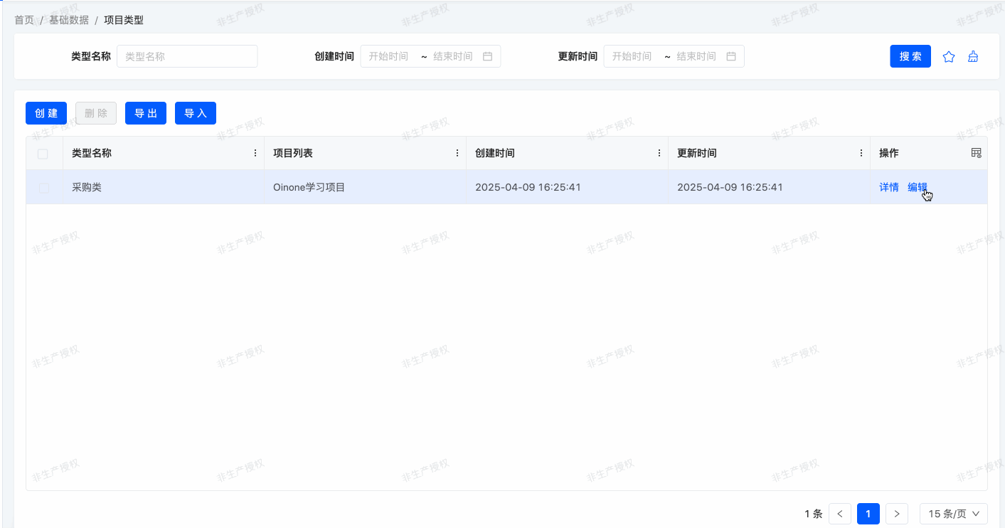
In the expense management module, we added a reimbursement list to project information. We simply referred to the default view to add the expenseBills field:
<field widget="Table" priority="113" data="expenseBills" label="false">
    <view type="TABLE" cols="2" model="expenses.ExpenseBill" enableSequence="false">
        <template slot="actions">
            <action name="internalGotoO2MCreateDialogFromProjectInfoFromExpenses" type="primary"/>
            <action name="internalDeleteOne" type="primary"/>
        </template>
        <template slot="rowActions">
            <action name="enabled" type="primary" refreshRoot = "true"/>
            <action name="disabled" type="primary" refreshRoot = "true"/>
            <action name="internalGotoO2MEditDialogFromProjectInfoFromExpenses" type="primary"/>
            <action name="internalDeleteOne" type="primary"/>
        </template>
        <template slot="fields">
            <field span="1" invisible="true" priority="5" data="id" label="ID" readonly="true"/>
            <field span="1" priority="102" data="projectInfoId" label="项目Id"/>
            <field span="1" priority="103" data="code" label="报销单号"/>
            <field span="1" priority="102" data="status" label="状态"/>
            <field span="1" priority="104" data="item" label="费用项"/>
            <field span="1" priority="105" data="reason" label="事由"/>
            <field span="1" priority="106" data="amount" label="报销金额"/>
            <field span="1" offset="0" widget="Upload" priority="107" data="attachment" label="附件(电子发票)" queryMode="DOMAIN"/>
            <field span="1" priority="200" data="createDate" label="创建时间" readonly="true"/>
            <field span="1" priority="210" data="writeDate" label="更新时间" readonly="true"/>
            <field span="1" priority="220" data="createUid" label="创建人ID"/>
            <field span="1" priority="230" data="writeUid" label="更新人ID"/>
        </template>
        <template slot="search" autoFill="true" cols="4"/>
    </view>
    <options>
        <option references="expenses.ExpenseBill" referencesModelName="expenseBill" referencesModuleName="expenses" referencesType="STORE" referencesPks="id" referencesLabelFields="item">
            <field name="item" data="item" label="费用项" ttype="STRING" store="true" relationStore="false"/>
            <field name="id" data="id" label="ID" ttype="INTEGER" store="true" relationStore="false"/>
        </option>
    </options>
</field>In some cases, we want to define a specific list view for use only in form or detail view contexts. For example, we might want to display a list of projects associated with a project type in the detail view, but for clarity, only show three fields: name, budget, and status.
To achieve this, we can define an inline list view directly within the detail view. For example:
package pro.shushi.oinone.trutorials.expenses.api.model;
//……
@Model.model(TestLineMainModel.MODEL_MODEL)
@Model(displayName = "测试内嵌子模型")
public class TestLineMainModel extends IdModel {
    public static final String MODEL_MODEL="expenses.TestLineMainModel";

    @Field(displayName = "description")
    private String description;

    @Field(displayName = "lines")
    @Field.one2many
    private List<TestLineSubModel> lines;

}package pro.shushi.oinone.trutorials.expenses.api.model;
//……
@Model.model(TestLineSubModel.MODEL_MODEL)
@Model(displayName = "测试内嵌子模型")
public class TestLineSubModel extends IdModel {
public static final String MODEL_MODEL="expenses.TestLineSubModel";
@Field(displayName = "字段一")
private String field1;
@Field(displayName = "字段二")
private String field2;
@Field(displayName = "字段三")
private String field3;
}<view name="detailView" type="DETAIL" cols="2" model="expenses.TestLineMainModel">
<template slot="actions" autoFill="true"/>
<template slot="fields">
<pack widget="group" title="基础信息">
<field span="1" invisible="true" priority="5" data="id" label="ID" readonly="true"/>
<field span="1" priority="101" data="description" label="description"/>
</pack>
<pack widget="tabs" cols="2">
<pack widget="tab" title="lines">
<field widget="Table" priority="102" data="lines" label="false">
<view type="TABLE" cols="2" model="expenses.TestLineSubModel" enableSequence="false" operation="false">
<template slot="fields">
<field span="1" invisible="true" priority="5" data="id" label="ID" readonly="true"/>
<field span="1" priority="101" data="field1" label="字段一"/>
<field span="1" priority="102" data="field2" label="字段二"/>
</template>
</view>
</field>
</pack>
</pack>
</template>
</view>In the detail view of expenses.TestLineMainModel, we defined a specific list view for expenses.TestLineSubModel containing field1 and field2 fields.
Exercise
Add an inline list view.
- Add an
one2manyfieldprojectsto theexpenses.ProjectTypemodel.- Customize the detail view of
expenses.ProjectTypeas described in this section's objectives and add the field to the view.
II. Component Widget
Objectives: By the end of this section
Whether a project is a key project should be displayed using a specific widget:
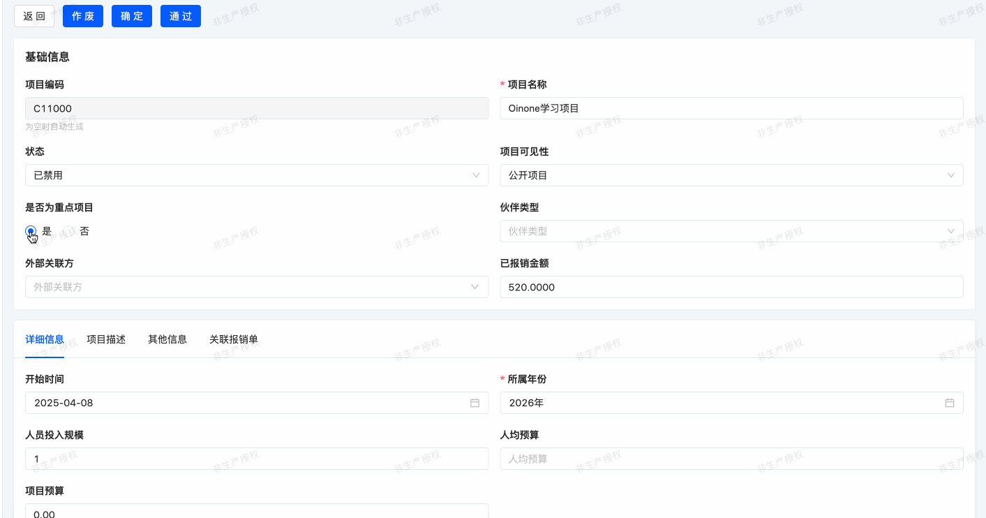
Two options will be displayed: Yes, No.
When adding fields to a model, we (almost) never need to worry about how they display in the user interface. For example, a Date field provides a date picker, and an one2many field automatically displays as a list. Oinone selects an appropriate "widget" based on the field type.
However, in some cases, we want a specific presentation for a field, which can be achieved using the widget attribute. We've already used it in the partners field with widget="Checkbox". Without this attribute, the field would display as a dropdown.
Each field type has a set of widgets that can be used to fine-tune its display. Some widgets also accept additional options. The complete list can be found in "Fields".
Exercise
Use a radio button widget.
As described in this section's objectives, use the
Radiowidget to display whetherexpenses.ProjectInfois a key project.
III. Table Sorting
Objectives: By the end of this section
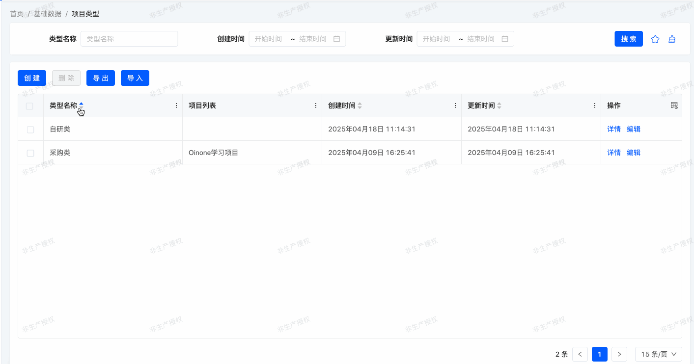
All lists should display in a defined order by default. Project types can be manually sorted.
In previous exercises, we created multiple list views but never specified the default order of records. For many business scenarios, this is crucial. For example, in our expense management module, we want the highest reimbursements to appear at the top of the list.
(I) Model
Oinone provides multiple ways to set the default sorting order. The most common way is to define the ordering attribute directly in the model. This ensures that retrieved records are ordered consistently across all views (including when searching records programmatically).
By default, even without specifying a sort order, records are not retrieved in an undefined order. This is because all models in this tutorial inherit from base.IdModel, which defines ordering = "createDate DESC, id DESC". We'll elaborate on model inheritance in subsequent training chapters.
The ordering attribute accepts a string containing the list of fields for sorting, which is converted to an SQL order by clause. For example:
……
@Model.Advanced(ordering = "code desc")
public class TestModel extends IdModel {
    ……
}Our records are sorted in descending order by code, meaning the record with the largest code appears first.
Exercise
Add model sorting.
Define the following order in the corresponding models:
| Model | Order |
|---|---|
| expenses.ProjectInfo | By Name ascending |
| expenses.ProjectType | By Name ascending |
| expenses.ExpenseBill | By Reimbursement Amount descending |
(II) View
Sorting can be defined at the model level, ensuring consistent ordering wherever records are retrieved. However, you can also define a specific order directly in the view using the ordering attribute. For example:
<view name="detailView" type="DETAIL" cols="2" model="expenses.TestLineMainModel">
    <template slot="actions" autoFill="true"/>
    <template slot="fields">
        <pack widget="group" title="基础信息">
            <field span="1" invisible="true" priority="5" data="id" label="ID" readonly="true"/>
            <field span="1" priority="101" data="description" label="description"/>
        </pack>
        <pack widget="tabs" cols="2">
            <pack widget="tab" title="lines">
                <field widget="Table" priority="102" data="lines" label="false">
                    <view type="TABLE" cols="2" model="expenses.TestLineSubModel" enableSequence="false" operation="false" >
                        <template slot="table" sortable="true" ordering="field1 desc"/>
                        <template slot="fields">
                            <field span="1" invisible="true" priority="5" data="id" label="ID" readonly="true"/>
                            <field span="1" priority="101" data="field1" label="字段一"/>
                            <field span="1" priority="102" data="field2" label="字段二"/>
                        </template>
                    </view>
                </field>
            </pack>
        </pack>
    </template>
</view>To add attributes to the Table component (Table widget), you can add a table slot in the table view, as shown in the example:
<template slot="table" sortable="true" ordering="field1 desc"/>Here, ordering specifies the default sorting at the view level, and sortable determines whether the view supports manual sorting.
For more on the view slot mechanism, refer to "View Architectures". In brief, a view defines what elements a page contains but not how they're laid out. The final page effect is a fusion of the layout and view, with slots serving as the protocol for merging them.
Exercise
Add manual sorting.
Customize the
expenses.ProjectTypetable view to support manual sorting.
Are you still keeping up? The content of this chapter may be challenging or even frustrating for back-end developers, but this concludes the view knowledge specific to back-end developers.
It's neither practical nor necessary to elaborate on all features for fine-tuning view appearance. Instead, we've focused on common functionalities to give you a preliminary understanding of Oinone's view mechanisms. For future view-related details, you can use Oinone's UI Designer for visual configuration, as detailed in the User Manual - UI Designer. If you want to delve deeper, refer to "View Records" and "View Architectures".