This chapter introduces the Widget framework, a component system tailored for Oinone. The main components of Widget are TypeScript components and Vue components.
In Oinone, every part of the user interface is managed by a component: these components carry relevant logic and define templates for presenting the UI. In practice, a component is represented by a small TypeScript class that inherits from the "VueWidget" class.
To start learning, you need a running Oinone service and a configured development environment. Before proceeding with the exercises, ensure you've followed all steps described in the setup guide of this tutorial.
Tip
If you use Google Chrome as your web browser, you can install the Vue DevTools extension. This extension provides many features to help you understand and剖析 any Vue-based application.
More Vue toolchain: Browser Developer Plugins
In this chapter, we learn the basic functions of Widget component development by registering a "Layout," aiming to study Widget components themselves without relying on the Oinone server.
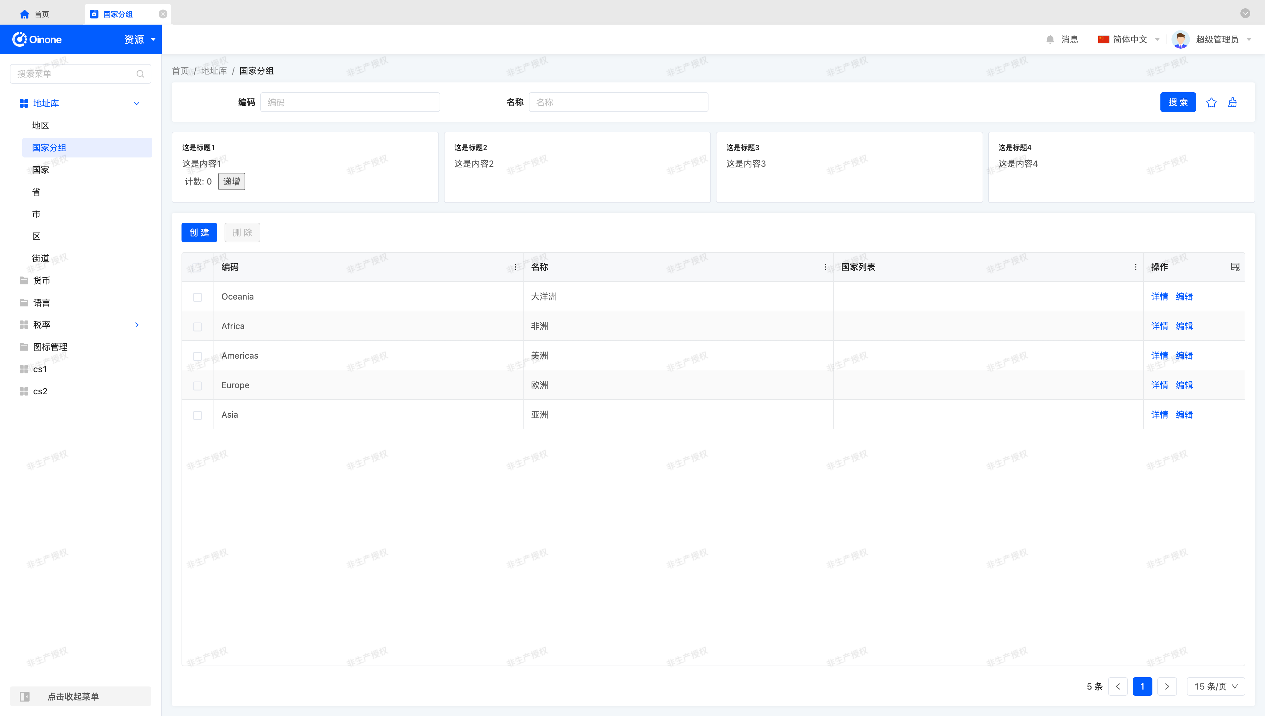
Ⅰ. Start with "Resource - Country Group"
Before learning, we need to switch to a unified page to facilitate learning the Widget framework without relying on the backend or other designers.
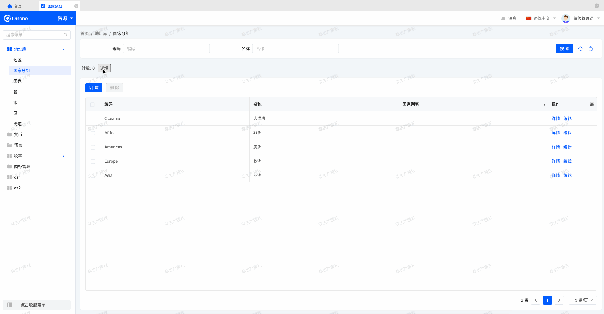
Select "Resources" from the module switch in the upper left corner of the page. After entering "Resources," choose "Country Groups" from the left menu to see the following page, where we'll complete all subsequent operations.
Next, let's create the first component!
Ⅱ. Take the "Counter" Component as an Example
First, let's look at a simple example. The counter component shown below is a component that maintains an internal value, displays the value, and updates the value whenever the user clicks a button.
Objective: By the end of this section, a Widget component should be created, but it cannot be displayed on the page yet.
As with conventional Vue components, we use a .vue file to create the component for rendering. This component receives two properties: a value for displaying the counter and an onIncrement method for modifying the value when the button is clicked.
In the template, we use the value property, display it on the page, and add a button. We also specify the click attribute on the button to trigger the onIncrement method each time the button is clicked.
<template>
  <div class="counter-demo">
    <span>Count: {{ value }}</span>
    <button @click="onIncrement">Increment</button>
  </div>
</template>
<script lang="ts">
import { defineComponent } from 'vue';

export default defineComponent({
  name: 'Counter',
  components: {},
  inheritAttrs: false,
  props: {
    value: {
      type: Number
    },
    onIncrement: {
      type: Function
    }
  }
});
</script>
<style lang="scss">
.counter-demo {
  padding: 4px;

  button {
    margin-left: 10px;
  }
}
</style>Tip
All sample codes are demonstrated based on Vue2+TS syntax. Readers accustomed to Vue3 syntax can modify the writing style accordingly.
To create a Widget component, we first select an appropriate base component for registration; this example uses BaseElementWidget. Then, register the component with the @SPI.ClassFactory decorator. Next, in the initialize method, associate the Widget with the Vue component via the setComponent method. Finally, use the @Widget.Reactive and @Widget.Method decorators to provide props for the Vue component.
import { BaseElementWidget, SPI, Widget } from '@oinone/kunlun-dependencies';
import Counter from './Counter.vue';

@SPI.ClassFactory(
  BaseElementWidget.Token({
    widget: 'Counter'
  })
)
export class CounterWidget extends BaseElementWidget {
  public initialize(props) {
    super.initialize(props);
    this.setComponent(Counter);
    return this;
  }

  @Widget.Reactive()
  public value: number = 0;

  @Widget.Method()
  public onIncrement() {
    this.value += 1;
  }
}The directory structure under the oinone-frontend-tutorials project is as follows:
oinone-frontend-tutorials
└── src
    ├── layout
    │   ├── index.ts
    │   └── register.ts
    ├── main.ts
    └── widgets
        ├── counter
        │   ├── Counter.vue
        │   ├── CounterWidget.ts
        │   └── index.ts
└── index.tsNote
The index.ts under each directory exports files that need to be exported in the current directory, which are finally imported in main.ts.
Warning
When importing in main.ts, the import directory needs to be placed after the import of @oinone/kunlun-dependencies; otherwise, the page will not render correctly.
The import order affects the component registration order. To override platform-built components, it is recommended to append the import statement after the last import.
Next, we can use the component in a "Layout" as follows.
<element widget="Counter"/>Tips
For more information about element components, refer to: Element
Ⅲ. Display the "Counter" Component on the Page
As the first exercise, let's create a register.ts file in the oinone-frontend-tutorials/src/layout directory to insert the counter between two "groups".
import { registerLayout, ViewType } from '@oinone/kunlun-dependencies';

registerLayout(
  `<view type="TABLE">
    <pack widget="group">
        <view type="SEARCH">
            <element widget="search" slot="search" slotSupport="field">
                <xslot name="searchFields" slotSupport="field" />
            </element>
        </view>
    </pack>
    <element widget="Counter" />
    <pack widget="group" slot="tableGroup">
        <element widget="actionBar" slot="actionBar" slotSupport="action">
            <xslot name="actions" slotSupport="action" />
        </element>
        <element widget="table" slot="table" slotSupport="field">
            <element widget="expandColumn" slot="expandRow" />
            <xslot name="fields" slotSupport="field" />
            <element widget="rowActions" slot="rowActions" slotSupport="action" />
        </element>
    </pack>
</view>`,
  {
    model: 'resource.ResourceCountryGroup',
    viewType: ViewType.Table
  }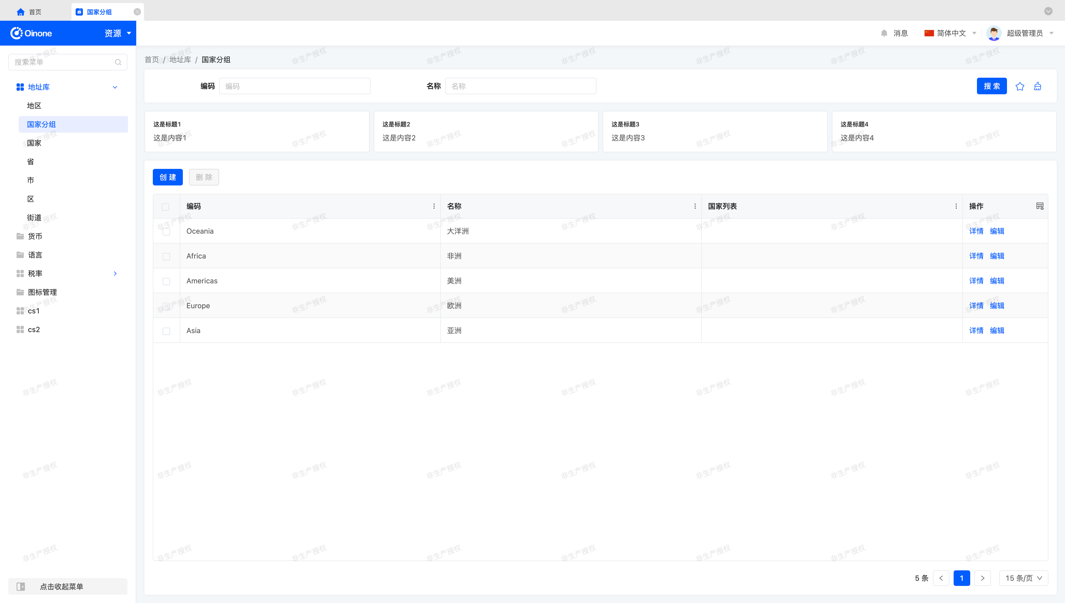
);Finally, we can see the following effect on the page:
Tip
If the above effect is not visible, check if each relevant file is correctly imported via main.ts using console.log.
Note
The first two sections may be the only sections where you can see the complete component code. From this section onward, readers need to write practice codes independently for other sections.
Ⅳ. Theory: Layout Registration
Judging from the registerLayout method we used above, there are two necessary parameters: layout template and layout options.
Under normal circumstances, we can modify the layout template based on the default layout template to meet business requirements. We can also use it freely after learning more knowledge. In a word, the layout template is used to describe the main components of a page and the relative positions between components.
For layout options, they are conditional parameters for registering a layout, and the corresponding layout template can only be used in pages that meet the conditions. Common layout options include:
- viewType: view type
- model: model code
- actionName: action name
- viewName: view name
In the above example, we used three of them: the view type Table, the model code resource.ResourceCountryGroup, and the action name resource#国家分组.
We don't need to understand the meaning of too many parameters here. We just need to learn to obtain the parameter values corresponding to the URL through the browser's address bar for registration.
Take the "Resource - Country Group" page as an example, the URL can be:
/page;module=resource;viewType=TABLE;model=resource.ResourceCountryGroup;action=resource%23国家分组;scene=resource%23国家分组;target=OPEN_WINDOW;menu=%7B"selectedKeys":%5B"国家分组"%5D,"openKeys":%5B"地址库","地区"%5D%7DBy decoding the address with decodeURIComponent, we can get:
// Enter in the browser console
decodeURIComponent('/page;module=resource;viewType=TABLE;model=resource.ResourceCountryGroup;action=resource%23国家分组;scene=resource%23国家分组;target=OPEN_WINDOW;menu=%7B"selectedKeys":%5B"国家分组"%5D,"openKeys":%5B"地址库","地区"%5D%7D')

// Execution result
'/page;module=resource;viewType=TABLE;model=resource.ResourceCountryGroup;action=resource#国家分组;scene=resource#国家分组;target=OPEN_WINDOW;menu={"selectedKeys":["国家分组"],"openKeys":["地址库","地区"]}'From the decoded results, we can get the following contents: (for convenience, we convert the parameters into JSON format for viewing)
{
    "module": "resource",
    "viewType": "TABLE",
    "model": "resource.ResourceCountryGroup",
    "action": "resource#国家分组",
    "target": "OPEN_WINDOW",
    "menu": {
        "selectedKeys": [
            "国家分组"
        ],
        "openKeys": [
            "地址库",
            "地区"
        ]
    }
}Among them, the viewType parameter is the view type, which is used through the ViewType enumeration in the code; the model parameter is the model code, which is the same as the model attribute in the layout options; the action parameter is the action name, which is the same as the actionName attribute in the layout options.
In Oinone, most pages can find the corresponding registration conditions in this way to modify the page layout. However, in fact, the search logic of registration conditions is relatively complex, which is not easy to understand for readers who are new to the Oinone front-end framework. Let's start with this relatively simple way.
Tips
For more content related to layout, please refer to: Layout
V. A Simple Card Component
Components are indeed the most natural way to divide complex UIs into reusable parts. But to make them truly useful, it's necessary to communicate information between them. Let's see how components provide information by using properties (most commonly props).
Objective
The goal of this section's exercise is to create a Card component that accepts two properties: title and content.
For example, here's how it's used:
<element widget="SimpleCard" title="This is the title" content="This is the content" />Warning
Since Oinone has a built-in card component, card cannot be used as the component name. The example component uses SimpleCard for illustration.
The template of the Vue component in the above example is as follows:
<template>
  <div class="simple-card-demo">
    <h5 class="simple-card-demo-title">{{ title }}</h5>
    <p class="simple-card-demo-content">{{ content }}</p>
  </div>
</template>Similar to the "Counter" component, we need to create a Widget component for registration and associate it with the corresponding Vue component.
Different from before, we need to obtain the title and content from the "Layout" and use the corresponding values in the Vue component.
@Widget.Reactive()
public get title() {
  return this.getDsl().title;
}

@Widget.Reactive()
public get content() {
  return this.getDsl().content;
}Tip
When developing Widget components, novices often forget to export components in index.ts of the current directory. This is a key step in component registration; without it, the component cannot be used normally in "Layout".
We can continue to modify oinone-frontend-tutorials/src/layout/register.ts to use this card component.
In the "Layout", wrap the four card components using a div tag and declare a class name to specify the css style.
<view type="TABLE">
    <pack widget="group">
        <view type="SEARCH">
            <element widget="search" slot="search" slotSupport="field">
                <xslot name="searchFields" slotSupport="field" />
            </element>
        </view>
    </pack>
    <div class="simple-card-demo-groups">
        <element widget="SimpleCard" title="This is title 1" content="This is content 1" />
        <element widget="SimpleCard" title="This is title 2" content="This is content 2" />
        <element widget="SimpleCard" title="This is title 3" content="This is content 3" />
        <element widget="SimpleCard" title="This is title 4" content="This is content 4" />
    </div>
    <pack widget="group" slot="tableGroup">
        <element widget="actionBar" slot="actionBar" slotSupport="action">
            <xslot name="actions" slotSupport="action" />
        </element>
        <element widget="table" slot="table" slotSupport="field">
            <element widget="expandColumn" slot="expandRow" />
            <xslot name="fields" slotSupport="field" />
            <element widget="rowActions" slot="rowActions" slotSupport="action" />
        </element>
    </pack>
</view>To make our cards look better, we just need to use the following style definition in the SimpleCard.vue file:
<style lang="scss">
.simple-card-demo-groups {
  display: flex;
  column-gap: 8px;
}

.simple-card-demo {
  flex: 1;
  background-color: #ffffff;
  border: 1px solid #e3e7ee;
  border-radius: 4px;
  padding: 16px;
}
</style>Finally, we can see the following effect on the page:
Ⅵ. Universal Card with Slots
In a previous exercise, we built a simple Card component. But to be honest, its functionality is quite limited. What if we want to display arbitrary content in the card, such as a subcomponent? Well, that won't work because the card's content is described with a string. However, it would be very convenient if we could describe the content as a template.
This is precisely the original intention of the Widget framework's slot system: to allow writing universal components.
Let's modify the Card component to use slots:
- Use the default slot to define the card's main content below the
contentproperty content. - Insert a component with arbitrary content, such as a Counter component.
- Add a counter component to the first card in the previous exercise, while leaving the other cards unchanged.
Finally, we can see the following effect on the page:
Okay, let's get started!
In the template of the Vue component, we can use Vue's native slot tag to continue rendering subcomponents downward to achieve our goal. The sample code is as follows:
<template>
  <div class="simple-card-demo">
    <h5 class="simple-card-demo-title">{{ title }}</h5>
    <p class="simple-card-demo-content">{{ content }}</p>
    <slot />
  </div>
</template>Correspondingly, we also need to modify the "Layout" to place a Counter component inside the first Card, as shown in the sample code below:
<div class="simple-card-demo-groups">
    <element widget="SimpleCard" title="This is title 1" content="This is content 1">
        <element widget="Counter" />
    </element>
    <element widget="SimpleCard" title="This is title 2" content="This is content 2" />
    <element widget="SimpleCard" title="This is title 3" content="This is content 3" />
    <element widget="SimpleCard" title="This is title 4" content="This is content 4" />
</div>Extended Content
In "Layout", the rendering of sub-tags fully follows Vue's slot rendering method, so you can use Widget slots just like Vue slots.
For named slots, in the Vue component, you can use <slot name="content" /> to declare a named slot, and in the "Layout", you can use <template slot="content"></template> to provide rendering content for this named slot.
Tip
For more information about Layout, refer to: Layout
Ⅶ. Minimize Card Content
Finally, let's add a feature to the Card component to make it more interesting: we want a button to toggle the display state of the card content (show or hide).
- Add a state to the card component to track whether the card is open (default) or closed.
- Add a
v-ifdirective in the Vue component template to conditionally render the content. - Add a button to the card header and modify the code to flip the state when the button is clicked.
- (Bonus) Use animation effects to fold or unfold the card content.
Ⅷ. Theory: Component Lifecycle and Lifecycle Functions
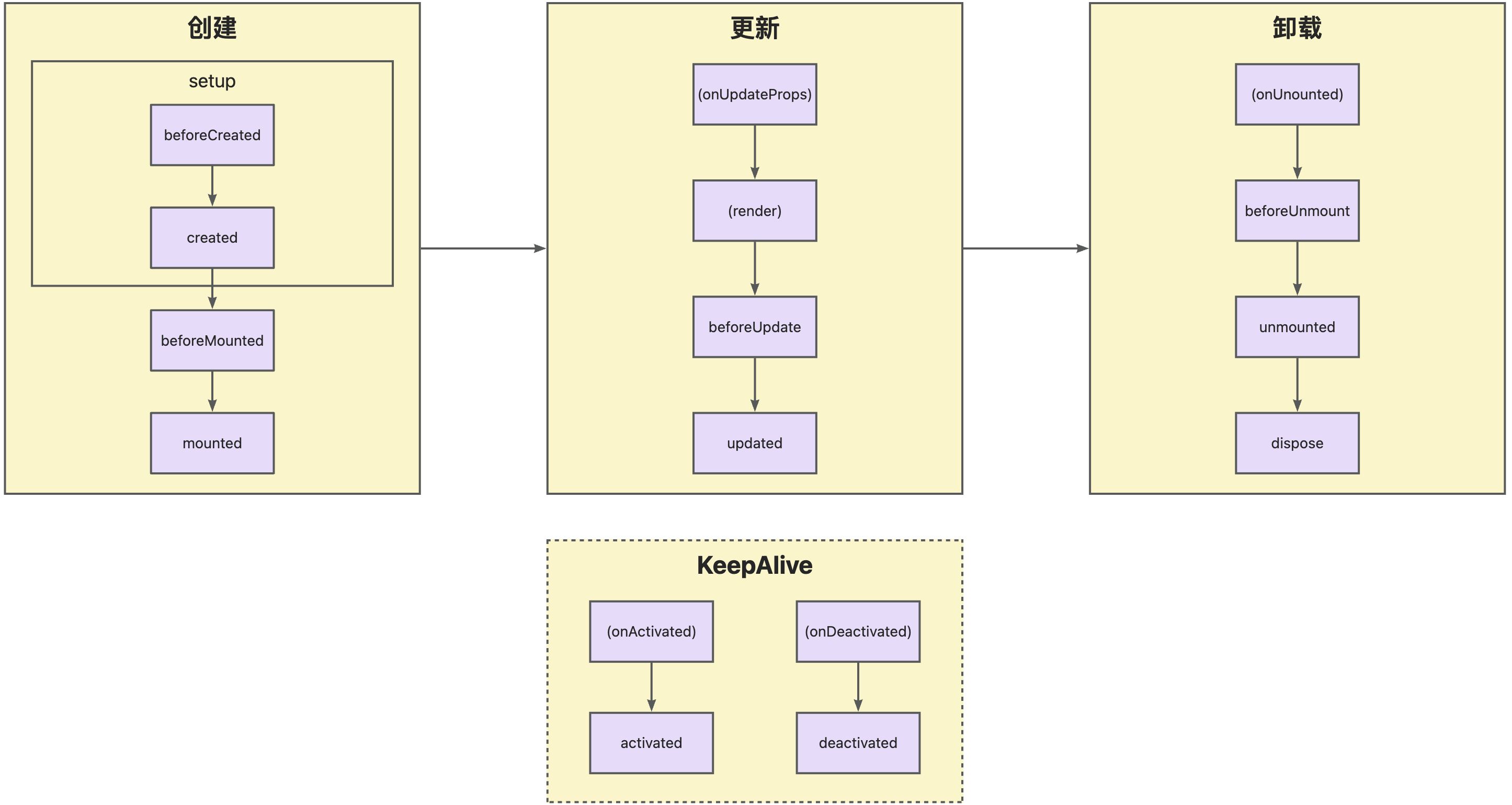
A Widget component goes through many stages: it can be instantiated, rendered, mounted, updated, separated, destroyed... This is the component lifecycle. The diagram above shows the most important events in a component's lifecycle. Roughly speaking, a component is first created, then updated (possibly many times), and finally destroyed.
The Widget framework provides various built-in functions, all declared in the VueWidget base class. For example, if you want to execute some code when the component is mounted, you can override the mounted function in the current component:
protected mounted() {
  super.mounted();
  // do something.
}Note
The Widget framework uses the characteristics of object-oriented inheritance. Thus, it is inevitable that some built-in methods are exposed in custom components. To prevent custom components from causing unnecessary impacts on kernel functions, the Widget framework uses the "$$" prefix to declare framework-built methods, which should not be overridden or used by custom components unless specially necessary.
Tip
For more information about component lifecycles, refer to: Component Lifecycle
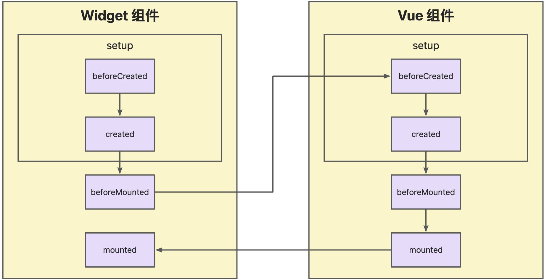
Ⅸ. Theory: The Relationship Between Widget Components and Vue Components
At the implementation level, a Widget component is essentially a Vue component. When mounted on a page, they have a parent-child component relationship. That is, the Widget component, as the parent component, provides props to the Vue component. This can also be viewed in the browser using the Vue DevTools plugin.
Therefore, combining the lifecycles of the two components, the lifecycle execution process of a complete Widget component during rendering is as shown in the following figure:
Ⅹ. Focus on Input Box
Objective
Complete the function of an input box that automatically focuses when mounted by following the knowledge points and tips provided below, and truly experience the relationship between Widget components and Vue components.
Like any Vue component, we can use ref to access the Document Object Model (DOM) in the Vue component. So, let's see how to use ref to access the DOM in a Widget component. The main idea is that you need to mark the target element with ref in the Vue component template:
<template>
  <div ref="divDom">hello world</div>
</template>Then you can define and access it using the ref method in TypeScript. However, upon careful consideration, there's an issue: when the component is created, the actual HTML element corresponding to the component does not exist. It only exists when the component is mounted. So we need to define an object using ref in the setup method, which contains a key named value (representing the element), and this key is only defined when the component is mounted.
setup() {
  const divDom = ref<HTMLElement | undefined>();

  onMounted(() => {
    console.log(divDom.value?.textContent);
  });

  return {
    divDom
  };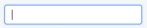
}At this point, you should be able to create an input box in the Vue component that automatically focuses when mounted, similar to the following effect:
But this is not enough. To better understand the use of Widget components in real-world scenarios, we hope to implement this function in a Widget component and freely and flexibly customize this function through object-oriented inheritance.
We can provide a setDivDom method from the Widget component via props and pass the Document Object Model (DOM) obtained in the Vue component to the Widget component through the method.
Then, we can execute similar logic through the mounted lifecycle function provided by the Widget component to achieve an input box that automatically focuses when mounted.
Tip
Using the @Widget.Reactive decorator can pass Widget component properties to the Vue component. For the performance of the Vue Patch algorithm, we recommend using the decorator to declare a property only when it needs to be used in the Vue component's props.
Thinking: What responsibilities do Widget components and Vue components each undertake in the Widget framework?
Widget components, by virtue of object-oriented characteristics, can extremely conveniently extend or modify specific component functions. Compared with extension features such as混入 (mixins) and functional programming provided by Vue components, this advantage of Widget components is more significant. Precisely because of this, when developing with the Widget framework, it is very necessary to clearly divide the responsibilities of Widget components and Vue components. Specifically: Widget components mainly undertake the important responsibility of providing properties and methods. Vue components are mainly responsible for rendering properties and calling and triggering methods. Although this division of responsibilities will affect the programming habits of R&D personnel to a certain extent, from an overall and long-term perspective, it is more conducive to achieving page componentization, thereby effectively improving development efficiency and promoting the smooth progress of projects.