Let's explore how to create a new view from scratch. To some extent, this is not overly difficult, but there is a lack of truly high-quality reference materials on how to create new views. It's important to note that in most cases, issues can be resolved by customizing existing views or using client-side actions.
For this exercise, we assume the goal is to create a Gantt chart view, which enables intuitive visualization of activity or plan progress using data containing names and start/end dates—common in most business systems. Taking task scheduling as an example, each task item includes a name, start time, and end time. Let's visualize these tasks' monthly schedules in a Gantt chart.
I. Preparation
In Oinone, all metadata revolves around models. Therefore, we need to prepare a simple model, some views, and create two menus: one for data entry and another for Gantt chart presentation.
Let's start by building the initial pages:
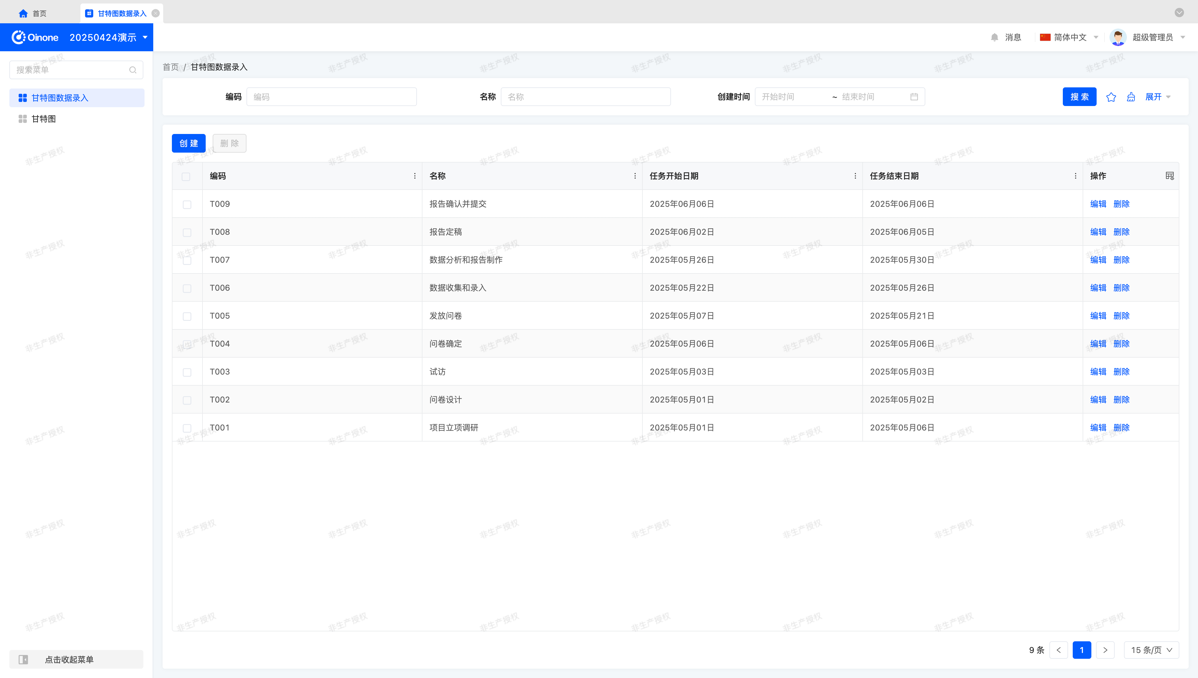
Gantt Data Entry:
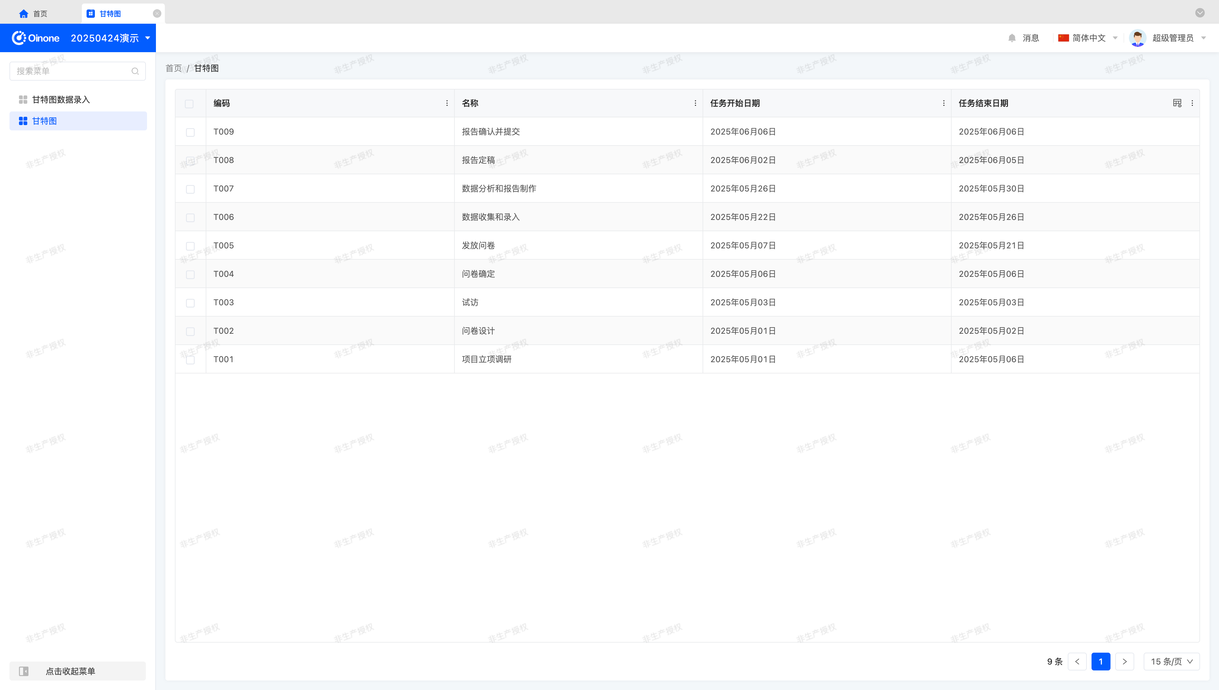
Gantt Chart:
Note
Readers unfamiliar with model and view preparation can find answers in the next theoretical section.
Tip
This exercise does not focus on preparing models and views. If you need familiarity with these topics, refer to:
(Ⅰ) Prepare the Model (GanttDemoModel)
You can create a model using the Model Designer or through the backend.
This model includes four fields: code, name, task start date, and task end date.
The field information for the model (GanttDemoModel) used in this exercise is as follows:
| Name | API Name | Field Type | Multivalue | Length (Single Value) |
|---|---|---|---|---|
| Code | code | Text (String) | No | 128 |
| Name | name | Text (String) | No | 128 |
| Task Start Date | taskStartDate | Date (Date) | No | - |
| Task End Date | taskEndDate | Date (Date) | No | - |
Tip
In this exercise, task start and end dates use the Date type. You can use other types based on business needs, provided they can represent an "interval."
(Ⅱ) Prepare Views
In addition to the model, we need views connected via navigation actions. You can complete these operations using the UI Designer or backend.
First, we need two table views: one for data entry and one for Gantt chart presentation, as shown in the examples.
Second, a form view is required for filling and creating test data.
Finally, bind the two tables to corresponding menus to view the views and enter necessary data by clicking the menus.
II. Switch to Custom Components
(Ⅰ) Switch via registerLayout
As practiced in the "Explore the Front-End Framework" chapter, we can switch components by registering a layout (Layout). Change widget="table" to widget="Gantt" to complete the switch:
<view type="TABLE">
    <pack widget="group">
        <view type="SEARCH">
            <element widget="search" slot="search" slotSupport="field">
                <xslot name="searchFields" slotSupport="field" />
            </element>
        </view>
    </pack>
    <pack widget="group" slot="tableGroup">
        <element widget="actionBar" slot="actionBar" slotSupport="action">
            <xslot name="actions" slotSupport="action" />
        </element>
        <element widget="Gantt" slot="table" slotSupport="field">
            <element widget="expandColumn" slot="expandRow" />
            <xslot name="fields" slotSupport="field" />
            <element widget="rowActions" slot="rowActions" slotSupport="action" />
        </element>
    </pack>
</view>(Ⅱ) Switch via Backend DSL
Add the widget attribute to <template slot="table"> and specify the component as Gantt:
<view model="demo.GanttDemoModel" type="table">
    <template slot="table" widget="Gantt">
        <field data="id" invisible="true" />

        <field data="code" />
        <field data="name" />
        <field data="taskStartDate" label="Task Start Date" />
        <field data="taskEndDate" label="Task End Date" />
    </template>
</view>III. Theory: Gantt Chart Characteristics and Solution Design
Before starting the exercise, it's essential to clarify key concepts and designs to form a basic understanding for the practical process.
(Ⅰ) Gantt Chart
Baidu Encyclopedia
A Gantt Chart, also known as a bar chart, displays the internal relationships of project progress and other time-related system developments over time through bar graphs.
From the content displayed in a Gantt chart, any Gantt data includes basic information: names and two values representing intervals. This supports the model design in the preparation phase.
Tip
This article aims to help readers understand the thinking behind view design. The same methodology applies to any view type—we hope readers will appreciate the general view design process.
(Ⅱ) View Types and Data Structures
In Oinone, different view types handle various data structures and presentation forms using different data processing and rendering methods. The Widget framework classifies data structures into two main categories: List and Object.
View Type Selection Criteria
| Data Structure | View Type | Selection Criteria |
|---|---|---|
| List | TABLE | Acquires a set of data based on configured fields, with each data item having the same structure; no need to consider field layout on the page. |
| List | GALLERY | Acquires a set of data based on configured fields, with each data item having the same structure; each item can render an independent area, requiring layout consideration. |
| Object | FORM | Acquires a single data item based on configured fields; the entire page displays this item's content, requiring layout consideration; all fields are editable. |
| Object | DETAIL | Acquires a single data item based on configured fields; the entire page displays this item's content, requiring layout consideration; all fields are non-editable, for viewing only. |
Tip
For more on view types and data structures, refer to: View Architectures
Regarding view types, we can determine that Gantt charts can be created by modifying TABLE views, resulting in a new view type—Gantt charts. This supports using table views to present Gantt charts in the preparation phase.
(Ⅲ) Technology Selection
Before implementing a Gantt chart, we need to select a front-end component library or evaluate self-implementation feasibility.
By researching popular third-party component libraries, we present a brief analysis of Gantt chart component libraries:
| Component Library Name | Open Source License | Technology Stack | API Usability | Documentation Completeness |
|---|---|---|---|---|
| dhtmlxGantt | GPL V2 | JS | Yes | Yes (paid support available) |
| gantt-elastic | MIT | Vue + JS | No | No |
| gantt-schedule-timeline-calendar | NEURONET Free / Trial License | Vue + TS | Yes | Yes (paid support available) |
| Vue-Ganttastic | MIT | Vue + TS | Yes | Yes |
As an exercise, we prioritize quick implementation over high customization. Therefore, we choose the Vue-Ganttastic component library.
Tip
The component library comparison table highlights key points for this exercise. Actual technology selection may also consider themes, aesthetics, internationalization, update cycles, etc., which can be adjusted based on requirements.
Let's install this component library using the official documentation:
Official Documentation: https://zunnzunn.github.io/vue-ganttastic/getting-started.html
For this exercise, we use version "@infectoone/vue-ganttastic": "2.3.2".
(Ⅳ) Data Query
Based on Gantt chart content, visible data always falls within a "range." In this exercise, task schedules use date precision ("day") to represent ranges.
For example, query tasks from 2025-05-01 to 2025-05-31:
taskStartDate >= '2025-05-01' and taskEndDate <= '2025-05-31'Tip
When executing queries, consider three key factors: time format, time precision, and range continuity. In this exercise, storage and query precision both use "day," so these factors require no consideration.
Let's discuss these factors beyond this exercise:
When transmitting date-time fields in Oinone, regardless of the page date-time format, convert to the standard format "YYYY-MM-DD HH:mm:ss" based on the field type.
Oinone uses database-native date-time design, meaning that even if the page omits seconds, storage and queries still consider "second-level" precision, affecting result sets.
When storage and query precision differ, range continuity is crucial. Users typically perceive date ranges as "closed on both ends," but to ensure query continuity, we use a "closed on the left, open on the right" range—e.g., extend the end date to 2025-06-01 without including the exact hour.
For the same result set, an alternative query condition could be:
taskStartDate >= '2025-05-01 00:00:00' and taskEndDate < '2025-06-01 00:00:00'
(Ⅴ) Data Processing
Without sorting or processing, raw data may appear as:
[
    {
        "code": "T007",
        "name": "Data Analysis and Report Creation",
        "taskStartDate": "2025-05-26",
        "taskEndDate": "2025-05-30",
        "id": "741211385631442610"
    },
    {
        "code": "T006",
        "name": "Data Collection and Entry",
        "taskStartDate": "2025-05-22",
        "taskEndDate": "2025-05-26",
        "id": "741211385631442591"
    },
    ...
]Based on the third-party component library's data structure requirements, process data according to rules. In this exercise, sort tasks by start date in ascending order, display one task per row, and convert to the component's required format:
[
    {
        "key": "1746783941876087636S8",
        "label": "Project Initiation Research",
        "bars": [
            {
                "barStart": "2025-04-30",
                "barEnd": "2025-05-05",
                "ganttBarConfig": {
                    "id": "1746783941876087636S8",
                    "label": "Project Initiation Research"
                }
            }
        ]
    },
    {
        "key": "17467839418760876YHTN",
        "label": "Questionnaire Design",
        "bars": [
            {
                "barStart": "2025-04-30",
                "barEnd": "2025-05-01",
                "ganttBarConfig": {
                    "id": "17467839418760876YHTN",
                    "label": "Questionnaire Design"
                }
            }
        ]
    }
    ...
]IV. Theory: Registration of Element Components
When creating dashboards, all components belong to element components (element), sharing a base class BaseElementWidget. They are simple to use, unconstrained by the framework, and fully customizable. However, element components offer more.
In the Widget framework, element components are defined as general components, enabling any functionality and placement on the page.
(Ⅰ) Registration Options for Element Components
/**
 * Element component registration options
 */
export interface BaseElementOptions extends SPIOptions {
  /**
   * Current view type
   */
  viewType?: ViewType | ViewType[];
  /**
   * Component name
   */
  widget?: string | string[];
  /**
   * Inline component
   */
  inline?: boolean;
  /**
   * Specified model
   */
  model?: string | string[];
  /**
   * Specified view
   */
  viewName?: string | string[];
}From the type declaration, classification dimensions include view type, component name, inline status, model code, and view name—describing where the component is used. Generally, the more "precise" the location description, the higher the priority for rendering in that location. Components registered later overwrite those registered earlier with identical location descriptions.
Notably, in most cases, using the component name suffices for element components, as they often support specific data structures, view types, or scenarios. Reusability is typically divided by page structure, explaining why we've only used the component name dimension in previous learning.
(Ⅱ) Built-in Element Components
In Oinone, different view types handle various data structures and presentation forms using different data processing and rendering methods. The Widget framework classifies data structures into List and Object.
Below is a list of components categorized by data structure and view type:
| Data Structure | View Type | Component | Base Class |
|---|---|---|---|
| List | TABLE | TableWidget | BaseElementListViewWidget |
| List | GALLERY | GalleryWidget | BaseElementListViewWidget |
| Object | FORM | FormWidget | BaseElementObjectViewWidget |
| Object | DETAIL | DetailWidget | BaseElementObjectViewWidget |
Generally, view component definitions rely on flexible use of platform-built functions.
Tip
For more on element components, refer to: Element
V. Create a Gantt Component
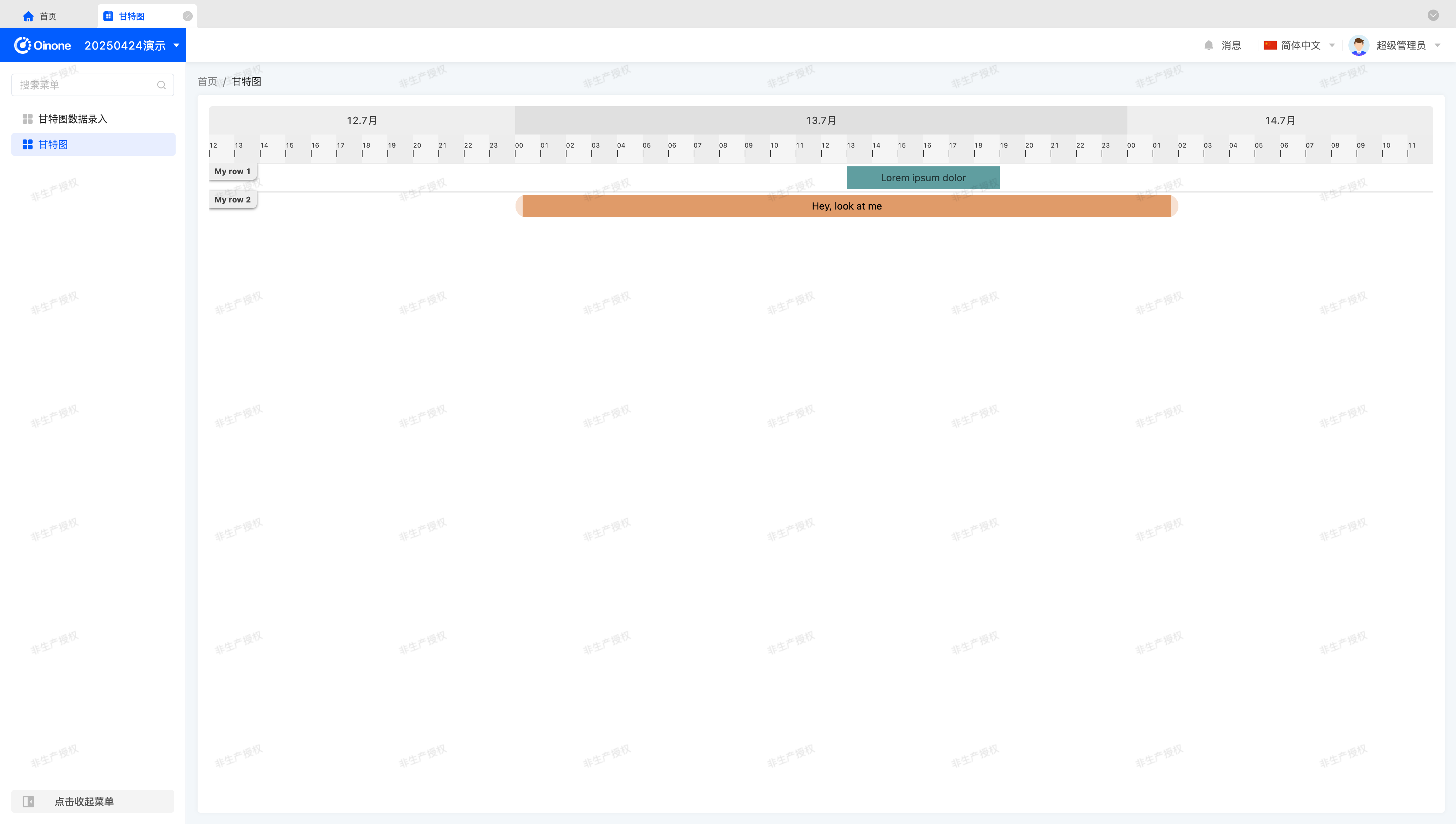
After this section, you should see a page similar to the official Vue Ganttastic quick start demonstration.
Let's implement it step by step:
(Ⅰ) Introduce Third-Party Component Library
Unlike most Vue projects, Oinone does not actively create or mount a Vue App object. Instead, use VueOioProvider for initialization in main.ts. Obtaining the Vue App object is straightforward:
VueOioProvider({}, [
  () => {
    const app = RuntimeContextManager.createOrReplace().frameworkInstance as App;
    // do something.
  }
]);Tip
The VueOioProvider method should not be executed multiple times. Add a second parameter to the existing VueOioProvider with a callback function to extend loading logic.
For more on VueOioProvider, refer to: Context
(Ⅱ) Define Widget Component
Similar to previously encountered components, tables are element components. However, table and Gantt chart components differ, meaning we cannot inherit from TableWidget. Instead, inherit from BaseElementListViewWidget to auto-fetch metadata and initiate query requests:
import Gantt from './Gantt.vue';

@SPI.ClassFactory(
  BaseElementWidget.Token({
    viewType: ViewType.Table,
    widget: ['gantt', 'Gantt']
  })
)
export class GanttWidget extends BaseElementListViewWidget {
  public initialize(props) {
    super.initialize(props);
    this.setComponent(Gantt);
    return this;
  }
}Tip
Notably, since this exercise uses single-word component naming,限定 viewType is necessary to avoid name conflicts during future Oinone platform iterations.
To avoid such conflicts, we recommend using multi-word names for all components in the Oinone platform.
Using multiple component names allows any name to reference the component, acting as aliases.
Details of the Vue component are omitted here—refer to the Vue Ganttastic official documentation.
Tip
Oinone uses TypeScript, while most third-party component libraries provide JavaScript examples. Add lang="ts" to the script tag to enable TypeScript syntax support.
At this point, you should see the page shown at the beginning of this section. Let's continue.
VI. Data Structure Definition
Previous tutorials haven't explained data structures in detail, merely presenting code. For complex components, defining data structures in a types.ts file is essential—for larger components, use a directory to define related types.
After初步 understanding the third-party component's basic usage, define data structures based on the renderable structure it provides, as shown below:
export interface GanttBars {
  key: string;
  label: string;
  bars: GanttBar[];
}

export interface GanttBar {
  barStart: Date;
  barEnd: Date;
  ganttBarConfig: {
    id: string;
    label: string;
  };
}Tip
Typically, type declaration files resolve dependency issues for data structures used in multiple files.
A design consideration:
Although the third-party component provides bar-start and bar-end fields for dynamic field names, the significant difference between this data structure and raw data makes conversion inevitable. Thus, design the data structure selectively, sacrificing some third-party component functionality.
For Widget-Vue component communication, most prefer using the third-party component's data structure.
However, for similar Vue components, abstract their properties and behaviors to design a data structure suitable for multiple components, requiring two-stage data conversion.
This represents a trade-off between execution efficiency and adaptability—consider this when designing component data structures.
With the data structure defined, template the Vue component as follows:
<template>
  <div class="gantt-demo">
    <g-gantt-chart
      :chart-start="chartStart"
      :chart-end="chartEnd"
      :date-format="false"
      :precision="precision"
      bar-start="barStart"
      bar-end="barEnd"
    >
      <g-gantt-row v-for="bars in ganttData" :key="bars.key" :label="bars.label" :bars="bars.bars" />
    </g-gantt-chart>
  </div>
</template>Corresponding props declaration:
props: {
  chartStart: {
    type: Date,
    required: true
  },
  chartEnd: {
    type: Date,
    required: true
  },
  precision: {
    type: String as PropType<GanttPrecision | keyof GanttPrecision | string>
  },
  ganttData: {
    type: Array as PropType<GanttBars[]>
  }
}Tip
The GanttPrecision enum is defined based on the third-party component's property options. Alternatively, use strings.
In the GanttWidget component, define chartStart, chartEnd, and precision properties. Initialize these before component mounting or use computed properties:
@Widget.Reactive()
protected get chartStart(): Date {
  return DateUtil.toDate('2025-04-28', 'YYYY-MM-DD');
}

@Widget.Reactive()
protected get chartEnd(): Date {
  return DateUtil.toDate('2025-06-03', 'YYYY-MM-DD');
}

@Widget.Reactive()
protected get precision(): GanttPrecision | keyof GanttPrecision | string | undefined {
  return GanttPrecision.day;
}Next, define and assign the ganttData property in the GanttWidget component.
VII. Data Structure Conversion
How is data queried? Before answering, open the browser console to view network requests. Despite replacing the table component with a functional Gantt chart example, it still initiates a queryPage request, fetching the first page of data by default—behaviors defined in the BaseElementListViewWidget base class. The default table component merely serves as a data display carrier.
When should we fetch this data and add conversion logic?
The BaseElementListViewWidget base class provides a mounted processing function (mountedProcess). After calling the parent class method, obtain data via dataSource and convert it to ganttData:
@Widget.Reactive()
protected ganttData: GanttBars[] | undefined;

protected async mountedProcess(): Promise<void> {
  await super.mountedProcess();
  this.ganttData = this.convertGanttData(this.dataSource || []);
}Here's an implementation reference using built-in utility classes and properties. Alternative approaches exist based on data characteristics:
protected convertGanttData(list: ActiveRecord[]): GanttBars[] {
  const dateFormat = 'YYYY-MM-DD';
  const ganttData: GanttBars[] = [];
  for (const data of list) {
    const key = this.generatorKey(data);
    let barStartVal = data.taskStartDate as string | undefined;
    if (!barStartVal) {
      continue;
    }
    let barEndVal = data.taskEndDate as string | undefined;
    if (!barEndVal) {
      continue;
    }
    const barStart = DateUtil.toDate(barStartVal, dateFormat);
    if (!barStart) {
      continue;
    }
    const barEnd = DateUtil.toDate(barEndVal, dateFormat);
    if (!barEnd) {
      continue;
    }
    const label = (data.name as string) || '';
    ganttData.push({
      key,
      label,
      bars: [
        {
          barStart,
          barEnd,
          ganttBarConfig: {
            id: key,
            label
          }
        }
      ]
    });
  }
  return ganttData;
}

protected generatorKey(data: ActiveRecord) {
  return data.__draftId || this.model.pks?.map((pk) => data[pk])?.join('-') || uniqueKeyGenerator();
}Tip
Regarding the generatorKey method: Every ActiveRecord object has a __draftId attribute as a unique identifier, but it may not always exist. Thus, generate a unique identifier via other means.
In most cases, a model has a single primary key (id), but composite keys are possible—handle this scenario simply.
In the rare case of a model without any primary key, generate a random identifier to ensure component functionality. Though uncommon, this is a key consideration.
Notably, if the unique identifier is used for selection or other operations, when __draftId is absent, the generated identifier must be回填 to the ActiveRecord object to prevent selection state loss during re-rendering.
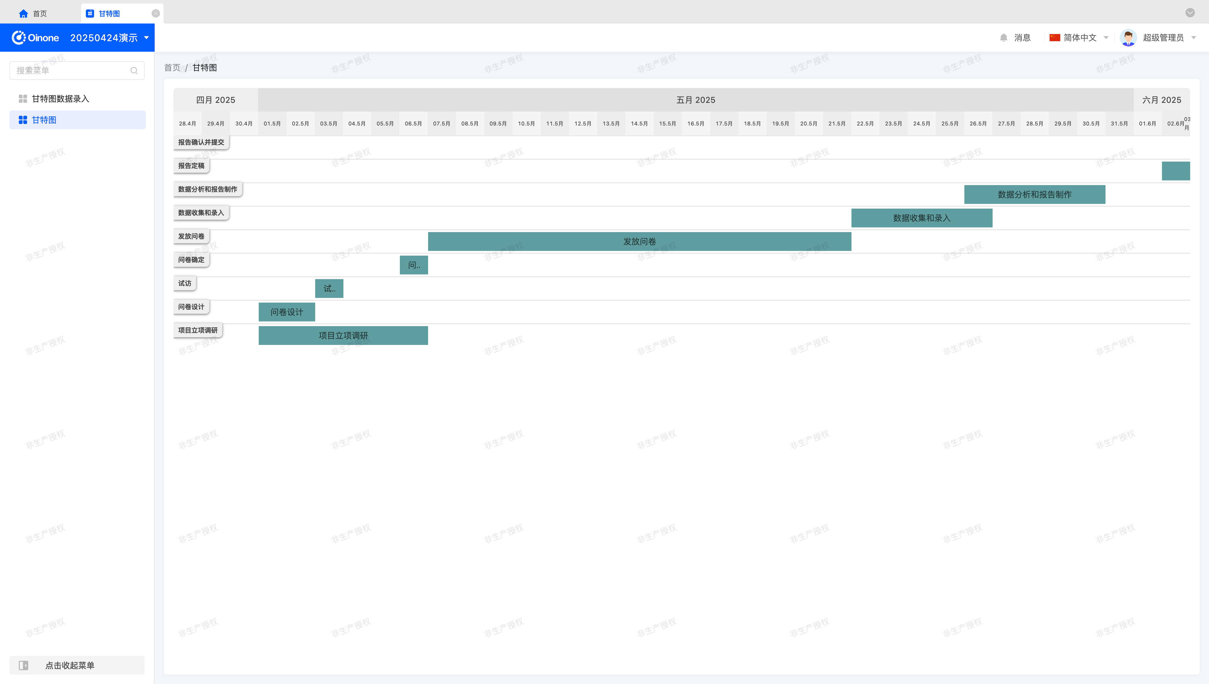
At this point, we can finally see a Gantt chart page with real data:
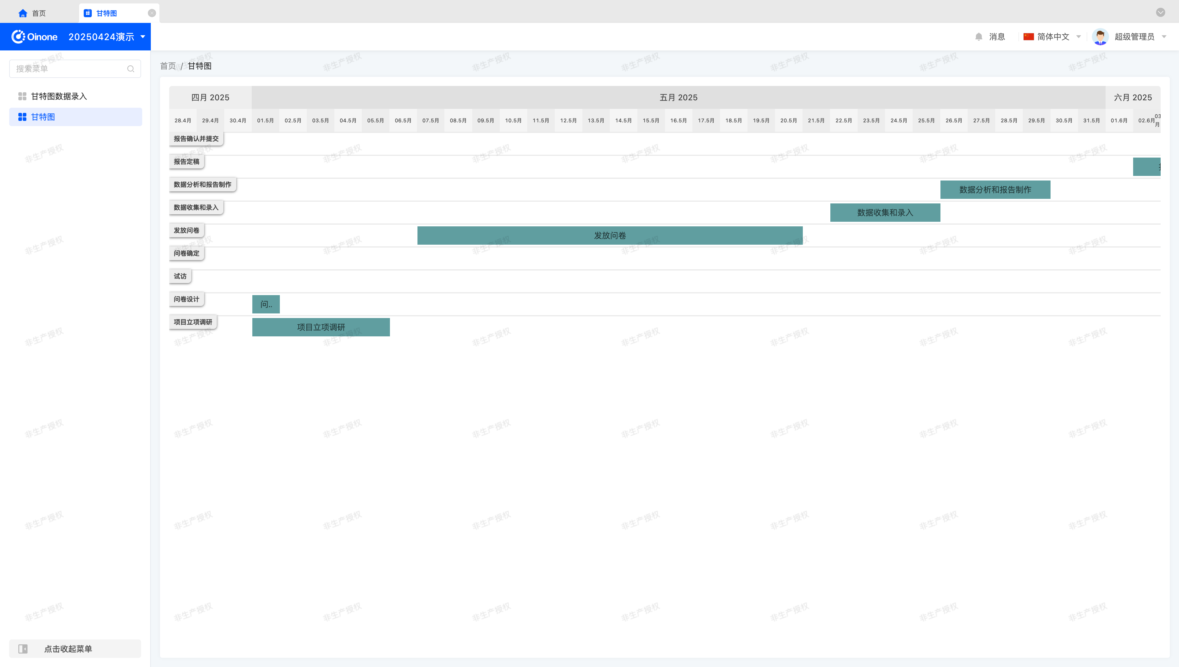
Oops—two middle data items display incorrectly, and others appear to be off by one day. Observing the missing items, taskStartDate and taskEndDate are identical. The issue arises because the third-party component renders based on specific times—no interval exists for identical values. Fix this by uniformly incrementing taskEndDate by one day:
const barEndDate = moment(barEndVal, dateFormat);
barEndDate.add(1, 'day');
const barEnd = barEndDate.toDate();Tip
Oinone uses moment for date-time processing by default. For different third-party component libraries, use the same date processing tool to ensure consistent conversion. Readers may use preferred tools in custom components.
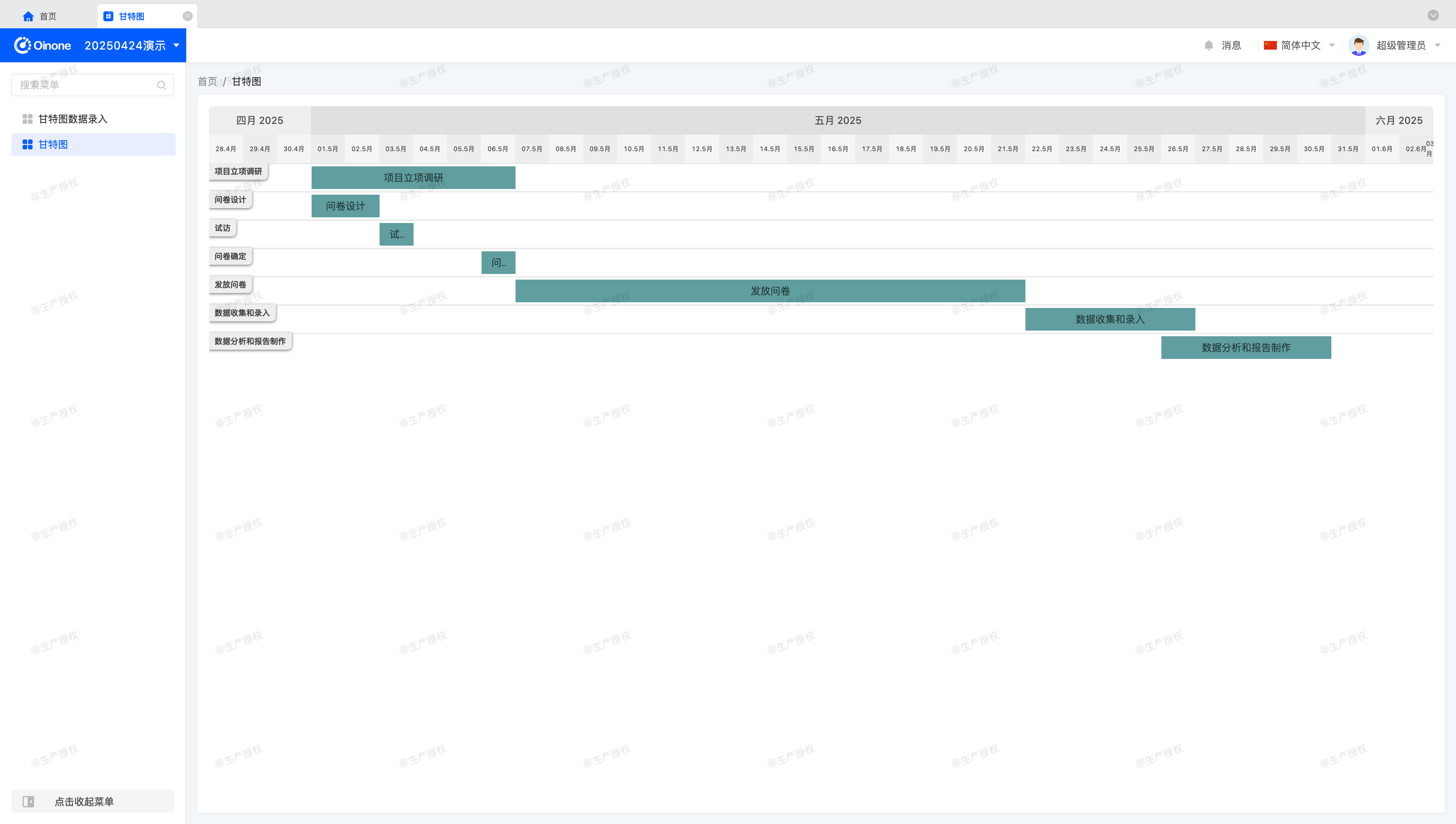
The page should now appear as:
VIII. Handle Data Queries
So far, we can view data but haven't processed queries, meaning the Gantt chart displays the first 15 items in reverse creation order—the default query rule for List data structures.
Tip
The default sorting rule can be modified when defining the model in the backend. The above describes the default rule in the absence of specifications.
This clearly doesn't align with Gantt chart query requirements. For this exercise, we want:
- Query a date range without pagination.
- Sort by
taskStartDateascending; if dates are identical, sort bytaskEndDatedescending.
Achieve this by overriding the queryPage method in BaseElementListViewWidget to process query conditions, pagination, sorting, etc.:
public async queryPage<T = ActiveRecord>(
  condition: Condition,
  pagination: Pagination,
  sort: ISort[],
  variables: QueryVariables,
  context: QueryContext
): Promise<QueryPageResult<T>> {
  const dateFormat = 'YYYY-MM-DD';
  const { chartStart, chartEnd } = this;
  // Disable pagination
  pagination.pageSize = -1;

  // Add query conditions
  condition.and(
    new Condition('taskStartDate')
      .greaterThanOrEuqalTo(DateUtil.dateFormat(chartStart, dateFormat))
      .and(new Condition('taskEndDate').lessThanOrEqualTo(DateUtil.dateFormat(chartEnd, dateFormat)))
  );

  // Add sorting rules
  sort.push(
    {
      sortField: 'taskStartDate',
      direction: EDirection.ASC
    },
    {
      sortField: 'taskEndDate',
      direction: EDirection.DESC
    }
  );
  return super.queryPage<T>(condition, pagination, sort, variables, context);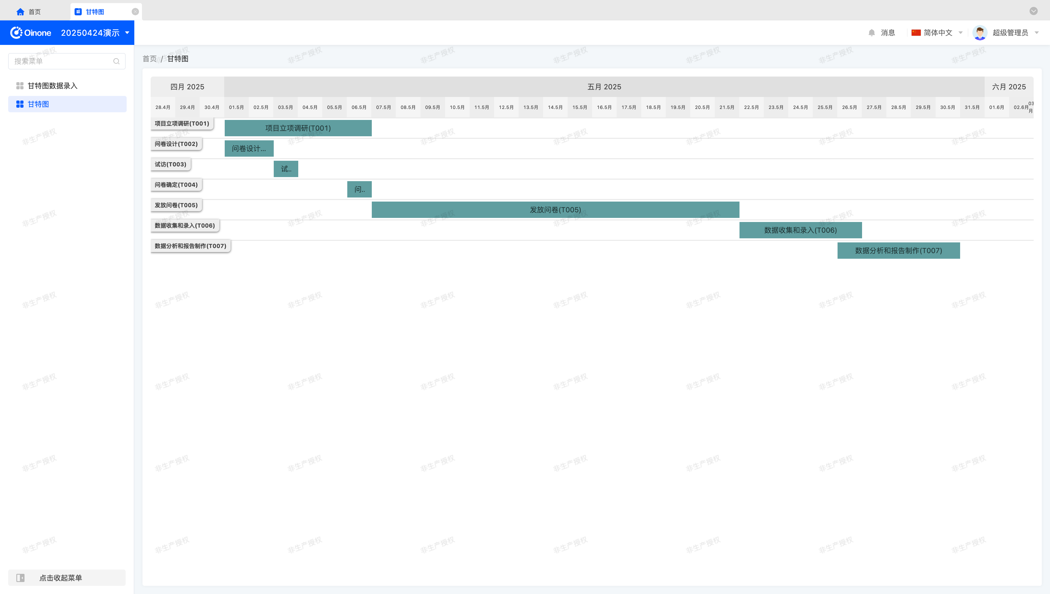
}With this, basic functionality is complete, and the page should appear as:
Next, we want the component to be usable anywhere, requiring DSL configuration. How to make the component generic via properties? Let's continue.
IX: Make Components Generic via Properties
Component generalization is a philosophy of component abstraction. Good property design enables components to adapt to most scenarios, but this requires long-term experience. This section aims to help readers flexibly use Widget framework configurations and gradually understand the development experience of component generalization.
This section includes more theoretical discussion to help readers build a mindset for component generalization and necessary trade-offs. Please read carefully and form your own insights—every component in Oinone undergoes this abstraction process, serving as an "important cornerstone" for future Oinone use.
(Ⅰ) Eliminate Model Influence and Extract Configuration Items
To adapt Gantt charts to more models and views, eliminating model influence and extracting configurations is essential. In simple terms, data structures should not restrict component values—typically achieved by mapping required fields through configuration to enhance flexibility.
During component implementation, we identified configurable properties like the fixed values defined earlier:
- chartStart: Gantt chart start date.
- chartEnd: Gantt chart end date.
- precision: Gantt chart date-time precision.
Additionally, during data structure conversion, how do we know which fields represent titles, start dates, and end dates?
Thus, define three configurations to make values independent of model constraints:
- labelField: Title field.
- startField: Start date field.
- endField: End date field.
Merely extracting data is insufficient—we also need a field for date-time format:
- dateFormat: Date-time format.
Are we ready to proceed? Clearly not—further thinking is required.
(Ⅱ) Further Considerations
After extracting configurations and reading them from DSL, some issues remain unresolved, for which we provide reference solutions:
- Should users see fixed-date-range tasks every time they enter the view? Probably not—display current month's tasks based on the current time to better meet user needs.
- How many scenarios can a simple title field satisfy? Might titles need to be displayed as拼接 of multiple fields? Use expressions to process titles for greater flexibility.
- Directly configuring date-time formats is ineffective, as they must match the date-time processing tool. When the tool changes, existing functions may not smoothly transition. Use enums to represent formats, decoupling from specific date-time formats—similar to model metadata design, where we have four business types for date-time fields: DATETIME, DATE, TIME, and YEAR.
As an exercise, we provide feasible implementation solutions for each issue, incorporating Oinone's built-in functions and tools to improve development efficiency.
Note
Here, we particularly remind readers that for any custom component, imagine how you would evaluate its API as a user.
This is similar to developing most third-party component libraries, where API design is carefully considered.
(Ⅲ) Implement Date-Time Format Configuration
Consider the following implementation:
export enum GanttDateType {
  datetime = 'datetime',
  date = 'date',
  time = 'time',
  year = 'year'
}import { defaultDateFormat, defaultFormat, defaultTimeFormat, defaultYearValueFormat } from '@oinone/kunlun-dependencies';
@Widget.Reactive()
protected get dateType(): GanttDateType {
return this.getDsl().dateType || GanttDateType.date;
}
@Widget.Reactive()
protected get dateFormat(): string {
const { dateFormat } = this.getDsl();
if (dateFormat) {
return dateFormat;
}
switch (this.dateType) {
case GanttDateType.datetime:
return defaultFormat;
case GanttDateType.date:
return defaultDateFormat;
case GanttDateType.time:
return defaultTimeFormat;
case GanttDateType.year:
return defaultYearValueFormat;
default:
return defaultDateFormat;
}
}This implementation defines an enum GanttDateType to represent date-time types, allowing users to configure date-time formats via the dateType configuration. Additionally, users can directly configure dateFormat for formats outside the default types, adapting to more scenarios.
Tip
In Oinone, we distinguish value types that a component may involve:
- Default value: Used when configuration is not obtained, often when empty.
- Initial value: Can be modified via configuration, even set to empty.
- Real value: Stored in the component at runtime, possibly used elsewhere.
- Display value: Transformed from the real value via a format or method.
- Submission value: In form fields, transformed from the real value for backend submission.
For example, the real value type stored in a component for date-time may be Date, the display value may be "2025年05月01日 00:00:00", and the submission value may be "2025-05-01 00:00:00".
(Ⅳ) Implement Title Expression Configuration
Consider the following implementation:
protected get labelField(): string | undefined {
  return this.getDsl().labelField;
}

protected get barLabel(): string | undefined {
  return this.getDsl().barLabel;
}

protected get defaultLabelValue() {
  return '未命名';
}

protected executeExpression<T>(
  activeRecord: ActiveRecord,
  expression: string,
  errorValue?: T
): T | string | undefined {
  return Expression.run(
    {
      activeRecords: [activeRecord],
      rootRecord: this.rootData?.[0] || {},
      openerRecord: this.openerActiveRecords?.[0] || {},
      scene: this.scene
    } as ExpressionRunParam,
    expression,
    errorValue
  );
}

protected computeBarLabel(data: ActiveRecord): string {
  const { labelField, barLabel, defaultLabelValue } = this;
  if (barLabel) {
    return this.executeExpression(data, barLabel, defaultLabelValue) || defaultLabelValue;
  }
  if (labelField) {
    return toString(data[labelField]);
  }
  return defaultLabelValue;
}This implementation allows users to configure titles via labelField or calculate them via barLabel expressions.
If configuration is missing or expression calculation fails, a default title is provided—though this property may not require configuration, use a fixed value for now.
Use Oinone's Expression.run method to calculate expressions. Due to complex parameters and potential reuse, define executeExpression to encapsulate parameter structures for easy use in other methods.
Finally, the title calculation logic: Prioritize expression calculation for maximum flexibility. If no expression is configured but a title field is, fetch the title directly from the field. If configuration is invalid, display the default title.
Tip
For more on expressions, refer to: Expression Service
(Ⅴ) Calculate Display Range Based on Current Time
Consider the following implementation:
@Widget.Reactive()
protected chartStart: Date = new Date();

@Widget.Reactive()
protected chartEnd: Date = new Date();

protected beforeMount() {
  const currentMonthVal = moment(new Date());
  currentMonthVal.startOf('month');
  this.chartStart = currentMonthVal.subtract(3, 'day').toDate();
  this.chartEnd = currentMonthVal.add(3, 'day').add(1, 'month').add(3, 'day').toDate();
}Use the moment tool to convert the current date-time to an editable object and modify it using relevant API.
Tip
Here, we change the time to the first day of the current month, subtract three days for the Gantt start date, and add one month and six days for the end date—displaying the Gantt chart with three days before and after the current month as the benchmark.
For more moment tool API, refer to: https://momentjs.com/docs
(Ⅵ) Implement Other Configurations
@Widget.Reactive()
protected get precision(): GanttPrecision | keyof GanttPrecision | string | undefined {
  return this.getDsl().precision || GanttPrecision.date;
}(Ⅶ) Apply These Configurations to Methods
至此, we've completed initial implementations for all configurable items we can think of. The final step is to use these configurations throughout the component and configure them in the UI Designer or backend DSL.
View the effect of configuring an expression:
The properties configured in XML are:
<element widget="Gantt"
    barLabel="activeRecord.name + '(' + activeRecord.code + ')'"
    startField="taskStartDate"
endField="taskEndDate" />At this point, we've achieved the goal of displaying any model as a Gantt chart.
But the view still lacks pagination. Let's continue.
X: View Data via Pagination
Gantt chart pagination differs from table pagination. While OioPagination enables pagination in tables, it cannot be directly used for Gantt charts.
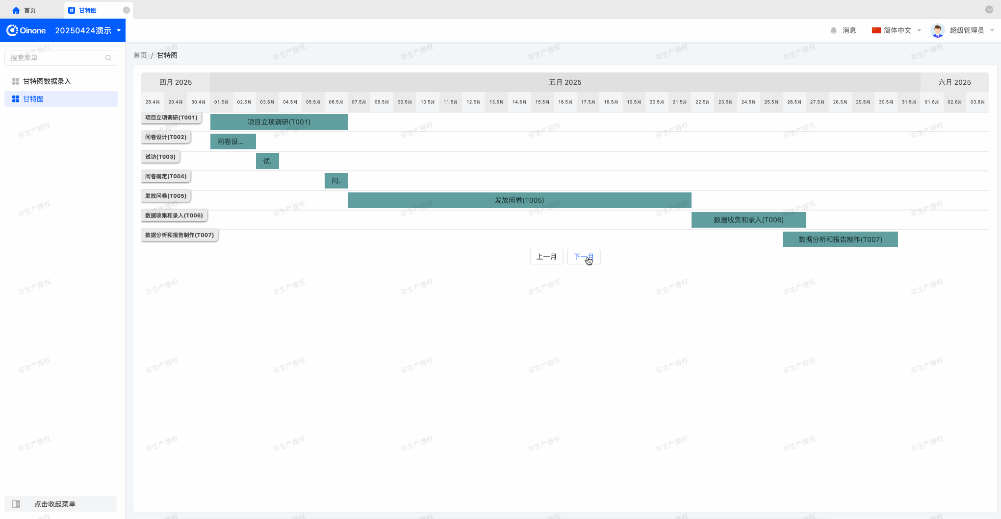
As an exercise, implement month switching via two buttons:
In the previous section, we implemented calculating the display range based on the current time when entering the page. We can now switch months based on the current month's offset, changing the display range by month for pagination.
A possible implementation:
@Widget.Reactive()
protected monthOffset: number = 0;

@Widget.Method()
public async onMonthOffsetChange(monthOffset: number) {
  this.monthOffset = monthOffset;
  const { chartStart, chartEnd } = this.computeChartRange(monthOffset);
  this.chartStart = chartStart;
  this.chartEnd = chartEnd;
  await this.refreshProcess();
}

protected computeChartRange(offset?: number) {
  const currentMonthVal = moment(new Date());
  currentMonthVal.startOf('month');
  offset = offset || 0;
  if (offset !== 0) {
    currentMonthVal.add(offset, 'month');
  }
  return {
    chartStart: currentMonthVal.subtract(3, 'day').toDate(),
    chartEnd: currentMonthVal.add(3, 'day').add(1, 'month').add(3, 'day').toDate()
  };
}Next, define two buttons in the Vue component and call onMonthOffsetChange to implement pagination.
The initialization method defined in beforeMount is now单独 defined as computeChartRange with an offset parameter to calculate the Gantt display range.
Tip
Note that in onMonthOffsetChange, we call refreshProcess to re-fetch data—provided by the BaseElementListViewWidget base class to describe refresh behavior logic.
In Oinone, after any parameter change affecting page data, simply refresh the component to re-fetch data based on the new parameters—e.g., pagination, search conditions, sorting.
Oops—when switching pages, the Gantt display range changes, but data remains the same. Using Vue DevTools, we find ganttData doesn't change during pagination switching—we forgot that refreshProcess is called during switching, and ganttData is only updated in mountedProcess. Follow the same logic to override refreshProcess and reassign ganttData after calling the parent method:
protected async refreshProcess(condition?: Condition): Promise<void> {
  await super.refreshProcess(condition);
  this.ganttData = this.convertGanttData(this.dataSource || []);
}Switch pages again—data now changes with the display range. This exercise now concludes.
XI. Further Practice
If time permits, try these exercises:
- Mimic Gantt chart implementation to complete a generic calendar component.
- Use the
vxe-tablethird-party component library to implement a configurable table. (Challenging) - Customize a gallery component to render cards as desired.