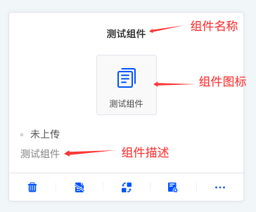
In the page designer, the component list is presented in the form of cards by default. You can preview the basic information of the components on the component cards, including the component name, component icon, and component description.
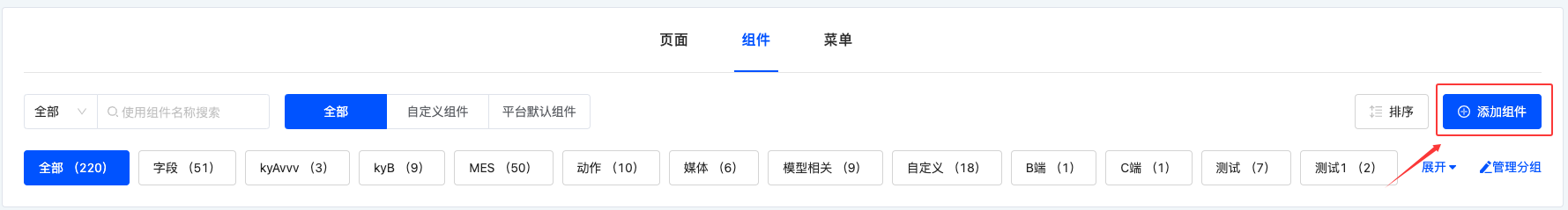
I. Filtering
1. Function Introduction
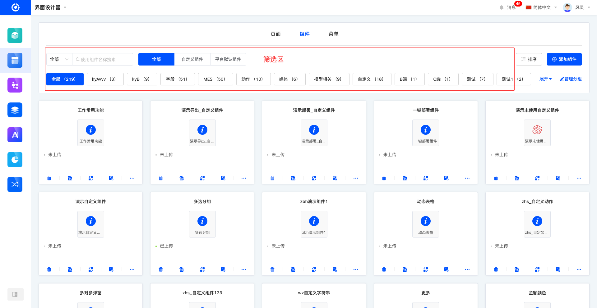
According to actual business requirements, you can customize component filtering conditions, including whether to hide, component name, component classification, and grouping settings, to accurately filter components. Under the set filtering conditions, the corresponding component list will be displayed, which facilitates viewing and editing operations on different components.
2. Operation Method
Select or enter conditions in the filtering area to complete the filtering of components.
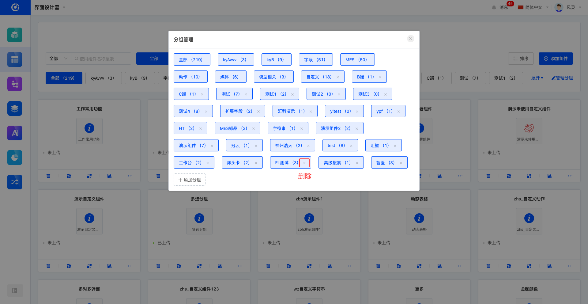
II. Group Management
1. Function Introduction
You can use the grouping function to classify and manage components (including adding and deleting), and there is no limit to the number of groups.
2. Operation Method
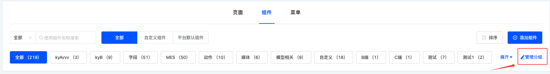
- Manage groups: Click "Manage Groups", and perform management operations on groups in the pop-up window.
- Add a group: Click "Add Group", enter the group name, and press Enter to add it successfully.
Note
The group name only allows Chinese or English characters to be entered.
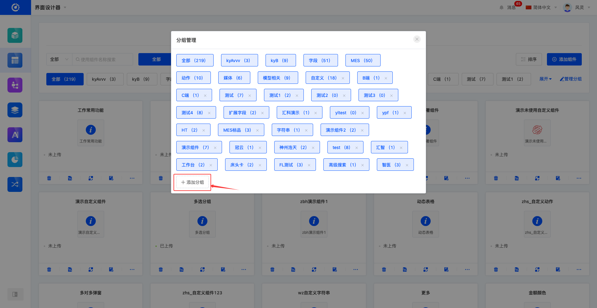
- Delete a group: Click the "Delete" icon after the group to delete the group.
Note
A group cannot be deleted when there are components under it.
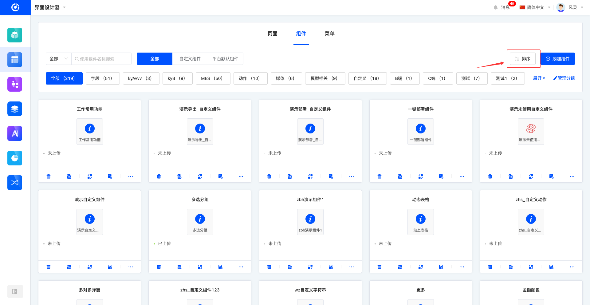
III. Sorting
1. Function Introduction
You can sort components and their groups. The sorted results will be displayed in the component library during page design, which is convenient for users to select and use as needed.
2. Operation Method
- Click "Sort" to enter the sorting page.
- Drag the "Drag" button in front of the group to sort the groups.
- Drag the "Component" button to sort the components, and cross-group sorting is supported.
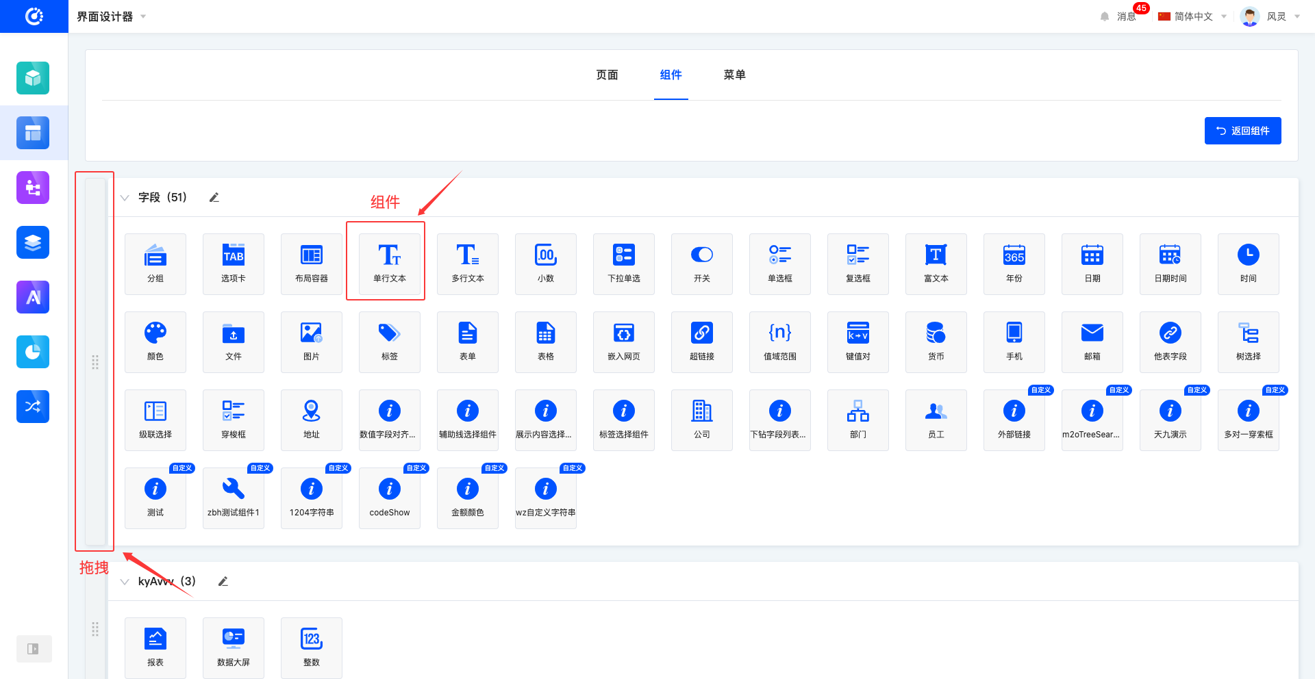
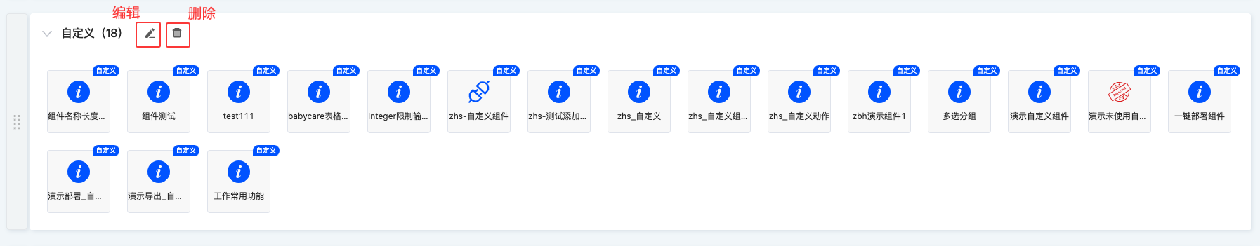
- Click the "Edit" icon to modify the group name.
- Click the "Delete" icon to delete the group.
Note
Only custom groups are allowed to be deleted. In addition, a group cannot be deleted if there are components under it.
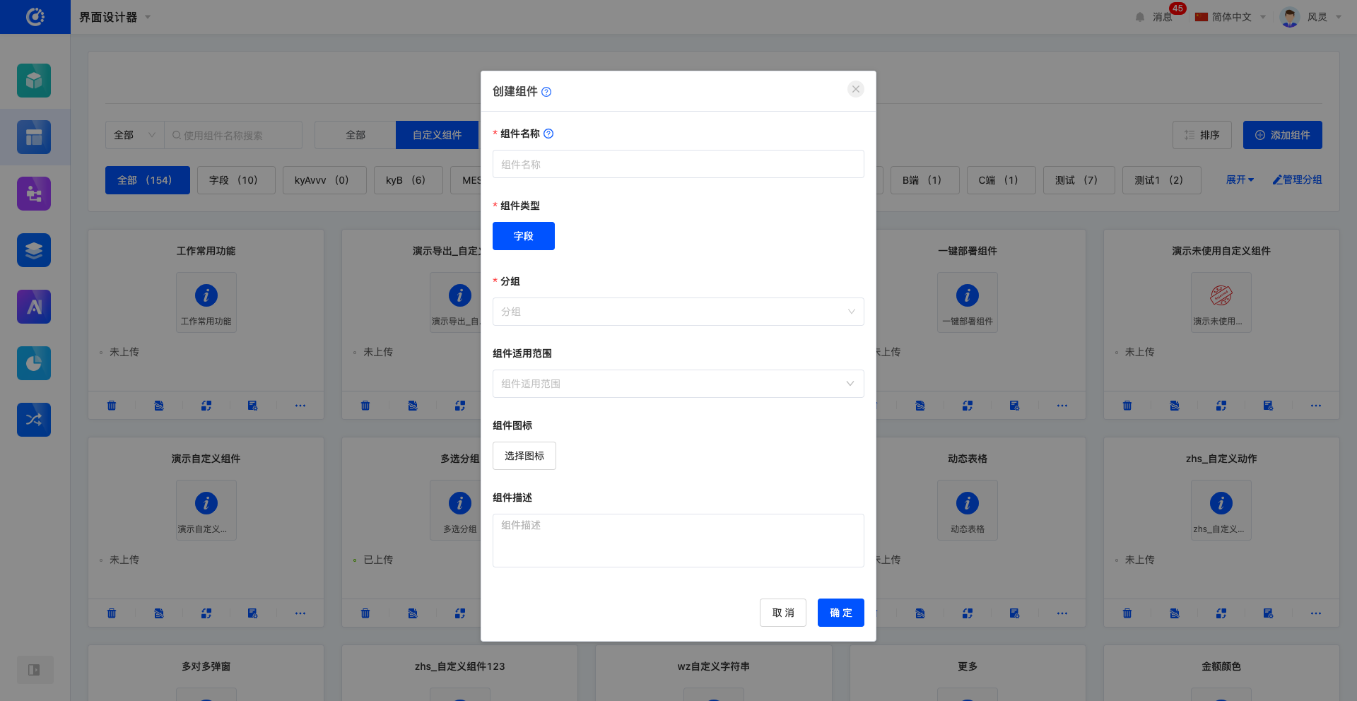
IV. Add Component
1. Function Introduction
Create components using the interface designer, and you can edit component information during the creation process. The created components can be used in the component library.
2. Operation Method
Click "Add Component", fill in the information correctly on the pop-up page, and click "OK" to create successfully.
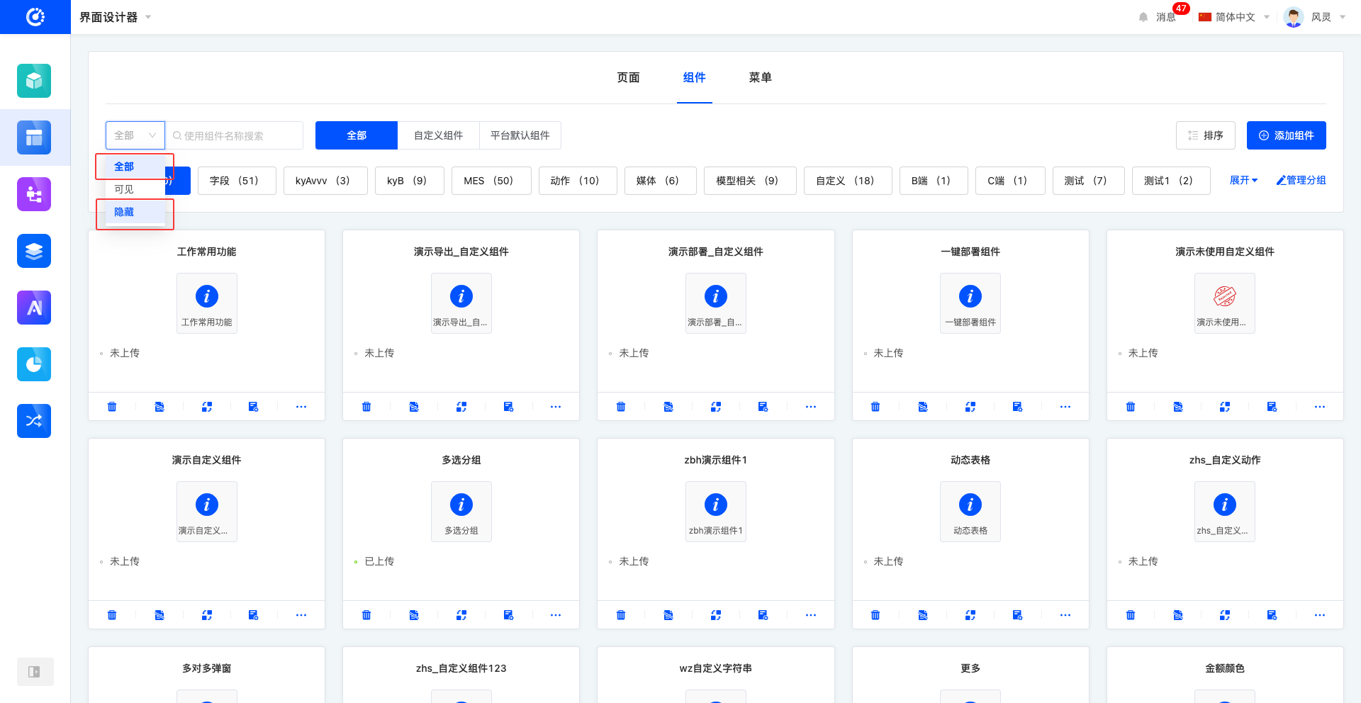
V. Hide/Show Components
1. Function Introduction
For components that are not currently in use, you can perform a hide operation. If needed in the future, simply set the hidden components to the visible state to put them back into use.
2. Operation Method
Click "Hide" to set the component to the hidden state, and the button changes to "Show"; click again to set the component to the visible state.

Tip
If you need to operate on a hidden component but cannot find a certain hidden component in the list, switch the "Visibility" filter option to "All" or "Hidden" to find the hidden component.
The following functions are only applicable to custom components.
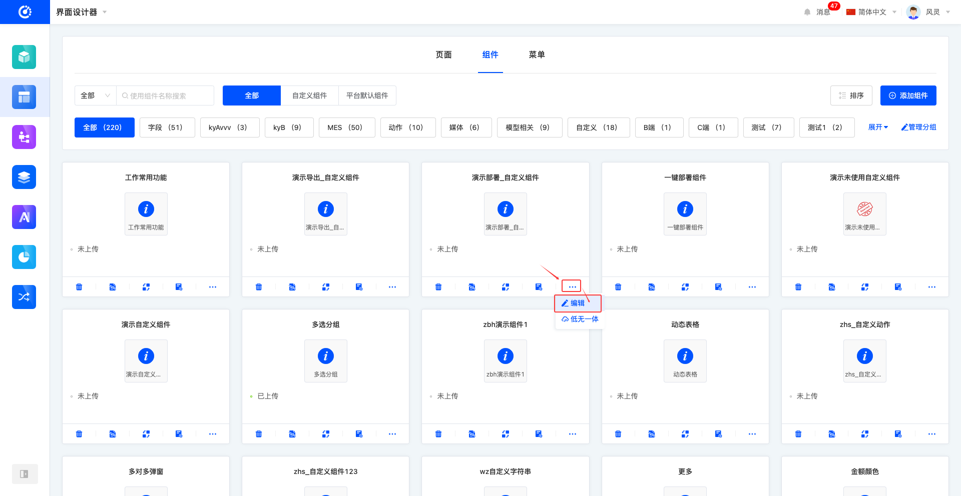
VI. Edit Component
1. Function Introduction
Successfully created components can be edited.
Note
Only some information can be modified, and some information is fixed at the time of creation, so please fill it in carefully when creating.
2. Operation Method
Click "Edit" to edit on the pop-up editing page.
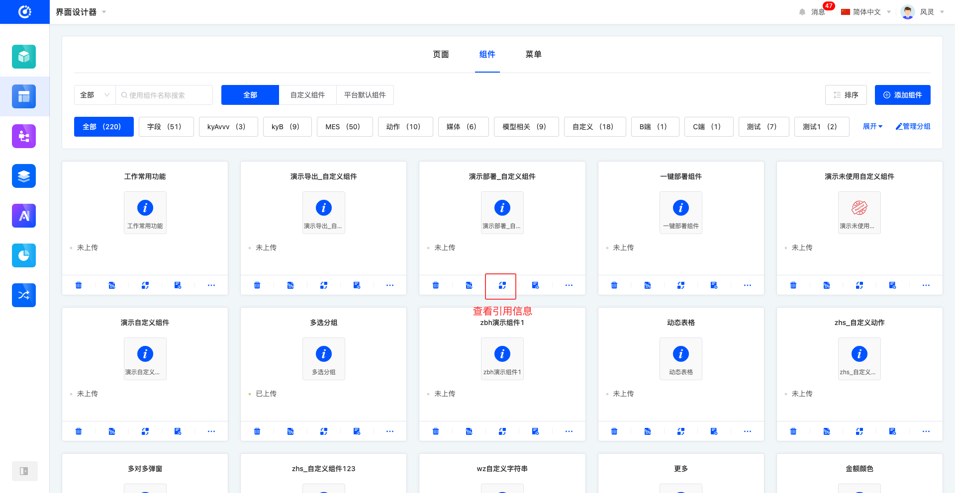
VII. View Reference Information
1. Function Introduction
Through this function, you can view the pages that have a reference relationship with the component. The relationships are displayed in a list, and the list items are links that can be linked to the corresponding design pages, and the content is the corresponding content.
2. Operation Method
Click the "View Reference Information" icon to view the reference information.
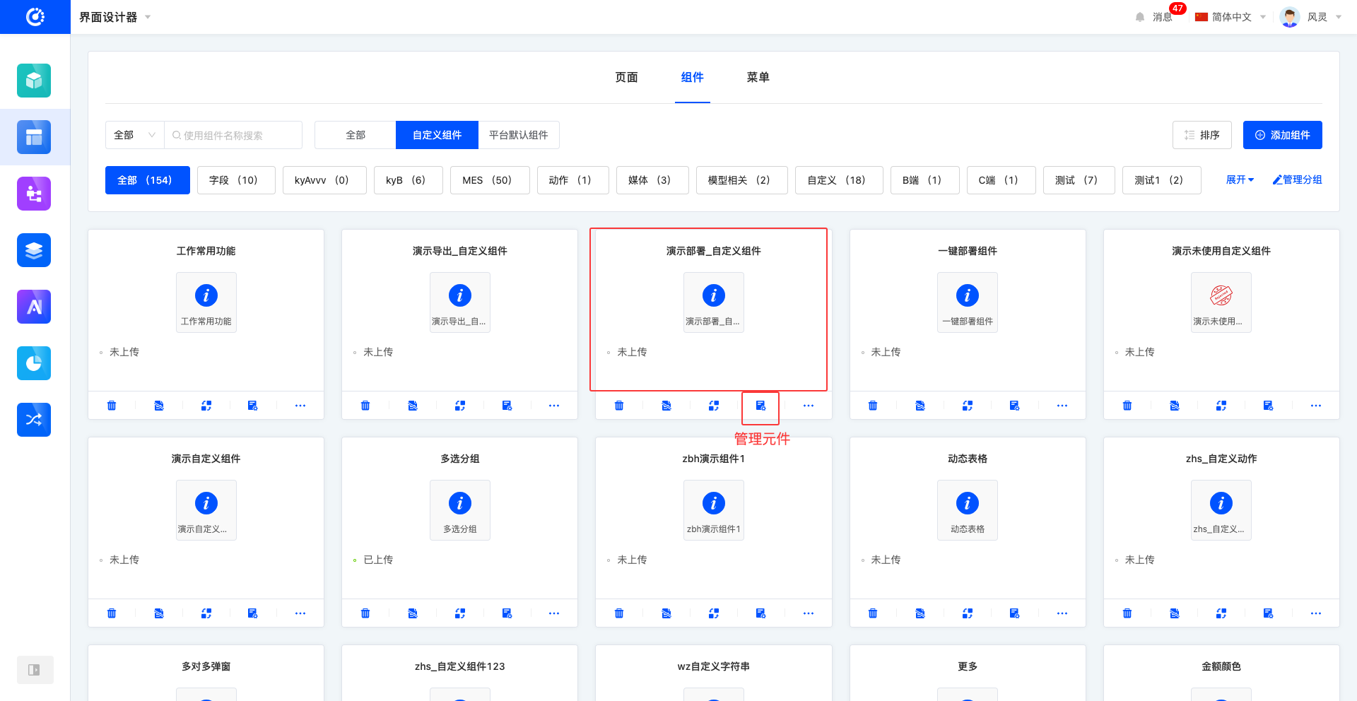
VIII. Manage Elements
1. Function Introduction
A component can contain multiple elements. To ensure that the function and performance of the component meet the design requirements, these elements need to be comprehensively and meticulously managed. Specific management operations include creating, editing, and deleting elements to ensure that the component is reasonably structured and fully functional. (See the element information document for details.)
2. Operation Method
Click the main part of the component card or the "Manage Elements" icon to enter the element management page.
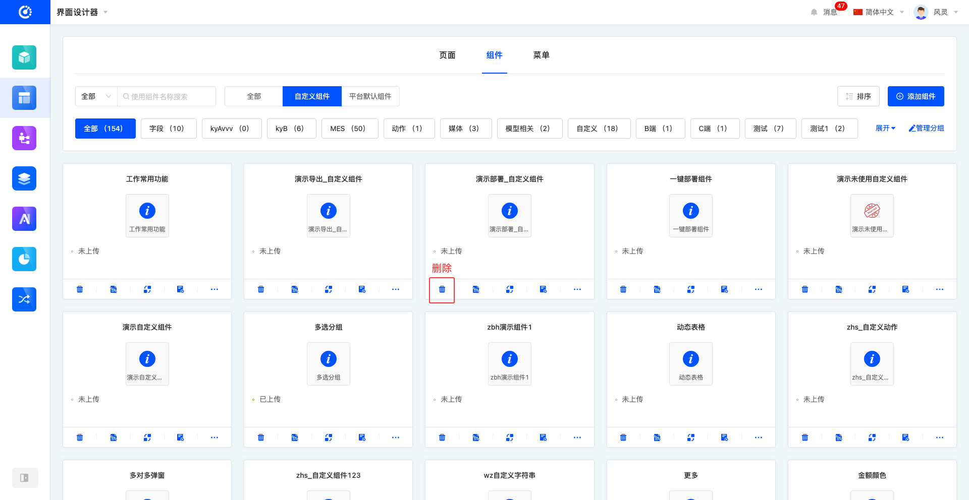
IX. Delete Component
1. Function Introduction
When a component is no longer needed, you can choose to delete it. If you are not sure whether to delete a component, you can hide it first.
Note
Before deletion, ensure that the component is not referenced by other pages; otherwise, the deletion operation cannot be performed.
Warning
Once a page is deleted, it cannot be restored. Please operate with caution!
2. Operation Method
Click the "Delete" icon, and confirm the deletion to delete the component.
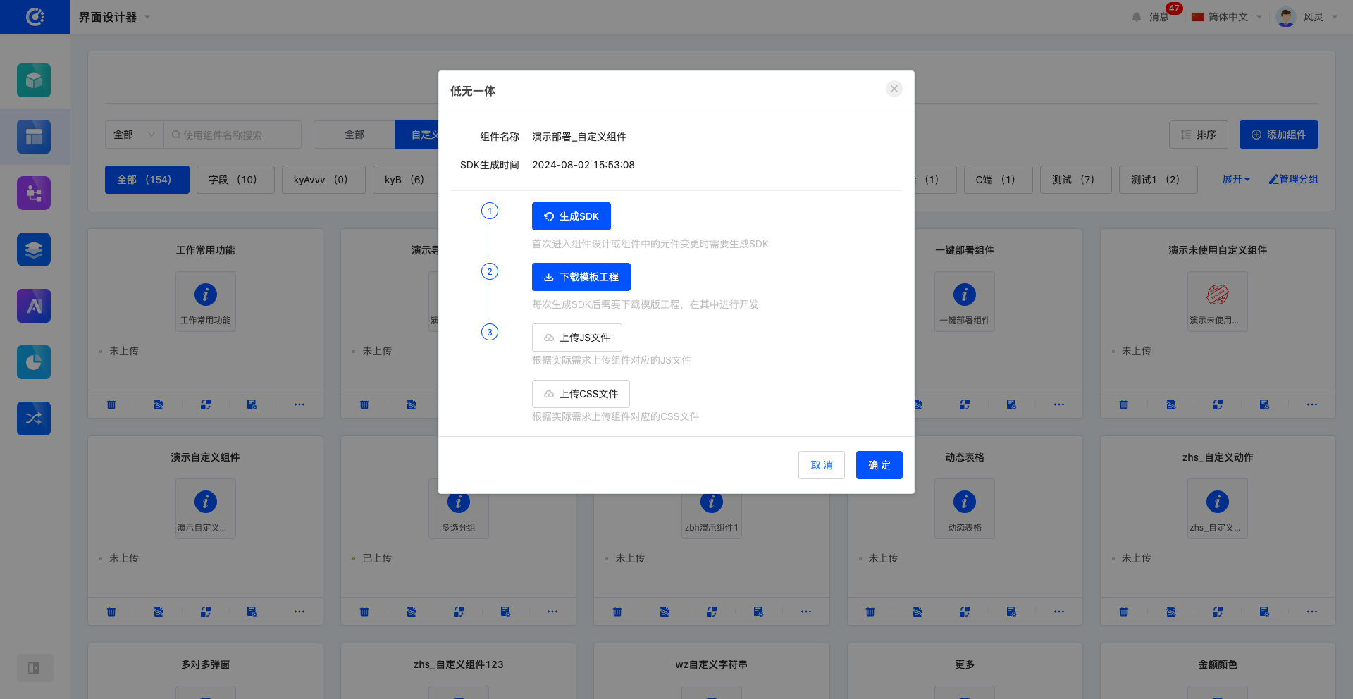
X. Low-Code/No-Code Integration
1. Function Introduction
The Oinone platform supports the organic integration of low-code development and no-code development. When the no-code development mode cannot meet the development requirements of some special scenarios or cannot perfect relevant functions, users can use the low-code/no-code integration function to further improve and optimize the project by writing code.
Tip
The system supports all custom components to have the low-code/no-code integration function. To facilitate code management and reduce network requests, it is recommended to upload low-code development files centrally in one component. There is no difference in effect between unified uploading and individual uploading, but unified uploading can manage code more efficiently and effectively avoid the network request burden caused by too many files.
2. Operation Method
- Click "Low-Code/No-Code Integration" to enter the pop-up window.
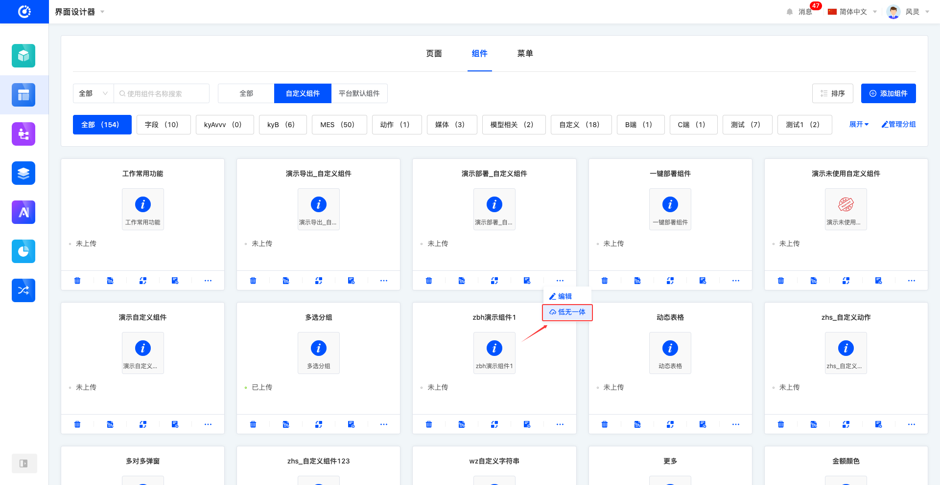
- If you are entering the component design for the first time or the elements in the component have changed, click "Generate SDK" to generate the SDK for the component.
- After generating the SDK each time, click "Download Template Project" to download the corresponding template project and develop in it.
- Click "Upload JS File" or "Upload CSS File" to upload the developed files.
XI. Attachment: Glossary
| Term | Description |
|---|---|
| Component | The basic unit of page design, such as buttons, text boxes, and pictures. |
| Element | The attribute page designed according to different field business types. |
| Low-Code/No-Code Integration | Reverse-generate API code, generate the corresponding extension project and API dependency package, and upload them to the platform after development by professional R & D personnel. |