Components used to wrap other components are typically registered through Pack components, also known as container components. These components are particularly meaningful in views with layout capabilities.
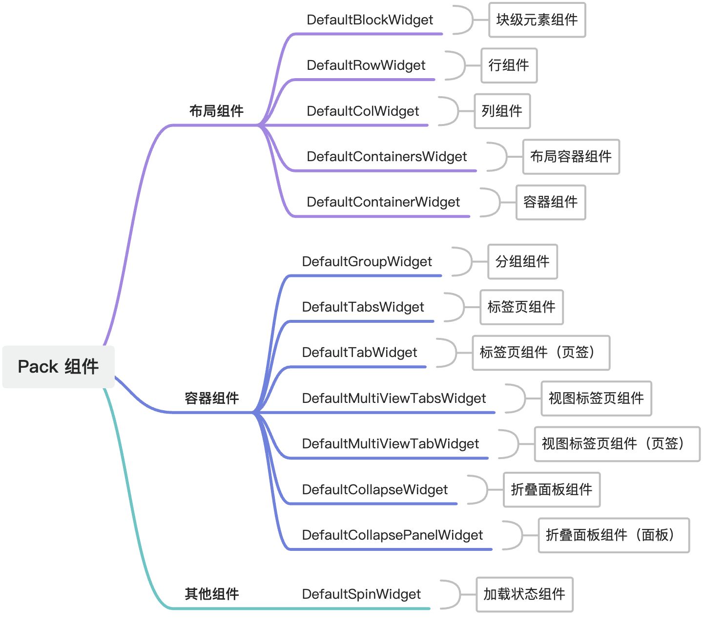
I. Pack Component Map
II. Registration of Pack Components
(Ⅰ) Registration Options for Pack Components
/**
 * Registration options for Pack components
 */
export interface BasePackOptions extends SPIOptions {
  /**
   * Specify view type(s)
   */
  viewType?: ViewType | ViewType[];
  /**
   * Specify component name or alias(es)
   */
  widget?: string | string[];
  /**
   * Specify if the component is inline
   */
  inline?: boolean;
  /**
   * Specify model(s)
   */
  model?: string | string[];
  /**
   * Specify view name(s)
   */
  viewName?: string | string[];
}From the above type declaration, it's evident that the classification dimensions include view type, component name, inline status, model code, and view name. These dimensions describe the component's usage location. Generally, the more "precise" the location description, the higher the priority of the component when rendered in that location. Components registered later will overwrite those with identical location descriptions.
(Ⅱ) Registering Components
1. Registering Default Pack Components
When the widget property is not specified, the component is registered as a default Pack component. Take DefaultGroupWidget as an example:
@SPI.ClassFactory(BasePackWidget.Token({}))
export class DefaultGroupWidget extends BasePackWidgetFor this component, use the pack tag in DSL:
<pack>
  ...
</pack>2. Registering Components with Specified Names
For other components, specify the component name via widget to distinguish them. Take the DefaultBlockWidget component as an example:
@SPI.ClassFactory(
  BasePackWidget.Token({
    widget: 'block'
  })
)
export class DefaultBlockWidget extends BasePackWidgetFor this component, use the pack tag in DSL with the widget attribute specified:
<pack widget="block">
  ...
</pack>III. Usage of Common Layout and Container Components
(Ⅰ) Grid Layout
Referencing Antd Grid for Vue, Oinone's grid layout also uses a 24-column grid. Let's explore how grid layouts are used in DSL.
Unlike native component-supported grid layouts, Oinone provides a combination of cols and span for flexible grid handling. The cols attribute defines the number of grid columns in a row, and the span attribute determines the span of a single grid, with the default span matching the number of columns.
Three Columns in a Row (1:1:1)
<pack widget="row" cols="3">
    <pack widget="col" span="1"></pack>
    <pack widget="col" span="1"></pack>
    <pack widget="col" span="1"></pack>
</pack>1:3 Ratio
<pack widget="row" cols="4">
    <pack widget="col" span="1"></pack>
    <pack widget="col" span="3"></pack>
</pack>Two Rows (Auto Wrap)
<pack widget="row" cols="3">
    <!-- First row -->
    <pack widget="col" span="1"></pack>
    <pack widget="col" span="1"></pack>
    <pack widget="col" span="1"></pack>
    <!-- Second row -->
    <pack widget="col" span="1"></pack>
    <pack widget="col" span="3"></pack>
</pack>(Ⅱ) Tab Components
Referencing Antd Tabs for Vue, for parent-child combined components, the usage is similar to native components, requiring adjacent definition of parent and child components.
Basic Usage
<pack widget="tabs">
    <pack widget="tab" title="Tab 1"></pack>
    <pack widget="tab" title="Tab 2"></pack>
    <pack widget="tab" title="Tab 3"></pack>
</pack>(Ⅲ) Built-in Grid Layout
In Oinone, some components natively use grid layouts, allowing direct usage without explicit grid layout component definitions.
Using Grid Layout in Groups
<pack title="Basic Information" cols="3">
    <field data="code" label="Code" span="1" />
    <field data="name" label="Name" span="2" />
    <field data="description" label="Description" span="3" />
</pack>The above DSL is equivalent to:
<pack title="Basic Information">
    <pack widget="row" cols="3">
        <pack widget="col" span="1">
            <field data="code" label="Code" />
        </pack>
        <pack widget="col" span="2">
            <field data="name" label="Name" />
        </pack>
        <pack widget="col" span="3">
            <field data="description" label="Description" />
        </pack>
    </pack>
</pack>The built-in grid layout is implemented via a mechanism similar to component mixing, where the parent component mixes in all properties and functions of the row component, and child components mix in all properties and functions of the col component, simplifying grid layout usage in DSL.
IV. Reference List
(Ⅰ) Layout Components
1、DefaultBlockWidget
Type Declaration:
@SPI.ClassFactory(
  BasePackWidget.Token({
    widget: 'block'
  })
)
export class DefaultBlockWidget extends BasePackWidgetProperties:
- defaultGutter: Default spacing. (
StandardGutterType) - flex: Whether to use flex layout. (
boolean) - flexDirection: Flex layout direction. (
string | undefined) - gutter: Spacing. (
number[]) - inline: Whether to display inline. (
boolean) - layout: Layout mode. (
string | undefined)
2、DefaultRowWidget
Type Declaration:
@SPI.ClassFactory(
  BasePackWidget.Token({
    widget: 'row'
  })
)
export class DefaultRowWidget extends BasePackWidgetProperties:
- align: Layout alignment. (
string) - containersGutter: Grid spacing for layout containers. (
number[]) - customDefaultGutter: Custom default spacing. (
StandardGutterType | undefined) - defaultGutter: Default spacing. (
StandardGutterType) - flexDirection: Flex layout direction. (
string) - flexLayout: Flex layout type. (
string) - gutter: Grid spacing. (
number[]) - isCard: Whether to use card layout. (
boolean | undefined) - justify: Content arrangement. (
string) - wrap: Whether to wrap. (
boolean | undefined)
3、DefaultColWidget
Type Declaration:
@SPI.ClassFactory(
  BasePackWidget.Token({
    widget: 'col'
  })
)
export class DefaultColWidget extends BasePackWidgetProperties:
- maxWidth: Maximum width. (
any) - minWidth: Minimum width. (
any) - mode: Layout mode. (
string | undefined) - offset: Grid offset. (
number) - span: Grid span. (
number) - width: Width. (
any)
4、DefaultContainersWidget
Type Declaration:
@SPI.ClassFactory(
  BasePackWidget.Token({
    widget: 'containers'
  })
)
export class DefaultContainersWidget extends DefaultRowWidgetProperties:
- border: Whether to show borders. (
boolean) - borderTop: Whether to show top border. (
boolean) - borderBottom: Whether to show bottom border. (
boolean) - borderLeft: Whether to show left border. (
boolean) - borderRight: Whether to show right border. (
boolean) - borderColor: Border color. (
string | undefined) - borderSize: Border size. (
string) - borderStyle: Border style. (
string | undefined) - colGutter: Column spacing. (
string) - currentGutter: Current grid spacing. (
number[]) - layout: Layout mode. (
string | undefined) - margin: Margin. (
string) - marginBottom: Bottom margin. (
string) - marginLeft: Left margin. (
string) - marginRight: Right margin. (
string) - marginTop: Top margin. (
string) - padding: Padding. (
string) - paddingBottom: Bottom padding. (
string) - paddingLeft: Left padding. (
string) - paddingRight: Right padding. (
string) - paddingTop: Top padding. (
string) - rowGutter: Row spacing. (
string) - showInternalBorder: Whether to show internal borders. (
boolean)
5、DefaultContainerWidget
Type Declaration:
@SPI.ClassFactory(
  BasePackWidget.Token({
    widget: 'container'
  })
)
export class DefaultContainerWidget extends DefaultRowWidgetProperties:
- allInvisible: Whether all are invisible. (
boolean) - border: Whether to show borders. (
boolean) - borderTop: Whether to show top border. (
boolean) - borderBottom: Whether to show bottom border. (
boolean) - borderLeft: Whether to show left border. (
boolean) - borderRight: Whether to show right border. (
boolean) - borderColor: Border color. (
string | undefined) - borderSize: Border size. (
string) - borderStyle: Border style. (
string | undefined) - colGutter: Column spacing. (
string) - currentGutter: Current grid spacing. (
number[]) - layout: Layout mode. (
string | undefined) - margin: Margin. (
string) - marginBottom: Bottom margin. (
string) - marginLeft: Left margin. (
string) - marginRight: Right margin. (
string) - marginTop: Top margin. (
string) - padding: Padding. (
string) - paddingBottom: Bottom padding. (
string) - paddingLeft: Left padding. (
string) - paddingRight: Right padding. (
string) - paddingTop: Top padding. (
string) - rowGutter: Row spacing. (
string) - showInternalBorder: Whether to show internal borders. (
boolean) - style: Component styles. (
CSSStyleDeclaration)
(Ⅱ) Container Components
1、DefaultGroupWidget
Type Declaration:
@SPI.ClassFactory(
  BasePackWidget.Token({})
)
export class DefaultGroupWidget extends BasePackWidgetProperties:
- border: Whether to show borders. (
boolean) - description: Description text. (
string) - help: Help content. (
any) - layout: Layout mode. (
string | undefined) - title: Group title. (
string)
2、DefaultTabsWidget
Type Declaration:
@SPI.ClassFactory(
  BasePackWidget.Token({
    widget: 'tabs'
  })
)
export class DefaultTabsWidget extends BasePackWidgetProperties:
- defaultActiveIndex: Default active tab index. (
number | undefined) - layout: Layout mode. (
string | undefined) - parentMountedCallChaining: Parent mounted call chaining instance. (
CallChaining | undefined) - tabAlign: Tab alignment. (
string) - tabPosition: Tab position. (
string)
Methods:
computeDefaultActiveKey
- Function Description: Computes the default active tab key (based on default index or reported key).
- Type:
() => string | undefined - Return Value: Default active tab key.
findNextActiveIndex
- Function Description: Finds the next visible tab index based on invisible flags and current index (searches forward/backward preferentially).
- Type:
(invisibleFlags: boolean[], currentActiveIndex: number) => number - Parameters:
invisibleFlags: Array of child tab visibility states.currentActiveIndex: Current active tab index.
- Return Value: Index of the next visible tab, or
-1if not found.
getActiveKey
- Function Description: Gets the current active tab key.
- Type:
() => string | undefined - Return Value: Current active tab key.
onActiveKeyChange
- Function Description: Handles active tab key changes and updates the active key.
- Type:
(key: string) => void - Parameters:
key: New active tab key.
resetInvisible
- Function Description: Resets tab visibility and automatically switches to the next visible tab if the current tab is invisible.
- Type:
() => void
setActiveKey
- Function Description: Sets the current active tab key.
- Type:
(key: string | undefined) => void - Parameters:
key: Tab key to activate.
3、DefaultTabWidget
Type Declaration:
@SPI.ClassFactory(
  BasePackWidget.Token({
    widget: 'tab'
  })
)
export class DefaultTabWidget extends BasePackWidgetProperties:
- currentTabKey: Current tab key (based on current handle). (
string) - disabled: Whether disabled (supports expressions). (
boolean) - forceRender: Whether to force rendering. (
boolean) - layout: Layout mode. (
string | undefined) - parentMountedCallChaining: Parent mounted call chaining instance. (
CallChaining | undefined) - title: Tab title (supports expressions, default is
DEFAULT_TAB_TITLE). (string)
Methods:
isDefaultActive
- Function Description: Determines if it is the default active state (based on
defaultActiveconfiguration in DSL). - Type:
() => boolean - Return Value: Whether it is the default active state.
4、DefaultMultiViewTabsWidget
Type Declaration:
@SPI.ClassFactory(
  BasePackWidget.Token({
    widget: 'MultiViewTabs'
  })
)
export class DefaultMultiViewTabsWidget extends DefaultTabsWidgetProperties:
- allInvisible: Whether all are invisible. (
boolean | undefined) - invisible: Whether invisible. (
boolean) - multiViewKeyCache: Multi-view key cache instance. (
ReturnType<MultiViewKeyCache>)
Methods:
onActiveKeyChange
- Function Description: Handles active key change events and updates the multi-view key cache.
- Type:
(tabKey: string) => void - Parameters:
tabKey: New active tab key.
5、DefaultMultiViewTabWidget
Type Declaration:
@SPI.ClassFactory(
  BasePackWidget.Token({
    widget: 'MultiViewTab'
  })
)
export class DefaultMultiViewTabWidget extends DefaultTabWidgetProperties:
- activeRecords: Current active records. (
ActiveRecord[] | undefined) - allInvisible: Whether all are invisible. (
boolean | undefined) - dataSource: Data source. (
ActiveRecord[] | undefined) - forceRender: Whether to force rendering. (
boolean) - invisible: Whether invisible. (
boolean) - metadataViewWidget: Metadata view component instance. (
MetadataViewWidget | undefined) - runtimeView: Runtime view. (
RuntimeView | undefined) - runtimeViewContext: Runtime view context. (
RuntimeContext | undefined) - viewName: View name. (
string | undefined) - viewModel: View model name. (
string | undefined)
Methods:
createMetadataViewWidget
- Function Description: Creates a metadata view component instance (with a unique handle and configuration).
- Type:
() => MetadataViewWidget - Return Value: Metadata view component instance.
initRuntimeContext
- Function Description: Initializes the context using a metadata subview and runtime view.
- Type:
(metadataSubviewWidget: MetadataViewWidget, view: RuntimeView) => RuntimeContext - Parameters:
metadataSubviewWidget: Metadata subview component.view: Runtime view instance.
- Return Value: Runtime context.
initView
- Function Description: Asynchronously loads the runtime view and initializes context and properties.
- Type:
async () => void
initViewAfterProperties
- Function Description: Hook function after view property initialization (empty implementation for subclass extension).
- Type:
() => void
reloadActiveRecords
- Function Description: Reloads active records and updates the current state.
- Type:
(records: ActiveRecords | undefined) => void - Parameters:
records: New active record data (optional).
reloadDataSource
- Function Description: Reloads the data source and updates the current state.
- Type:
(records: ActiveRecords | undefined) => void - Parameters:
records: New data source data (optional).
6、DefaultCollapseWidget
Type Declaration:
@SPI.ClassFactory(
  BasePackWidget.Token({
    widget: 'collapse'
  })
)
export class DefaultCollapseWidget extends BasePackWidgetProperties:
- accordion: Whether to use accordion mode. (
boolean | undefined) - collapseMethod: Collapse method. (
string) - expandAll: Whether to expand all (default
true). (boolean | undefined) - expandIconPosition: Expand icon position (default
right). (string) - layout: Layout mode. (
string | undefined) - type: Collapse type (default
bordered). (string)
Methods:
getActiveKey
- Function Description: Gets the current active key.
- Type:
() => string | string[] | undefined - Return Value: Current active key.
onActiveKeyChange
- Function Description: Handles active key changes and updates the active state.
- Type:
(key: string | string[]) => void - Parameters:
key: New active key.
setActiveKey
- Function Description: Sets the current active key.
- Type:
(key: string | string[] | undefined) => void - Parameters:
key: Key to activate.
7、DefaultCollapsePanelWidget
Type Declaration:
@SPI.ClassFactory(
  BasePackWidget.Token({
    widget: ['collapsePanel', 'collapse-panel', 'CollapsePanel']
  })
)
export class DefaultCollapsePanelWidget extends BasePackWidgetProperties:
- currentTabKey: Current tab key. (
string) - disabled: Whether disabled. (
boolean) - forceRender: Whether to force rendering. (
boolean) - layout: Layout mode. (
string | undefined) - title: Title. (
string)
(Ⅲ) Other Components
1、DefaultSpinWidget
Type Declaration:
@SPI.ClassFactory(
  BasePackWidget.Token({
    widget: 'spin'
  })
)
export class DefaultSpinWidget extends BasePackWidgetProperties:
- delay: Delay time (milliseconds). (
number | undefined) - loadingIndicator: Custom loading indicator. (
VNode | undefined) - size: Loading icon size. (
string | undefined) - tip: Loading prompt text. (
string | undefined) - wrapperClassName: Outer container class name. (
string | string[] | undefined)
Methods:
load
- Function Description: Executes an asynchronous operation and shows the loading state.
- Type:
async <R>(fn: (...args: any[]) => R, ...args: any[]) => Promise<R> - Parameters:
fn: Asynchronous function to execute....args: Parameters passed to the asynchronous function.
- Return Value: Result of the asynchronous function.