In Oinone, a gallery view is a type of view that displays data in card form. While the card content can be designed through the UI Designer or backend DSL, this sometimes fails to meet our business scenarios—after all, not all cards are designed uniformly. Therefore, customizing the cards in a gallery view is often necessary.
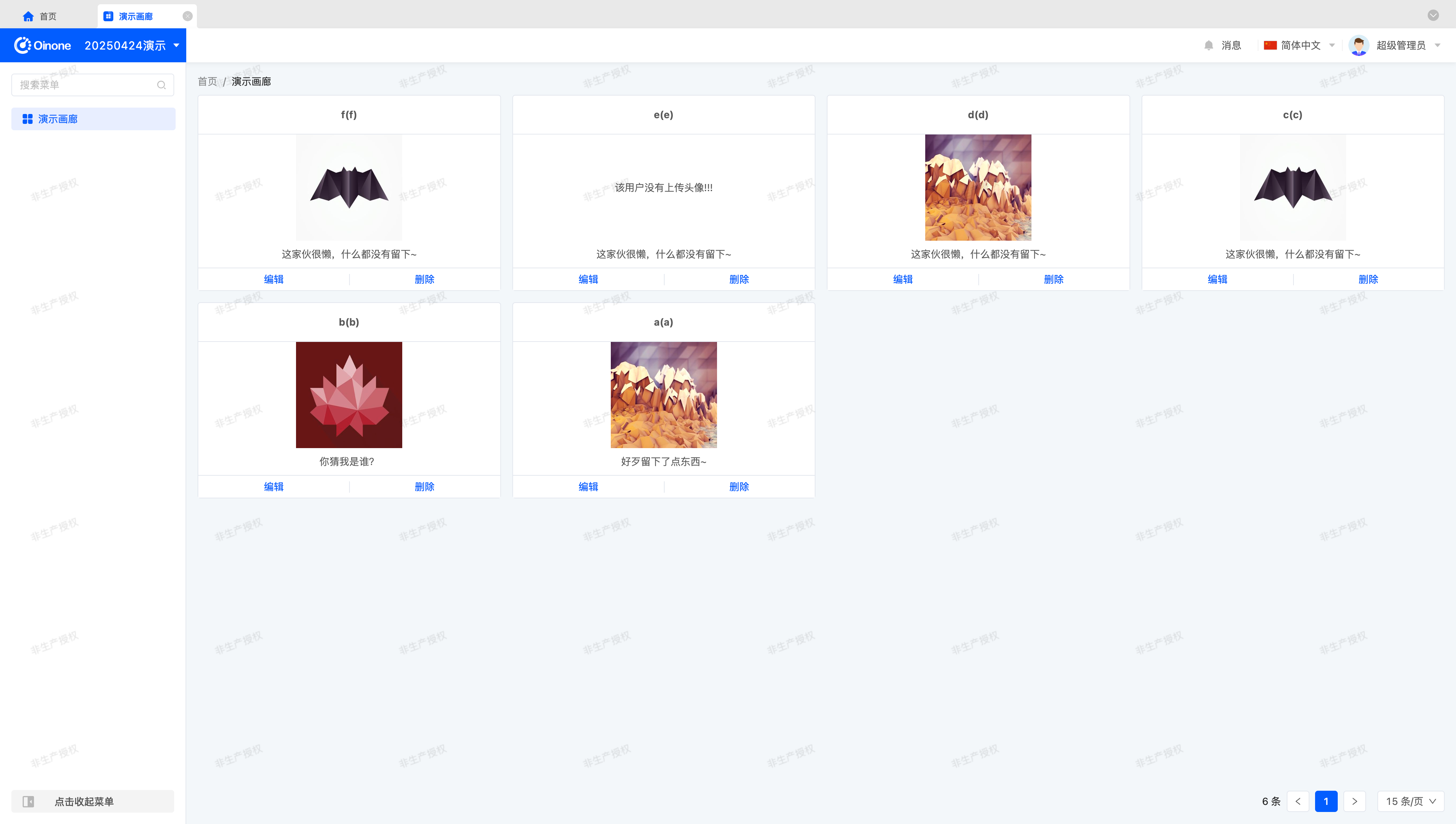
Let's first take a look at the final effect of this exercise.
I. Preparation
In Oinone, all metadata revolves around models. Therefore, we need to prepare a simple model, some views, and create a menu to display the model's views on the page.
Let's start by building the original page.
Tip
This preparation is not the focus of this exercise. If you are unfamiliar with these concepts, here are some learning resources:
(I) Prepare the Model (GalleryDemoModel)
You can create a model using the Model Designer or through the backend.
This model contains four fields: code, name, personal signature, and avatar.
The field information for the model (GalleryDemoModel) used in this exercise is listed below:
| Name | API Name | Field Type | Multi-value | Length (Single Value) |
|---|---|---|---|---|
| 编码 | code | Text (String) | No | 128 |
| 名称 | name | Text (String) | No | 128 |
| 个性签名 | description | Multi-line Text | No | - |
| 头像 | avatar | Text (String) | No | 512 |
Tip
Note that when using a text type for the avatar field, the field length must be specified as 512 or larger; otherwise, image uploads may fail due to insufficient field length.
(II) Prepare Views
In addition to the model, we need views and navigation actions to link them. You can complete these operations using the UI Designer or through the backend.
First, we need a gallery view to showcase the exercise results.
Second, we need a form view to create test data.
Finally, bind the gallery view to a menu so we can access it by clicking the menu.
II. Switch to a Custom Component
(I) Switch via registerLayout
As we practiced in the "Explore Frontend Framework" chapter, we can switch components by registering a layout. Change widget="card" to widget="GalleryCustomCard" to complete the component switch:
<view type="gallery">
    <view type="search">
        <element slot="search" widget="search" />
    </view>
    <element widget="actionBar" slot="actionBar" />
    <element widget="gallery" slot="gallery">
        <element widget="GalleryCustomCard" slot="card">
            <template slot="title" />
            <template slot="content" />
            <template slot="rowActions" />
        </element>
    </element>
</view>(II) Switch via Backend DSL
Add the widget="GalleryCustomCard" attribute to <template slot="card">. A possible DSL template is as follows:
<view model="demo.GalleryDemoModel" type="gallery">
    <template slot="actionBar">
        <action name="redirectCreatePage" label="创建" />
    </template>
    <template slot="gallery">
        <template slot="card" widget="GalleryCustomCard">
            <template slot="content">
                <field data="id" invisible="true" />

                <field data="code" label="编码" />
                <field data="name" label="名称" />
                <field data="description" label="个性签名" />
                <field data="avatar" label="头像" widget="UploadImg" />
            </template>
            <template slot="rowActions">
                <action name="redirectUpdatePage" label="编辑" />
                <action label="删除" name="delete" />
            </template>
        </template>
    </template>
</view>III. Create the GalleryCustomCard Component
Similar to components we've encountered before, a card is an element component that reuses built-in component functionality. Define it as follows:
import GalleryCustomCard from './GalleryCustomCard.vue';

@SPI.ClassFactory(
  BaseElementWidget.Token({
    viewType: ViewType.Gallery,
    widget: 'GalleryCustomCard'
  })
)
export class GalleryCustomCardWidget extends CardWidget {
  public initialize(props) {
    super.initialize(props);
    this.setComponent(GalleryCustomCard);
    return this;
  }
}Next, we need a Vue component template to display the required information. Start with a simple display:
<template>
  <div class="gallery-custom-card-demo">
    <b>{{ formData.name }}({{ formData.code }})</b>
  </div>
</template>The built-in component provides a formData property to access current card data. Declare its data type for maintainability:
interface DemoData {
  code?: string;
  name?: string;
  description?: string;
  avatar?: string;
}

props: {
  formData: {
    type: Object as PropType<DemoData>
  }
}Enhance the page appearance with CSS styling:
.gallery-custom-card-demo {
  background-color: #ffffff;
  border: 1px solid #e3e7ee;
  border-radius: 4px;
  padding: 16px;
}This gives us a custom simple card.
Tip
For more on card component APIs, refer to: Element
IV. Render the Bottom Action Area with ActionBar
The rowActions inline action area defined in the UI Designer or backend DSL can be rendered using the ActionBar component.
Use it in the Vue component template as follows:
<div class="default-card-row-actions">
  <action-bar widget="CardRowActions" inline :active-records="formData" :row-index="rowIndex">
    <slot name="rowActions" />
  </action-bar>
</div>Declare the component in Vue:
import { ActionBar } from '@oinone/kunlun-dependencies';

components: {
  ActionBar
}Tip
CardRowActions is a built-in component for rendering actions.
In addition to the formData property, rowIndex is used here—simply define it in props. Both are declared in the CardWidget component.
Wrap the component in a div with the class default-card-row-actions to ensure complete styling, consistent with the original page.
V. Enhance the GalleryCustomCard Component
Next, refine the card component styling. There's no标准答案 (standard answer) here—use your imagination or the image at the beginning of this chapter to complete the component.
VI. Make the Component Generic via Attributes
Component generalization is a philosophy of component abstraction. Good attribute design makes a component adaptable to most scenarios, but this requires long-term practice. Through this section, we hope readers will flexibly use the configurations provided by the Widget framework and gradually appreciate the development experience of component generalization.
(I) Eliminate Model Dependencies
To make the card component generic, eliminating model dependencies is essential. In simple terms, the data structure should not restrict component value retrieval. A common approach is to make field references flexible through configuration mapping.
For example, using formData.name is straightforward but sacrifices flexibility. Instead, use formData[nameField] where nameField is a configurable variable. This makes the card component's value retrieval more flexible, though it does shift some development habits—a necessary trade-off.
In the Widget component, define attributes by fetching DSL configurations:
@Widget.Reactive()
public get title() {
  return `${this.formData[this.nameField]}(${this.formData[this.codeField]})`;
}

@Widget.Reactive()
public get codeField() {
  return this.getDsl().codeField || 'code';
}

@Widget.Reactive()
public get nameField() {
  return this.getDsl().nameField || 'name';
}In the Vue component template, use the title property for the title definition. Similarly, semantically define other properties based on their functions—exploration is encouraged.
Tip
If possible, configure the title format via expressions for greater flexibility.
For more on expressions, refer to: Expression Service
(II) A Poor but More Generic Approach
When designing attributes requiring complex structure configurations, DSL attributes may be insufficient. We must sometimes prioritize functionality over DSL readability.
Attentive readers may have noticed that whether configuring extension attributes via the UI Designer or backend DSL, XML syntax limitations allow only simple values. For complex structured values, we rely on conventions.
For example, design a contentLayout attribute for the card that accepts a JSON-structured array to layout the middle content area. This can enhance component reuse but increases maintenance and configuration complexity. Poorly designed complex configurations can make components unmaintainable and non-iterative.
Tip
While we mention this "convention over configuration" approach, we hope readers understand that this is a last resort and not recommended for general use.