I. Bar Chart
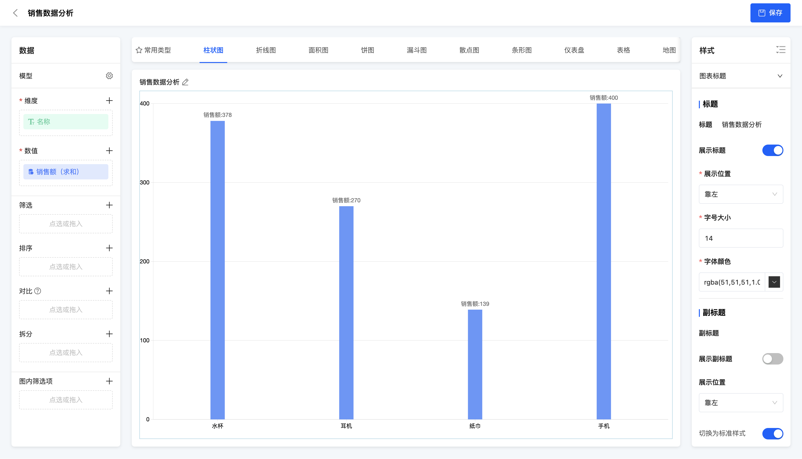
(Ⅰ) Single Bar Chart
A single bar chart is a type of chart that uses a single bar to represent a data point. It is suitable for displaying data comparisons of a single category, such as the comparison of sales amounts in different months.
Example
Comparison of sales amounts of different products
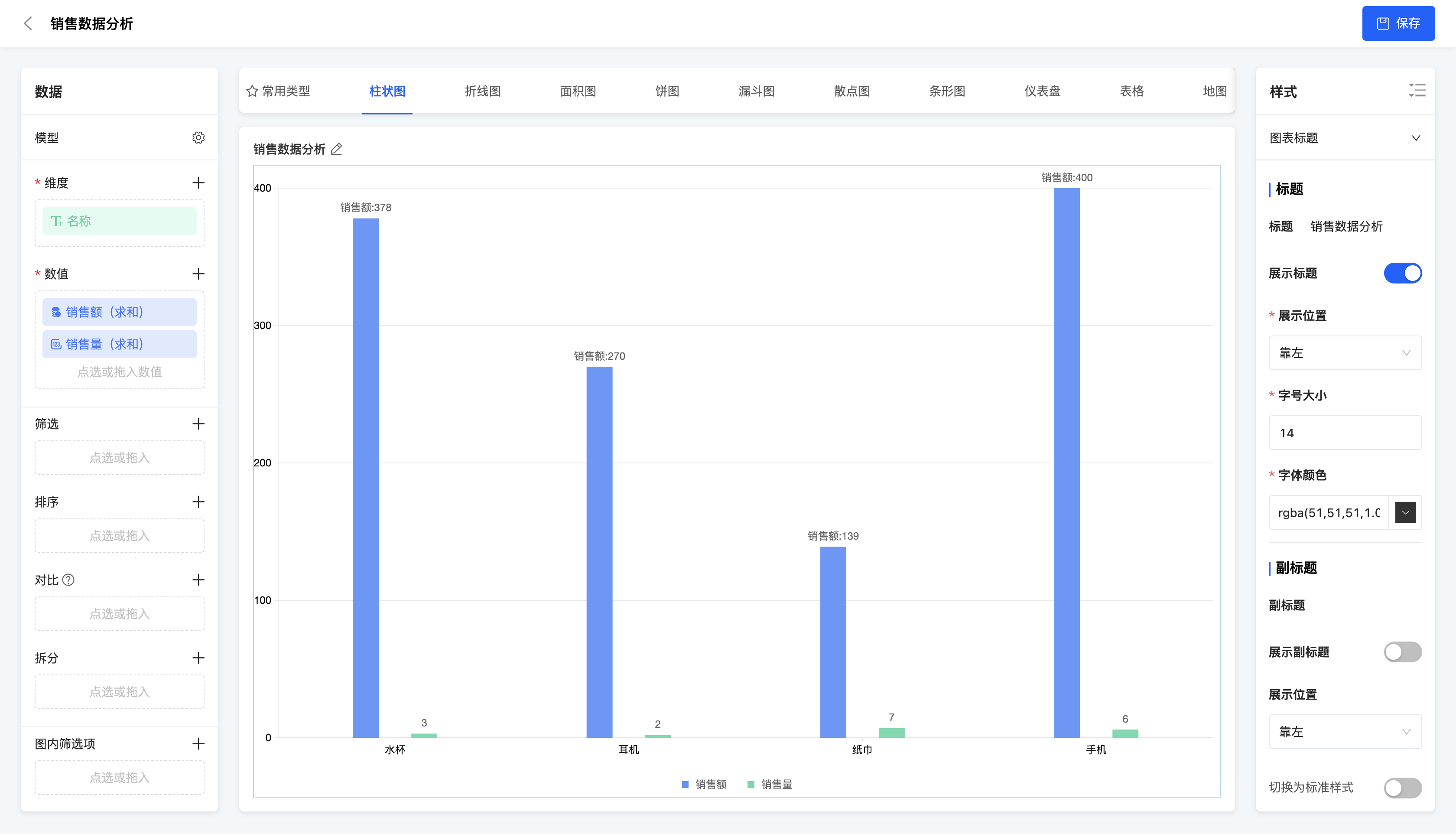
(Ⅱ) Multiple Bar Chart
A multiple bar chart uses multiple bars to represent data points of different categories in the same chart. It is suitable for displaying data comparisons between multiple categories, such as the comparison of sales amounts of different products in different months.
Example
Comparison of sales amounts and sales volumes of different products
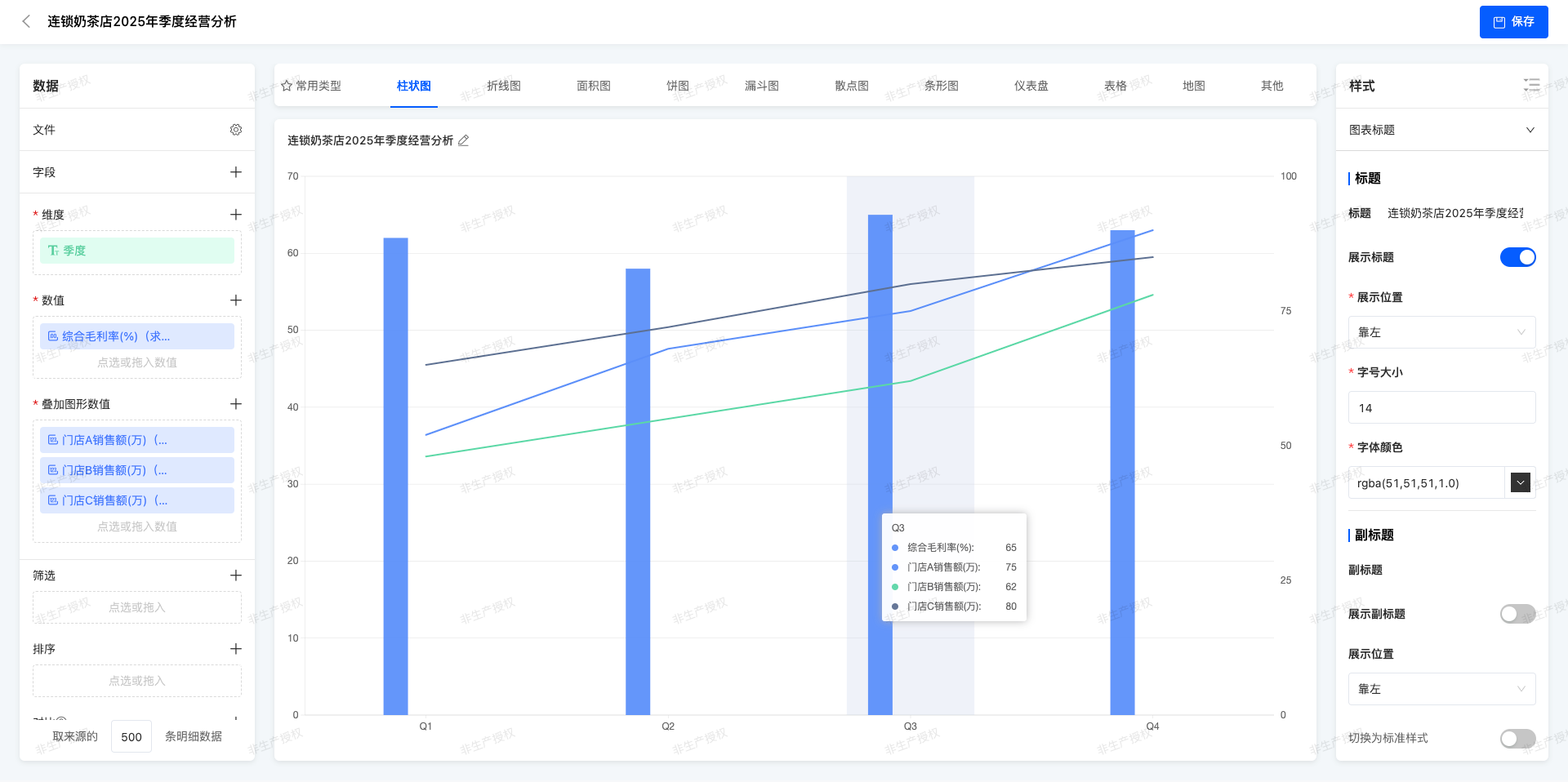
(Ⅲ)Multi - column Chart + Line Chart
In the same coordinate system,Cylindrical body of different colors are used to represent the values of multiple categories (multi - column chart), and at the same time, a line is superimposed to show the trend or reference value.
Example
Quarterly Operation Analysis of Chain Milk Tea Stores in 2025
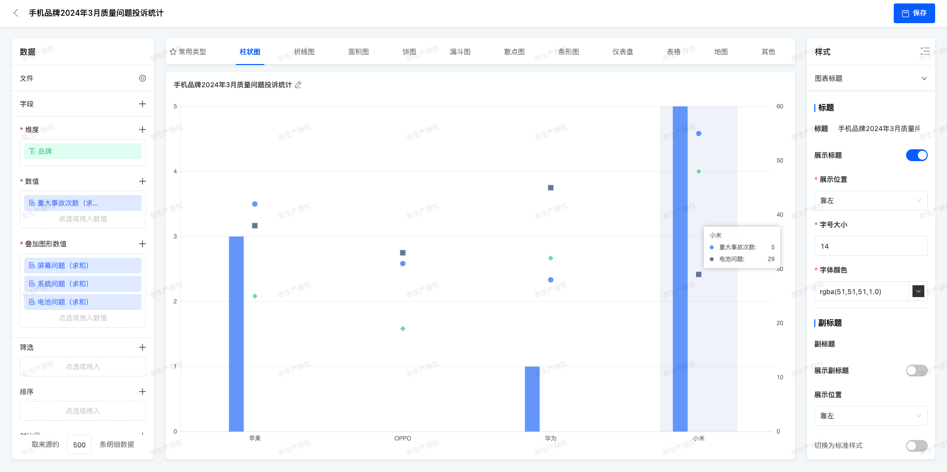
(Ⅳ)Multi - column Chart + Symbol Chart
On the basis of the multi - column chart, personalized symbols are added on the top of the columns or at specific positions to mark special data points.
Example
Statistics of Quality Complaint for Mobile Phone Brands in March 2025
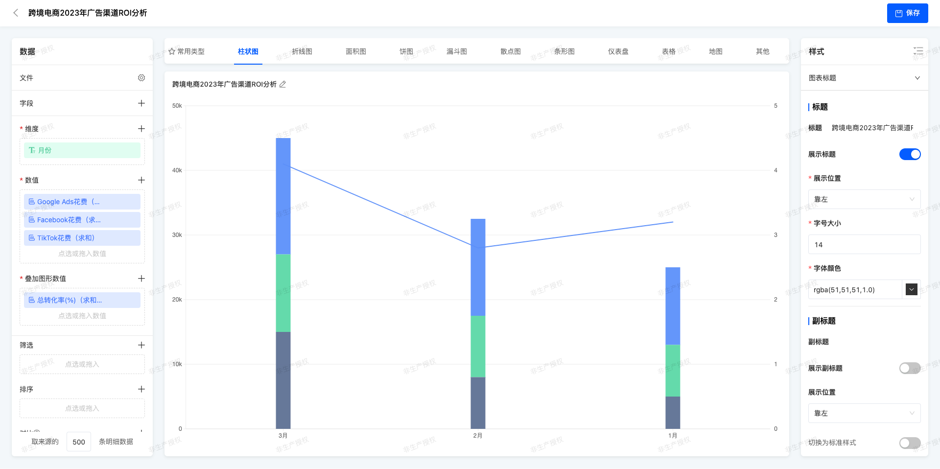
(Ⅴ)Stacked Chart + Line Chart
The stacked column chart shows the total amount and composition ratio of each component, and the line represents an independent but related indicator.
Example
ROI Analysis of Cross - border E - commerce Advertising Channels in 2023
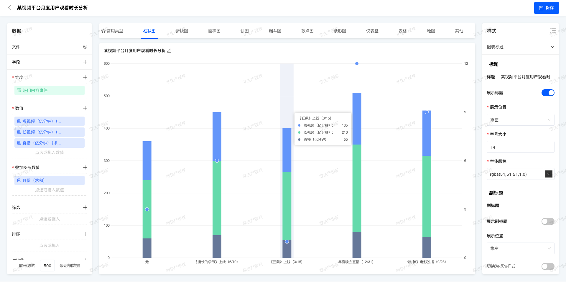
(Ⅵ)Stacked Chart + Symbol Chart
Symbols are used in the stacked chart to emphasize specific data points, which usually represent outliers or important milestones.
Example
Analysis of Monthly User Watching Duration on a Video Platform
II. Line Chart
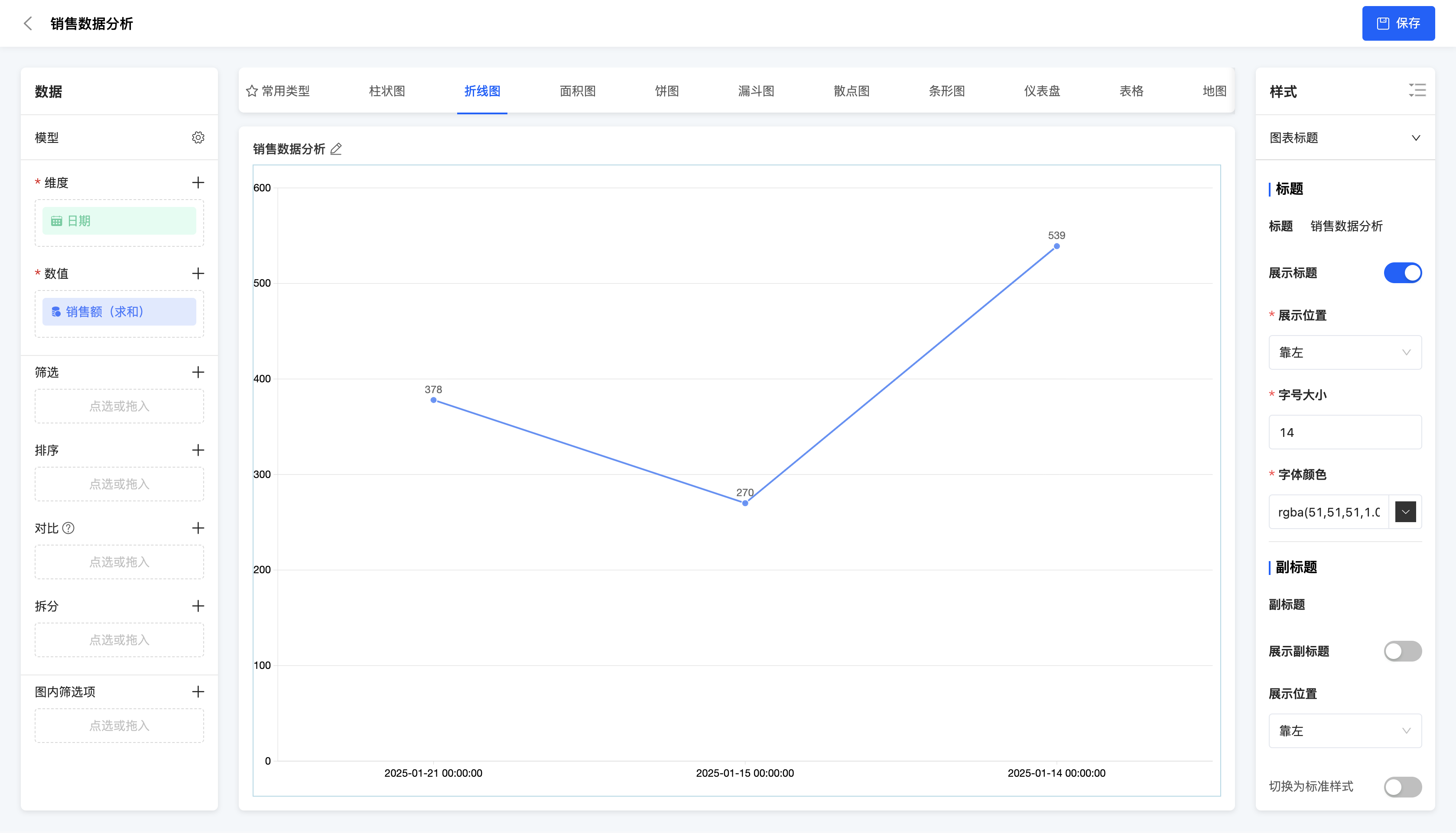
(Ⅰ) Single Line Chart
A single line chart connects data points with a single line to show the changing trend of data. It is suitable for displaying the changing trend of a single data series over time or other continuous variables.
Example
Changing trend of sales amount over time
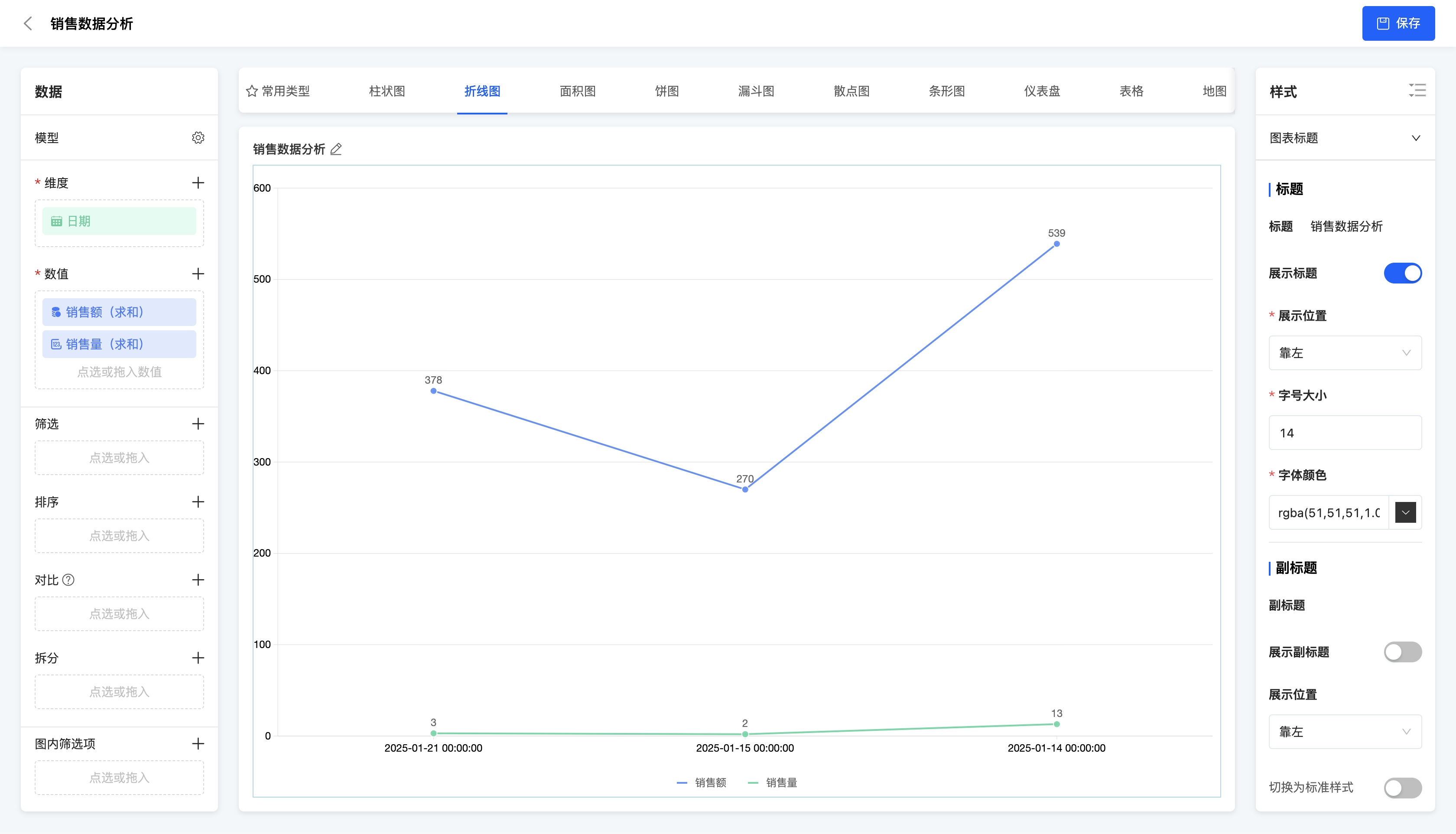
(Ⅱ) Multiple Line Chart
A multiple line chart uses multiple lines to represent the changing trends of different data series in the same chart. It is suitable for comparing the changing trends of multiple data series over time or other continuous variables.
Example
Changing trends of sales amount and sales volume over time
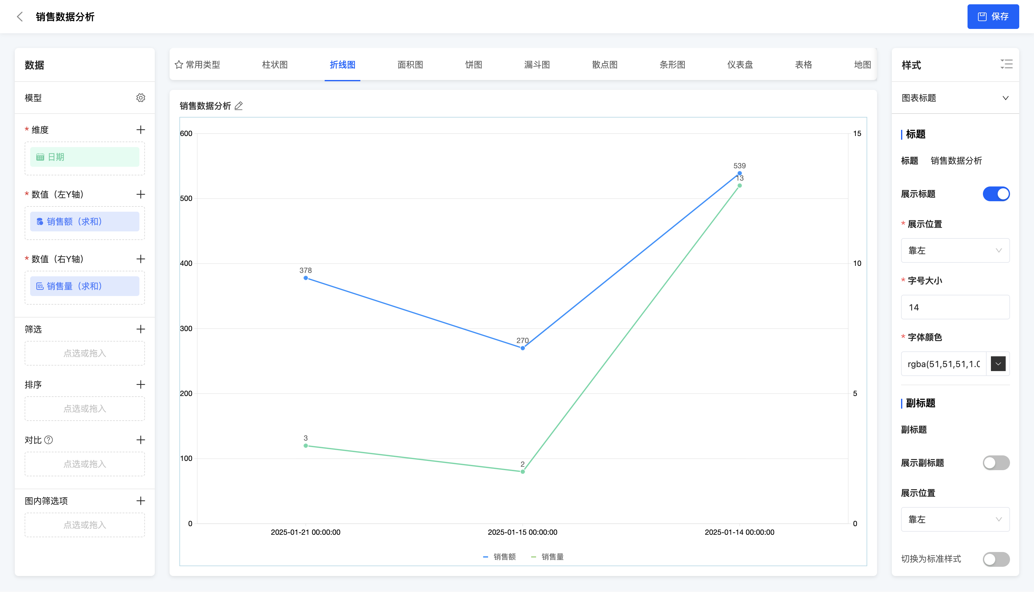
(Ⅲ) Dual Y-Axis Line Chart
A dual Y-axis line chart uses two Y-axes in the same chart to represent the changing trends of different data series respectively. It is suitable for situations where the value ranges of two data series differ greatly and their changing trends need to be displayed in one chart simultaneously.
Example
Changing trends of sales amount and sales volume over time
III. Area Chart
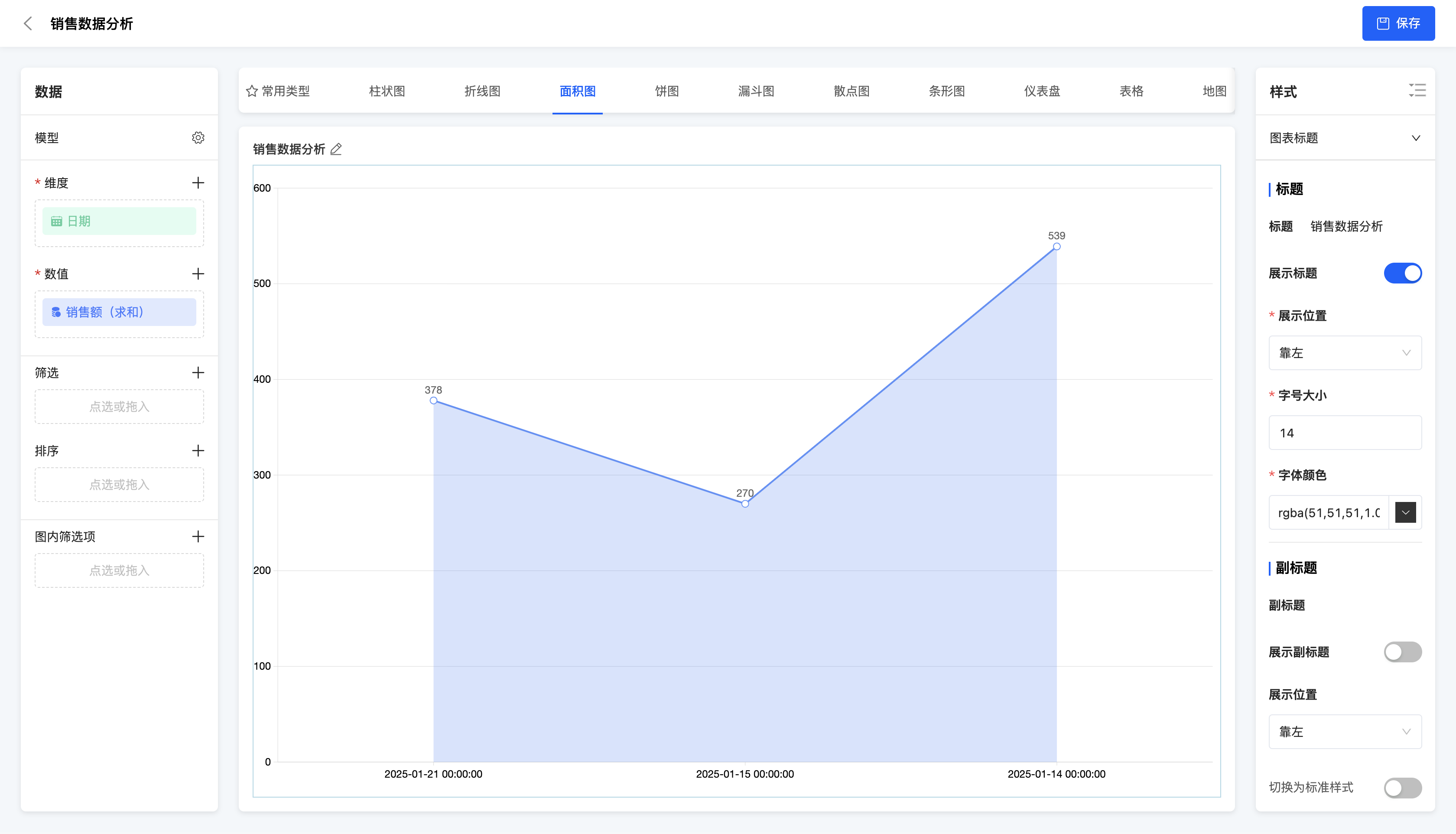
(Ⅰ) Area Chart
An area chart connects data points with a line and fills the area below the line with color. Purpose: It is suitable for displaying the changing trend of a data series over time or other continuous variables and emphasizing the total amount comparison between data.
Example
Changing trend of sales amount over time
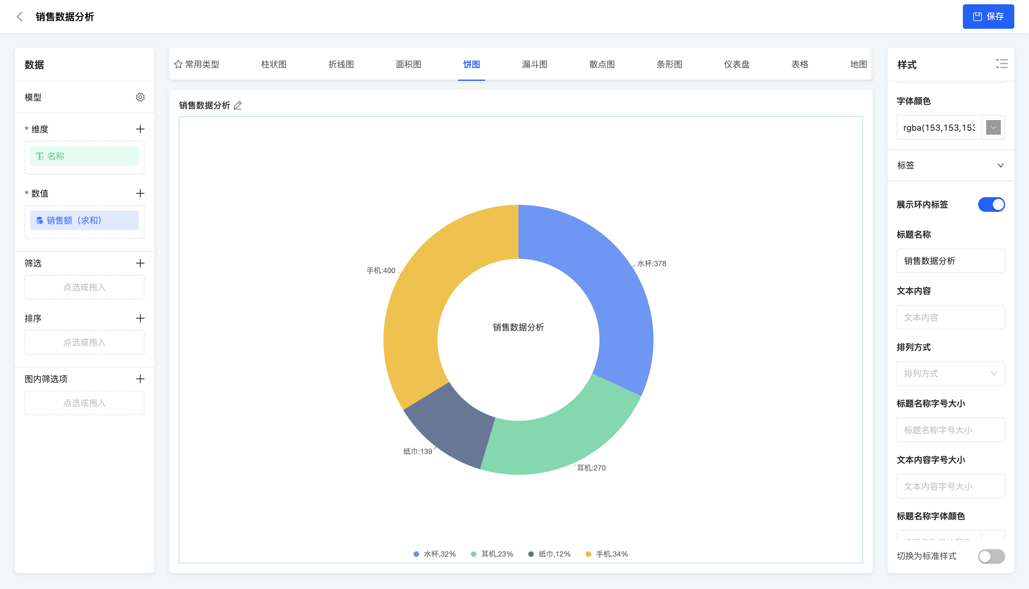
IV. Pie Chart
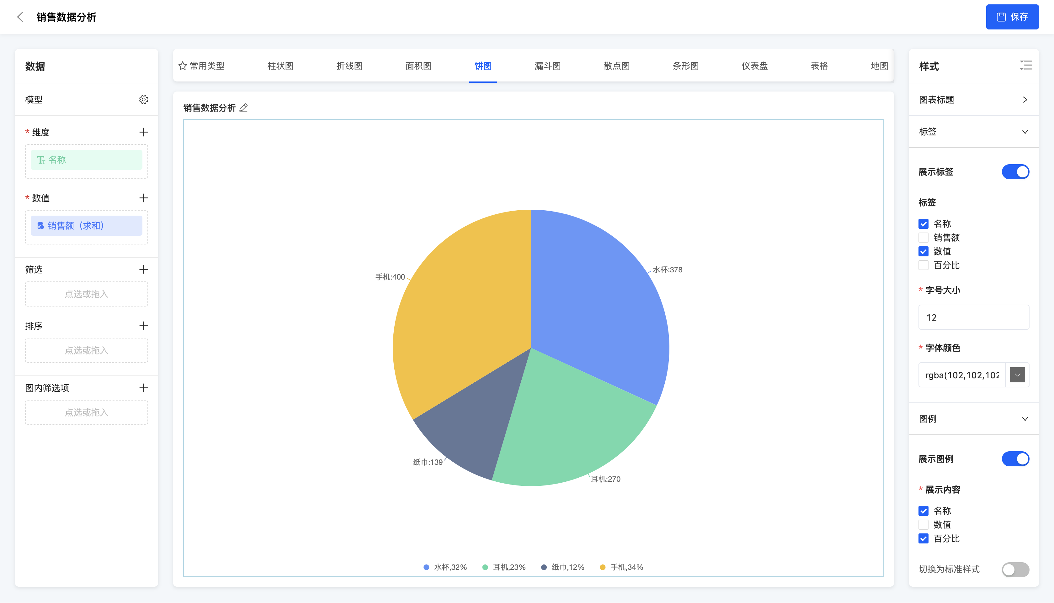
(Ⅰ) Pie Chart
A pie chart uses a circle to represent the whole and sectors to represent the proportions of each part. It is suitable for displaying the proportional relationship of each part in the whole, such as the proportion of sales amounts of different product categories.
Example
Proportion of sales amounts of different products
(Ⅱ) Doughnut Chart
A doughnut chart is a type of chart formed by leaving the center of a pie chart empty. Similar to a pie chart, the empty part can be used to place labels or other information.
Example
Proportion of sales amounts of different products
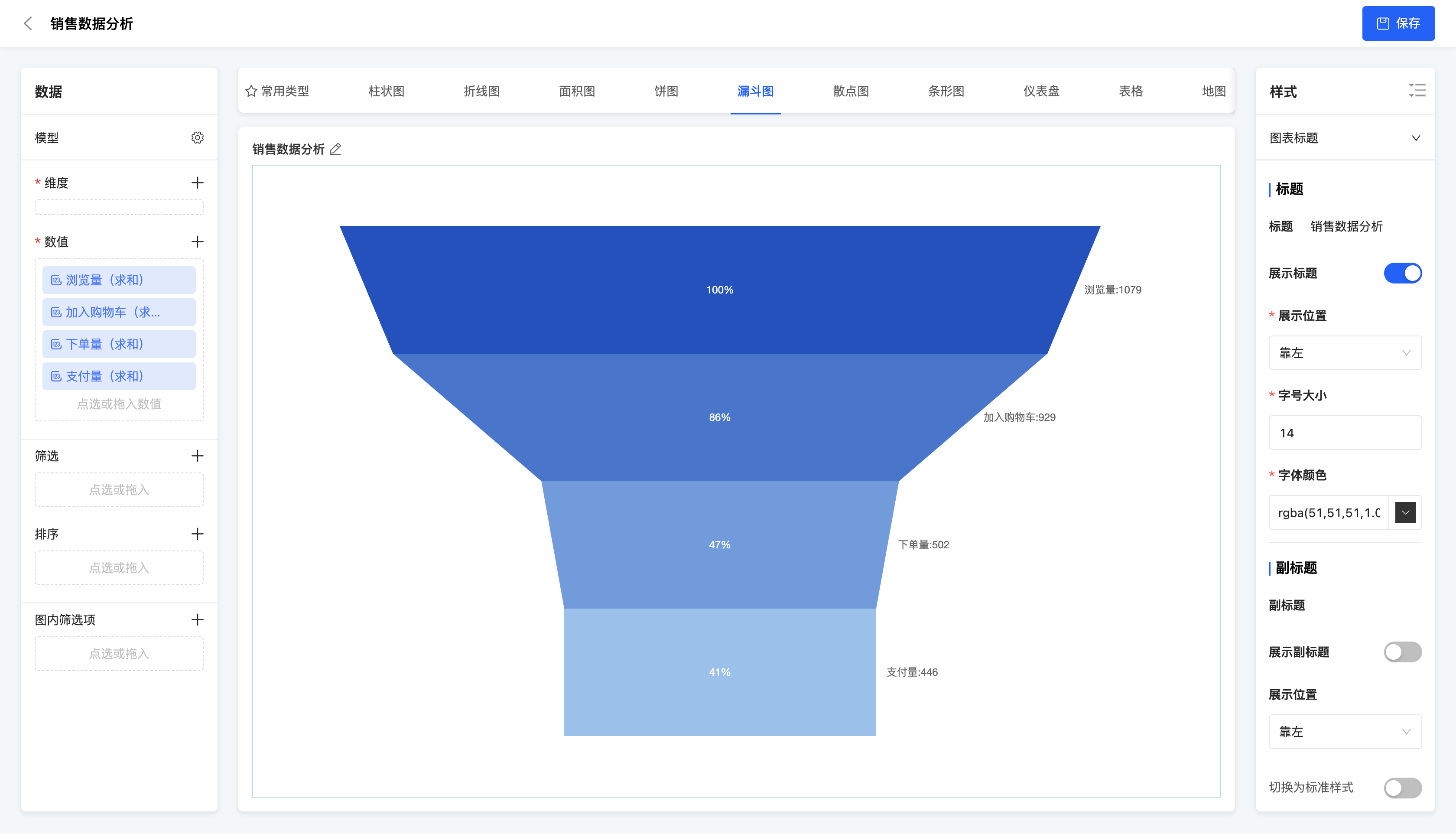
V. Funnel Chart
(Ⅰ) Funnel Chart
A funnel chart is a type of chart that uses trapezoids or triangles to represent the data flow process, usually used to display conversion rates or churn rates. It is suitable for analyzing the conversion situation in business processes, such as the conversion rate analysis of user registration, purchase and other processes.
Example
User behavior conversion rate (browsing -> adding to cart -> placing an order -> payment)
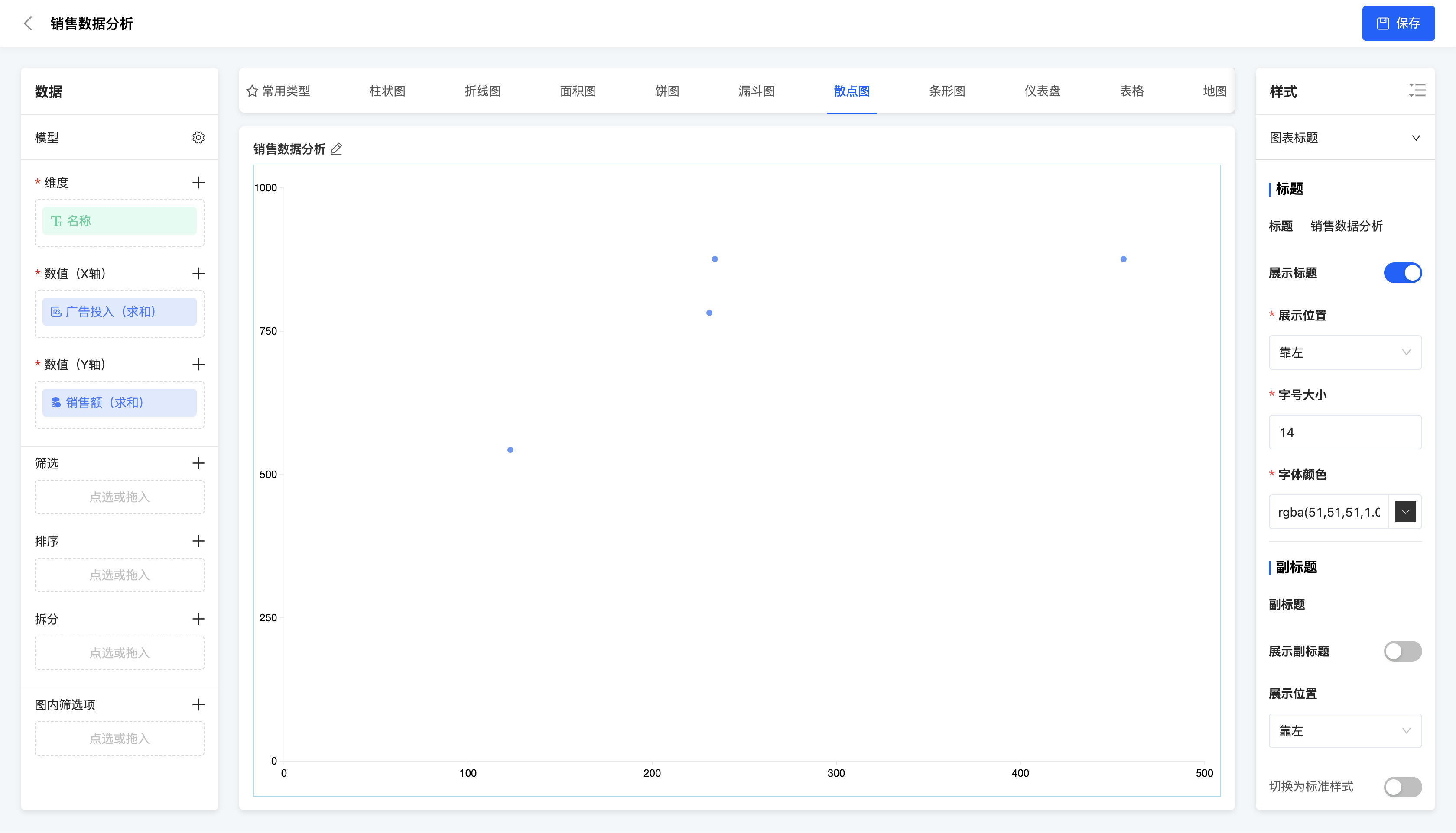
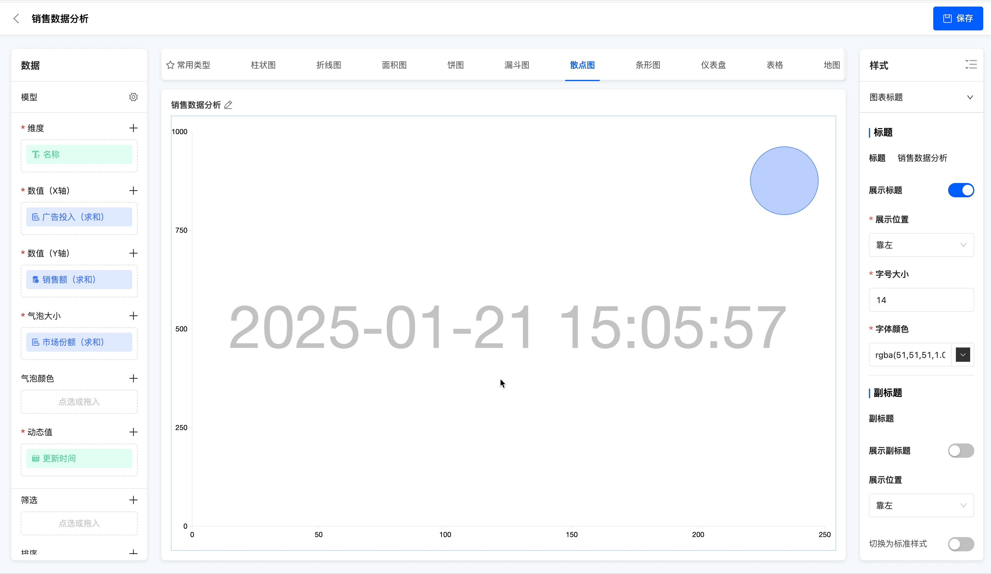
VI. Scatter Plot
(Ⅰ) Scatter Plot
A scatter plot uses points to represent the positions of data points and shows the relationship between data through the distribution of points. It is suitable for displaying the relationship between two variables, such as the relationship between sales amount and advertising investment.
Example
Relationship between sales amount and advertising investment.
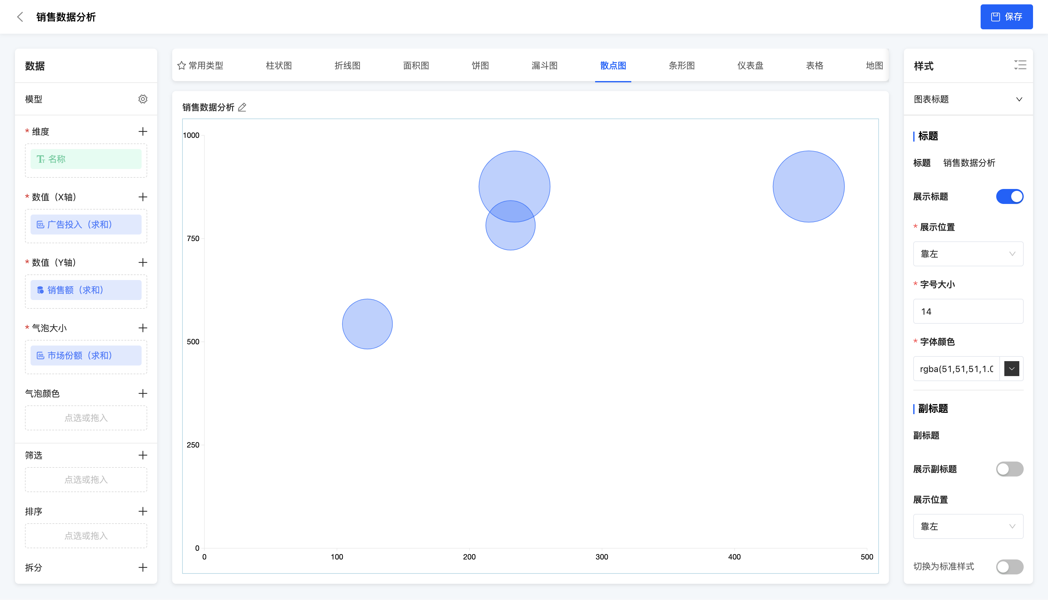
(Ⅱ) Bubble Chart
A bubble chart is based on a scatter plot and uses the X-axis, Y-axis, size and color of bubbles to represent the values of four variables. It is suitable for displaying the relationship between variables, such as showing the correlation between multiple dimensions of data such as sales amount, cost, profit margin and market share.
- Data configuration - Bubble size: Only numerical values can be selected, indicating the size of the value.
- Data configuration - Bubble color: Only dimensions can be selected, indicating the differentiation of different categories.
Example
Relationship between sales amount, advertising investment and market share.
(Ⅲ) Dynamic Bubble Chart
A dynamic bubble chart is a variant of the bubble chart that can dynamically display the changes of data points. It is suitable for displaying the dynamic change process of data over time or other variables.
- Data configuration - Bubble size: Only numerical values can be selected, indicating the size of the value.
- Data configuration - Bubble color: Only dimensions can be selected, indicating the differentiation of different categories.
- Data configuration - Dynamic value: Dimensions or numerical values can be selected, and the data will be dynamically displayed based on this value.
Example
Change process of product sales amount, advertising investment and market share over time.
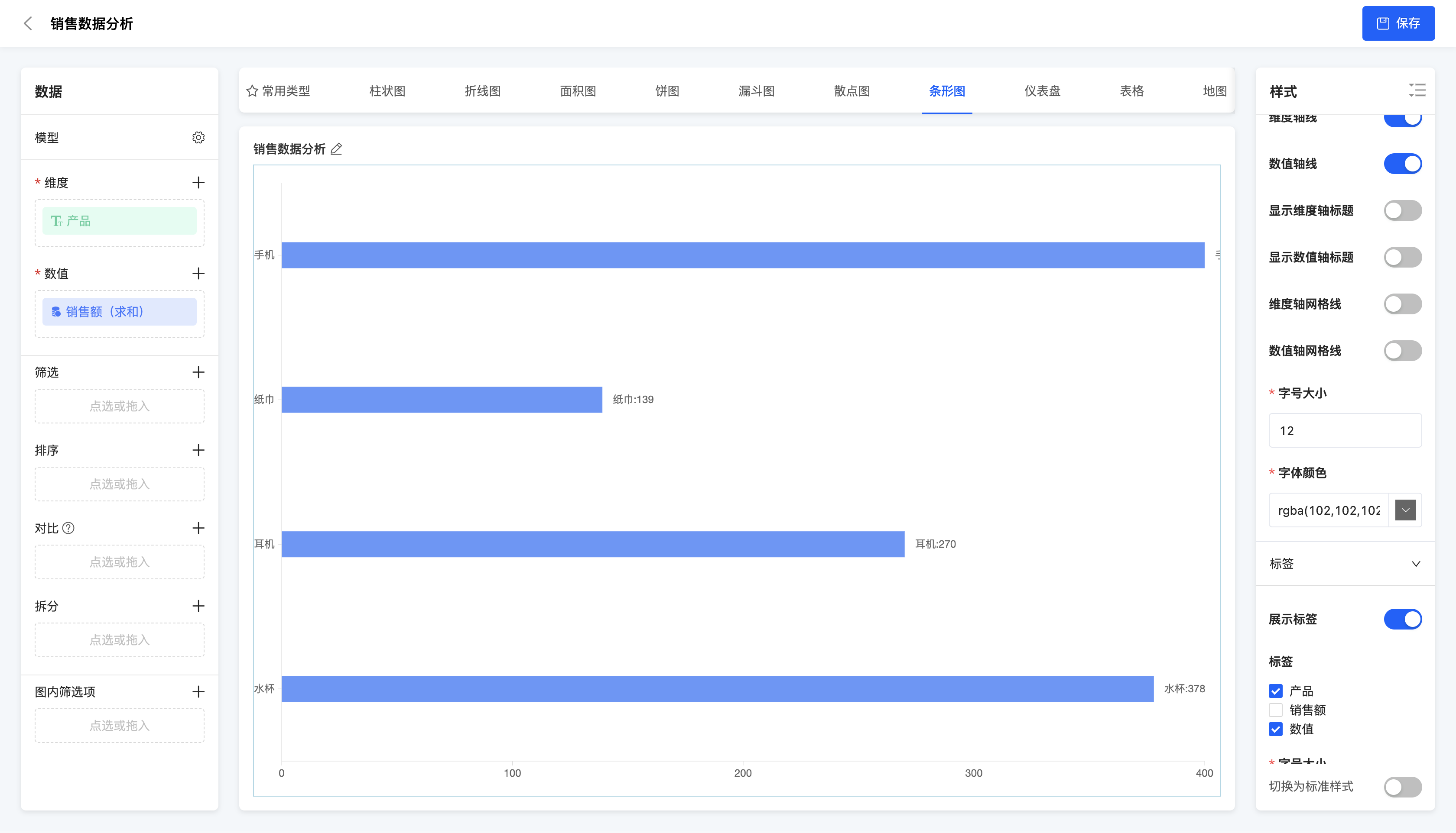
VII. Bar Graph
(Ⅰ) Basic Bar Graph
A basic bar graph is a type of chart that uses bars to represent data points. It is similar to a bar chart but in a different direction. It is suitable for displaying data comparisons of various categories, such as the comparison of sales volumes of different products.
Example
Comparison of sales amounts of different products
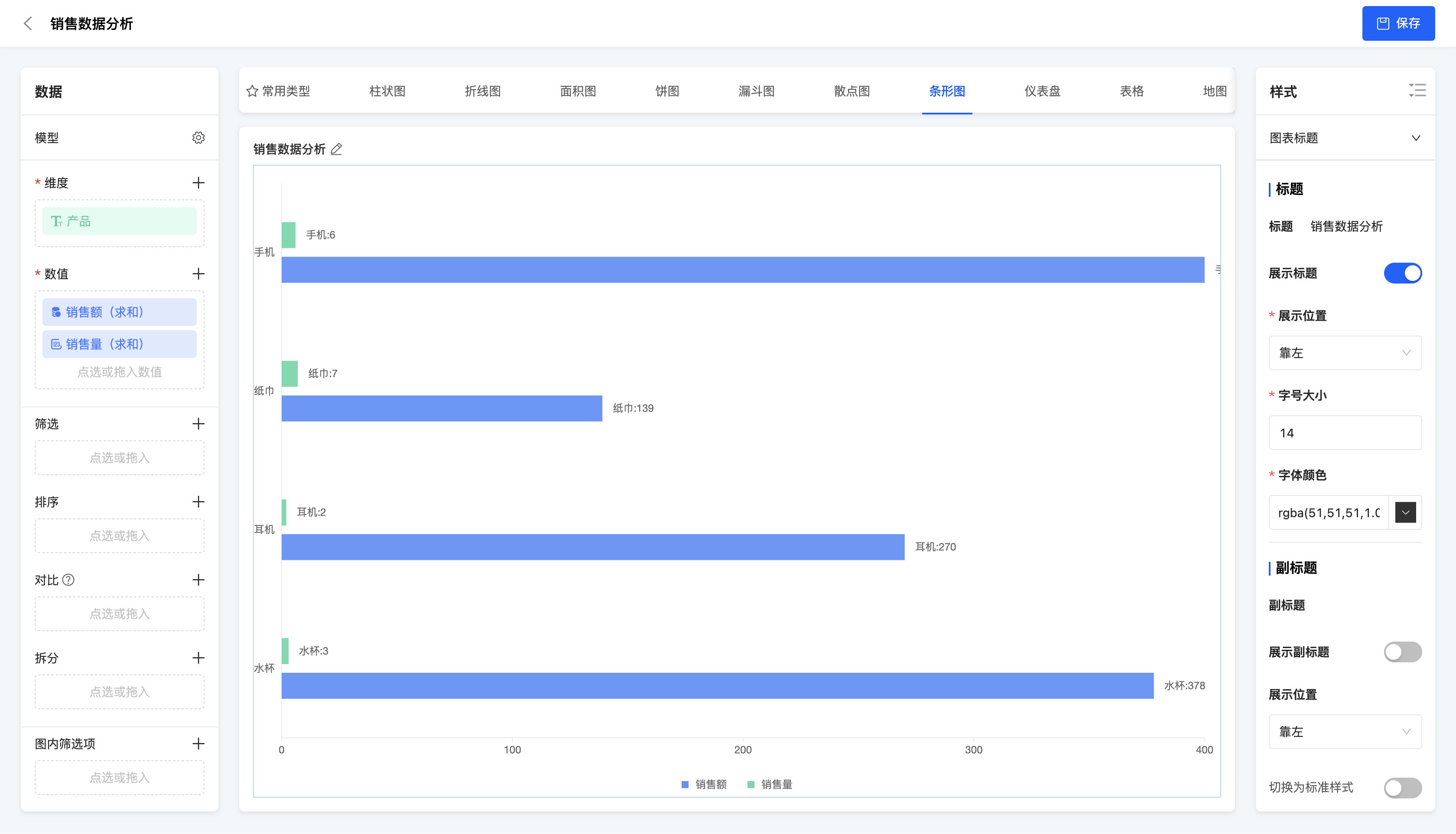
(Ⅱ) Multiple Bar Graph
A multiple bar graph uses multiple bars to represent data points of different categories in the same chart. It is suitable for displaying data comparisons between multiple categories, and each category contains multiple data points, such as the comparison of sales volumes of different products in different regions.
Example
Comparison of sales amounts and sales volumes of different products
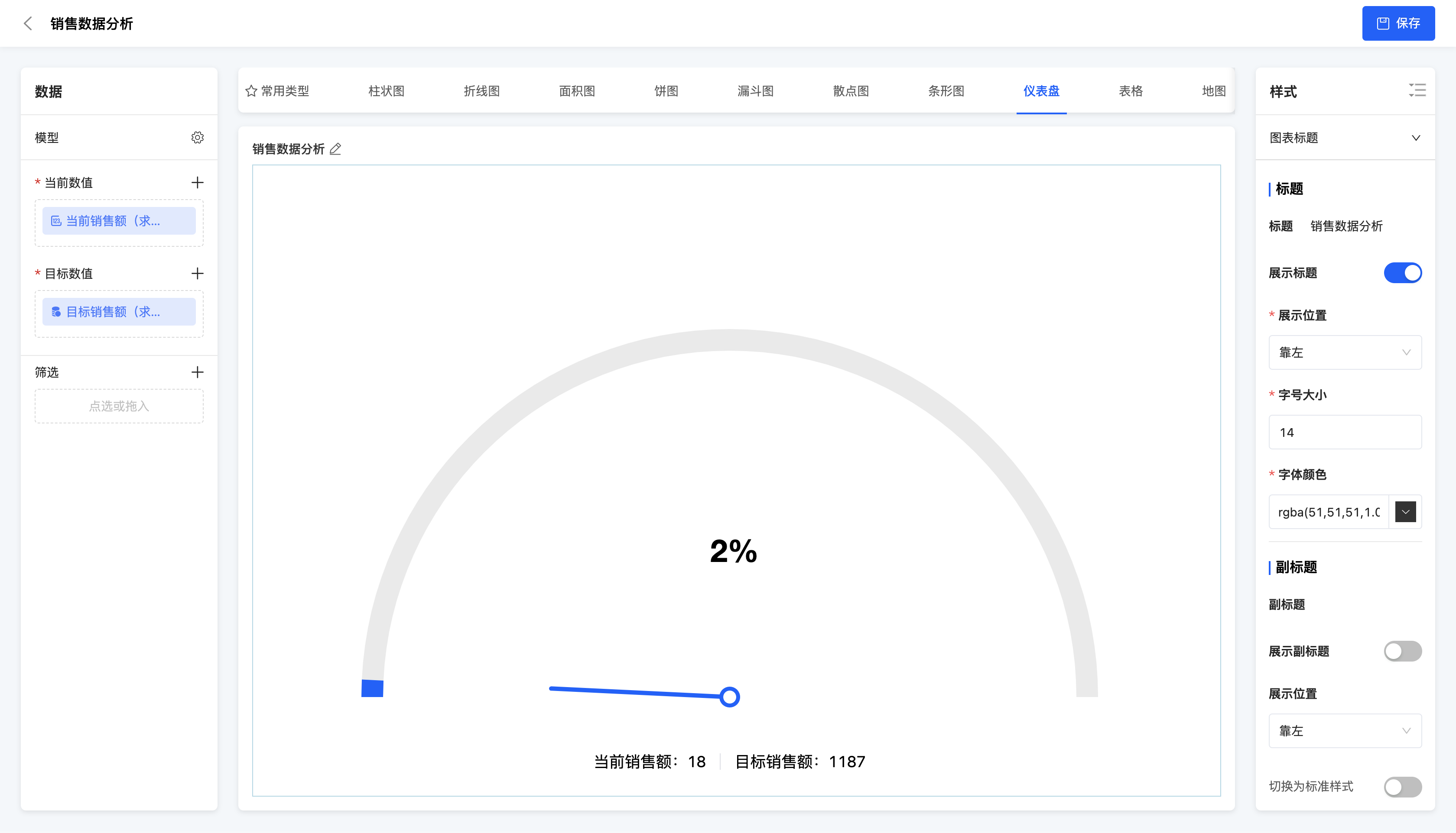
VIII. Dashboard
(Ⅰ) Dashboard
A dashboard is a type of chart that mimics a car dashboard and is used to display key indicators or the completion status of goals. It is suitable for real-time monitoring and displaying key business indicators, such as sales amount, customer satisfaction, etc.
- Data configuration - Current value: A numerical field can be selected, which represents the achieved data situation in the current indicator.
- Data configuration - Target value: A numerical field can be selected, which represents the expected data situation in the current indicator.
- Style - Color setting: Custom colors can be set for the current value and target value of the dashboard.
- Style - Angle setting: Angles can be set for the start and end values of the target value of the dashboard.
Example
Completion status of the monthly sales amount target.
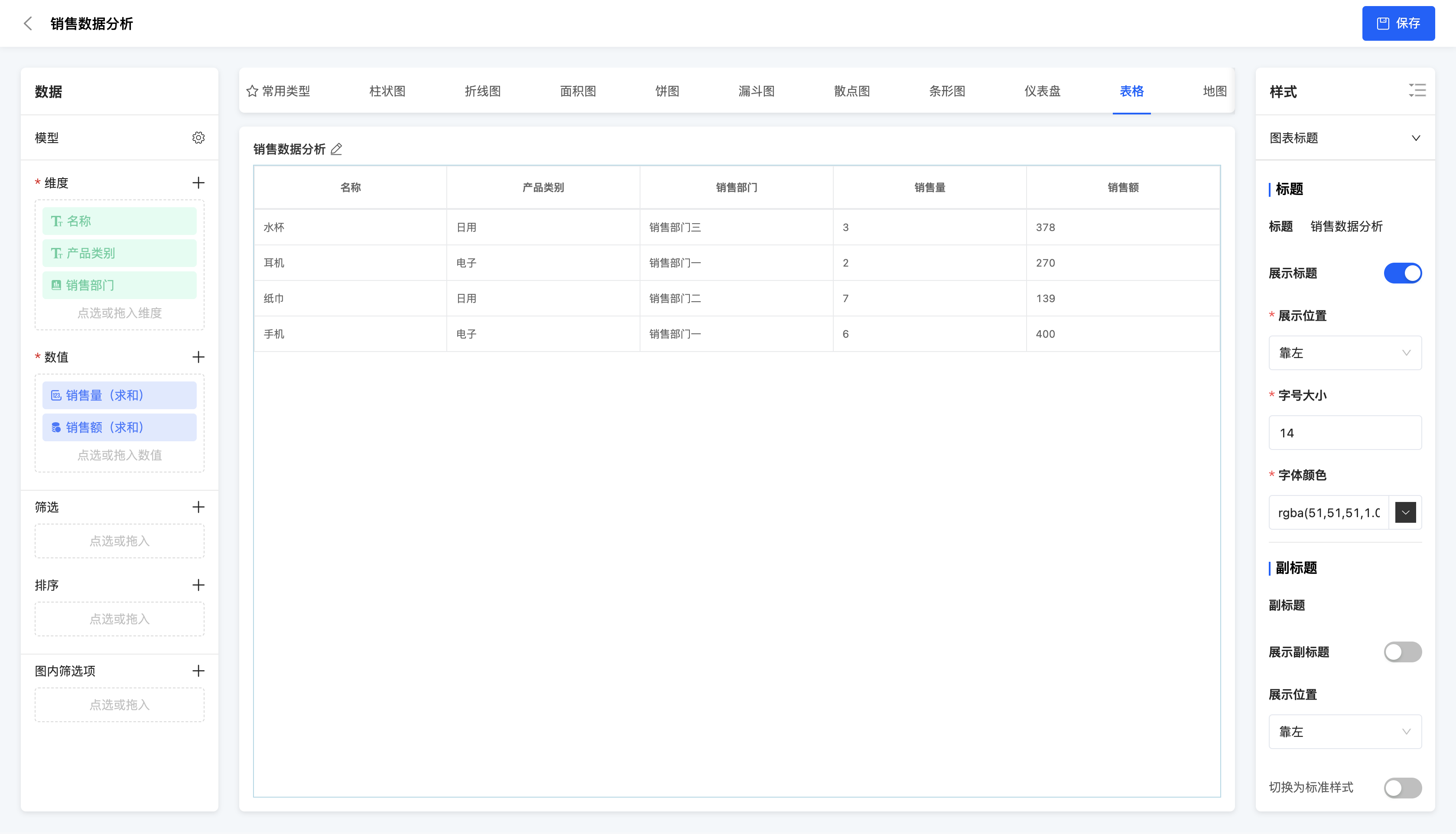
IX. Table
(Ⅰ) Table
A table is a type of chart that uses rows and columns to represent data and is the most basic way of data display. It is suitable for displaying detailed data or conducting data analysis, such as sales data tables, customer information tables, etc.
- Style - Basic format: Alignment methods, row heights, font sizes, font colors and background colors can be set for the table header and table body.
- Style - Subtotal: Whether to display the subtotal can be selected, and the alignment method, row height, font size, font color and background color of the subtotal can be set.
Example
Product sales data
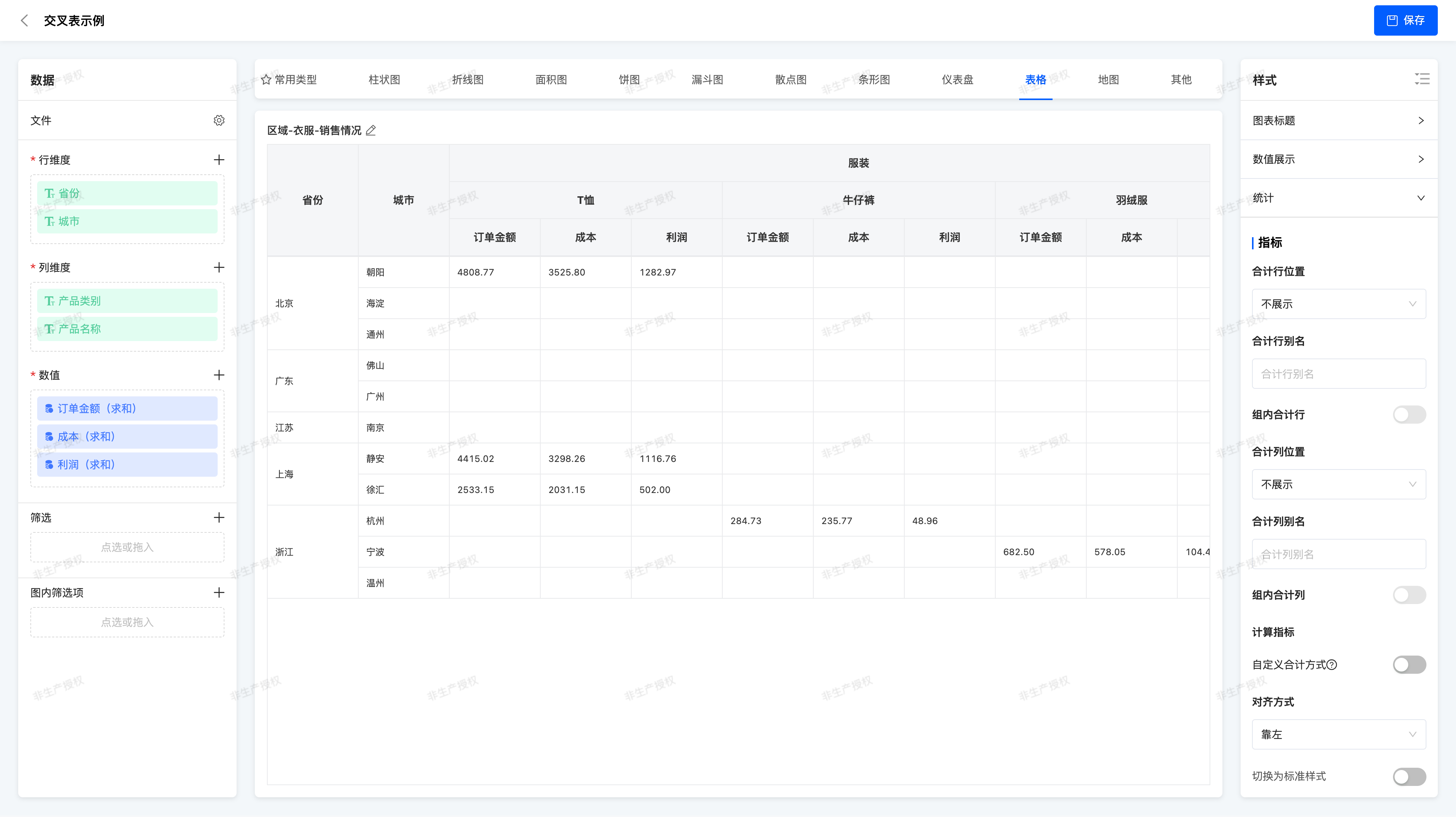
(II) Cross Table
A Cross Table (Pivot Table) is a tabular component that combines data across multiple dimensions and presents summarized views, allowing flexible combination of different fields as row dimensions and column dimensions, with aggregated values of corresponding indicator fields displayed in the intersecting areas. Cross tables enable users to view business data under different dimension combinations clearly and intuitively, facilitating trend insight, anomaly detection, and decision-making support.
- Dimension Configuration
- Row Dimension: Used for vertical classification display, such as "Province > City" structure
- Column Dimension: Used for horizontal classification display, such as "Product Category > Product Name"
- Supports combination of multiple fields, renaming, and ascending/descending sorting
Note:
At least one field must be configured for both row and column dimensions
- Numeric Field Configuration
- Supported field examples: Order Amount, Profit, Cost
- Default aggregation method: Sum (sum)
- Supports aggregation method switching:
- No Processing, Minimum, Maximum, Average, Sum, Count, Distinct Count, Sample/ Population Standard Deviation and Variance
- Style - Numeric Display Format:
- Null Handling: Display as null / 0 / custom text / do not display
- Display Name: Can be custom renamed
- Data Format: Standard numeric / thousands separator / percentage / custom unit
- Decimal Places: Supports precision setting (e.g.,保留2位小数 / retain 2 decimal places)
- Style - Numeric Position Style
- Numeric as Column Display: Each indicator field is a column, commonly used when there are few dimension fields and many indicator fields
- Numeric as Row Display: Indicator fields are displayed as additional rows, suitable for scenarios with limited horizontal space
- Style - Total and Subtotal
- Total Display: Can set to show row total and column total
- Subtotal: Supports setting the first N-1 dimensions as grouping criteria (e.g., Province > City, can total by province)
- When a dimension is removed, the total level automatically moves up
- Custom Total Algorithm: Supports
sum,avg,min,max,count,count_distinct
Example
Regional - Clothing - Sales Situation
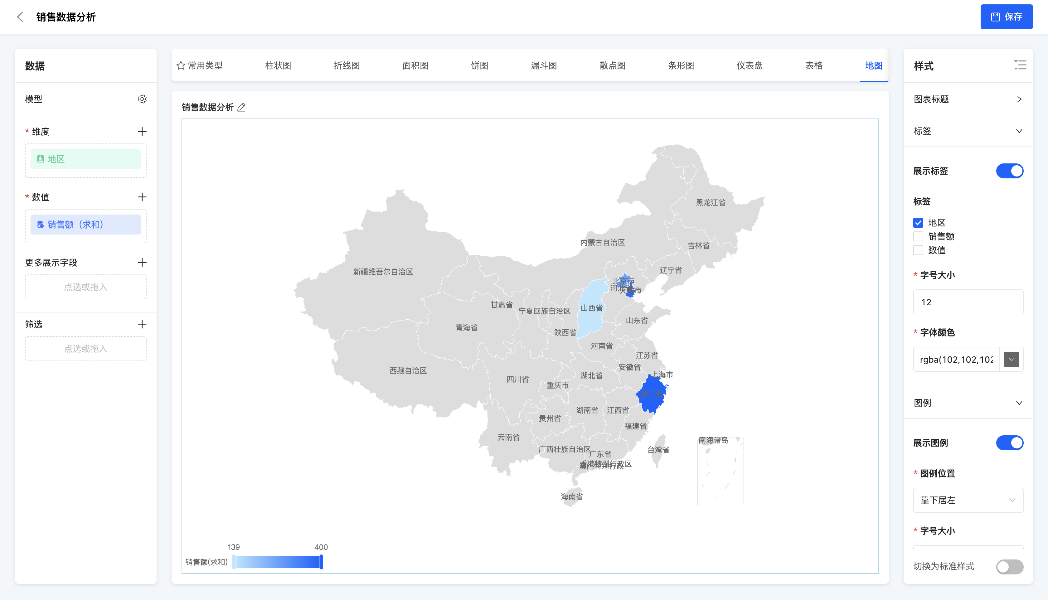
X. Map
(Ⅰ) China Map
A China map is a type of chart that uses a map to display data of different regions in China. It is suitable for displaying the data distribution situation of different regions in China, such as the sales amount and population of each province.
- Data configuration - More display fields: Dimension fields and numerical fields can be selected, and the field data can be displayed in the chart after selection.
Example
Sales amount of each region
XI. Others
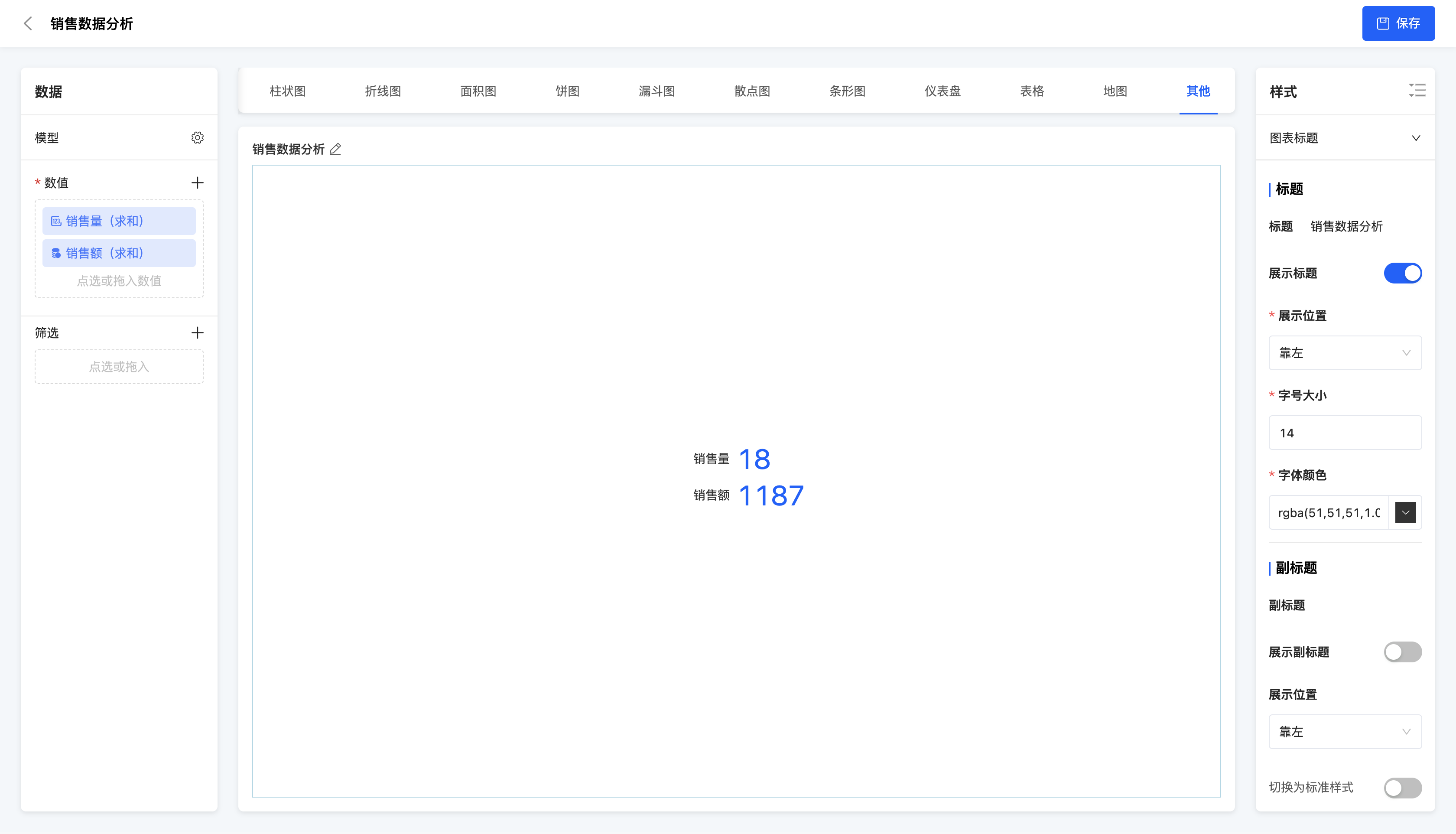
(Ⅰ) Indicator Statistical Chart
An indicator statistical chart is a type of chart that comprehensively displays multiple key indicators. It is suitable for simultaneously displaying and monitoring multiple key business indicators to comprehensively understand the business situation.
Example
Comprehensive display of sales volume and sales amount