This interface is mainly divided into four areas: the operation bar, the data configuration area, the chart preview area, and the style bar.
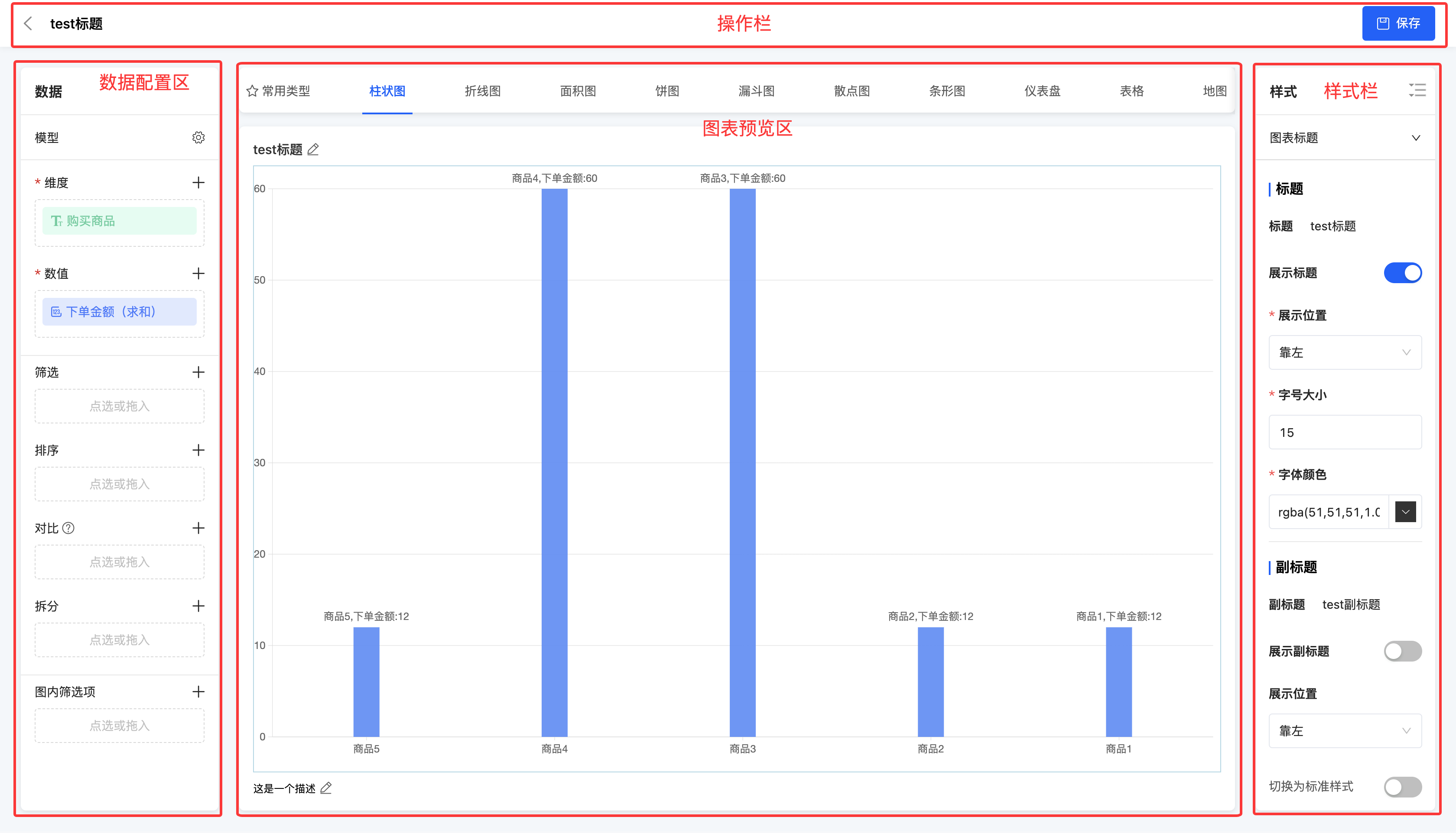
I. Operation Bar
(I) Save
1. Function Introduction
It supports archiving and saving the chart design. Even if the chart design is not yet complete, you can choose to save the current design progress. When you enter the chart design page next time, the system will automatically load and display the previously saved design page, facilitating the continuation of chart improvement.
Prompt
When the chart design is completed but not yet published, it can be directly referenced in reports or data dashboards. This reference operation will not have any impact on the subsequent publication of the chart.
2. Operation Method
Click "Save" to archive and save the current design progress.

II. Data Configuration Area
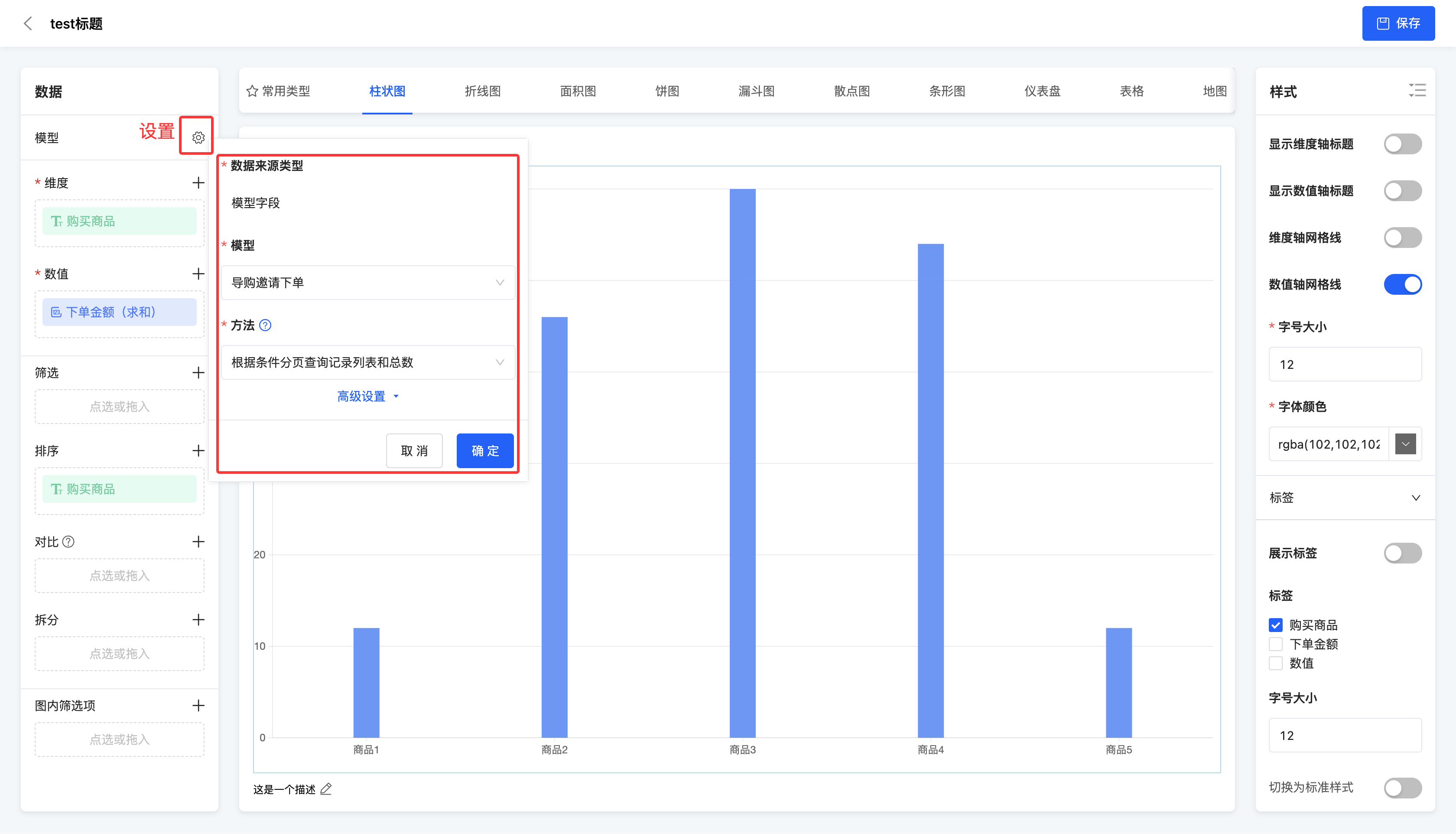
(I) Chart Editing - Data Source Type
1. Function Introduction
In the data configuration area, you can edit the data source type of the chart.
When the data source type is a model field, you can change the model and method. In addition, you can set query conditions, data grouping, and data calculation in the advanced settings.
Note
If data grouping and data calculation have been configured, when setting dimensions and values, you can only select the fields that have been selected during the data grouping and data calculation process.
- Query conditions: Display data based on the configured query conditions.
- Data grouping: Only dimension fields are allowed to be selected for grouping. When multiple dimension fields are selected for grouping, a multi-dimensional grouping result will be generated.
- Data calculation: Only numeric fields are allowed to be selected for calculation. You can choose the aggregation method, including no processing, minimum value, maximum value, average value, sum, and count.
Note
After the above conditions are set, the system will perform a grouped query operation based on the data grouping fields, and at the same time perform aggregate statistics on the numerical values within each group based on the data calculation fields, ensuring that the results meet all the requirements set in the query conditions.
- When the data source type is an integrated application, you can change the application, API, and API parameters (see the integrated designer for details).
- When the data source type is a database, you can change the database, API, and API parameters (see the integrated designer for details).
Note
When you modify the data source type, the chart information will be cleared.
2. Operation Method
Click the "Settings" icon, edit the information in the pop-up window, and then click "OK" to successfully edit.
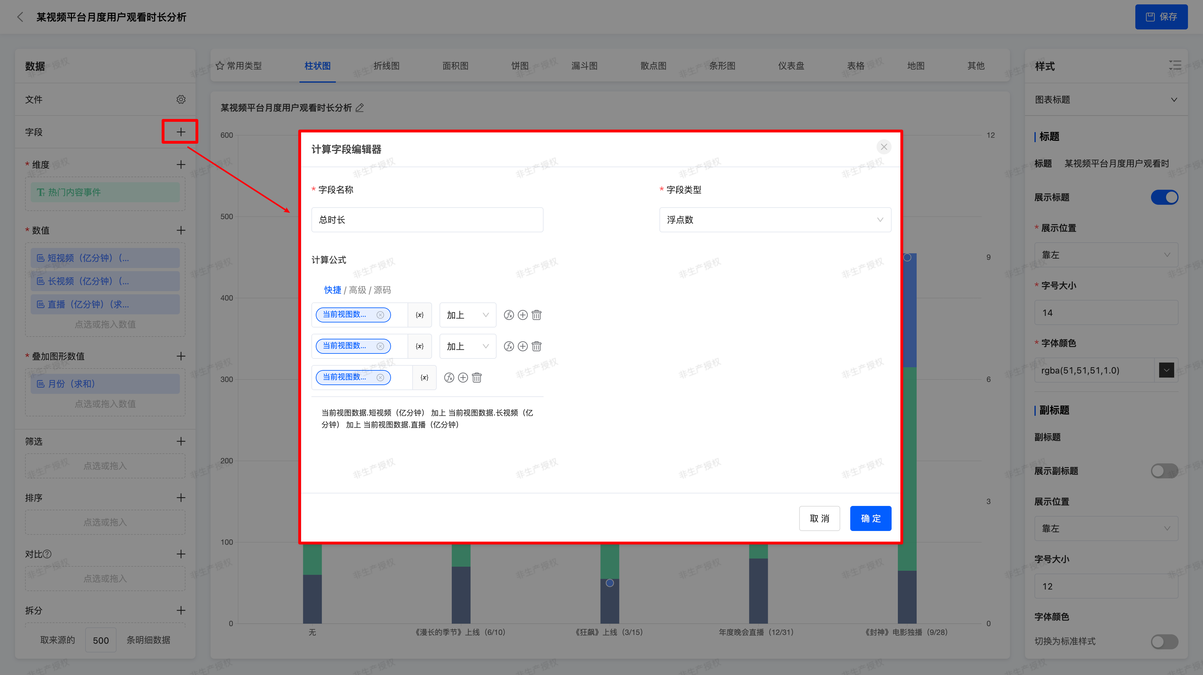
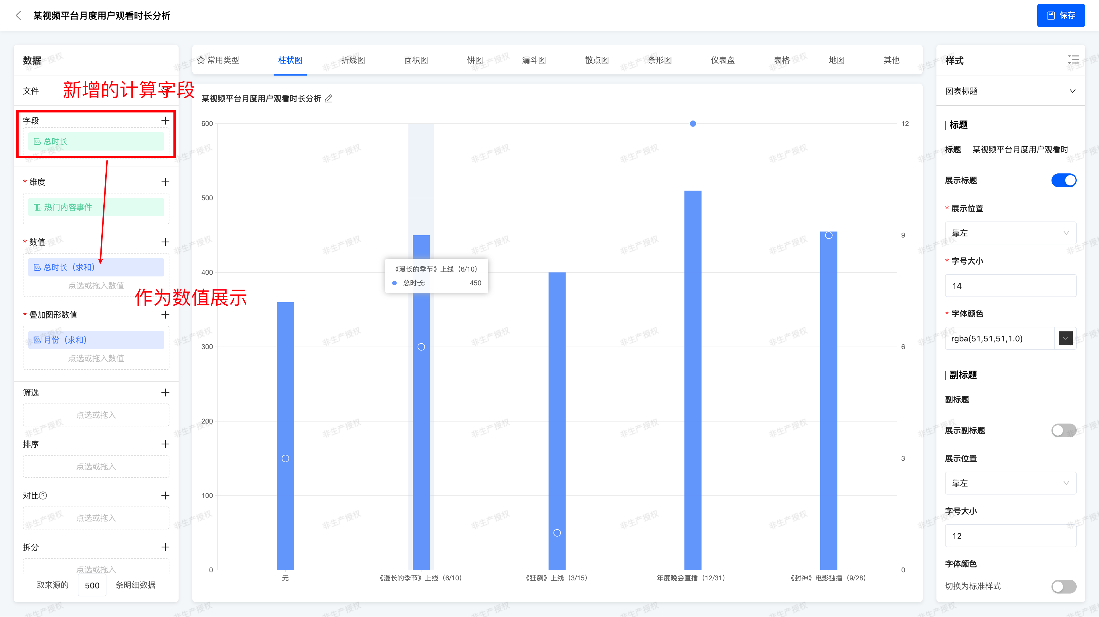
(Ⅱ)Calculated Fields
1. Function Introduction
- Function Location: Data Configuration Area → Add Calculated Field
- Configuration Methods:
- Supports using existing fields for addition, subtraction, multiplication, and division, as well as platform - built - in functions
- Examples:
Total Duration = Short Video Duration + Long Video Duration + Live Broadcast Durationas the actual total duration
- Validation Rules:
- Fields in the expression must exist in the current dataset
- Cross - dataset field reference is not supported
2. Operation Methods
Click the 「 + 」 icon, edit the information in the pop - up window, and then click 「Confirm」 to successfully create a calculated field.
(Ⅲ) Data Configuration
1. Function Introduction
Supports configuration of dimensions, values, filters, sorting, comparison, splitting, in-chart filter options, and user-defined query quantity.
Note
The data configuration here only applies to the general data configuration of standard chart types provided by the system. For the special data configuration of some charts, please refer to the chart type documentation.
- Dimension: In a chart, a dimension is an attribute used to describe the category or characteristics of data, helping users distinguish and classify data.
- Value: The values in a chart are the specific data results calculated through the set aggregation method, used to display quantitative information.
- Filter: You can select dimension fields or value fields for filtering, with no limit on the quantity. After selection, you can specify the values to be displayed or excluded for each field.
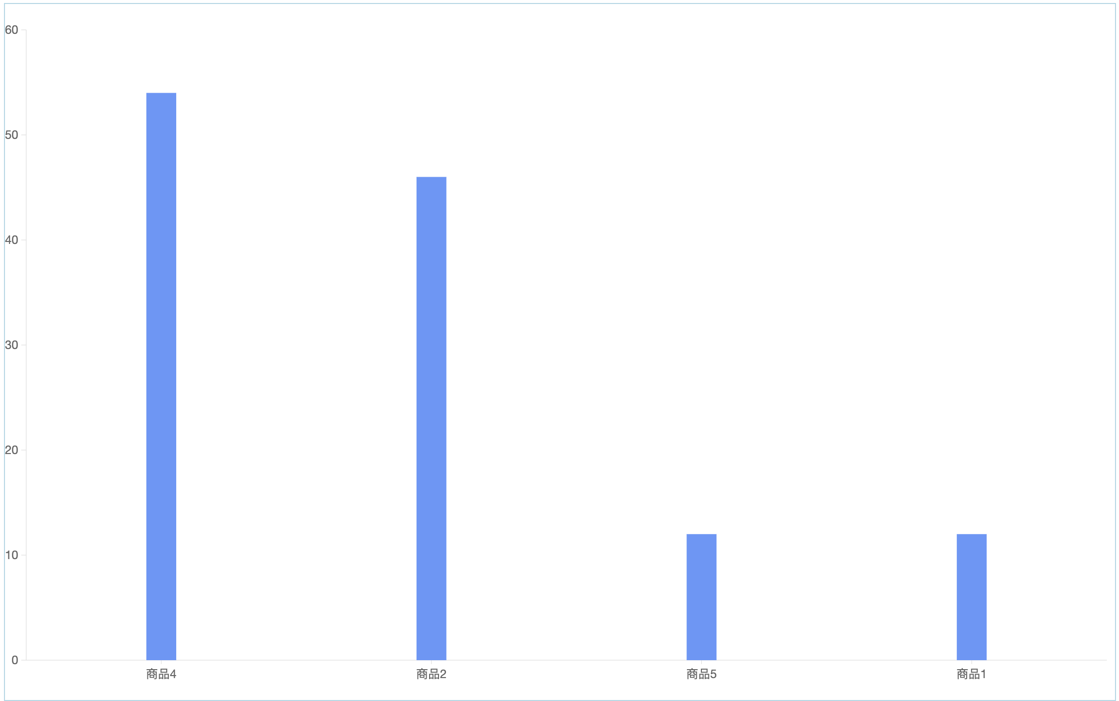
Example
The original chart shows the order amounts of different products.

Set to exclude Product 3.
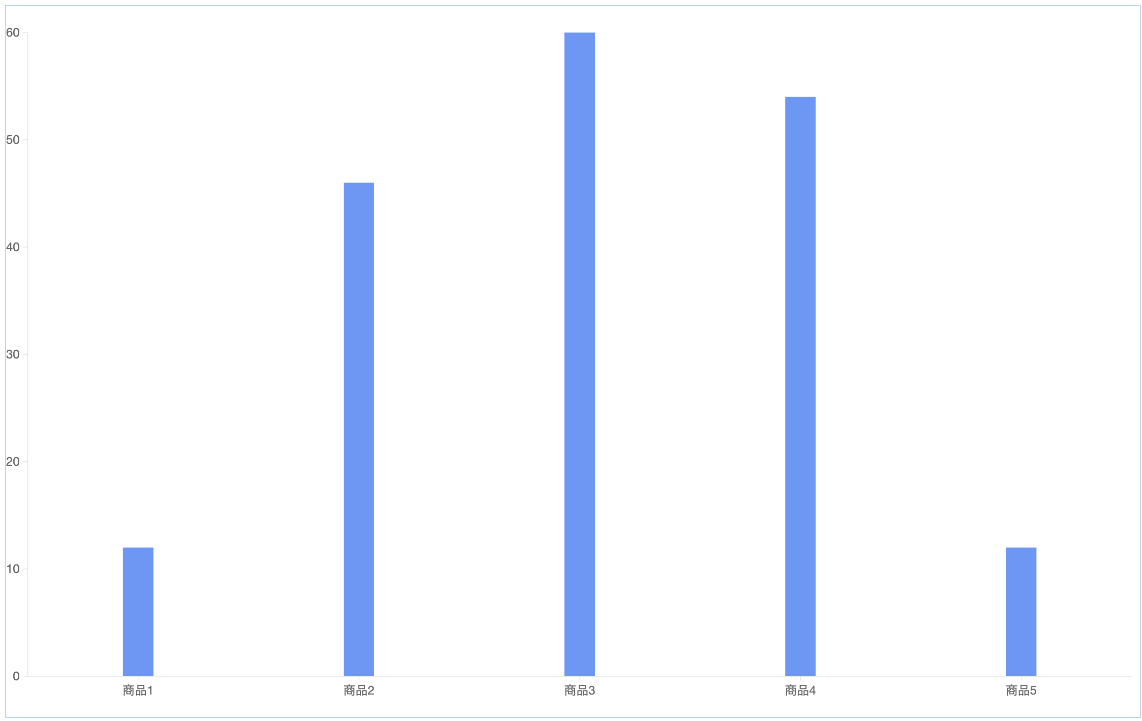
- Sorting: You can select a dimension field or a value field for sorting and choose the corresponding sorting rule based on this field. At the same time, custom sorting is supported to meet specific requirements.
Example
The original chart shows the order amounts of different products, with no sorting rule.

Set to sort in ascending order by "Purchased Product".
- Comparison: Only one dimension field can be selected. After selection, the system will display the data in comparison based on this field.
Example
The original chart shows the order amounts of different products.
Drag the order code into the comparison field, and you can view the order amounts of different orders for each product.
Prompt
It is recommended that the number of field values of the dragged comparison field does not exceed 10. If this limit is exceeded, only the top 10 comparison data for each dimension value will be displayed.
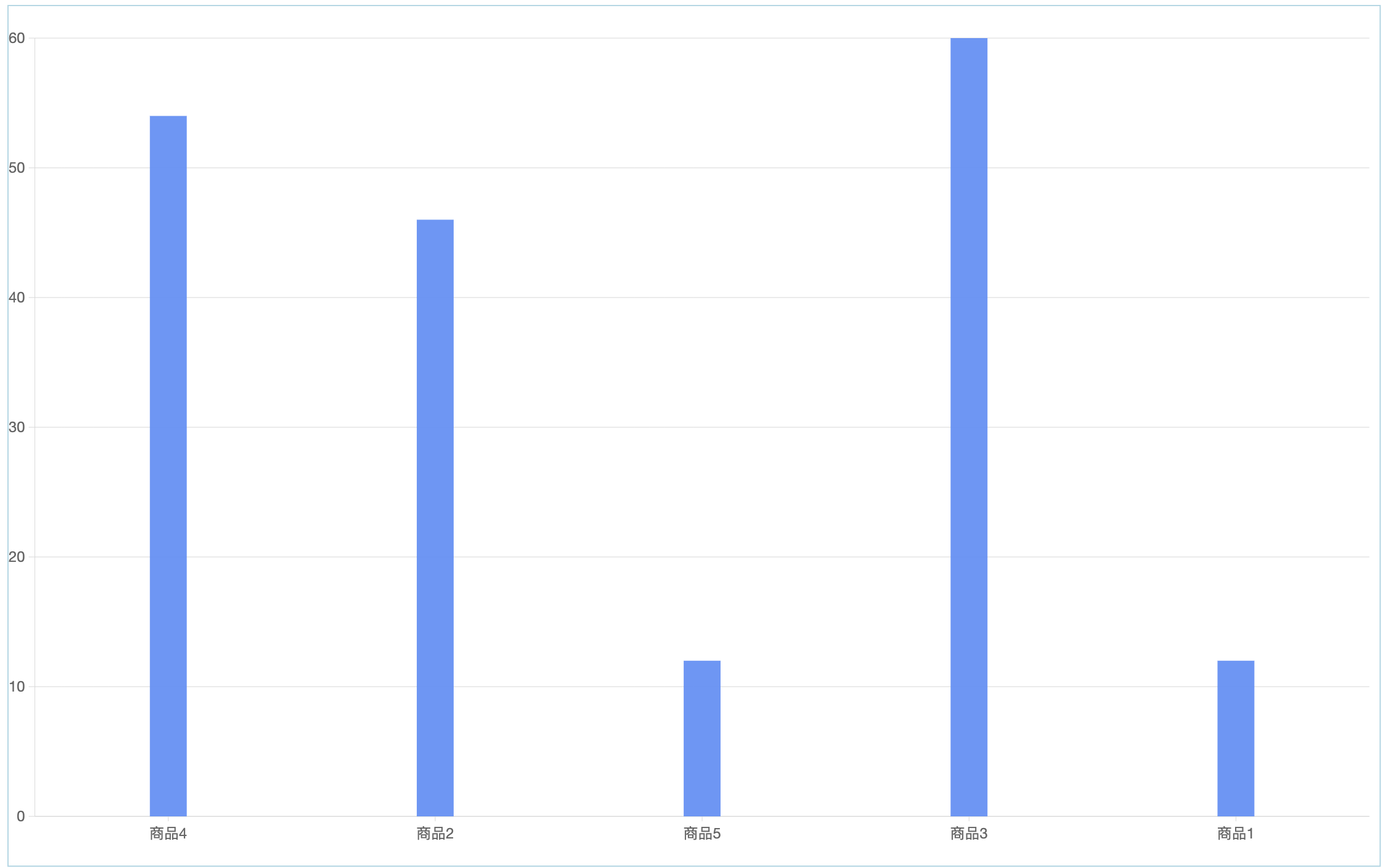
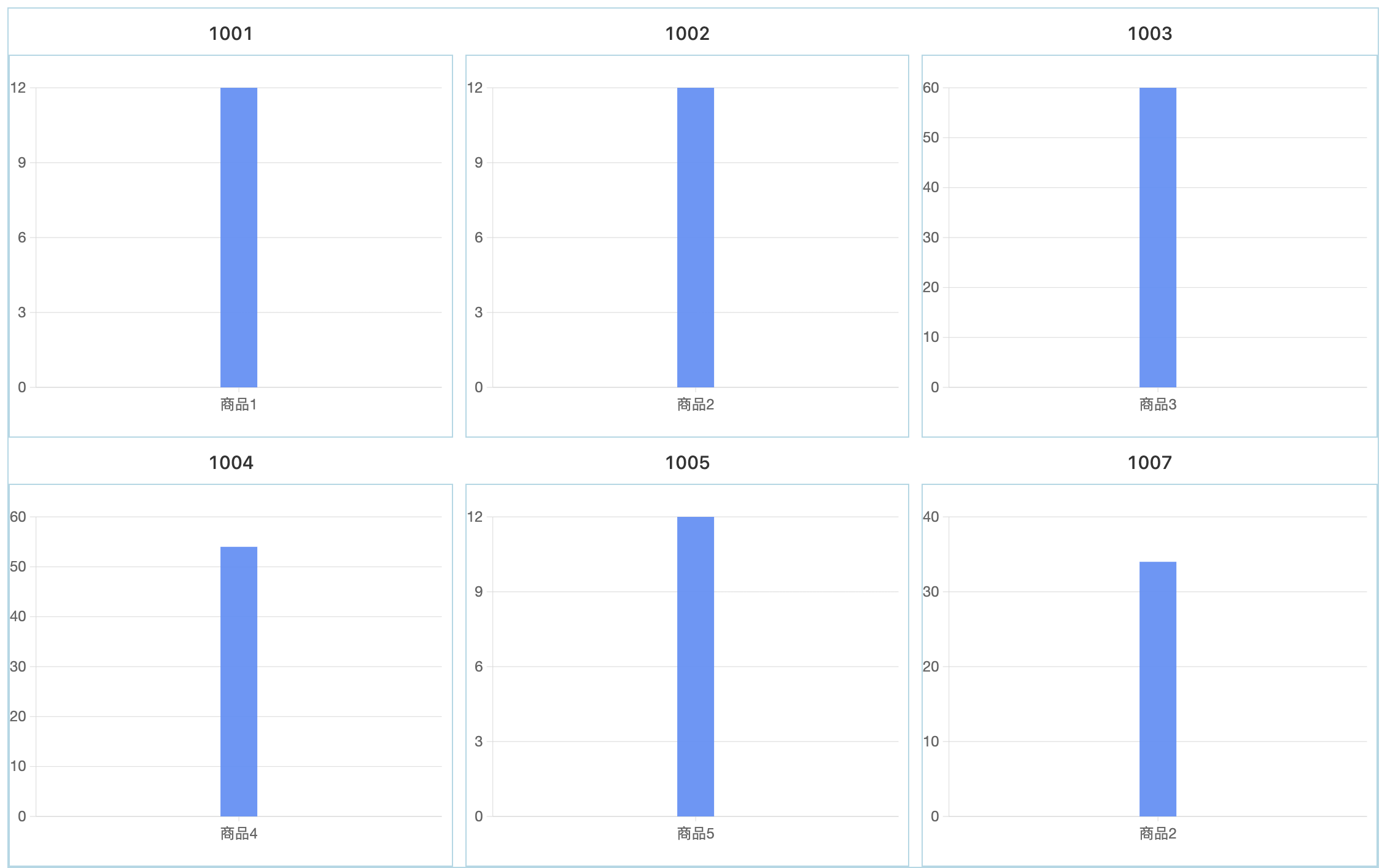
- Splitting: Only one dimension field can be selected for splitting. After selection, the original chart will be split into multiple sub-charts based on this field.
Example
The original chart shows the order amounts of different products.

After dragging the order code into the splitting field, the original chart will be split into multiple charts equal to the number of codes according to different order codes. Each split chart will show the order amounts of products under one order.
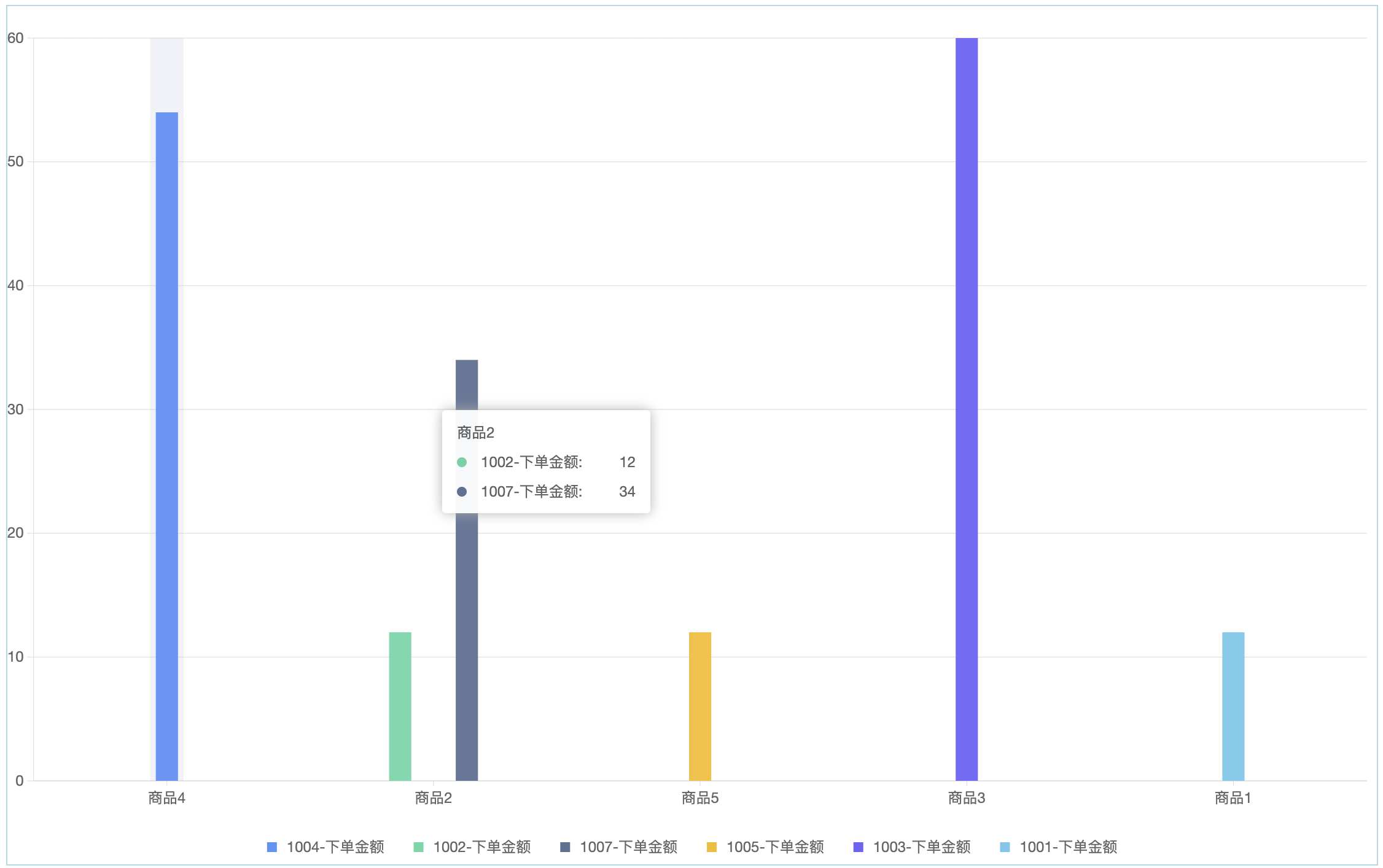
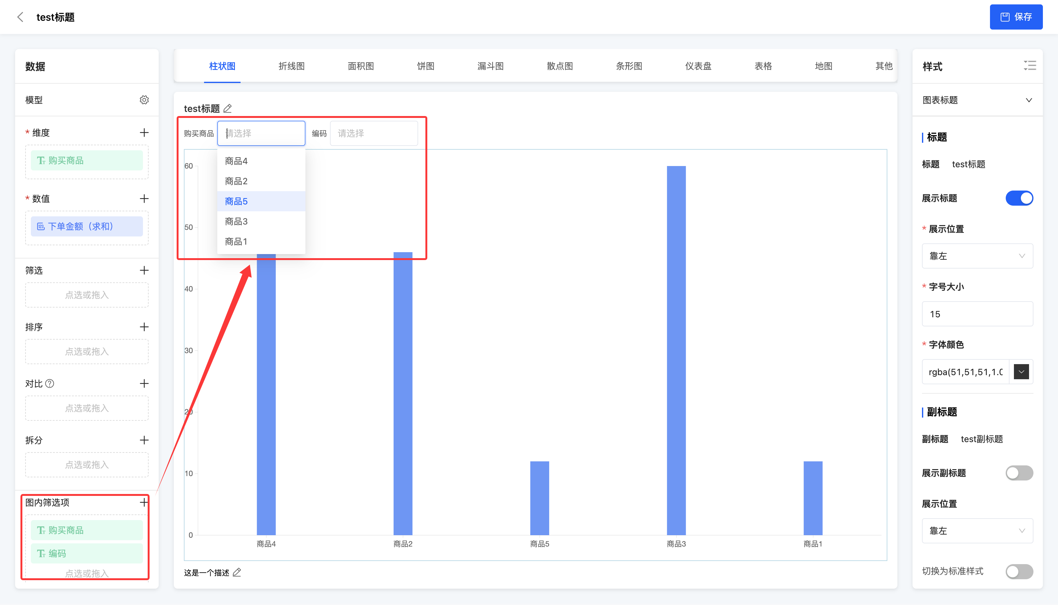
- In-chart filters: Only dimension fields can be selected, and a maximum of six can be selected. Through the selected filters, you can filter the data, and the chart will only display the analysis results of the filtered data.
Example
The chart shows the order amounts of different products. Set the in-chart filters to "Purchased Product" and "Code", and you can filter the chart information in the chart.
Note
The data configuration supported by different types of charts may vary.
- Limit the maximum number of queryable entries: Users can customize the query quantity.
2. Operation Method
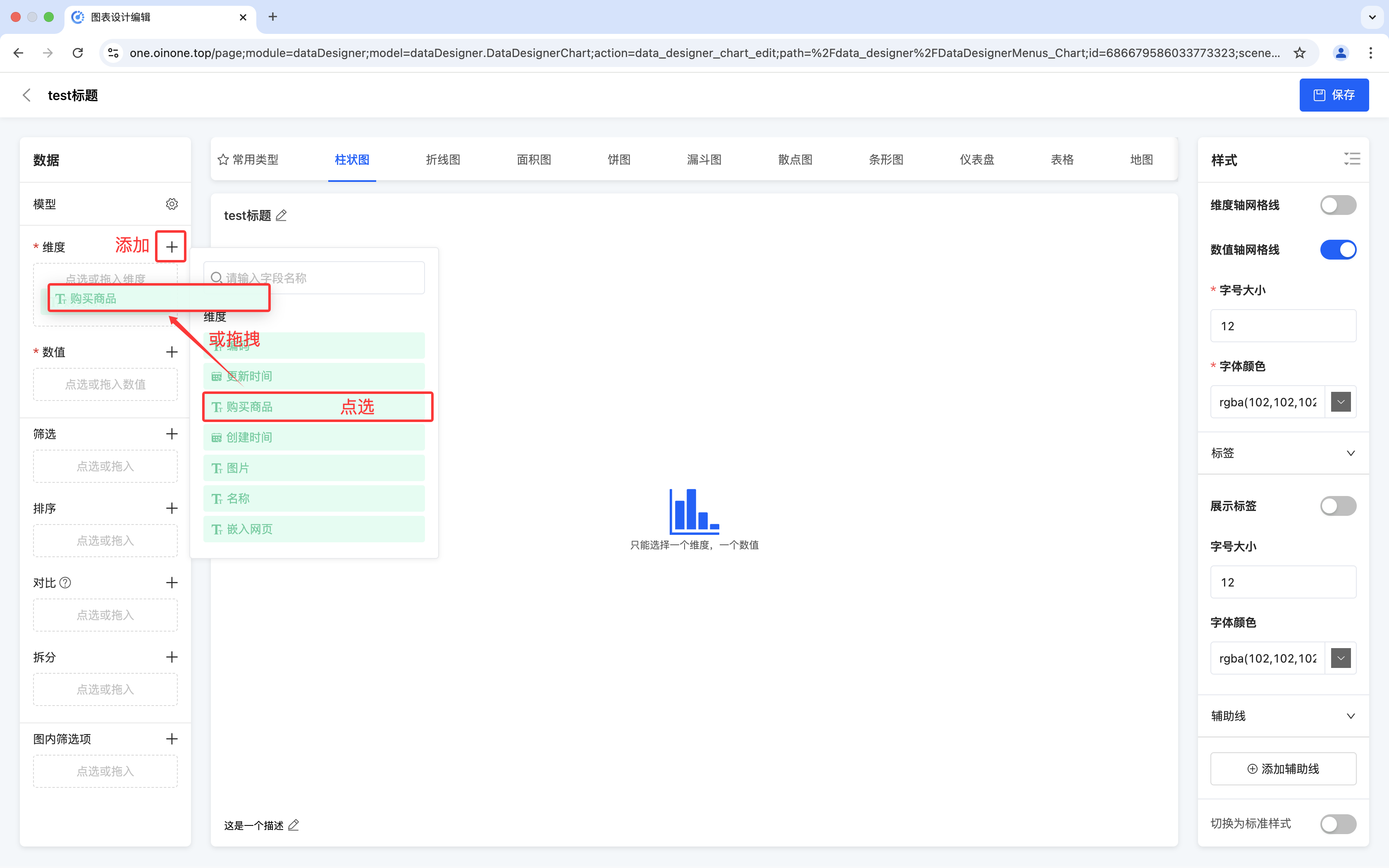
- Add: Click the "Add" icon, and click or drag the fields into the pop-up window.
Note
- Different charts support different numbers of fields. When the number of fields reaches the upper limit, no more can be added. At this time, if you add a new field, the new field will replace the old field for data analysis, and the same style will be retained.
- When multiple fields can be added to the values, the field types must be consistent, that is, all time-type fields or all non-time-type fields.
- Pie charts, funnel charts, and dashboards cannot have time-type fields added to the values.
Modify: Click the "Settings" icon to modify and adjust the fields according to different functions.
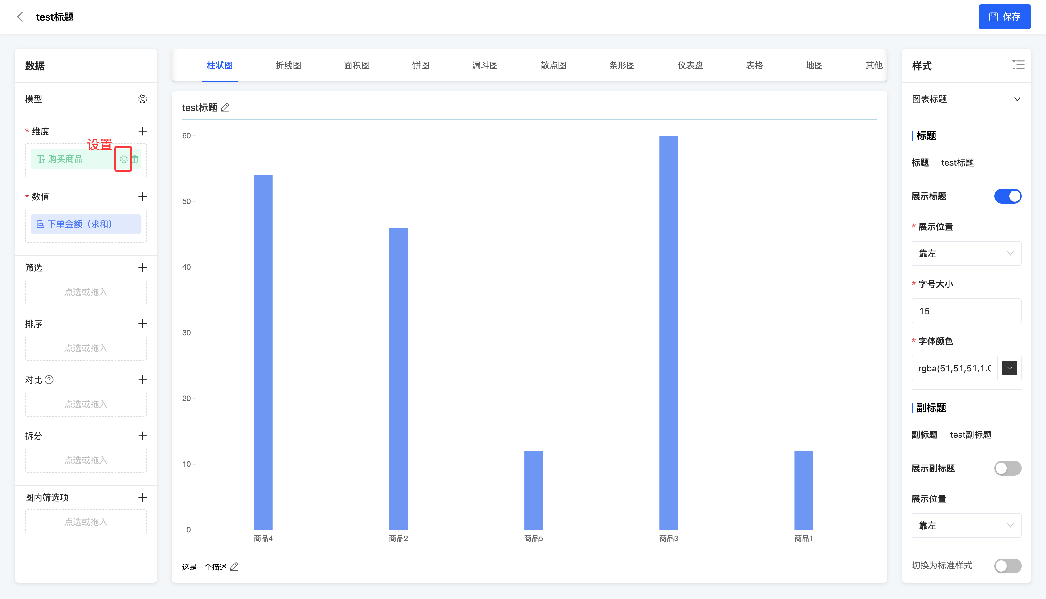
- Dimension: You can modify the display name.
- Value: You can modify the display name, aggregation method, and data format.
- Aggregation method: Including no processing, minimum value, maximum value, average value, sum, and count.
- Data format: You can select a type for the data, including default, numeric, currency, and percentage. Different formats can be configured according to different types.
Default: You can set a unit for the data to meet basic display requirements.
Numeric: In addition to the unit, you can also set the precision for the data to ensure the accuracy of data display.
Currency: You can select a currency type for the data and set the precision and unit to present the data in currency format.
Prompt
The currency types here can be set in "Resources" - "Currencies".
Percentage: You can set the precision and unit for the data, and the data will be displayed in percentage form, intuitively reflecting the data ratio.
- Filter: You can modify the data included in the selected fields to be displayed or excluded.
- In-chart filters: You can modify the display name.
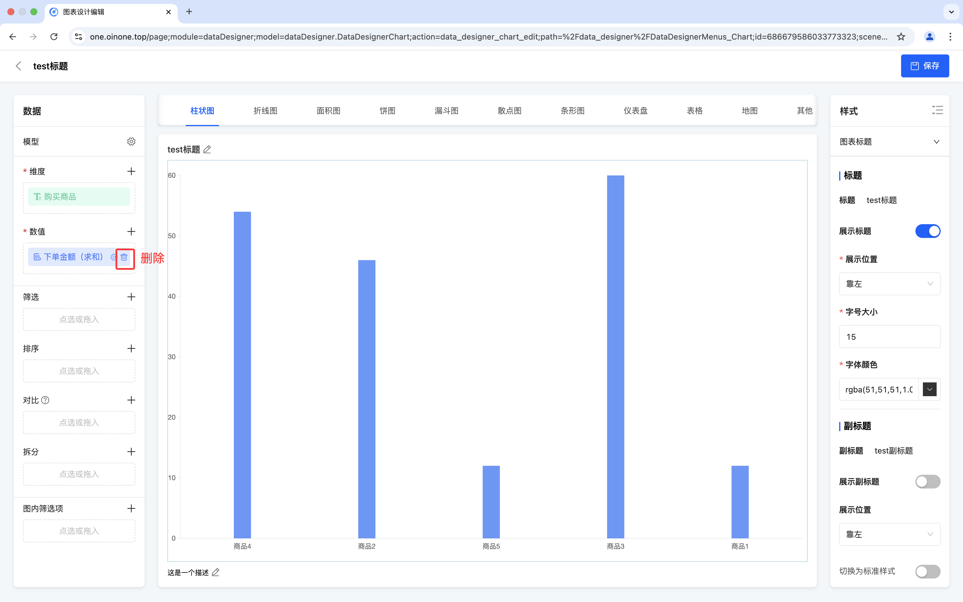
Delete: Click the "Delete" icon to delete the selected field.
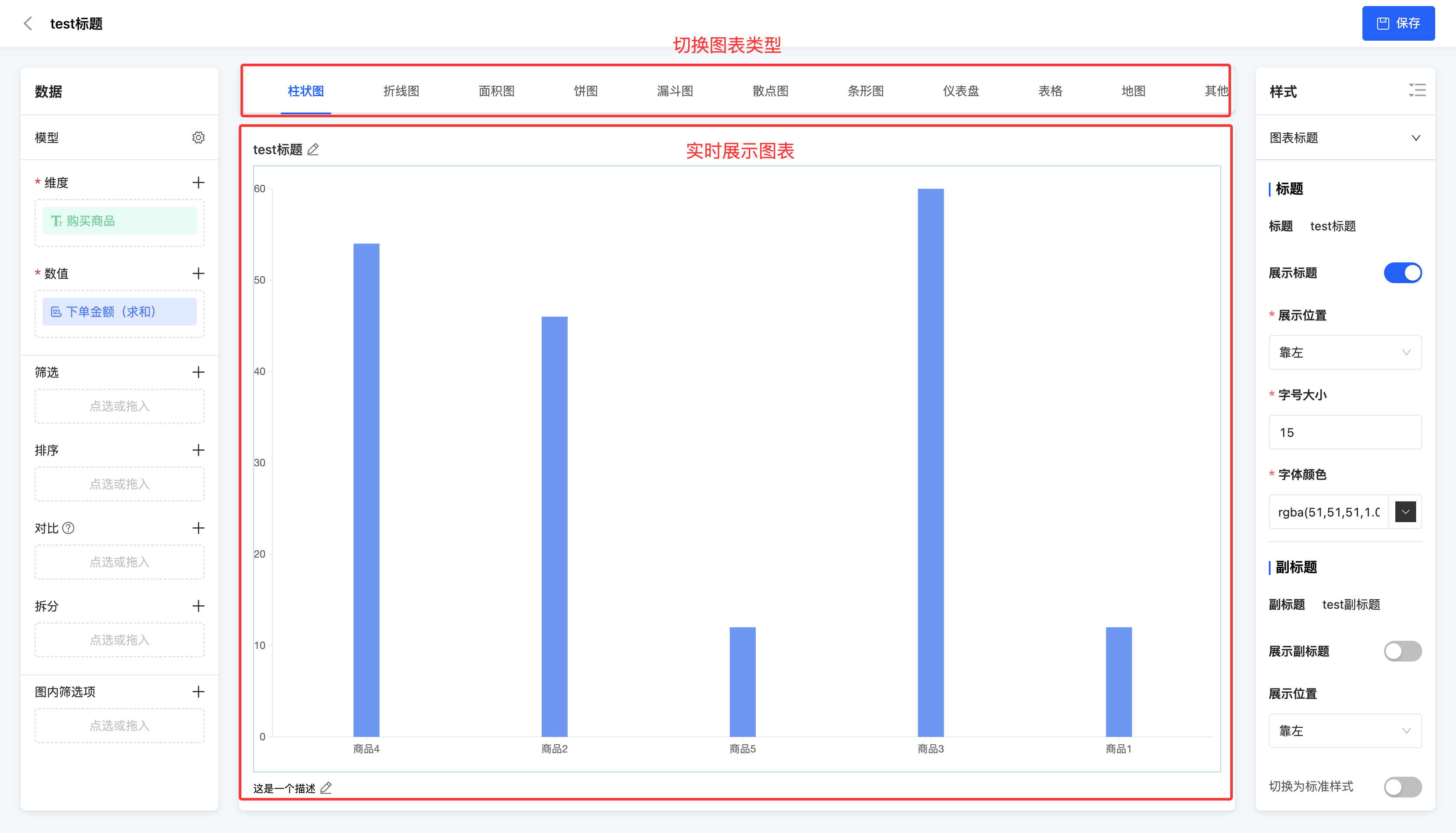
III. Chart Preview Area
(I) Switch Chart Type
1. Function Introduction
In the chart preview area, the corresponding chart will be dynamically displayed based on the selected chart type, combined with the settings in the data configuration area and the style bar. In addition, you can switch between different chart types above the chart preview area to meet different data display needs.
Note
There may be differences in data configuration and style settings for different types of charts. (See the chart type documentation for details.)
Prompt
If the chart types provided by the system cannot meet your actual needs, you can go to the chart template to customize the chart type.
2. Operation Method
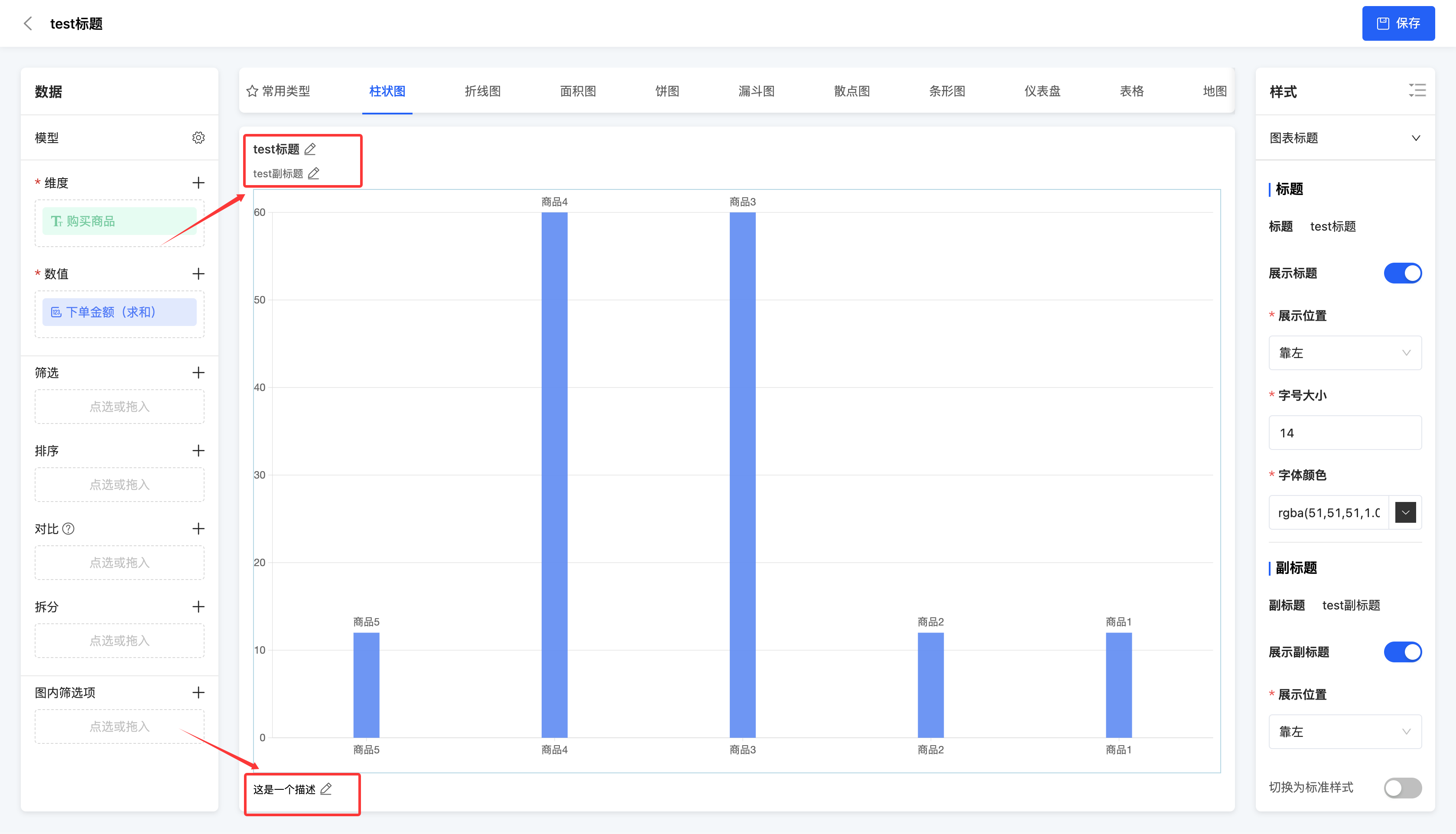
(II) Chart Editing - Title and Description
1. Function Introduction
In the chart preview area, you can edit the title, subtitle, and description of the chart.
Note
If the title, subtitle, or description is not displayed, check if the display is turned off in the style bar of the designed chart. If it is turned off, it cannot be displayed, and similarly, it cannot be edited.
2. Operation Method
Click on the title area, subtitle area, description area, or the "Edit" icon, enter the information, and then you can successfully edit.
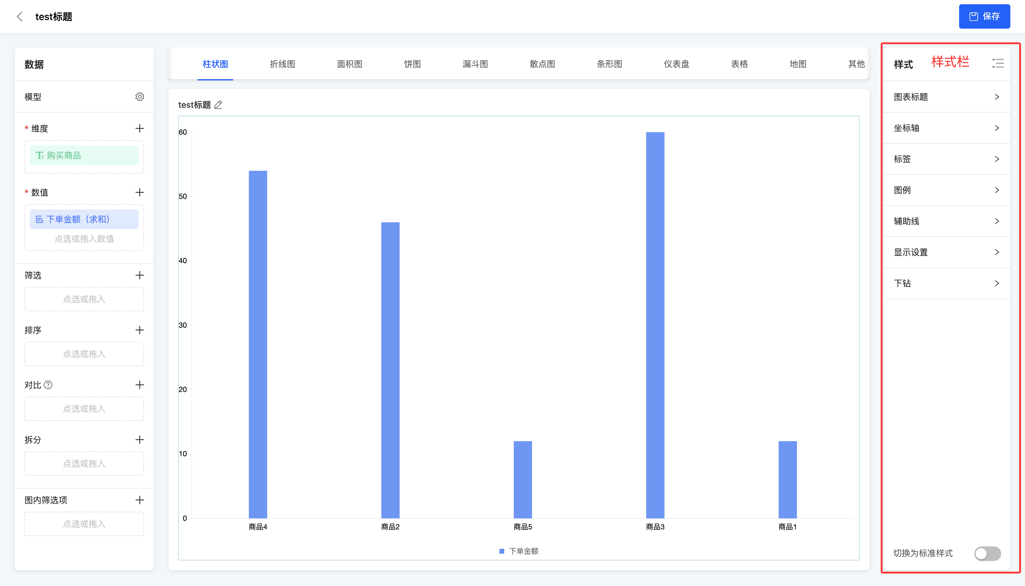
IV. Style Bar
1. Function Introduction
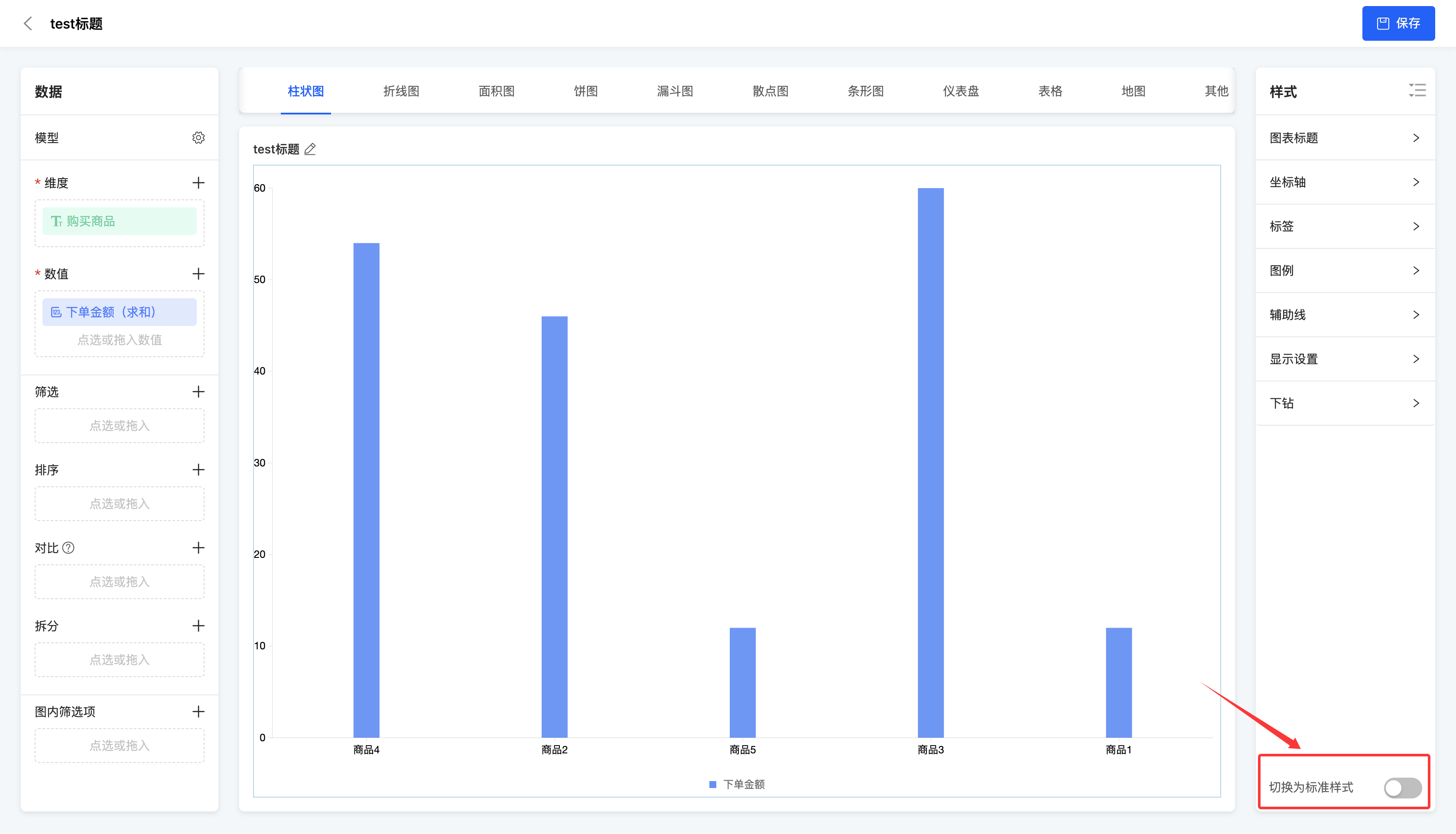
It supports configuring styles for the chart, including the chart title, axes, labels, legends, auxiliary lines, display settings, and drill-down. In addition, you can enable the standard style of the chart.
Note
When you switch to the standard style of the chart, if you modify a certain style, the standard style of the chart will be automatically cancelled.
Note
The style settings here only apply to the general styles of standard chart types provided by the system. For the special styles of some charts, please refer to the chart type documentation. For the special styles included in custom charts, this part will not be explained in detail.
- Chart title: You can customize the display status, position, font size, and font color of the title, subtitle, and description to meet personalized needs.
- Axes: You can choose whether to display the axis lines, axis titles, and gridlines of the axes, and set appropriate font sizes and font colors for the axes to improve the readability of the chart.
- Labels: You can flexibly choose whether to display labels and the field content to be displayed in the labels. At the same time, you can set the font size and font color for the labels to make the data information clearer.
- Legends: You can choose whether to display legends and set the position, font size, and font color of the legends as needed to better explain the data series in the chart.
- Auxiliary lines: You can add auxiliary lines to the chart and support setting a fixed value or selecting a value from the chart (such as the average value, minimum value, or maximum value) as the position of the auxiliary line to better analyze the data.
- Display settings: You can choose whether to display the drag bar to freely adjust the view. At the same time, you can set the number of dimension values to be displayed on one screen and the total number of dimension values to be displayed to optimize the display effect of the chart.
Prompt
When the display drag bar function is enabled and the number of dimension values to be displayed on one screen is set, you can adjust the number of dimension values displayed on one screen by lengthening or shortening the length of the drag bar in the chart, achieving an increase or decrease effect.
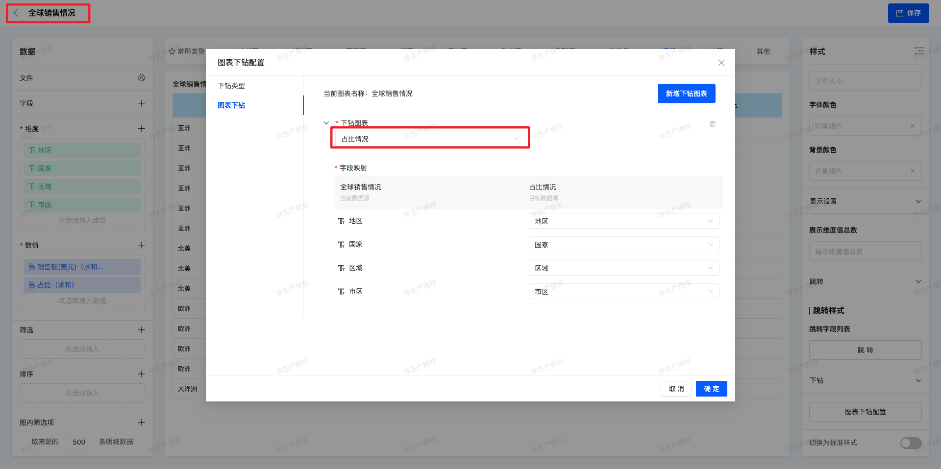
Ⅰ.Drill:Users click on a specific data dimension or metric to access more granular data analysis layer by layer. Supported features include:
- Chart Drill:Bind to an existing chart and configure field mappings.
- Free Drill:Select all fields from the current data source; the selection order determines the drilling sequence.
(Ⅰ)Chart Drill
- Feature Introduction
The Chart Drill feature enables users to click on data points in a chart during runtime to view more granular data details layer by layer.
During the analysis process, users can quickly switch from a macro perspective to micro-level data, facilitating the identification of trends, anomalies, or key driving factors.
For example:
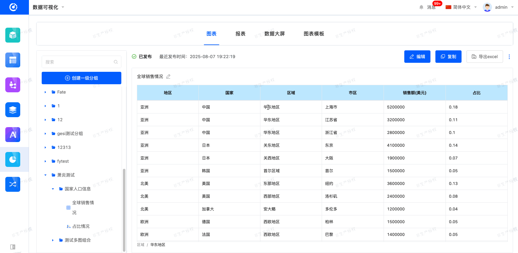
Click on the "Asia" region in the "Global Sales" chart to drill down to "Sales by Country in Asia";
Click on "China" in the "Sales by Country" chart to further drill down to "Sales by Province in China".
Applicable Scenarios
- Sales Analysis: Global → Region → Country → Province → City → Store
- Financial Analysis: Company Overall → Department → Team → Employee
- Operations Analysis: Full Platform → Product Line → Individual Product → User Group
- Customer Analysis: Customer Industry → Customer Company → Customer Contact Person
Supported Data Sources
Chart Drill can be configured based on the following data sources:
- Model Data Source: Structured data provided by the low-code platform model.
- Database: Relational databases such as MySQL, PostgreSQL, and Oracle.
- Integrated Application: Integrated data from third-party systems.
- File: Uploaded files such as Excel and CSV.
The Drill feature supports the following chart types:
- Bar Chart
- Horizontal Bar Chart
- Line Chart
- Dual-Axis Chart
- Area Chart
- Pie Chart / Donut Chart
- Funnel Chart
- Map
- Table
- KPI Statistic Chart (Single-Value Chart, usable as a drill entry)
Note
- The drill interaction method may vary across different chart types. For instance, Map Drill supports geographic region linkage.
- At the same hierarchy level, the drill path configured for the parent chart takes precedence over that of the child chart.
- The data source must have pre-configured field hierarchical relationships (e.g., Region → Country → Province).
- Drill paths must be pre-defined; otherwise, data gaps or interruptions may occur.
- Chart refresh performance is related to data volume. It is recommended to configure pagination or aggregation strategies for large datasets.
(Ⅱ)Free Drill
- Feature Introduction
The Free Drill feature allows users to independently select dimension fields for drilling during runtime and dynamically expand data details. Compared with fixed-hierarchy drilling, Free Drill does not require pre-set hierarchy sequences. Users can freely determine the drill path and hierarchy depth based on analysis needs.
Examples: 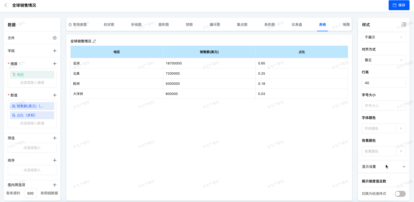 Scenario: Quickly locate the core market
- Click on "Asia" : find out that Asia contributes 65% of the company's sales and is the absolute main force.
- Drill down to "China" : See that China accounts for 39% of Asia's revenue and is the core pillar.
- Drill down to "East China" : find that East China alone accounts for 39% of China's income. Conclusion: Through three clicks, immediately lock East China is the engine of the company's global business. The decision became clear: priority must be given to securing resource inputs in the region and to studying its success models for replication in other regions.
The path can be flexibly adjusted without being restricted by a fixed sequence.
- Supported Data Sources
- Model
- Database
- Integrated Application
- File
- upported Chart Type:Table
- Configuration Logic
- Multiple fields can be selected as drillable fields
- Configuration order = Label display order
- Number of fields = Maximum drill hierarchy
Note
- The target chart must support the passing of drill context variables (e.g., dimension values such as Region and Department).
- The supported drill styles and behaviors may vary across different chart types.
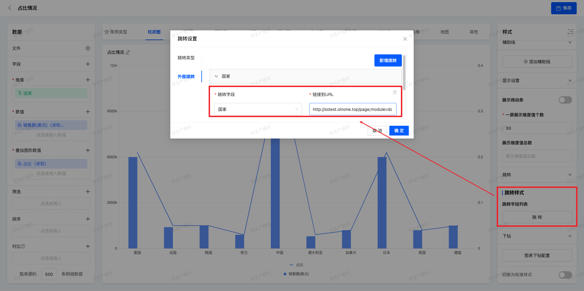
(Ⅲ)Jump
- Feature Introduction
The Chart Jump feature allows users to click on the entire chart or chart elements during runtime to jump to other pages or external system links.
Overall Jump: Click anywhere on the chart (or the entire chart area) to jump to the target page.
Element-Level Jump: Click on specific data points (bars, pie chart sectors, scatter points, etc.) to jump to the target page or a third-party system.
The Jump feature is commonly used for:
- Viewing data detail pages
- Opening related reports or dashboards
- Linking to external systems or business tools
Configuration Scenarios
Example:
- A bar chart displays sales data; clicking any bar → jumps to the Sales Detail Table page.
- A pie chart displays sales proportion by region; clicking the "Asia" sector → jumps to the "Asia Sales Details" page in a third-party system.
Configuration Key Points
- Jump links support parameter concatenation: Field values can be dynamically concatenated into the URL. For example:
https://example.com/detail?region={Region}&date={Date}- Coexistence of Jump and Drill: When both Jump and Drill are configured for the same field, users can select the entry for either Jump or Drill.
Note
- Jump links support field parameter concatenation (e.g.,
https://example.com/detail?region={Region}). - Ensure the target page can accept parameter transmission to avoid blank data after jumping.
- It is recommended to use HTTPS for jump links to ensure security.
2.Operation Method
- Customize styles in the Style Panel; styles take effect immediately and are displayed in real-time on the chart.
- Switch to Standard Style: Enable the "Switch to Standard Mode" button to convert the current chart to the standard style.
- Chart Drill
Example: Drill down from [Global Sales Overview] to [Proportion Analysis] chart.
Field mapping relationships between the two charts need to be configured here.
Usage Steps (Runtime)
- Open the target chart.
- Click on a data point (e.g., the "Asia" region).
- The system automatically applies the filter condition (Region = Asia) and displays the data of the next hierarchy.
- Confirm the current position via the path navigation bar (e.g., "Region > Asia").
- Continue clicking on the next-level data to access more granular dimensions step by step.
- To return, click on the upper-level node in the path navigation bar.
- Free Drill
Example: Drill down from [Global Sales Overview] to [Proportion Analysis] chart.
Drillable fields need to be configured here.
Usage Steps (Runtime)
- Click on a dimension field value
a. The user clicks on the value of a dimension field (e.g., "Order ID = 1001").
b. The system adds this condition to the current drill path. - Select a drill-down field
a. The system pops up a drill field selection box, and the user can select a drillable field.
b. The next-level table will display data based on the current condition + the new dimension.

- Jump
External page jumping is supported.
Usage Steps (Runtime)
- The user clicks on the chart or chart element configured with the Jump feature.
- The system concatenates parameters according to the configured URL and opens the target page or external link.
- If there are path parameters or context variables, the system will automatically replace the placeholders in the URL.
V. Attachment: Glossary
| Term | Description |
|---|---|
| Dimension | An attribute used to describe the category or characteristics of data |
| Value | Used to display quantitative information |
| Filter | Filter the source data and only use the filtered data for effective analysis |
| Sorting | Adjust the arrangement order of dimension values in the formed analysis chart to optimize the display effect |
| Comparison | Used to compare and analyze different dimensions |
| Splitting | Split the data according to a specific dimension to display the data in more detail |
| In-chart filters | Provide a smaller range of query functions for the formed analysis chart to accurately locate data |
| Label | The intersection point of each dimension value and each value, used to mark data points or dimension information in the chart |
| Legend | Facilitate differentiation and identification through the value names and their corresponding colors on the chart |
| Auxiliary line | After adding an auxiliary line, compare the analysis results of the chart with this auxiliary line |
| Drill-down | Explore deeper information in the data |