I. Operation Bar
- Styles: Two display styles for action components are provided:
- Default Style: All buttons are displayed according to their respective preset styles.
- Prominent First Button Style: The first button is displayed as a primary button, while the remaining buttons are shown as text buttons.

- Number of Displayed Actions in the Action Area: You can set the number of buttons directly displayed in the action area. When "Disable Collapse" is not selected, you can set the style of the "More" button. If "Disable Collapse" is enabled, the "More" button will not be displayed.
II. General Attributes
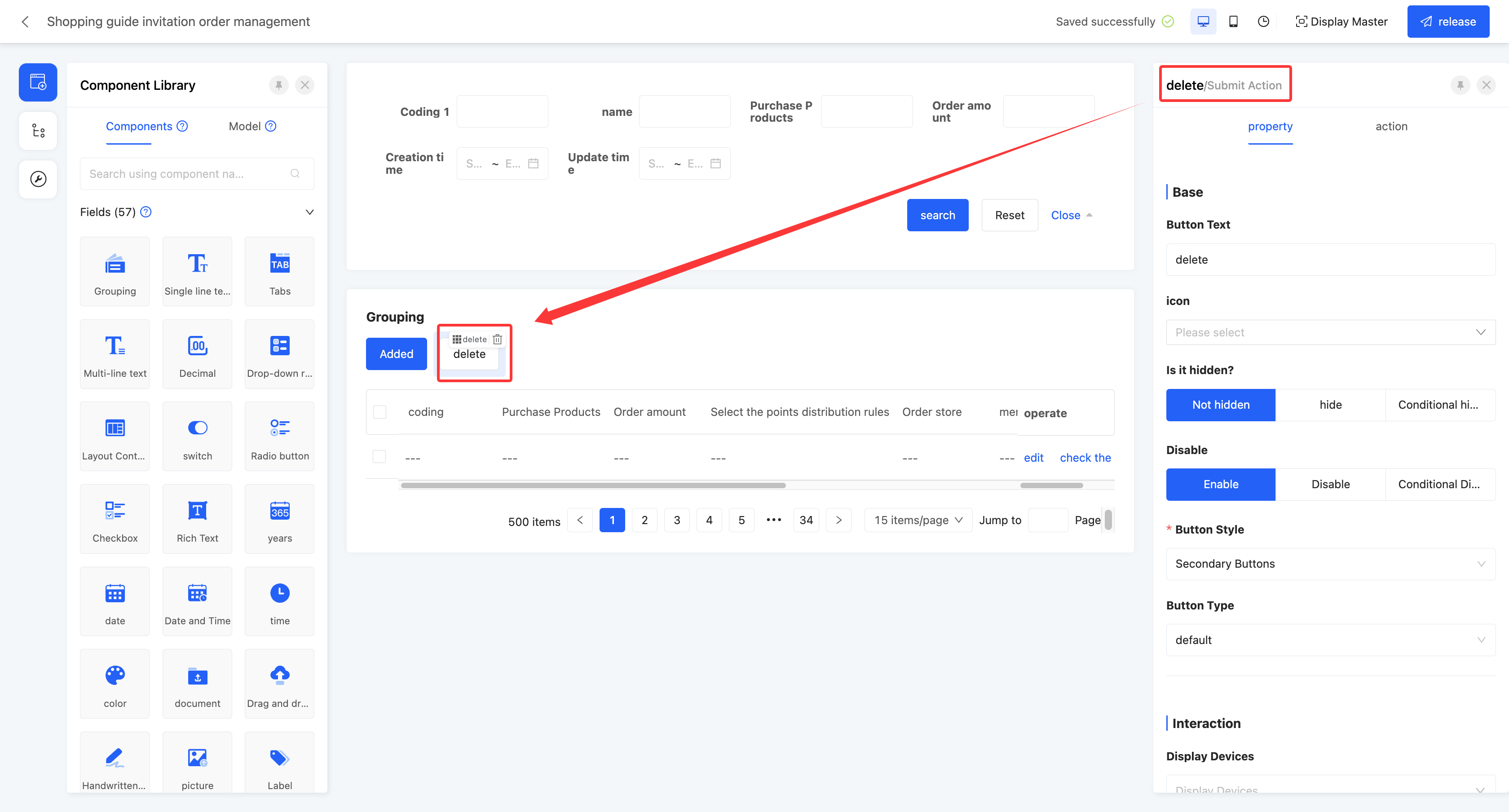
Action Name/Button Text: The display name of the component on the current page.
Retain Action: After enabling this option, if the action component is deleted, it will be retained in the model action list in the left tool area for subsequent reuse.
Icon: Supports adding icons to action components to enhance their visualization and recognition.
Hidden: If set to hidden, the component will be invisible and uneditable on the actual page. If set to conditionally hidden, it will be hidden when the conditions are met. In the design page, hidden components will still be displayed.
Disabled: If set to disabled, the component will be visible but uneditable on the actual page. If set to conditionally disabled, it will be disabled when the conditions are met.
Button Style: Two options are available: primary button and secondary button. The primary button has a background color and is more prominent; the secondary button has no background color.
Button Type: Different types of buttons can be set, and each type has a different background color, including default, success, warning, danger, and prompt.
Display Device: Supports PC, mobile, and PAD.
Shortcut Key: Provides a keyboard shortcut customization function to quickly execute specified actions.
Trigger Scope: The trigger scope of the shortcut key can be set, including the current view and the global mode. When the current view is selected, the shortcut key is only valid in the current view; when the global mode is selected, the shortcut key can be used throughout the platform.
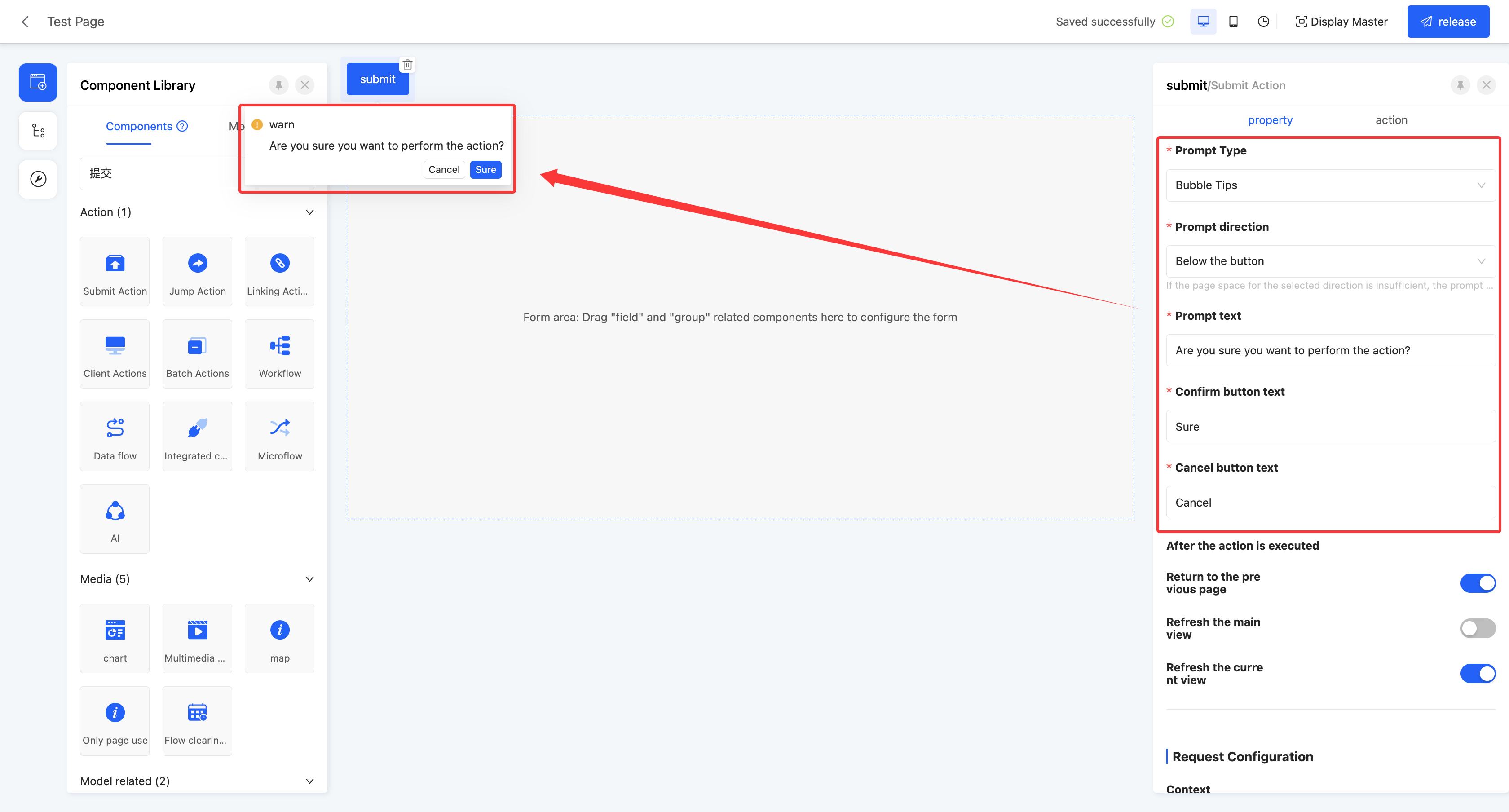
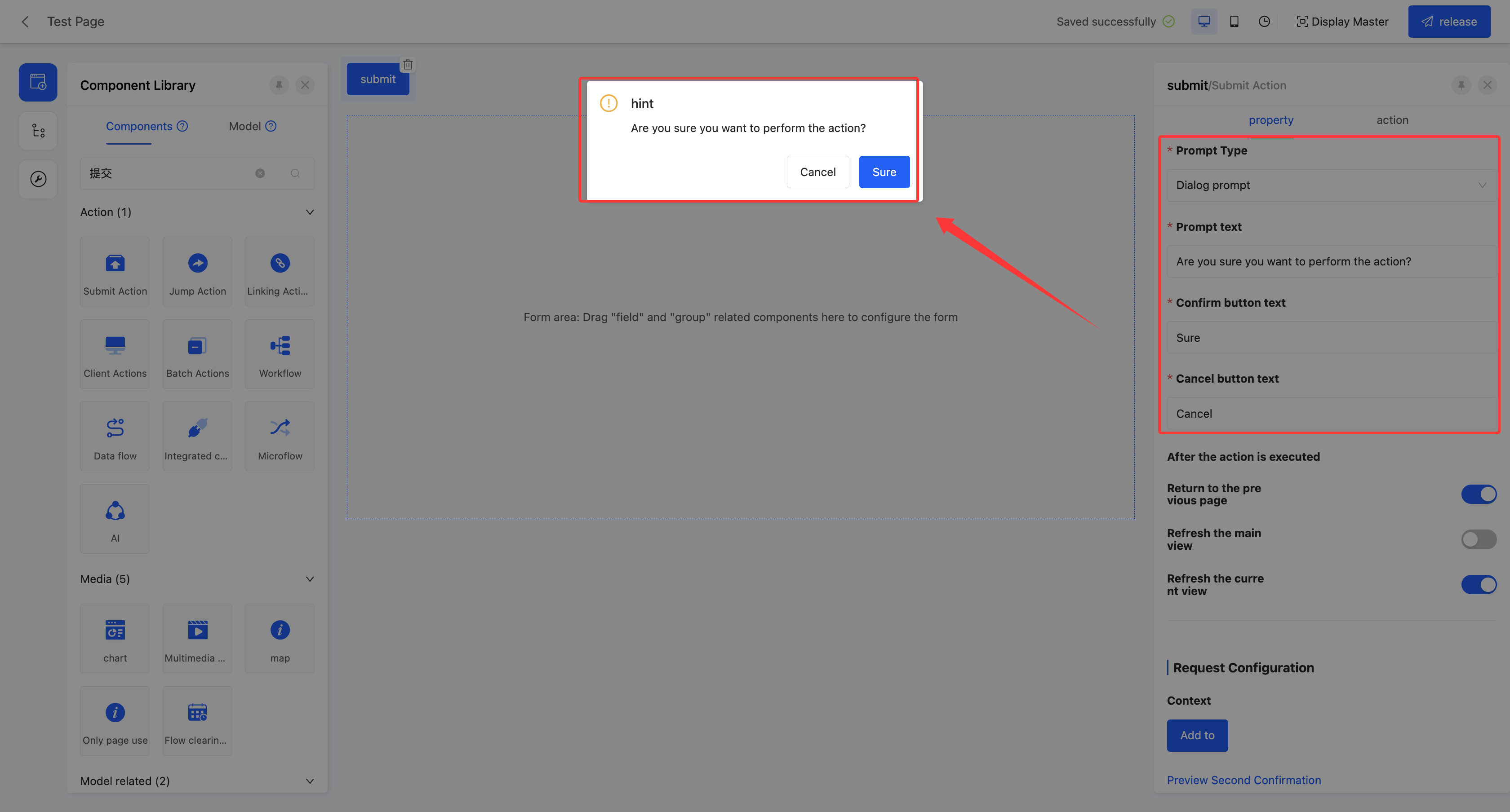
Secondary Confirmation: After enabling this function, a confirmation box will pop up for secondary confirmation before performing an action.
- Prompt Type: Refers to the display type of the pop-up box, including bubble prompt and dialog prompt.
- Prompt Direction: When the prompt type is a bubble prompt, this attribute is displayed. The display position of the bubble can be set, including above, below, left, and right of the button.
Note
If there is insufficient space in the selected direction on the page, the prompt position will be adjusted automatically.
- Prompt Text: The main text content displayed in the confirmation box.
- Confirm Button Text: Supports customizing the display text of the confirm button.
- Cancel Button Text: Supports customizing the display text of the cancel button.
III. Specific Attributes
(Ⅰ) Submit Action
By configuring different server functions, different operations can be performed, which is suitable for various scenarios such as querying, deleting, and creating.
Example
Design Example:
Display Page:
Specific attributes of the submit action:
- Data Control Type: The data controlled when performing the action. It includes four types: processing single data, processing multiple data, processing single or multiple data, and no data processing.
- Server Function: The function executed by the action. Multiple functions are provided and can be selected according to actual needs.
- Validate Data: After enabling this option, data will be validated before the action is executed.
- Return to Previous Page: After enabling this option, it will directly return to the previous page after the action is executed.
- Refresh Main View: After enabling this option, the main view will be refreshed after the action is executed.
- Refresh Current View: After enabling this option, the current view will be refreshed after the action is executed.
- Context: When the data has different names in different locations but actually refers to the same data, data mapping can be achieved by configuring the context.
Example
User System and Sales System:
- In the user system, the unique identifier of a user may be called "User ID".
- In the sales system, the unique identifier of the same user may be called "Customer ID".
Through context configuration, the names in these two different systems can be mapped to the same actual data, that is, the User ID and Customer ID refer to the same data.
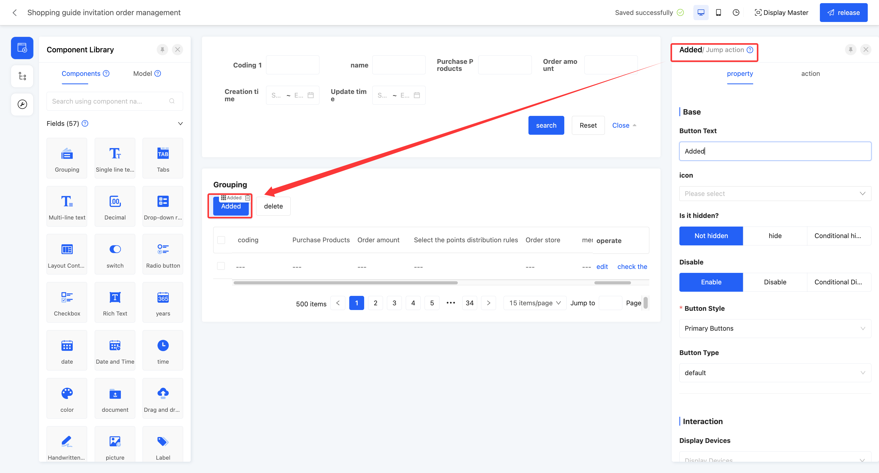
(Ⅱ) Jump Action
Supports jumping to a certain page, which is suitable for scenarios such as page navigation and submission confirmation.
Example
Design Example:
Display Page:

Specific attributes of the jump action:
- Data Control Type: The data controlled when performing the action. It includes four types: processing single data, processing multiple data, processing single or multiple data, and no data processing.
- Open Mode: Sets the open mode of the jumped page, including opening in the current window, opening in a new window, opening in a pop-up window, and opening in a drawer.
Prompt
When setting the jumped page to a pop-up window or a drawer, its page attributes can be configured:
- Title: You can enter the title to be displayed on the pop-up window page.
- Enable Dynamic Title: When enabled, the title can be dynamically displayed according to the set rules; when disabled, the default title will be displayed statically.
- Pop-up Window Height/Pop-up Window Width: Different size specifications can be selected.
- Title Arrangement: The arrangement style of the pop-up window title can be set, including horizontal and vertical.
- Allow Dragging: After enabling, the pop-up window can be freely dragged.
- Add Display Mask: You can choose whether to display a mask to blur the background content when the pop-up window appears, highlighting the content of the pop-up window.
- Allow Closing: You can set whether to display the close button.
- Close on Mask Click: You can set whether the pop-up window closes when the user clicks on the mask area.
- Switch to Full - screen: After enabling this function, users can switch the pop - up window/drawer to full - screen mode on the actual running page.
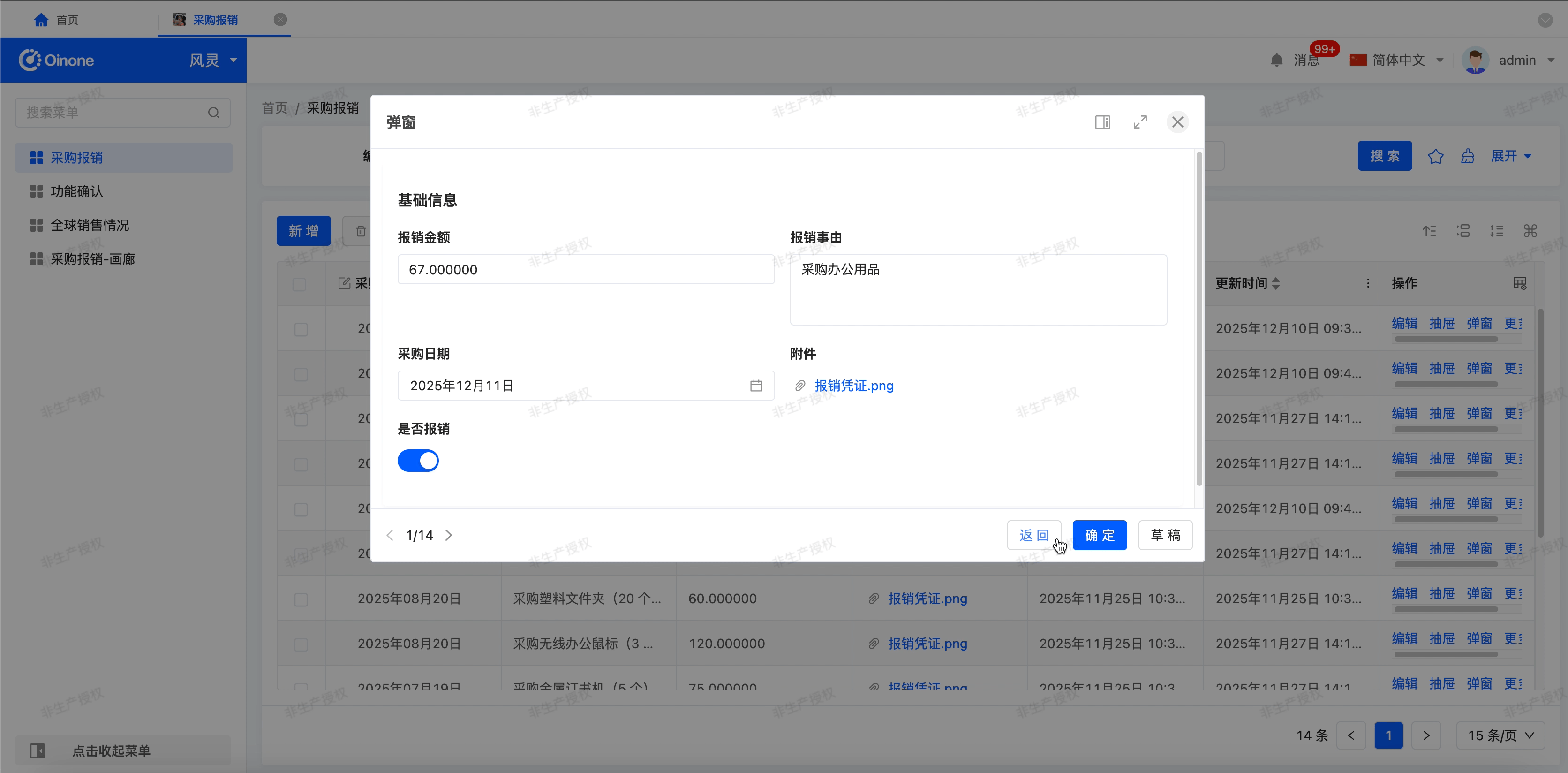
- Pop - up Window/Drawer Switch: After enabling this function, users can freely switch the display form (pop - up window or drawer) on the actual running page.
- Record Switch: After enabling this function, users can quickly switch the data displayed on the page on the actual running page.

- Page Content: Specifies the content of the jumped page. You can either choose to bind an existing page or create a new page. When choosing to create a new page, relevant attributes for creating a new page will be added to the current component property bar, facilitating the quick creation and setting of a new page.
- Bind Page: When choosing to bind an existing page, this attribute is displayed. You can select a published page in the interface designer.
- Disable Data Loading: After enabling this option, the data loading function will not be executed.
- Loading Function: If "Disable Data Loading" is enabled, this attribute will not be displayed. When a certain option value is selected on the actual page, this function will be executed to load data.
Note
When a specific loading function is specified, the loading function will no longer be automatically recognized.
- Force Refresh Tab: After enabling this option, the page content will be automatically refreshed every time you switch to this tab.
- Context: When the data has different names in different locations but actually refers to the same data, data mapping can be achieved by configuring the context.
Example
User System and Sales System:
- In the user system, the unique identifier of a user may be called "User ID".
- In the sales system, the unique identifier of the same user may be called "Customer ID".
Through context configuration, the names in these two different systems can be mapped to the same actual data, that is, the User ID and Customer ID refer to the same data.
- Design Jump Page: Provides a shortcut for users to quickly design the jumped page.
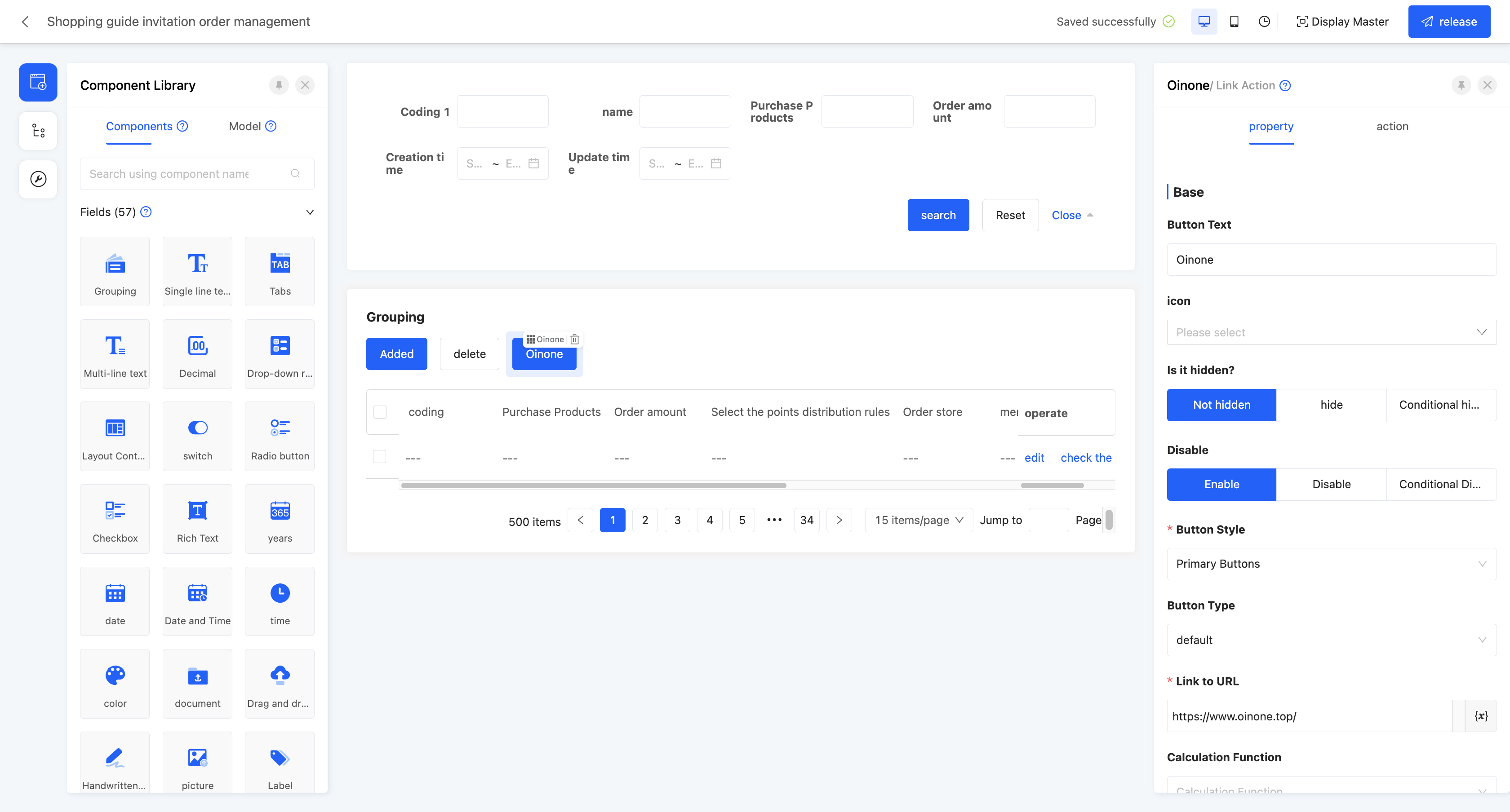
(Ⅲ) Link Action
Supports linking to other web pages, which is suitable for scenarios such as quickly navigating to relevant pages.
Example
Design Example:
Display Page:

Specific attributes of the link action:
- Data Control Type: The data controlled when performing the action. It includes four types: processing single data, processing multiple data, processing single or multiple data, and no data processing.
- Link to URL: Specifies the target link URL to jump to.
Note
It supports a dynamic URL configuration mechanism, allowing users to customize dynamic parameters in the link according to their needs, achieving flexible link jumps based on different data.
- Calculation Function: The function executed by the action, which can be customized according to actual needs.
Note
Calculation Function: The function executed by the action, which can be customized according to actual needs
- Open Mode: Sets the open mode of the linked page.
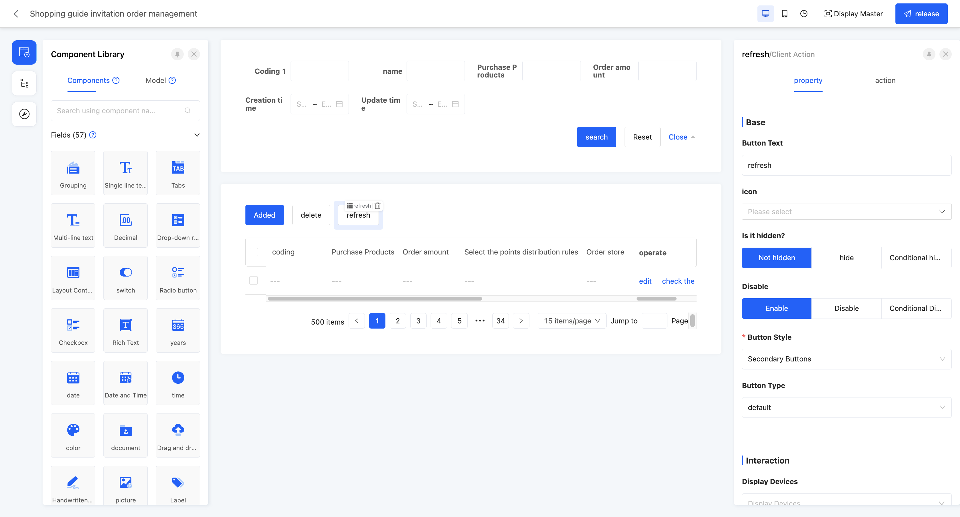
(Ⅳ) Client Action
According to different client behaviors, different operations can be performed, which is suitable for scenarios such as returning, refreshing, and updating data.
Example
Design Example:
Display Page:

Specific attributes of the client action:
- Client Behavior: Configures actions according to client behaviors.
- Return to Previous Page: If there is a previous page, it can return to the previous page.
- Refresh Data: Can refresh the data information displayed on the page.
- Batch Update: Needs to be used in conjunction with the batch action to update multiple pieces of data on the batch jump page.
- Delete Data: After selecting the data to be deleted, the deletion operation can be performed.
- Add a Row of Data: You can directly add a row of data to the table without jumping to a page.
- Copy a Row of Data: After selecting any piece of data, you can quickly copy the data.
- Save as Draft: Temporarily save the currently filled - in content without submitting it as official data.
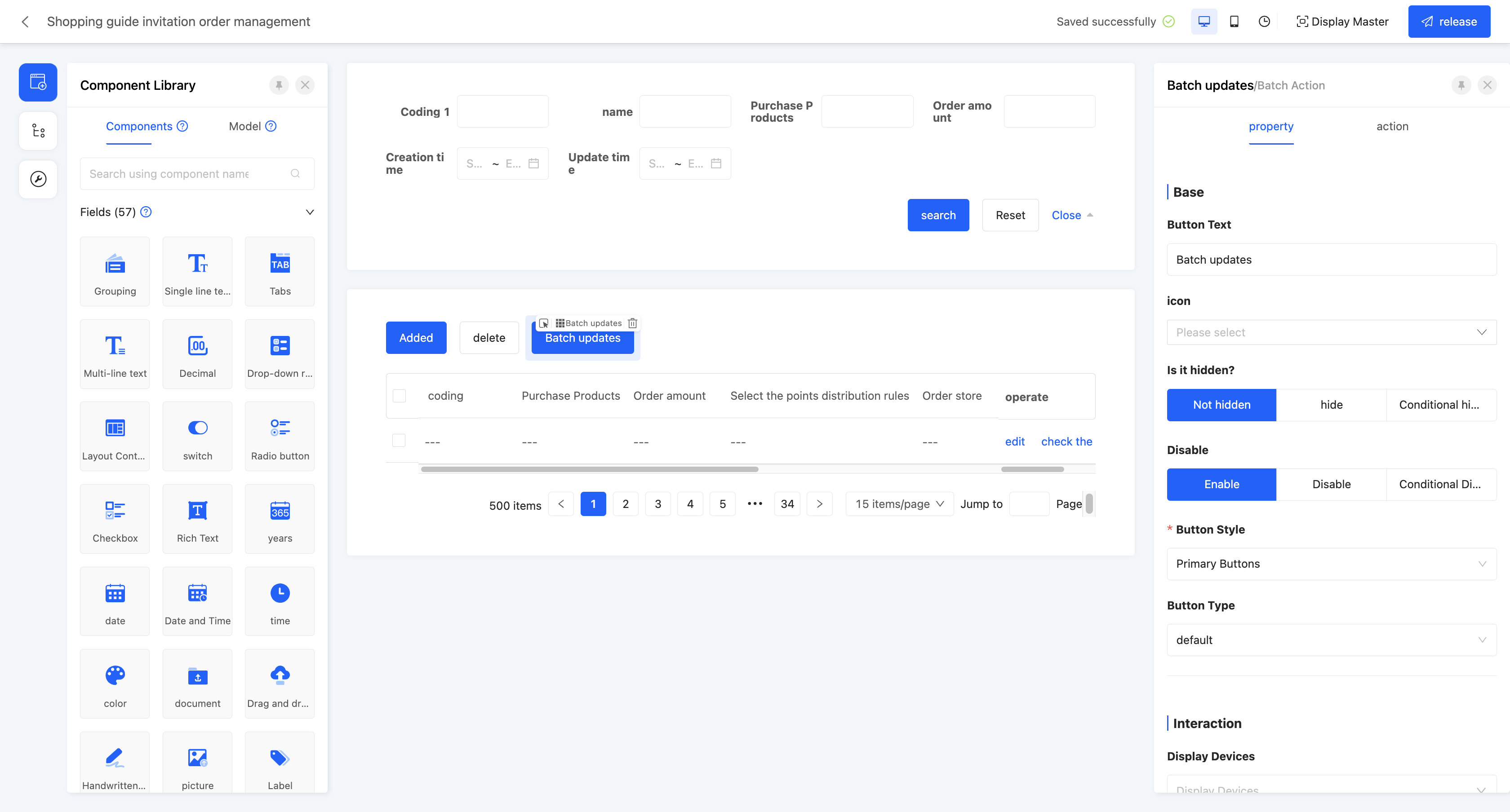
(Ⅴ) Batch Action
A shortcut for the jump action to process multiple pieces of data, which can perform batch modification operations on the data in the selected data set.
Example
Design Example:
Display Page:
Specific attributes of the batch action:
- Open Mode: Sets the open mode of the batch action, including opening in a pop-up window and opening in a drawer.
- Page Model: The model bound to the page jumped to when performing the batch action.
- Design Pop-up Window/Drawer: Can design the page jumped to by the batch action.
Note
When setting a pop-up window/drawer page for the batch action, the "Client Action - Batch Update" action needs to be used to submit relevant data.
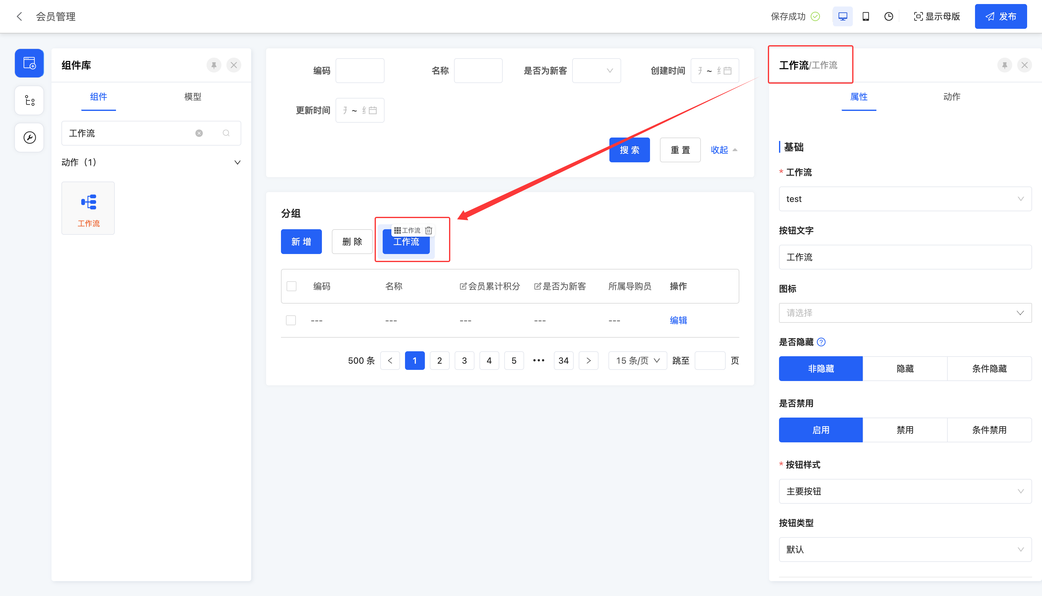
(Ⅵ) Workflow
Supports manually triggering the workflow.
Note
The workflow action will only be displayed in the component library after the "Workflow" application is dependent on under the application to which the page belongs.
Example
Design Example:
In this example, the workflow is selected: after triggering the process, an in-app message will be sent with the content "This is a process triggered by the workflow action".
Display Page:
Specific attributes of the workflow:
- Execution Function: The function called when performing the action.
- Workflow: You can select the processes that need to be triggered by the model included in the model to which the current page belongs.
- Validate Data: After enabling this option, data will be validated before the action is executed.
- Return to Previous Page: After enabling this option, it will directly return to the previous page after the action is executed.
- Refresh Main View: After enabling this option, the main view will be refreshed after the action is executed.
- Refresh Current View: After enabling this option, the current view will be refreshed after the action is executed.
- Submit Data: If this option is enabled, parameter mapping can be configured. That is, when the data has different names in different locations but actually refers to the same data, it can be achieved by configuring parameter mapping.
- Context: When the data has different names in different locations but actually refers to the same data, data mapping can be achieved by configuring the context.
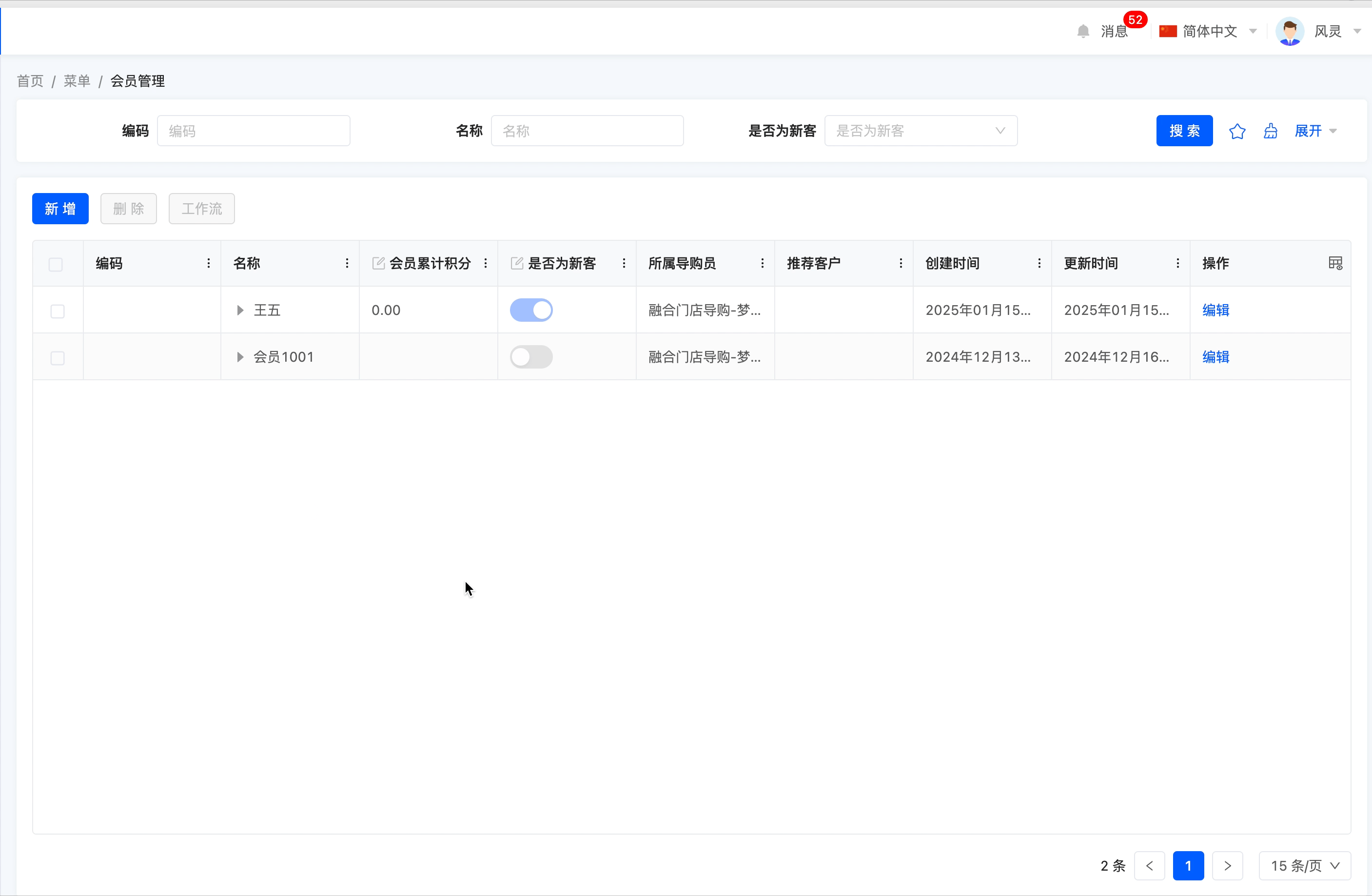
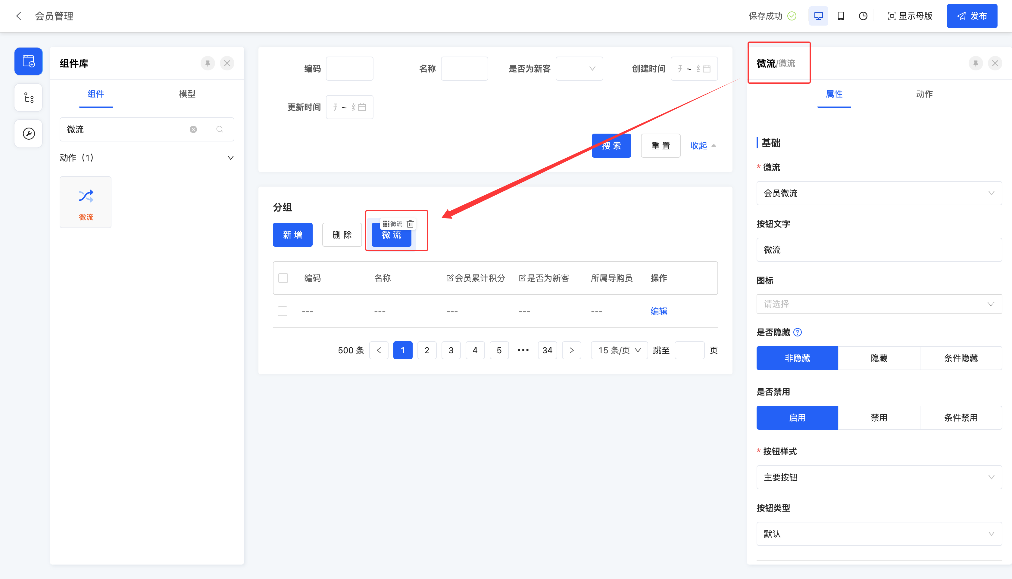
(Ⅶ) Microflow
Supports manually triggering the microflow.
Note
The microflow action will only be displayed in the component library after the "Workflow" application is dependent on under the application to which the page belongs.
Example
Design Example:
In this example, the microflow is selected: after triggering the process, an in-app message will be sent with the content "This is a microflow triggered by the microflow action".
Display Example:
Specific attributes of the microflow:
- Execution Function: The function called when performing the action.
- Workflow: You can select the processes that need to be triggered by the model included in the model to which the current page belongs.
- Validate Data: After enabling this option, data will be validated before the action is executed.
- Return to Previous Page: After enabling this option, it will directly return to the previous page after the action is executed.
- Refresh Main View: After enabling this option, the main view will be refreshed after the action is executed.
- Refresh Current View: After enabling this option, the current view will be refreshed after the action is executed.
- Submit Data: If this option is enabled, parameter mapping can be configured. That is, when the data has different names in different locations but actually refers to the same data, it can be achieved by configuring parameter mapping.
- Context: When the data has different names in different locations but actually refers to the same data, data mapping can be achieved by configuring the context.
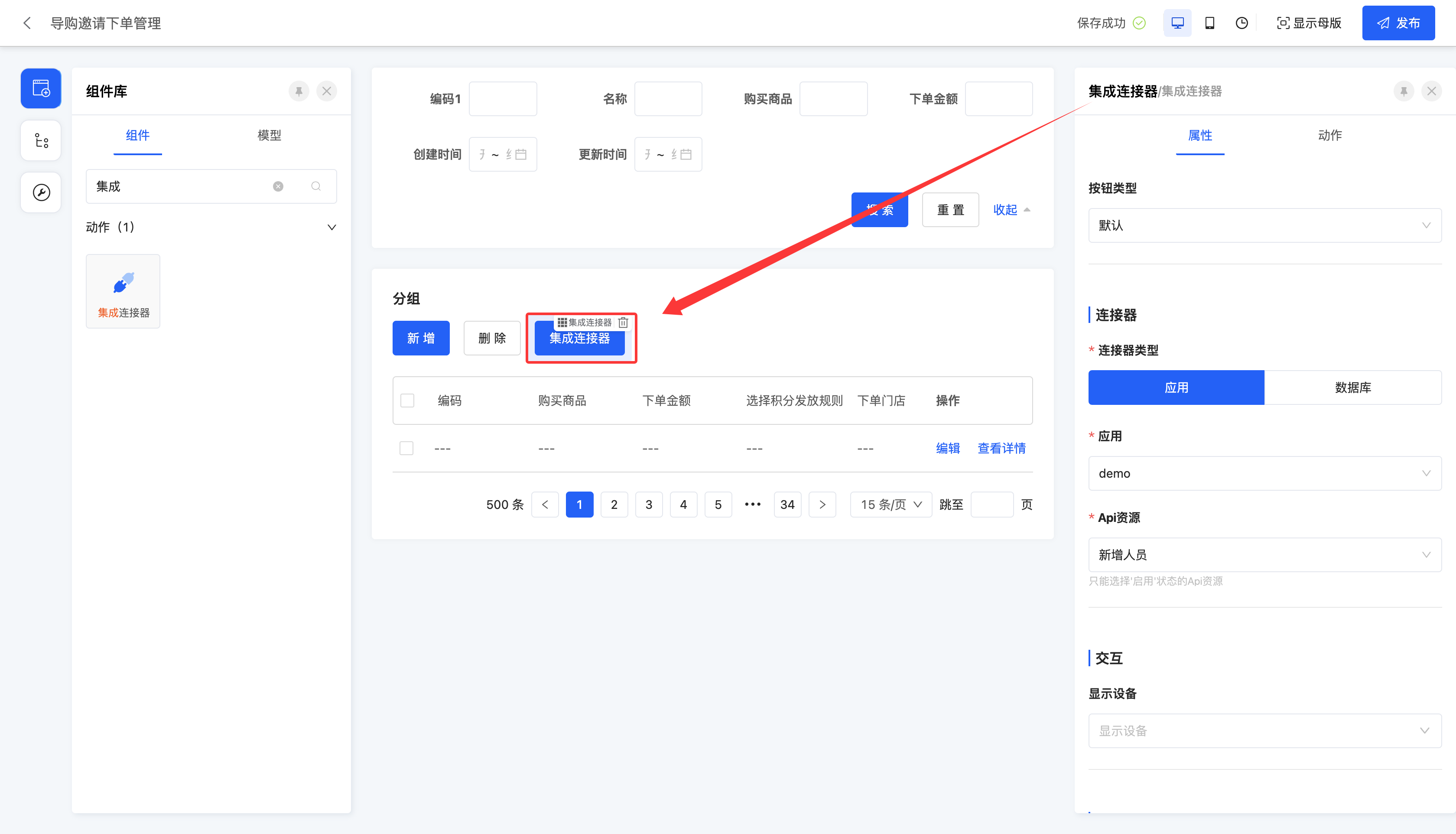
(Ⅷ) Integration Connector
Supports manually initiating an integration connection to other applications or databases.
Note
The integration connector action will only be displayed in the component library after the "Integration Interface" application is dependent on under the application to which the page belongs.
Example
Design Example:
In this example, the connector is selected: after triggering the integration connection, the interface will be executed (the interface log can be viewed in "Integration Designer" - "Interface Log").
Display Page:
Specific attributes of the integration connector:
- Execution Function: The function called when performing the action.
- Connector Type: You can select the type of the connector, including application or database.
- Application/Database: You can select from existing applications or databases in the integration designer.
- Api Resource: Displays the API resources included in the selected application or database.
- Validate Data: After enabling this option, data will be validated before the action is executed.
- Return to Previous Page: After enabling this option, it will directly return to the previous page after the action is executed.
- Refresh Main View: After enabling this option, the main view will be refreshed after the action is executed.
- Refresh Current View: After enabling this option, the current view will be refreshed after the action is executed.
- Submit Data: If this option is enabled, parameter mapping can be configured. That is, when the data has different names in different locations but actually refers to the same data, it can be achieved by configuring parameter mapping.
- Context: When the data has different names in different locations but actually refers to the same data, data mapping can be achieved by configuring the context.
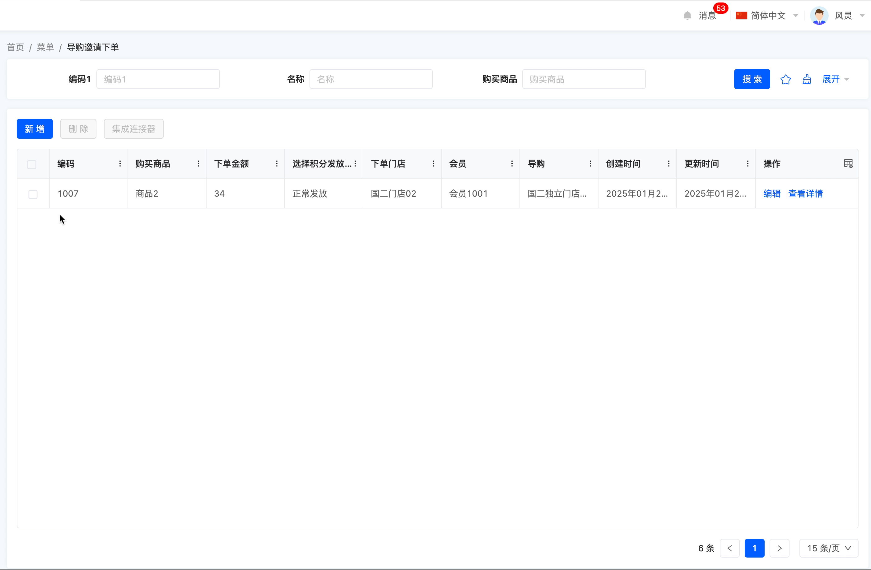
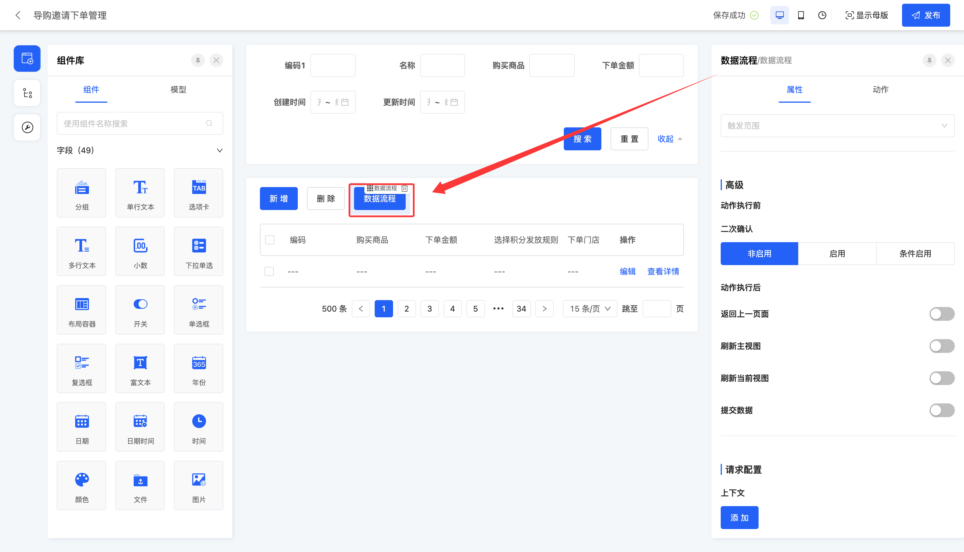
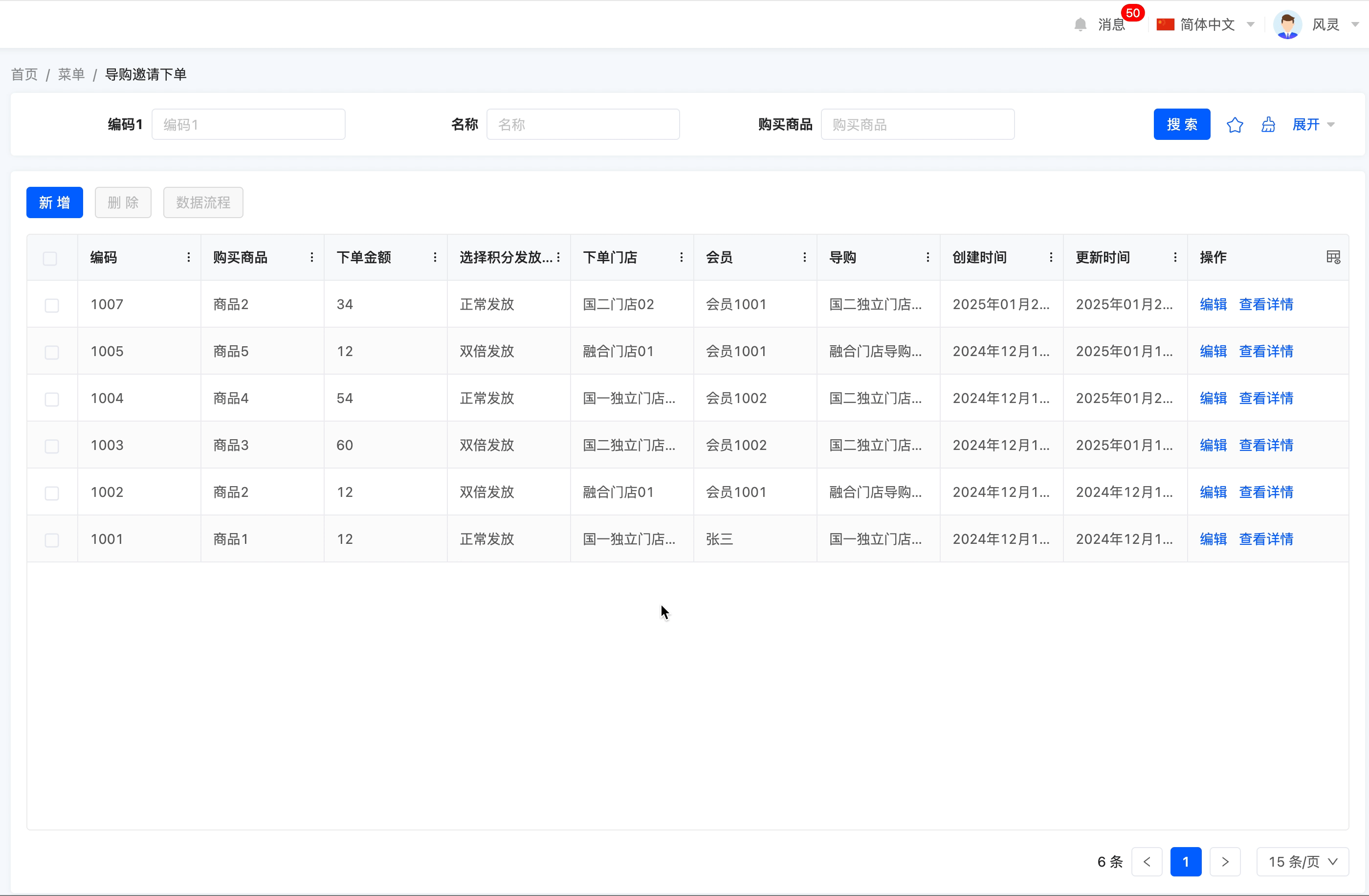
(Ⅸ) Data Flow
Supports manually triggering the data flow.
Note
The data flow action will only be displayed in the component library after the "Integration Interface" application is dependent on under the application to which the page belongs.
Example
Design Example:
In this example, the data flow is selected: after triggering the process, an in-app message will be sent with the content "The process has been executed."
Display Page:
Specific attributes of the data flow:
- Execution Function: The function called when performing the action.
- Data Flow: You can select the data flow that needs to be triggered by the model included in the model to which the current page belongs.
- Validate Data: After enabling this option, data will be validated before the action is executed.
- Return to Previous Page: After enabling this option, it will directly return to the previous page after the action is executed.
- Refresh Main View: After enabling this option, the main view will be refreshed after the action is executed.
- Refresh Current View: After enabling this option, the current view will be refreshed after the action is executed.
- Submit Data: If this option is enabled, parameter mapping can be configured. That is, when the data has different names in different locations but actually refers to the same data, it can be achieved by configuring parameter mapping.
- Context: When the data has different names in different locations but actually refers to the same data, data mapping can be achieved by configuring the context.
Prompt
The actions in the model are shortcut operation methods for the above actions. Their specific attributes can be directly referred to the attributes of the above actions for viewing.
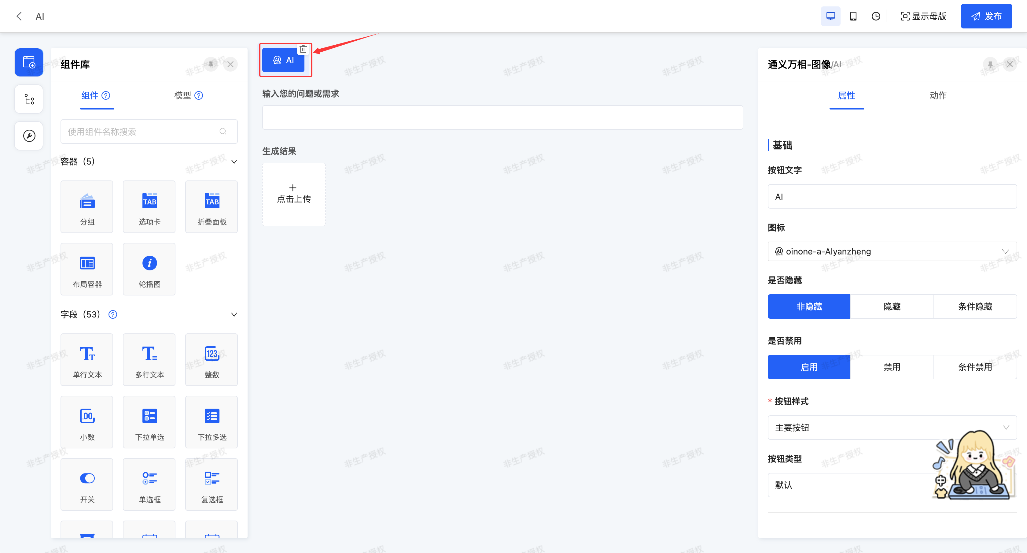
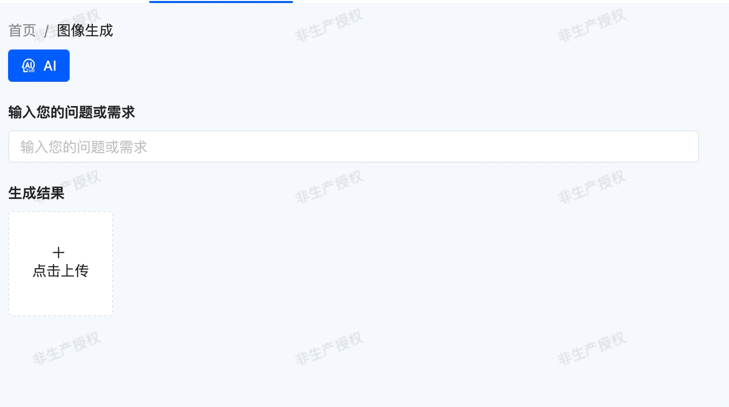
(Ⅹ) AI
Supports binding and associating the configured AI connector with various fields on the current page, and quickly building customized AI product solutions through data mapping.
Note
The AI action will only be displayed in the component library after the "AI" application is dependent on under the application to which the page belongs.
Example
Design Example:
Generate corresponding pictures based on the text entered by the user.
Display Page:
Specific attributes of AI:
- AI Connector: You can select a successfully published AI connector, and the system will complete data interaction according to the fields configured in the selected connector and the order of the large model.
- Body Parameter Mapping: Refers to establishing a relationship between the fields on the current page and the input fields of the AI connector.
- Response Parameter Mapping: Refers to establishing a relationship between the fields on the current page and the output fields of the AI connector.
- Return to Previous Page: After enabling this option, it will directly return to the previous page after the action is executed.
- Refresh Main View: After enabling this option, the main view will be refreshed after the action is executed.
- Refresh Current View: After enabling this option, the current view will be refreshed after the action is executed.
- Submit Data: If this option is enabled, parameter mapping can be configured. That is, when the data has different names in different locations but actually refers to the same data, it can be achieved by configuring parameter mapping.
- Context: When the data has different names in different locations but actually refers to the same data, data mapping can be achieved by configuring the context.