I. General Attributes
- Create properties: that is, configure the bound fields for the desired component. You can:
- New field: Set the business type, display name, encoding length and other parameters of the field.
Note
This creates a new field in the model for the current page, which is the same as creating the field in the model Designer.
- Select an existing field: If the field already exists in the model, it can be selected directly. This operation will not repeat the creation of new fields.
- Title: The display name of the component on the current page.
- Hide Title: When this option is enabled, the title of the component will be hidden.
- Width: The size of the component in the current row.
- Display Device: Includes PC, Mobile, and PAD.
Example
When designing a PC page, if the display device of a component is set to Mobile only and does not include PC, then in the actual page display, this grouped component and other components it contains will not be shown on the PC page.
II. Specific Attributes
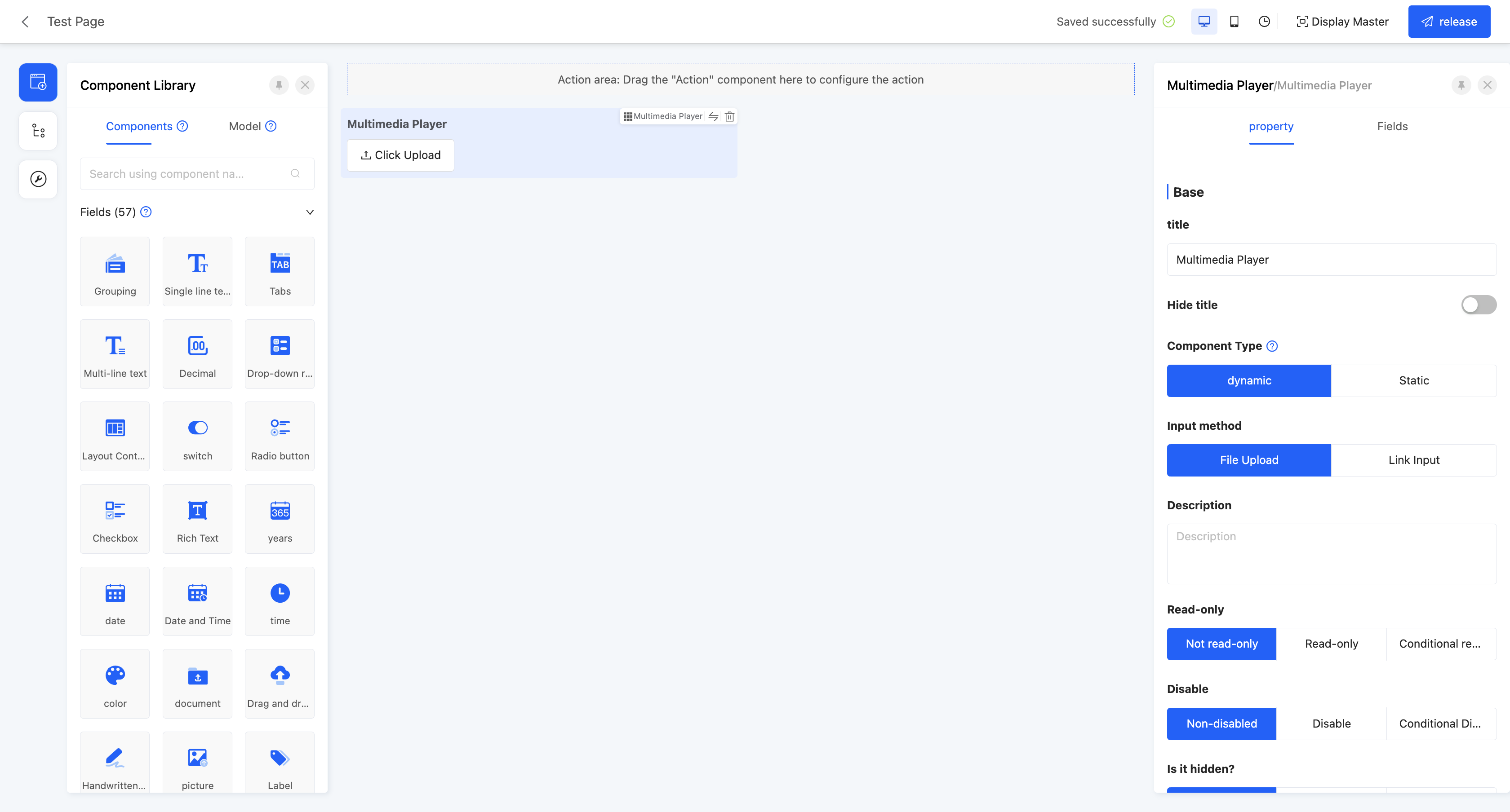
(Ⅰ) Multimedia Player
Supports embedding a multimedia player on the page, suitable for scenarios such as viewing pictures and videos.
Example
Design Example:
Display Page:

Specific attributes of the multimedia player:
- Component Type: Includes two types, dynamic and static. Dynamic components are in the input state in the form, while static components are in the read-only state in the form.
Note
- When the component type is dynamic, there are two input methods: file upload and link input.
- File Upload: Allows users to manually upload files. You can set the maximum upload file size and restrict the upload file types.
- Link Input: Allows users to manually enter links. You can set optional prefixes.
- When the component type is static, enter the multimedia link to display it on the actual page.
- Default Value: When the actual page is displayed, this field will show the set value by default. If the link is deleted or changed, the original default value will not be filled back.
- Calculation Formula: The calculated value involves variables. When the variables change, the calculated value changes synchronously.
Note
If both the default value and the calculation formula are set, the default value will be filled in first on the actual page, and the subsequent value will change according to the calculation function.
Hint
For the filling of custom expressions in the calculation formula, you can refer to the "Custom Expressions" document.
- Placeholder Hint: When the input box has no content, it shows light-colored prompt text to guide users to input, but it does not affect the actual input value.
- Description: Provides a description of the component, often used to explain the component's function, precautions, etc. It is displayed below the component.
- Read-only: When set to read-only, the component is visible but not editable on the actual page. If set to conditional read-only, it will be read-only when the conditions are met.
- Disabled: When set to disabled, the component is visible but not editable on the actual page. If set to conditional disabled, it will be disabled when the conditions are met.
- Hidden: When set to hidden, the component is neither visible nor editable on the actual page. If set to conditional hidden, it will be hidden when the conditions are met. On the design page, hidden components are still displayed.
- Required: Controls whether the component is required on the current page. If set to required, an asterisk (*) will be shown before the title. If set to conditional required, it will be required when the conditions are met.
- Data Validation: Supports custom validation rules to check whether the input data meets the set requirements.
Hint
For the filling of custom expressions in data validation, you can refer to the "Custom Expressions" document.
- Validation Failed Prompt: When the input data fails the validation, corresponding prompt information will be displayed.
- Submit Data: When this option is enabled, if the current content changes, the data scope covered by the submission method will change according to the submission function.
- Clear Data: When this option is enabled, if the current content changes, the selected field scope will be cleared.
- Title Arrangement: The arrangement of the title and its content, divided into horizontal and vertical.
- Maximum Upload File Size: Limits the size of a single uploaded file.
- Restrict Upload File Types: Limits the upload file formats, supporting pictures and videos.
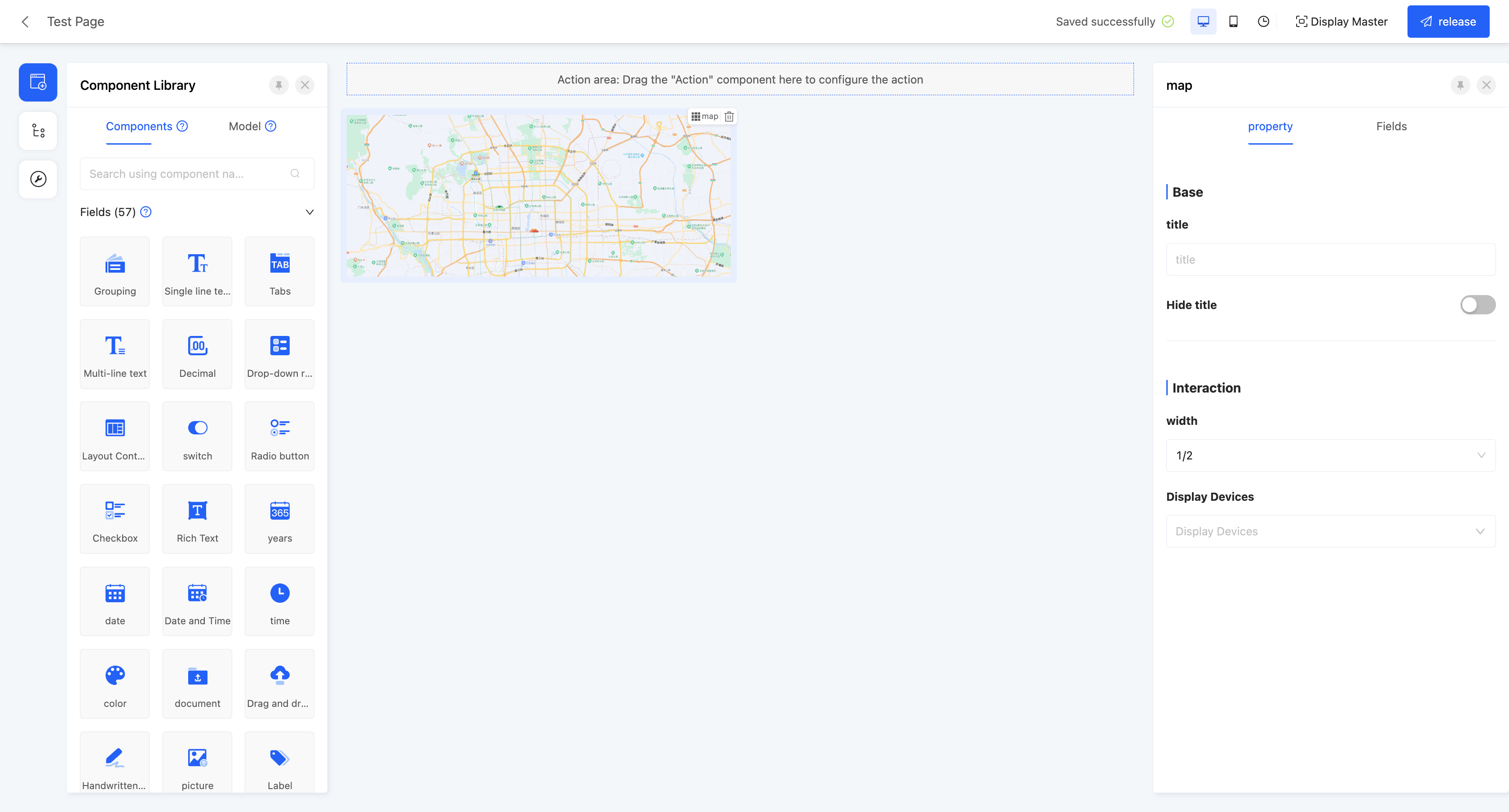
(Ⅱ) Map
Supports embedding a map on the page, suitable for scenarios such as displaying geographical locations and location positioning.
Example
Design Example:
Display Page:

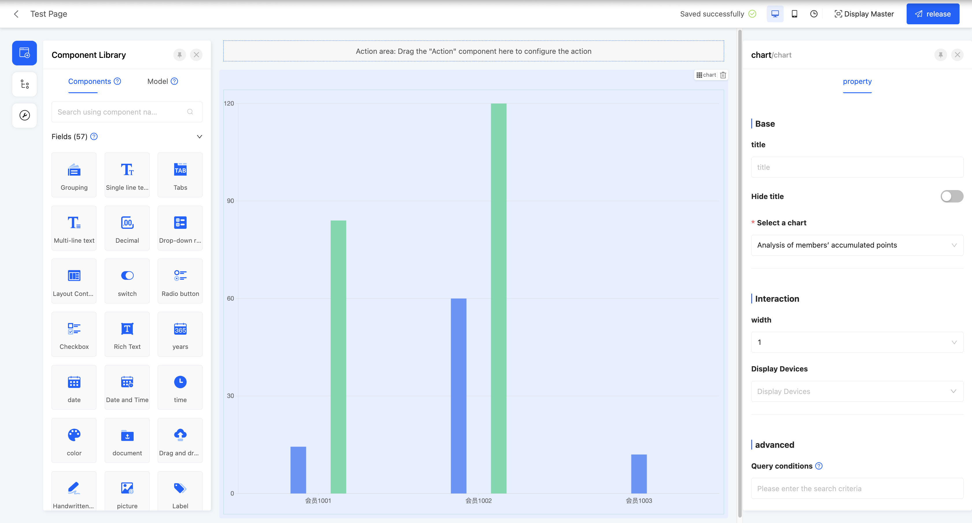
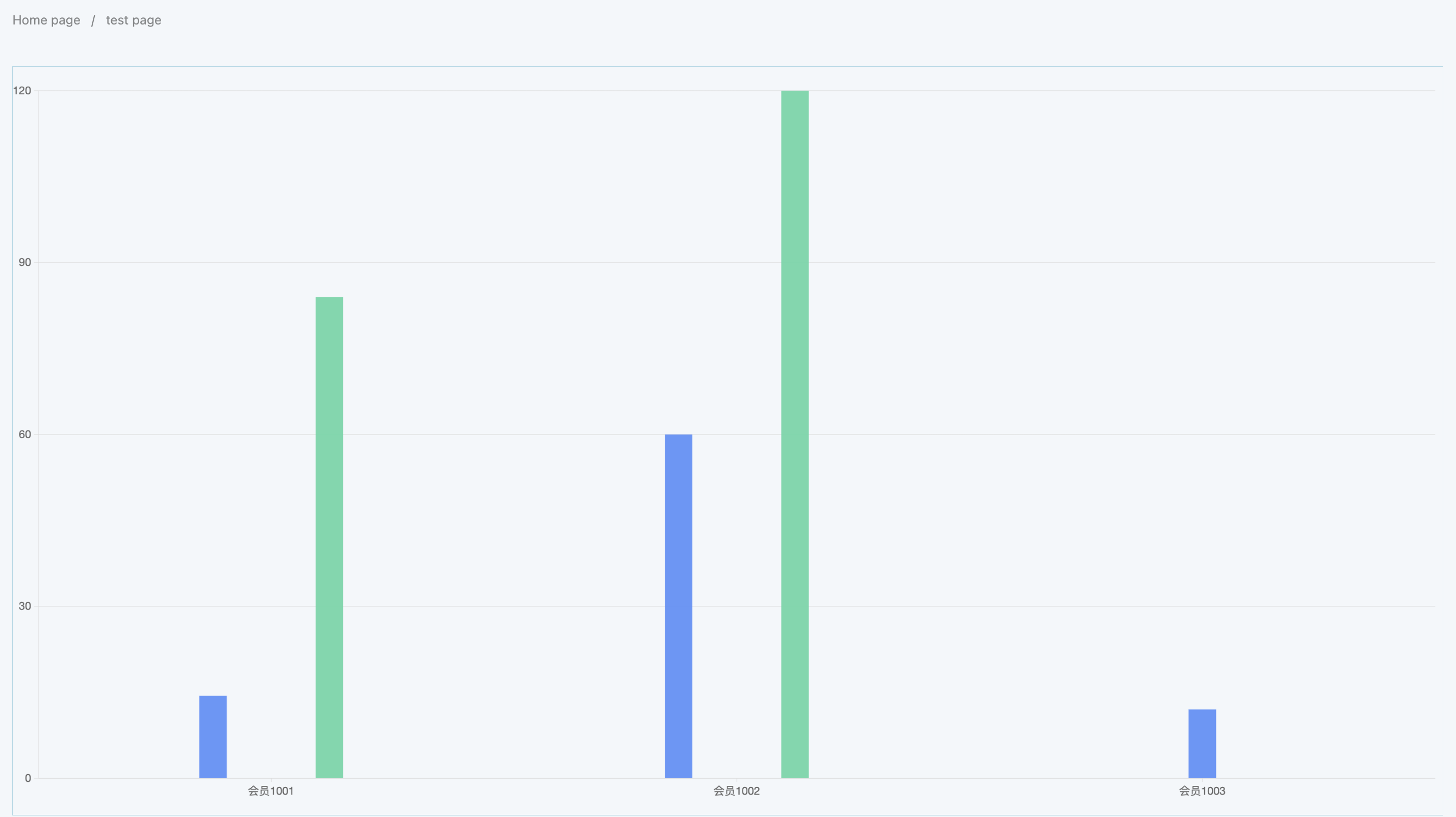
(Ⅲ) Chart
Supports displaying a designed chart on the page.
Example
Design Example:
Display Page:
Specific attributes of the chart:
- Select Chart: You can select a published chart in the data visualization.
- Query Conditions: On the actual page display, data will be shown according to the configured query conditions.
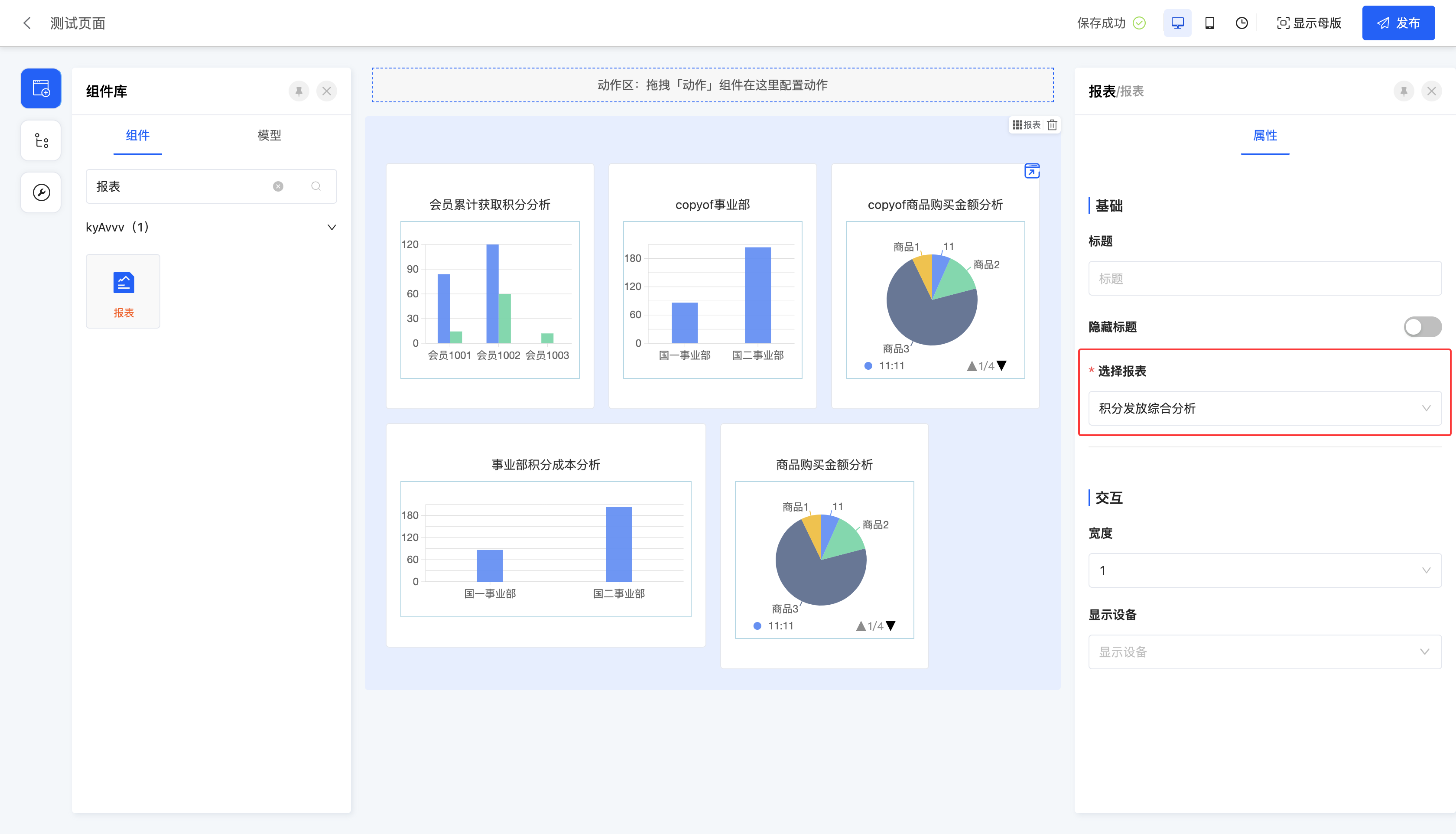
(Ⅳ) Report
Supports displaying a designed report on the page.
Example
Design Example:
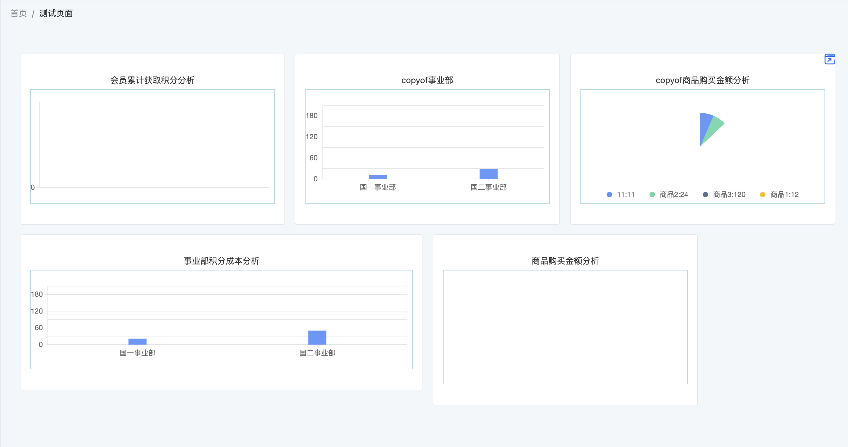
Display Page:
Specific attributes of the report:
- Select Report: You can select a published report in the data visualization.
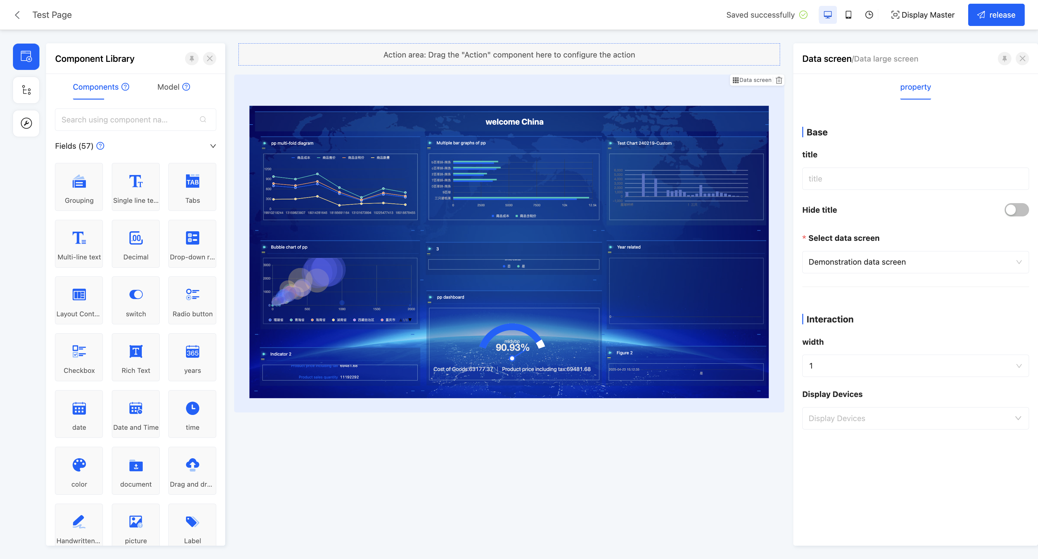
(Ⅴ) Data Dashboard
Supports displaying a designed data dashboard on the page.
Example
Design Example:
Display Page:

Specific attributes of the data dashboard:
- Select Data Dashboard: You can select a published data dashboard in the data visualization.