When designing pages, the component library consists of two parts: components and models. Components include system components and custom components. System components are mainly divided into four categories: layout, fields, media, and actions. Models include all fields under the page's model and system default actions.
I. Components
(Ⅰ) Layout
Layout components are mainly used for page styling and typesetting. They act as containers that can hold multiple other components. Meanwhile, layout components support nesting with each other, allowing users to build page structures and layouts more flexibly.
- Group: Components with similar business meanings can be grouped into the same category to achieve categorized management and clear display of page components.
- Layout Container: Similar to a table structure, users can flexibly add or delete rows or columns, and perform personalized settings on a specific container.
- Tab: Multiple tab pages can be added to each tab, and users can configure different components for each tab page to meet diversified display needs.
- Collapsible Panel: Various components can be configured in the panel, and users can expand or collapse the panel as needed to optimize page layout and user experience.
(Ⅱ) Fields
Field components are the most commonly used in components and are the main component category supporting pages. Each field component corresponds to a model field.
Note
When configuring field components, if the field already exists in the model, bind the original field and display the component as the current component. If it does not exist, add a new field to the model and bind it to the current component.
- Single-line Text: A single-line text box suitable for recording short text contents such as names and codes.
- Multi-line Text: A multi-line text box suitable for recording longer text contents such as opinions and remarks.
- Rich Text: A WYSIWYG text editor embedded in the browser, similar to Word in functionality. It is suitable for editing long explanatory texts, supporting operations such as changing font styles and inserting pictures.
- Integer: Only integers are allowed, suitable for inputting integer-type data such as days and quantities.
- Decimal: Only decimals are allowed, suitable for inputting decimal-type data such as amounts and temperatures.
- Dropdown Single Selection: Allows dropping down to select one data value from multiple options. Options can be associated with model data, data dictionaries, or boolean data, suitable for single-selection scenarios.
- Dropdown Multiple Selection: Allows dropping down to select multiple data values from multiple options. Options can be associated with model data, data dictionaries, or boolean data, suitable for multiple-selection scenarios.
- Radio Button: Only one value can be selected from directly displayed options, suitable for single-option scenarios such as gender selection.
- Checkbox: Multiple values can be selected from directly displayed options, suitable for multiple-option scenarios such as course selection.
- Switch: Commonly used for choosing between two opposite options like yes/no.
- Year: Provides a year selector function, suitable for scenarios requiring specifying a year such as birth year.
- Date: Provides a year-month-day selector, suitable for fields requiring precision to the date, such as employment date and birth date.
- Date and Time: Provides a comprehensive selector for year-month-day and hour-minute-second, suitable for fields requiring precision to the specific time, such as order time and delivery time.
- Time: Provides an hour-minute-second selector, suitable for fields only involving time without date, such as submission time and work time.
- Color Picker: Provides a custom color function, suitable for scenarios such as setting label colors and selecting colors for theme customization.
- File Upload: Supports uploading multiple formats of files, including documents, pictures, videos, etc., suitable for uploading attachments.
- Image Upload: Supports uploading image files, suitable for scenarios such as uploading schematics, photos, and avatars.
- Tag: Allows inputting and saving multiple values, suitable for saving tags marking users.
- Cascader Selection: Filters and locates required data through逐级 selection (cascading selection), suitable for scenarios such as region selection and classification filtering.
- Tree Selection: Filters and locates required data through逐级 selection (tree selection), suitable for scenarios such as region selection and classification filtering.
Example
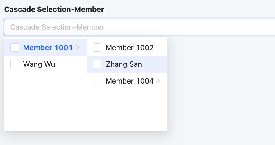
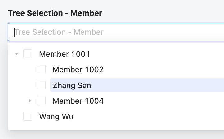
Cascader Selection and Tree Selection actually have the same function for business scenarios but have different interaction experiences.
- Cascader Selection: When selecting an option in the selection box, the component dynamically expands the sub-options of that option to its right.
- Tree Selection: When selecting an option in the selection box, the component dynamically expands the sub-options of that option below it.
- Key-Value Pair: Displays structured information in a clear and intuitive way, very suitable for scenarios such as product detail display and user configuration option settings.
- Range: Supports specifying a range for time, facilitating flexible application in scenarios such as time interval prompts.
- Mobile Phone: Specifically used for storing or displaying mobile phone number-type data, strictly limited to an 11-digit integer format.
- Currency: Used for storing or displaying amount-type data, allowing input of integers or decimals, with the number of decimal places needing to be accurate to within two.
- Email: Used for storing or displaying data conforming to the email format (xx@xx.xx), facilitating users' information exchange and management.
- Other Table Field: A special field that can extract corresponding fields from related relationship fields and tile them in the current model. Suitable for引用 (referencing) data information in related tables when generating complex reports.
- Paragraph: Allows displaying a complete paragraph of text content on the page, suitable for scenarios such as detailed product explanations, descriptions, or elaborations.
- Embed Web Page: Supports embedding specified web pages in the page, enabling users to directly access and browse other web page contents in the design page.
- Hyperlink: Supports displaying hyperlinks on the page. Users can easily jump to the corresponding page by clicking the hyperlink, achieving convenient navigation between pages.
- Shuttle Box: A shuttle box is a left-right divided selection box, with the left side displaying selectable fields and the right side displaying selected fields. Fields can be selected or deselected through the shuttle box, suitable for scenarios such as selecting display fields.
- Address: Provides an address selector function, suitable for scenarios such as selecting a home address.
- Company: Provides a shortcut to directly select a company recorded in the system.
- Department: Provides a shortcut to directly select a department recorded in the system.
- Employee: Provides a shortcut to directly select an employee recorded in the system.
- Form: Supports embedding forms in the page, suitable for designing complex pages to meet diversified page needs.
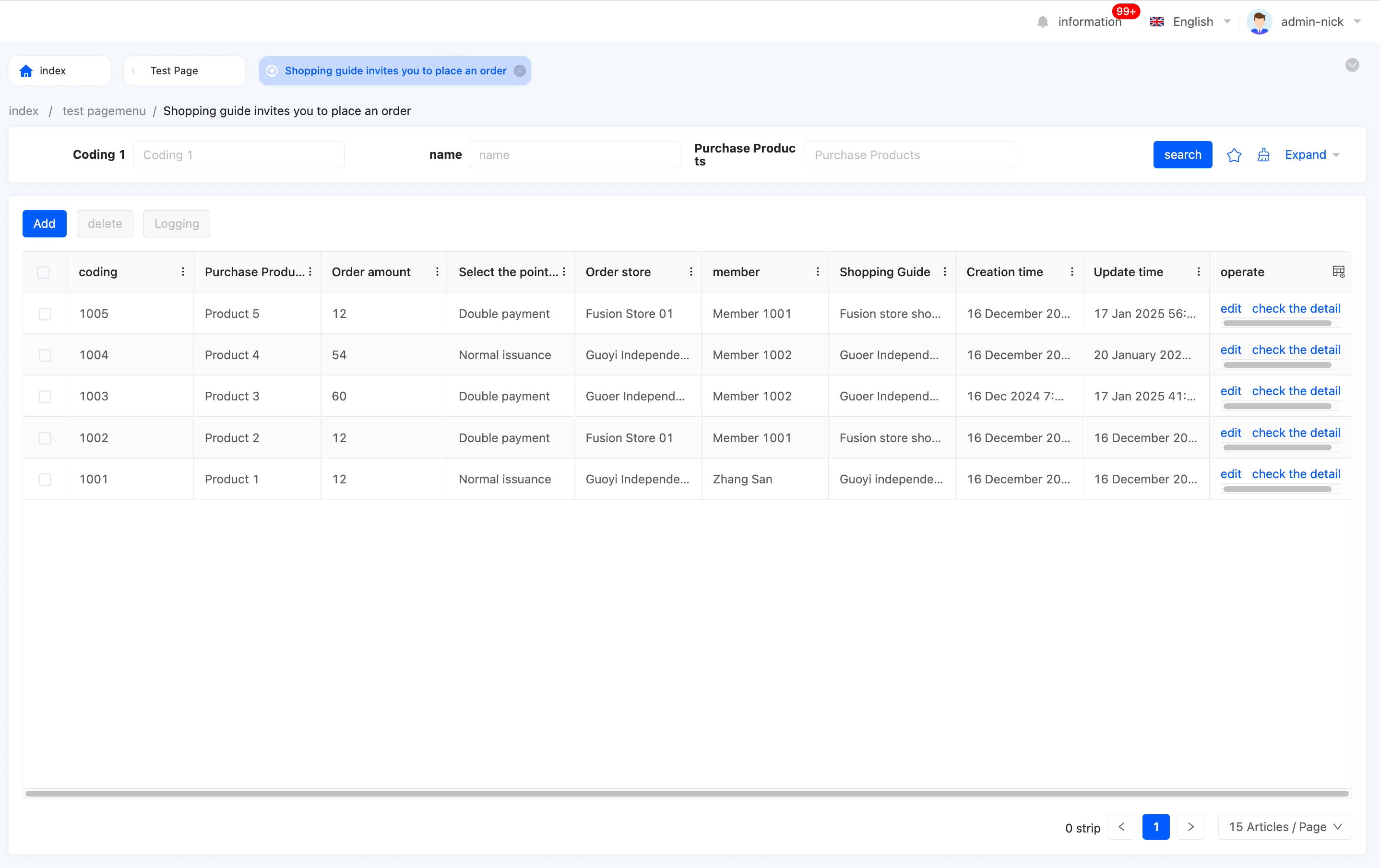
- Table: Supports embedding tables in the page, suitable for scenarios such as displaying lists or data.
- File Download: Supports packaging data into a file for download, suitable for batch obtaining data for subsequent analysis.
- Drag and Drop Upload: Used to complete upload by dragging files into a specified area, also supporting click upload.
- Handwriting Signature: Supports implementing handwriting signatures on web pages, suitable for online contract signing, electronic form signing, etc.
(Ⅲ) Media
- Multimedia Player: Supports embedding multimedia players in the page, suitable for scenarios such as viewing pictures and videos.
- Map: Supports embedding maps in the page, suitable for scenarios such as displaying geographical locations and place positioning.
- Chart: Supports displaying designed charts on the page.
- Report: Supports displaying designed reports on the page.
- Data Dashboard: Supports displaying designed data dashboards on the page.
Note
Charts, reports, and data dashboards need to be designed in the 'Data Visualization' designer provided by the platform and published before they can be used.
(Ⅳ) Actions
- Submission Action: Configure different server functions to perform different operations, suitable for various scenarios such as query, delete, and create.
- Navigation Action: Supports navigating to a certain page, suitable for scenarios such as page navigation and submission confirmation.
- Link Action: Supports linking to other web pages, suitable for scenarios such as quickly navigating to related pages.
Note
The difference between Navigation Action and Link Action:
- Pages jumped by the Navigation Action are all pages designed by the Page Designer, supporting multiple opening methods, including opening in the current window, opening in a new window, opening in a pop-up, and opening in a drawer.
- Pages jumped by the Link Action are pages outside the platform, only supporting opening in a new window.
- Client Action: Perform different operations based on different client behaviors, suitable for scenarios such as return, refresh, and data update.
- Batch Action: A shortcut for the Navigation Action to process multiple pieces of data, enabling batch modification of data in the selected dataset.
- Workflow: Supports manually triggering a workflow.
Note
The selected workflow trigger condition must be model-triggered, and the model must have been published and successfully enabled.
- Micro Flow: Supports manually triggering a micro flow.
- Integration Connector: Supports manually initiating connection requests to other applications or databases.
- Data Flow: Supports manually triggering a data flow.
- AI: Supports binding and associating configured AI connectors with various fields on the current page, and quickly building customized AI product solutions through data mapping.
Note
The five actions of Workflow, Micro Flow, Integration Connector, Data Flow, and AI will only be displayed on the page if the application where the page is located has depended on the corresponding application or module.
II. Models
The model here is the model selected when creating a page. Model components are the visual representation and operation entry of model data on the page.
Note
- When using components provided by the platform, the system will automatically bind the component to the corresponding field in the model.
- If the field does not exist in the model, the system will generate the corresponding field in the model and display it in the model component.
(Ⅰ) Fields
According to the model bound to the page, No-Code Fields and Low-Code Fields can be flexibly used to configure the page.
- No-Code Fields: Fields under the model generated by the No-Code Designer.
- Low-Code Fields: Fields under the model written by code or automatically generated by the system.
(Ⅱ) Actions
The model includes some system default actions, which are basic operations on model data and can be used without additional configuration.
Note
Server Actions defined in code form will also be displayed in the actions of the model.
System default actions:
- Business Process: A shortcut for the Navigation Action, which can navigate to the business process drawer and requires selecting only one piece of data.
Example
- Import: A shortcut for the Navigation Action, which can navigate to the import pop-up window, download the corresponding template, fill it in, and import it.
Example
- Export: A shortcut for the Navigation Action, which can navigate to the export pop-up window and export data after selecting an export template.
Example
Export according to the template: 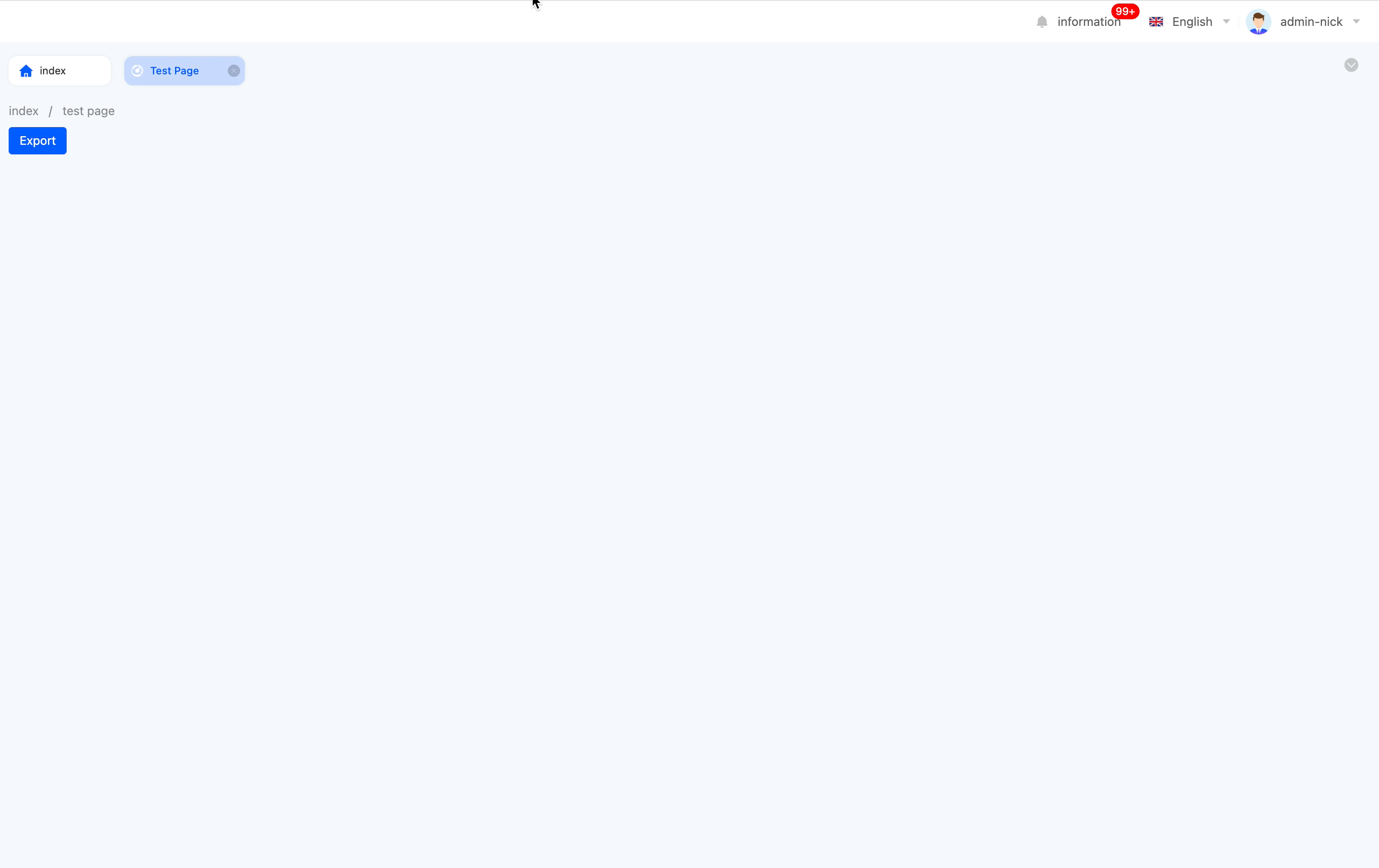 Export by selecting fields according to the model:
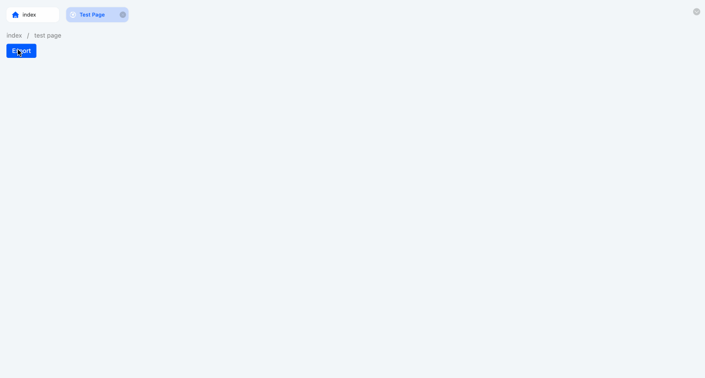
- Log Record: A shortcut for the Navigation Action, which can navigate to the log record page to view log information and requires selecting only one piece of data.
Note
This action can only take effect after defining an audit rule for the page model in business auditing.
Example
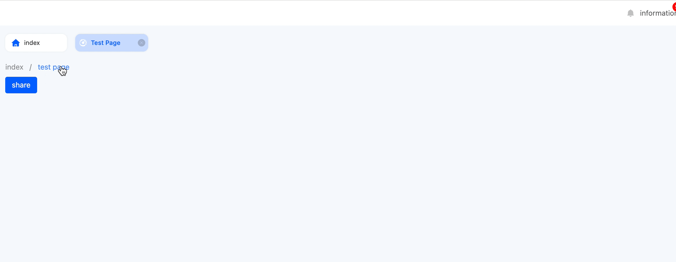
- Share: A shortcut for the Navigation Action, which can navigate to the share pop-up window and provide a share link.
Example
- Create: A shortcut for the Submission Action, which can create a single piece of data.
- Delete: A shortcut for the Submission Action, which can delete a single or multiple pieces of data.
- Update: A shortcut for the Submission Action, which can update a single piece of data.
Note
- The four actions of Business Process, Import, Export, and Log Record will only be displayed on the page if the application where the page is located has depended on the corresponding application or module.