Oinone provides users with a comprehensive set of tools to help them create, edit, and optimize the application interface. With this feature, users can easily set the page layout, style, interactive effects, etc., to achieve a beautiful, intuitive, and user-friendly interface. This platform includes a rich component library, and users can select appropriate components according to their needs to build pages.
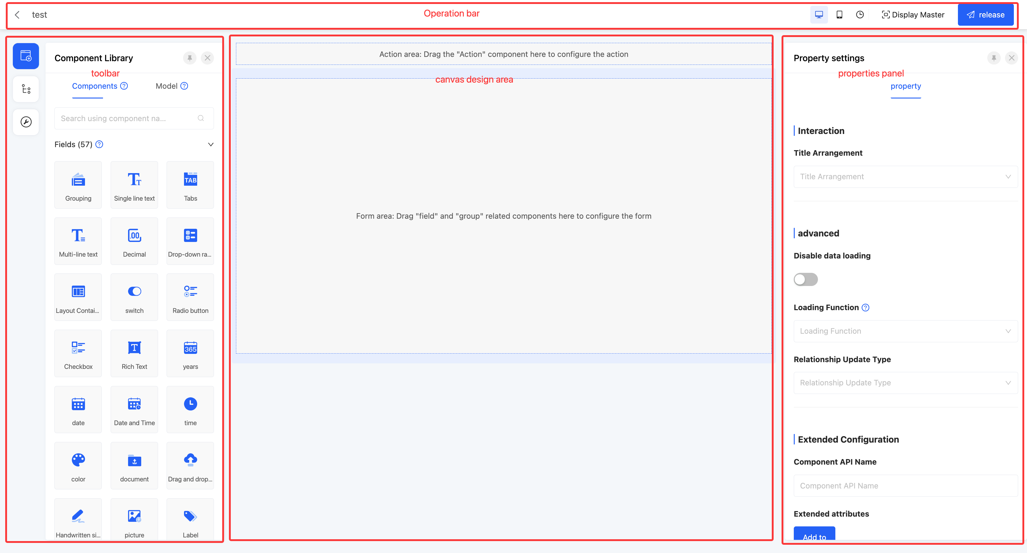
This interface is mainly divided into four functional areas: the operation bar, the toolbar, the canvas design area, and the property panel.
Tip
This section takes the form as an example. For details of other view types, please refer to the view type documentation.
Ⅰ. Operation Bar
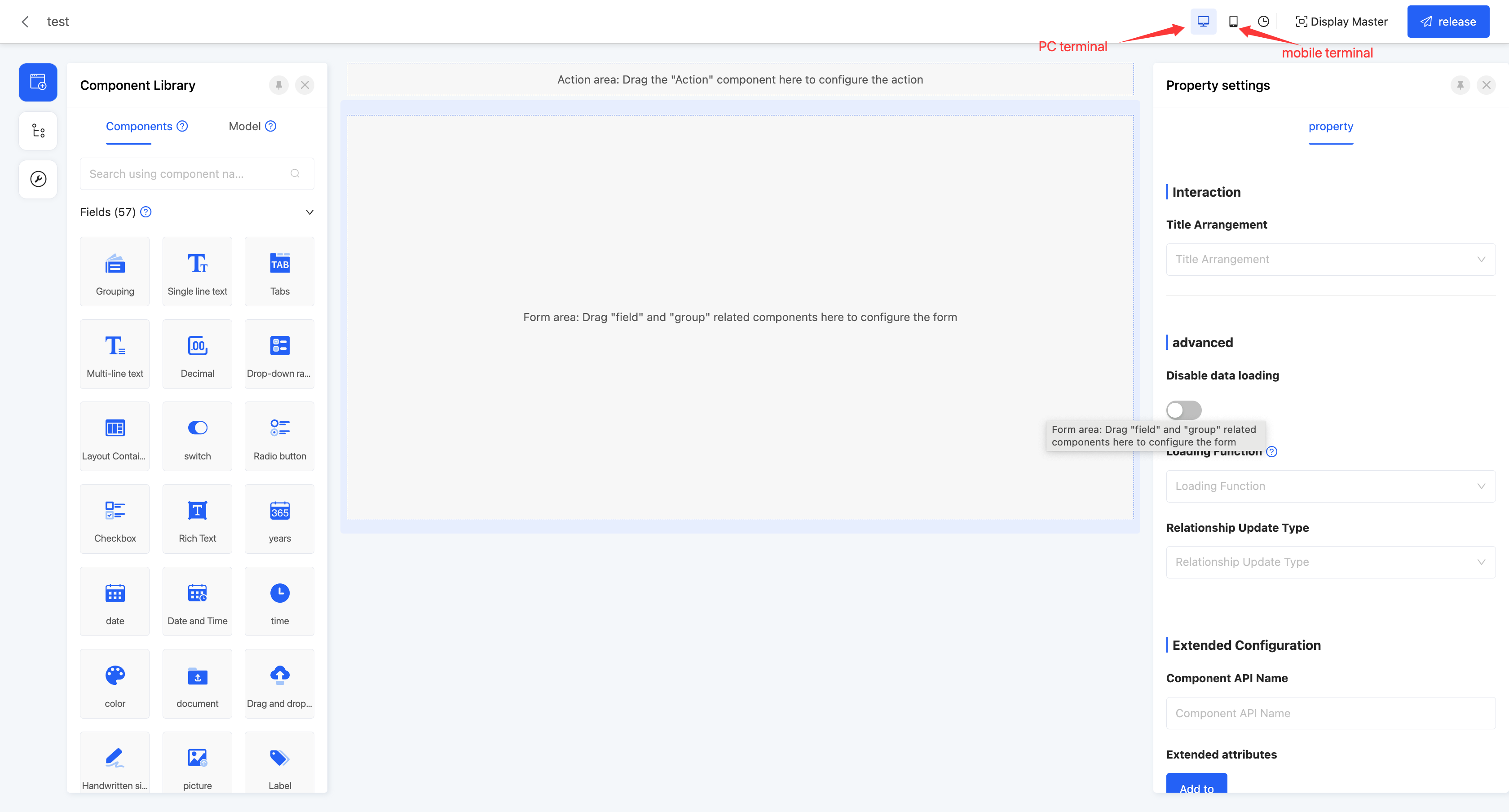
(Ⅰ) Switch Page Size
1. Function Introduction
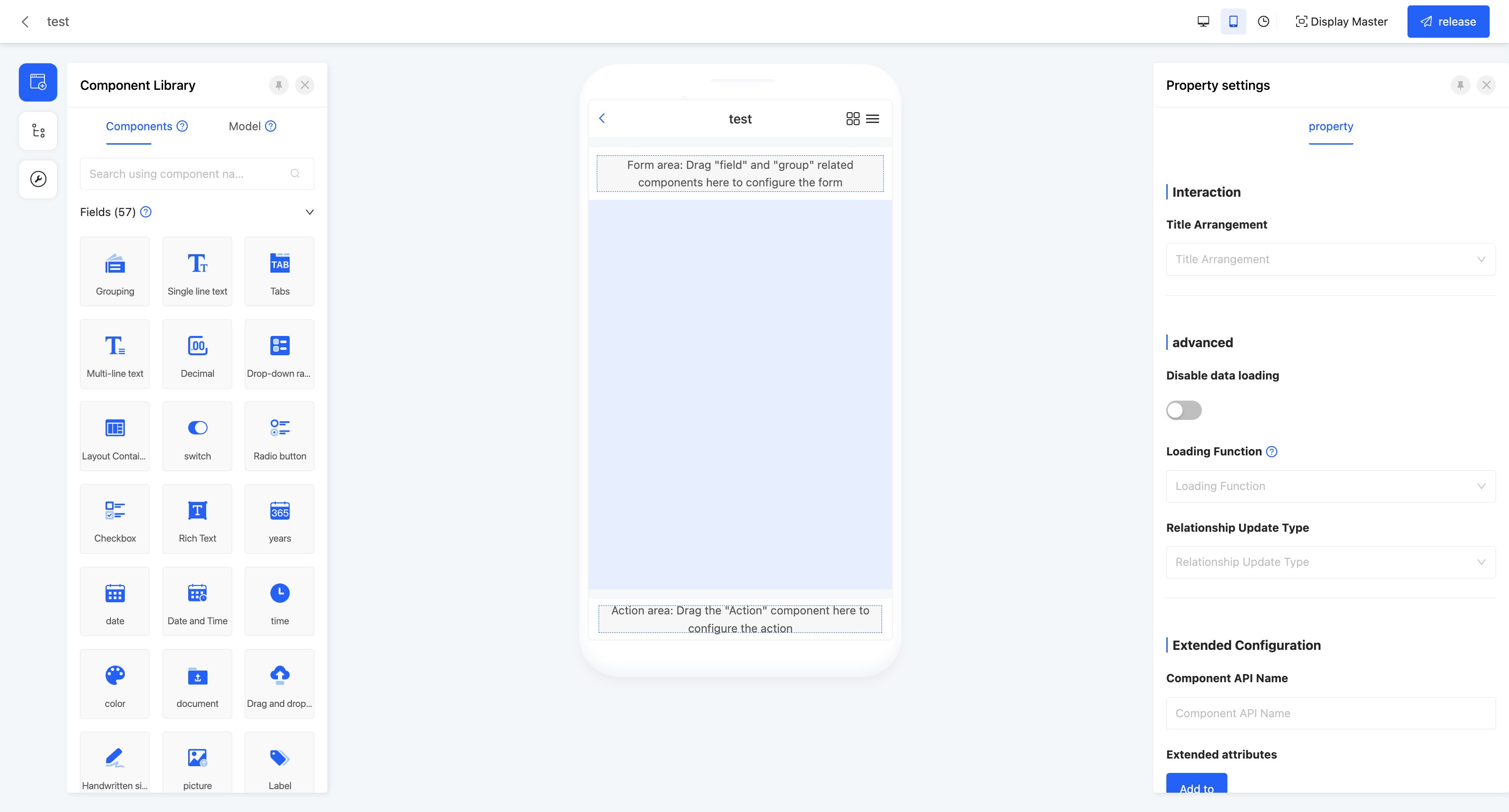
Users can flexibly switch the page to be designed and laid out for the PC or mobile device according to different business application scenarios. This function effectively avoids the problem of page layout confusion caused by device differences, thereby significantly improving the user experience. Regardless of the device used by the user, the page can present the best display effect.
2. Operation Method
In the top operation bar, click the "PC" icon or the "Mobile" icon to switch the canvas to the corresponding page.
(Ⅱ) View Historical Versions
1. Function Introduction
The function of viewing historical versions allows users to view the version records released at different time points in the past, which is particularly useful for scenarios where it is necessary to trace or compare page content. In addition, the function of viewing historical versions also provides users with data protection and security guarantees. In case of unexpected situations such as data loss, malicious tampering, or system failure, users can quickly retrieve important data or content by restoring a historical version.
Note
This function is only available for viewing previously published page versions. Although the page has an auto-save function, if a version is not published, it will not be saved in the historical records.
2. Operation Method
- In the top operation bar, click the "View Historical Versions" icon to enter the historical version record page.

- Select a historical version and click "Restore This Version" to restore to that historical version.

(Ⅲ) Show/Hide Master
1. Function Introduction
The master provides a set of standard page elements and layout templates, allowing users to quickly create pages with a consistent style based on the master. During page design, the master is not directly displayed by default, but users can manually set it as needed. When the master is selected to be displayed, users can preview the overall display effect of the page globally.
2. Operation Method
In the top operation bar, click the "Show/Hide Master" icon to show or hide the master.

(Ⅳ) Publish
1. Function Introduction
After the page design is completed, the page can take effect officially through the publish operation. If the publish operation is not performed, the page will also be saved automatically, but in this case, the auto-saved version only exists as a draft and will not be officially displayed or take effect externally.
Note
During the publishing process, if the component properties on the page do not meet the preset validation rules, such as a required property not being filled in or the input content failing the validation, the publish operation will fail. At the same time, the corresponding fields will be specially marked so that users can quickly locate and view the properties that need to be modified, ensuring that the page can be published and take effect smoothly.
2. Operation Method
In the top operation bar, click "Publish" to publish the current page.

Ⅱ. Toolbar
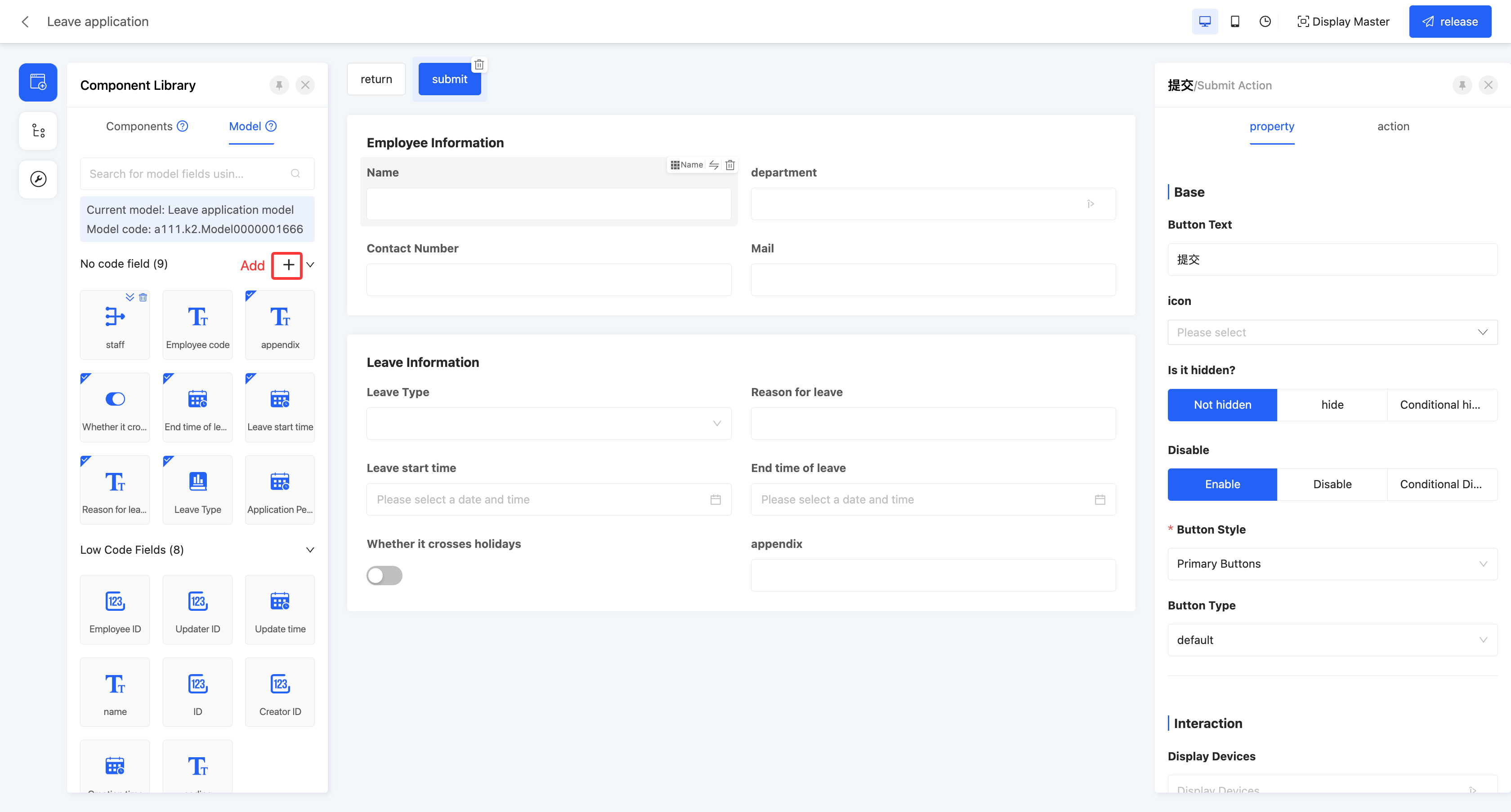
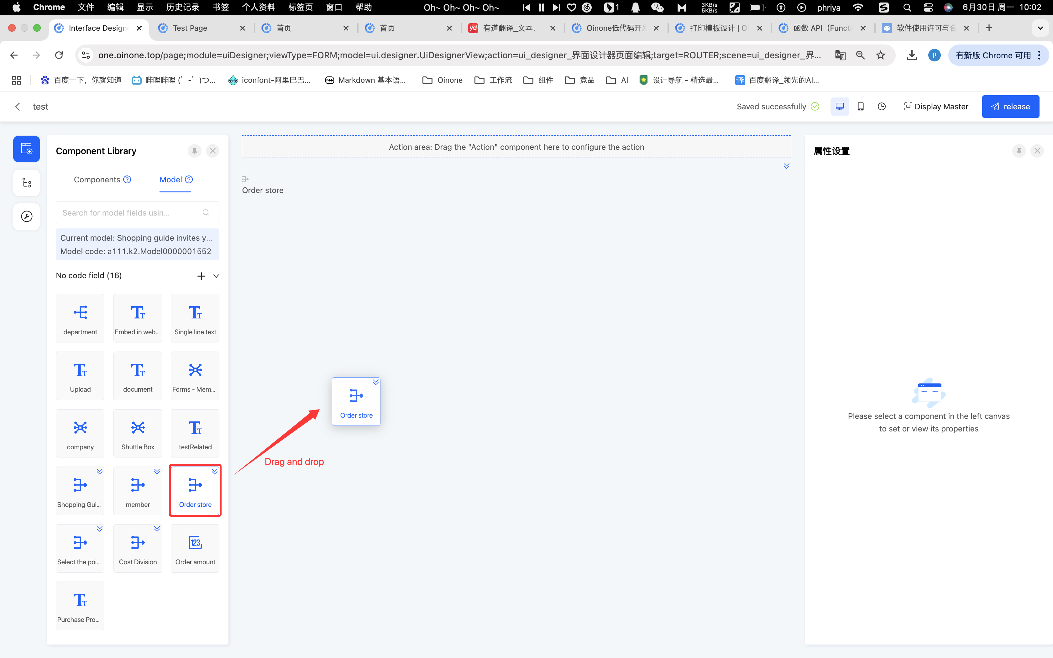
(Ⅰ) Component Library
1. Function Introduction
The component library includes two parts: components and models (for details, see the component introduction documentation):
- Components: All components supported by the current designer, including system components and custom components.
Note
Some components can only be used after depending on the corresponding application or module, such as data flow and integration connector components.
- Models: All fields under the model where the page is located and the system default actions.
Tip
In addition to the field components included in the current page model:
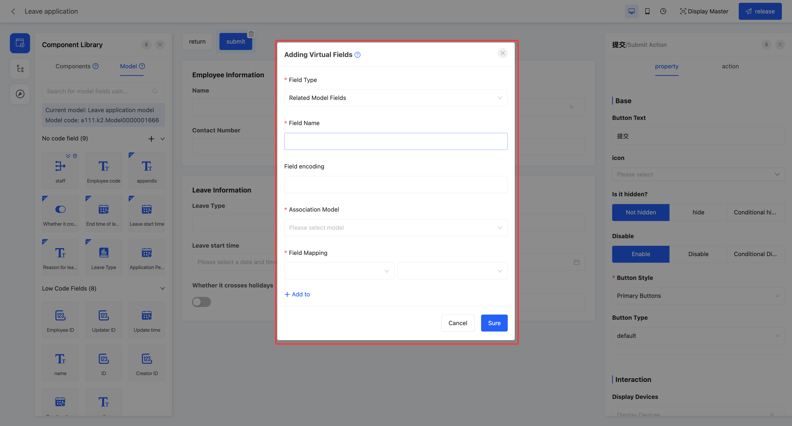
Virtual fields are supported (special fields that are not actually stored in the database but can play a role in business logic processing and interface interaction). For example, under the rule setting of the interface designer, each field component is only allowed to be used once on the same page. With the virtual field generation mechanism, users can create reusable components that are exactly the same as the original component, thereby achieving efficient reuse of components. In addition, in the table, virtual fields can also be set as search conditions, displayed, and applied on the page.
Addition
Field mapping: When the field type is selected as "Associated model field", field mapping needs to be configured, that is, the field mapping rules between the current page model and the associated model.
Deletion
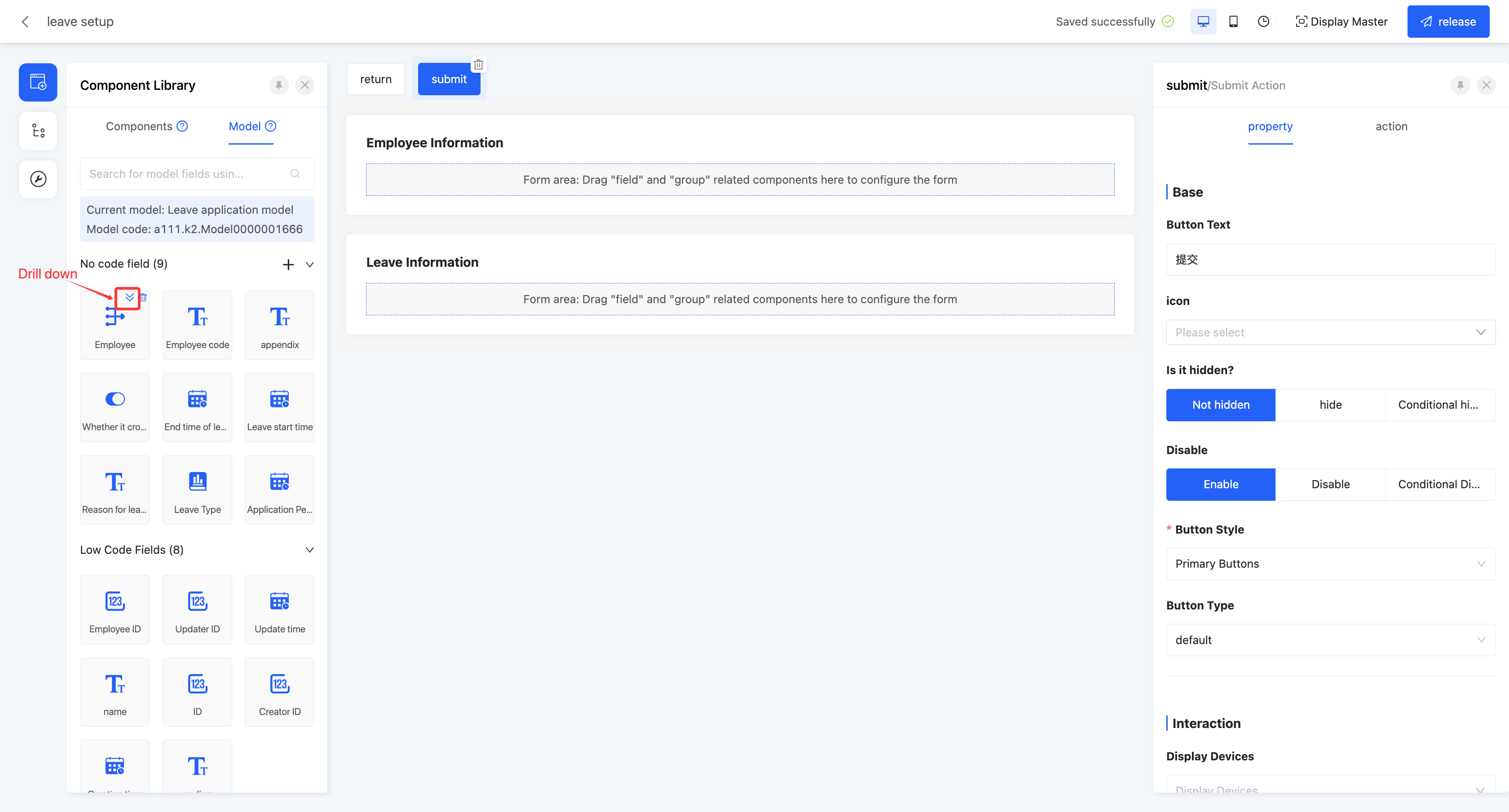
Drilling down on many-to-one fields is supported. Users are allowed to switch the model displayed in the current component library to the associated model of the many-to-one field through the drilling-down function. Users can directly drag the available fields in the associated model to the page design area.
Note
Differences between components and models:
Different dimensions of displayed content Components display component information, such as groups, tabs, single-line text, file uploads, etc.; models display all existing fields under the model.
Different usage functions Before using a component in the component library, a field needs to be created in the model. Of course, the created field will also exist in the model; fields in the model can be used directly, and a default component will be generated correspondingly on the design canvas when used.
Different usage scenarios If the target field already exists in the model, it should be directly dragged from the model; if the required field does not exist in the model, a component can be added to the page, which is actually adding a new field.
2. Operation Method
Drag the component to the corresponding area in the canvas design area.
Note
When configuring components on the page, action components and non-action components need to be placed in appropriate positions on the canvas respectively, and the required properties of the components need to be correctly configured. Otherwise, the components will not work properly and may cause errors.
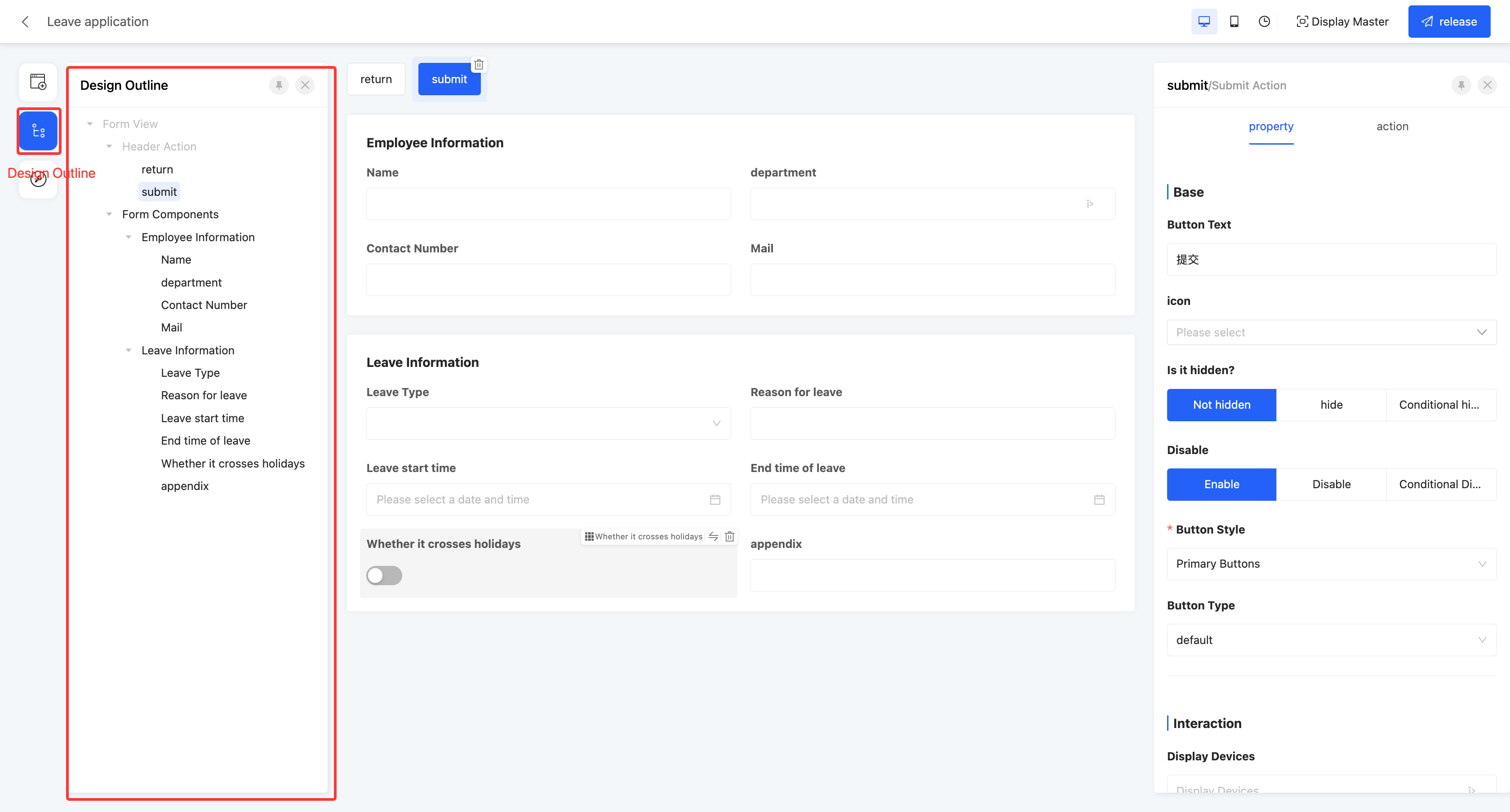
(Ⅱ) Design Outline
1. Function Introduction
Viewing the design outline is supported, and the hierarchical relationship between components is intuitively displayed using a list.
Tip
When a component on the page is selected, the relevant properties of the component will be immediately displayed in the property area on the right, facilitating users to view and edit. When the page design is complex and there are many components, users can use the design outline to quickly find the required component and then conveniently configure and adjust it.
2. Operation Method
In the left tool area, click the "Design Outline" icon to display the design outline list.
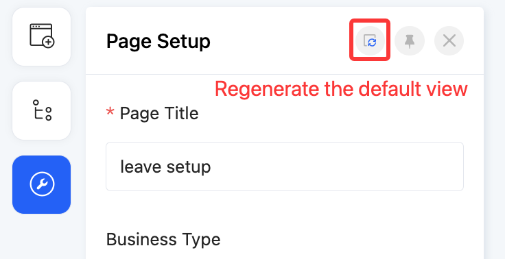
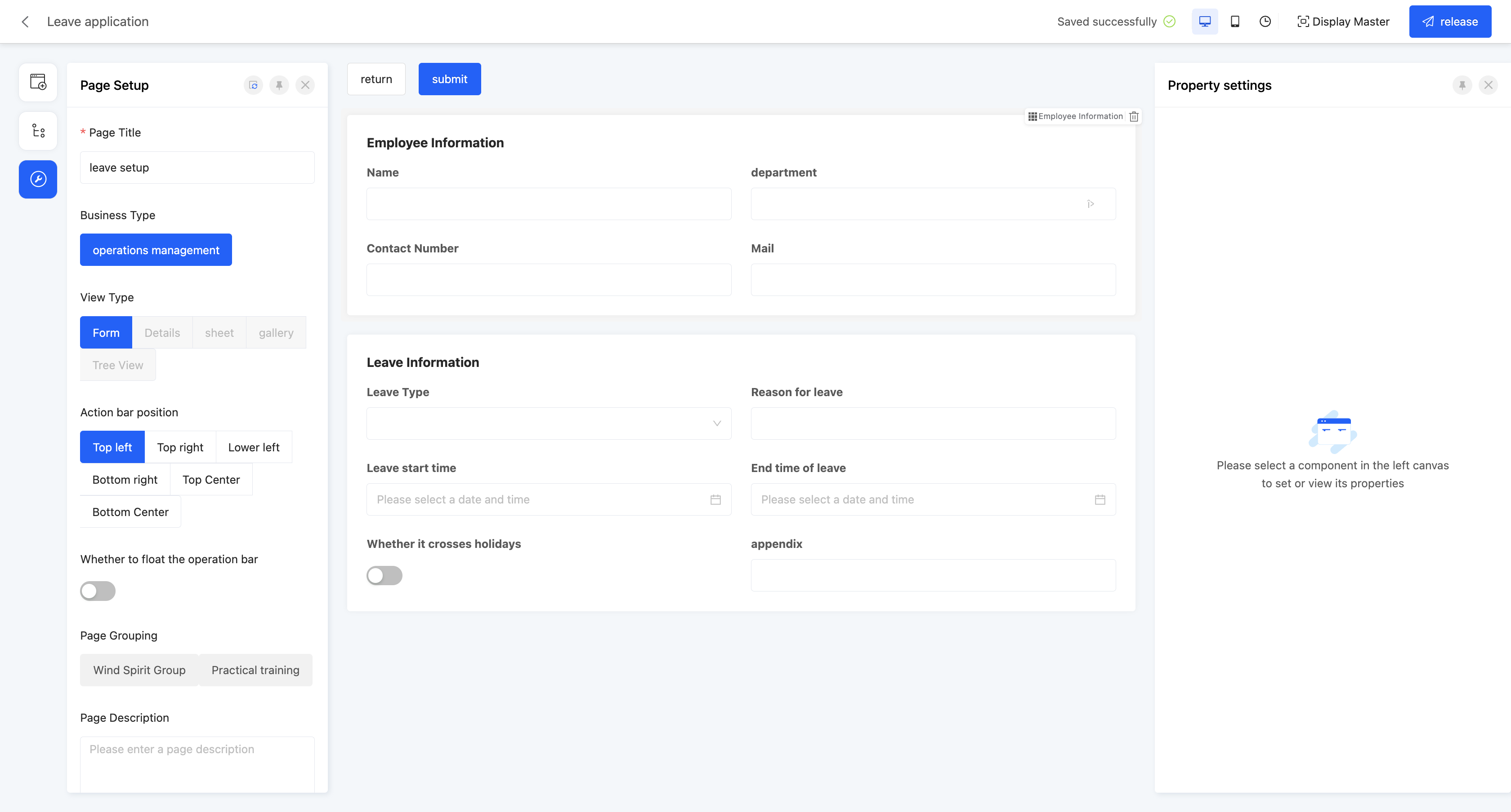
(Ⅲ) Page Settings
1. Function Introduction
In the page settings, users can modify the relevant information of the current page, such as the title and description. Fixing the action area is supported, and the action area will always be visible when the page is scrolled. In addition, page settings are the only way to upload a thumbnail for the page, which facilitates users to add an appropriate thumbnail to the page to enhance the visual effect and recognition.
Tip
When there are changes to the fields in the model to which the page belongs, users can use the "Regenerate Default View" function above the page settings to quickly generate a new page according to the model changes. This function provides two generation methods:
- Regenerate all: A brand-new default view will be generated according to the model changes in the order of the default components.
- Regenerate only the changed parts: Keep the unchanged parts of the original model, and only add or remove the field components that have changed in the model.
2. Operation Method
In the left tool area, click the "Page Settings" icon to display the page settings page.
- Floating operation bar: If this function is enabled, the action area will remain stationary when the page is scrolled.
- Thumbnail: An image can be uploaded as the page thumbnail.
Ⅲ. Canvas Design Area
1. Function Introduction
When a component is added to the design canvas area, a default style will be automatically generated.
- Users can select any component and set its detailed properties in the property panel on the right. Most property adjustments can be reflected on the canvas in real time, facilitating users to immediately view the effect and make corresponding adjustments.
Note
When the selected component is a table, the "Model" will automatically switch to the model associated with the table.
- Users can easily select a component on the canvas through shortcut keys and quickly switch it to another component type, which is simple and fast to operate.
- When there are nested components on the page, users can flexibly switch the selected component to conveniently set and adjust the nested components.
Note
Only switching from an inner component to an outer component is allowed.
2. Operation Method
Tip
This takes the form view as an example, and the same applies to other view types.
- In the component library in the left tool area, drag the component into the corresponding position in the canvas design area.
- Click the "Switch Component" icon to select other eligible components.
Note
The supported switching type rule is: Only when the business type of the setting field at the time of component creation is exactly the same as the view type supported by the component itself can the component be switched.
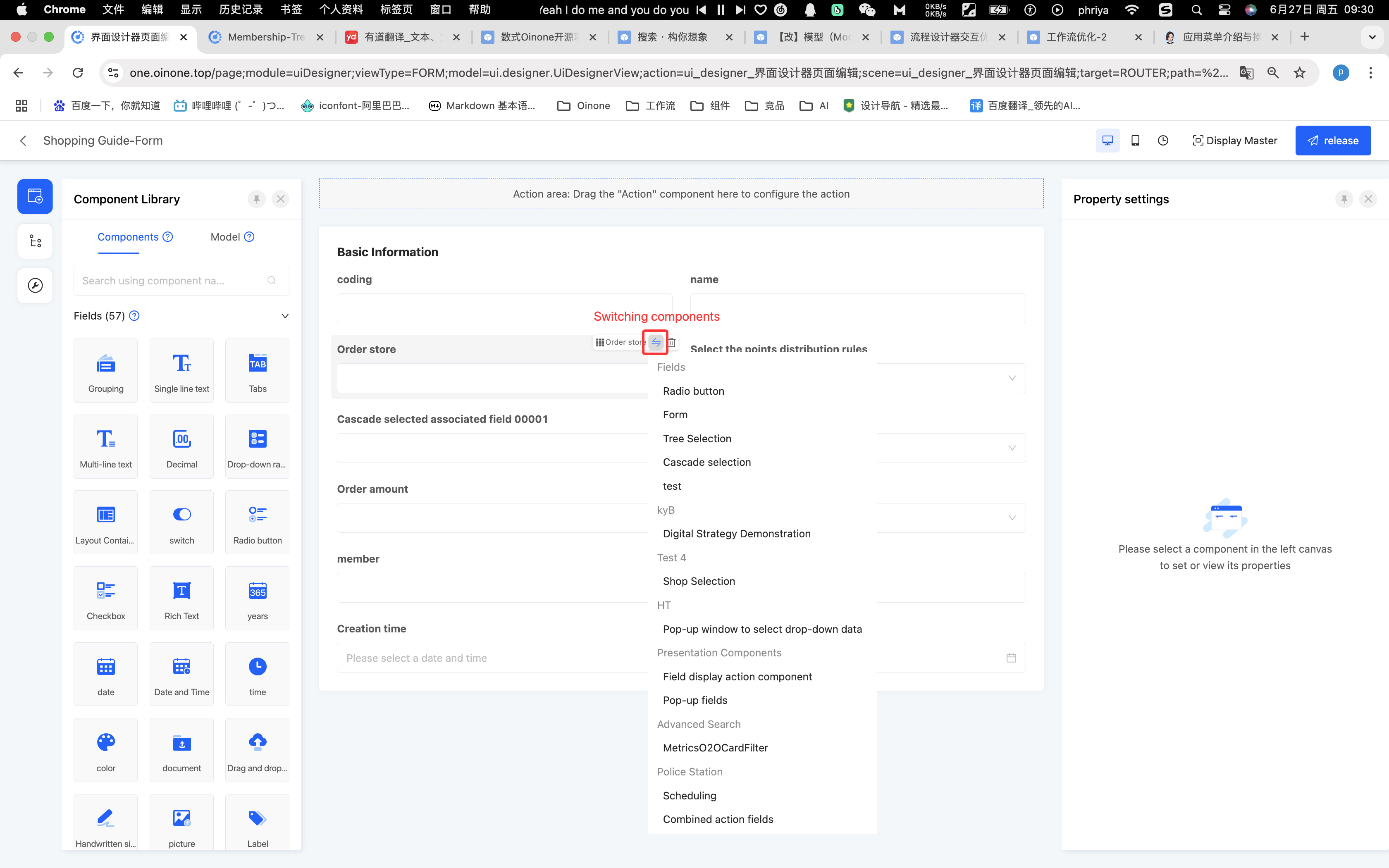
- Click the "Switch Selected Component" icon to switch to the outer component.

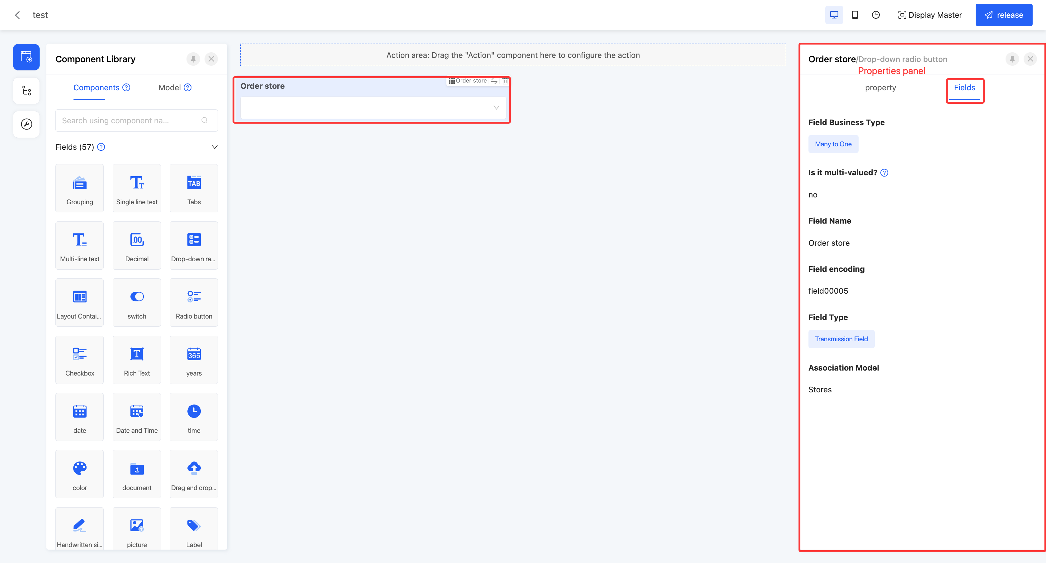
Ⅳ. Property Panel
1. Function Introduction
In the property panel, users can conveniently set various properties of the component (for details, see the component property introduction documentation) and view the field information of the component. By flexibly configuring component properties, users can achieve diverse display and function customization of components.
2. Operation Method
- Click a component and configure the property information on the "Properties" page of the property panel.
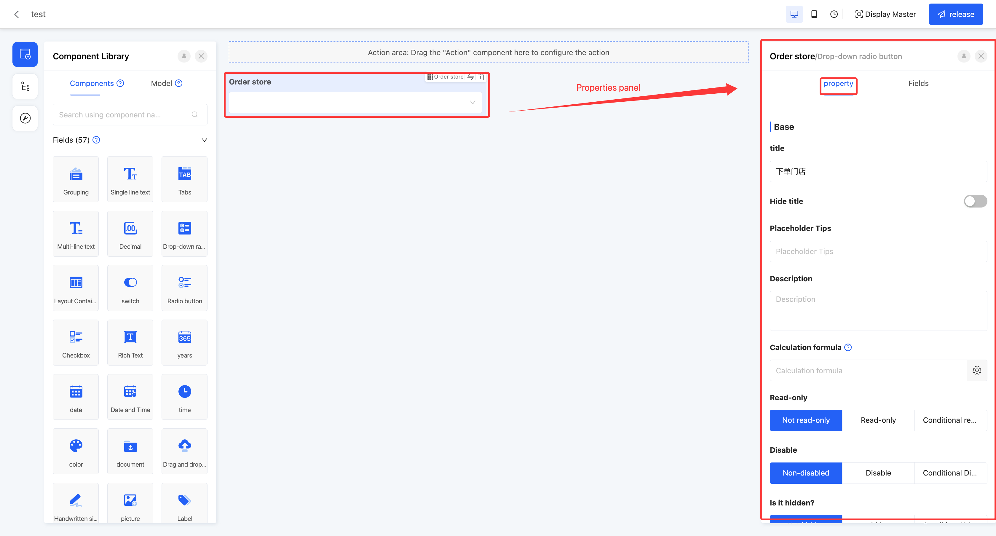
- Click a component and view the field information on the "Fields" page of the property panel.
- Click on a component and customize the component style in the Properties panel Styles page.
- Provides a class attribute to customize the styles of individual components in code

- Provides a class attribute to customize the styles of individual components in code
Ⅴ. Page Design Example
Scenario: Employee leave application business page
- Use the model designer to build two business models: the employee information model and the leave application model.
- Employee information model: Used to store the basic information of enterprise employees.
- Leave application model: Used to store the leave application information submitted by employees.
| Model | Field Name | Field Type |
|---|---|---|
| Employee Information Model | Employee ID | Text |
| Name | Text | |
| Department | Many-to-many (Associated department model) | |
| Position | Text | |
| Date of Joining | Date and Time | |
| Contact Phone | Text | |
| Text | ||
| Leave Application Model | Application ID | Text |
| Application Time | Date and Time | |
| Leave Type | Enumeration | |
| Reason for Leave | Text | |
| Leave Start Time | Date and Time | |
| Leave End Time | Date and Time | |
| Employee ID | Text | |
| Attachment | Text |
- After the model construction is completed, design the leave approval page in the interface designer. This page mainly consists of two parts: employee information and leave information.
- Create a page, select the model as the "Leave Application Model" and the view type as "Form".
- After entering the design interface, add two group components to the canvas and name them "Employee Information" and "Leave Information" respectively.
- In the "Employee Information" group, the relevant fields of the employee information model are planned to be used. However, these fields are not included in the model bound to the current page. To achieve this goal, the following steps can be followed:
(1) Under the "Component Library - Model" category, add a virtual field and name it "Employee", and establish an association relationship between it and the "Employee Information Model".

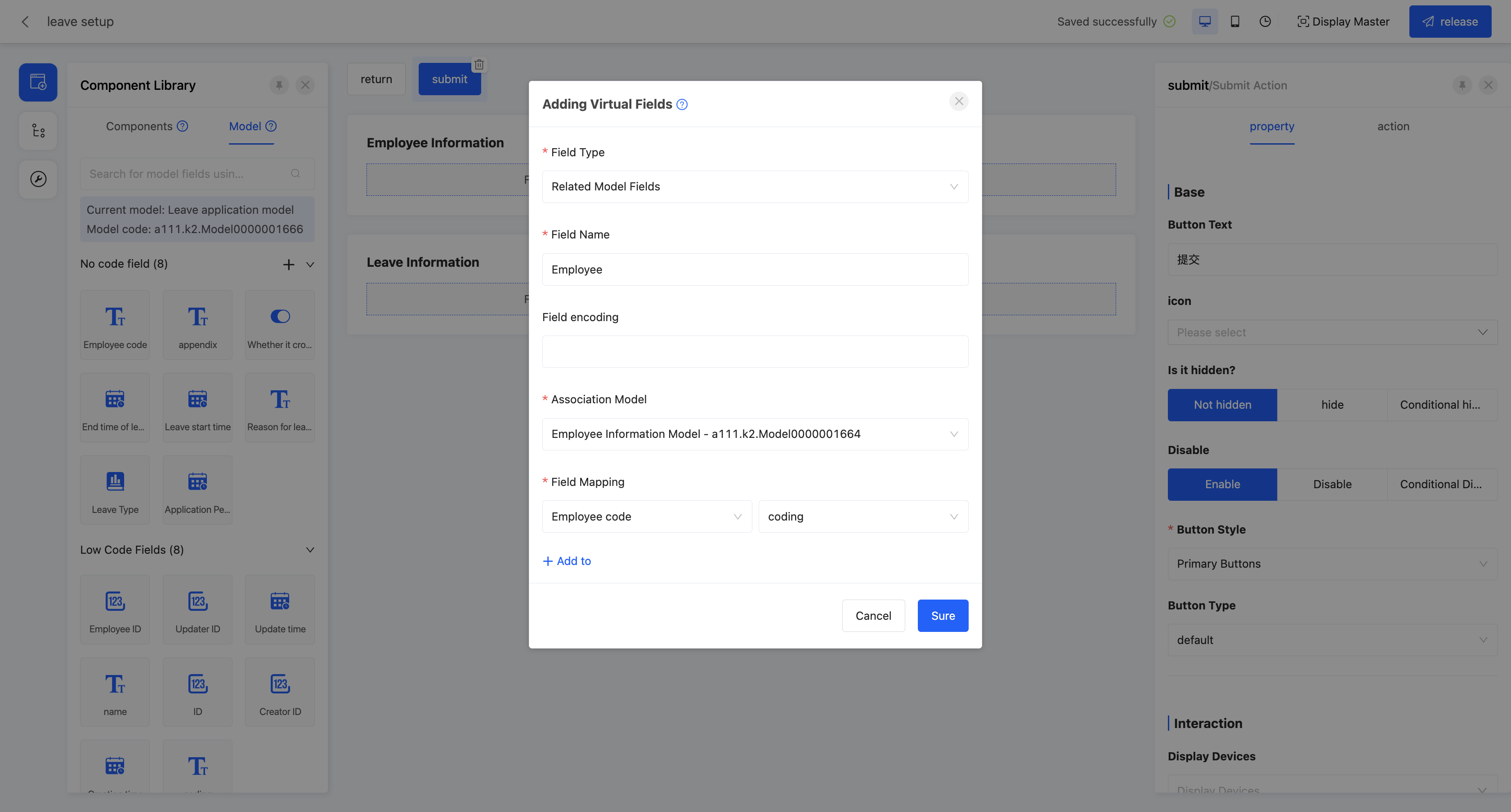

(2) Drill down on the added "Employee" virtual field to obtain all the fields included in the associated model. Then, drag the required field components from the field list to the "Employee Information" group on the page.
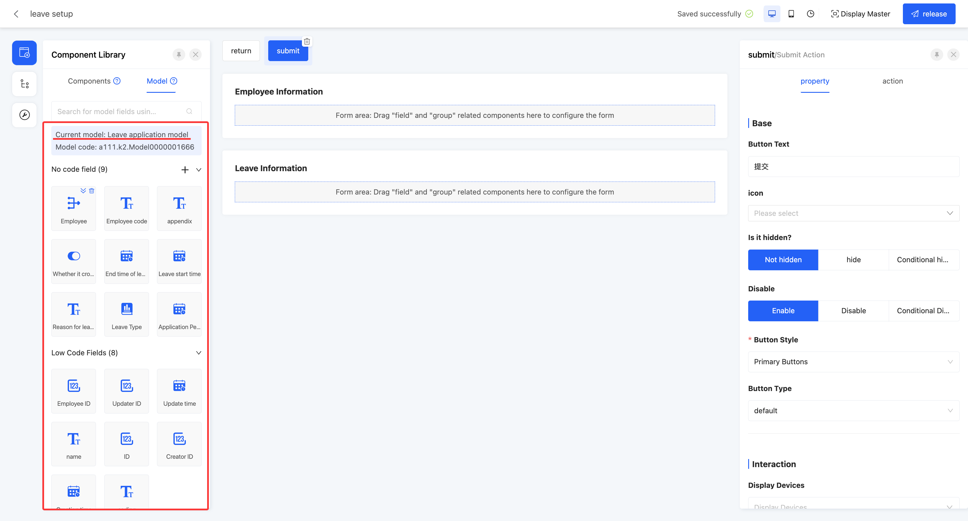

- In the "Leave Information" group, drag the required fields to the page to complete the design of the leave information area.

- After completing all the above design steps, click the publish button to officially publish the designed page. After successful publication, the page can be put into use.
Ⅵ. Attachment: Glossary
| Term | Description |
|---|---|
| Operation Bar | Contains commonly used operation buttons for page settings, historical records, saving, etc. |
| Toolbar | Contains the component library, page outline, and page settings. |
| Canvas Design Area | The main area where users design pages. Components are dragged and the layout is adjusted in this area. |
| Property Panel | Displays and edits the properties of the selected component. Properties such as the title, validation, and interaction of the component can be adjusted. |
| Master | A template with a fixed format and layout used to unify and standardize the design and content presentation of a type of page or document. |
| Component Library | A repository that collects various reusable components. |
| Component | The basic unit of page design, such as buttons, text boxes, and pictures. |
| Model | A model designed in the model designer. |
| Design Outline | The overall framework and structure of the page design. |
| Virtual Field | A field that does not actually exist, which is a carrier for data transmission. |