The first part of this tutorial introduced you to most of the concepts of the Widget framework. Now it's time to gain a deeper understanding of the Oinone framework, which is the framework used by the Web client.
To start learning, you need a running Oinone service and a set-up development environment. Before starting the exercises, ensure you have followed all the steps described in the tutorial introduction. In this chapter, we will continue to use the simple Card component built in the previous chapter and gradually add features to it using the Oinone framework.
I. A New Mask
Most interfaces in the Oinone client use a common layout: a control component with some functions at the top, and a lower area divided into two parts— a menu for switching pages on the left and a main content area on the right. This is achieved using a Mask rendering framework.
Remember the registerLayout method used in the previous chapter to register layouts? For masks, there is a corresponding registerMask method to register masks.
Below is the default mask provided by the platform. Generally, you only need to modify it as needed:
<mask>
    <multi-tabs />
    <header>
        <widget widget="app-switcher" />
        <block>
            <widget widget="notification" />
            <widget widget="divider" />
            <widget widget="language" />
            <widget widget="divider" />
            <widget widget="user" />
        </block>
    </header>
    <container>
        <sidebar>
            <widget widget="nav-menu" height="100%" />
        </sidebar>
        <content>
            <breadcrumb />
            <block width="100%">
                <widget width="100%" widget="main-view" />
            </block>
        </content>
    </container>
</mask>In the examples of this chapter, you need to make the following changes to this mask:
- Retain all top-bar functions and remove the left navigation menu component.
- Remove the breadcrumb component to make the main content distribution area appear larger.
- Apply this mask to the page corresponding to the "Country Groups" menu item.
As the first master template exercise, let's create a register.ts file in the oinone-frontend-tutorials/src/mask directory to register the modified master template.
import { registerMask, ViewType } from '@oinone/kunlun-dependencies';

registerMask(
  `<mask>
    <multi-tabs />
    <header>
        <widget widget="app-switcher" />
        <block>
            <widget widget="notification" />
            <widget widget="divider" />
            <widget widget="language" />
            <widget widget="divider" />
            <widget widget="user" />
        </block>
    </header>
    <container>
        <content>
            <block width="100%">
                <widget width="100%" widget="main-view" />
            </block>
        </content>
    </container>
</mask>`,
  {
    viewType: ViewType.Table,
    model: 'resource.ResourceCountryGroup',
    actionName: 'resource#国家分组'
  }
);As required, we have removed the nav-menu and breadcrumb components, and set the registration conditions using the corresponding parameter values for "Resource-Country Group".
After making these modifications, we can proceed with the following learning content.
Tip
For more information on masks, refer to: Mask
II. Theory: Master Template (Mask) Registration
Recall the layout registration we learned earlier: the registerLayout method has two required parameters: layout template and layout options. Similarly, the registerMask method also has two required parameters: master template (mask template) and master layout options.
Whether it is a master template (mask) or a layout, the template is defined via XML. Both are used to describe the main components of a page and the relative positions between these components.
For master options, they are almost identical to layout options. The corresponding master template can only be applied to pages that meet the specified conditions. Common master options include:
- viewType: View type
- model: Model code
- actionName: Action name
- viewName: View name
In the example above, we used three of these options: the view type Table, the model code resource.ResourceCountryGroup, and the action name resource#国家分组.
The method for obtaining these parameters is exactly the same as what was introduced in the "Layout Registration" section.
Tips
For more information about Master Templates (Mask), please refer to: Mask
Ⅲ. Theory: Initiate a Back-end Request
In practice, each component may initiate requests to the back-end to fetch necessary data for display on the page. We usually manage these requests in the service directory for easy use in any component.
The Oinone framework provides a unified method to send requests. We can define a request to the back-end like this to obtain statistical results of "country groups":
import { GenericFunctionService } from '@oinone/kunlun-dependencies';

const MODEL_MODEL = 'resource.ResourceCountryGroup';

export class ResourceCountryGroupService {
  public static async countByWrapper(rsql?: string): Promise<number> {
    const count = await GenericFunctionService.INSTANCE.simpleExecuteByName<number>(MODEL_MODEL, 'countByWrapper', {
      rsql
    });
    return Number(count || 0);
  }
}Tip
For more information on custom requests, refer to: Customize GraphQL Request
Then, we can use it when the component is mounted and display the fetched data on the page:
@Widget.Reactive()
protected count: number = -1;

protected async mounted() {
  super.mounted();
  this.count = await ResourceCountryGroupService.countByWrapper();
}If query conditions need to be carried, we can filter the dataset through the function's input parameter rsql to obtain the required statistical results:
protected async mounted() {
  super.mounted();
  this.count = await ResourceCountryGroupService.countByWrapper("code =like= 'a'");
}Tip
For more information on RSQL, refer to: RSQL Service
Ⅳ. Add a Statistics Count Card
Next, we will complete a simple dashboard by implementing a statistics count card. This is the final page effect:
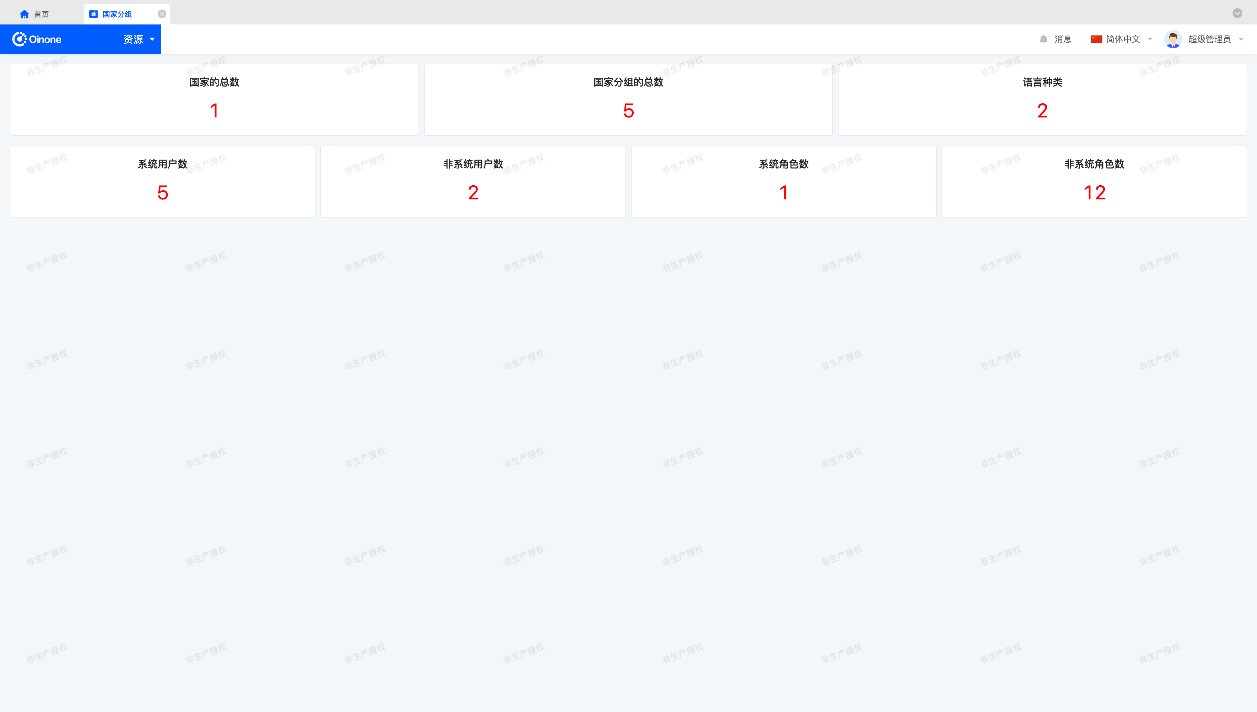
Please try to complete the exercise according to the following prompts:
- Use
registerMaskto remove the left menu and breadcrumbs. (Completely the same as the first section) - Create a
StatisticsCardcomponent that initiates statistical requests for specified models and displays them on the page. This component has three configurable parameters: title, model code (modelModel), and filter expression (rsql). - Use
registerLayoutto render the component in the page'smain content distribution area. Display information such as "Total Number of Countries", "Total Number of Country Groups", "Number of Languages", "Number of System Users", and "Number of System Roles".
Tip
Data such as countries, country groups, and languages can be maintained in "Resources".
Data such as users and roles can be maintained in "Management Center".
Since we are practicing on the "Country Groups" page, readers can first comment out the code related to the custom-registered Mask and Layout, maintain the data, and then continue with the exercise.
A feasible layout template can be defined as follows:
<view type="TABLE">
    <div class="statistics-card-demo-groups">
        <element widget="StatisticsCard" title="国家的总数" modelModel="resource.ResourceCountry" />
        <element widget="StatisticsCard" title="国家分组的总数" modelModel="resource.ResourceCountryGroup" />
        <element widget="StatisticsCard" title="语言种类" modelModel="resource.ResourceLang" />
    </div>
    <div class="statistics-card-demo-groups">
        <element widget="StatisticsCard" title="系统用户数" modelModel="user.PamirsUser" rsql="source == 'BUILD_IN'" />
        <element widget="StatisticsCard" title="非系统用户数" modelModel="user.PamirsUser" rsql="source != 'BUILD_IN'" />
        <element widget="StatisticsCard" title="系统角色数" modelModel="auth.AuthRole" rsql="source == 'BUILD_IN'" />
        <element widget="StatisticsCard" title="非系统角色数" modelModel="auth.AuthRole" rsql="source != 'BUILD_IN'" />
    </div>
    <div />
</view>Tip
In the table view, the last div tag is processed to expand according to the screen height, which is a side effect of the built-in css styles.
Using different view types may cause side effects where built-in css styles affect the current page display, and readers need to properly handle these issues according to the actual situation.
The layout provided above solves this problem with an empty div tag.
Ⅴ. Display a Pie Chart
Everyone loves charts(!), so let's add a pie chart to the dashboard. It will show the proportion of system users (source == 'BUILD_IN') and non-system users (source != 'BUILD_IN') in the entire system.
To make our pie chart component more versatile, readers can explore implementing a more generic pie chart that shows the proportion of system roles and non-system roles in the entire system. This is the final page effect:
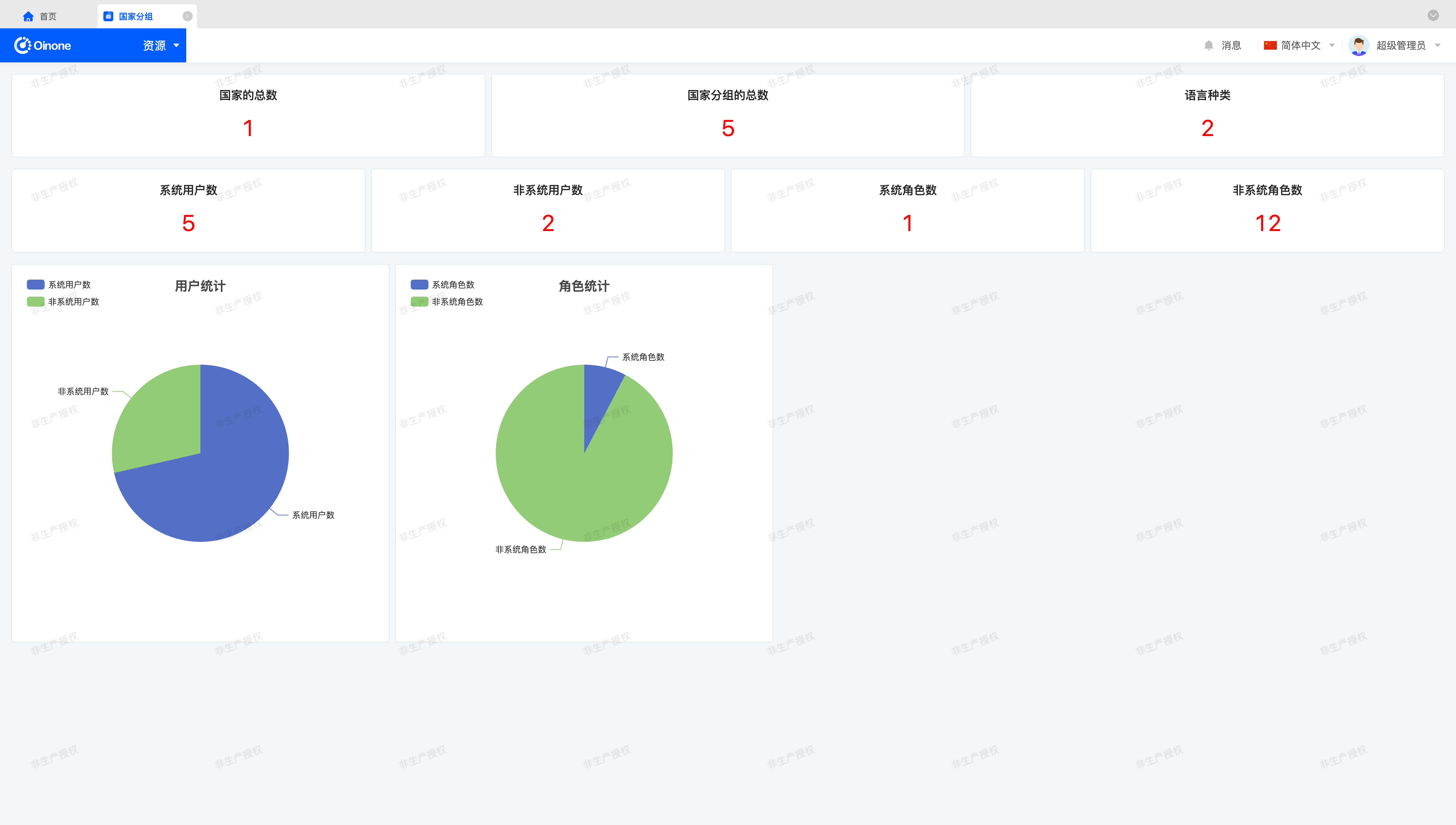
Please try to complete the exercise according to the following prompts:
- Create a
PieChartcomponent that displays a pie chart based on the configured statistical dimensions (series). - Use the
EChartsthird-party chart plugin to implement the pie chart display. - Due to the order of requests and rendering, initiate the request in the
mountedmethod, and use thewatchmethod provided byVueto monitor data changes, finally re-rendering the pie chart component after data changes. - In the
onUnmountedhook, call thedisposemethod provided by theEChartscomponent instance to destroy it. - (Bonus) Use
Loadinganimation effects to handle the loading process when network requests are slow. - (Bonus) Design the registered
Layoutstructure to make theLayoutreadable.
To help readers better understand the readability of Layout, this section provides a reasonable definition method.
For structured data, the performance in XML is usually the definition of multiple identical sub-tags. A feasible layout template can be defined as follows:
<element widget="PieChart" title="用户统计" modelModel="user.PamirsUser">
    <series name="系统用户数" rsql="source == 'BUILD_IN'" />
    <series name="非系统用户数" rsql="source != 'BUILD_IN'" />
</element>Tip
The sub-tags defined in the layout can be obtained using this.template.widgets in the initialize method, which is used to parse the available dimension (series) definition part of the component.
Ⅵ. Take It Further
If you have time, here are some small improvements you can try:
- Ensure your page can be translated (use
$translatefor static text in Vue templates andtranslateValueByKeyfor static text in TypeScript). - Implement clicking a part of the pie chart to navigate to the list page of the corresponding model data and display all data.
- Create a dashboard component that can configure the dashboard content and save it in user preferences.