A component can contain multiple elements internally. These elements are property pages designed based on different field business types. When designing a page, the process of selecting a field business type for the component is essentially about choosing different elements to build the component.
In the page designer, elements are presented as an element list in the form of cards by default, facilitating users to browse and select. The element card displays basic information about the element, including the element name, API name, supported field business types, whether multi-value is supported, supported view types, and element description, enabling users to quickly understand the function and purpose of the element. 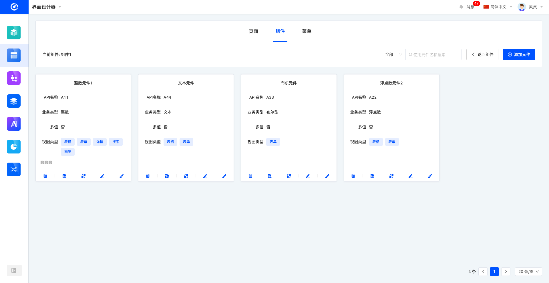
Ⅰ. Filter
1. Function Introduction
According to actual business needs, element filter conditions can be customized, including selecting whether to hide and entering the element name, so as to precisely filter elements. Under the set filter conditions, the corresponding element list will be displayed, facilitating the viewing and editing of elements.
2. Operation Method
Select or enter conditions in the filter area to complete the filtering of elements. 
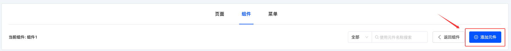
Ⅱ. Add Element
1. Function Introduction
Use the interface designer to create elements, and edit element information during the creation process. Elements that are created and published can be used when configuring components.
2. Operation Method
Click "Add Element", fill in the information correctly in the pop-up page, and click "OK" to successfully create it.
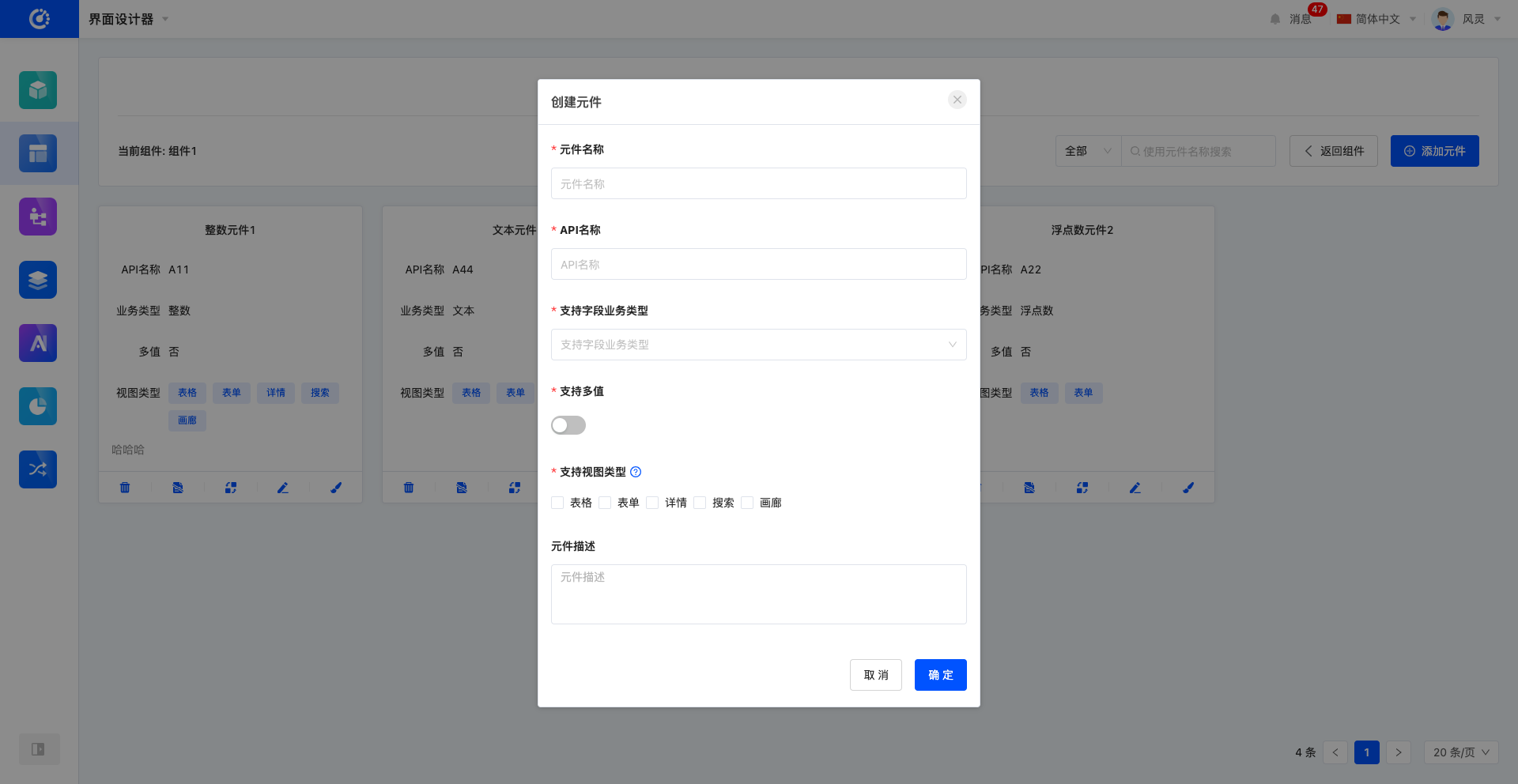
Note
- Users can select and use the element in the supported view types; the element will not be displayed in the unsupported view types.
- A multi-value field means that the field can store or transmit multiple data of this business type, while a non-multi-value field can only store or transmit a single data of this business type.
Example
Create a "drop-down selection" component, which can include two elements: "drop-down single selection" and "drop-down multiple selection". When the "drop-down selection" component is dragged from the component library, the "drop-down single selection" element is used for single-value setting, and the "drop-down multiple selection" element is used for multi-value setting.
Ⅲ. Edit Element
1. Function Introduction
Successfully created elements can be edited.
Note
Only part of the information supports modification, and some information is fixed when created, so please fill in carefully when creating.
2. Operation Method
Click "Edit" to edit in the pop-up editing page. 
Ⅳ. Design Element
1. Function Introduction
When designing elements, you can use various components to carry out personalized design layout for elements to meet different needs and styles. (For details, see the element design document.)
2. Operation Method
Click the main part of the element card or click the "Design Page" icon to enter the element design interface. 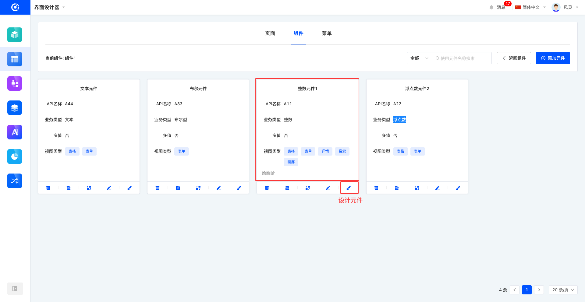
Ⅴ. View Reference Information
1. Function Introduction
Through this function, you can view the pages that have a reference relationship with the element. The relationship is displayed through a list, and the list items are links that can be linked to the corresponding design page, with the content being the corresponding content.
2. Operation Method
Click the "View Reference Information" icon to view reference information. 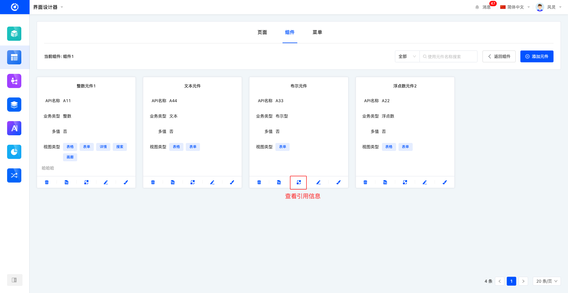
Ⅵ. Invalidate/Enable Element
1. Function Introduction
For elements that are not currently in use, you can perform the invalidation operation. If needed in the future, you only need to set the invalidated element to the available state to put it back into use.
2. Operation Method
Click "Invalidate" to set the component to the invalidated state, and the button becomes "Available"; click again to set the element to the visible state. 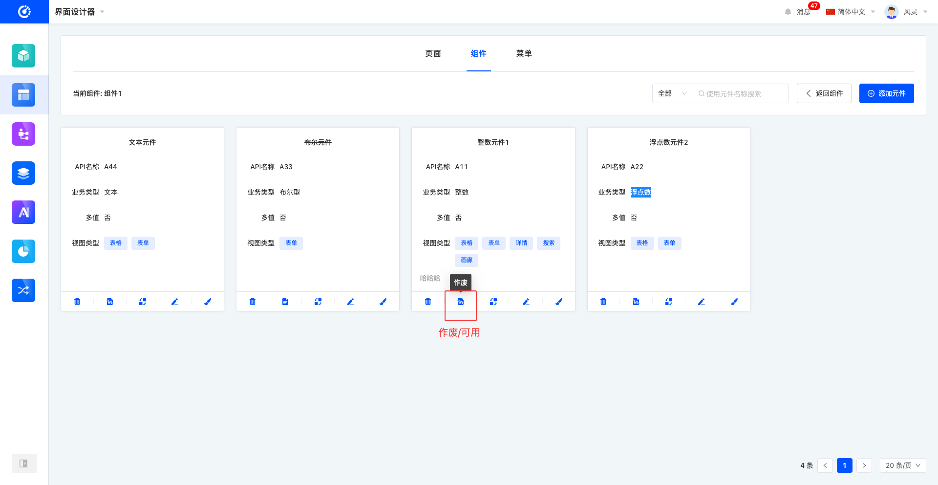
Ⅶ. Delete Element
1. Function Introduction
When an element is no longer in use, you can choose to delete it. If you are not sure whether the element needs to be deleted, you can invalidate it first.
Note
Before deleting, make sure that the component is not referenced by other pages, otherwise the deletion operation cannot be performed.
Warning
The page cannot be recovered after deletion, please operate with caution!
2. Operation Method
Click the "Delete" icon, and delete it after confirming the deletion. 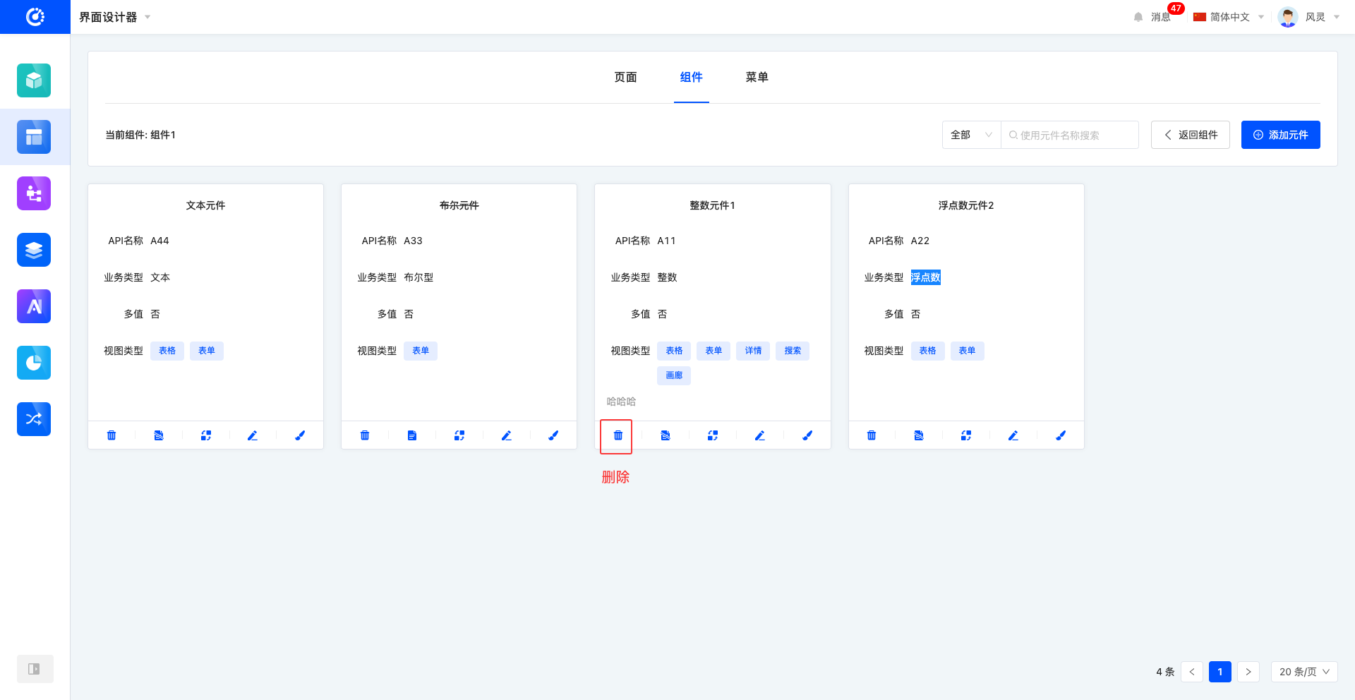
Ⅷ. Attachment: Noun Explanation
| Noun | Description |
|---|---|
| Element | A property page designed based on different field business types. |
| API Name | The name of the Application Programming Interface (API), used to identify and call a specific API. |
| View Type | Various layout methods for displaying data on the page. |