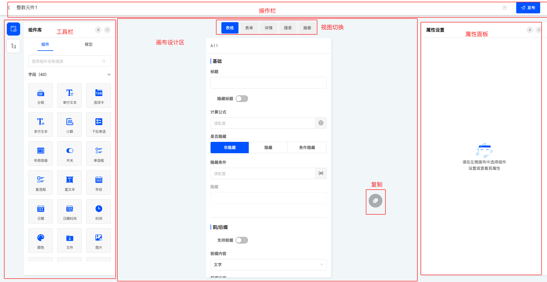
The design of components maintains consistency with page design, and its design interface is mainly divided into four functional areas: action bar, toolbar, canvas design area, and property panel. The difference is that component design adds two practical functions in the canvas design area: view switching and copying functions.
- View switching function: It can display all view types supported by the current component, and users can select different views to design the component page according to their needs.
- Copy function: If users want to quickly apply the designed component page to other view types supported by the component, they can use the copy function and select the target view type for quick copying to improve design efficiency.
I. Action Bar - Publish
1. Function Introduction
After the page design is completed, the publish operation can make the page officially take effect. If the publish operation is not performed, the page will also be automatically saved, but in this case, the automatically saved version only exists as a draft and will not be officially displayed or take effect.
Note
During the publishing process, if the component attributes on the page do not meet the preset validation rules, such as required attributes not being filled in or the input content not passing validation, the publishing operation will fail. At the same time, the corresponding fields will be specially marked to help users quickly locate and view the attributes that need to be modified, ensuring that the page can be successfully published and take effect.
2. Operation Method
In the action bar, click "Publish" to publish the current page.

II. Toolbar
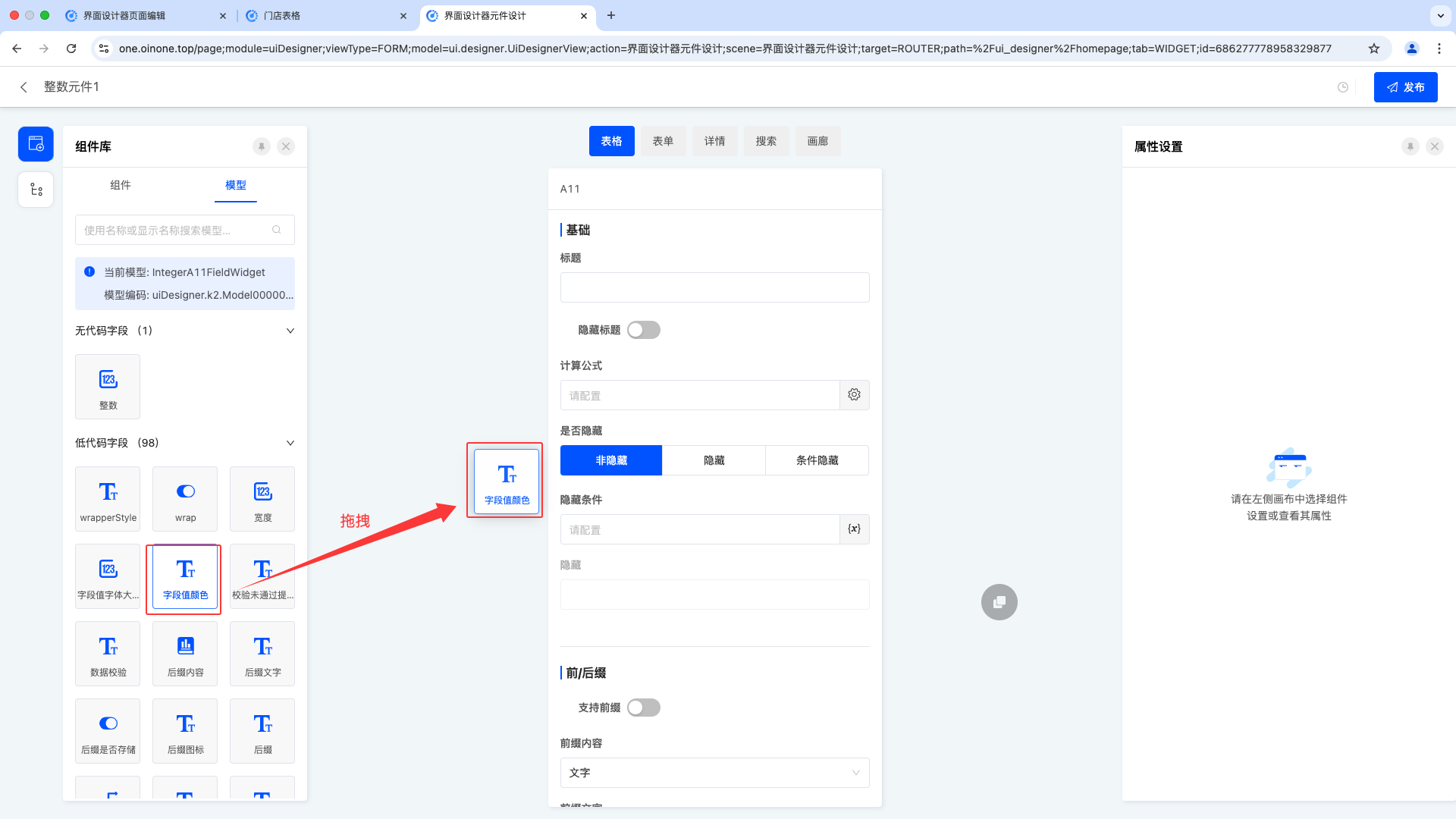
(I) Component Library
1. Function Introduction
The component library includes two parts: components and models (for details, see the component introduction document):
- Components: All components supported by the current designer, including system components and custom components.
Note
The component library for component design does not include action-type components.
- Models: All fields under the page's model and system default actions.
Note
The models for page design and component design have the following differences:
- The model for page design is derived from the model pre-created in the model designer, and its fields are also generated and provided by the model designer.
- The model for component design, on the other hand, is specially provided by the platform for component design, which has built-in many fields for attribute design to meet the special needs of component design.
Note
Differences between components and models:
- Different dimensions of displayed content
Components display component information, such as groups, tabs, single-line text, file upload, etc.; models display all existing fields under the model.
- Different functional uses
Components need to create a field in the model before use, and of course, the created fields will also exist in the model; fields in the model can be used directly, and using them will generate a default component in the design canvas.
- Different usage scenarios
If the target field already exists in the model, you should directly select to drag the field from the model; if the required field does not exist in the model, you can add a component to the page, which actually adds a new field.
2. Operation Method
Drag components to the corresponding area in the canvas design area.
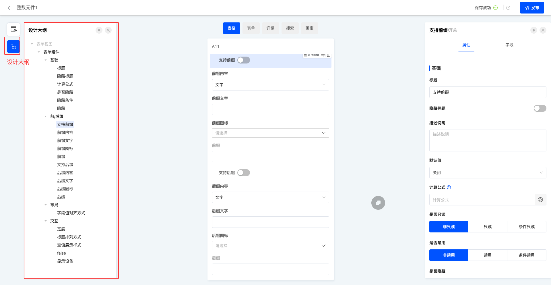
(II) Design Outline
1. Function Introduction
Supports viewing the design outline and intuitively displaying the ownership relationship between components using a list.
Tip
When a component on the page is selected, the canvas design area will quickly locate the component, and the right property area will instantly display the relevant properties of the component for users to view and edit. When the page design is complex with many components, users can use the design outline to quickly find the required component and then conveniently configure and adjust it.
2. Operation Method
In the left toolbar, click the "Design Outline" icon to display the design outline list.
III. Canvas Design Area
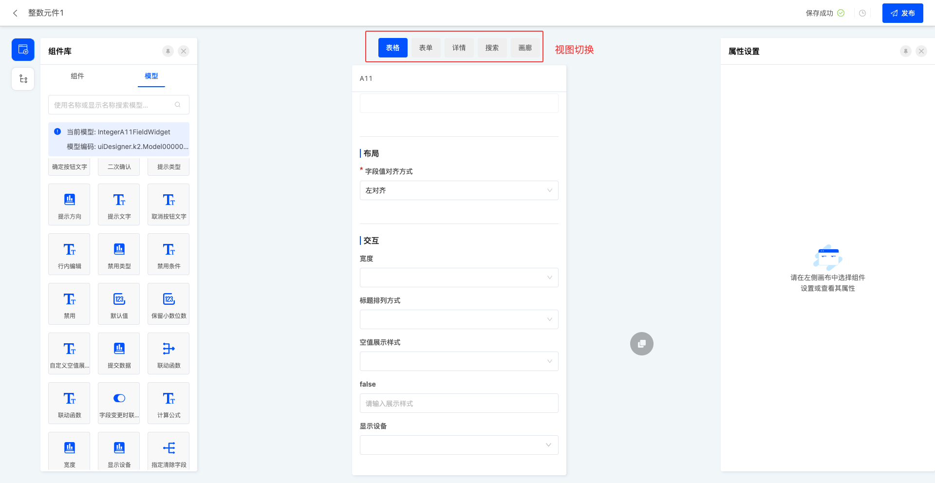
(I) View Switching
1. Function Introduction
In the view switching area, the system will display all view types supported by the current component. Users can freely switch between different view types and design unique pages for each view type to meet diverse design needs.
2. Operation Method
Click on the name of different view types to switch to the corresponding page.
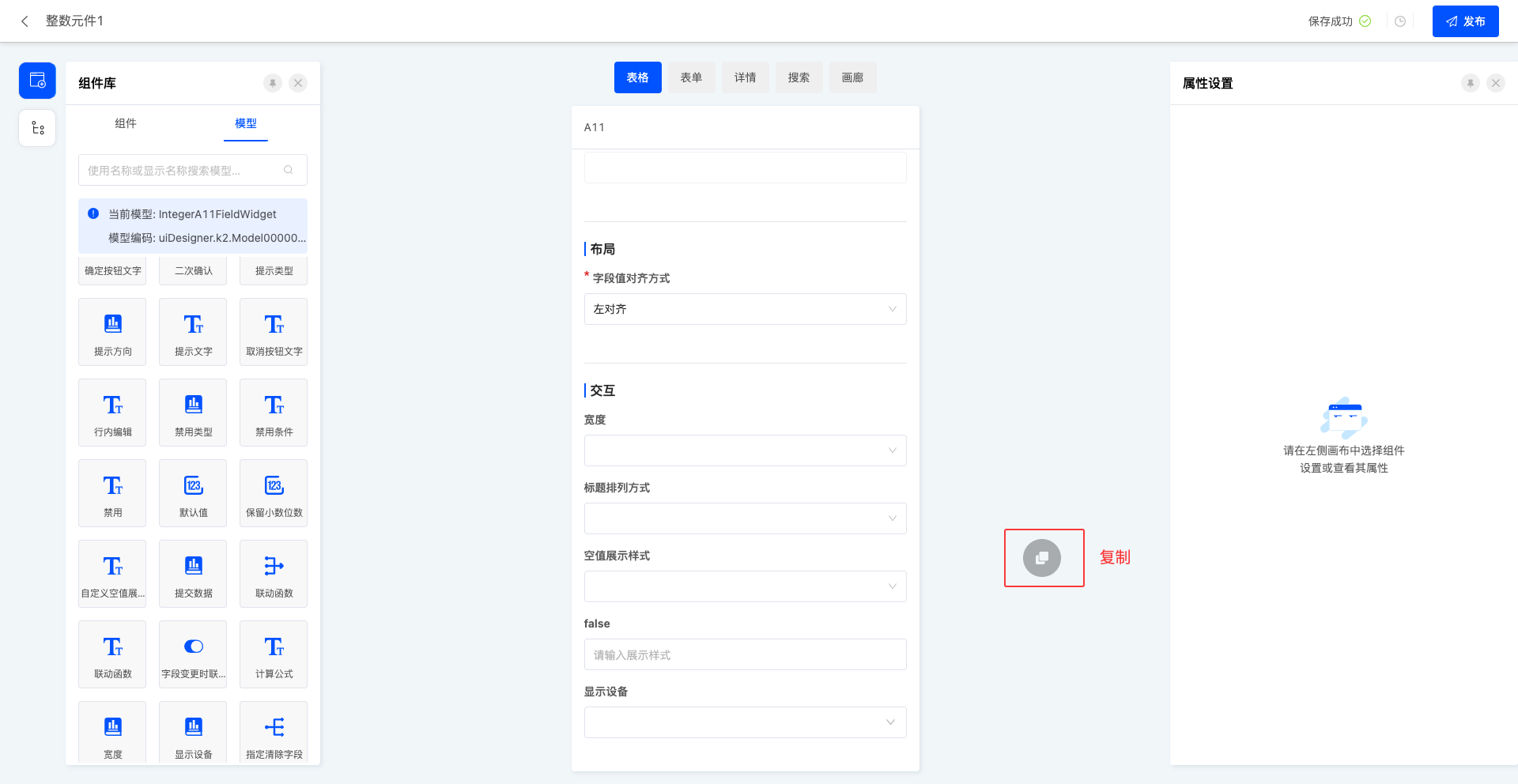
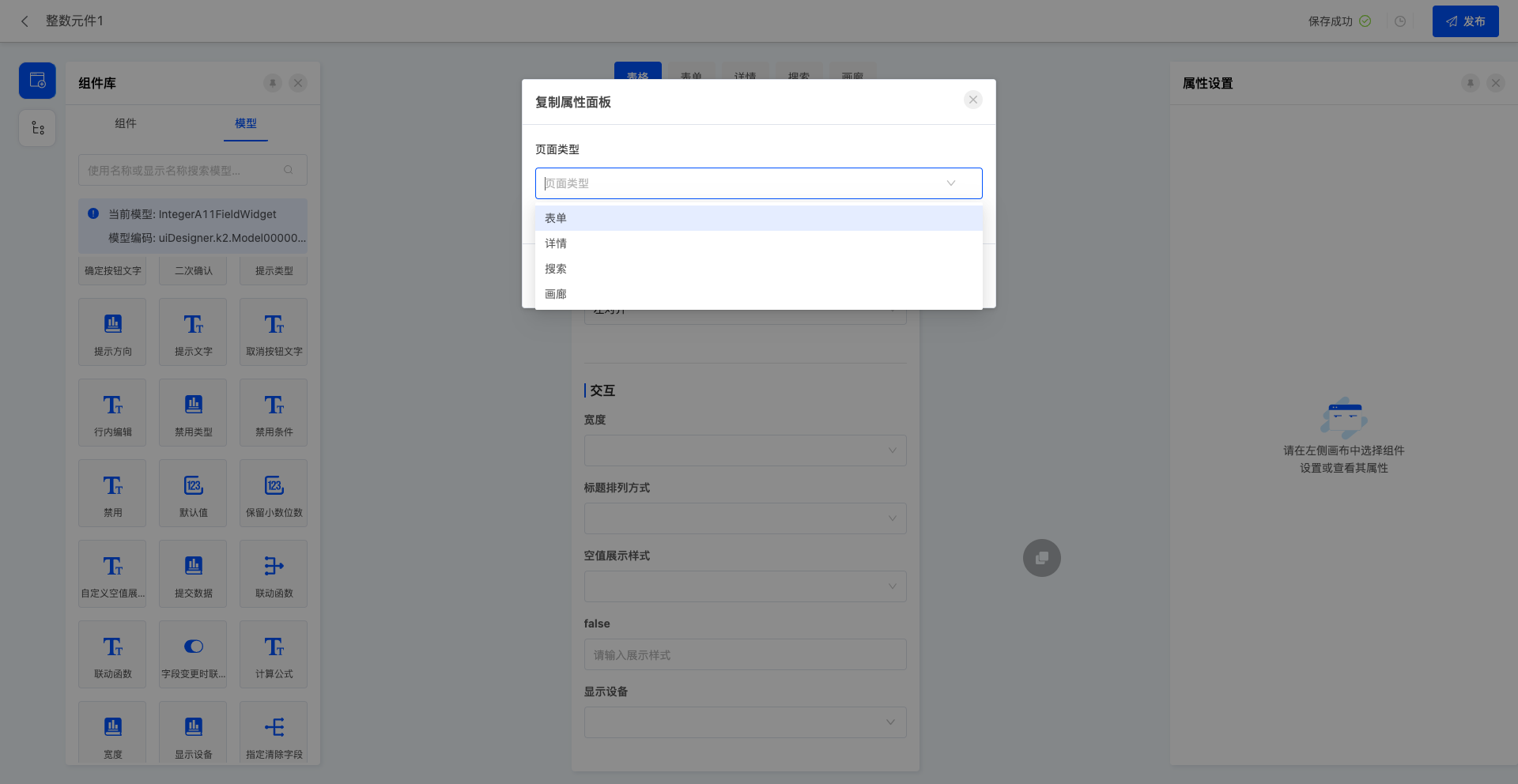
(II) Copying
1. Function Introduction
If you want to quickly copy the current attribute page to other view types supported by the component, you can conveniently use this function to achieve it. The copied page will overwrite the original page of the target view type.
2. Operation Method
Click the "Copy" icon and select the page type in the pop-up window.

(III) Page Design
1. Function Introduction
When a component is added to the design canvas area, a default style is automatically generated.
- Users can select any component and set its detailed attributes in the right property panel. Most attribute adjustments can be reflected in real-time on the canvas, allowing users to instantly view the effects and make corresponding adjustments.
Note
When the selected component is a table, the "model" will automatically switch to the model associated with the table.
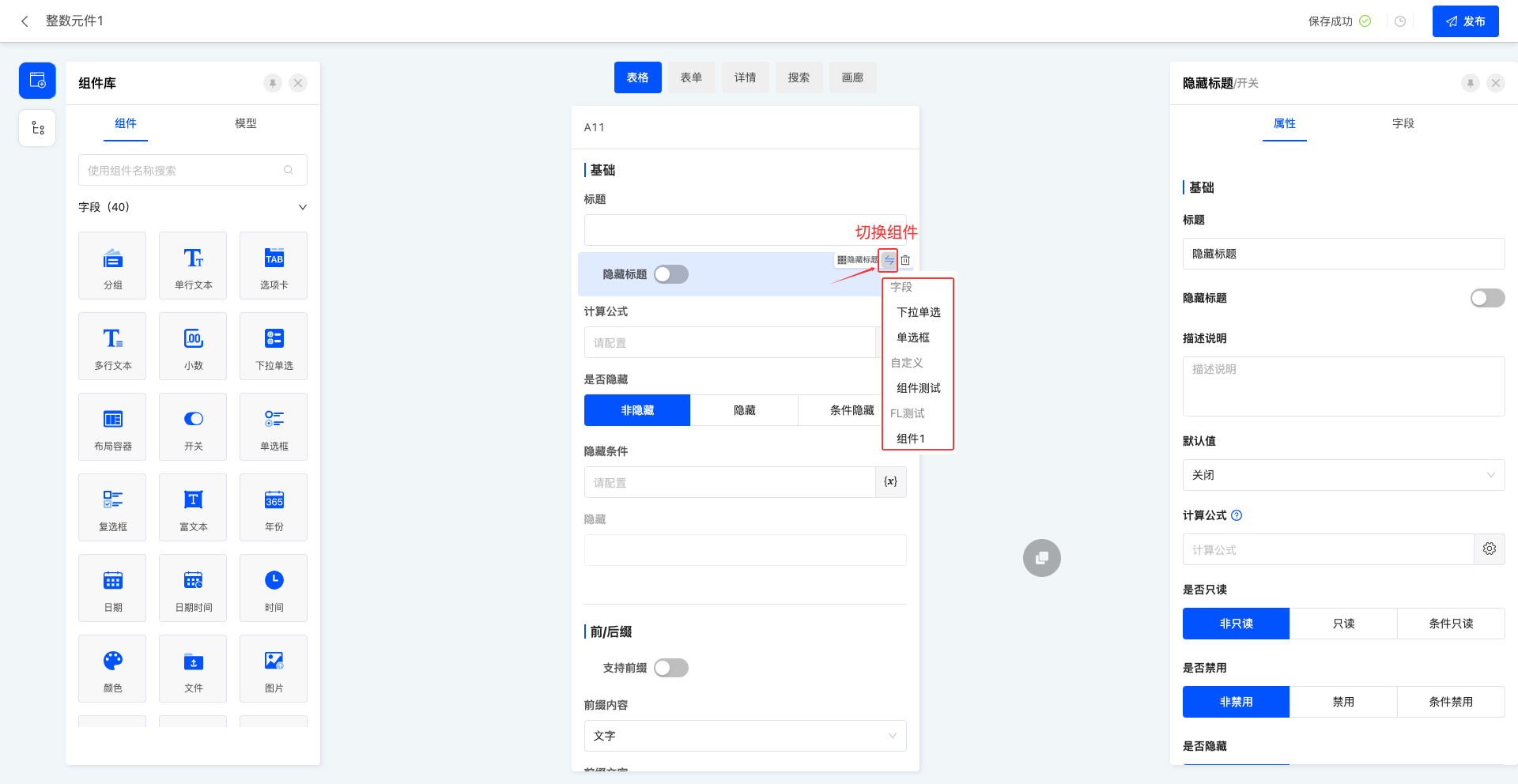
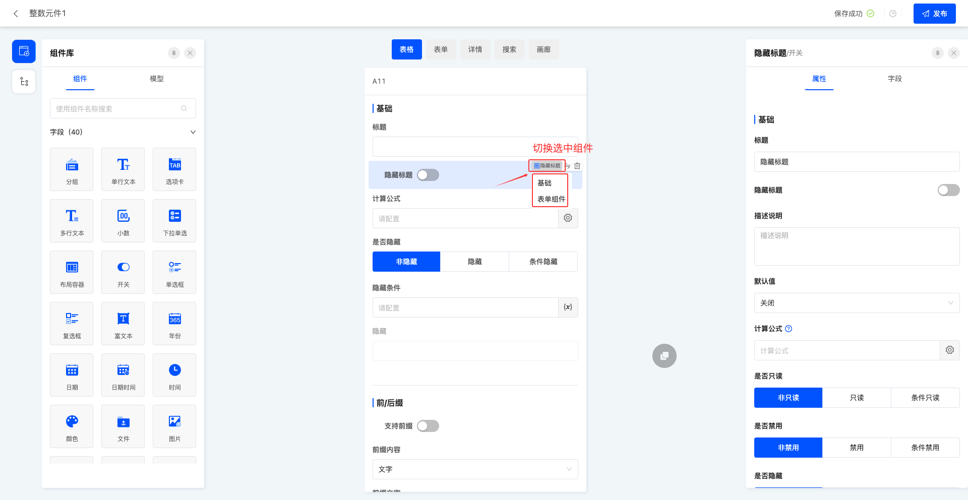
- Users can easily select a component on the canvas through shortcuts and quickly switch it to other component types, which is simple and fast.
- When there is component nesting in the page, users can flexibly switch the selected component to facilitate the setting and adjustment of the nested components.
Note
Only switching from an embedded component to an outer component is allowed.
2. Operation Method
Tip
Take the form view as an example, and other view types are the same.
- In the component library of the left toolbar, drag components into the corresponding position in the canvas design area.
- Click the "Switch Component" icon to select other components that meet the conditions.
Note
The supported switching type rules are: a component can only be switched when the business type of the setting field at the time of component creation is completely consistent with the view type supported by the component itself.
- Click the "Switch Selected Component" icon to switch to the outer component.
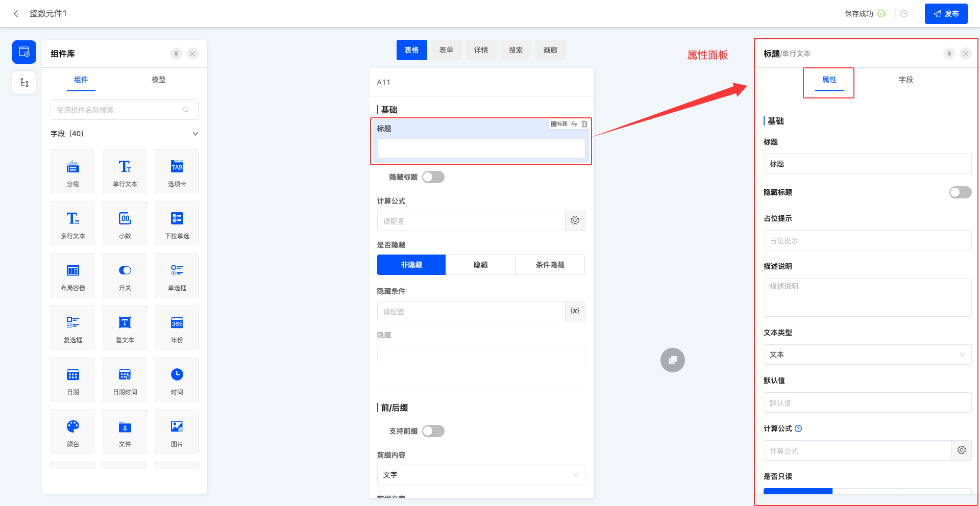
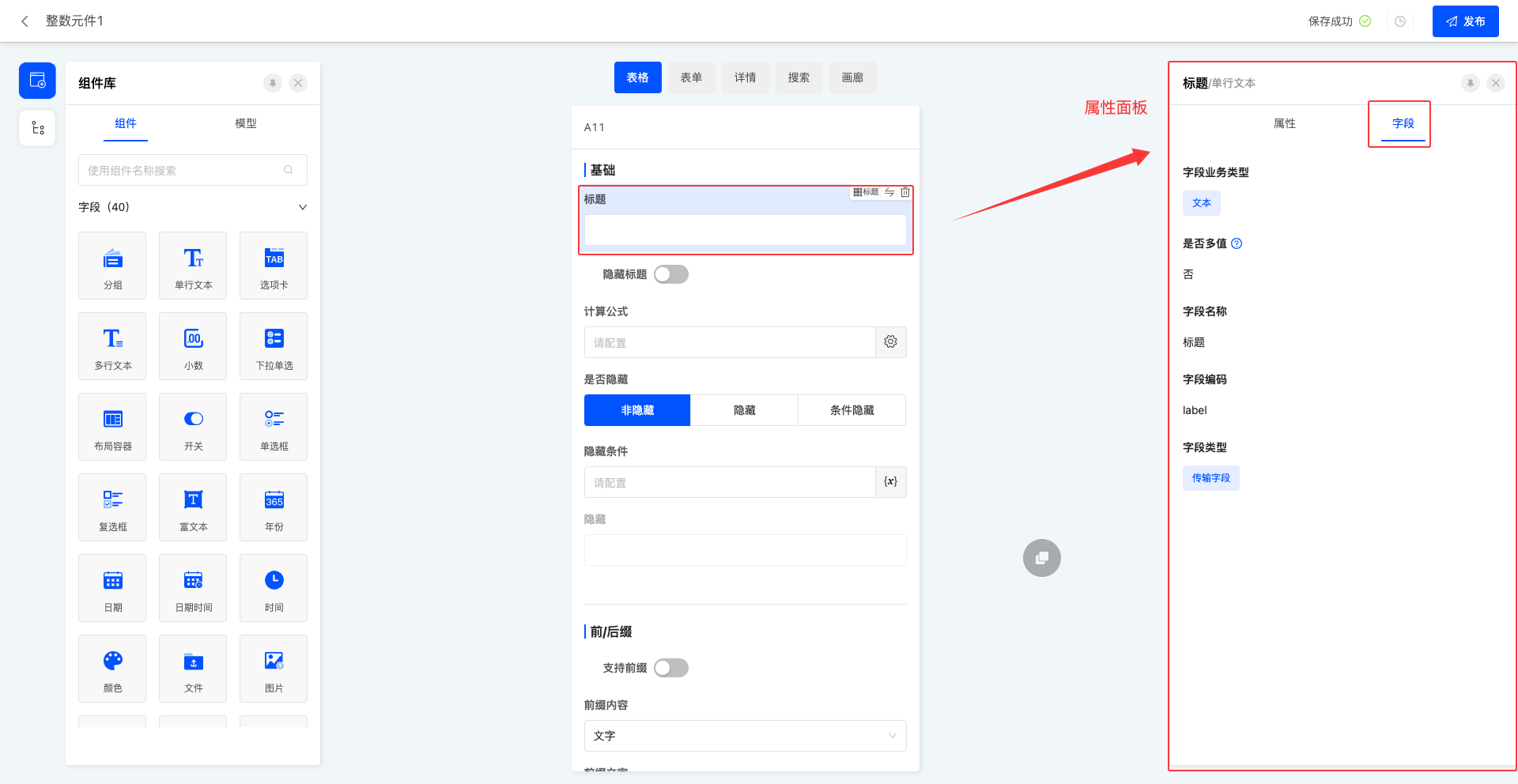
IV. Property Panel
1. Function Introduction
In the property panel, users can easily set various attributes of components (for details, see the component attribute introduction document) and view the field information of components. By flexibly configuring component attributes, users can achieve diversified display and functional customization of components.
2. Operation Method
- Click on a component and configure attribute information in the "Attributes" page of the property panel.
- Click on a component to display field information in the "Fields" page of the property panel.
V. Appendix: Nomenclature Explanation
| Noun | Description |
|---|---|
| Component | An attribute page designed based on different field business types. |
| Action Bar | Contains common operation buttons for page settings, history, saving, etc. |
| Toolbar | Contains the component library, page outline, and page settings. |
| Canvas Design Area | The main area where users design pages, where they drag components, adjust layouts, etc. |
| Property Panel | Displays and edits the attributes of the selected component. Allows adjusting component title, validation, interaction, etc. |
| Component Library | A resource library that collects various reusable components. |
| Component | The basic unit of page design, such as buttons, text boxes, images, etc. |
| Model | A model designed in the model designer. |
| Design Outline | The overall framework and structure of page design. |
| View Type | Various ways to display data on the page. |