Recall the content in our "Master the Front-end Framework" chapter, where we briefly mentioned content related to registration of element components. Next, let's introduce the customization methods for built-in view components based on each view type.
View components are a special type of element components that typically exist as data source providers in views. They are the core components for view operation. Learning about the operational logic of view components can help us better understand the data interaction capabilities provided by the Widget framework and create more abstract view display forms based on this, just like the Gantt chart view we created before.
Before we start, let's review the content related to registration of element components, then do some simple exercises to gain a deeper understanding of view components.
I. Theory: Registration of Element Components
In the Widget framework, element components are defined as general components that can be used to implement any function you want and placed anywhere on the page.
(Ⅰ) Registration Options for Element Components
/**
 * Element component registration options
 */
export interface BaseElementOptions extends SPIOptions {
  /**
   * Current view type
   */
  viewType?: ViewType | ViewType[];
  /**
   * Component name
   */
  widget?: string | string[];
  /**
   * Inline component
   */
  inline?: boolean;
  /**
   * Specified model
   */
  model?: string | string[];
  /**
   * Specified view
   */
  viewName?: string | string[];
}From the above type declaration, it is not difficult to find that the classification dimensions include the following aspects: view type, component name, whether it is an inline component, model code, and view name. These dimensions describe the usage location of the component. Generally speaking, the more "precise" the location description, the higher the priority of the component when rendering in the corresponding location. In the case of completely identical location descriptions, the later registered component will overwrite the earlier one.
In particular, in most cases, element components usually only need to use the component name to meet the needs of most scenarios. This is because element components generally include functional support for data structures, specific view types, or even specific scenarios, and their reuse is generally divided by page structure. Therefore, in previous studies, we have only used the single dimension of component name.
(Ⅱ) Built-in Element Components
In Oinone, different view types handle different data structures and presentation forms, and the data processing and rendering methods they adopt are also different. The Widget framework mainly divides data structures into two categories: list (List) and object (Object).
The following lists some components according to data structure and view type:
| Data Structure | View Type | Component | Base Class |
|---|---|---|---|
| List | Table (TABLE) | TableWidget | BaseElementListViewWidget |
| Gallery (GALLERY) | GalleryWidget | ||
| Object | Form (FORM) | FormWidget | BaseElementObjectViewWidget |
| Detail (DETAIL) | DetailWidget |
Generally speaking, the definition of our view components is inseparable from the flexible use of platform built-in functions.
Tip:
For more information about element components, please refer to: Element
II. Custom Table Component
In this exercise, we will gradually implement a table component from scratch, which will allow us to understand the functions provided by the built-in table component and the use of some standard components.
Let's get started~
(Ⅰ) Create CustomTableWidget Component
Like all element components, we can obtain all the functions of the default table component by inheriting the TableWidget component, just like this:
import CustomTable from './CustomTable.vue';
@SPI.ClassFactory(
BaseElementWidget.Token({
viewType: ViewType.Table,
widget: 'CustomTable'
})
)
export class CustomTableWidget extends TableWidget {
public initialize(props) {
super.initialize(props);
this.setComponent(CustomTable);
return this;
}
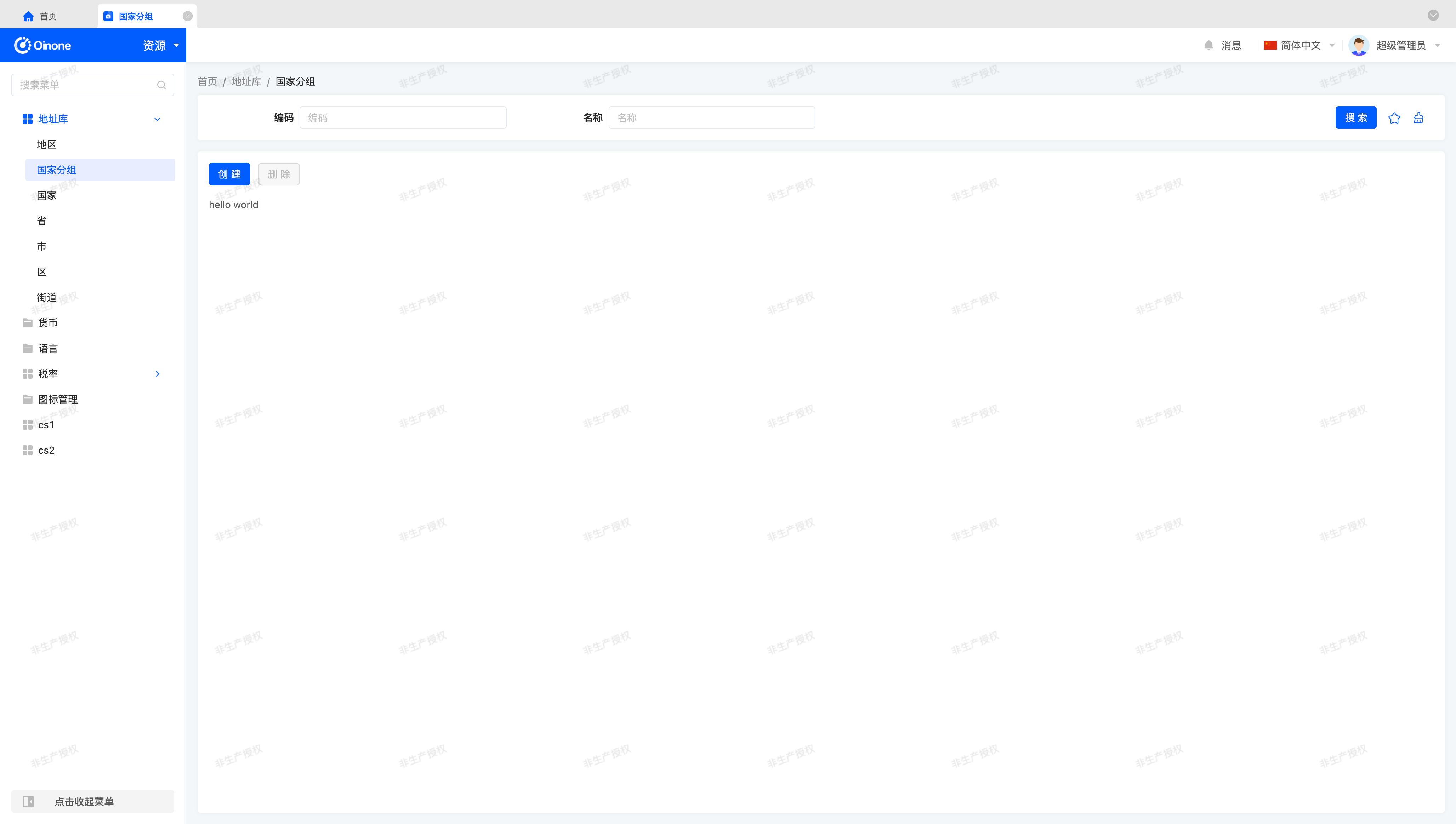
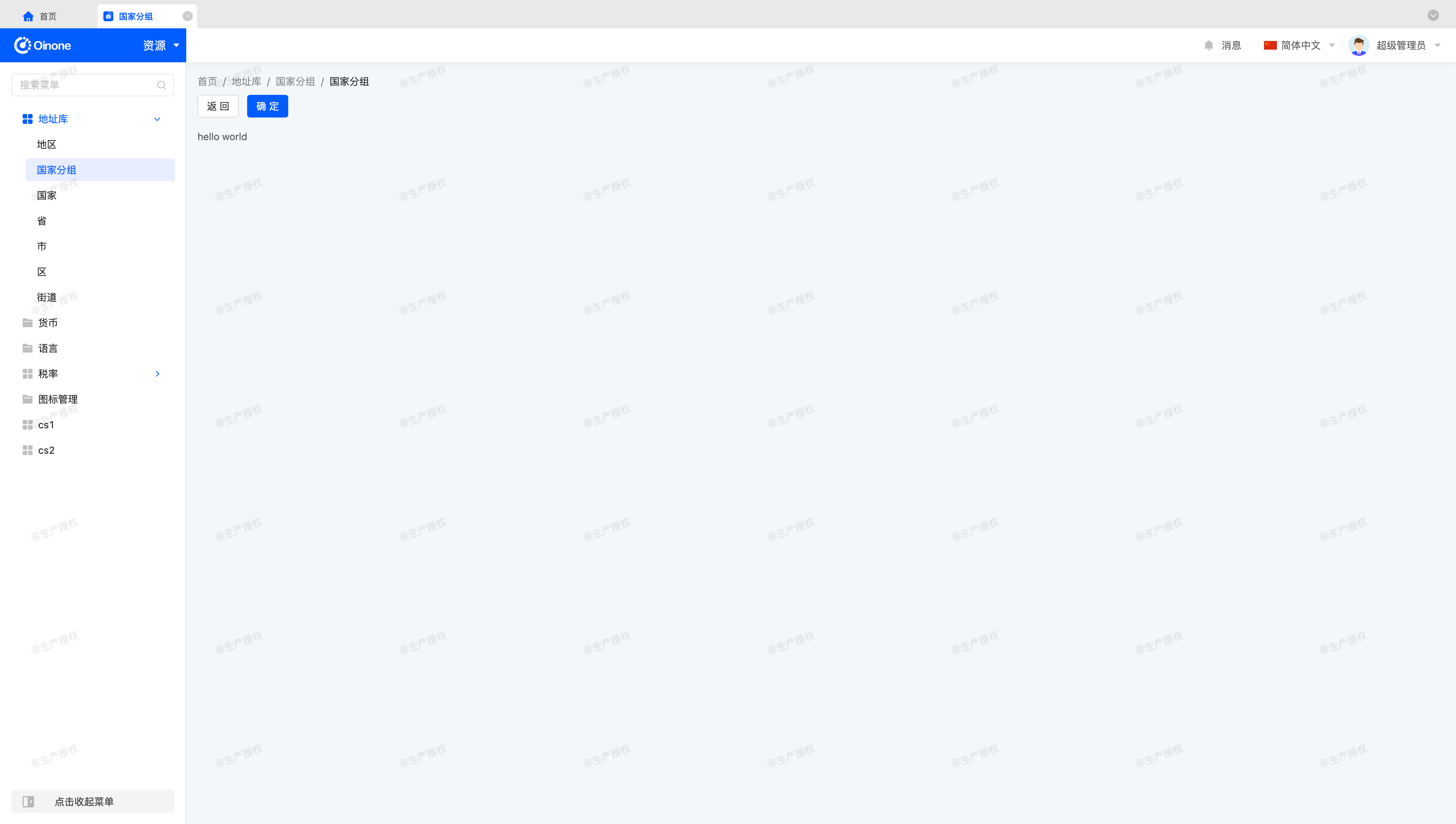
}Let's start with a hello world:
<template>
  <div class="custom-table-demo">hello world</div>
</template>(Ⅱ) Display CustomTableWidget on the Page
Let's switch components through registerLayout by changing widget="table" to widget="CustomTable" to complete the component switch:
<view type="TABLE">
    <pack widget="group">
        <view type="SEARCH">
            <element widget="search" slot="search" slotSupport="field">
                <xslot name="searchFields" slotSupport="field" />
            </element>
        </view>
    </pack>
    <pack widget="group" slot="tableGroup">
        <element widget="actionBar" slot="actionBar" slotSupport="action">
            <xslot name="actions" slotSupport="action" />
        </element>
        <element widget="CustomTable" slot="table" slotSupport="field">
            <element widget="expandColumn" slot="expandRow" />
            <xslot name="fields" slotSupport="field" />
            <element widget="rowActions" slot="rowActions" slotSupport="action" />
        </element>
    </pack>
</view>Tip
For related content about built-in layouts, please refer to: Layout
Well, our page should now look like this:
(Ⅲ) Use OioTable Component
Let's make some modifications to the Vue component template:
<template>
  <div class="custom-table-demo">
    <oio-table
      ref="table"
      :data="showDataSource"
      border
      show-overflow
      :row-config="{ isCurrent: true, isHover: true }"
    >
      <slot />
    </oio-table>
  </div>
</template>The corresponding props declaration can be like this:
props: {
  setTableInstance: {
    type: Function as PropType<(tableInstance: OioTableInstance | undefined) => void>
  },
  showDataSource: {
    type: Array as PropType<ActiveRecord[]>
  }
}Tip
The BaseElementListViewWidget component provides two data source objects: dataSource and showDataSource.
These two data source objects are completely the same when front-end search and front-end sorting are not performed. In the previous Create a gantt view tutorial, we have used the dataSource data source object, and here we use another showDataSource data source object.
Here, to ensure the table functions properly, we must use the setTableInstance method to pass the OioTable component instance to the Widget component, allowing the Widget component to directly operate on the OioTable instance. This is similar to our operation in the Focus on Input Box tutorial, both aiming to transfer logic to the Widget component to provide specific functions that can be overridden or inherited. We can handle it like this:
setup(props) {
  const table = ref<OioTableInstance | undefined>();

  onMounted(() => {
    props.setTableInstance?.(table.value);
  });

  return {
    table
  };
}Tip
Although we can see the page rendered normally without this handling, it is very necessary to call the setTableInstance method when mounted for the TableWidget component to facilitate our subsequent work without issues in certain functions.
Up to this point, we can see a table display on the page that is "almost" identical to the default table style:
Oops~, the table height doesn't seem right. Let's write some css to adjust it:
.custom-table-demo {
  height: 100%;
}Thus, our basic table is completed~
(Ⅳ) Use OioPagination Component
Let's make some modifications to the Vue component template:
<template>
  <div class="custom-table-demo">
    ...
    <oio-pagination
      :page-size-options="pageSizeOptions"
      :current-page="pagination.current"
      :page-size="pagination.pageSize"
      :total="pagination.total"
      :show-total="true"
      :show-jumper="true"
      :show-last-page="true"
      @change="onPaginationChange"
    />
  </div>
</template>The corresponding props declaration can be like this:
props: {
  pageSizeOptions: {
    type: Array as PropType<(number | string)[]>
  },
  pagination: {
    type: Object as PropType<Pagination>,
    default: () => ({})
  },
  onPaginationChange: {
    type: Function as PropType<(currentPage: number, pageSize: number) => ReturnPromise<void>>
  }
}These attributes have the following meanings:
- pageSizeOptions: Pagination size options.
- pagination: Pagination parameters. Including current page, page size, total pages, total data size.
- onPaginationChange: Called when pagination changes.
At this point, we find that although the paginator has been rendered, there is a slight issue with the styling. Now we want the table to expand according to the screen, and the paginator should always be at the bottom of the page. We can adjust it with flex layout:
.custom-table-demo {
  height: 100%;
  display: flex;
  flex-direction: column;
  row-gap: 16px;

  .oio-table {
    flex: 1;
    position: relative;

    .oio-table-content-wrapper {
      width: 100%;
      height: 100%;
      position: absolute;
    }
  }
}Due to the height implementation issue of the vxe-table third-party component, the height control of the table component is somewhat special. In addition to the above css adjustments, we also need to add the height="100%" attribute to the OioTable component to make the table height normal.
Now, our page looks like this:
Warning
We have provided a solution for the table height above, and readers can also solve the table height problem by themselves.
When solving the height problem independently, it is necessary to consider the issue of exceeding the screen range when the table data volume exceeds one screen. For easy observation, we can change the paginator to 30 items/page so that the table height will expand beyond the screen range.
In the css style we provided above, the combination of position: relative; and position: absolute; is the key to solving the height problem. Using off-document flow height control, the table height is limited to the maximum height of the outer div, ensuring that the height calculation of the table component does not exceed the maximum height of the outer div.
To allow us to quickly test the pagination function, let's adjust the pagination size options (pageSizeOptions) parameter to the array [1, 2, 3, 4, 5]. We also need to adjust the default pagination size (defaultPageSize) parameter so that we can select the corresponding pagination size option when first entering the page.
Following our division of responsibilities between Widget components and Vue components, we should adjust these parameters in CustomTableWidget as follows:
@Widget.Reactive()
protected get pageSizeOptions(): number[] {
  return [1, 2, 3, 4, 5];
}

@Widget.Reactive()
protected get defaultPageSize(): number {
  return 2;
}Let's test whether the paginator works properly.

It seems that our paginator is working properly. Let's continue practicing to implement other functions~
Tip
Although our development process for the pagination function ends here, there is a change that we need to explicitly mention.
The default pagination change (onPaginationChange) method will synchronously modify the browser URL parameters, appending two parameters currentPage and pageSize to save the current page status.
When the page is refreshed or the URL is copied elsewhere, the browser URL parameters will be prioritized as the pagination parameters for the current page.
(Ⅴ) Enable Checkbox Functionality
In the first column of the table, we notice the lack of the default table's Checkbox selection function. Let's try to restore this function.
Let's make some modifications to the Vue component template:
<template>
  <div class="custom-table-demo">
    <oio-table
      ref="table"
      :data="showDataSource"
      height="100%"
      border
      show-overflow
      :row-config="{ isCurrent: true, isHover: true }"
      :checkbox-config="{ trigger: 'row', highlight: true, checkMethod }"
      @checked-change="onCheckedChange"
      @checked-all-change="onCheckedAllChange"
    >
      <oio-column
        type="checkbox"
        class-name="table-column-checkbox"
        haader-class-name="table-header-column-checkbox"
        :width="52"
        align="center"
        fixed="left"
      />
      <slot />
    </oio-table>
    ...
  </div>
</template>The corresponding props declaration can be like this:
props: {
  checkMethod: {
    type: Function
  },
  onCheckedChange: {
    type: Function as PropType<(data: ActiveRecords, event?: CheckedChangeEvent) => void>
  },
  onCheckedAllChange: {
    type: Function as PropType<(selected: boolean, data: ActiveRecord[], event?: CheckedChangeEvent) => void>
  }
}At this point, without any other processing, we will find that these methods do not work properly. This is because events emitted by the OioTable component cannot be directly processed by the TableWidget component. We also need to do a "bridging" process in setup to make these methods work properly. For different processing methods of specific methods, we need to handle them flexibly according to the API documentation. For our current function, we can handle it as follows:
setup(props) {
  const onCheckedChange = (event: CheckedChangeEvent) => {
    const { records } = event;
    props.onCheckedChange?.(records, event);
  };

  const onCheckedAllChange = (event: CheckedChangeEvent) => {
    const { checked, records } = event;
    props.onCheckedAllChange?.(checked, records, event);
  };

  return {
    onCheckedChange,
    onCheckedAllChange
  };
}Tip
When using methods with the same name as those declared in props in setup, the priority in setup is higher than the props declaration.
Tip
It is worth mentioning that in Oinone, there are many designs similar to methods like onCheckedChange and onCheckedAllChange. The purpose of this is that during component abstraction, we try not to expose too many details of standard component event parameters. In Vue components, the processable parameters of a class of behaviors are separated from the event parameters, and built-in Widget components use component event parameters as little as possible, which can maximize the generality of a class of behaviors.
Of course, there are some exceptions. Due to different understandings of this abstraction process among developers, some methods that are not abstracted, insufficiently abstracted, or overly abstracted will eventually be defined. We have mentioned in the "Tutorial" that component generalization is a philosophy of component abstraction, which leads to the re-evaluation of previously abstracted behaviors in different periods or when using different third-party component libraries. We hope that readers can summarize their own understanding of component abstraction during the study of Oinone to better use Oinone.
In the above, we added a Checkbox column using the OioColumn component. In addition, we can also add a Checkbox column by using the widget="checkbox-column" component in the layout (Layout), which can achieve the same effect.
<element widget="checkbox-column" />Warning
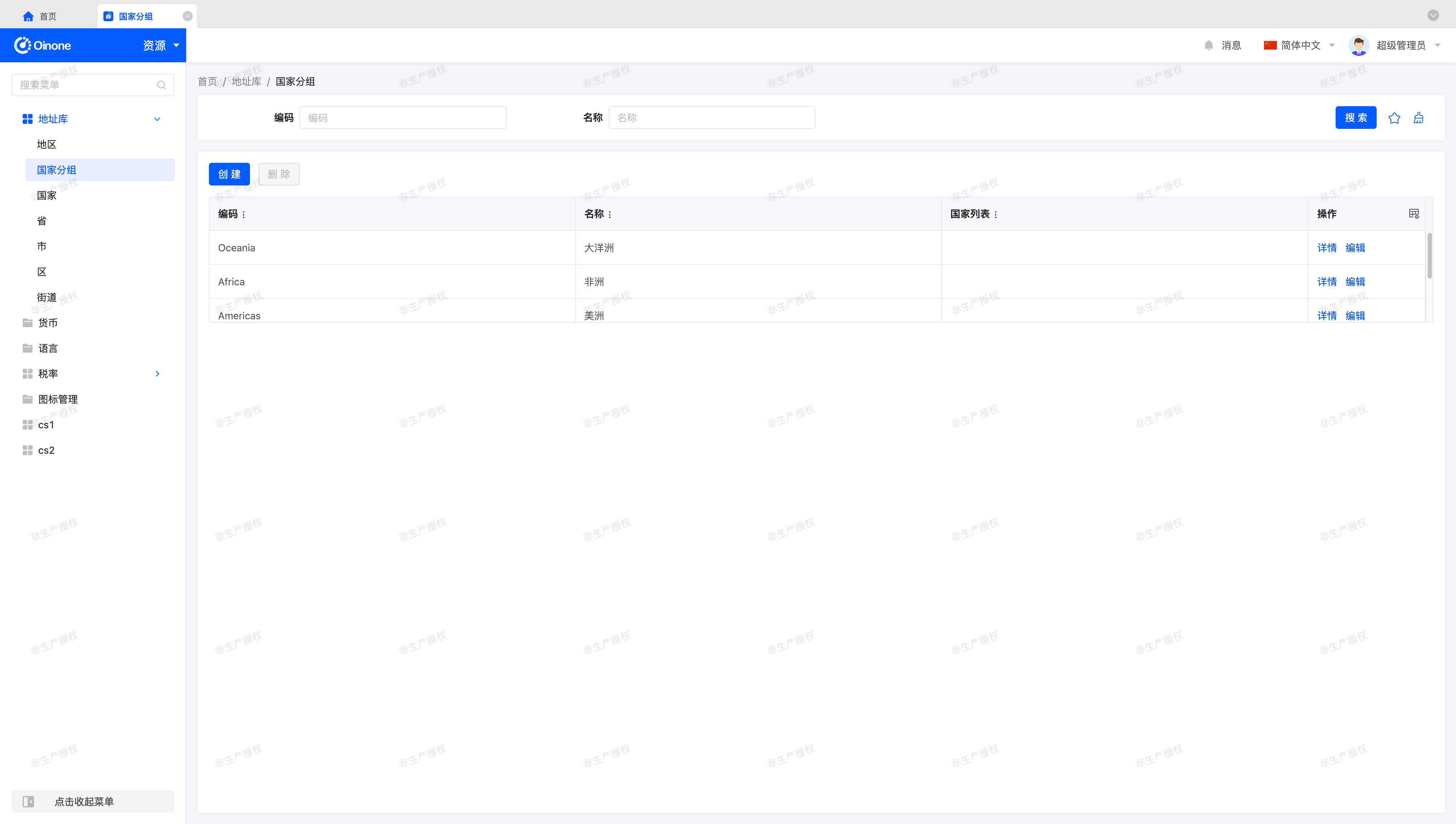
When testing the Checkbox function, we may find that the "Delete" button does not become "clickable" because the "Resource - Country Group" page configures a "disabled" attribute for the "Delete" action, which is an expression that does not allow users to delete specified country groups. We can test the "Delete" function by using the "Create" function to create a new country group data for testing.
(Ⅵ) Further Steps
If you have time, here are some exercises you can try:
- Enable Radio single-selection functionality to replace Checkbox multi-selection functionality using built-in APIs.
- Enable sorting functionality using built-in APIs.
- Enable inline editing functionality using built-in APIs.
III. Custom Form Component
In this exercise, we will gradually implement a form component from scratch, which will allow us to understand the functions provided by the built-in form component and the use of some standard components.
Let's get started~
(Ⅰ) Create CustomFormWidget Component
Similar to the custom table component, we can create the CustomFormWidget component by inheriting the FormWidget component to complete our exercise content. Just like below:
import CustomForm from './CustomForm.vue';

@SPI.ClassFactory(
  BaseElementWidget.Token({
    viewType: ViewType.Form,
    widget: 'CustomForm'
  })
)
export class CustomFormWidget extends FormWidget {
  public initialize(props) {
    super.initialize(props);
    this.setComponent(CustomForm);
    return this;
  }
}In the following sections, the template for the registerLayout method will no longer be provided. Readers can complete the layout (Layout) registration and component switching by themselves according to the default layout provided in the Layout article. Similar to creating the custom table component above, we first use hello world to see the effect page of component switching:
(Ⅱ) Use OioForm Component
Compared to the table component, the OioForm component is easier to use and has fewer complex functions than the table component. Let's make some modifications to the Vue component template:
<template>
  <div class="custom-form-demo">
    <oio-form ref="form" class="oio-default-form" :layout="layout" :label-col="labelCol" :wrapper-col="wrapperCol">
      <pack widget="row">
        <slot />
      </pack>
    </oio-form>
  </div>
</template>Tip
Here we use the Pack component, which is exactly the same as the XML-defined pack tag we use in layout (Layout). You can use it in layout (Layout) or in the Vue component template.
For more content related to the Pack component, please refer to: Pack
The corresponding props declaration can be like this:
props: {
  setFormInstance: {
    type: Function as PropType<(instance: OioFormInstance | undefined) => void>
  },
  layout: {
    type: [String, Object] as PropType<FormLayout>
  },
  labelCol: {
    type: Object as PropType<OioColModel>
  },
  wrapperCol: {
    type: Object as PropType<OioColModel>
  }
}Similar to the table component, to ensure the form functions properly, we must use the setFormInstance method to pass the OioForm component instance to the Widget component, allowing the Widget component to directly operate on the OioForm instance.
Next, we use the Pack component, class="oio-default-form", and the other three layout attributes to keep the layout style of the form fields consistent with the default form.
At this point, we have completed the exercise content for this section.
Tip
For more content related to Form, please refer to: Form
IV. Custom Gallery Component
Let's recall the case of customizing a card component in the "Customize a gallery view" section. In that case, we completed the customization requirements for the gallery view by customizing the card component in the gallery view.
Next, let's create a gallery component to customize the gallery view in a more flexible way.
In this exercise, you will display the table view as a gallery view instead of directly using the gallery view, and complete the customization of the gallery layout and card style.
(Ⅰ) Create CustomGalleryWidget Component
Similar to the custom table component, we can create the CustomGalleryWidget component by inheriting the GalleryWidget component to complete our exercise content. Just like below:
import CustomGallery from './CustomGallery.vue';

@SPI.ClassFactory(
  BaseElementWidget.Token({
    viewType: ViewType.Table,
    widget: 'CustomGallery'
  })
)
export class CustomGalleryWidget extends GalleryWidget {
  public initialize(props) {
    super.initialize(props);
    this.setComponent(CustomGallery);
    return this;
  }
}Tip
It should be noted that here we use the view type Table (TABLE), not Gallery (GALLERY).
(Ⅱ) Use OioGallery Component
Let's "extract" the card implemented in "Customize a gallery view"过来, the corresponding Vue component template should be like this:
<template>
  <div class="custom-gallery-demo">
    <oio-gallery
      :list="showDataSource"
      item-key="__draftId"
      wrapperClassName="oio-scrollbar"
      :cols="cols"
      :gutter="gutter"
    >
      <template #default="{ key, data, index }">
        <div class="custom-card-demo" :key="key">
          <div class="custom-card-title">
            <b>{{ data.name }}({{ data.code }})</b>
          </div>
          <div class="custom-card-content">This is a content area.</div>
          <div class="default-card-row-actions">
            <action-bar widget="CardRowActions" inline :active-records="data" :row-index="index">
              <slot name="rowActions" />
            </action-bar>
          </div>
        </div>
      </template>
    </oio-gallery>
  </div>
</template>The corresponding props declaration can be like this:
props: {
  showDataSource: {
    type: Array as PropType<ActiveRecord[]>
  },
  cols: {
    type: Number
  },
  gutter: {
    type: [Number, String, Array, Object] as PropType<CommonGutterType>
  }
}Then "extract" a part of the css style:
.custom-card-demo {
  background-color: #ffffff;
  border: 1px solid #e3e7ee;
  border-radius: 4px;

  .custom-card-title {
    border-bottom: 1px solid #e3e7ee;
    text-align: center;
    padding: 16px 0;
  }

  .custom-card-content {
    padding: 16px;
    text-align: center;
  }
}Now our page looks like this:
Tip
Combined with the definition of the Vue component template, if you do not process the content of the rowActions slot in the layout (Layout), you may not be able to see the actions on the card normally. Regarding this issue, you can find the answer in the next section.
(Ⅲ) Fix Card Actions
If you directly switch components according to the previous method, the actions rendered in the card may be lost. Maybe you did this:
<view type="TABLE">
    <pack widget="group">
        <view type="SEARCH">
            <element widget="search" slot="search" slotSupport="field">
                <xslot name="searchFields" slotSupport="field" />
            </element>
        </view>
    </pack>
    <pack widget="group" slot="tableGroup">
        <element widget="actionBar" slot="actionBar" slotSupport="action">
            <xslot name="actions" slotSupport="action" />
        </element>
        <element widget="CustomGallery" slot="table" slotSupport="field">
            <element widget="expandColumn" slot="expandRow" />
            <xslot name="fields" slotSupport="field" />
            <element widget="rowActions" slot="rowActions" slotSupport="action" />
        </element>
    </pack>
</view>The definition of other places remains unchanged. Let's extract the CustomGallery paragraph definition:
<element widget="CustomGallery" slot="table" slotSupport="field">
    <element widget="expandColumn" slot="expandRow" />
    <xslot name="fields" slotSupport="field" />
    <element widget="rowActions" slot="rowActions" slotSupport="action" />
</element>Now, let's recall the section "Universal Card with Slots", in the layout (Layout), we used slots (Slot) and the content related to named slots mentioned in the extended content section. A correct definition should be like this:
<element widget="CustomGallery" slot="table" slotSupport="field">
    <xslot name="fields" slotSupport="field" />
    <template slot="rowActions" />
</element>The final merged DSL result may be like this:
<element widget="CustomGallery" slot="table" slotSupport="field">
    <field data="code" />
    <field data="name" />
    <template slot="rowActions">
        <action name="redirectDetailPage" />
        <action name="redirectUpdatePage" />
    </template>
</element>Tip
When merging the layout (Layout) and DSL, as long as the XML tag in the layout has a slot attribute, then the template fragment with the same name in the DSL will have its attributes merged into the corresponding tag, and the sub-tags will be inserted under the corresponding XML tag. For the processing of xslot tags, it is a complete fragment replacement. This is how we obtain the XML fragment after the final merged DSL as seen above.
For more content about DSL, please refer to: DSL
(Ⅳ) More Layout Forms
When using the OioGallery component, we can only achieve one layout form rendered in the order of grid layout. To customize the gallery layout, we can process the dataset through a v-for statement to achieve more possible layout forms.
For simplicity, we render the same page without using the OioGallery component, so our Vue component template can be like this:
<template>
  <div class="custom-gallery-demo">
    <div class="custom-card-demo" v-for="(data, index) in showDataSource" :key="data.__draftId">
      <div class="custom-card-title">
        <b>{{ data.name }}({{ data.code }})</b>
      </div>
      <div class="custom-card-content">This is a content area.</div>
      <div class="default-card-row-actions">
        <action-bar widget="CardRowActions" inline :active-records="data" :row-index="index">
          <slot name="rowActions" />
        </action-bar>
      </div>
    </div>
  </div>
</template>The previous page achieved a grid layout with four cards per row through the combination of oio-row and oio-col. To achieve the same effect, let's add such a paragraph of css style to see the effect:
.custom-gallery-demo {
  display: flex;
  flex-wrap: wrap;
  align-content: flex-start;
  gap: 16px;

  .custom-card-demo {
    flex-basis: calc((100% - 48px) / 4);
  }
}Tip
In this example, what we need to care about is the use of the showDataSource attribute and the rendering of the rowActions slot, rather than the final displayed page effect. Combined with the content of our previous "Customize a gallery view" chapter, we can also achieve the effect of customizing card styles and realize component generalization. It is worth mentioning that compared to the method of only customizing cards, in this example, we can have more attributes to represent more functional changes.
(Ⅴ) Further Improvements
If you have time, here are some small improvements you can try:
- Add a paginator to our custom gallery.
- Add Checkbox on the card to allow users to perform selection operations