I. General Attributes
Form
- Creation Attribute: Similar to creating fields in the model designer, when creating a field-type component, a corresponding field will be added under the model of the current page.
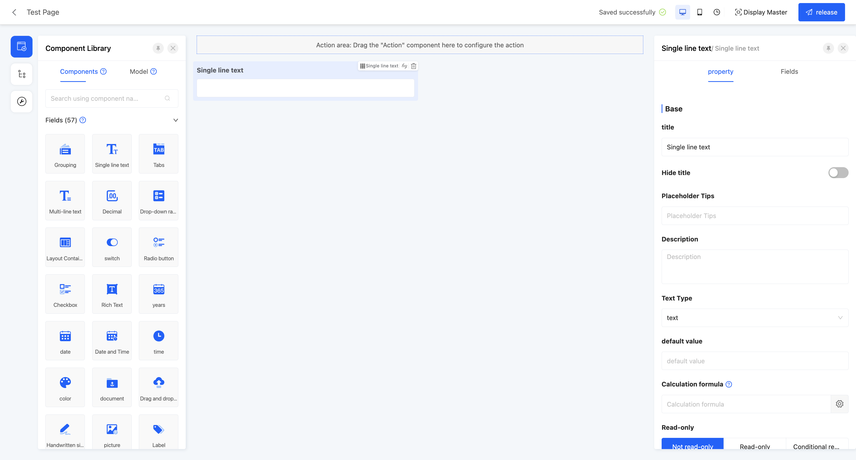
- Title: The display name of the component on the current page.
- Hide Title: When this option is enabled, the title of the component will be hidden.
- Placeholder Prompt: When the input box or selection box is empty, it shows light-colored prompt text to guide users to input, which does not affect the actual value of the field.
- Description: Provides descriptive information about the component, usually used to explain the scope and precautions of the field, helping users better understand and fill in. For field-type components, the description will be displayed below the component.

- Default Value: When the actual page is displayed, the field will show the set value by default. If the field is deleted or changed, the original default value will not be automatically filled back.
- Calculation Formula: If the calculated value involves variables, when the variables change, the calculated value will change synchronously.
Note
If both the default value and the calculation formula are set, on the actual page, the default value will be filled in first, and then the field value will change according to the calculation function.
Tip
For the filling of custom expressions in the calculation formula, you can refer to the "Custom Expressions" document.
- Read-only: If set to read-only, on the actual page, the field is visible but cannot be edited. If conditional read-only is set, it will be read-only when the conditions are met.
- Disabled: If set to disabled, on the actual page, the field is visible but cannot be edited. If conditional disable is set, it will be disabled when the conditions are met.
Tip
Generally, set read-only for field-type components and set disabled for action-type components.
- Hidden: If set to hidden, on the actual page, the field is invisible and cannot be edited. If conditional hiding is set, it will be hidden when the conditions are met. When designing the page, the hidden component will still be displayed.
- Required: You can control whether the field is required on the current page. If set to required, an asterisk (*) will be displayed before the title. If conditional requirement is set, it will be required when the conditions are met.
- Data Validation: Supports custom validation rules to check whether the input data meets the set requirements.
Tip
For the filling of custom expressions in data validation, you can refer to the "Custom Expressions" document.
- Validation Failure Prompt: When the input data fails the validation, the corresponding prompt message will be displayed.
- Submit Data: When the switch is enabled, if the current field changes, the data scope covered by the submission method will be changed according to the submission function.
- Clear Data: When the switch is enabled, if the current field changes, the selected field scope will be cleared.
- Title Arrangement: That is, the arrangement of the title and its content, which is divided into horizontal and vertical arrangements.
- Width: That is, the size of the component in the current row.
- Display Devices: Include PC, mobile, and PAD.
Example
When designing a PC page, if the display device of a component is set to only mobile and does not include PC, on the actual page, the component and other components it contains will not be displayed on the PC page.
- Show Clear Button: When this function is enabled, when there is content in the input box, users can clear the input content with one click.

Table
- Title: The display name of the component on the current page.
- Calculation Formula: If the calculated value involves variables, when the variables change, the calculated value will change synchronously.
- Hidden: If set to hidden, on the actual page, the field is invisible and cannot be edited. If conditional hiding is set, it will be hidden when the conditions are met. When designing the page, the hidden component will still be displayed.
- Inline Editing: When enabled, the field content can be directly edited in the cell. If conditional enablement is set, editing will be supported when the conditions are met.
- Required: You can control whether the field is required on the current page. If set to required, an asterisk (*) will be displayed before the title. If conditional requirement is set, it will be required when the conditions are met.
- Data Validation: Supports custom validation rules to check whether the input data meets the set requirements.
- Validation Failure Prompt: When the input data fails the validation, the corresponding prompt message will be displayed.
- Double Confirmation: When this function is enabled, before performing an action, a confirmation box will pop up for double confirmation. You can customize the prompt type, direction, text, and other content of the pop-up box.
- Support Prefix/Suffix: Supports adding prefixes and suffixes to the input content. The prefix and suffix types can be text or icons. When the text type is selected, you can choose whether to store the prefix/suffix content to simplify the operation process when the data highly overlaps.
- Field Action Configuration: When this function is enabled, when you click on the field data, the pre-configured action will be executed.
- Operation Method: Used to select the operation method of the field, which can be single-click or double-click.
- Specify Click Action: You can customize the specific action to be executed when clicking on the field. The selection range is limited to the action options included in the current table row.
- Fixed Column Width: Used to specify the fixed width of the column where the field is located in the table. Once the fixed column width is set, the width of this column will remain constant regardless of the number of columns in the table.
- Minimum Column Width: Used to set the minimum width of the column where the field is located in the table. When the column width in the table changes, the minimum shrinkable value will be limited by the set minimum column width.
Note
- If the set value of the fixed column width is less than the minimum column width, the minimum column width will be used as the actual displayed column width.
- After manually adjusting the table column width, the previously set fixed column width and minimum column width will no longer be effective. You need to restore their default values through the table header settings for these settings to take effect again.
- Header Alignment: That is, the alignment of the content in the table header cells, including left alignment, center alignment, and right alignment.
- Content Alignment: That is, the alignment of the content in the data cells in the table, including left alignment, center alignment, and right alignment.
- Display Devices: Include PC, mobile, and PAD.
- Allow Sorting: When this function is enabled, a sorting icon will be displayed in the column where the field is located, allowing users to customize the ascending or descending sorting method.
II. Specific Attributes
(Ⅰ) Single-line Text
A single-line text box is suitable for recording short text content such as names and codes.
Example
Design Example:
Display Page:
Specific attributes of single-line text:
- Creation Attribute
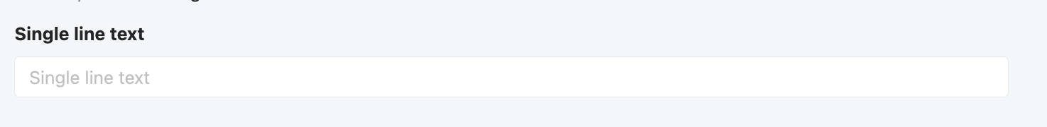
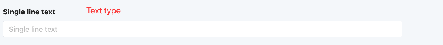
- Field Business Type: Only supports text type.
- Text Type: Includes text and password, with text as the default. If set to text, the input content will be visible; if set to password, the input content will be invisible.
- Maximum/Minimum Length: You can set the length range of the input content, including the maximum and minimum lengths, to limit user input.
- Input Format: Provides multiple input format restriction options, including no restriction, URL, ID card, and custom. When custom is selected, you can define the specific format through a regular expression and set the prompt message when the format does not match.
- Support Prefix/Suffix: Supports adding prefixes and suffixes to the input content. The prefix and suffix types can be text or icons. When the text type is selected, you can choose whether to store the prefix/suffix content to simplify the operation process when the data highly overlaps.
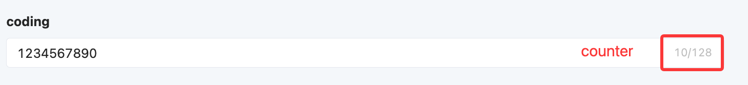
- Show Counter: If users need to pay attention to the length of the input content, they can enable the show counter function to see the current length of the content in real-time while inputting.
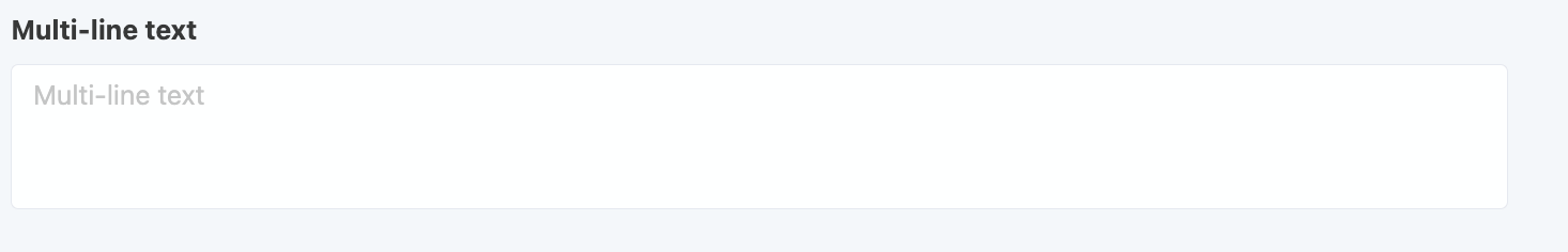
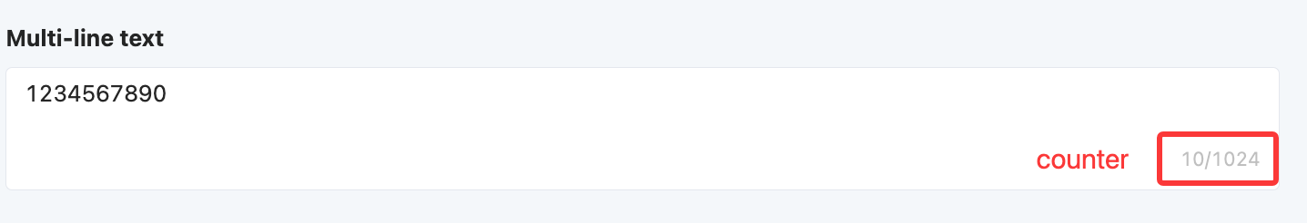
(Ⅱ) Multi-line Text
A multi-line text box is suitable for recording long text content such as opinions and remarks.
Example
Design Example:
Display Page:
Specific attributes of multi-line text:
- Creation Attribute
- Field Business Type: Only supports multi-line text type.
- Maximum/Minimum Length: You can set the length range of the input content, including the maximum and minimum lengths, to limit user input.
- Show Counter: If users need to pay attention to the length of the input content, they can enable the show counter function to see the current length of the content in real-time while inputting.
(Ⅲ) Rich Text
A WYSIWYG text editor that can be embedded in the browser, similar to Word in function. It is suitable for editing long descriptive text and supports operations such as changing font styles and inserting pictures.
Example
Design Example:
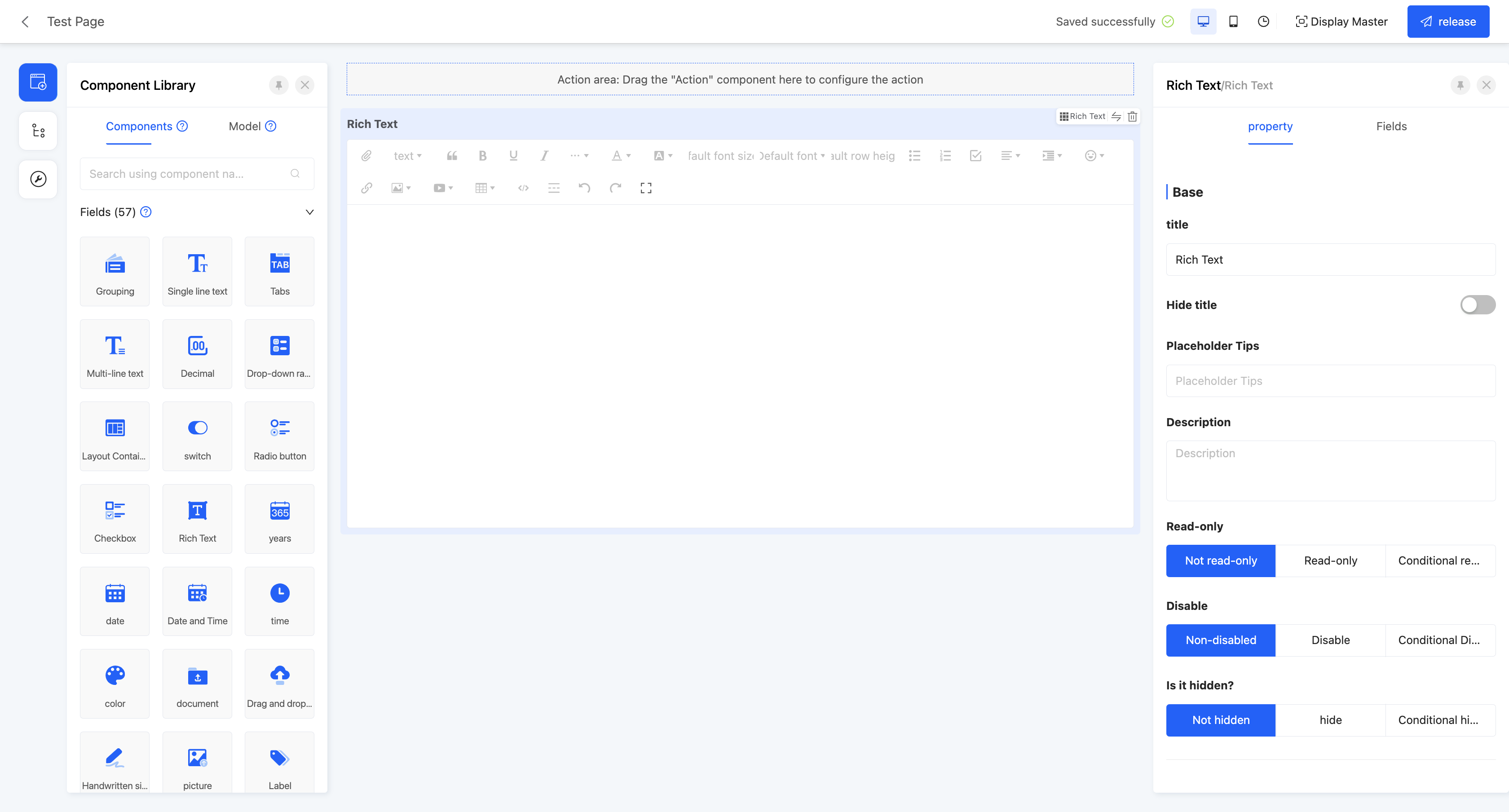
Display Page:
Specific attributes of rich text:
- Creation Attribute
- Field Business Type: Only supports rich text type.
- Height: Refers to the size of the component displayed on the actual page.
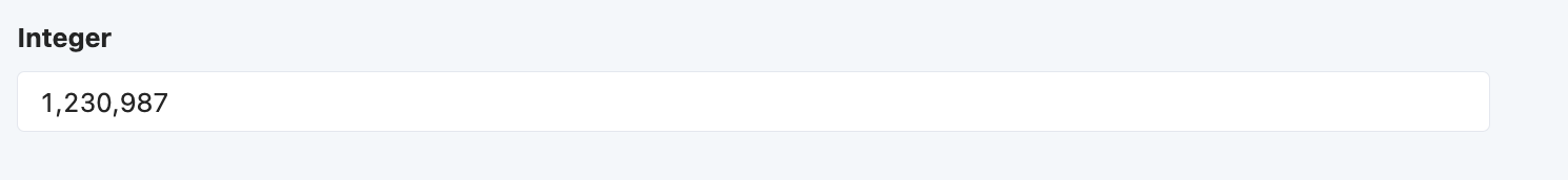
(Ⅳ) Integer
Only allows integer input, suitable for inputting integer data such as days and quantities.
Example
Design Example:

Display Page:
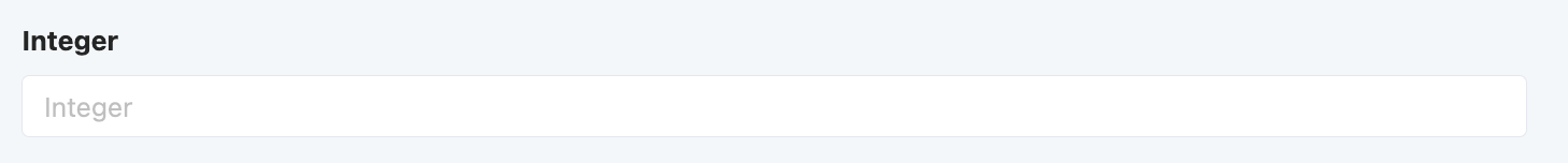
Specific attributes of integers:
- Creation Attribute
- Field Business Type: Only supports integer type.
- Maximum/Minimum Value: You can set the value range of the input content, including the maximum and minimum values, to limit user input.
- Support Prefix/Suffix: Supports adding prefixes and suffixes to the input content. The prefix and suffix types can be text or icons. When the text type is selected, you can choose whether to store the prefix/suffix content to simplify the operation process when the data highly overlaps.
- Show Thousands Separator: When this function is enabled, when the input value is large, it will be displayed in thousands separator format.
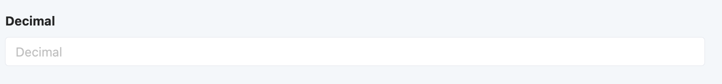
(Ⅴ) Decimal
Only allows decimal input, suitable for inputting decimal data such as amounts and temperatures.
Example
Design Example:

Display Page:
Specific attributes of decimals:
- Creation Attribute
- Field Business Type: Only supports floating-point type.
- Precision: Limits the precision range of decimals, and its value must be between 1 and 2.
- Maximum/Minimum Value: You can set the value range of the input content, including the maximum and minimum values, to limit user input.
- Decimal Places: Its value must be within the precision range set when creating the component.
- Support Prefix/Suffix: Supports adding prefixes and suffixes to the input content. The prefix and suffix types can be text or icons. When the text type is selected, you can choose whether to store the prefix/suffix content to simplify the operation process when the data highly overlaps.
- Show Thousands Separator: When this function is enabled, when the input value is large, it will be displayed in thousands separator format.
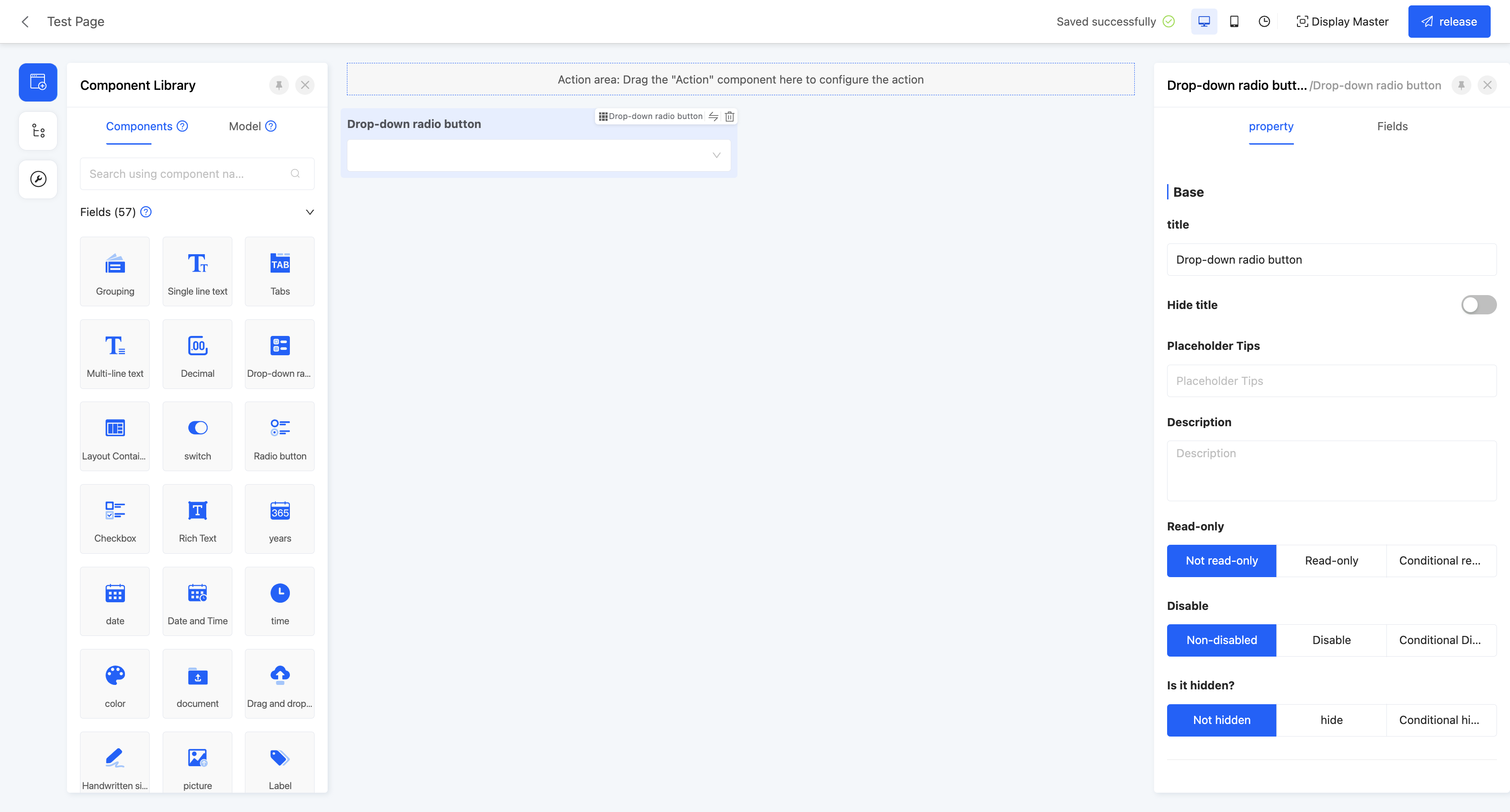
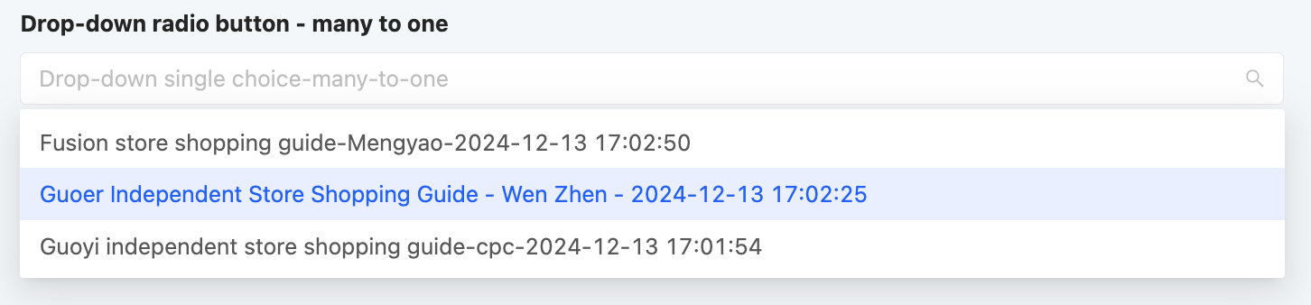
(Ⅵ) Drop-down Single Selection/Table drop-down radio/popup radio
Allows users to select one data value from multiple options in a drop-down list. The options can be associated with model data, data dictionaries, or boolean data, suitable for single-selection scenarios.
Example
Design Example:
Display Page:
Standard drop-down single selection: 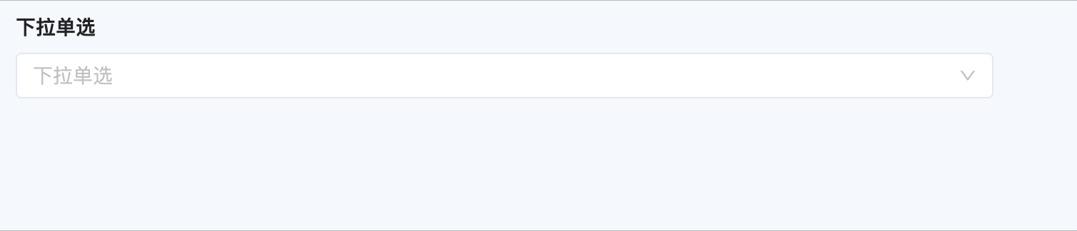
Table drop down single selection: 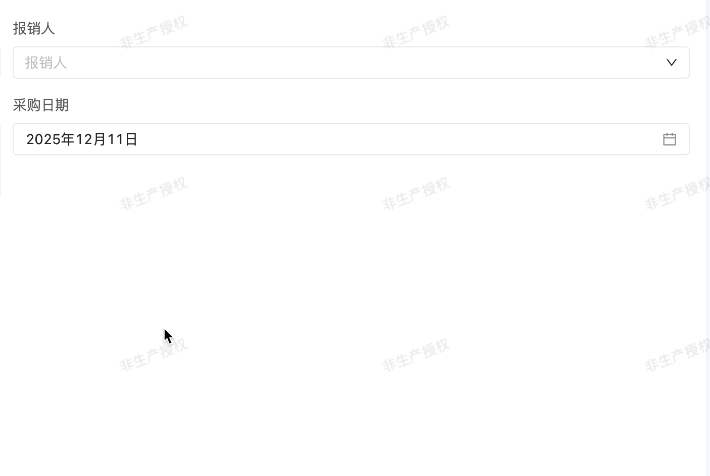
Select the popup window: 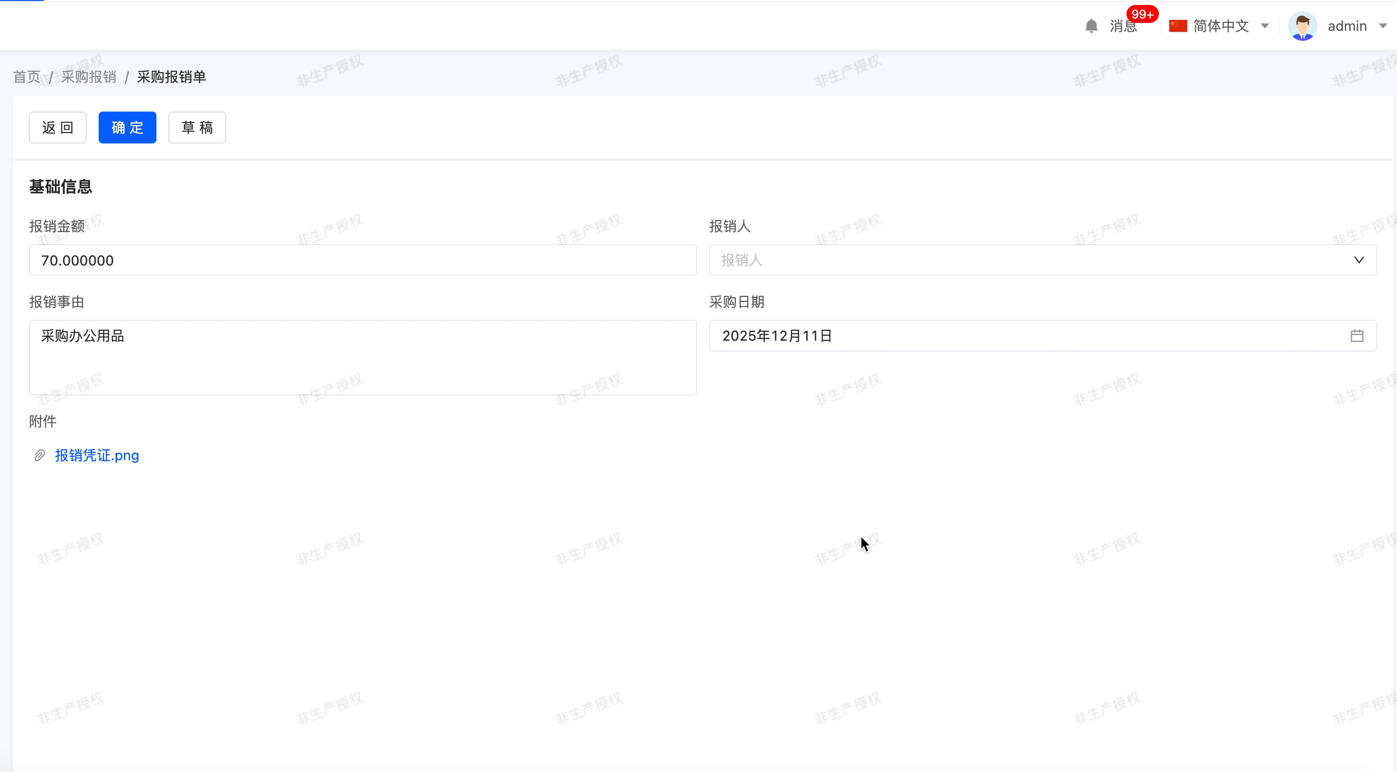
Specific attributes of drop-down single selection:
- Creation Attribute
- Field Business Type: Supports boolean, data dictionary, and many-to-one.
Note
- For data dictionaries, existing data dictionaries need to be selected.
- For many-to-one, the associated model needs to be set.
- Table drop-down radio and popup radio only support many-to-one type
- Option Type: That is, the field business type at creation, which cannot be changed.
- Auto-fill Data Dictionary Options: When the field business type is a data dictionary, this attribute is displayed. If this option is enabled, adding dictionary items to the data dictionary will be updated synchronously.
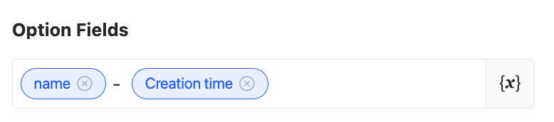
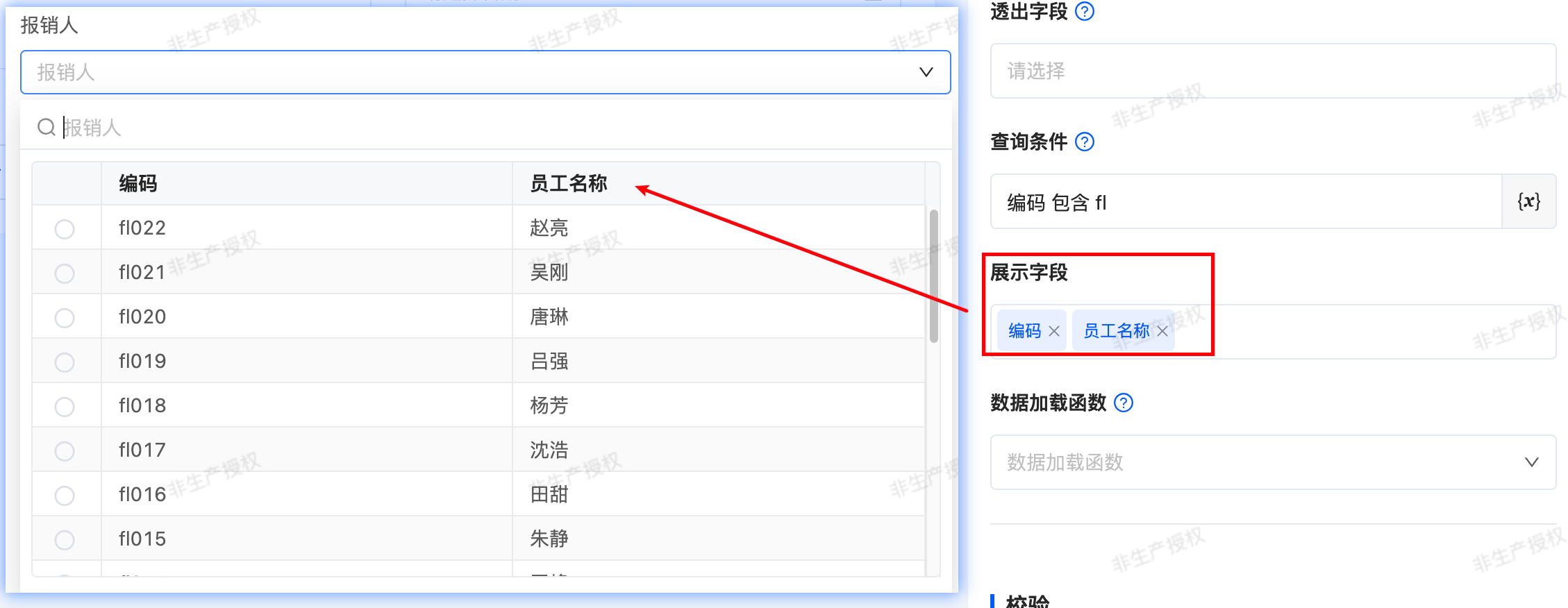
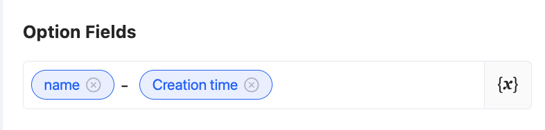
- Option Field: When the field business is many-to-one, this attribute is displayed. You can select a specific field as the option value. When multiple selections are made, these option values will be concatenated and displayed. The default option field is the name.
Tip
You can set constant content as a separator between option fields, such as "-" or "/".
- Search Field: When the field business is many-to-one, this attribute is displayed. When users input content in the input box, if the input content is included in the search field, the values containing this content will be displayed as search results. By default, all option fields are set as search fields. You can choose whether to use existing search conditions as needed.

- Exposed Field: When the field business is many-to-one, this attribute is displayed. The selection range is limited to the model fields bound to the component. When a field is set as an exposed field, it means that this field can be used in the current view.
- Query Condition: When the field business is many-to-one, this attribute is displayed. On the actual page, data will be displayed according to the configured query conditions.
Tip
For the filling of custom expressions in query conditions, you can refer to the "Custom Expressions" document.
- Display fields: Fields in the associated model can be checked and displayed as columns in the table/popup when the drop-down is expanded
- Data Loading Function: When the field business is many-to-one, this attribute is displayed. When an option value is selected on the actual page, this function will be executed to load data.
- Option Configuration: When the field business is boolean or a data dictionary, this attribute is displayed.
- After selecting an option row, you can directly drag it to change its position.
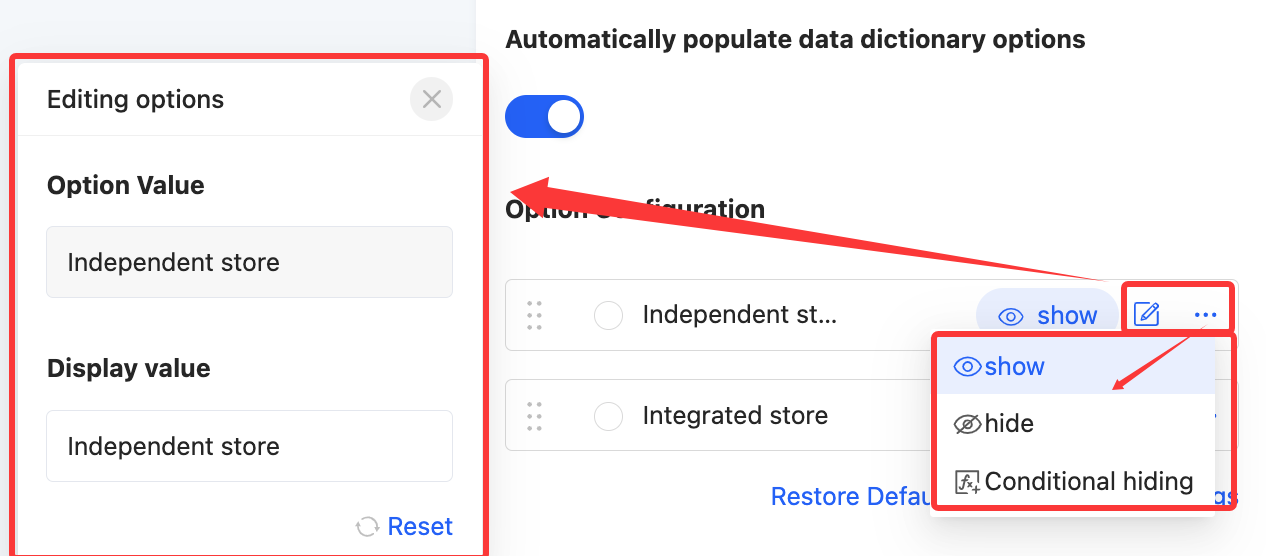
- Click the radio button before an option to set this option as the default value for drop-down single selection. This default value will be directly displayed on the actual page.
- Click the "Edit" icon to modify the display value of this option, making the same data dictionary or boolean value applicable in different scenarios.
- Click "Hide/Show" to control whether this option is visible at runtime. All dictionary items are visible by default.
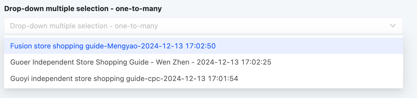
(Ⅶ) Drop-down Multiple Selection/Table drop down multiple select/popup multiple select
Allows users to select multiple data values from multiple options in a drop-down list. The options can be associated with model data, data dictionaries, or boolean data, suitable for multiple-selection scenarios.
Example
Design Example:

Display Page:
Standard drop-down multiple selection 
Drop down the table to select more 
Multiple options for the popup 
Specific attributes of drop-down multiple selection:
- Creation Attribute
- Field Business Type: Supports data dictionary, one-to-many, and many-to-many.
Note
- For data dictionaries, existing data dictionaries need to be selected.
- For one-to-many and many-to-many, the associated model needs to be set.
- Table drop-down multi-select and popup multi-select only support one-to-many and many-to-many types
- Option Type: That is, the field business type at creation, which cannot be changed.
- Auto-fill Data Dictionary Options: When the field business type is a data dictionary, this attribute is displayed. If this option is enabled, adding dictionary items to the data dictionary will be updated synchronously.
- Option Configuration: When the field business is a data dictionary, this attribute is displayed.
- After selecting an option row, you can directly drag it to change its position.
- Click the radio button before an option to set this option as the default value for drop-down single selection. This default value will be directly displayed on the actual page.
- Click the "Edit" icon to modify the display value of this option, making the same data dictionary or boolean value applicable in different scenarios.
- Click "Hide/Show" to control whether this option is visible at runtime. All dictionary items are visible by default.
- Option Field: When the field business is one-to-many or many-to-many, this attribute is displayed. You can select a specific field as the option value. When multiple selections are made, these option values will be concatenated and displayed. The default option field is the name.
Tip
You can set constant content as a separator between option fields, such as "-" or "/".
- Search Field: When the field business is one-to-many or many-to-many, this attribute is displayed. When users input content in the input box, if the input content is included in the search field, the values containing this content will be displayed as search results. By default, all option fields are set as search fields. You can choose whether to use existing search conditions as needed.

- Exposed Field: When the field business is one-to-many or many-to-many, this attribute is displayed. The selection range is limited to the model fields bound to the component. When a field is set as an exposed field, it means that this field can be used in the current view.
- Query Condition: When the field business is one-to-many or many-to-many, this attribute is displayed. On the actual page, data will be displayed according to the configured query conditions.
Tip
For the filling of custom expressions in query conditions, you can refer to the "Custom Expressions" document.
- Display fields: Fields in the associated model can be checked and displayed as columns in the table/popup when the drop-down is expanded

- Data Loading Function: When the field business is one-to-many or many-to-many, this attribute is displayed. When an option value is selected on the actual page, this function will be executed to load data.
- Maximum/Minimum Selection Count: You can limit the selection count range, including the maximum and minimum selection counts, to limit user input.
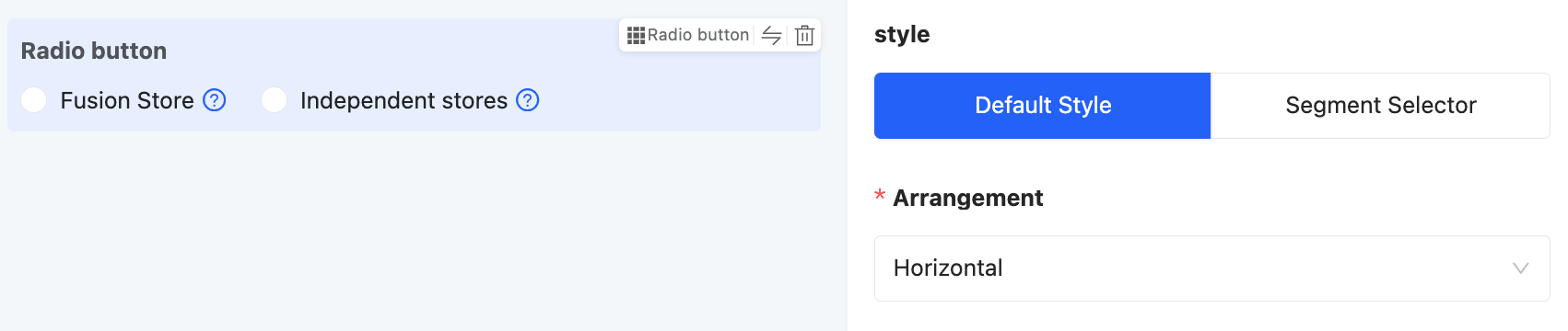
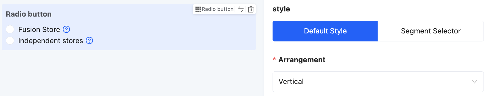
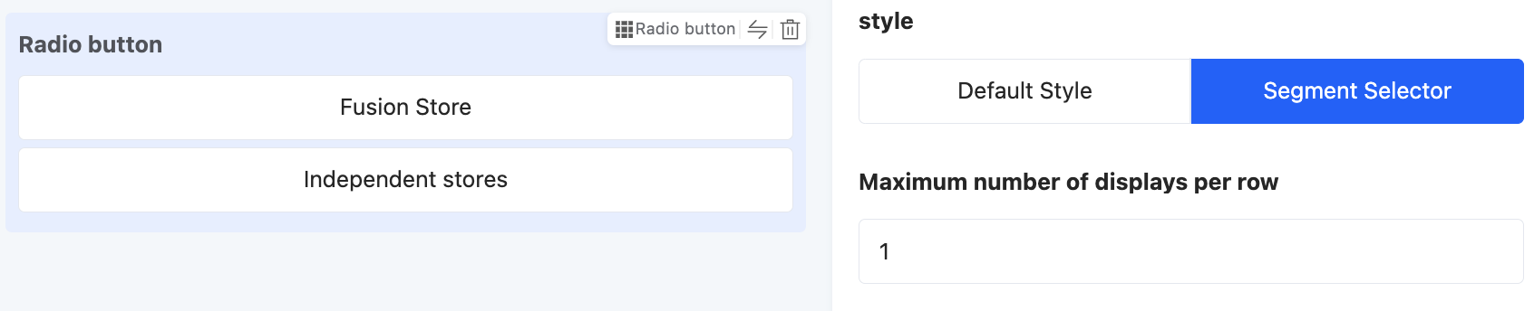
(Ⅷ) Radio Button
Allows users to select only one value from directly displayed options, suitable for single-option scenarios such as gender selection.
Example
Design Example:
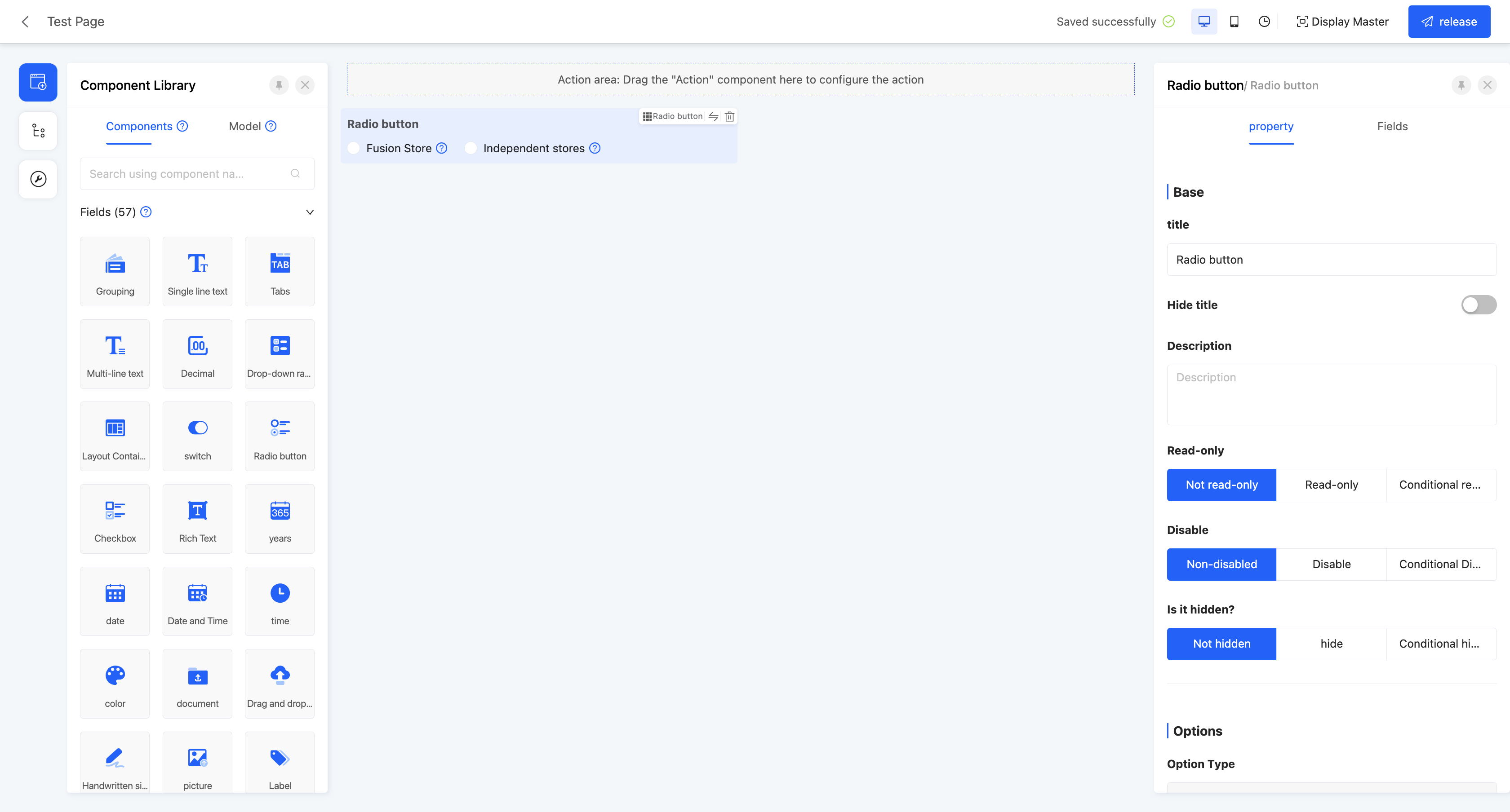
Display Page:

Specific attributes of radio buttons:
- Creation Attribute
- Field Business Type: Supports boolean, data dictionary, and many-to-one.
Note
- For data dictionaries, existing data dictionaries need to be selected.
- For many-to-one, the associated model needs to be set.
- Option Type: That is, the field business type at creation, which cannot be changed.
- Auto-fill Data Dictionary Options: When the field business type is a data dictionary, this attribute is displayed. If this option is enabled, adding dictionary items to the data dictionary will be updated synchronously.
- Option Field: Same as drop-down single selection.
- Exposed Field: Same as drop-down single selection.
- Query Condition: Same as drop-down single selection.
- Data Loading Function: Same as drop-down single selection.
- Style: When the field business is boolean or a data dictionary, this attribute is displayed. Two display styles are provided for selection: default style and segmented selector.
Note
- When the default style is selected, you can set the option arrangement according to actual needs, including horizontal and vertical arrangements.
- When the segmented selector is selected, you can set the maximum number of options displayed in a single line according to actual needs.
- Option Configuration: Same as drop-down single selection.
(Ⅸ) Checkbox
Allows users to select multiple values from directly displayed options, suitable for multiple-option scenarios such as course selection.
Example
Design Example:

Display Page:

Specific attributes of checkboxes:
- Creation Attribute
- Field Business Type: Supports data dictionary, one-to-many, and many-to-many.
Note
- For data dictionaries, existing data dictionaries need to be selected.
- For one-to-many and many-to-many, the associated model needs to be set.
- Option Type: That is, the field business type at creation, which cannot be changed.
- Auto-fill Data Dictionary Options: When the field business type is a data dictionary, this attribute is displayed. If this option is enabled, adding dictionary items to the data dictionary will be updated synchronously.
- Arrangement: Same as drop-down multiple selection.
- Option Configuration: Same as drop-down multiple selection.
- Option Field: Same as drop-down multiple selection.
- Exposed Field: Same as drop-down multiple selection.
- Query Condition: Same as drop-down multiple selection.
- Data Loading Function: Same as drop-down multiple selection.
- Maximum/Minimum Selection Count: Same as drop-down multiple selection.
(Ⅹ) Switch
Often used to select between two opposite options, such as yes/no.
Example
Design Example:
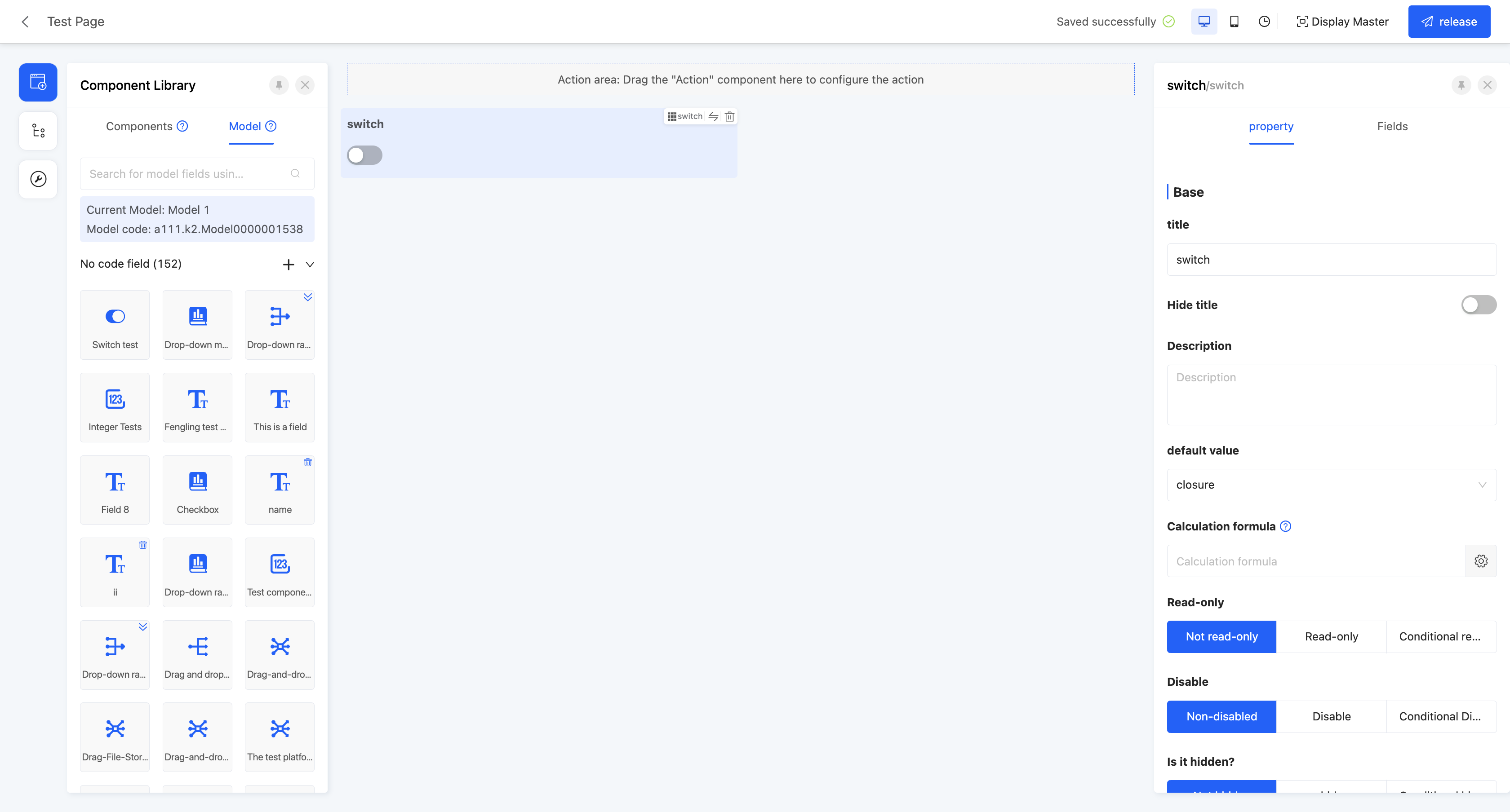
Display Page:

Specific attributes of switches:
- Creation Attribute
- Field Business Type: Only supports boolean type.
(Ⅺ) Year
Provides a year selector function, suitable for scenarios where a specific year needs to be selected, such as birth year.
Example
Design Example:
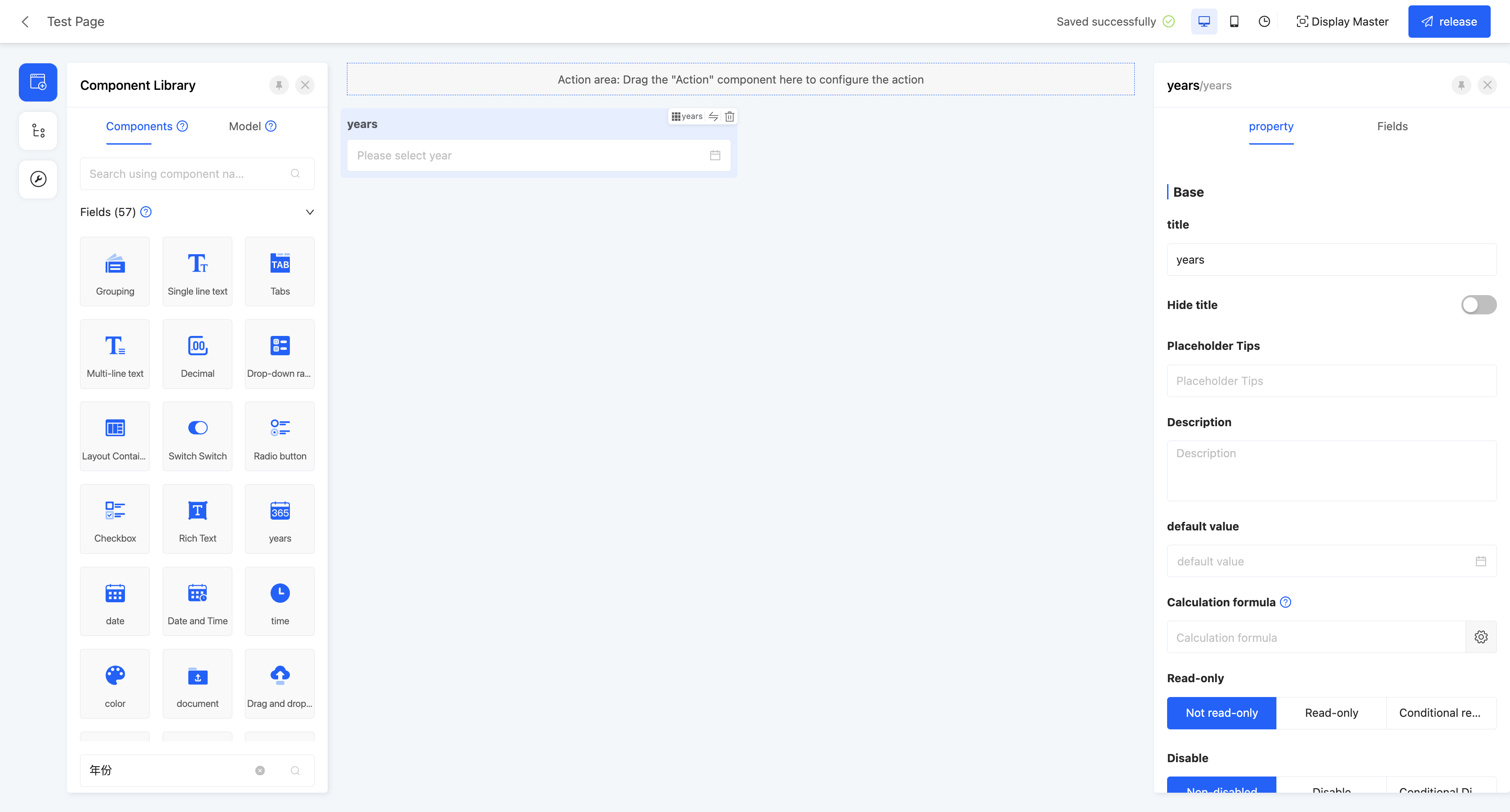
Display Page:

Specific attributes of years:
- Creation Attribute
- Field Business Type: Only supports year type.
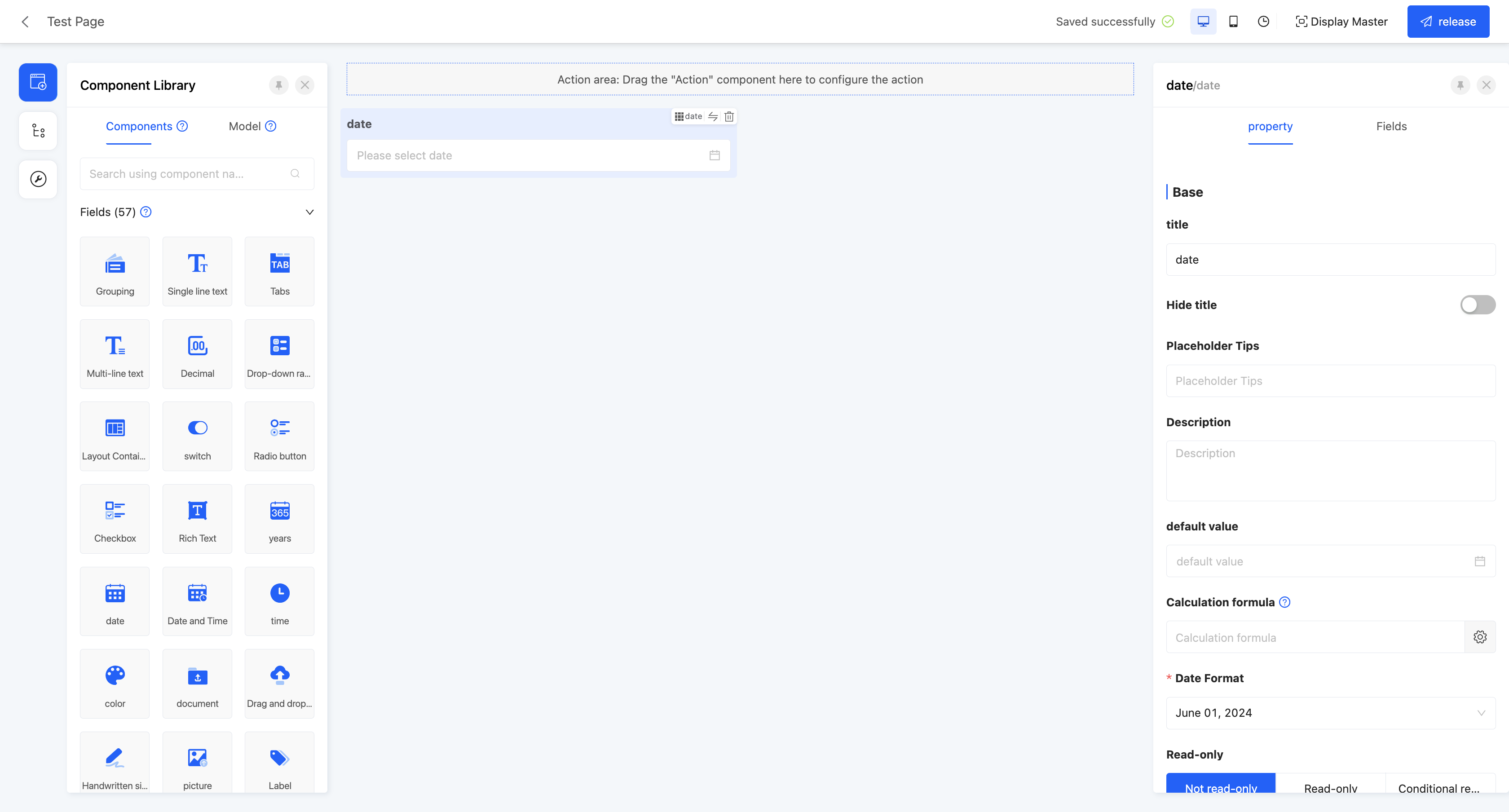
(Ⅻ) Date
Provides a year-month-day selector, suitable for fields that need to be accurate to the date, such as employment date and birth date.
Example
Design Example:
Display Page:

Specific attributes of dates:
- Creation Attribute
- Field Business Type: Only supports date type.
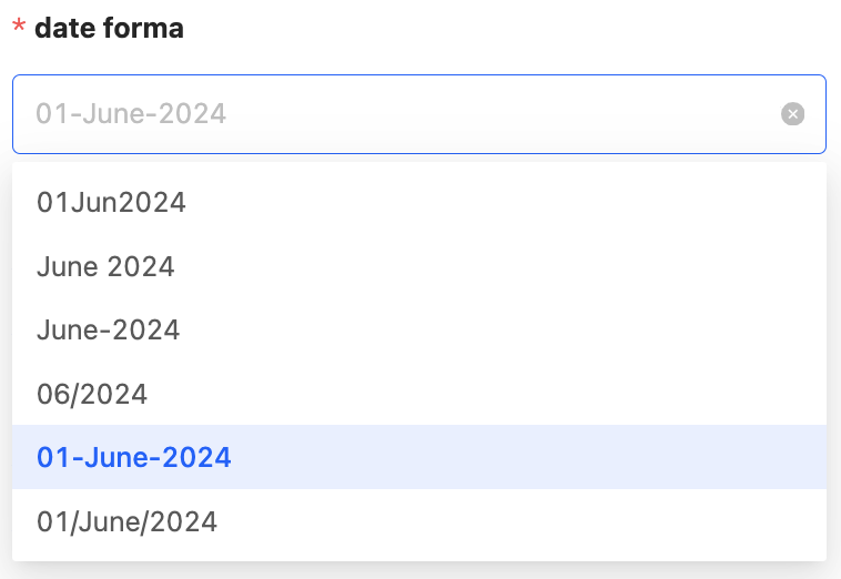
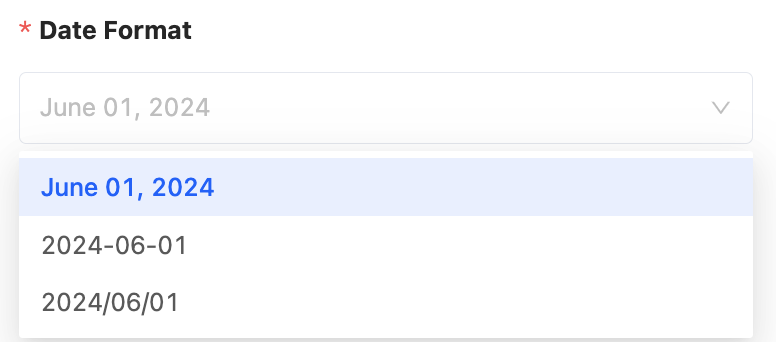
- Date Format: Provides a variety of date format options. You can choose a suitable date format according to actual needs.
- Start Date: Used to limit the earliest start time of selectable dates.
- End Date: Used to limit the latest end time of selectable dates.
- Offset: You can set an offset to make the start date or end date move forward or backward by a specified time.
- Quick Options: Used to quickly specify selectable time.
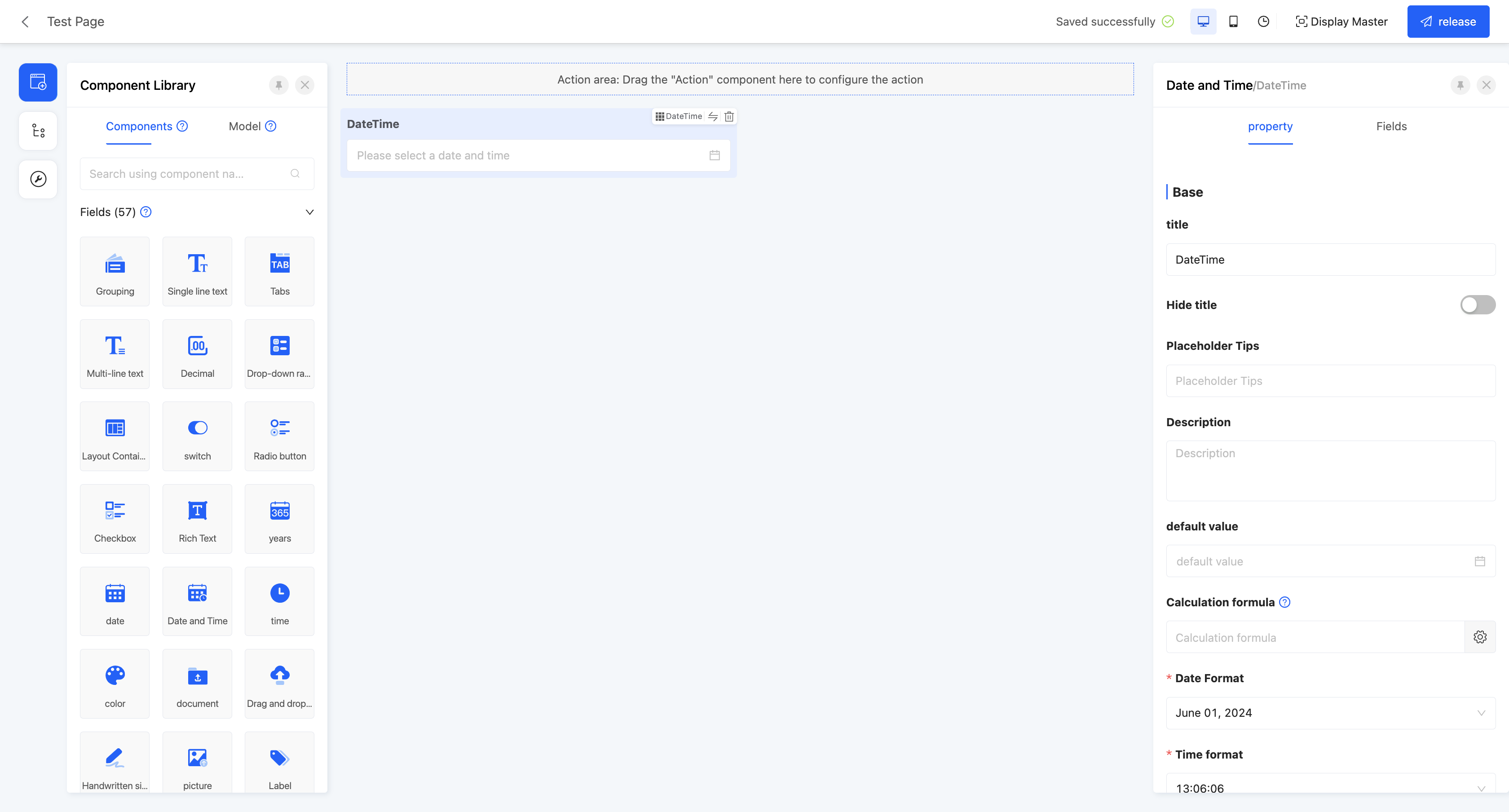
(XIII) Date and Time
Provides a comprehensive year-month-day, hour-minute-second selector, suitable for fields that need to be accurate to a specific time, such as order time and shipping time.
Example
Design Example:
Display Page:

Specific attributes of date and time:
- Creation Attribute
- Field Business Type: Only supports date and time type.
- Date Format: Provides a variety of date format options. You can choose a suitable date format according to actual needs.
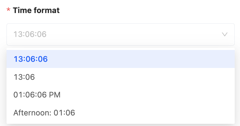
- Time Format: Provides a variety of time format options. You can choose a suitable time format according to actual needs.

- Start Date: Used to limit the earliest start time of selectable dates.
- End Date: Used to limit the latest end time of selectable dates.
- Offset: You can set an offset to make the start date or end date move forward or backward by a specified time.
- Quick Options: Used to quickly specify selectable time.
(XIV) Time
Provides an hour-minute-second selector, suitable for fields that only involve time and not dates, such as submission time and working time.
Example
Design Example:

Display Page:

Specific attributes of time:
- Creation Attribute
- Field Business Type: Only supports time type.
- Time Format: Provides a variety of time format options. You can choose a suitable time format according to actual needs.
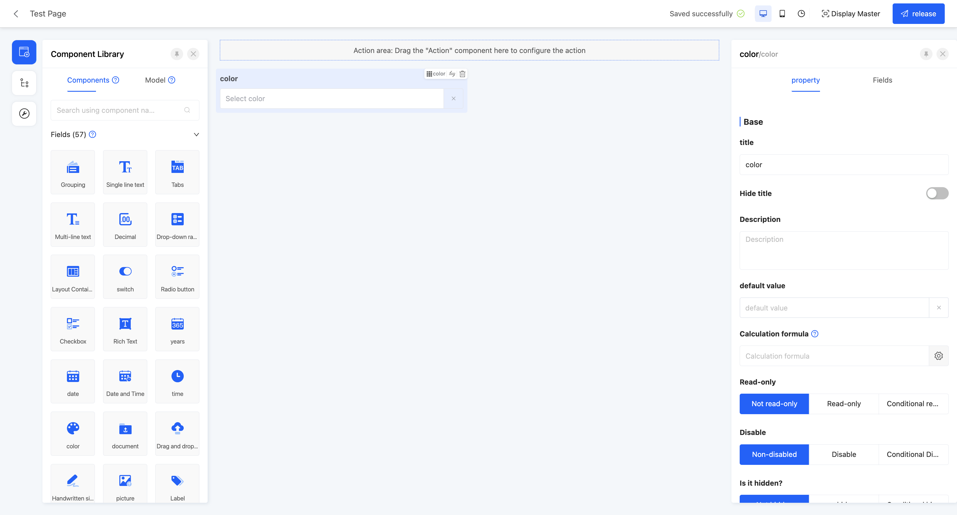
(XV) Color Picker
Provides a custom color function, suitable for scenarios such as setting label colors and selecting colors for theme customization.
Example
Design Example:
Display Page:

Specific attributes of colors:
- Creation Attribute
- Text Field Business Type: Only supports text type.
(XVI) File Upload
Supports uploading files in multiple formats, including documents, pictures, videos, etc., suitable for uploading attachments.
Example
Design Example:
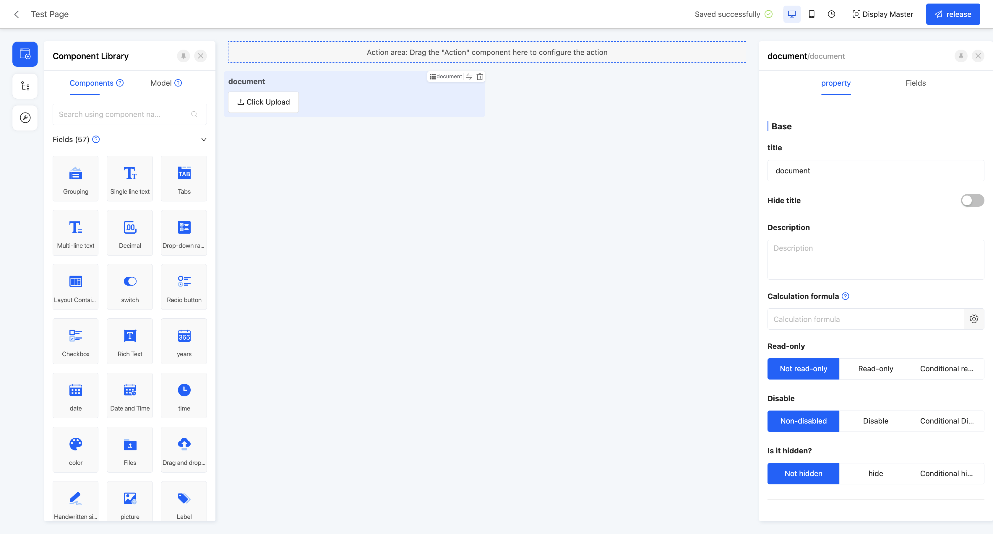
Display Page:

Specific attributes of file upload:
- Creation Attribute
- Field Business Type: Supports text, multi-line text, one-to-many, many-to-one, and many-to-many.
Note
When the field business type is one-to-many, many-to-one, or many-to-many, the associated model can only be associated with files.
- Maximum Number of Uploaded Files: When the field business is one-to-many or many-to-many, this attribute is displayed. Limits the maximum number of files that can be uploaded.
- Maximum Upload File Size: Limits the size of a single uploaded file.
- Restricted Upload File Types: Limits the upload format of files, supporting multiple types such as pictures, documents, audio, and videos, and also provides a custom option. When customizing, you need to enter the format suffix of the supported files.
Note
If a certain format is allowed, files of other formats cannot be selected in the file selection dialog box.
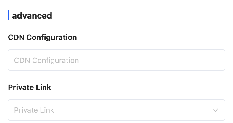
- CDN Configuration: Supports CDN configuration.
- Private Link: You can choose whether to use a private link.
(XVII) Image Upload
Supports uploading image files, suitable for scenarios such as uploading schematic diagrams, photos, and avatars.
Example
Design Example:
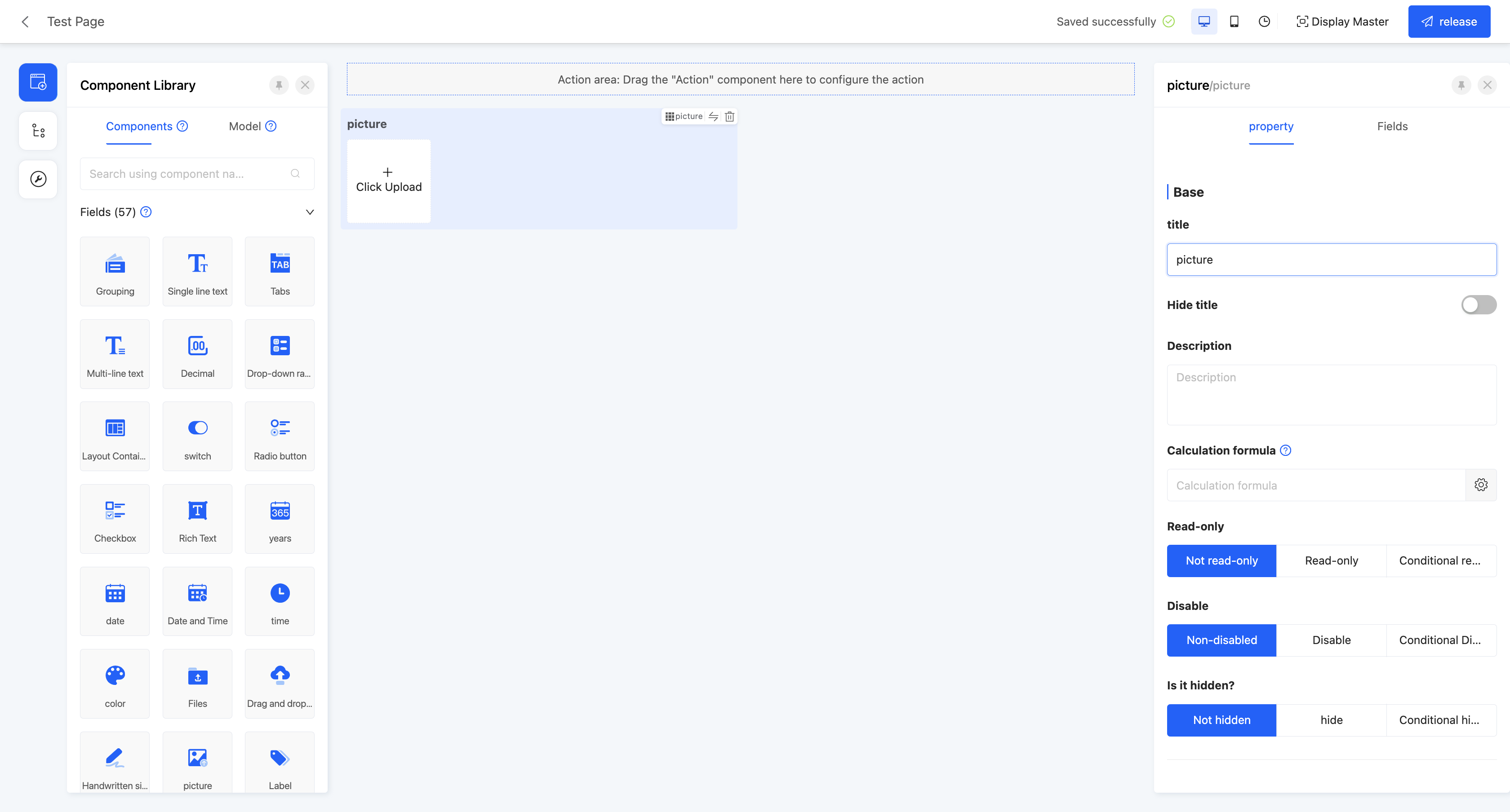
Display Page:

Tip
If the link length is too long when uploading an image, you can modify the length of the component field in the model designer.
Specific attributes of images:
- Creation Attribute
- Field Business Type: Supports text, multi-line text, one-to-many, many-to-one, and many-to-many.
Note
When the field business type is one-to-many, many-to-one, or many-to-many, the associated model can only be associated with files.
- Maximum Number of Uploaded Images: When the field business is one-to-many or many-to-many, this attribute is displayed. Limits the maximum number of images that can be uploaded.
- Maximum Upload Image Size: Limits the size of a single uploaded image.
- Restricted Upload File Types: Limits the upload format of files, supporting pictures and a custom option. When customizing, you need to enter the format suffix of the supported files.
Note
If a certain format is allowed, files of other formats cannot be selected in the file selection dialog box.
(XVIII) Tag
Allows users to input and save multiple values, suitable for saving tags for users.
Note
Tag values are not allowed to be repeated.
Example
Design Example:
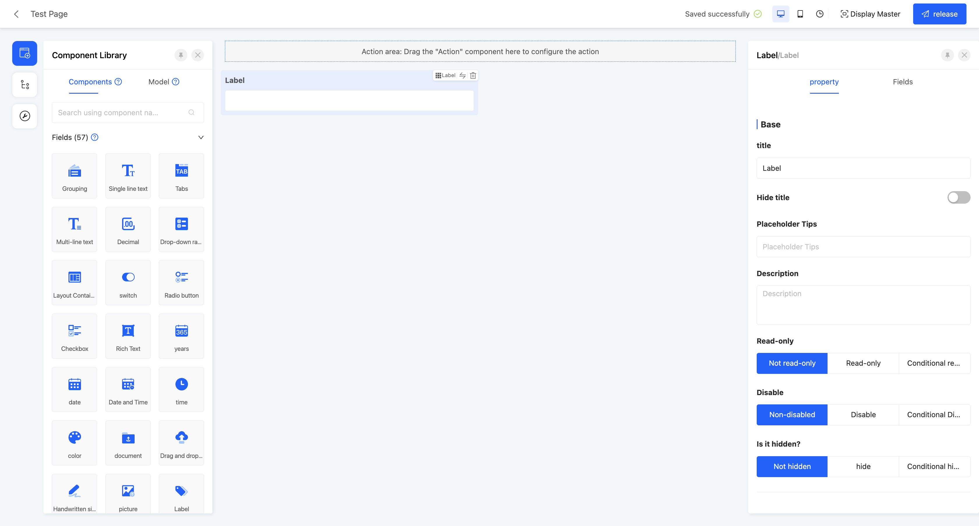
Display Page:

Specific attributes of tags:
- Creation Attribute
- Field Business Type: Supports integer and text.
- When the field type is a storage field, you can also set a quantity limit and a single-value length for it.
Note
- Quantity Limit: The maximum number of tags that can be stored, and its value cannot be less than 1.
- Single-value Length: The length of a single tag, and its value cannot be less than 1.
- Quantity Limit: Same as the quantity limit in the creation attribute, the maximum number of tags that can be stored, and its value cannot be less than 1.
(XIX) Cascading Selection
Allows users to filter and locate the required data through step-by-step selection, suitable for scenarios such as region selection and category filtering.
Example
Design Example:
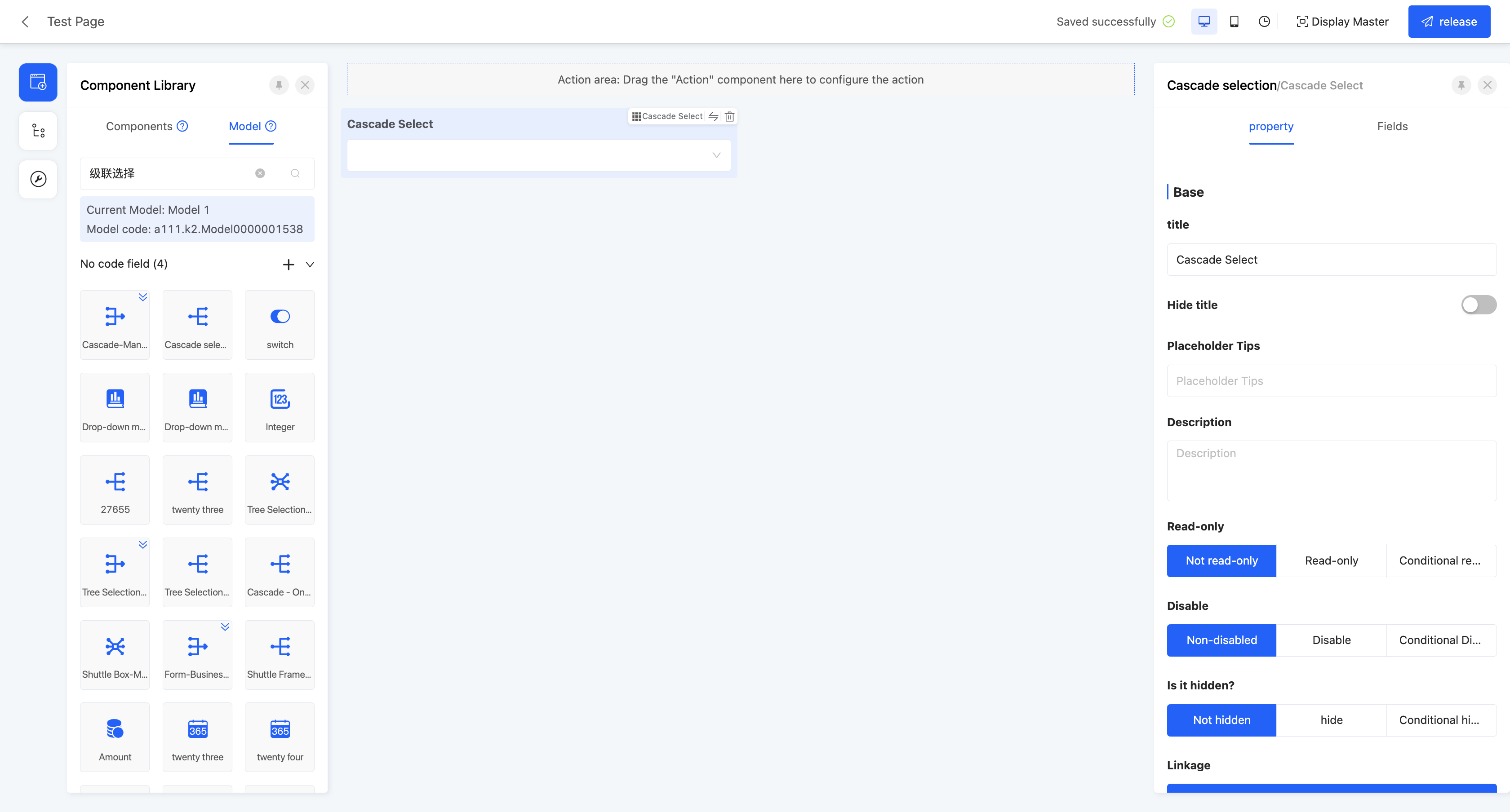
Display Page:

Specific attributes of cascading selection:
Creation Attribute
- Field Business Type: Supports one-to-many, many-to-one, and many-to-many.
Set Linkage Relationship: That is, the model fields to be displayed in the component.
- Model: The model where the fields to be displayed are located.
Note
This model needs to be consistent with the associated model selected when creating the cascading component; otherwise, a complete linkage relationship cannot be formed.
- Data Title: That is, the option value name. When multiple selections are made, these data will be concatenated and displayed. The default option field is the name.
Tip
You can set constant content as a separator between option fields, such as "-" or "/".
- Filter Conditions: On the actual page, data will be displayed according to the configured filter conditions.
Tip
For the filling of custom expressions in filter conditions, you can refer to the "Custom Expressions" document.
- Self-associated Relationship Field: That is, the associated relationship field in the selected model, and the model of this field is consistent with the selected model.
Note
This relationship field is used to set the hierarchy during cascading selection.
Maximum/Minimum Selection Count: When the field business type is one-to-many or many-to-many, this attribute is displayed. You can limit the selection count range, including the maximum and minimum selection counts, to limit user input.
Select and Change: If this function is enabled, any level can be used as the end point when selecting. That is, after selecting an item, if there are sub-options under this item, they will be directly all selected. If this option is not enabled, only the last-level sub-options can be selected.
Note
This function is only effective when the field business type is many-to-one. Only a single value can be selected during selection.
- Display Selection Path: When the field business type is one-to-many or many-to-many, this attribute is displayed. If this function is enabled, after selecting an option, its complete selection path will be displayed.
Note
When the field business is many-to-one, this function is automatically enabled.
(XX) Tree Selection
Allows users to filter and locate the required data through step-by-step selection, suitable for scenarios such as region selection and category filtering.
Example
Design Example:
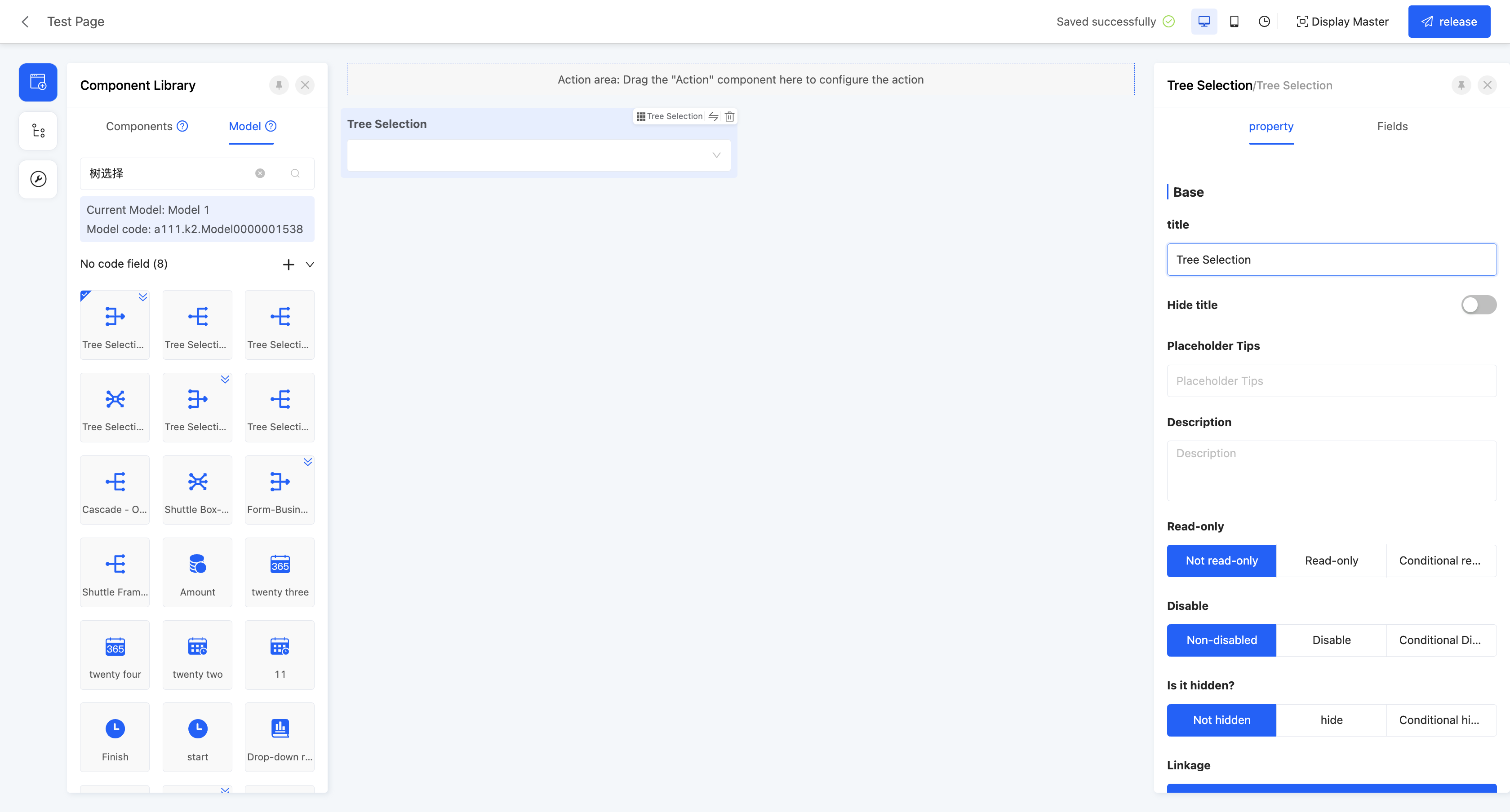
Display Page:

Specific attributes of tree selection:
Creation Attribute
- Field Business Type: Supports one-to-many, many-to-one, and many-to-many.
Set Linkage Relationship: That is, the model fields to be displayed in the component.
- Model: The model where the fields to be displayed are located.
- Data Title: That is, the option value name. When multiple selections are made, these data will be concatenated and displayed. The default option field is the name.
Tip
You can set constant content as a separator between option fields, such as "-" or "/".
- Filter Conditions: On the actual page, data will be displayed according to the configured filter conditions.
Tip
For the filling of custom expressions in filter conditions, you can refer to the "Custom Expressions" document.
- Self-associated Relationship Field: That is, the associated relationship field in the selected model, and the model of this field is consistent with the selected model.
Maximum/Minimum Selection Count: When the field business type is one-to-many or many-to-many, this attribute is displayed. You can limit the selection count range, including the maximum and minimum selection counts, to limit user input.
(XXI) Key-Value Pair
Displays structured information in a clear and intuitive way, which is very suitable for scenarios such as product detail display and user configuration option settings.
Note
Fields are not allowed to have duplicate keys.
Example
Design Example:
Display Page:

Specific attributes of key-value pairs:
- Creation Attribute
- Field Business Type: Only supports key-value pairs.
- When the field type is a storage field, you can also set a quantity limit, key length, and value length for it.
Note
- Quantity Limit: The maximum number of tags that can be stored, and its value cannot be less than 1.
- Key Length: Limits the length of the key value, and its value cannot be less than 1.
- Value Length: Limits the length of the value, and its value cannot be less than 1.
(XXII) Range
Supports specifying a range for time, which is convenient for flexible application in scenarios such as time interval prompts.
Note
The end date must be after the start date.
Example
Design Example:

Display Page:

Specific attributes of ranges:
- Creation Attribute
- Field Business Type: Supports year, date, date and time, and time.
- Start Placeholder Prompt: When the start time input box or selection box is empty, it shows light-colored prompt text to guide users to input, which does not affect the actual value of the field.
- End Placeholder Prompt: When the end time input box or selection box is empty, it shows light-colored prompt text to guide users to input, which does not affect the actual value of the field.
- Start Default Value: When the actual page is displayed, the field will show the set start time by default.
- End Default Value: When the actual page is displayed, the field will show the set end time by default.
- Date Format: When the field business is date or date and time, this attribute is displayed.
- Time Format: When the field business is date and time or time, this attribute is displayed.
(XXIII) Phone
Specifically used to store or display data of the mobile phone number type.
Note
Input Rule: It must start with the digit 1, the second digit ranges from 3 to 9, and the total number of digits is 11.
Example
Design Example:

Display Page:

Specific attributes of phones:
- Creation Attribute
- Field Business Type: Only supports mobile phones.
- Support Prefix/Suffix: Supports adding prefixes and suffixes to the input content. The prefix and suffix types can be text or icons. When the text type is selected, you can choose whether to store the prefix/suffix content to simplify the operation process when the data highly overlaps.
(XXIV) Currency
Used to store or display amount-type data, allowing input of integers or decimals with the number of decimal places accurate to within two.
Example
Design Example: 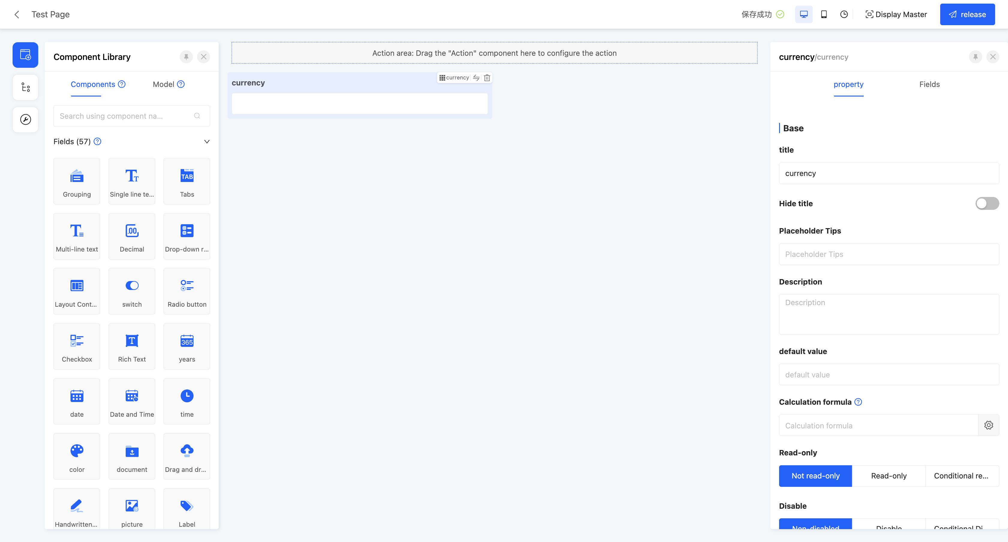 Display Page:
Specific attributes of currency:
- Creation Attribute
- Field Business Type: Only supports amount
- When the field type is a storage field, length and precision can also be set for it.
Note
- Length: Limits the length range of the value, with values ranging from 1 to 15.
- Precision: Limits the precision range of decimals, with values ranging from 1 to 6.
- Maximum/Minimum Value: Can set the value range of input content, including maximum and minimum values, to limit user input.
- Number of Decimal Places Reserved: Its value must be within the precision range set when creating the component.
- Support Prefix/Suffix: Supports adding prefixes and suffixes to input content. Prefix and suffix types can be text or icons. When the text type is selected, you can choose whether to store the prefix/suffix content to simplify the operation process when data highly overlaps.
- Show Thousands Separator: When this function is enabled, large input values will be displayed in thousands separator format.
(XXV) Email
Used to store or display data in compliance with the email format (xx@xx.xx), facilitating users' information exchange and management.
Example
Design Example:  Display Page:
Specific attributes of email:
- Creation Attribute
- Field Business Type: Only supports email
- When the field type is a storage field, length can also be set for it.
Note
- Length: Limits the length range of the value, with values ranging from 3 to 256.
- Support Prefix/Suffix: Supports adding prefixes and suffixes to input content. Prefix and suffix types can be text or icons. When the text type is selected, you can choose whether to store the prefix/suffix content to simplify the operation process when data highly overlaps.
(XXVI) Cross-table Field
A special field that can extract corresponding fields from associated relationship fields and flatten them in the current model. Suitable for referencing data information from related tables when generating complex reports.
Example
Design Example: 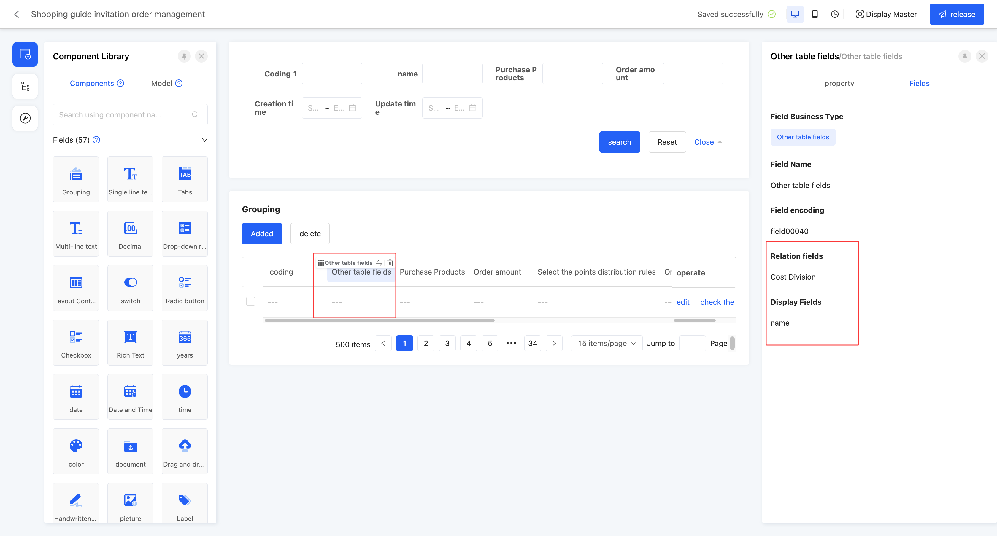 Display Page:
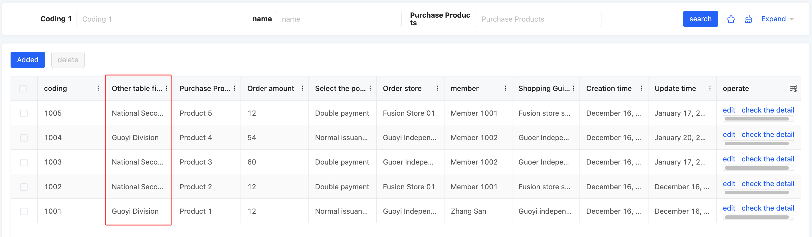
Specific attributes of cross-table field:
- Creation Attribute
- Field Business Type: Only supports cross-table field
- Associated Field: That is, the field with an associated relationship under the model where the current page is located.
- Display Field: Selects the field existing under the model of the associated field.
(XXVII) Paragraph
Allows displaying a complete paragraph of text content on the page, suitable for scenarios such as detailed explanation, description, or elaboration of products.
Example
Design Example: 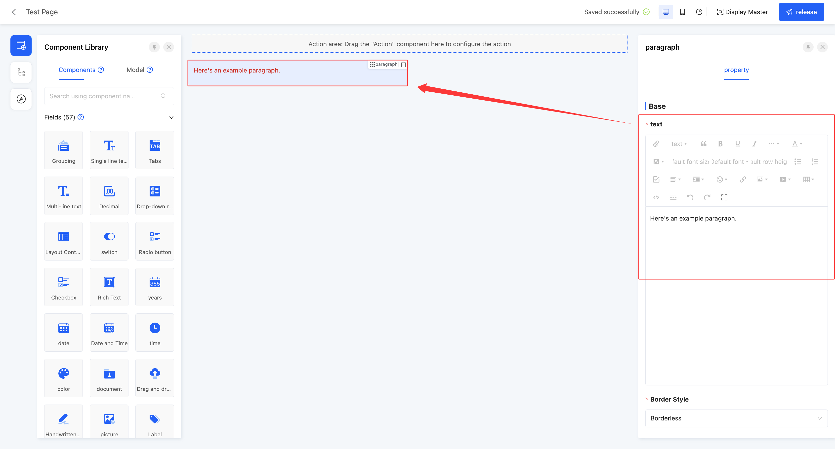 Display Page:
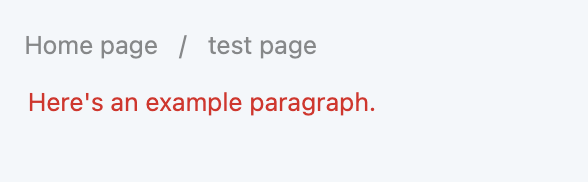
Specific attributes of paragraph:
- Text: Provides a feature-rich rich text editor for inputting and editing content.
- Border Style: Supports setting various border styles for paragraphs, including three styles: no border, solid border, and dashed border.
(XXVIII) Embedded Web Page
Supports embedding specified web pages in the page, allowing users to directly access and browse other web content in the design page.
Example
Design Examples:
Static: 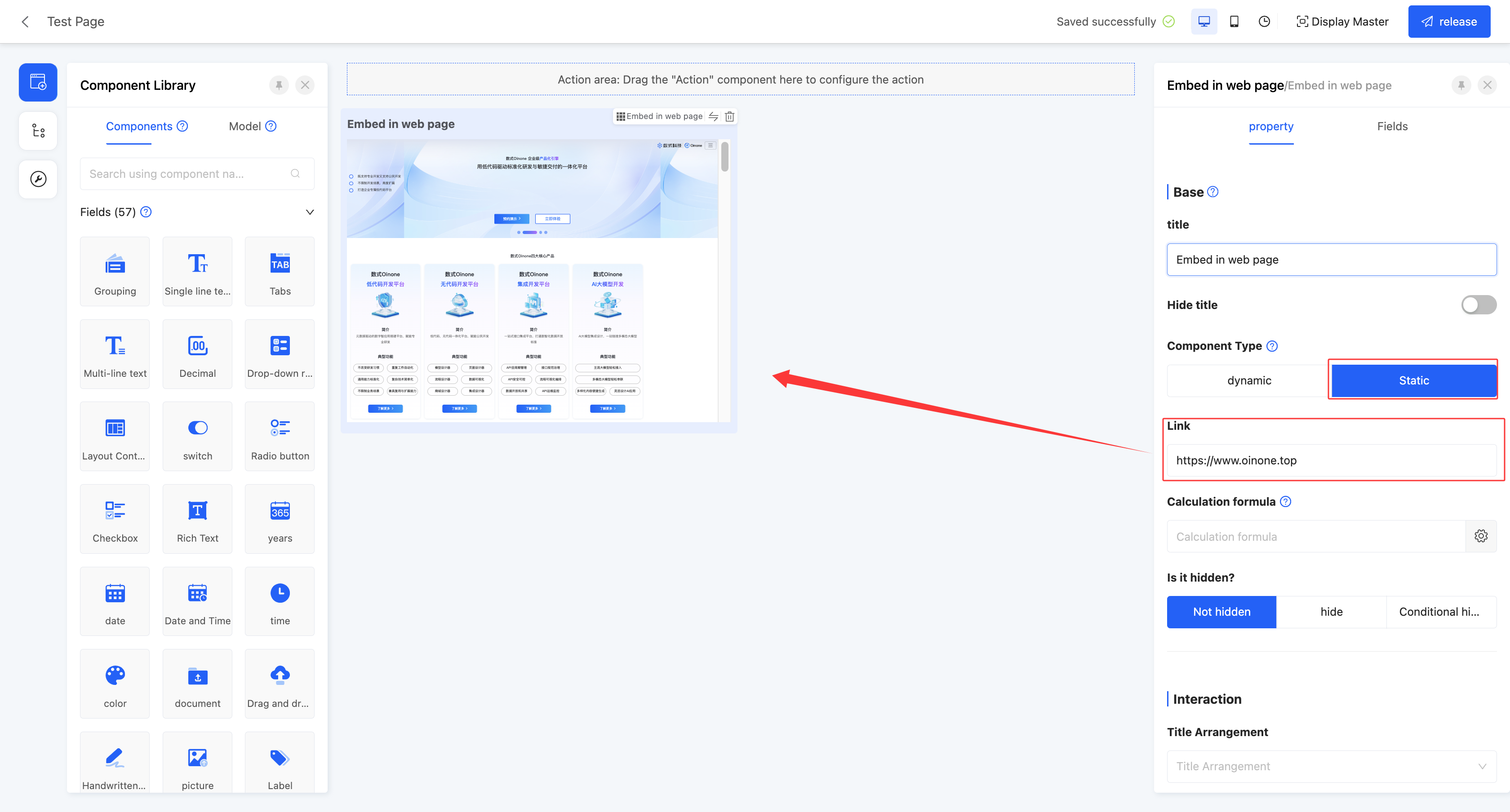 Dynamic:
 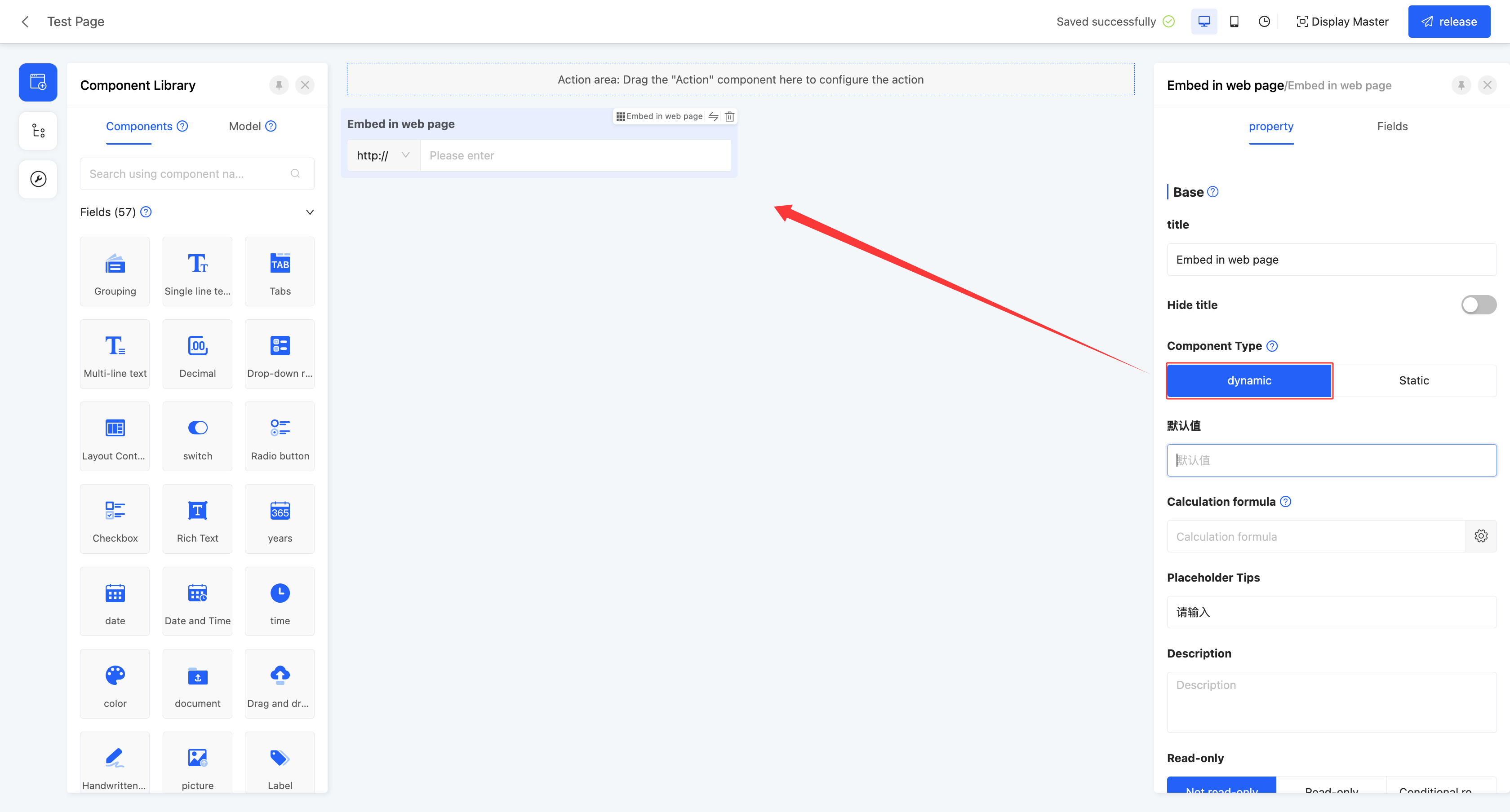 Display Pages:
Static:  Dynamic:
Specific attributes of embedded web page:
- Creation Attribute
- Field Business Type: Only supports text
- Component Type: Includes two types, dynamic and static. Dynamic components are in input state in forms, and static components are in read-only state in forms.
Note
- When the component type is dynamic, it supports setting optional prefixes, including four common prefixes: http://, https://, ftp://, sftp://.
- When the component type is static, entering a web link will directly display the page content corresponding to the link in the actual page. If it cannot be displayed, please check whether the web page allows embedding.
(XXIX) Hyperlink
Supports displaying hyperlinks on the page. Users can easily jump to the corresponding page by clicking the hyperlink, achieving convenient navigation between pages.
Example
Design Examples:
Static: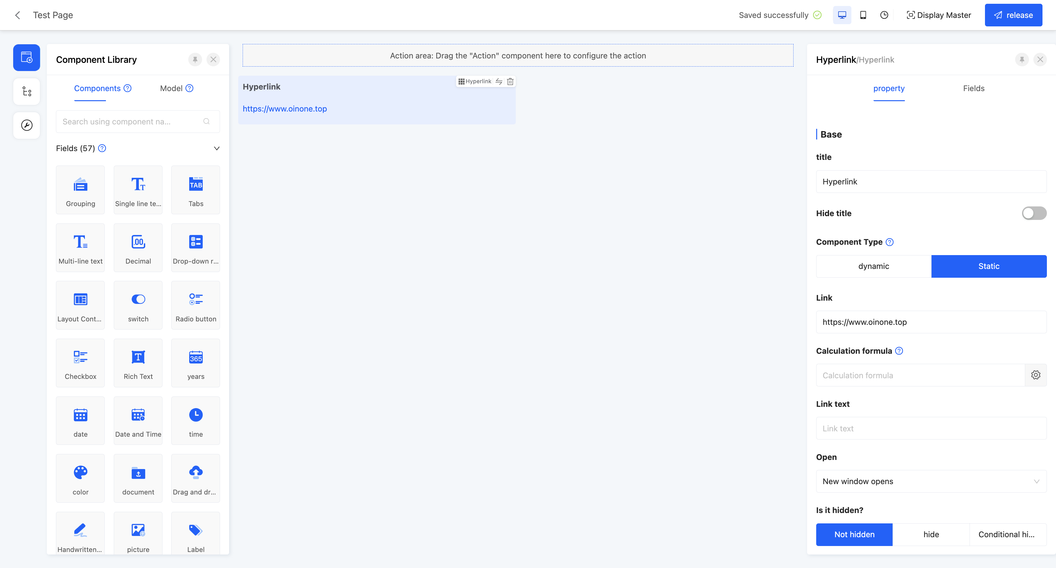 Dynamic:
  Display Pages:
Static:  Dynamic:
Specific attributes of hyperlink:
- Creation Attribute
- Field Business Type: Only supports text
- Component Type: Includes two types, dynamic and static. Dynamic components are in input state in forms, and static components are in read-only state in forms.
Note
- When the component type is dynamic, it supports setting optional prefixes, including four common prefixes: http://, https://, ftp://, sftp://.
- When the component type is static, entering a web link will display the link in the actual page, and clicking it will jump to the link page.
- Link: Requires entering a valid web link.
- Link Text: Sets the display text of the link. If not set, the web link is displayed by default.
- Opening Method: Includes two methods: opening in the current window and opening in a new window.
(XXX) Shuttle Box
A shuttle box is a two-column selection box with selectable fields displayed on the left and selected fields displayed on the right. Fields can be selected or deselected through the shuttle box, suitable for scenarios such as selecting display fields.
Example
Design Example: 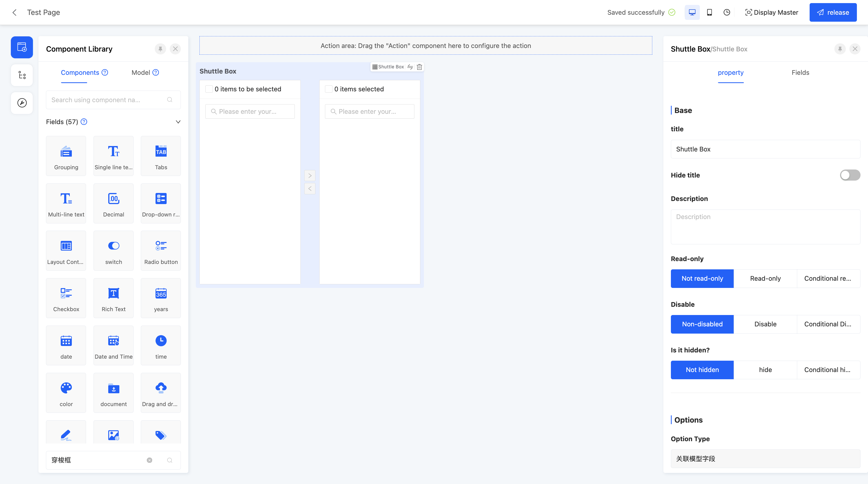 Display Page:
Specific attributes of shuttle box:
- Creation Attribute
- Field Business Type: Supports one-to-many and many-to-many
- Associated Model: Requires setting the associated model of the current component
- Option Type: That is, the associated model field specified at creation, which cannot be changed.
- Option Field: Can select specific fields as option values. When multiple selections are made, these option values will be concatenated and displayed. The default option field is the name.
- Search Field: When users enter content in the input box, if the entered content is included in the search field, the values containing this content will be displayed as search results. By default, all option fields are set as search fields, and you can choose whether to use existing search conditions as needed.
- Exposed Field: The selection range is limited to the model fields bound to the component. When a field is set as an exposed field, it means the field can be selected in the current view.
- Query Condition: In the actual page, data will be displayed according to the configured query conditions.
Tip
For the filling of custom expressions in query conditions, you can refer to the "Custom Expressions" document.
- Display Form of Option Box: Provides two display methods, list and table. When table display is selected, you can further set the field definition of the option box, that is, define the header content of the table.
- Display Form of Result Box: Same as the display form of the option box.
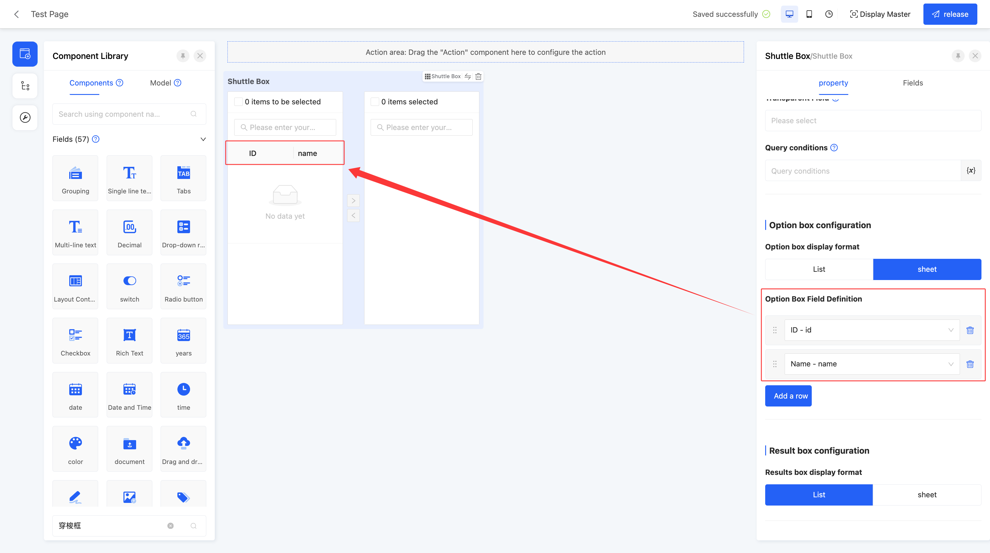
- Maximum/Minimum Selection Count: Can limit the selection count range, including maximum and minimum selection counts, to limit user input.
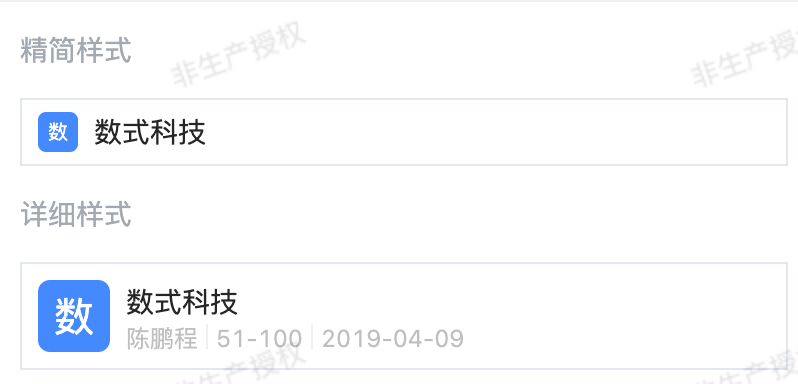
(XXXI) Company
Provides a shortcut to directly select companies already entered in the system.
Note
- When the created field business type is many-to-one, it is a drop-down single selection in practical applications.
- When the created field business type is many-to-many, it is a drop-down multiple selection in practical applications.
Example
Design Example: 
Specific attributes of company:
- Creation Attribute
- Field Business Type: Supports many-to-one and many-to-many.
- Associated Model: Requires setting the associated model of the current component, and this component only supports associating with the "Company" model.
- Drop - down Style: Supports two drop - down display styles: Compact Style and Detailed Style.
- Compact Style: Displays company information in a more compact way, suitable for scenarios where space is limited or you only need to quickly select a company.
- Detailed Style: Provides information in more dimensions, suitable for scenarios where you need to know more background information when selecting a company.
- Maximum/Minimum Selection Count: Can limit the selection count range, including maximum and minimum selection counts, to limit user input.
(XXXII) Department
When using the department component, the system will automatically identify the relevant organizational information based on the currently logged - in user and display the selectable departments according to the configured department scope.
Note
- When the business type of the created field is many - to - one, it will be a single - select dropdown in actual applications.
- When the business type of the created field is many - to - many, it will be a multi - select dropdown in actual applications.
Example
Design Example: 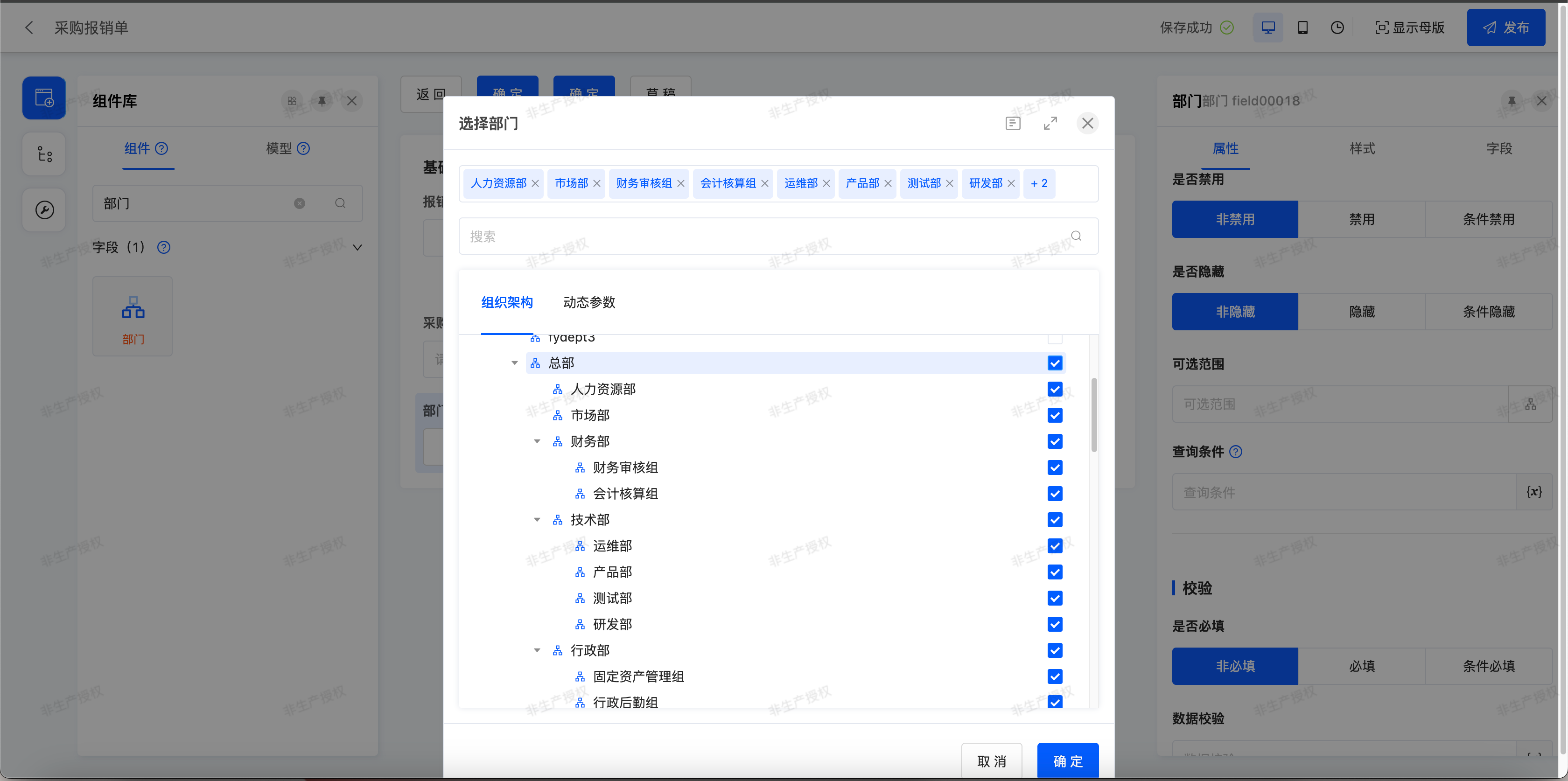 Display Page:
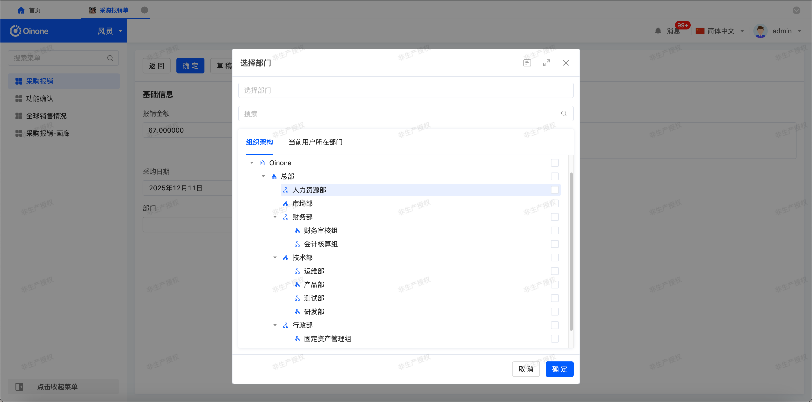
Department - specific Attributes:
- Creation Attributes
- Field Business Type: Supports many - to - one and many - to - many.
- Associated Model: You need to set the associated model for the current component. This component only supports associating with the "Department" model.
- Selectable Scope: Includes all departments and custom selection. If no specific departments are manually selected, it will be all departments.
- All Departments: You can select all the departments created in the system.
- Custom: You can manually select specific departments, and there are quick options provided:
- All departments of the current user's company: All departments of the company to which the current user binds all employee identities
- Department of the current user: All departments belonging to all employee identities tied to the current user
- Department and subordinate departments of the current user: all departments and all sub-departments belonging to all employee identities bound by the current user
- Maximum/Minimum Number of Selections: You can limit the range of the number of selections, including the maximum and minimum number of selections, to restrict user input.
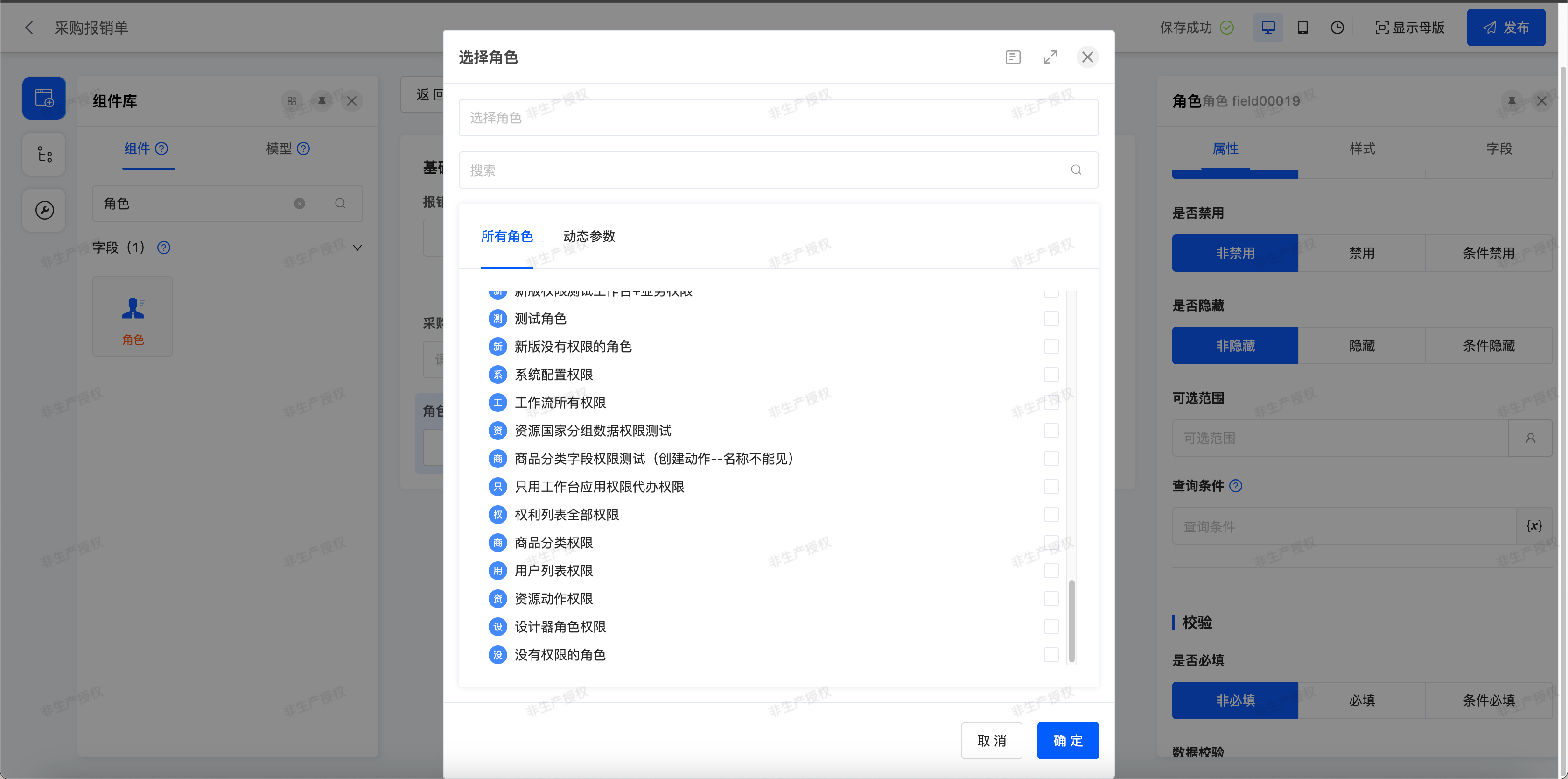
(XXXIII) Role
When using the role component, the system will automatically identify relevant information based on the currently logged - in user and display selectable roles according to the configured role scope.
Note
- When the business type of the created field is many - to - one, it will be a single - select dropdown in actual applications.
- When the business type of the created field is many - to - many, it will be a multi - select dropdown in actual applications.
Example
- Design Example:
- Display Page:
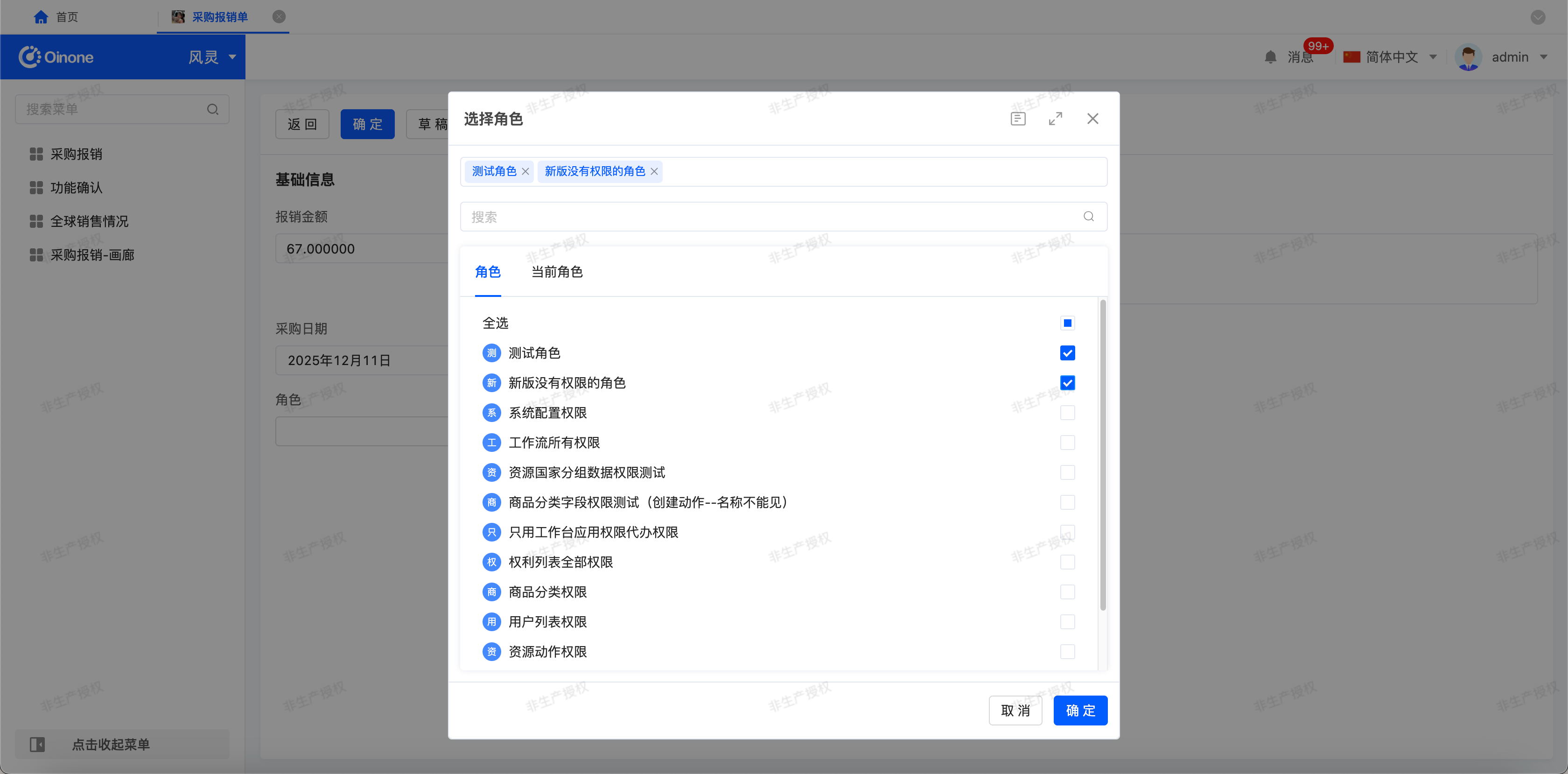
Role - specific Attributes:
- Creation Attributes
- Field Business Type: Supports many - to - one and many - to - many.
- Associated Model: You need to set the associated model for the current component. This component only supports associating with the "Role" model.
- Selectable Scope: Includes all roles and custom selection. If no specific roles are manually selected, it will be all roles.
- All Roles: You can select all the roles created in the system.
- Custom: You can manually select specific roles, and there are quick options provided:
- Roles Bound to the Current User: All roles bound to the currently logged - in user.
- Maximum/Minimum Number of Selections: You can limit the range of the number of selections, including the maximum and minimum number of selections, to restrict user input.
(XXXIII) Employee
When using the employee component, the system will automatically identify relevant information based on the currently logged - in user and display employees according to the configured employee scope.
Note
- When the business type of the created field is many - to - one, it will be a single - select dropdown in actual applications.
- When the business type of the created field is many - to - many, it will be a multi - select dropdown in actual applications.
Example
Design Example:  Display Page:
Employee - specific Attributes:
- Creation Attributes
- Field Business Type: Supports many - to - one and many - to - many.
- Associated Model: You need to set the associated model for the current component. This component only supports associating with the "Employee" model.
- Selectable Scope: Includes all employees and custom selection. If no specific employees are manually selected, it will be all employees.
- All Employees: You can select all the employees created in the system.
- Custom: You can manually select specific employees, and there are quick options provided:
- Employee Bound to the Current User: Refers to all employee identity bound to the current user.
- Employees in the Department of the Current User: Refers to all employees in the department to which the current user's employee belongs.
- Employees in the Department of the Current User and Its Sub - departments: Refers to all employees in the department to which the current user's employee belongs and all its sub - departments.
- Maximum/Minimum Number of Selections: You can limit the range of the number of selections, including the maximum and minimum number of selections, to restrict user input.
(XXXIV) Address
Provides an address selector function, suitable for scenarios such as selecting home addresses.
Note
Allows selection to stop at any level.
Example
Design Example: 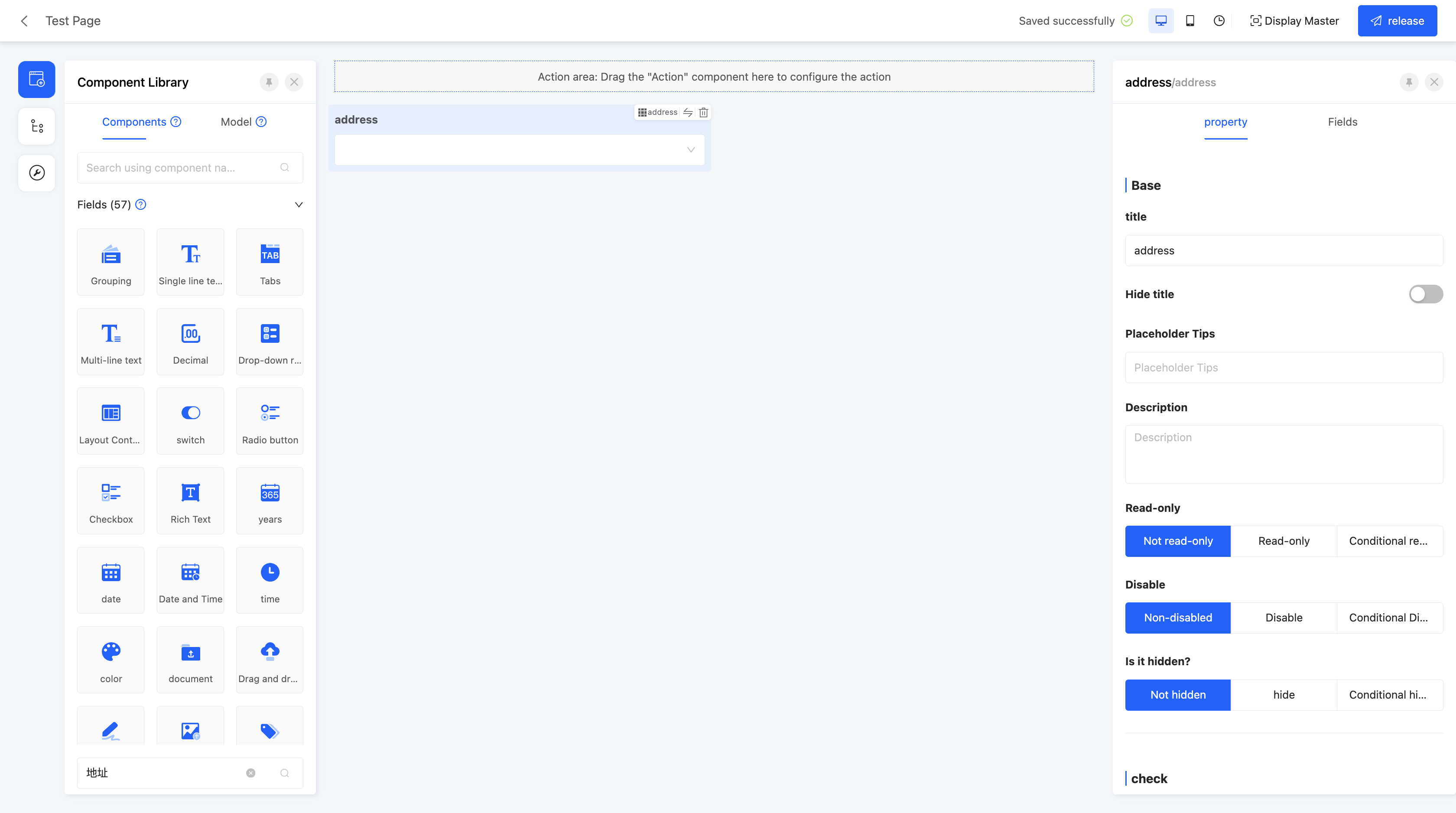 Display Page:
Specific attributes of address:
- Creation Attribute
- Field Business Type: Supports many-to-one.
- Associated Model: Requires setting the associated model of the current component, and this component only supports associating with the "Address" model.
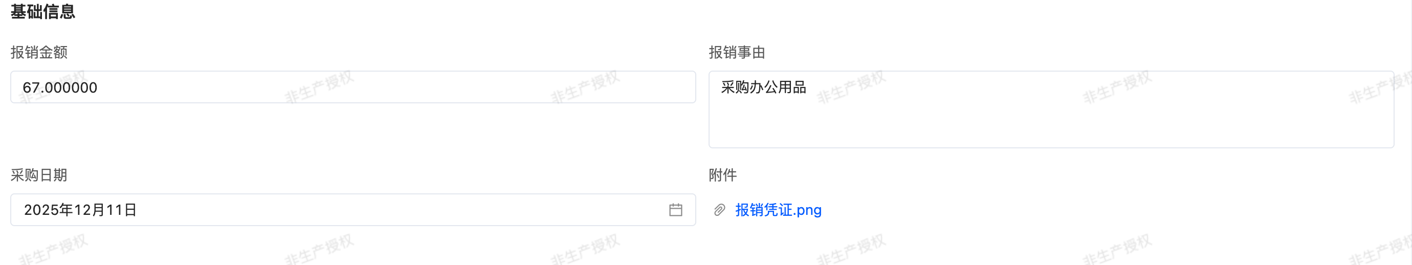
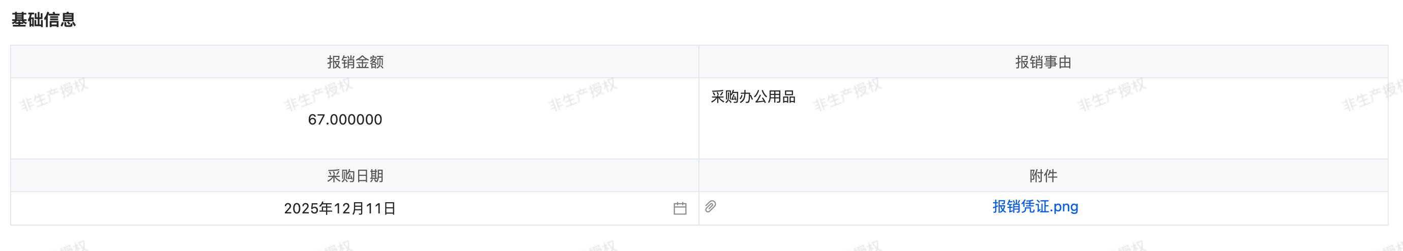
(XXXV) Form
Supports embedding forms in the page, suitable for designing complex pages to meet diverse page requirements.
Example
Design Example: 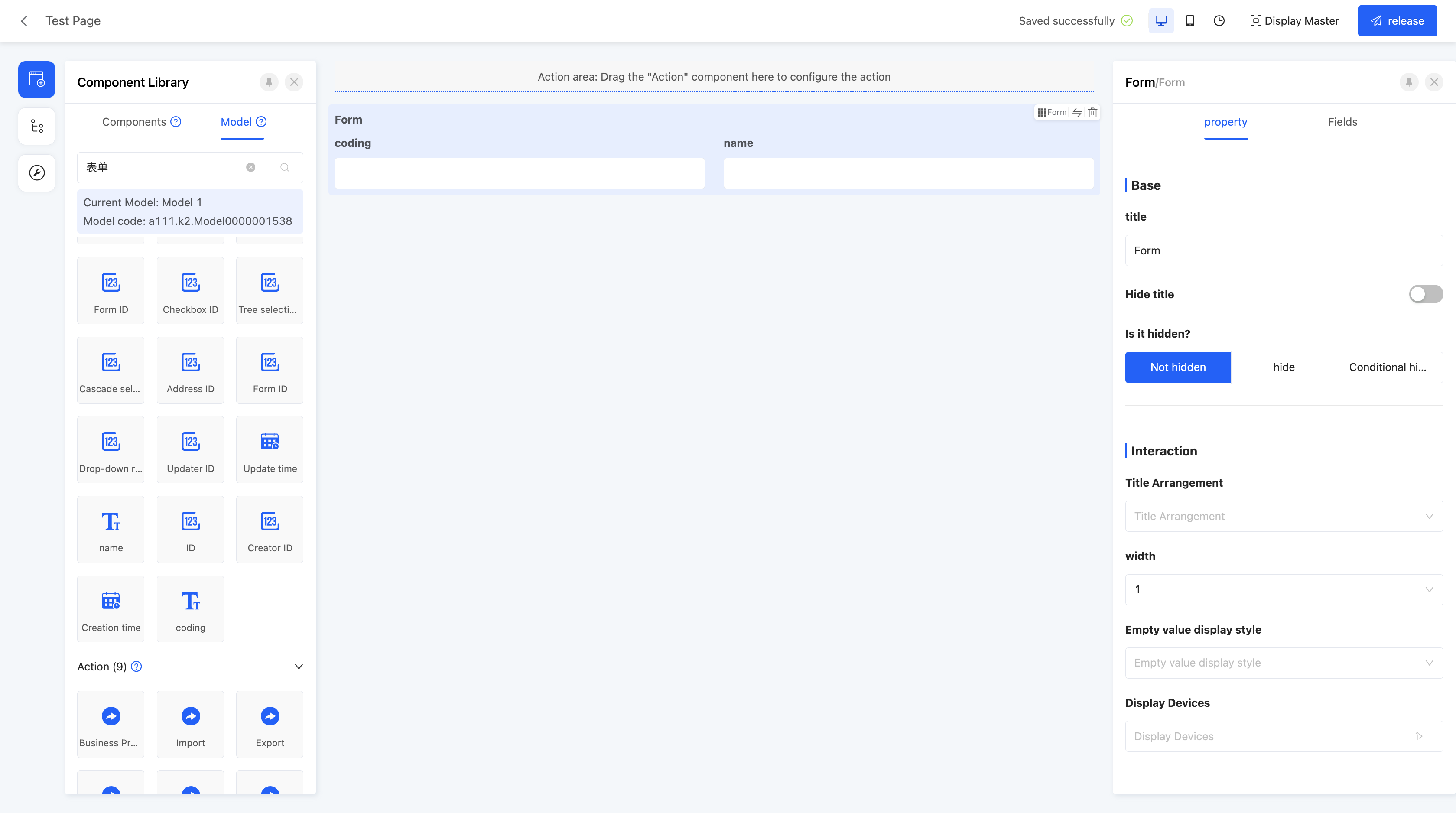 Display Page:
Specific attributes of form:
- Creation Attribute
- Field Business Type: Supports many-to-one.
- Associated Model: Requires setting the associated model of the current component.
- Layout Type: Two form layout formats are provided: Normal Layout and Word Layout.
Normal Layout:
Word Layout:
- Empty Value Display Style: Used to set the display method when some field values in the form are empty.
(XXXVI) Table
Supports embedding tables in the page, suitable for scenarios such as displaying lists or data.
Example
Design Example: 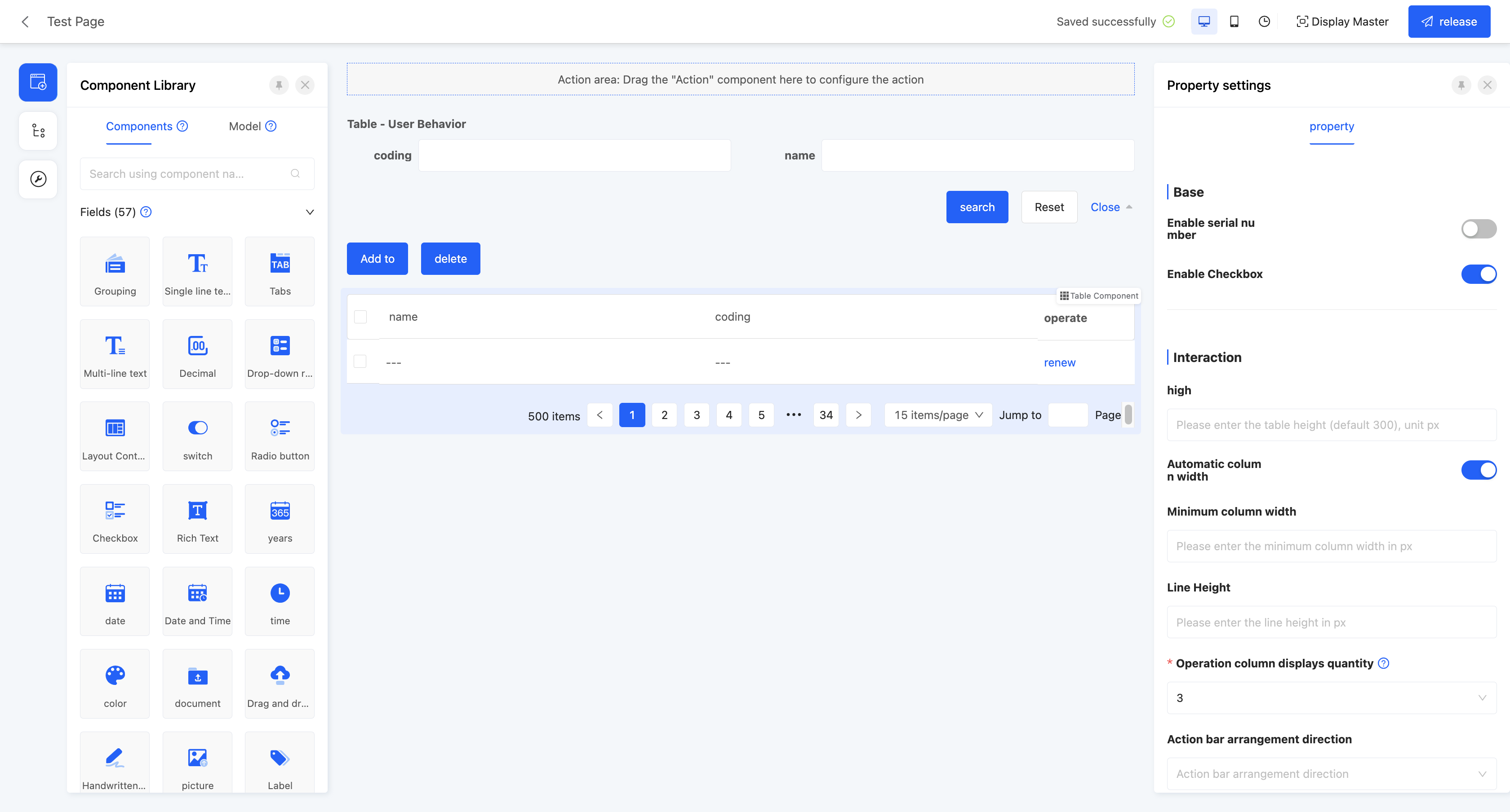 Display Page:
Specific attributes of table:
- Creation Attribute
- Field Business Type: Supports one-to-many and many-to-many.
- Associated Model: Requires setting the associated model of the current component.
- One - to - Many Table: You can set up quick operations, including creation, editing, deletion, in - line editing, adding a row, and quick data entry. After enabling these operations, the corresponding actions will be displayed in the table.
INFO
Quick Data Entry: Allows users to efficiently enter or update sub - table data by copying Excel content or performing batch editing.
- Mode Description
This function includes two modes: "Add New Data" and "Edit Existing Data". It is applicable to various field types and will automatically validate the data format and field rules during data entry.
- Add New Data Mode: Suitable for batch data import:
- You can directly paste the Excel content into the data entry area.
- The pasted data will be appended to the corresponding fields in the sub - table.
- Only the field columns that support pasting and have in - line editing enabled will be displayed.
- If there are empty rows in the pasted content, the empty rows will be automatically filtered and ignored when submitting.
- Edit Existing Data Mode: Suitable for quickly modifying existing data in the sub - table:
- You can directly perform batch editing or paste replacement on the existing values.
- For fields that are only visible but not editable, they will be displayed in gray on the data entry page and cannot be modified. When pasting data, these fields will be automatically skipped, and the data in the corresponding columns will be discarded.
- Field Column Selection
The data entry page supports selecting fields through a dropdown menu in the table header:
- You can select other supported fields in the sub - table model.
- Each field column can be set to "Do not paste", which means the pasted content will not be written to this column.
Note: The field columns that are not set to "Do not paste" cannot be repeated. If there are repetitions after adjusting the fields, the system will automatically change the original field column to "Do not paste".
- Data Entry
The system will judge the pasted data based on the type of the table header fields:
- When the data format does not match the field type, the system will mark it in red as a prompt.
- If the user does not correct the data and selects "Continue data entry", the system will automatically clear the data that does not match the format and write null values to the sub - table.
- When submitting the data, if there are calculation formulas in the sub - table that depend on the current field, the system will automatically calculate and fill back the results of other fields based on the data entered by the user.
- Special Fields:
- Drop - down Selection: The system will judge whether the entered value is valid through the "Option Field". If the entered value is not within the selectable range, it will be marked in red as a prompt, and a drop - down component will be displayed for the user to select the correct item.
- Date and Time: The system will fill back the data according to the date or time format set for the field.
- The date supports the following format recognition:
2000/01/01,2000 - 01 - 01,2000.01.01. - The time supports the
00:00:00format.
- The date supports the following format recognition:
- Organization - related Fields (Company/Department/Employee/Role): If the entered name is not within the selectable range or there are duplicate names, it will be marked in red as a prompt, and a component will be provided for the user to select the correct value.
- Address Field: During data entry, the system will split the address into multiple cells (Country - Province/State - City - District/County - Street). The system will verify in sequence whether the country, province, city, district, and street match the real - world address data.
- Many - to - Many Table: You can set up quick operations, including adding, deleting, and in - line deletion. After enabling these operations, the corresponding actions will be displayed in the table.
- Data Submission Type: Specifies the submission method used when submitting data, currently only supporting full submission.
- Associated Relationship Update Type: The data submission method when associated relationship fields in the table are updated, including full submission and incremental submission.
Note
- Full Submission: Submits all data.
- Incremental Submission: Only submits updated data.
(XXXVII) File Download
Supports packaging data into a file for download, suitable for batch data acquisition for subsequent analysis.
Example
Design Example: 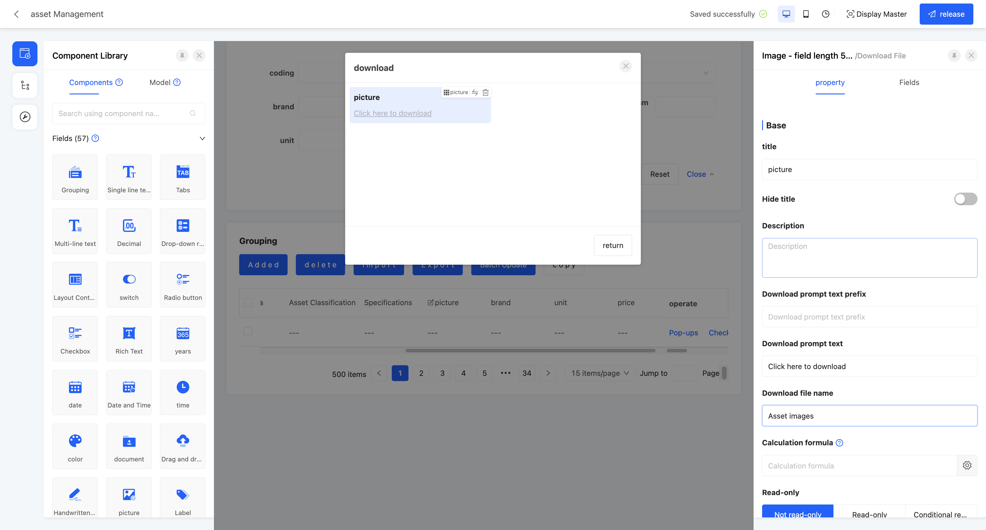 Display Page:
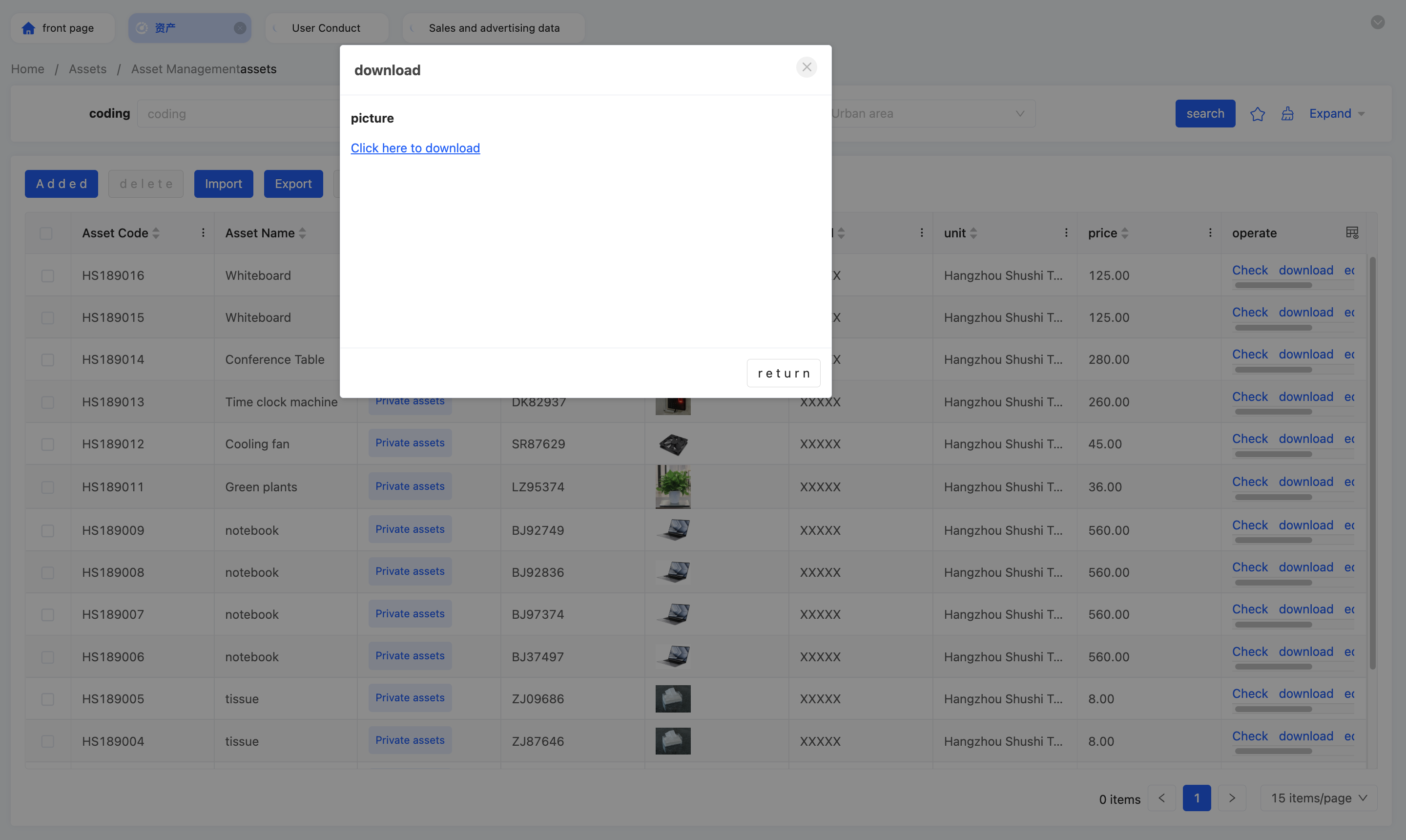
Specific attributes of file download:
- Download Prompt Text Prefix: Used to add a paragraph of guiding or explanatory text before the download prompt information.
- Download Prompt Text: The main content part of the download prompt information. You can enter specific information to inform users here, clarifying the download content.
- Download File Name: Used to specify the file name displayed when the download file is saved on the user's device.
(XXXVIII) Drag and Drop Upload
Used to drag files into a specified area to complete upload, also supporting click upload.
Example
Design Example: 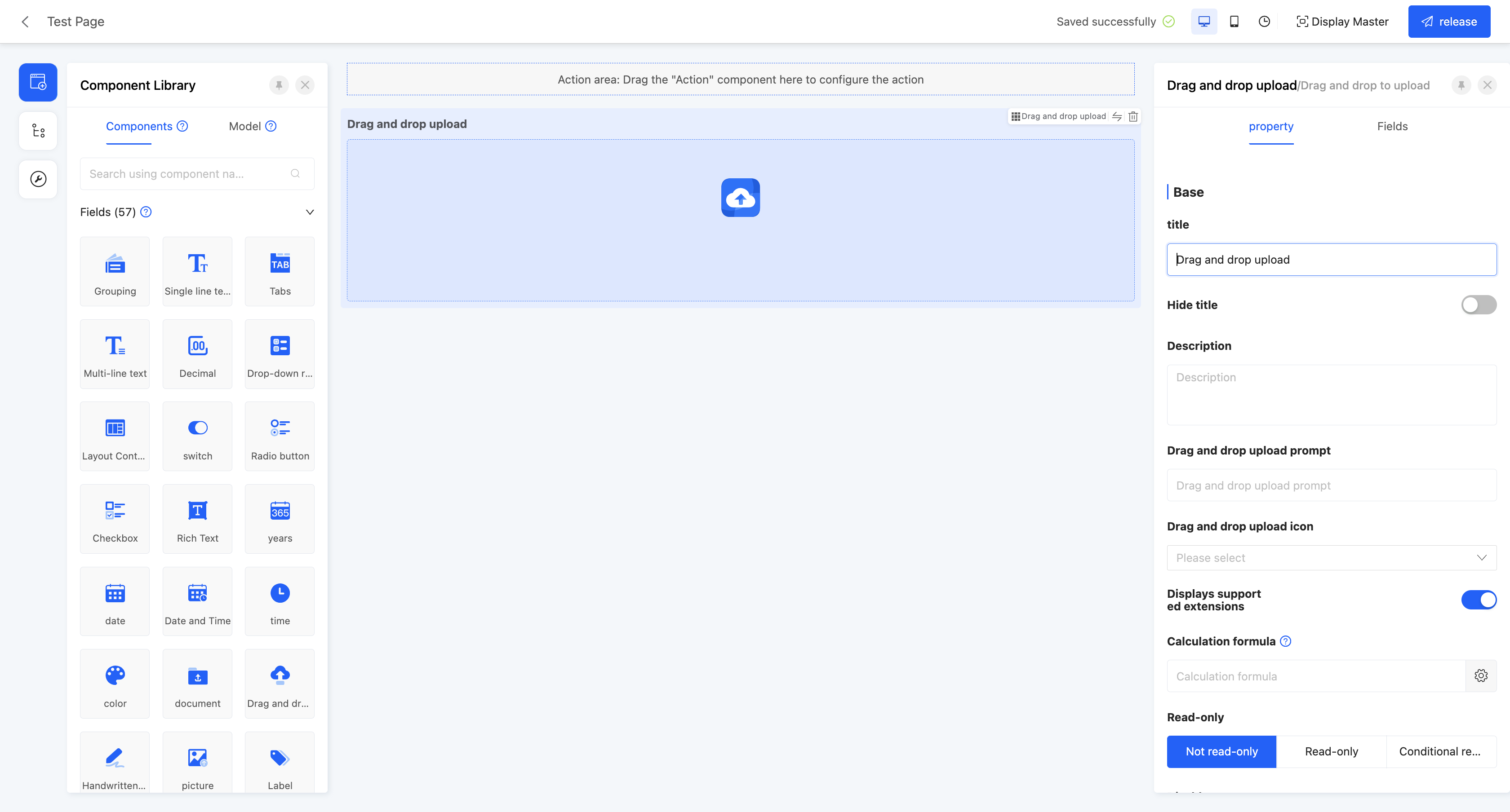 Display Page:
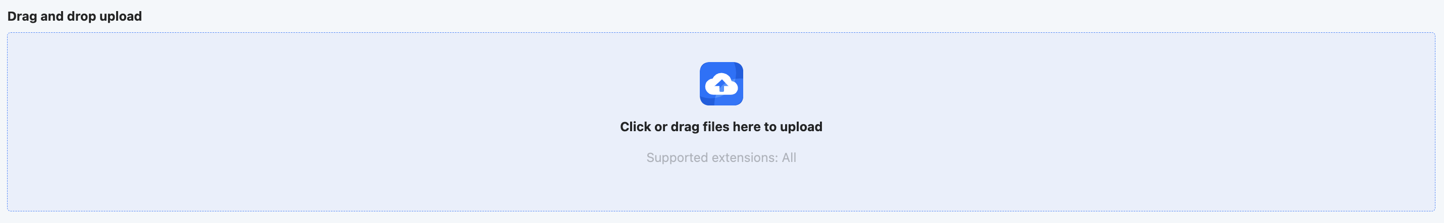
Specific attributes of drag and drop upload:
- Drag and Drop Upload Prompt: Used to set the prompt text displayed in the drag and drop upload area.
- Drag and Drop Upload Icon: Supports selecting a suitable icon to display in the drag and drop upload area, serving as visual guidance and beautification.
- Show Supported Extensions: When enabled, displays the file extensions supported by this component in the drag and drop upload area.
Note
The extensions displayed here are the suffixes of the file formats selected in the "Restricted Upload File Types" attribute.
- Maximum Number of Uploaded Files: When the field business is one-to-many or many-to-many, this attribute is displayed. Limits the maximum number of files that can be uploaded.
- Maximum Upload File Size: Limits the size of a single uploaded file.
- Restricted Upload File Types: Limits the upload format of files, supporting multiple types such as pictures, documents, audio, and videos, and also providing a custom option. When customizing, you need to enter the format suffixes of the supported files.
Note
If a certain format is allowed, files of other formats cannot be selected in the file selection dialog box.
- CDN Configuration: Supports CDN configuration.
- Private Link: Allows choosing whether to use a private link.
(XXXIX) Handwritten Signature
Supports implementing handwritten signatures on web pages, suitable for online contract signing, electronic form signing, etc.
Example
Design Example: 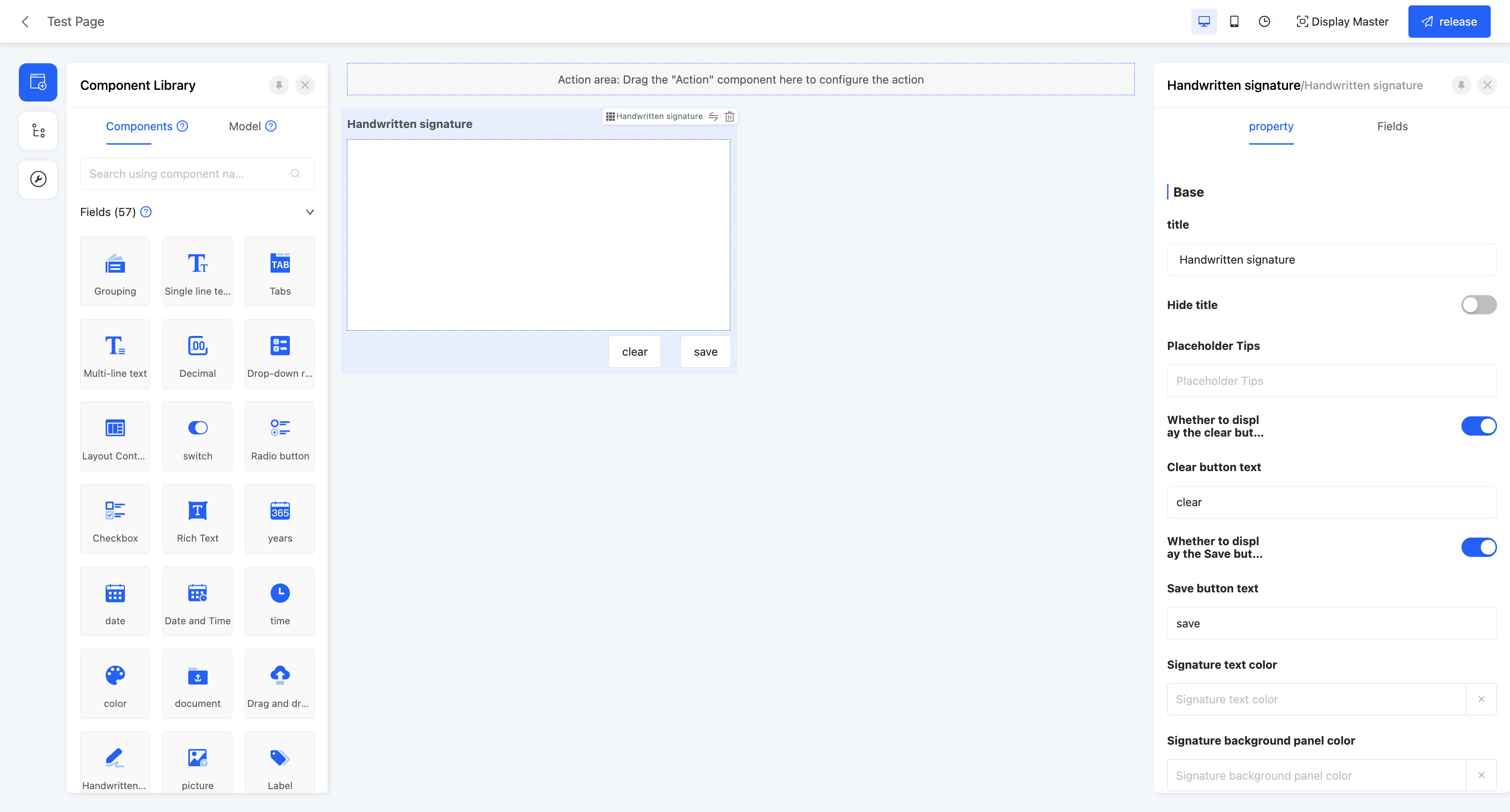 Display Page:
Specific attributes of handwritten signature:
- Show Clear Button: When enabled, a clear button will be displayed in the handwritten signature component interface, which can be clicked to clear the existing handwritten signature content; when disabled, the clear button will not appear in the interface.
- Clear Button Text: Used to set the text displayed on the clear button.
- Show Save Button: When enabled, a save button will be displayed in the handwritten signature component interface for users to save the handwritten signature; when disabled, the save button will not be displayed.
- Save Button Text: Used to set the text displayed on the save button.
- Signature Text Color: Used to set the color of the signature handwriting after handwritten signing.
- Signature Background Panel Color: Used to set the background color of the handwritten signature area.