Layout components are mainly used for the style layout of pages. They are equivalent to containers that can hold multiple other components. At the same time, layout components support nested use with each other, allowing users to more flexibly build page structures and layouts.
Ⅰ. Common Attributes
- Hidden Status: In addition to the simple binary option of hidden or visible, a conditional hiding function can be set. That is, the component will be hidden when specific conditions are met; otherwise, it will remain visible.
Note
When a component is set to be hidden, it will not be visible on the actual page. However, even if a component is set to be hidden, it will still be displayed on the design interface.
- Title Arrangement: This refers to the arrangement of the title and its content, which can be either horizontal or vertical. For layout components, setting the arrangement will uniformly adjust the title arrangement of all sub-components within the component.
- Display Devices: Include PC, mobile, and tablet devices.
Example
When designing a PC page, if the display device of a grouping component is set to only mobile devices and does not include PC devices, then in the actual page display, the grouping component and all its included components will not be shown on the PC page.
Ⅱ. Specific Attributes
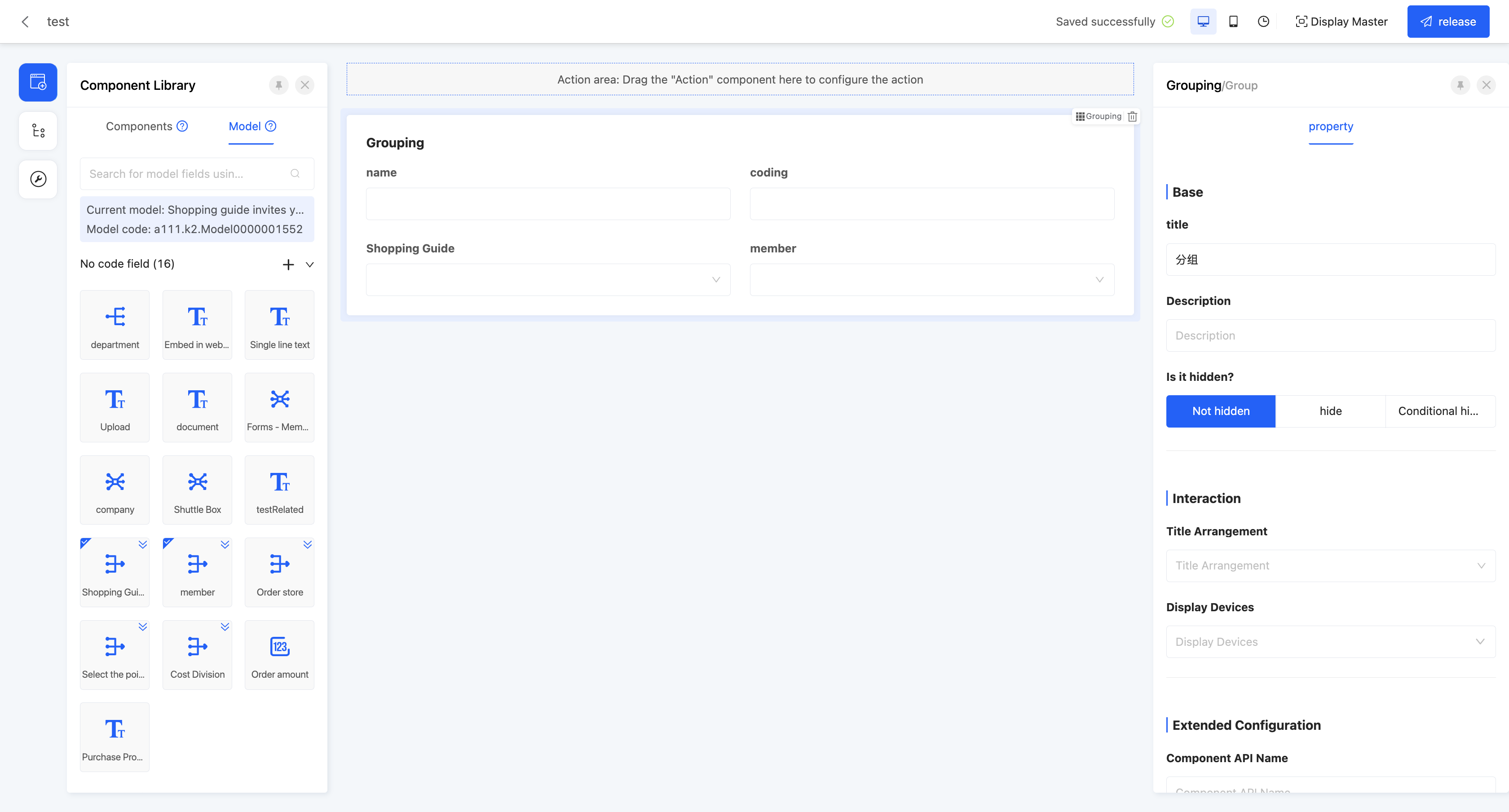
(Ⅰ) Grouping
Components with similar business meanings can be grouped together to achieve categorized management and clear presentation of page components.
Example
Design example:
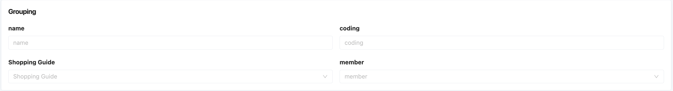
Displayed page:
Specific attributes of the grouping component:
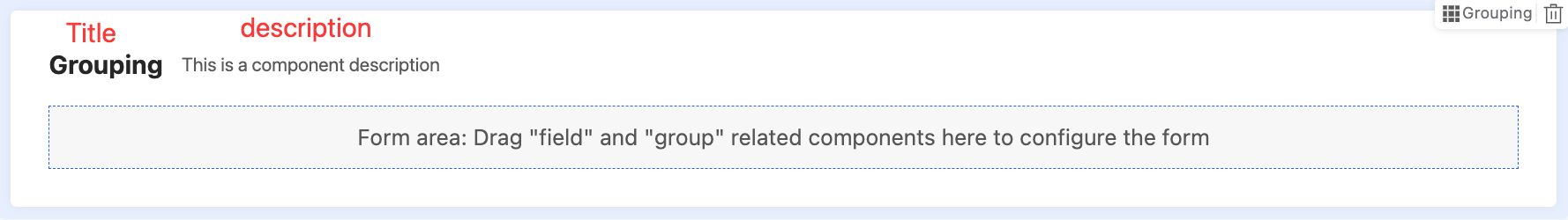
- Title: This is the name of the component displayed on the current page.
- Description: Used to describe the component information. The description of the grouping is on the left side of the title.
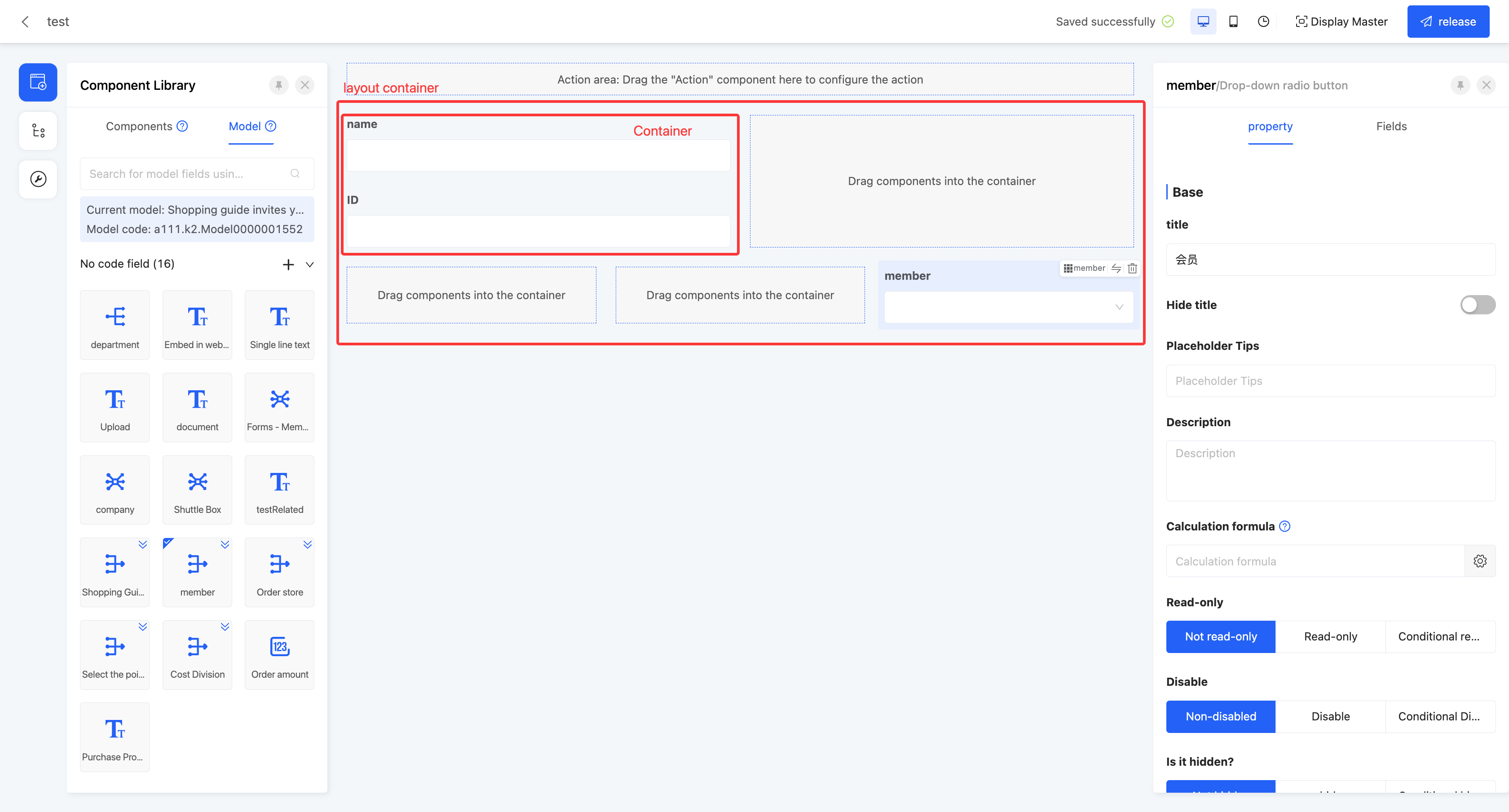
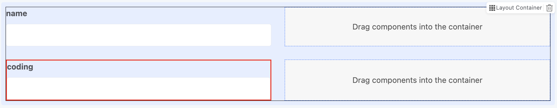
(Ⅱ) Layout Container
Similar to a table structure, users can flexibly add or delete a row or a column, and can also customize the settings of a specific container.
Note
- Only containers with components will be displayed. Containers without configured components will not be shown on the page.
- A container can contain multiple sub - containers.
Example
Design example:
Displayed page:
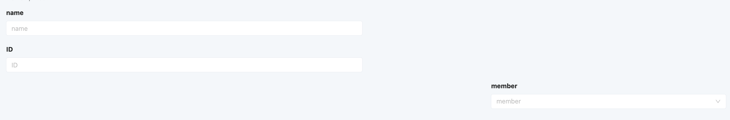
Specific attributes of the layout container:
- Title: This is the name of the component displayed on the current page.
- Border Visibility: Supports showing or hiding the container border. You can also apply the set border visibility to all containers with one click or clear all container border settings with one click.
- Border Width: You can set the width of the layout container border, and the width value must be an integer.
- Border Color: You can customize the border color through the color picker.
- Border Style: Four styles are available: solid line, dashed line, double line, and dotted line.
Note
- The border color and style will only be displayed on the page when the border is set to be visible and the width is set to a value greater than 0.
- If no components are added to the layout container, the border will not be displayed even if it is set.
- You can set borders for both the layout container and individual containers. The layout container border will be applied globally, while the individual container border will only be applied to that specific container.
- Row Spacing: If the layout container contains multiple rows, you can adjust the spacing between each row of containers to make the page more aesthetically pleasing.
- Column Spacing: If the layout container contains multiple columns, you can adjust the spacing between each column of containers to make the page more aesthetically pleasing.
- Padding: This is the margin between the layout container and its contained containers. You can customize the margins in the top, bottom, left, and right directions.
- Margin: This is the margin between the layout container and external components. You can customize the margins in the top, bottom, left, and right directions.
- Container
- Insert Row: Allows you to insert a new row of containers above or below the row where the selected container is located.
- Insert Column: Allows you to insert a new column of containers to the left or right of the selected container.
- Width: Supports two modes: adaptive and self - adjustable. When the self - adjustable mode is selected, you can customize the width of the container in its row.
- Vertical Alignment: Refers to the vertical arrangement of components within the container. The default setting is top alignment.
Note
The layout container contains multiple sub - containers. When setting attributes, if you select the "layout container", the same attribute settings will be uniformly applied to all included containers; if you select a specific "container", only the attributes of that single container will be set, without affecting other containers.
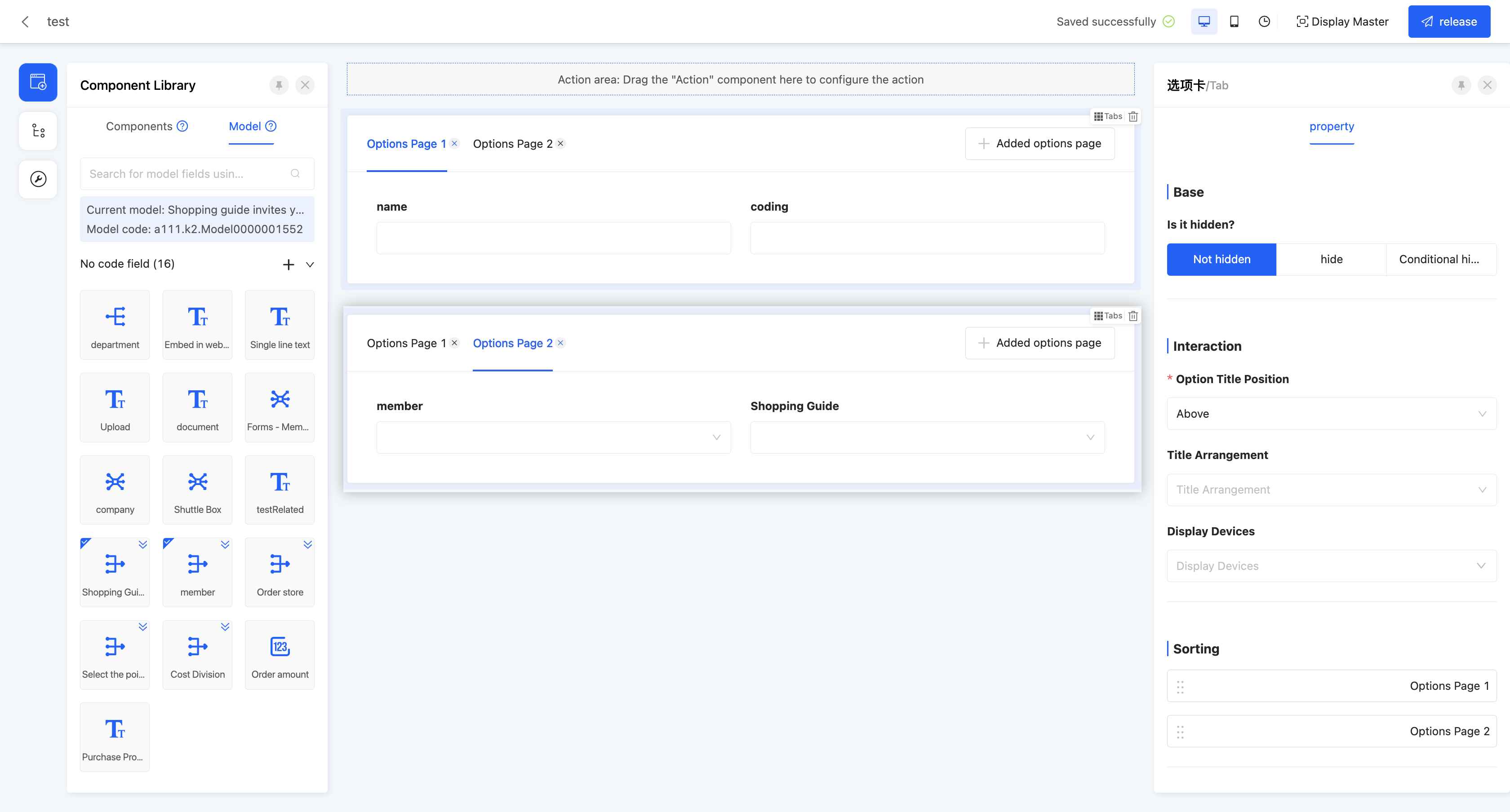
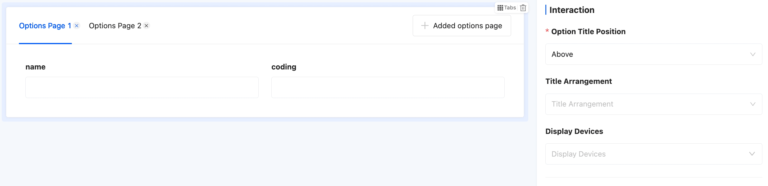
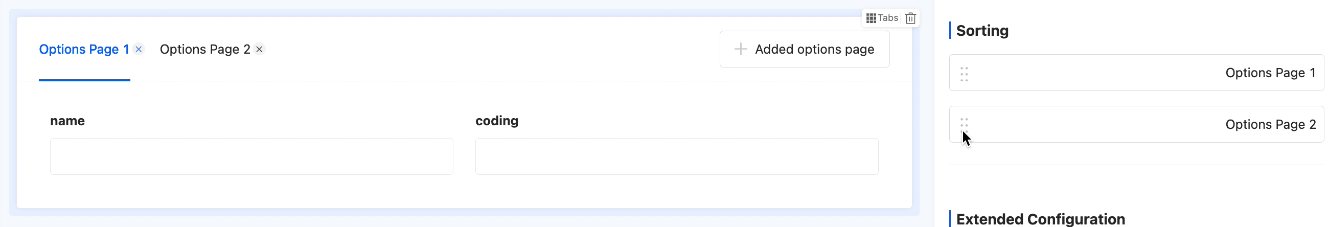
(Ⅲ) Tab
Multiple tab pages can be added to each tab. Users can configure different components for each tab page to meet diverse display requirements.
Example
Design example:
Displayed page:

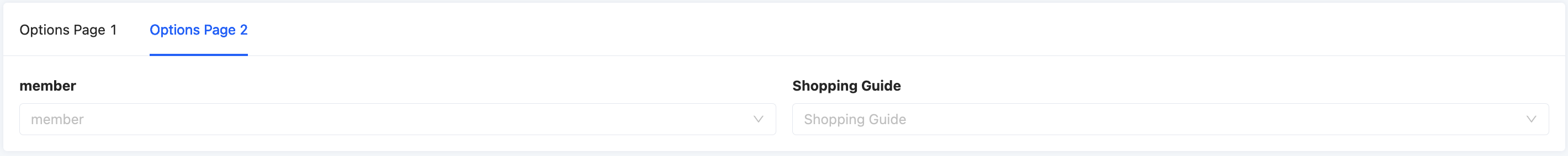
Specific attributes of the tab:
- Tab Title Position: Supports two positions: top or left.
- Sorting: Supports dragging tab pages to change their positions.
- Tab Page
- Default Activation: A tab page can be set as the default active page, and activation conditions can also be set. The tab page will be activated when the conditions are met.
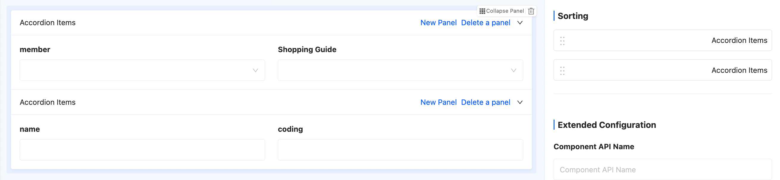
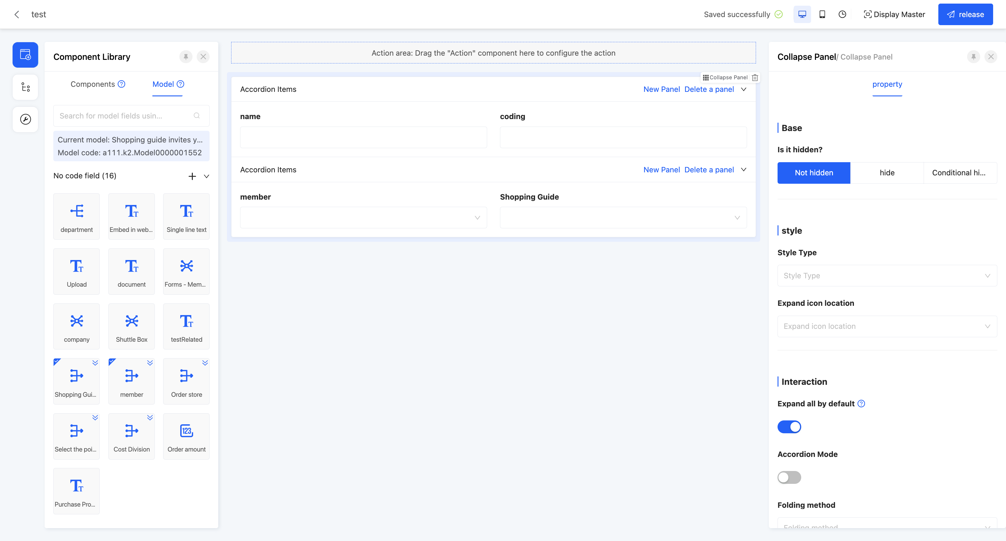
(Ⅳ) Collapsible Panel
Various components can be configured in the panel. Users can expand or collapse the panel as needed to optimize the page layout and user experience.
Example
Design example:
Displayed page:
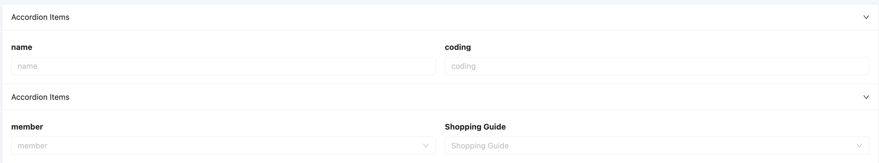
Specific attributes of the collapsible panel:
- Style Type: Four style options are available, including bordered, striped, simple, and transparent background, to meet different design needs for collapsible panels.
- Expand Icon Position: The position of the expand icon can be flexibly set, supporting left or right display, or you can choose to hide the expand icon to adapt to different design styles.
- Default Expand All: Controlled by a switch, you can set the initial state of the collapsible panel on the actual page. When the switch is on, the panel is expanded by default; when the switch is off, the panel is collapsed by default.
Note
This function is invalid if the accordion mode is enabled.
- Accordion Mode: When this mode is enabled, if there are multiple collapsible panel items, only one item can be expanded at a time. When trying to expand another panel item, the currently open panel item will automatically collapse.
- Collapse Method: Two collapse methods are available. You can collapse the panel by clicking on the header area or the title to meet different user interaction habits.
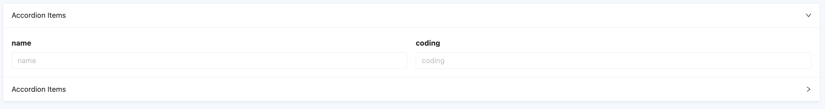
- Sorting: Supports dragging collapsible panel items to change their positions.