In the Oinone platform, the interface designer provides multiple view types to meet interface design requirements in different application scenarios. The following is an introduction to five view types: form, table, detail, gallery, and tree view:
Ⅰ. Form
The form view is a view type used for data input and display. It usually contains multiple fields (such as text boxes, drop-down lists, radio buttons, etc.), where users can input or select data. The form view is suitable for scenarios where users need to fill in and submit information, such as registration pages and information filling forms.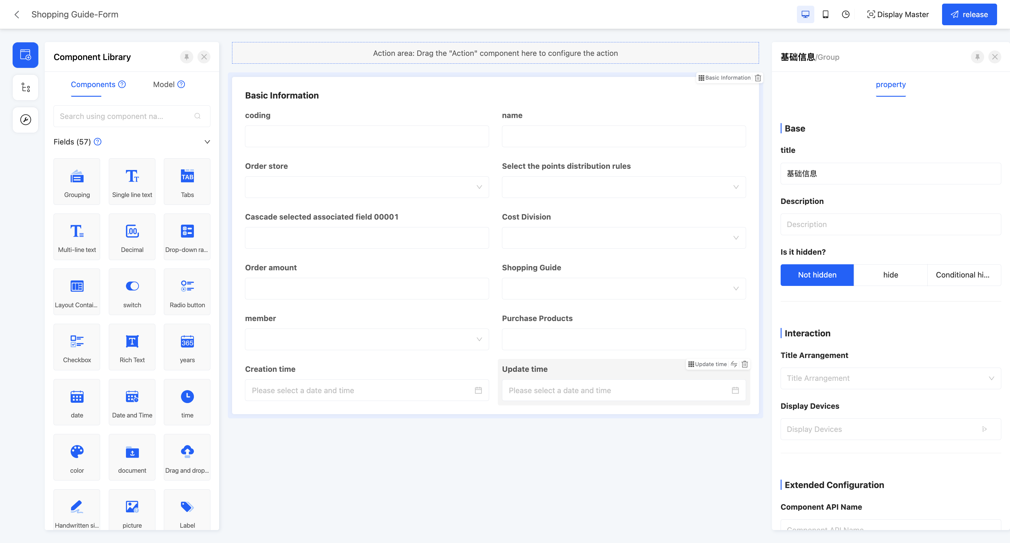
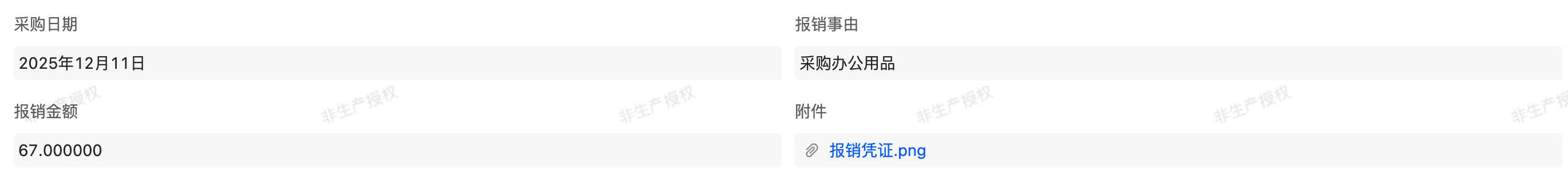
Example
Form view display effect: 
In the canvas design area, the form view will default to providing a form component, and the attributes configured in this form component can act on the entire form view.
Attention
The extended carrying forms of the form include pop - up windows and drawers. Both can complete form interactions in the current scenario. The specific choice can be determined based on the amount of content and the usage scenario:
- The pop - up window appears as a pop - up in the center of the screen and is suitable for operations with fewer form items that need to be completed quickly.
- The drawer slides out from the edge of the screen and is suitable for scenarios with more form items where detailed information needs to be supplemented. For detailed configuration and interaction rules, please refer to the description in "Jump Action Component": Jump Action
- Title arrangement: that is, the arrangement of the title and its content, which is divided into horizontal and vertical.
- Disable data loading: after enabling this option, the data loading function will not be executed.
- Loading function: if data loading is disabled, this attribute will not be displayed. When a certain option value is selected in the actual page, this function will be executed to load data.
- Association update type: the data submission method when the association field in the form is updated, including full submission and incremental submission.
- Full submission: submit all data.
- Incremental submission: only submit updated data.
Example
If there are multiple fields in the form, and only the data of some fields have changed
- When incremental submission is selected, only the data of these changed fields will be submitted
- When full submission is selected, the data of all fields in the form will be submitted, regardless of whether they have changed.
Ⅱ. Detail
The detail view is used to display detailed information of data items and cannot be edited. It is usually used in conjunction with other views. Users can enter the detail view through links or buttons in other views to view the detailed information of data items. The detail view can contain multiple types of fields to provide rich information display.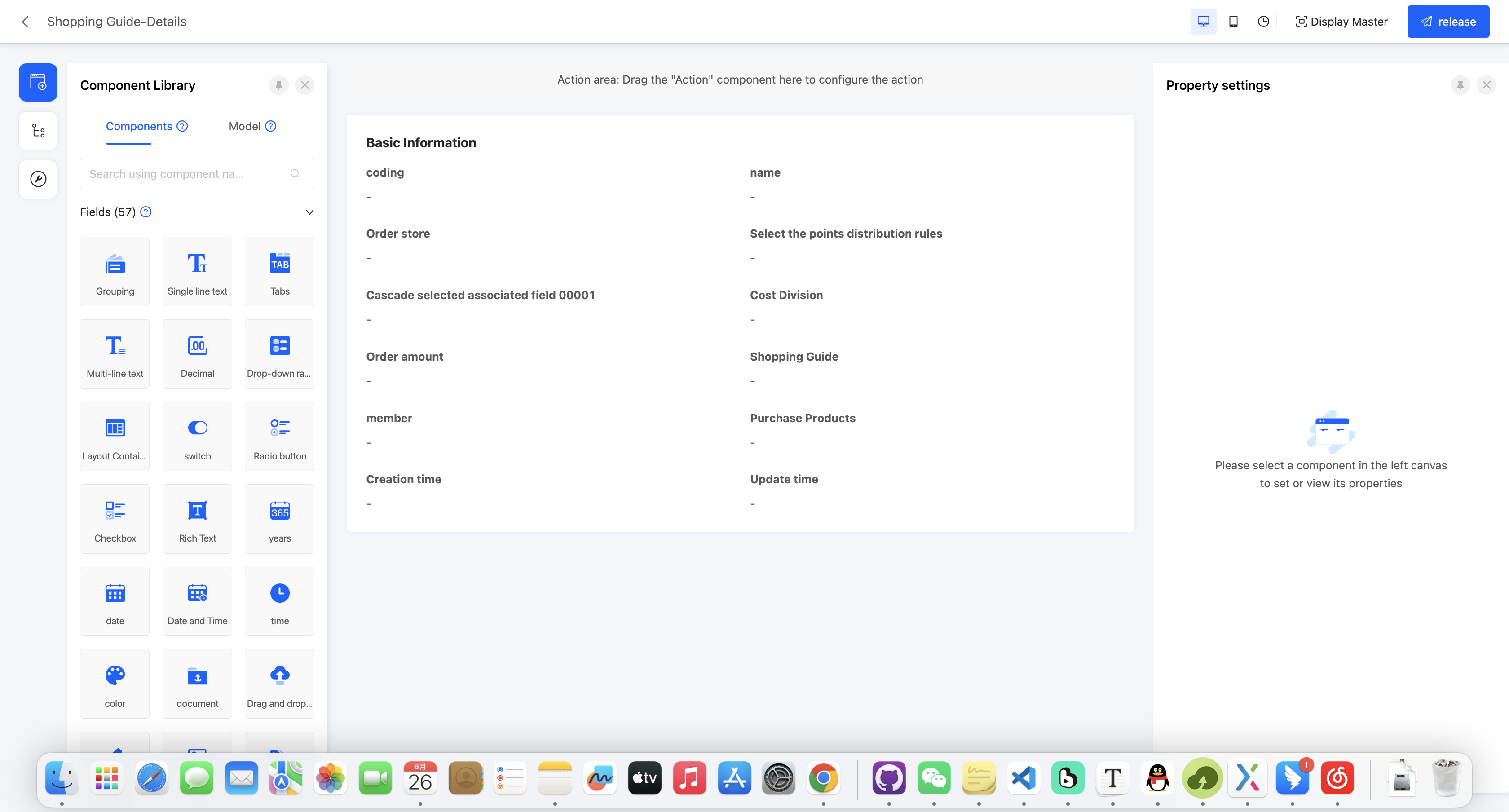
Example
Detail view display effect: 
In the canvas design area, the detail view will default to providing a detail component, and the attributes configured in this detail component can act on the entire detail view.
- Title arrangement: that is, the arrangement of the title and its content, which is divided into horizontal and vertical.
- Detail page style: Provides two different effects of the detail page
- No borders: The interface is clean and undecorated

- There is a border: The detail content will be decorated with a border and rounded shadow, making the information module more container differentiated
- No borders: The interface is clean and undecorated
- Disable data loading: after enabling this option, the data loading function will not be executed.
- Loading function: if data loading is disabled, this attribute will not be displayed. When a certain option value is selected in the actual page, this function will be executed to load data.
Ⅲ. Table
The table view is used to display data sets in the form of rows and columns. Each row represents a data item, and each column represents an attribute of the data item. It is suitable for scenarios that require intuitive display and operation of data sets, such as order management and customer lists.
Prompt
In addition to the regular table, the table also supports two advanced views, tree table and cascading, to meet more complex display requirements.
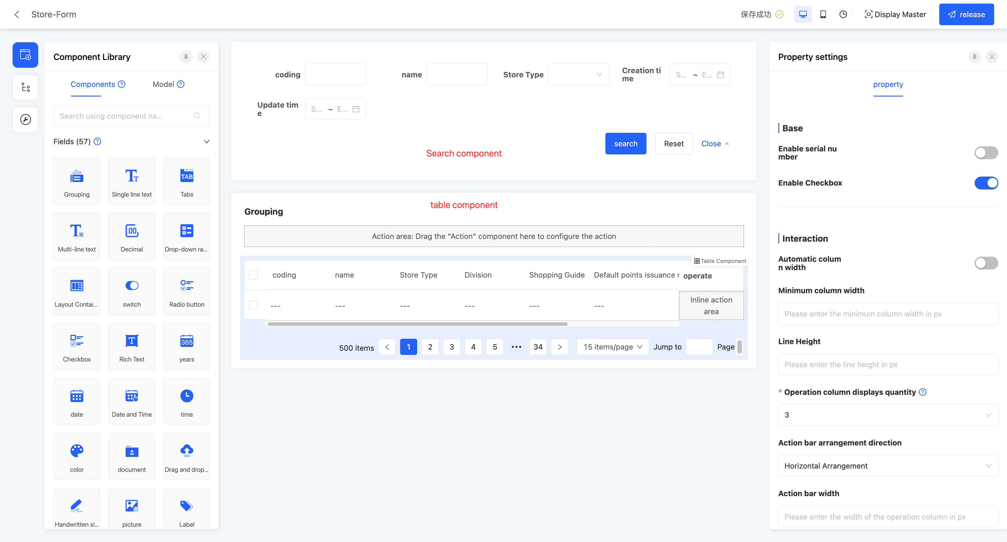
Example
Default table view display effect: 
In the canvas design area, the table view by default includes a search component and a table component. The attribute configuration of these two components will affect the global settings. When dragging other components into the canvas, they must be placed inside the search component or table component, otherwise the component cannot be successfully created.
(Ⅰ) Default Table
Search component attributes
- Show row number: If this option is enabled, the table will automatically add a row number column in the first column to make it easier for users to see the order of the data.
- Show checkboxes: If this option is enabled, the table will show checkboxes at the beginning, allowing the user to check the desired data items.
- Checkbox selectable range: The condition that the checkbox can be selected can be set, the checkbox of the data that meets the condition can be selected, and the checkbox of the data that does not meet the condition can be disabled. If no condition is set, all are optional
- Automatic column width: If this option is enabled, the header width of the table will automatically adapt based on its contents.
- Minimum column width: This is the minimum allowable width of each column in the table. -Automatic row height: When the height of a single cell exceeds other cells, the current row height is changed based on the highest cell.
- Row height: You can customize the minimum row height displayed in the table.
- Toggle row height: When this property is enabled, the table will display a row height adjustment icon at runtime. The user can click on the icon, and select the row height from the drop-down menu, including: default (using the row height set at design time), low, medium, high, and adaptive (the row height is automatically adjusted based on the content).

Note
If the user switches the row height while working with the table, the set automatic row height will lose its effect
- Number of operation columns displayed: the operation column on the far right of the table will default to displaying a certain number of operation items, and operation items exceeding this number will be folded up.
- Operation column arrangement direction: the action items in the operation column on the far right of the table can be arranged horizontally or vertically.
- Operation column width: allows users to customize the width of the operation column on the far right of the table.
- Operation column button style: action items in the operation column can adopt different button styles, including primary button, secondary button, and no style.
Note
Primary button: presented in the form of a button, with a background color, and highlighted. Secondary button: also presented in the form of a button, but without a background color, relatively low-key. No style: do not use button style, and action items are displayed in ordinary text form.
- Paginator style: the display style of the paginator, providing three styles: simple, standard, and hidden.
- Default number of pages: that is, the number of data entries displayed on each page.
- Query conditions: in the actual page display, data will be displayed according to the configured query conditions.
- Support expandable rows: if this option is enabled, the expandable row view can be set for the selected display fields.
- Expand all by default: if this function is enabled, in the actual display page, all expandable rows will be directly presented without additional operations.
- Expand operation display field definition: you can select fields from the model to which the current page belongs. After selection, in the actual display page, you can expand the field to view the set expandable row view.
- Set expandable row view: you can customize the view of expandable rows according to the current model or associated model. Different models may provide different view types, please select according to the actual situation. You can choose to copy an existing page or use a new page to create an expandable row view.
- Expandable row context: when data has different names in different positions but essentially refers to the same data, data mapping can be achieved by configuring the expandable row context.
- Support tree display: if this function is enabled, the table data will be intuitively displayed in a tree structure according to the set associated fields and expandable fields.
- Expand all by default: if this function is enabled, in the actual display page, all expandable rows will be directly presented without additional operations.
- Associated field: you need to select a self-associated field from the model to which the table belongs as the basis for association in the tree structure.
- Expandable field: you can select a field in the table as the expandable field of the tree structure to better display the hierarchy and relationship of the data.
- Double-click action: allows users to customize the jump action, and when a row in the table is double-clicked, the set action will be automatically executed.
- Enable inline editing: If enabled, users can quickly edit data directly in the table without having to jump to the edit page. This feature provides three editing modes: whole line editing, cell editing, and custom editing.
- Entire row edit: When the user clicks on a data item, the entire row will be in the edit state, which is convenient for the user to make full changes to the data in the row.
- Cell editing: When the user clicks on a data item, only that specific cell will enter the editing state, enabling precise modification.
- Custom editing: Users can customize the scope of editing operations and specific editing actions according to their actual needs, providing higher flexibility and personalized Settings.
- Disable data loading: after enabling this option, the data loading function will not be executed.
- Loading function: if data loading is disabled, this attribute will not be displayed. When a certain option value is selected in the actual page, this function will be executed to load data.
- Toggle full screen: When this property is enabled, the user can manually choose whether to display the table in full screen

- Shortcuts: With this feature enabled, users can use the following shortcuts in the table view to perform quick operations on the field columns that are allowed to be edited. In addition, the user can see the shortcut prompt panel at the top right of the table.
Note
- The above shortcuts for editable cells only work for cells with "Edit icon" in the table header
- After editing the whole row, all editable data in the cell will be submitted uniformly; If you press Enter during the editing process, the data in the row that has been edited but not yet committed will also be synchronously committed
- If you press the ESC key during the editing process, the data in the row that has been edited but not yet committed will be discarded by Ichii
| Operation | shortcut key |
|---|---|
| Move cell left | 'Shift' + 'Tab' |
| Move cell to the right | 'Tab' |
| Submit data | 'Enter' |
| Unedit | 'Esc' |
Sort
With "Allow users to sort" enabled, this feature allows you to set and manage the ordering of data in the table for more efficient viewing and analysis of information.
- Default ordering: If the system has a default ordering configured at design time, when the table is loaded, the data will be arranged according to the default ordering.
- Single field sort: The current sort order is displayed next to the column header
- Multi-field sort: This field and its current sort configuration will be shown by default in the popup.
- Sorting: The table provides two ways to set the sorting, and they have different scopes:
- Single field sort (list header setting)
- Action position: Directly click the table column title next to the sort icon.
- Valid logic: Sorting only applies to the currently clicked field. This is a quick, single-level sort that overwrites any currently applied sorting rules (including the multi-field sorting set in the popup).
- Multi-field sorting (icon popover Settings)
- Action location: Click the sort icon in the top right corner of the table.
- Valid logic: Multiple fields can be sorted and manually dragged to adjust the priority (the higher the priority, the higher the priority)Once the configuration is complete, click the "OK" button to apply multilevel sorting.
- Multi-field sorting (icon popover Settings)
- Single field sort (list header setting)
- Remove sorting
- Single field sort: Click the "Unsort" button next to the column title.
- Multi-field sort: Click the Delete icon next to the field
Grouping
After enabling "Allow Data Grouping", this function allows you to organize and classify table data based on one or more selected fields, thereby improving the readability and analysis efficiency of the data.
Note
The grouping function is mutually exclusive with the tree table, and the two cannot be enabled simultaneously.
- Default Grouping Settings: Configured during table design to determine the initial grouping state when the table is loaded.
- Configuration Permission: Only takes effect after enabling "Allow Data Grouping" during design.
- Field Scope: You can select fields in the table as default grouping fields, not limited to the currently displayed columns in the table.
- Setting Multiple Fields: You can select one or more fields. If multiple fields are set, the data will be grouped sequentially according to the priority order (from top to bottom) of the list during runtime.
- Grouping Methods: During runtime, users can set or modify grouping fields in two ways.
- Header Grouping
- Operation Location: In the column header (table header) of the table, click "Group by this field".
- Function: Quickly add this field as a grouping field. The new field will be appended to the end of the existing grouping list, with the priority decreasing in turn.
- Cancel Grouping: If the column is already a grouping field, the "Cancel grouping" option will be displayed in the table header. Click it to remove the grouping setting.
- Advanced Grouping
- Operation Location: Click the grouping icon in the upper - right corner of the table.
- Function: Supports adding one or more fields as grouping fields. You can manually drag the added fields in the pop - up window to adjust their grouping priority.
- Header Grouping
- Deleting Grouping
- Header Grouping: Click the "Cancel grouping" button next to the column header.
- Advanced Grouping: Click the delete icon next to the field.
INFO
Sorting and Statistics
- Sorting within Groups: You can sort the selected fields, with the default being ascending order. Sorting within groups will override the sorting settings for this field in the original sorting function, and the two functions do not affect each other.
- Statistics within Groups: Supports statistics on the data within groups (such as summation, average, total number of records, etc.), and the results are displayed in the group title row.
- Multi - value data with the same content but only different orders is treated as one piece of data.
Expanding and Collapsing
- When the data volume < 300 records: All data is expanded by default.
- When the data volume > 300 records: The data is collapsed by default, and one - click expansion of all data is not supported.
Batch Operations
- Batch Selection: Select the checkbox in the group title row to select all data under this group at the same time.
- When the data is not expanded, the checkboxes are disabled.
- The table supports a maximum of 200 records. If the number of batch - selected records is greater than 200, only the first 200 records will be selected, and the rest will be disabled.
(Ⅱ) Tree Table
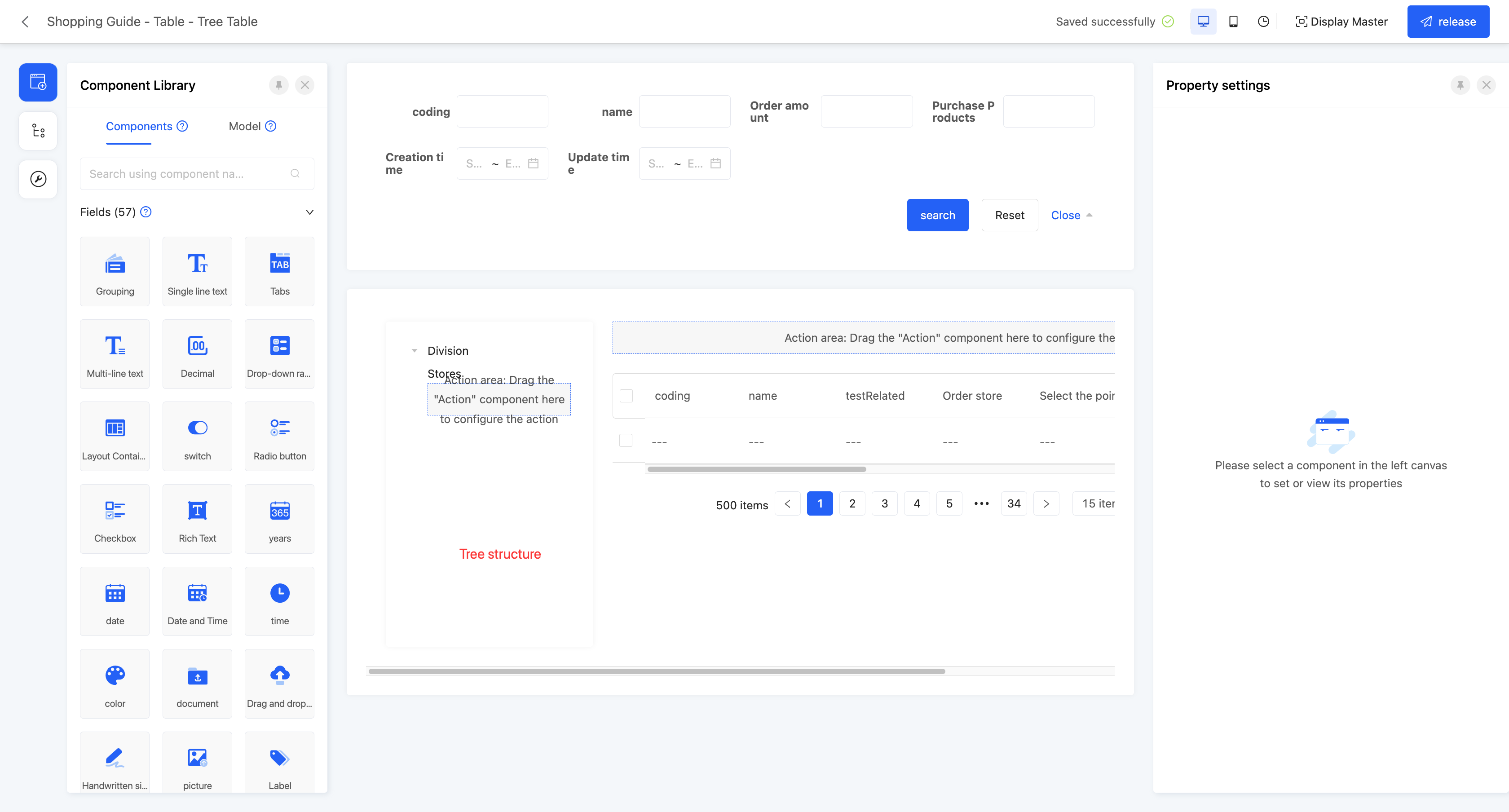
Example
Table - Tree Table View Display Effect: 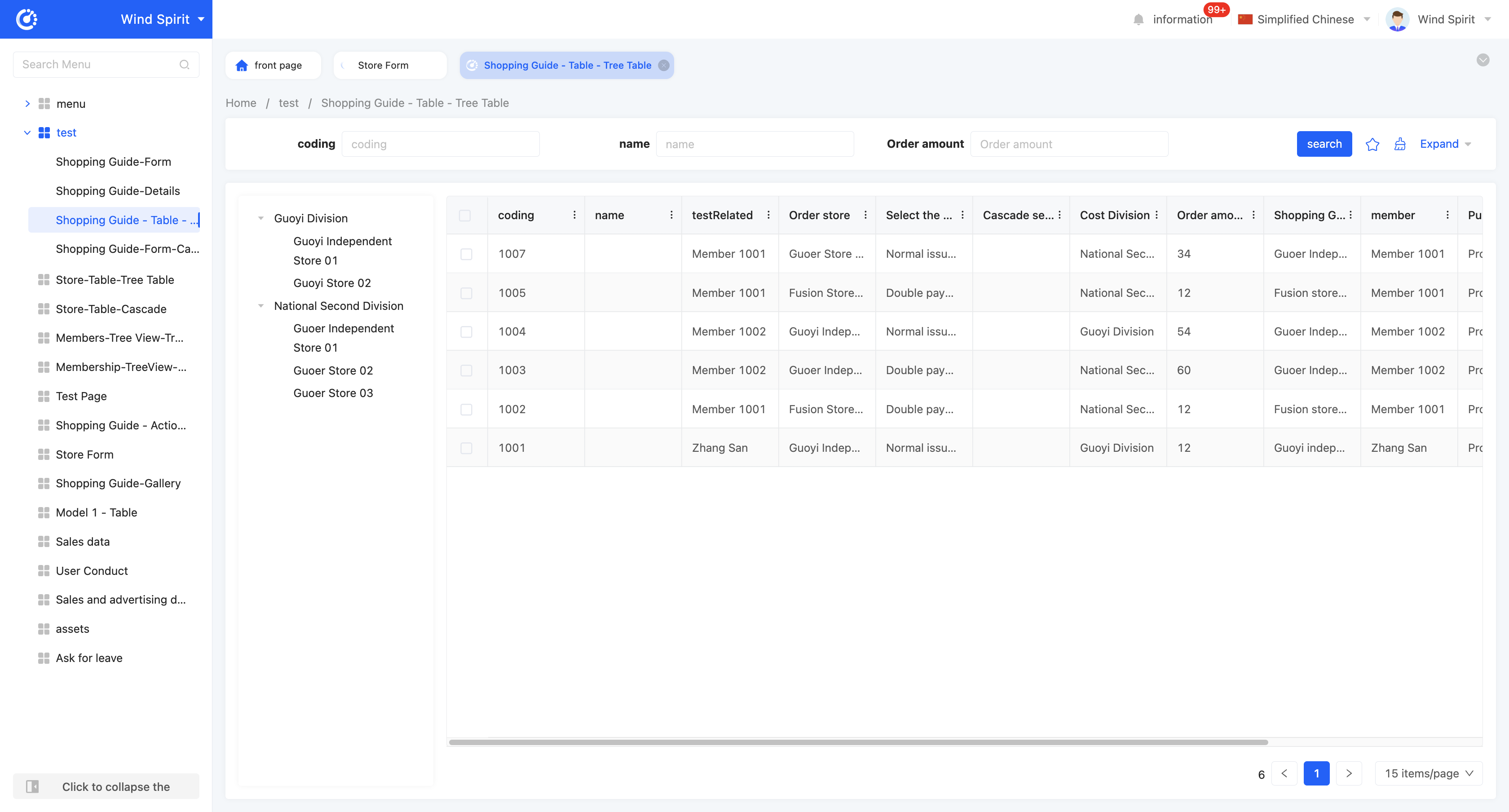
The tree table is consistent with the default table in the search component and table component, and the difference is that the tree table additionally adds a tree structure. By setting the tree structure, the tree table can display data in a hierarchical form, making the data presentation clearer and more intuitive. Here, only the relevant attributes of the tree are introduced. For details of the search component and table component, please refer to the relevant introduction of the default table.
- Linkage relationship: refers to the model fields that need to be displayed in the tree structure, and users can customize the setting of multi-layer linkage relationships.
- Hierarchical association field: when setting a multi-layer linkage relationship, this attribute will be displayed from the second level and subsequent levels, and is used to define the association field with the upper-level model.
- Data title: that is, the name of the option value. When multiple selections are made, these data will be spliced and displayed. The default option field is the name.
- Filter conditions: in the actual page display, data will be displayed according to the configured filter conditions.
- Table association field: refers to the association field between the current level model and the model selected by the page.
- Self-association field: refers to the field in the current level model that is consistent with its own model.
Note
A complete association field must be formed to successfully generate the linkage relationship.
- Support search: if this function is enabled, a search box will be displayed in the tree structure, and hierarchical fields can be filtered.
- Expand level: if a multi-layer linkage relationship is set, you can specify which level to expand to.
(Ⅲ) Cascading
Similar to the tree table, the difference is that a cascading component is added to the cascading. In the actual page display, the tree table will dynamically display sub-options below, while the cascading will dynamically display sub-options on the right. Here, only the relevant attributes of the cascading are introduced. For details of the search component and table component, please refer to the relevant introduction of the default table. 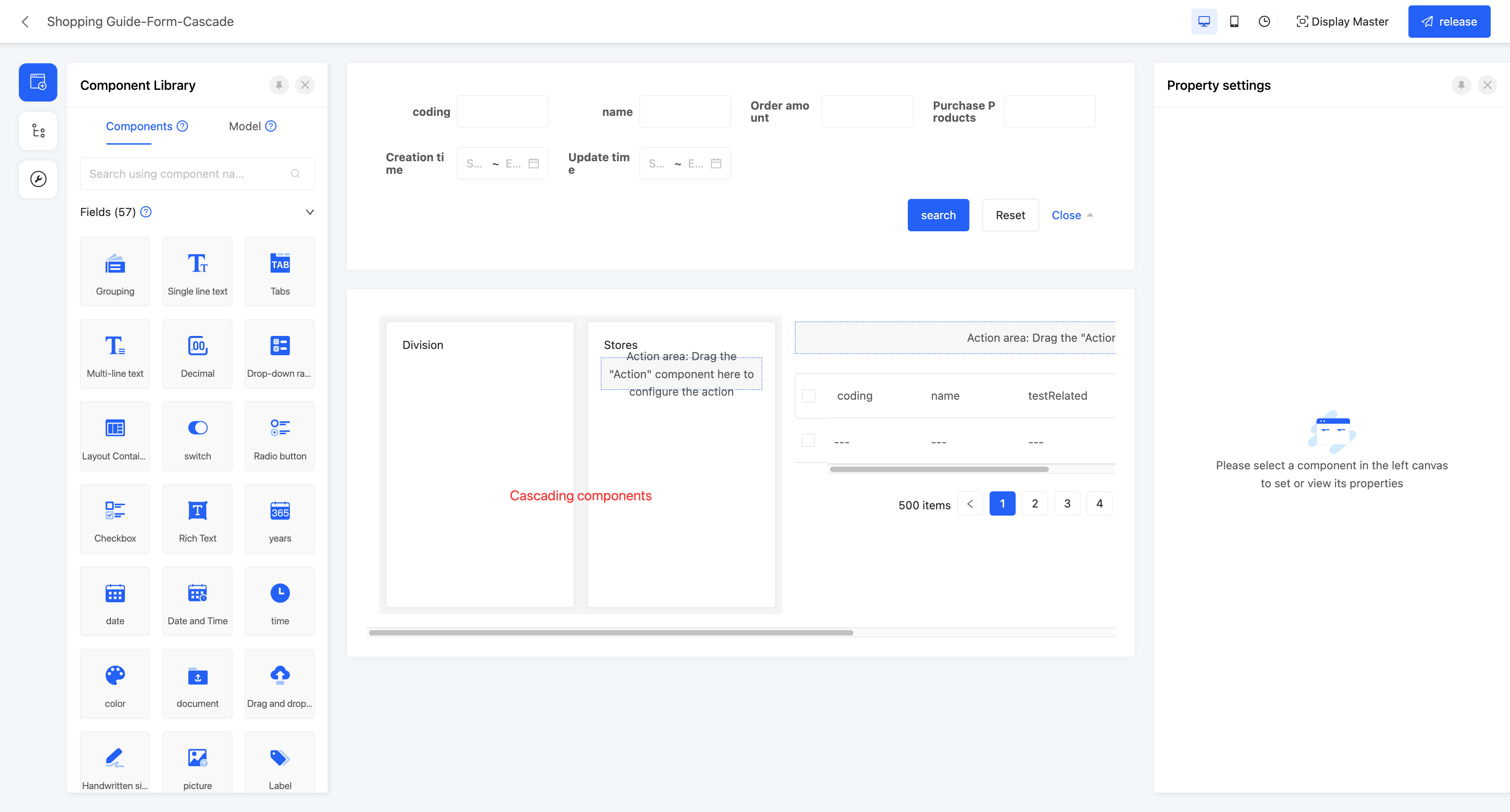
Example
Table - Cascading View Display Effect: 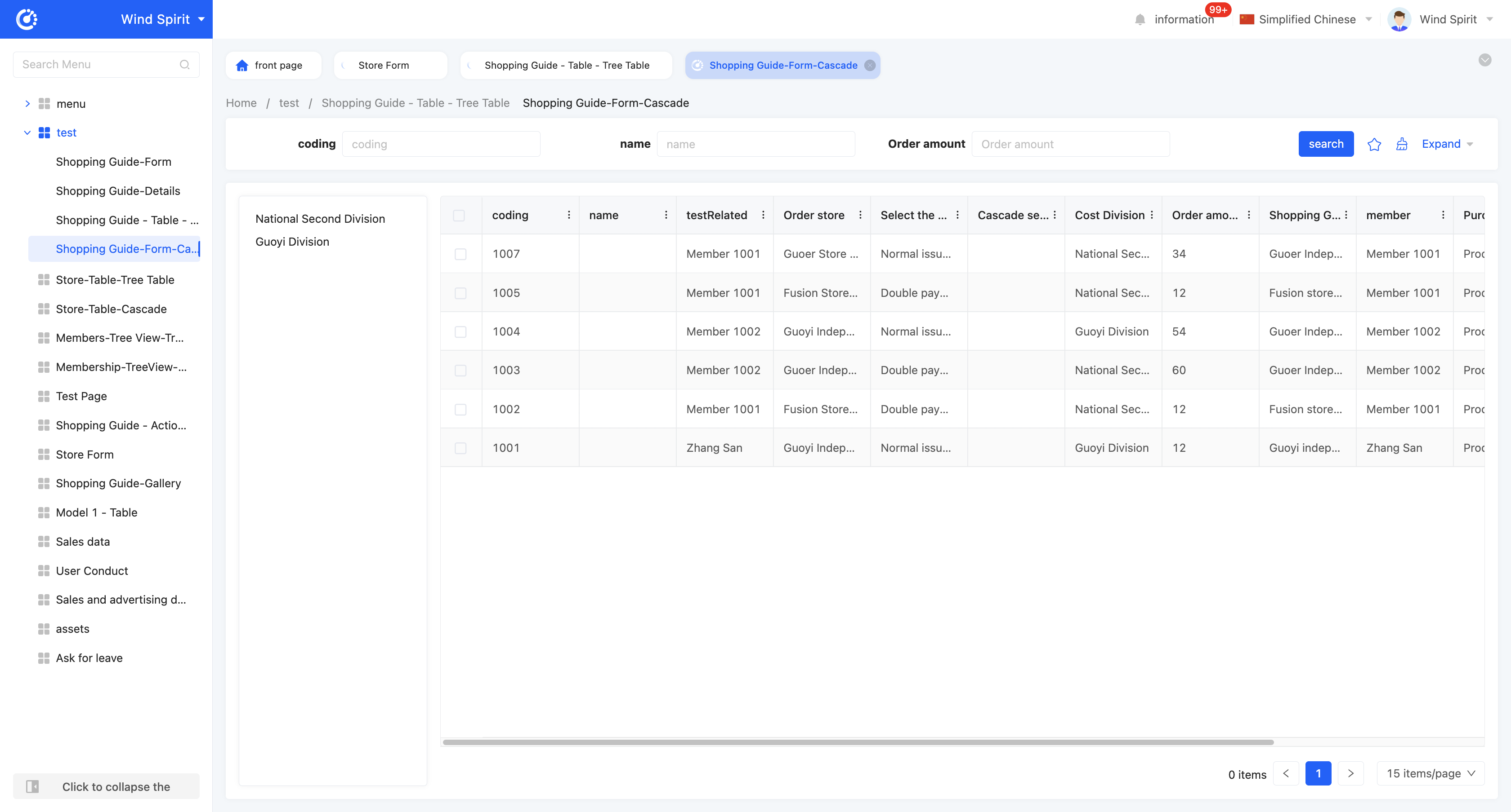
- Linkage relationship: refers to the model fields that need to be displayed in the tree structure, and users can customize the setting of multi-layer linkage relationships.
- Hierarchical association field: when setting a multi-layer linkage relationship, this attribute will be displayed from the second level and subsequent levels, and is used to define the association field with the upper-level model.
- Data title: that is, the name of the option value. When multiple selections are made, these data will be spliced and displayed. The default option field is the name.
- Filter conditions: in the actual page display, data will be displayed according to the configured filter conditions.
- Table association field: refers to the association field between the current level model and the model selected by the page.
- Self-association field: refers to the field in the current level model that is consistent with its own model.
Note
A complete association field must be formed to successfully generate the linkage relationship.
- Support search: if this function is enabled, a search box will be displayed in the tree structure, and hierarchical fields can be filtered.
Ⅳ. Gallery
The gallery view displays content items in the form of cards, allowing users to intuitively browse different content items. It is suitable for scenarios that need to display visually rich content, such as product displays and photo album browsing.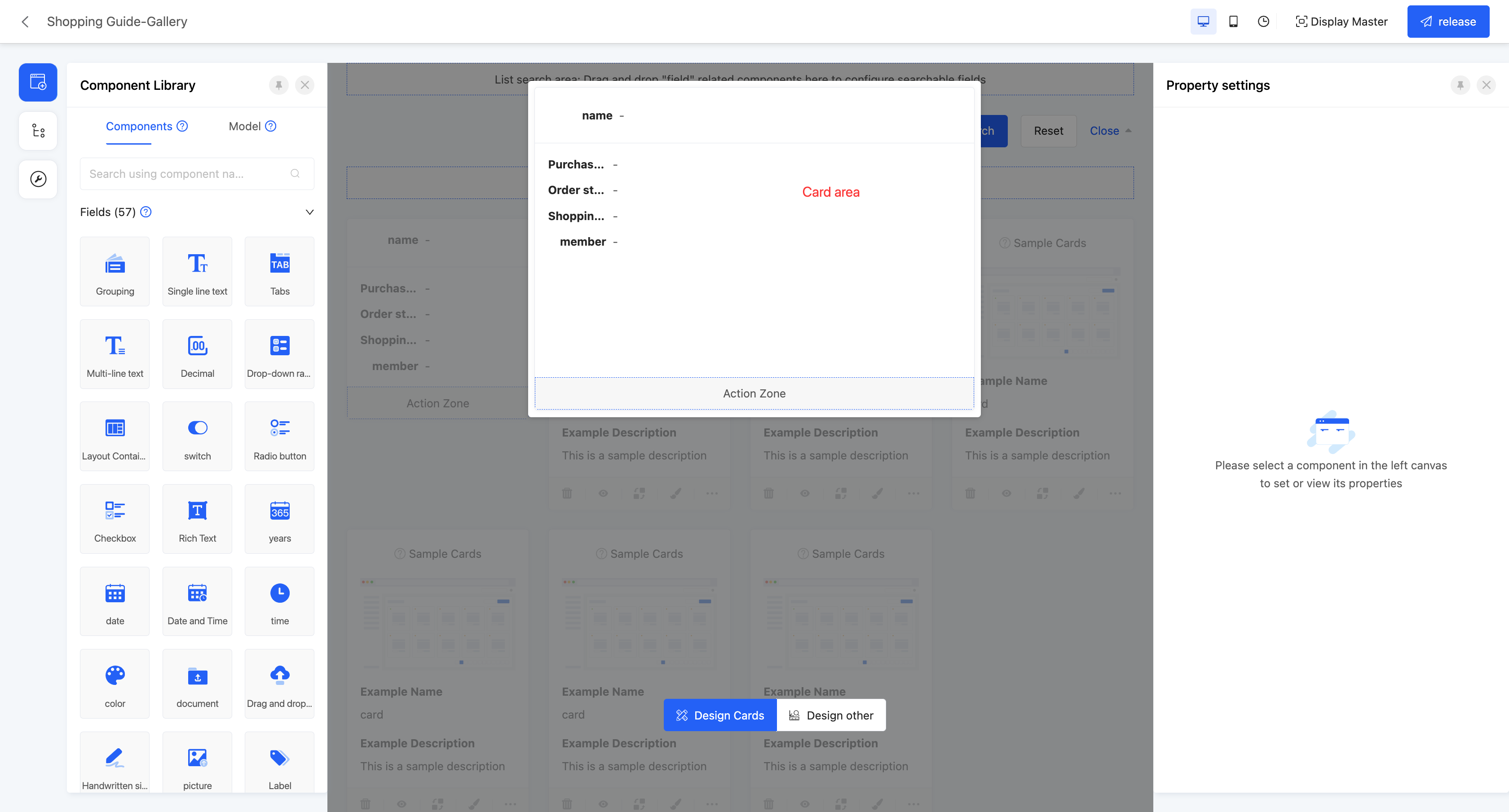
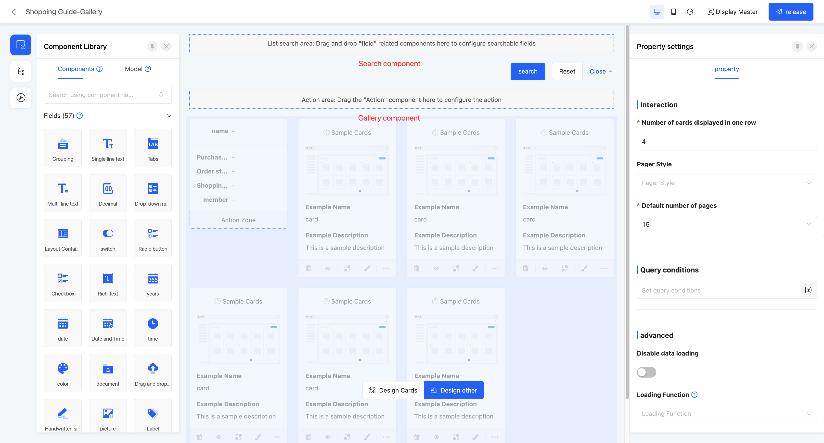
Example
Gallery view display effect: 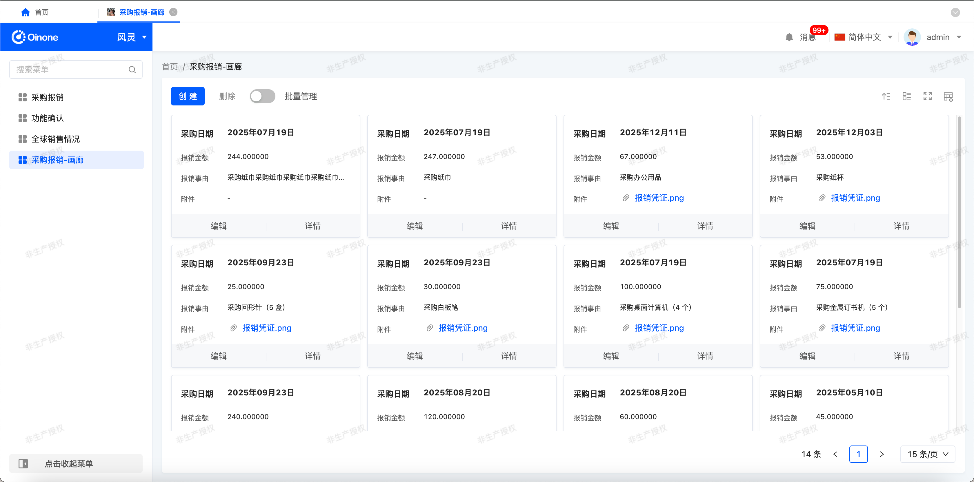
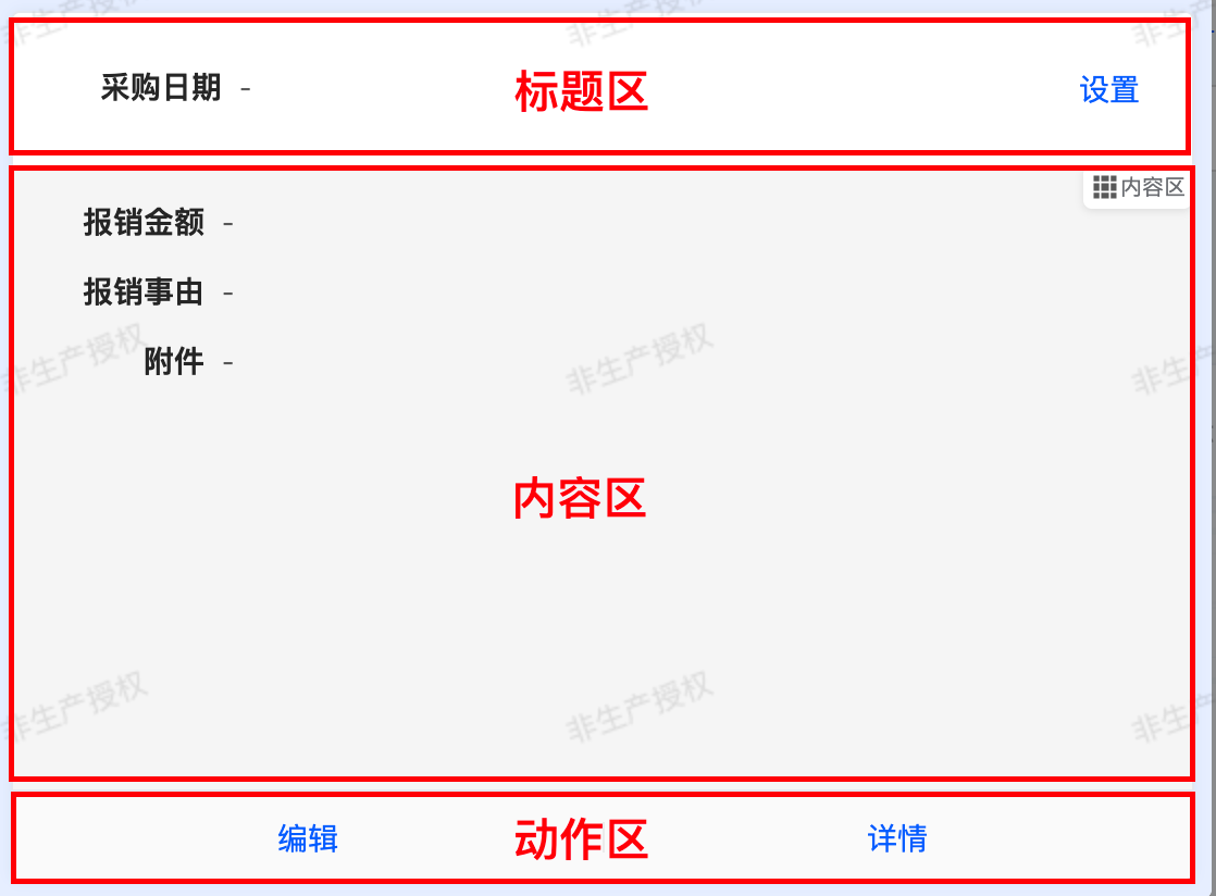
In the canvas design area, the gallery view consists of two pages, namely "Design Cards" and "Design Others". On the "Design Cards" page, users can design a single card view in the gallery, and the design effect will be applied to all cards. The "Design Others" page contains a search component and a gallery component by default. The attribute configuration of these two components will affect the global settings.
- Card Attributes:
Card
- Arrangement Order: It includes three areas, namely the title area, content area, and action area, and the display order can be freely dragged.
- Click to Jump: You can configure the jump behavior when clicking on the main area of the card. The configuration method is the same as that of the jump action.
- Text Action Area: Located in the upper - right corner of the card, it is a set of actions that can be expanded by dropdown. After dropdown, various operation actions can be used.
Prompt
If you need to configure the actions in this area, you can follow these steps:
- Find the "Text Action Area" module in the card configuration interface and click on the module area to expand it.
- In the component library, find the action you need and drag it into the "Text Action Area".
- After the dragging is completed, the configured actions will be automatically added to the action set in the upper - right corner. When viewing the card later, click on the dropdown of the action area in the upper - right corner, and you can see and use these operations.
- Time Difference: After enabling this function, the time interval between the current actual system time and the time in the pre - selected "Bound Field" will be automatically displayed in the card, allowing you to quickly grasp the gap between the two time nodes.
- Minimum/Maximum Card Width: You can set the display range of the card width.
- Minimum Card Height: It limits the "lower limit value" of the card height. No matter how much content is in the card, the card height will not be less than this set value.
- Arrangement Order: It includes three areas, namely the title area, content area, and action area, and the display order can be freely dragged.
- Title Area/Content Area/Operation Area
- Border Visibility: You can customize whether the four sides of the border are visible.
- Border Color: This property is displayed when there is a visible border. You can set the color for the visible border.
- When Content is Too Long: For the card title area and content area, you can separately configure the display rules for "when the content is too long". After finding the configuration item for the corresponding area, click on the dropdown menu of "When Content is Too Long", and you can select either the "Auto - wrap" or "Disable Auto - wrap" mode.
- If you choose "Auto - wrap", when the length of the title or content exceeds the card width, the system will automatically wrap the excess content to ensure that all information is fully presented, and you can view all the content without manual adjustment.
- If you choose "Disable Auto - wrap", when the title or content exceeds the card display range, the system will automatically truncate the excess part (to avoid content overflow affecting the interface cleanliness).
- Search Component Attributes
- Hide Search Button: If this option is enabled, all action buttons in the search component will be hidden. To perform a search, you can press the Enter key.
- Disable Collapse: If this option is enabled, the search area will remain in a fixed state, and expansion or collapse operations are not allowed.
- Tab Labels: When there are data dictionary type fields under the model of the current page, you can set tab labels for the search component. After configuration, the search bar will be presented in the form of tab cards.
- Gallery Component Attributes
- Number of cards displayed per row: That is, the number of cards that can be displayed in one row.
- Switch the number of cards: After enabling this function, users can customize the number of cards displayed per row on the actual running page.

- Paginator style: The display style of the paginator. There are three styles available for selection: minimalist, standard, and hidden.
- Default number of items per page: That is, the number of data entries displayed per page.
- Query conditions: In the actual page display, the data will be displayed according to the configured query conditions.
- Sorting: After enabling "Allow users to sort", this function allows you to set and manage the sorting rules of data in the gallery for more efficient data viewing and analysis.
Attention
- Default sorting: If the system is configured with default sorting rules during design, when the gallery is loaded, the data will be arranged according to the preset default sorting rules.
- Sorting method: Click the sorting icon in the upper - right corner of the table to set sorting rules for multiple fields, and manual dragging is supported to adjust the priority (the field ranked higher has a higher priority).
- Delete sorting: Click the delete icon next to a field to delete the selected field.

- Switch to full - screen: After enabling this property, users can manually choose whether to display the table in full - screen mode.
- Disable data loading: After enabling this option, the data loading function will not be executed.
- Loading function: If "Disable data loading" is enabled, this property will not be displayed. When a certain option value is selected on the actual page, this function will be executed to load data.
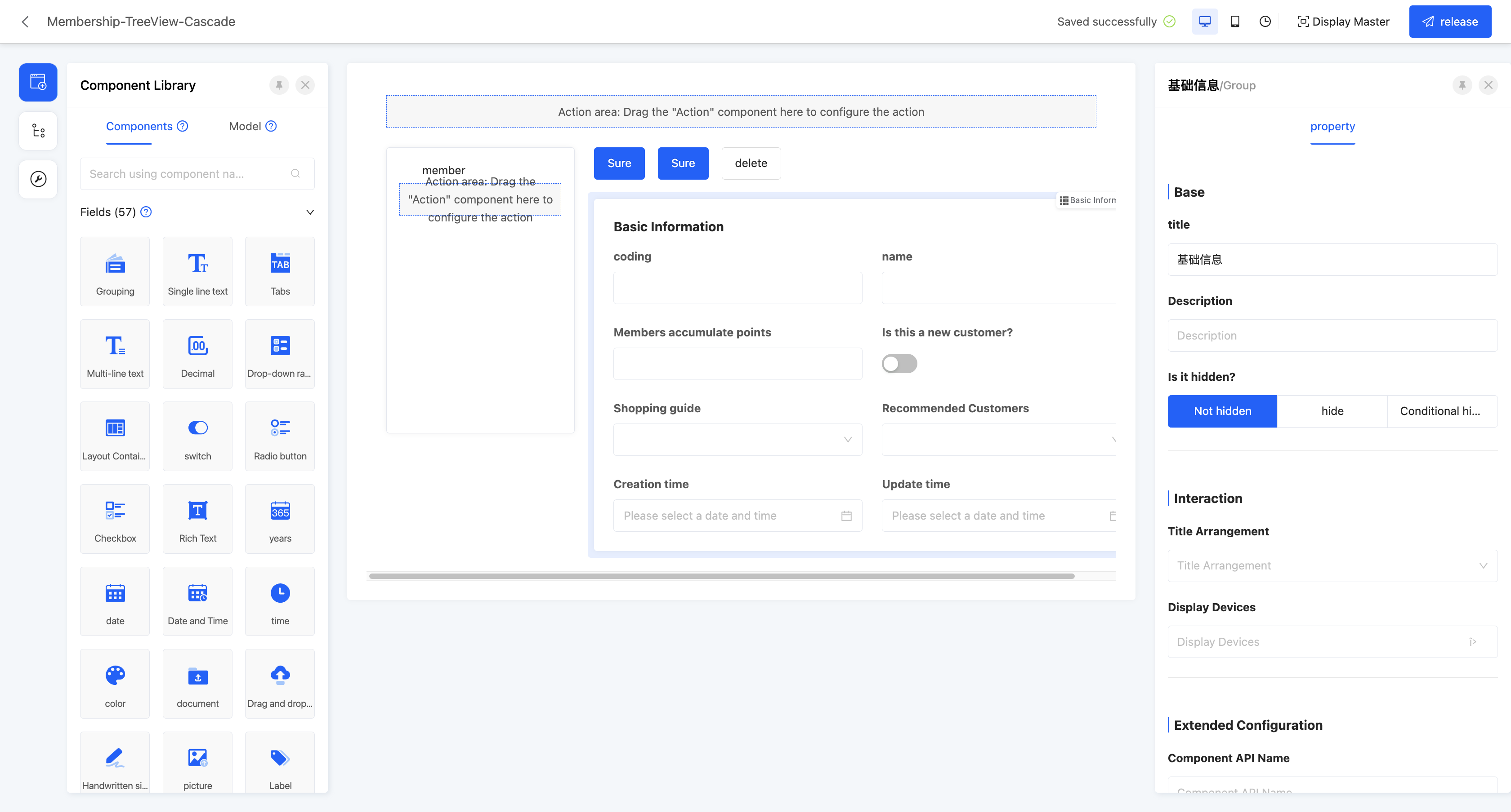
Ⅴ. Tree View
The tree view is used to display data items in a hierarchical structure. Each data item can contain sub-items, forming a hierarchical structure. The tree view supports expand and collapse operations, which is convenient for users to view and manage data with hierarchical relationships. It is suitable for scenarios that need to display data with hierarchical relationships, such as organizational charts and classification directories.
Note
The tree table in the table is different from the tree table in the tree view, and the same is true for cascading:
- The tree table in the table uses the table's model as the main model
- The tree table in the tree view uses the tree table's model as the main model, and the left form is the expanded content part.
The tree view is divided into two types: tree table and cascading, which are composed of a cascading component (or tree component) and a selected view type component. The relevant attributes of the form component have been described in detail above, and will not be repeated here.
(Ⅰ) Tree Table
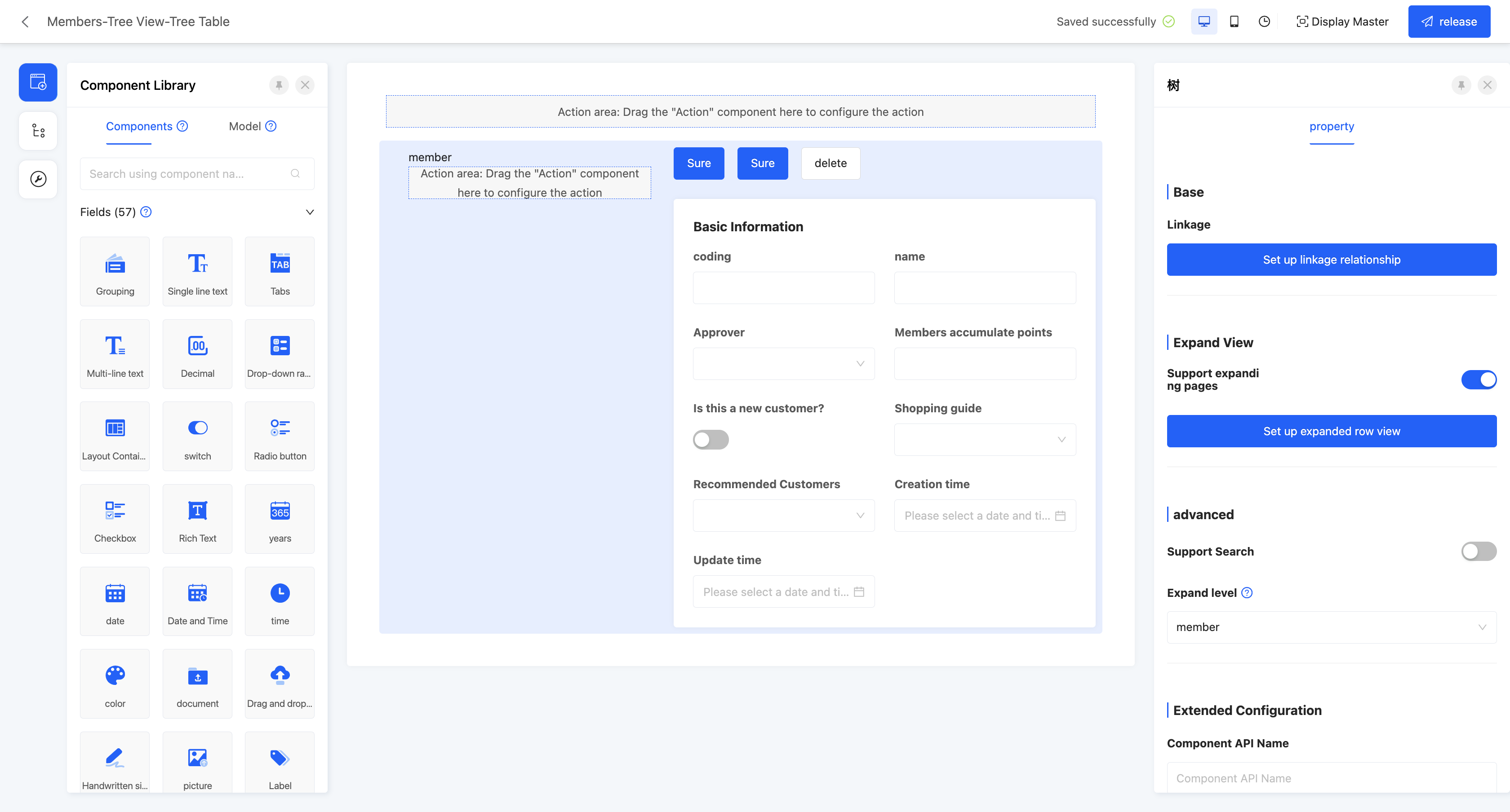
Example
Tree View - Tree Table View Display Effect: 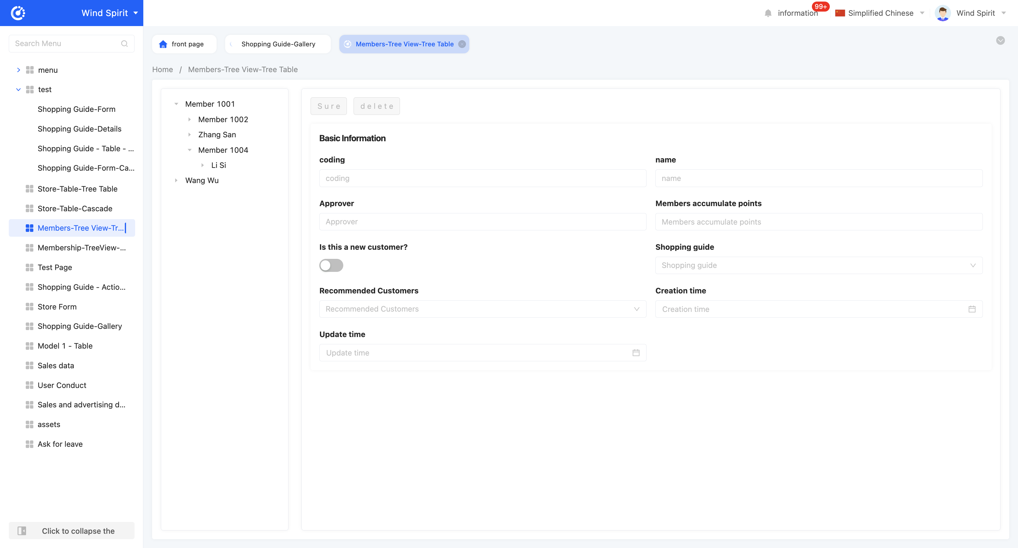
- Linkage relationship: refers to the model fields that need to be displayed in the tree structure, and users can customize the setting of multi-layer linkage relationships.
- Hierarchical association field: when setting a multi-layer linkage relationship, this attribute will be displayed from the second level and subsequent levels, and is used to define the association field with the upper-level model.
- Data title: that is, the name of the option value. When multiple selections are made, these data will be spliced and displayed. The default option field is the name.
- Filter conditions: in the actual page display, data will be displayed according to the configured filter conditions.
- Self-association field: refers to the field in the current level model that is consistent with its own model.
- Support expand page: after enabling this function, you can set the expand row view. In the tree structure of the actual display page, after selecting an item, the view will be displayed.
- View type: users can choose the type of expand row view, including two options: "detail" and "form".
- Page model: refers to the model associated with the current page.
- Page content: users can choose to copy an existing page or use a new page. When choosing to use a new page, you can customize the content under the selected view type.
- Copy page: when choosing to copy an existing page, this attribute will be displayed. Users can choose to copy a published page that meets the view type under the current model.
- Support search: if this function is enabled, a search box will be displayed in the tree structure, and hierarchical fields can be filtered.
- Expand level: supports specifying which level the page defaults to expand to.
(Ⅱ) Cascading
Example
Tree View - Cascading View Display Effect: 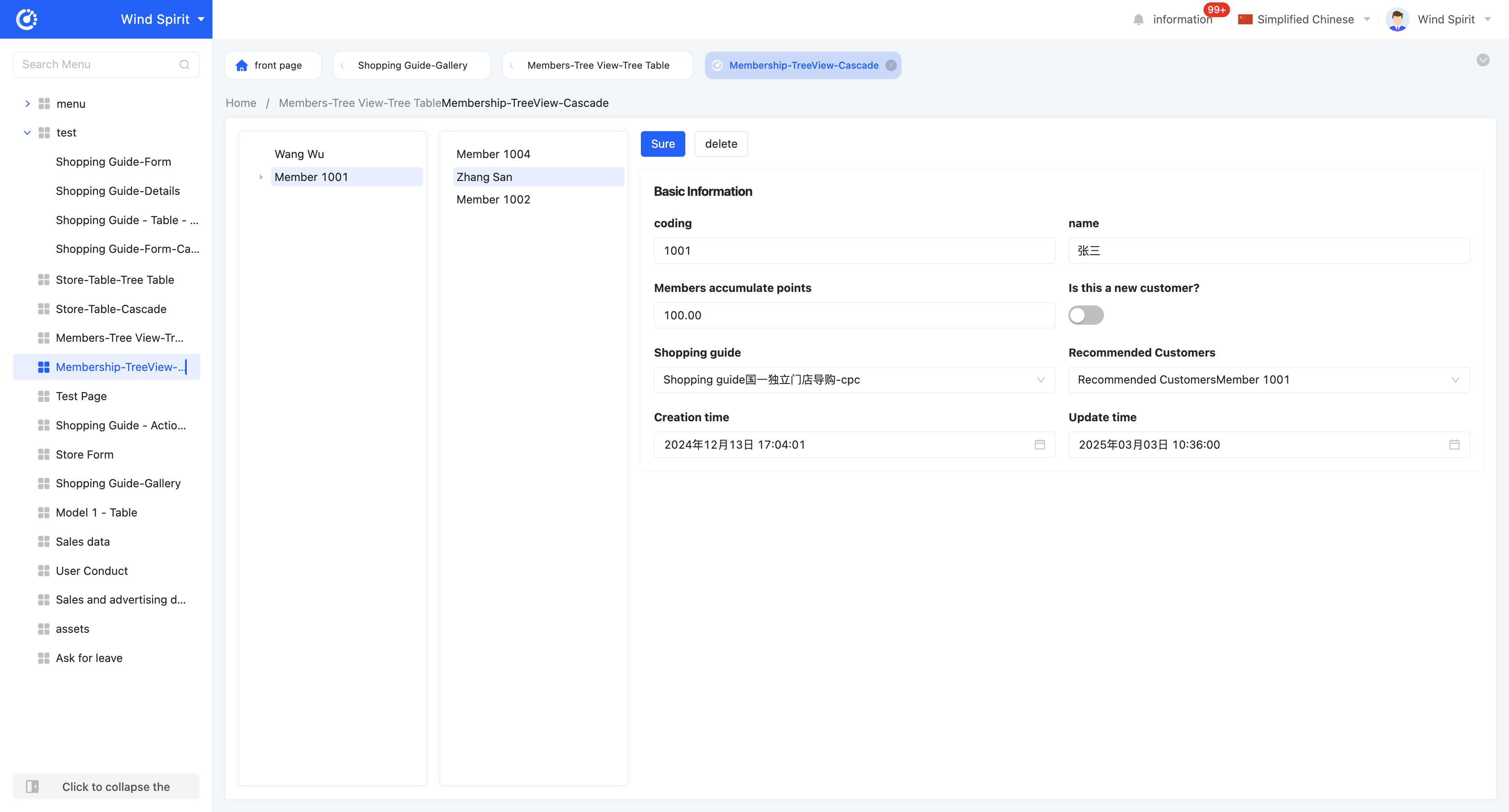
Note
When there are more than two levels of linkage relationships, they will be presented in a cascading manner in the actual display page. When there is only one level of linkage relationship, the actual display page is the same as the display page of the tree view.
- Linkage relationship: refers to the model fields that need to be displayed in the tree structure, and users can customize the setting of multi-layer linkage relationships.
- Hierarchical association field: when setting a multi-layer linkage relationship, this attribute will be displayed from the second level and subsequent levels, and is used to define the association field with the upper-level model.
- Data title: that is, the name of the option value. When multiple selections are made, these data will be spliced and displayed. The default option field is the name.
- Filter conditions: in the actual page display, data will be displayed according to the configured filter conditions.
- Self-association field: refers to the field in the current level model that is consistent with its own model.
- Title: that is, the title of each cascading box.
- Support expand page: after enabling this function, you can set the expand row view. In the cascading structure of the actual display page, after selecting an item, the view will be displayed.
- View type: users can choose the type of expand row view, including two options: "detail" and "form".
- Page model: refers to the model associated with the current page.
- Page content: users can choose to copy an existing page or use a new page. When choosing to use a new page, you can customize the content under the selected view type.
- Copy page: when choosing to copy an existing page, this attribute will be displayed. Users can choose to copy a published page that meets the view type under the current model.
- Support search: if this function is enabled, a search box will be displayed in the cascading structure, and hierarchical fields can be filtered.