Pages designed can be displayed in the application by binding to menus. The Oinone UI Designer has built-in menu management functionality, allowing users to customize the menu structure according to actual needs, ensuring precise binding between each view and corresponding menu item, thereby enhancing the navigational logic of the application and the smoothness of the user experience.
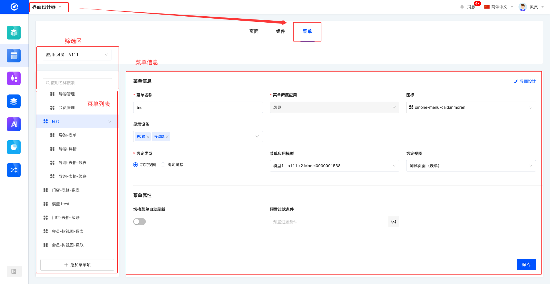
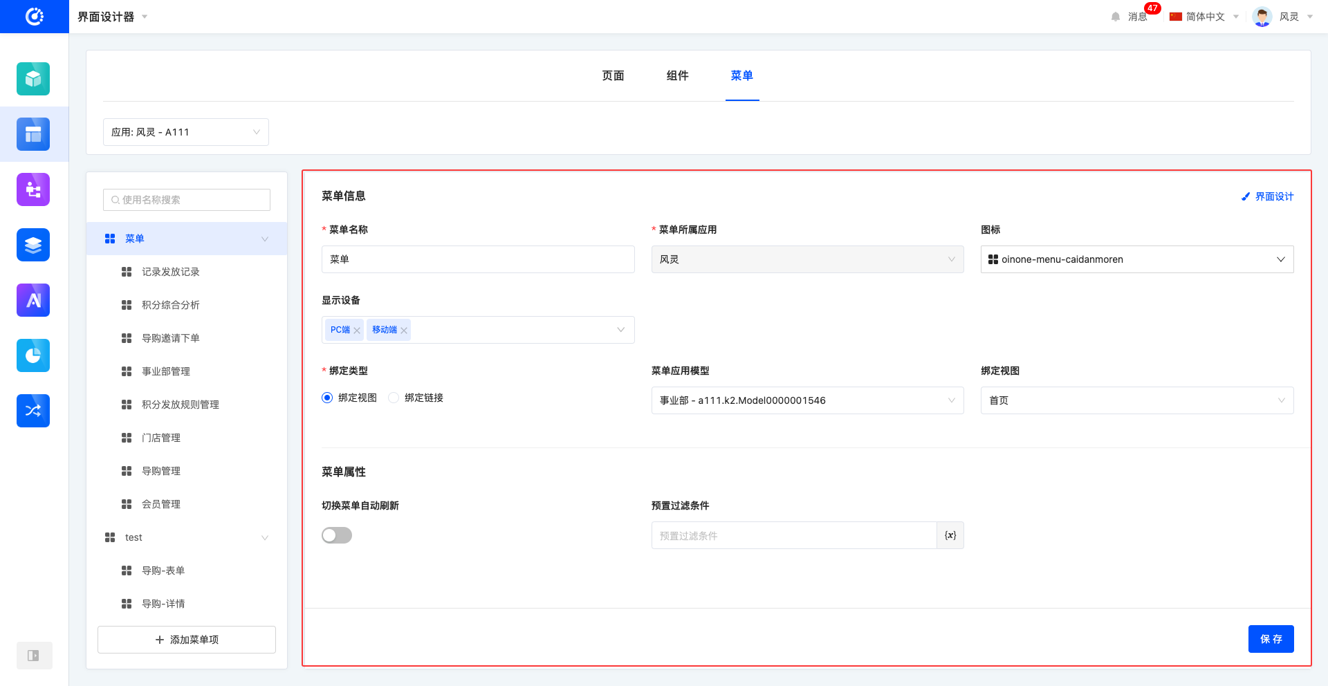
In the application, menu configuration can be completed through the Menu page after entering the UI Designer, mainly consisting of three core sections: the filter area, the menu list, and menu information.
- Filter Area: Provides convenient menu filtering functionality to help users quickly find the required menu items for configuration and adjustment.
- Menu List: Clearly displays the order of menus, allowing an intuitive understanding of the menu structure and hierarchy.
- Menu Information: Displays detailed information about each menu item, including name, type, icon, etc., to facilitate comprehensive understanding and management of menus.
When designing pages in the UI Designer, if the master mode display is selected, the system will intuitively show the association between menus and pages. Users can perform operations such as binding pages to menus, adding new menu items, deleting existing menu items, and editing menu items in this mode. These specific operations are consistent with those in the menu management page, making it easy for users to get started and flexibly manage the association between menus and pages.
I. Filter Area
1. Function Introduction
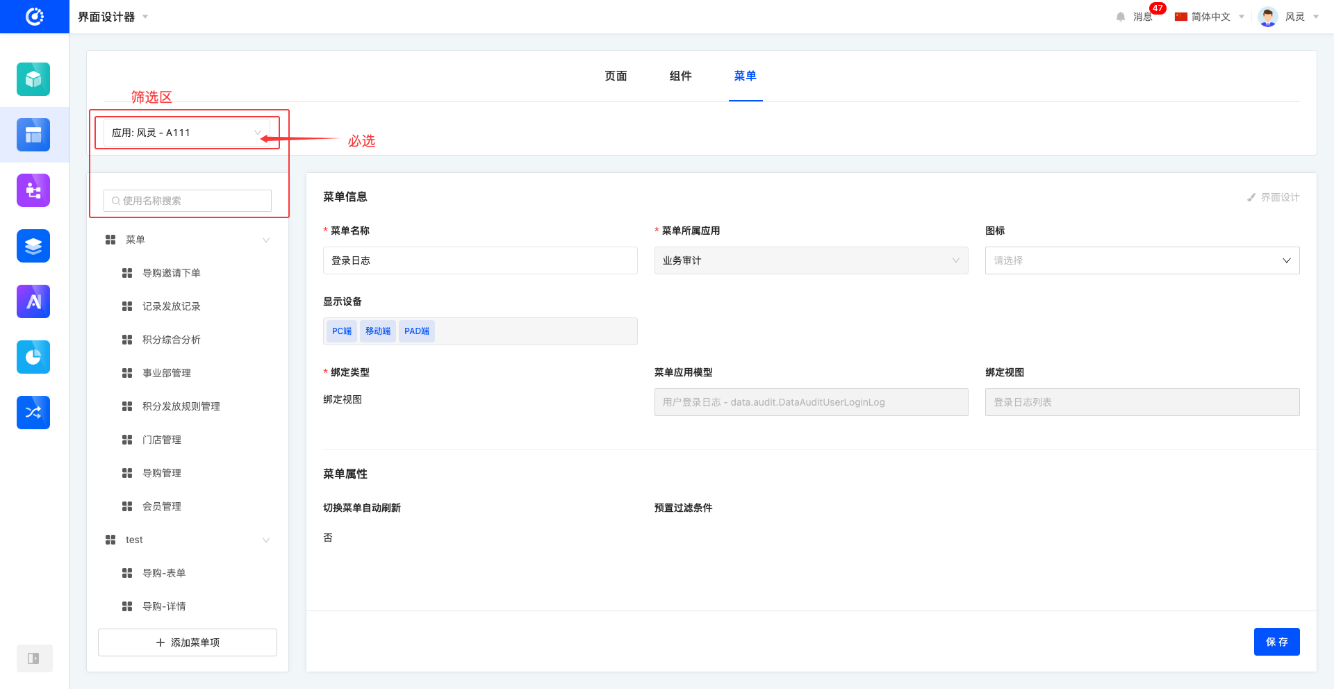
The menu management page provides efficient and convenient filtering functionality to help users quickly locate and find the required menu items for flexible configuration and adjustment. The filter area mainly includes two core parts: one is filtering by application, allowing users to quickly filter menu items according to application needs; the other is searching by menu name, where entering keywords can accurately find the target menu, greatly improving the efficiency and convenience of menu management.
2. Operation Method
Select or enter conditions in the filter area to complete the filtering of menus.
Note
The application is a mandatory key item. The menu list and menu information are both displayed and configured based on the selected application.
Tip
If the required application is not found in the current list, users can go to the Application Center to create a new application or install an existing application, after which it can be found and selected in the application filter.
II. Menu List
1. Function Introduction
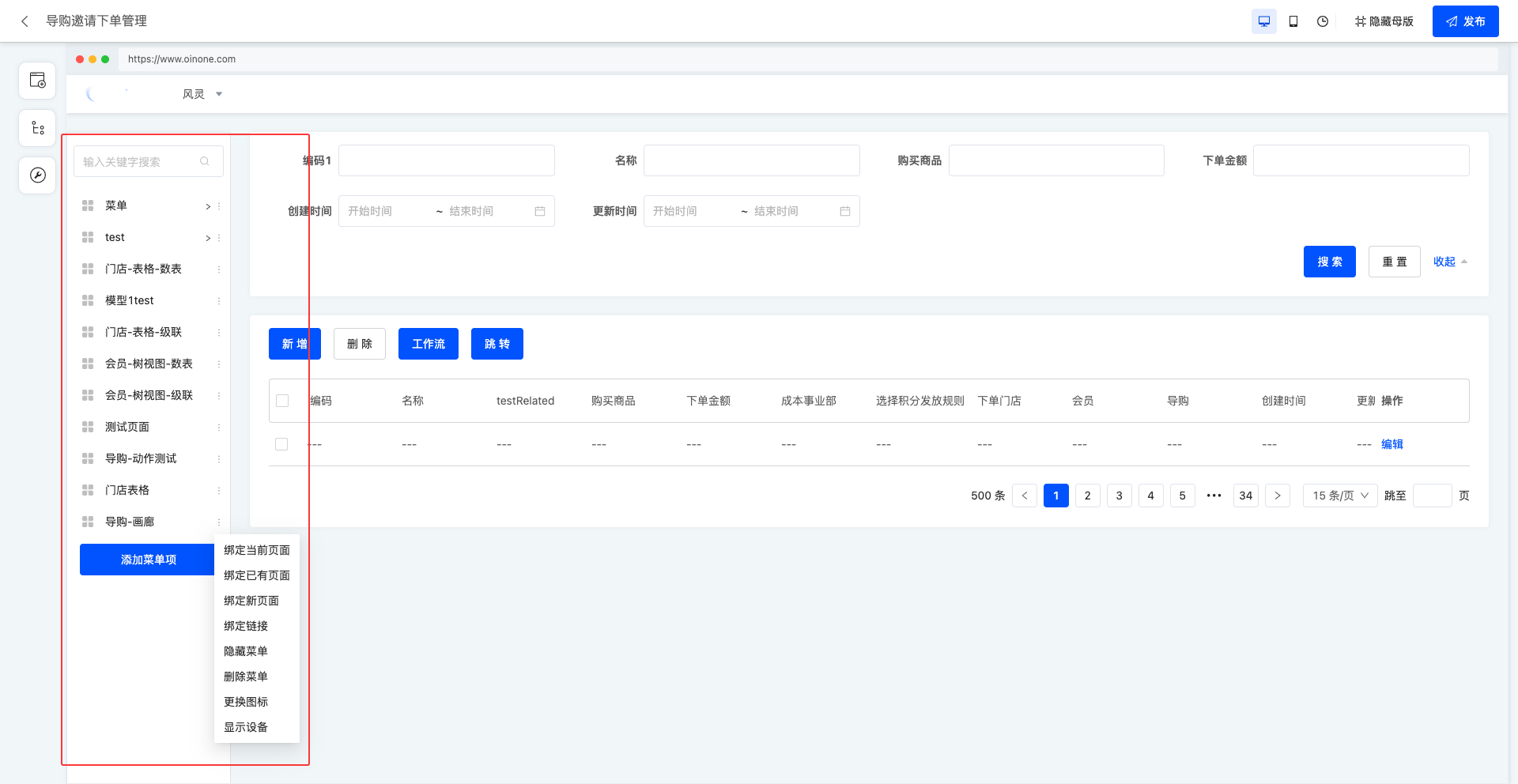
The menu list intuitively displays the structure and hierarchy of menus. In the menu list, operations such as adding, modifying, and deleting menus can be performed to achieve flexible menu management and meet diverse needs.
Note
Built-in menu items cannot be edited, deleted, or bound to views; only hide or show operations can be performed on them.
2. Operation Methods
- Adding a Menu Item: At the bottom of the menu, click Add Menu Item, enter the menu name, and it will be created successfully. By default, the menu is created at the bottom.
Tip
You can select a menu item, click Add Menu Item, enter the menu name, and create it under that menu item.
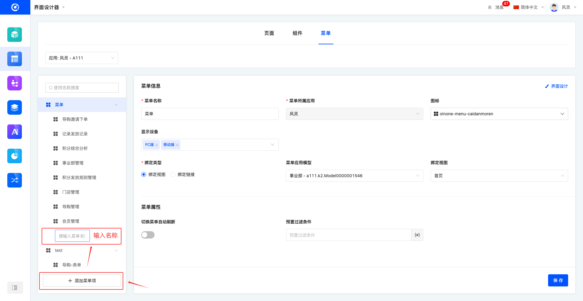
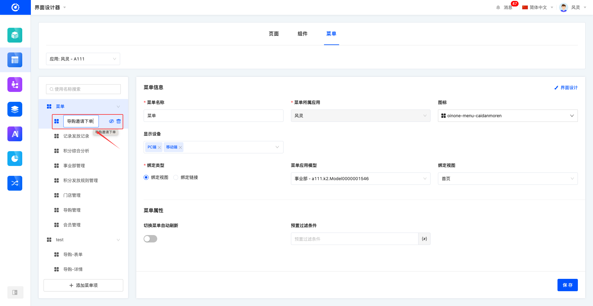
- Modifying the Menu Name: Select the target menu, click the menu name to display the input box, enter the new name, and press Enter or click anywhere outside the input box to complete the modification.
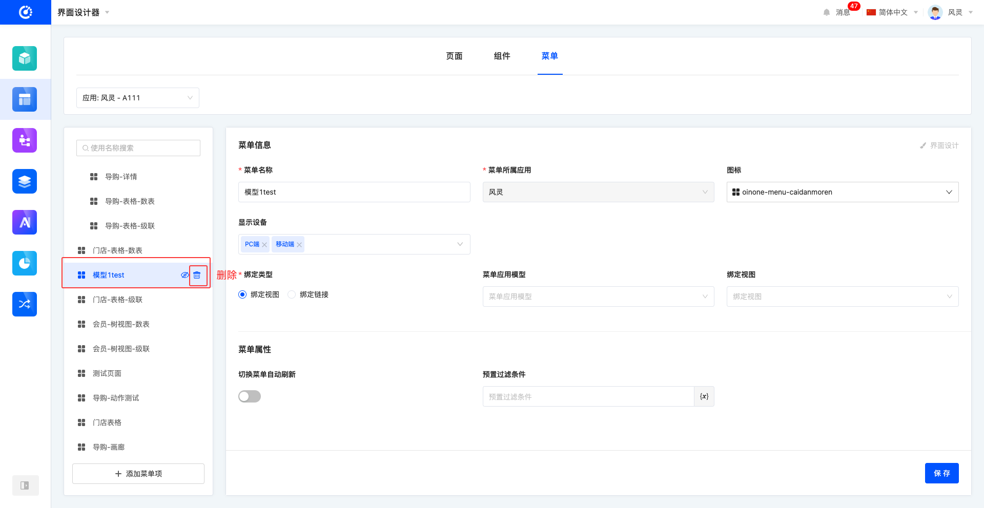
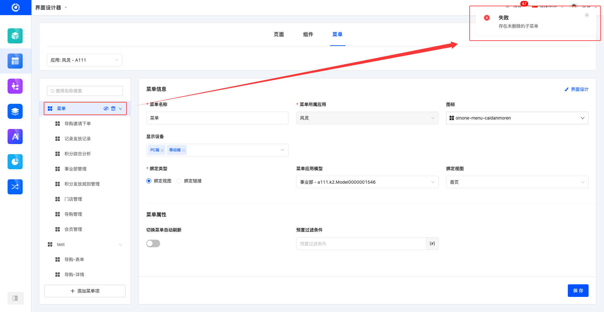
- Deleting a Menu Item: Select the target menu, click the Delete icon to delete it successfully.
Note
When a menu has submenus that have not been deleted, the menu cannot be deleted.
Warning
Deleted menus cannot be recovered. Please operate with caution!
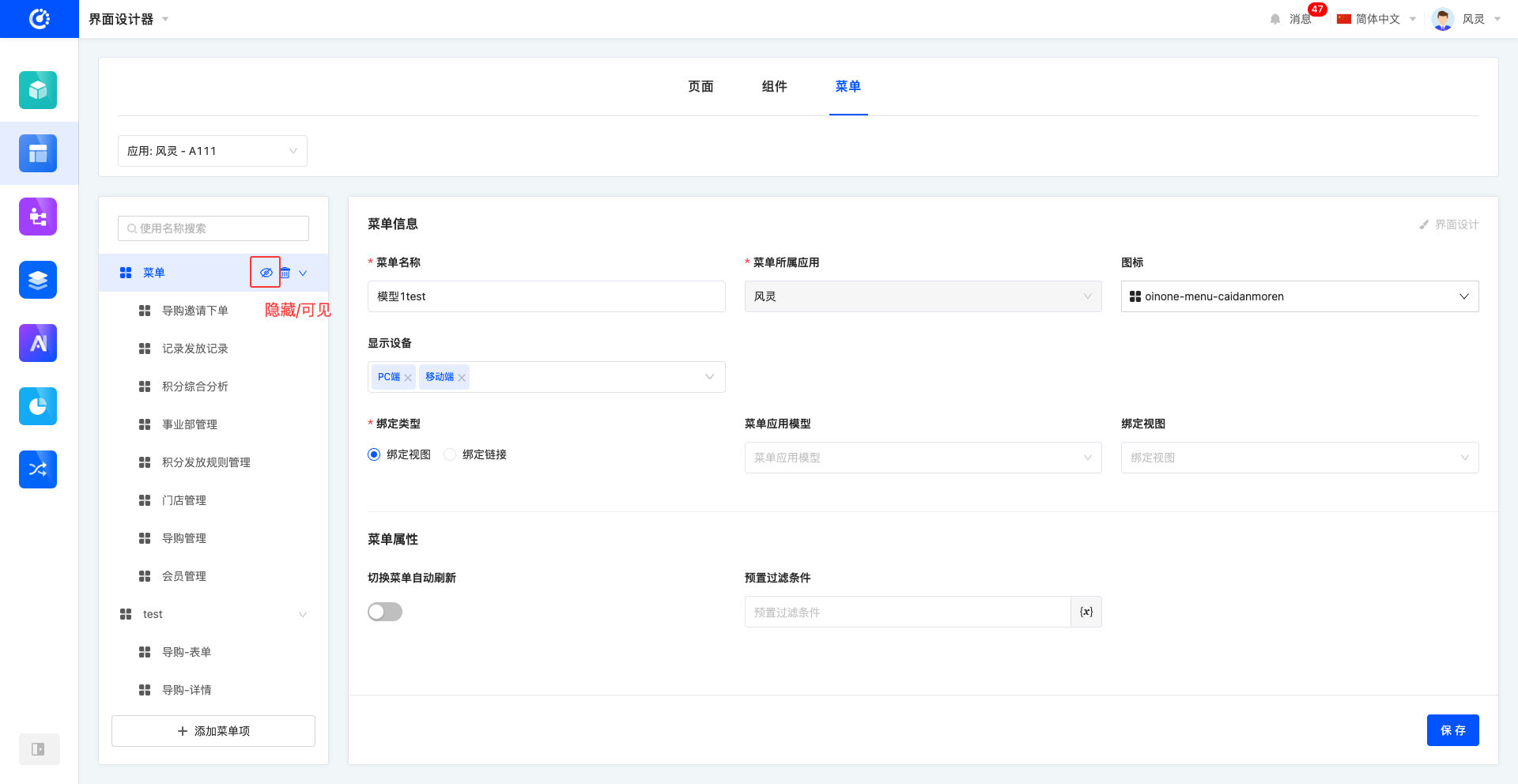
- Hiding/Showing Menus: Select the target menu, click the Hide/Show icon to change the menu status successfully.
Note
When a menu has submenus, changing the status of the menu will automatically apply the status to the menu and all its submenus, enabling unified status management and quick adjustment.
Tip
If a designed menu is visible but not displayed in the application, you can check whether permissions are configured for the menu in the Management Center.
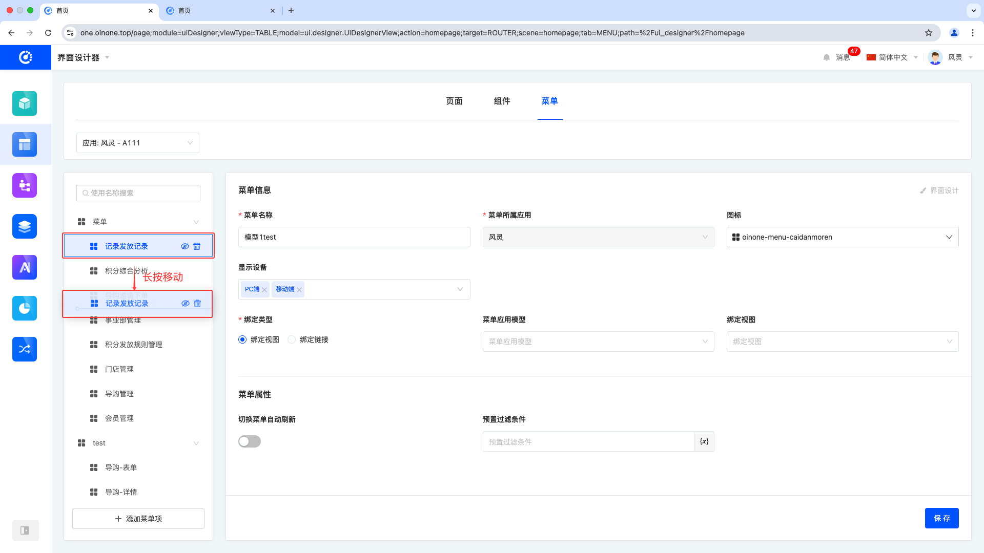
- Moving Menu Items: Select the target menu, long-press to move the menu, and choose to move it to the same level or as a submenu of another menu.
Note
When a menu has sub-levels, moving the menu will also move its submenus.
III. Menu Information
1. Function Introduction
Displays detailed information about each menu item. When creating or editing a menu, you can edit its detailed information.
Note
The application selected in the filter area is the application to which the menu belongs. The application to which the menu belongs is determined when the menu is created and cannot be modified later. All models and views that the menu can bind to belong to this application.
Menu Name: The display name of the menu on the interface.
Menu Owned Application: Refers to the application to which the menu belongs, and the menu will be displayed under this application.
Icon: The identification icon located before the menu name, enhancing menu visualization and recognition.
Display Devices: Defines on which devices the menu can be displayed, including PC, mobile, and PAD, meeting multi-device adaptation needs.
Binding Type: Provides different binding options, which can be bound to different view types, including "Bind to View" and "Bind to Link".
- Menu Application Model: When the binding type is Bind to View, this attribute is displayed. Allows selecting models included in the current application.
- Bound View: When the binding type is Bind to View, this attribute is displayed. Allows selecting views included in the current model.
Tip
If the desired view is not found, a quick entry is provided to create a page, which will be automatically bound to the menu.
- Bound URL: When the binding type is Bind to URL, this attribute is displayed. Allows entering the URL of the page to jump to.
- Opening Method: When the binding type is Bind to URL, this attribute is displayed. You can select the page opening method, including routing opening and opening in a new page.
- Routing Opening: Open the URL page directly within the current page.
- Opening in a New Page: Open the URL page in a new window.
Auto-refresh When Switching Menus: When users make modifications on other pages and switch back to this menu, the system will automatically refresh the menu content to ensure real-time information.
Preset Filter Conditions: After setting filter conditions in the configuration interface, they will be automatically applied when querying data on the page. Once configured, the preset filter conditions will remain in effect when the page is running and will not be cleared or reset.
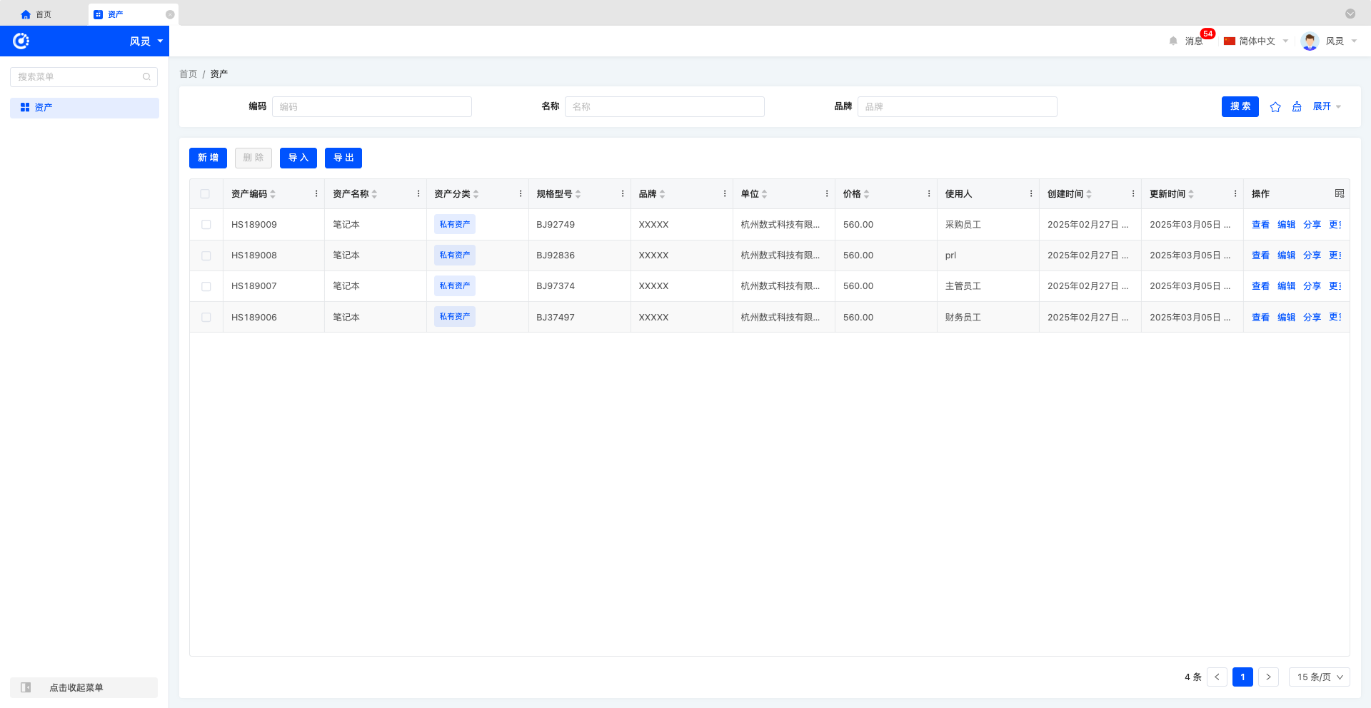
Example
Current data on the Assets page
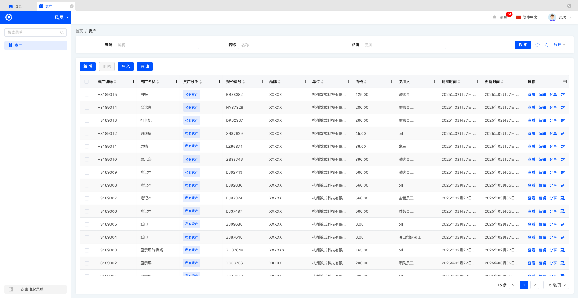
Set the preset filter condition to: Asset Name equals Laptop
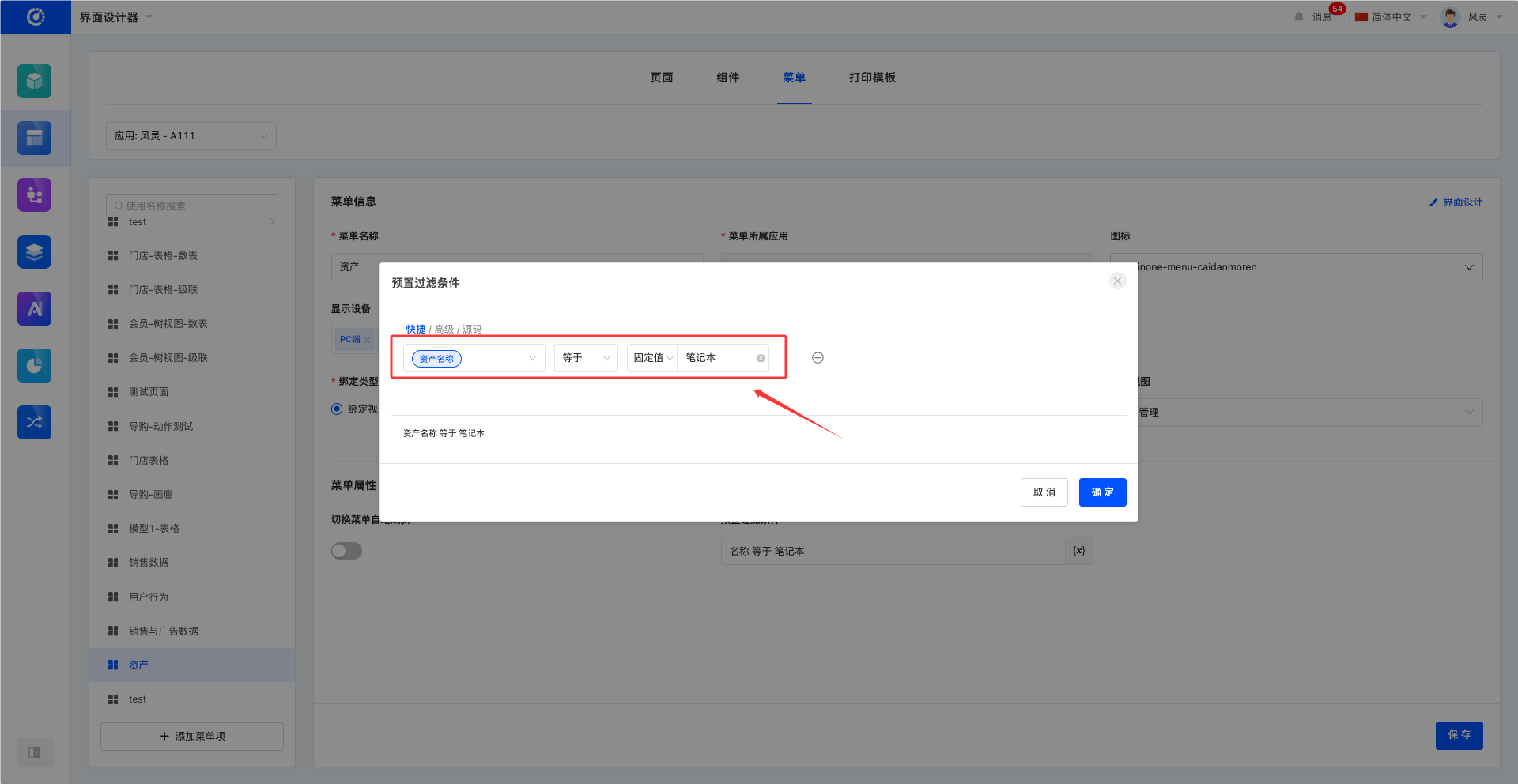
The Assets page only displays data where the asset name is Laptop
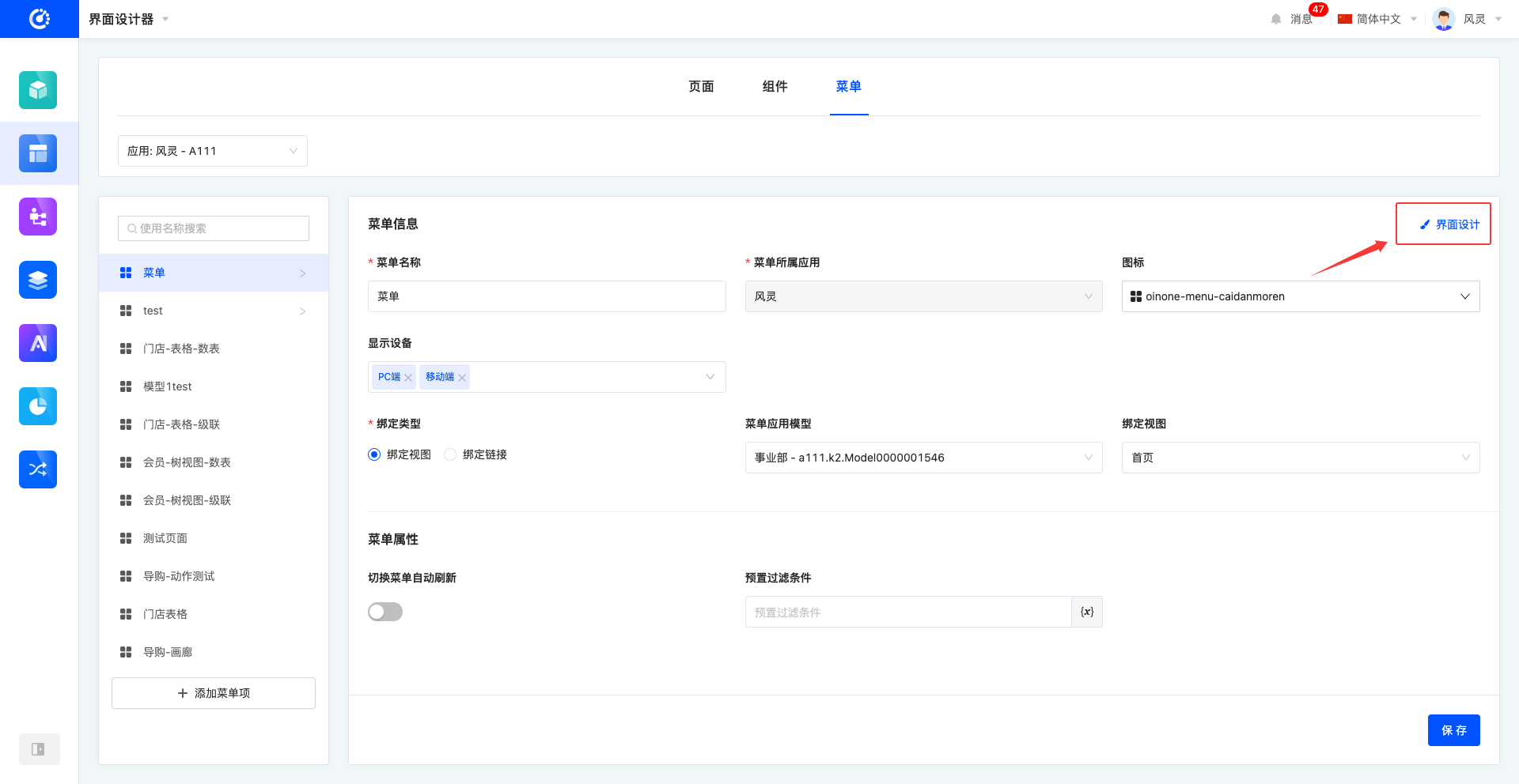
- Interface Design: When the binding type is a view type and has been bound to a view, the interface design function can be used to enter the page design interface of the view to adjust and optimize the page.
2. Operation Method
After entering or selecting information, click Save to complete the editing of the information.
Note
- If the user does not fill in the required information, the system will prompt that the items are not completed, and the menu item information will not be saved.
- If the bound view has not been published or there are unpublished modifications, the system will prompt "The bound view page has not been published" or "There are the latest but unpublished pages in the view binding".
Click Interface Design to jump to the page design interface of the bound page.