Recall the components we created in the "Explore the Front-end Framework" chapter, all of which used a base class named BaseElementWidget and had distinct usage patterns. To help refresh our memory, here is part of the code for the previous "counter" component and its usage:
import Counter from './Counter.vue';

@SPI.ClassFactory(
  BaseElementWidget.Token({
    widget: 'Counter'
  })
)
export class CounterWidget extends BaseElementWidget {
  public initialize(props) {
    super.initialize(props);
    this.setComponent(Counter);
    return this;
  }
  ...
}<element widget="Counter" />I. Subclassing Existing Field Widgets
Let's consider an example where we want to customize the built-in FormBooleanSwitchFieldWidget component by adding text prompts inside the switch.
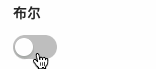
This is how it appears before extension:
After extension, it will resemble:

Note
Boolean fields in form views can use switch components. Before starting the exercise, ensure you have a page to view the original effect. If none exist, use the UI Designer to create a corresponding page for this practice.
In the FormBooleanSwitchFieldWidget component, we extract the component registration code as follows:
@SPI.ClassFactory(
  FormFieldWidget.Token({
    viewType: [ViewType.Form, ViewType.Search],
    ttype: ModelFieldType.Boolean
  })
)
export class FormBooleanSwitchFieldWidget extends FormFieldWidget {
  ...
}Next, create a FormCustomSwitchFieldWidget component that inherits from FormBooleanSwitchFieldWidget with identical registration conditions. This allows us to retain all built-in functionalities while enabling customization:
@SPI.ClassFactory(
  FormFieldWidget.Token({
    viewType: [ViewType.Form, ViewType.Search],
    ttype: ModelFieldType.Boolean
  })
)
export class FormCustomSwitchFieldWidget extends FormBooleanSwitchFieldWidget {
  ...
}Note
Normally, we wouldn't register field widgets this way, but it's acceptable for exercise purposes.
For more on field widget registration, refer to Field Widgets.
Next, declare two properties checkedText and uncheckedText to render text when the switch is on/off:
@Widget.Reactive()
public get checkedText() {
  return this.getDsl().checkedText || '是';
}

@Widget.Reactive()
public get uncheckedText() {
  return this.getDsl().uncheckedText || '否';
}Similar to the previous counter component, we need a Vue component to use these properties. Notably, form field widgets must handle data interaction, such as value retrieval and changes.
We can also use built-in standard components to maintain theme and styling consistency with the platform. A valid Vue component template might look like:
<template>
  <oio-switch :checked="booleanValue" @change="onChange">
    <template v-if="checkedText" #checkedChildren>
      <span>{{ checkedText }}</span>
    </template>
    <template v-if="uncheckedText" #uncheckedChildren>
      <span>{{ uncheckedText }}</span>
    </template>
  </oio-switch>
</template>This template showcases:
booleanValue: Passes component value (true/false).onChange: Handles value changes, e.g., updatingbooleanValue.checkedText&uncheckedText: New properties for this exercise.
Note
For more on Oinone built-in components, see Oio Components.
Next, declare the built-in data interaction properties for form field widgets in the Widget framework. These are core properties/methods for any form field widget:
- value: Current field value.
- change: Called when value changes, submits new value.
- focus: Called when component gains focus.
- blur: Called when component loses focus.
props: {
  value: {
    type: [Boolean, String],
    default: undefined
  },
  change: {
    type: Function
  },
  focus: {
    type: Function
  },
  blur: {
    type: Function
  }
}Note
Don't forget to declare checkedText and uncheckedText properties!
The Vue template uses properties/methods not in props, so we need to declare them in setup to implement component functionality. In FormBooleanSwitchFieldWidget, value can be Boolean/String or null, but oio-switch and many third-party components don't accept such values. Use a computed property to handle this:
const booleanValue = computed(() => BooleanHelper.toBoolean(props.value));Additionally, to retain base functionality, handle value changes specially. For switch components, we expect the blur method to trigger immediately after a value change, not via browser blur events. Wrap the change method:
const onChange = (val: boolean | undefined) => {
  props.change?.(val);
  props.blur?.();
};Note
Generally, component operation follows: focus → input → blur. For special components like switches, date/time pickers, or color pickers, ensure they follow this flow for consistent behavior abstraction.
Note
By now, you should have a functional customized component. When modifying built-in components, refer to or copy their Vue implementations due to Vue's inheritance limitations.
Built-in code references: (Hyperlink missing here) FormBooleanSwitchFieldWidget.ts Switch.vue
II. Theory: Field Widget Registration
The Widget framework classifies components, allowing registration based on classification features to determine usage scope. Here's a brief introduction to field widget registration basics; refer to Field Widgets for more details.
(I) Field Widget Registration Options
/**
 * Field widget registration options
 */
export interface BaseFieldOptions extends SPIOptions {
  /**
   * Current view type
   */
  viewType?: ViewType | ViewType[];
  /**
   * Widget name
   */
  widget?: string | string[];
  /**
   * Field business type
   */
  ttype?: ModelFieldType | ModelFieldType[];
  /**
   * Multi-value flag
   */
  multi?: boolean;
  /**
   * Specified model
   */
  model?: string | string[];
  /**
   * Specified view name
   */
  viewName?: string | string[];
  /**
   * Specified field name
   */
  name?: string;
}Registration dimensions include view type, widget name, field type, multi-value flag, model code, field name, and view name. More precise positioning grants higher rendering priority. Components with identical positioning will override earlier registrations.
Take FormBooleanSwitchFieldWidget as an example:
@SPI.ClassFactory(
  FormFieldWidget.Token({
    viewType: [ViewType.Form, ViewType.Search],
    ttype: ModelFieldType.Boolean
  })
)
export class FormBooleanSwitchFieldWidget extends FormFieldWidget {
  ...
}This component is used in form/search views for boolean-type fields.
(II) Field Widgets for Different View Types
Oinone handles data structures and presentations differently for various view types. The Widget framework classifies data structures into List and Object:
| Data Structure | View Type | Base Class |
|---|---|---|
| List | Table (TABLE) | BaseTableFieldWidget |
| List | Gallery (GALLERY) | FormFieldWidget |
| Object | Form (FORM) | FormFieldWidget |
| Object | Detail (DETAIL) | FormFieldWidget |
| Object | Search (SEARCH) | FormFieldWidget |
Note
Only field widgets using the same base class can appear in multiple views. Common registration combinations:
- viewType: ViewType.Table
- viewType: [ViewType.Form, ViewType.Search] (editable)
- viewType: [ViewType.Detail, ViewType.Gallery] (read-only)
For more on built-in field widgets, see Field Widgets.
Note
All field widget registration Tokens derive from BaseFieldWidget. Built-in components like the switch use FormFieldWidget because it inherits from BaseFieldWidget, enabling registration.
III. Creating a New Form Field Widget
After learning to customize existing components, let's create a red-text input field with these features:
- Only for form views
- Text input field
- Displays red text
(I) Determine Base Class and Registration Conditions
@SPI.ClassFactory(
  FormFieldWidget.Token({
    viewType: ViewType.Form,
    ttype: ModelFieldType.String,
    widget: 'RedInput'
  })
)
export class FormRedInputWidget extends FormFieldWidget<string> {
  ...
}(II) Implement Vue Component with oio-input
A valid Vue template:
<template>
  <oio-input class="red-input-demo" :value="value" @update:value="change" @focus="focus" @blur="blur" />
</template>Note
See Oio Components for more on built-in components.
Use this CSS to turn input text red, considering CSS scoping:
.red-input-demo.oio-input .ant-input {
  color: red;
}(III) Use RedInput in DSL
<field data="name" widget="RedInput" />Note
For form field widget APIs, see Form Field Widgets.
IV. Creating a New Table Field Widget
This example creates a table field widget with:
- Only for table views
- Text display only
- Red text
(I) Determine Base Class and Registration Conditions
@SPI.ClassFactory(
  BaseFieldWidget.Token({
    viewType: ViewType.Table,
    ttype: ModelFieldType.String,
    widget: 'RedInput'
  })
)
export class TableRedInputWidget extends BaseTableFieldWidget<string> {
  ...
}(II) Override renderDefaultSlot to Customize Cell Rendering
@Widget.Method()
public renderDefaultSlot(context: RowContext): VNode[] | string {
  const currentValue = this.compute(context);
  return [createVNode('span', { class: 'red-input-demo' }, currentValue)];
}Note
Table field widgets render per row, with RowContext containing row-level context.
(III) Implement red-input-demo CSS
.oio-column-wrapper > .red-input-demo {
  color: red;
}Note
Narrow CSS scope to avoid side effects, as component usage contexts are unpredictable.
(IV) Use RedInput in DSL
<field data="name" widget="RedInput" />Note
For table field widget APIs, see Table Field Widgets.
V. Further Practice
If time permits, try these exercises:
- Define a red read-only input widget for detail and gallery views and use it on a page.
- Combine with the UI Designer to use our practice components as custom widgets. Refer to Custom Widgets with Designer - Field Widgets.