In the Interface Designer provided by Oinone, you can freely switch components, including three categories: view components, layout components, and field components.
In the previous chapter, we are no stranger to component switching. In the Customize a Field Widget chapter, we replaced the FormBooleanSwitchFieldWidget component with the FormCustomSwitchFieldWidget component through component registration. In the Customize a View Widget chapter, we replaced the TableWidget component with the CustomTableWidget component by registering a Layout.
Next, we will learn how to use the functions provided by the Interface Designer to complete component replacement without using the above two methods. This is very significant.
I. Replacing Components with Extension Configuration
Recall the Gantt Chart component we created in the "Create a Gantt View" chapter. Imagine if we could switch the table to a Gantt Chart in the Interface Designer and configure some necessary properties of the component, we could make this table view display as a Gantt Chart on the page.
Let's look at the table page used by the previous Gantt chart, which may look like this in the designer:
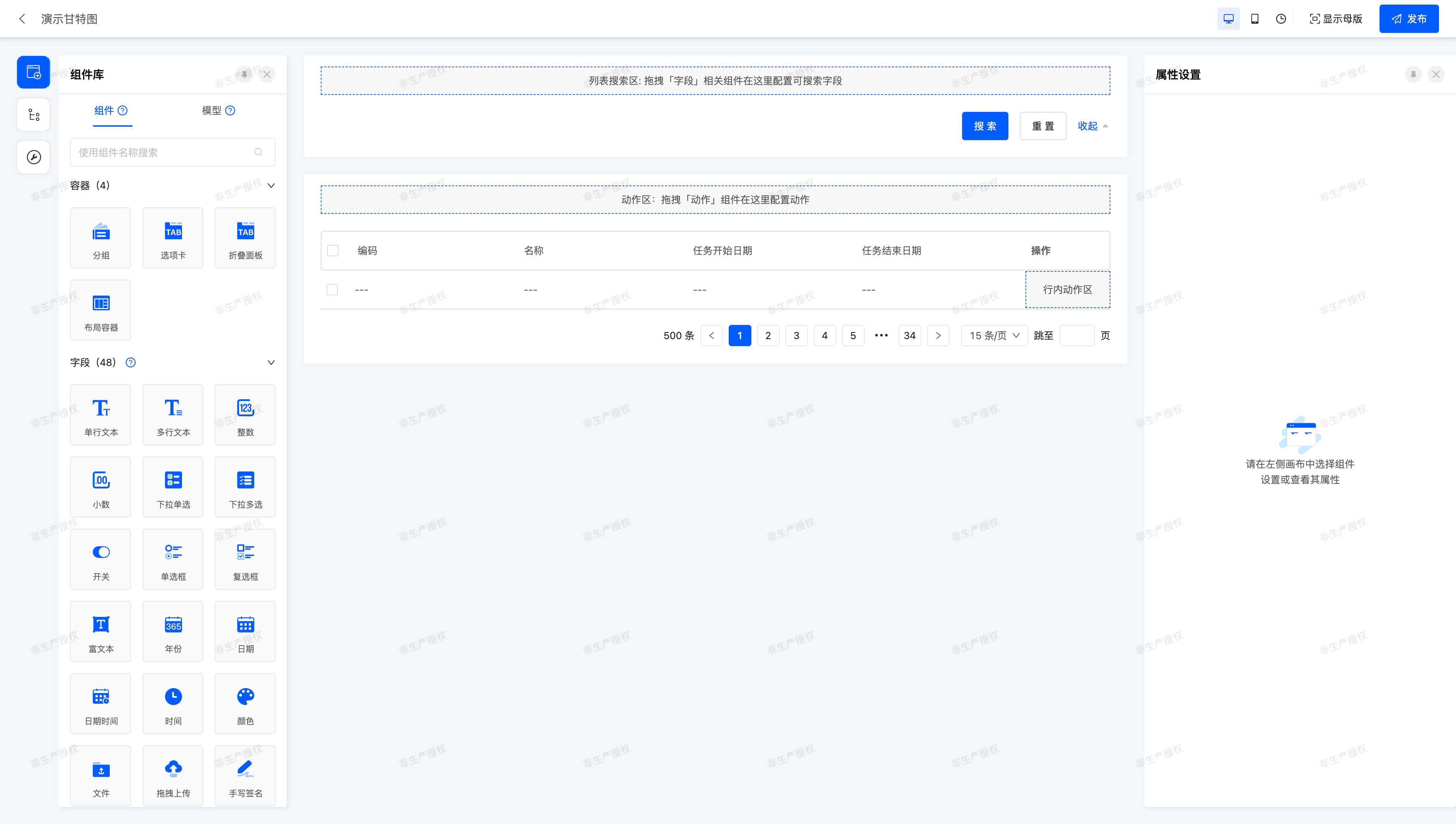
Select the table component, and in the right property panel, there is an Extension Configuration group, which contains two configurable properties: Component API Name and Extension Properties.
- Component API Name: The
widgetproperty used during component registration. - Extension Properties: You can obtain the property values through
this.getDsl().
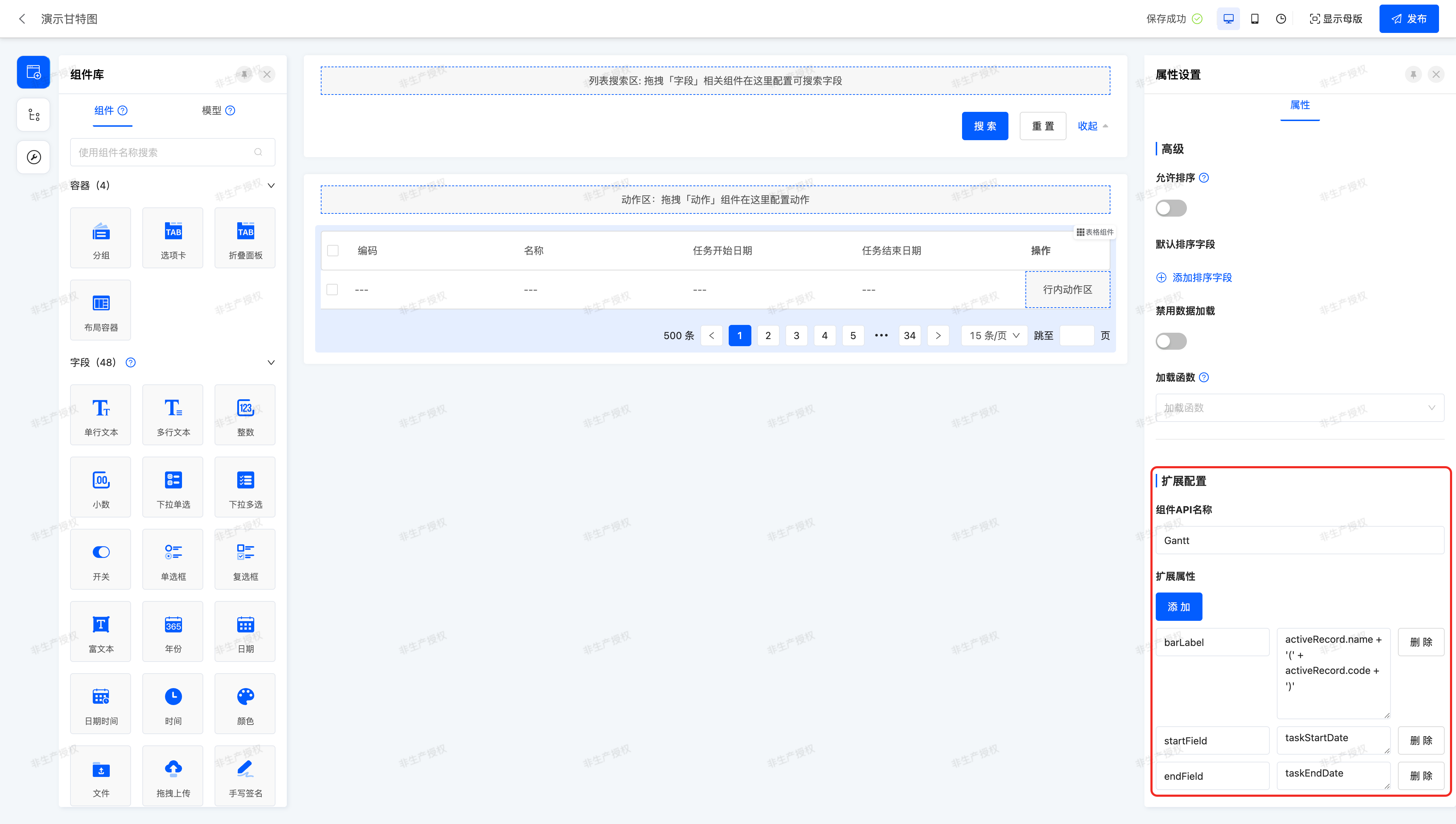
Let's enter the widget="Gantt" corresponding to the previously registered Gantt chart component into the Component API Name, and configure the three properties barLabel, startField, and endField respectively. This is exactly the same as how we configured the properties in XML before. Just like below:
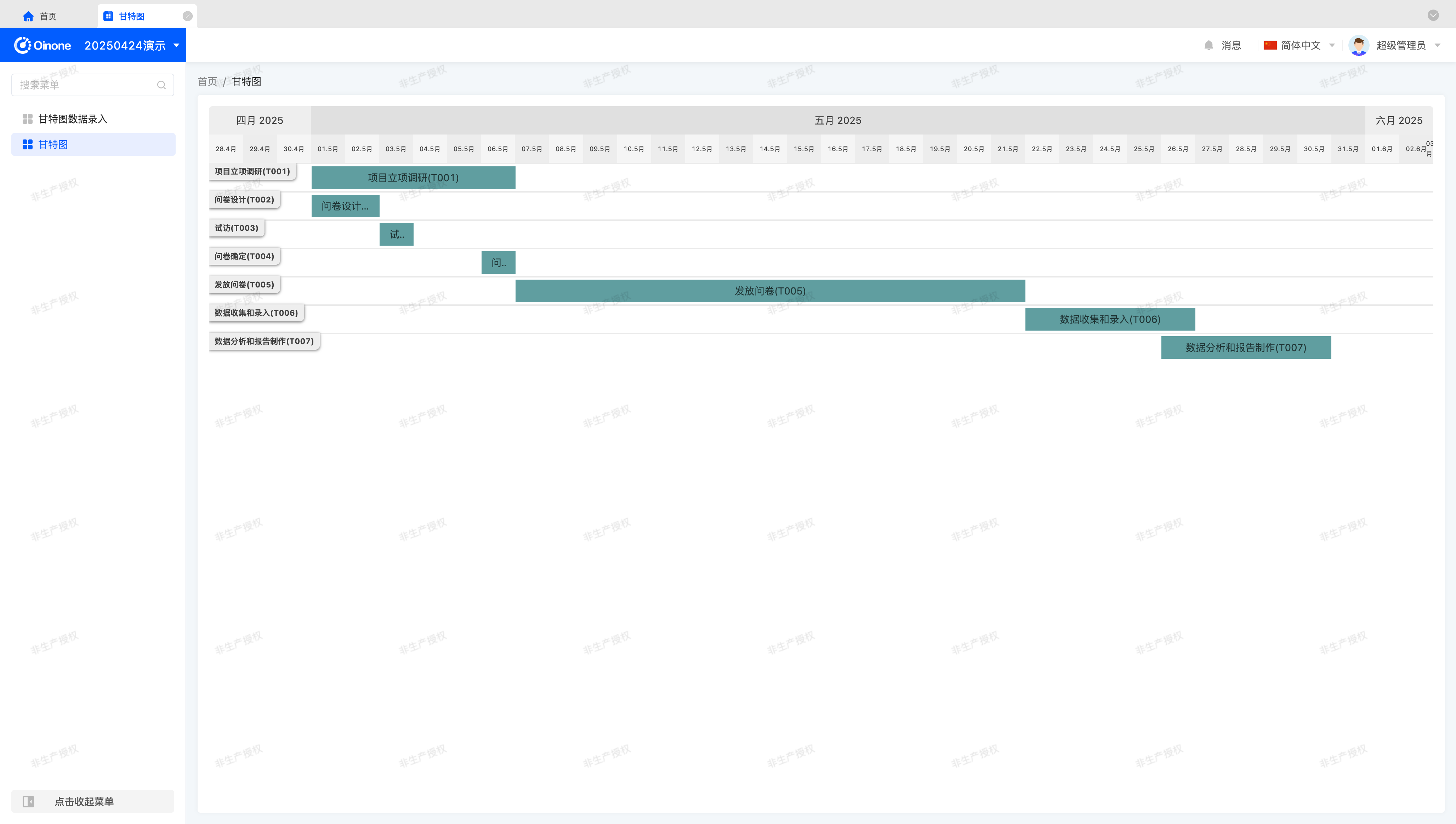
In this way, we can see the exact same Gantt Chart page on the runtime page:
Tip
For view components and layout components with design functions, we usually need to maintain the original design functions to add some additional functions. These components can all use extension configuration to complete component replacement and property configuration.
II. Custom Field Components
Compared with view components and layout components, field components have more functional support in the interface designer.
- Create components/elements
- Low-code and no-code integration
Recall the RedInput component we created in the "Customize a Field Widget" chapter. If possible, we hope that in the designer, we can switch such field components as easily as the existing field components in the designer, so that after we create a custom component, it can be used anywhere it can be used.
Next, let's create the first RedInput component in the designer.
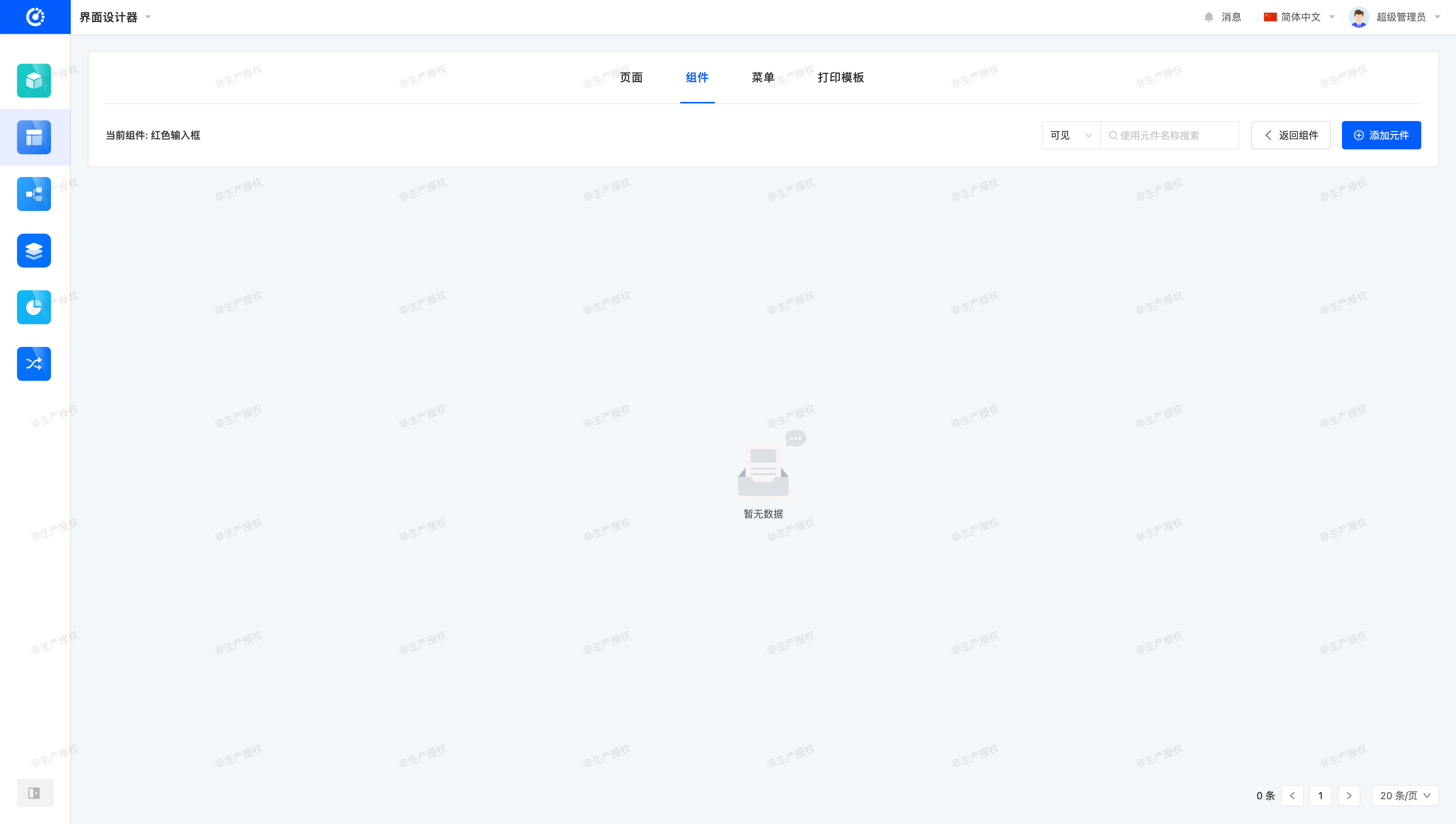
(Ⅰ) Enter the Interface Designer Component Management Page
After entering from the Interface Designer, select the "Components" item, and you can see the component management page, just like this:

Next, let's create components and elements.
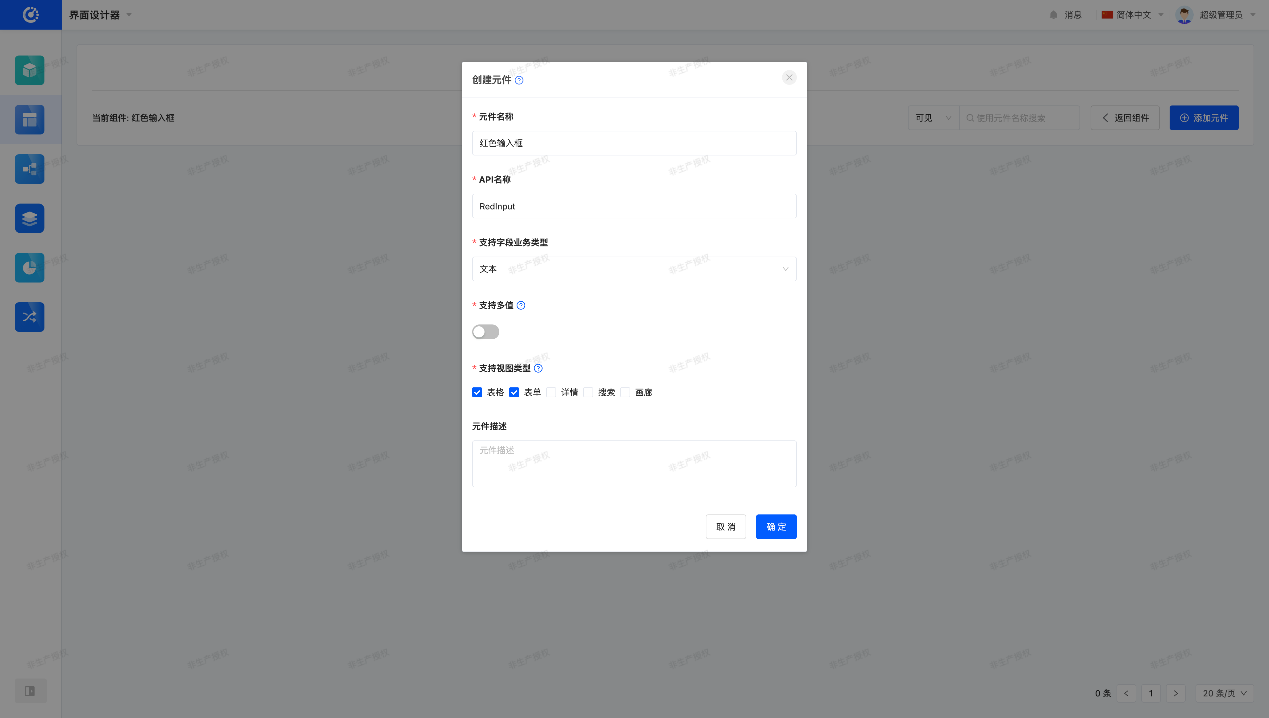
(Ⅱ) Create Components
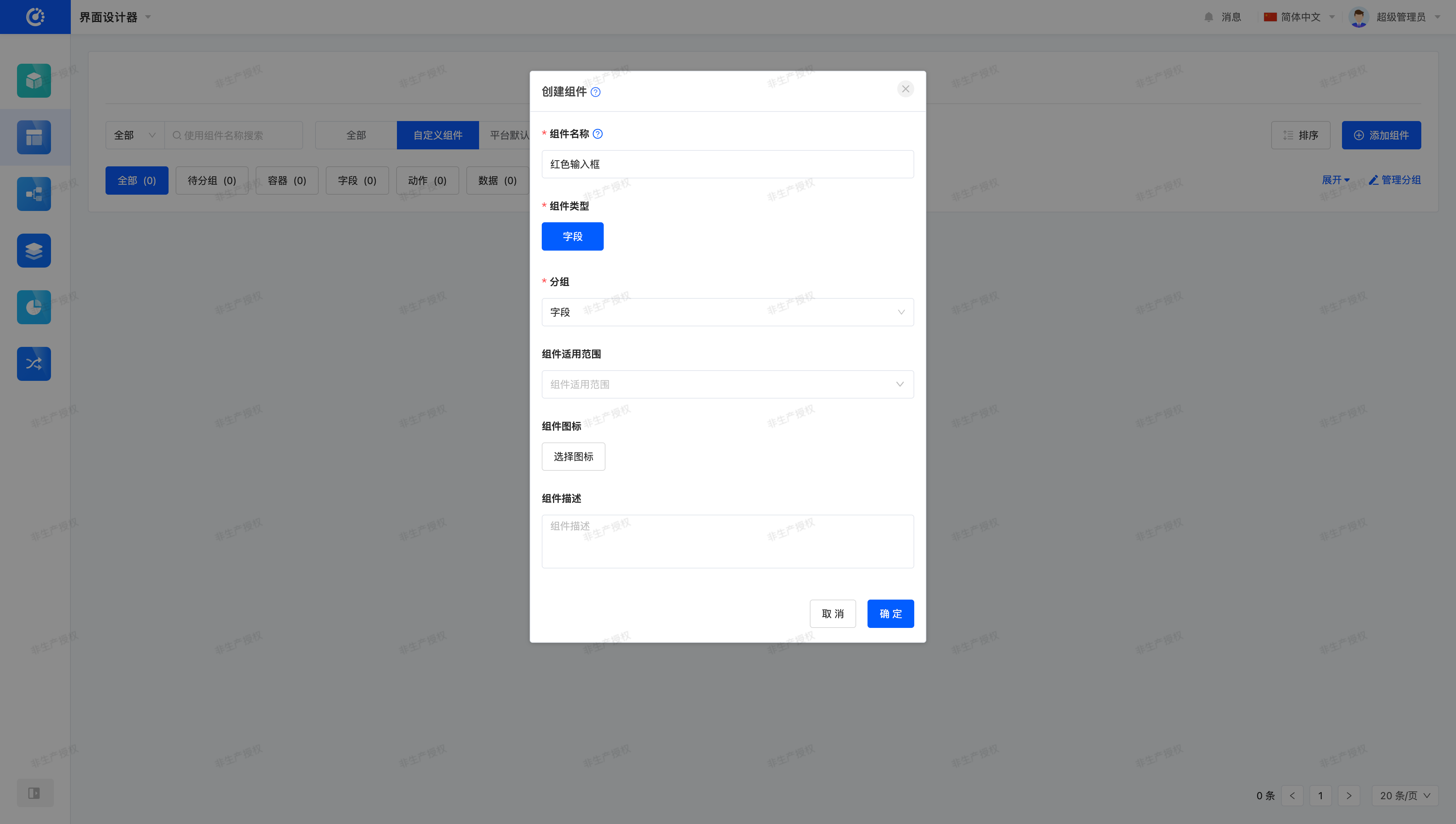
Select the "Add Component" button and fill in some necessary information, just like below:
Tip
The "Component Name" in the pop-up window will be displayed in the left component library of "Page Design" or "Component Design".
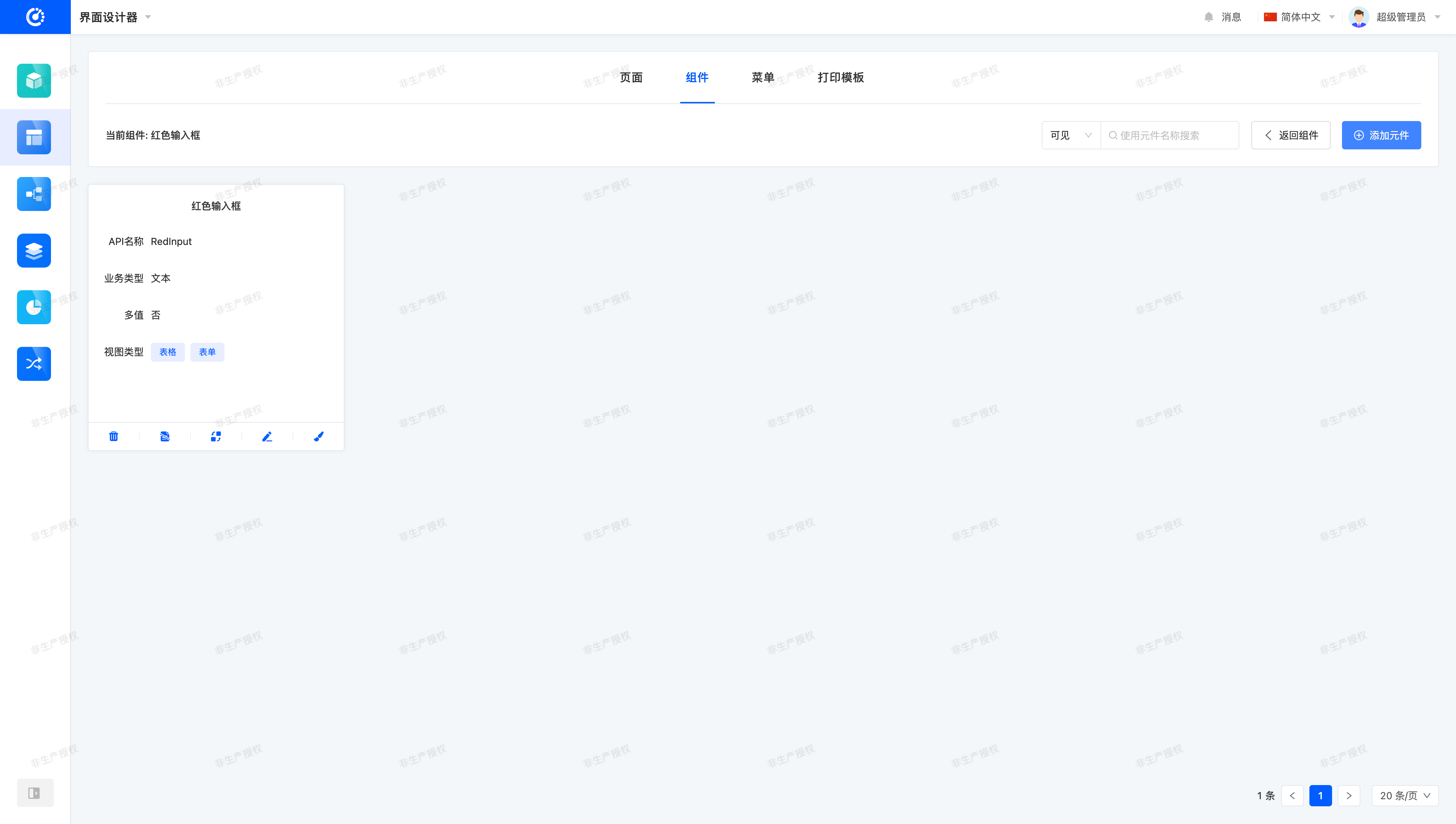
Click "OK", and we can see that the component is successfully created~

(Ⅲ) Create Elements
Click anywhere on the "Component Card" or select the fourth item "Manage Elements" to enter the element management page:
Select the "Add Element" button and fill in the component-related registration information:
The "Create Element" page corresponds one-to-one with the registration conditions of field components:
- Element Name: Only displayed on the management page.
- API Name: Corresponds to the
widgetproperty. - Supported Field Business Types: Corresponds to the
ttypeproperty. - Support Multi-value: Corresponds to the
multiproperty. - Supported View Types: Corresponds to the
viewTypeproperty. - Element Description: Only displayed on the management page.
So, where do these information come from?
Let's first look at the code snippets used when registering the RedInput form and table field components:
@SPI.ClassFactory(
  FormFieldWidget.Token({
    viewType: ViewType.Form,
    ttype: ModelFieldType.String,
    widget: 'RedInput'
  })
)
export class FormRedInputWidget extends FormFieldWidget<string> {
  ...
}@SPI.ClassFactory(
BaseFieldWidget.Token({
viewType: ViewType.Table,
ttype: ModelFieldType.String,
widget: 'RedInput'
})
)
export class TableRedInputWidget extends BaseTableFieldWidget<string> {
...
}We found that the RedInput component can be used in Form View (FORM) and Table View (TABLE), and can only be used on fields with the field business type of Text (String). The multi property defaults to false.
Based on these registration conditions, we can obtain the information shown in the above figure.
Click "OK", and we can see that the element is successfully created~
(Ⅳ) Using Custom Components on Pages
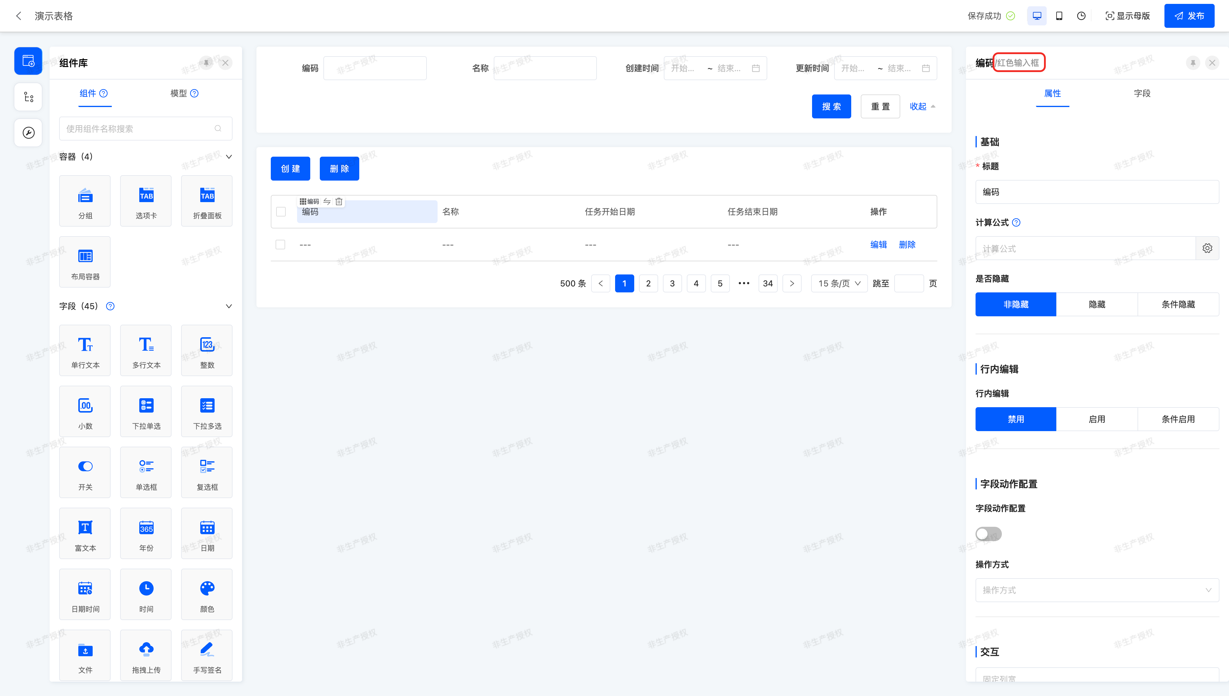
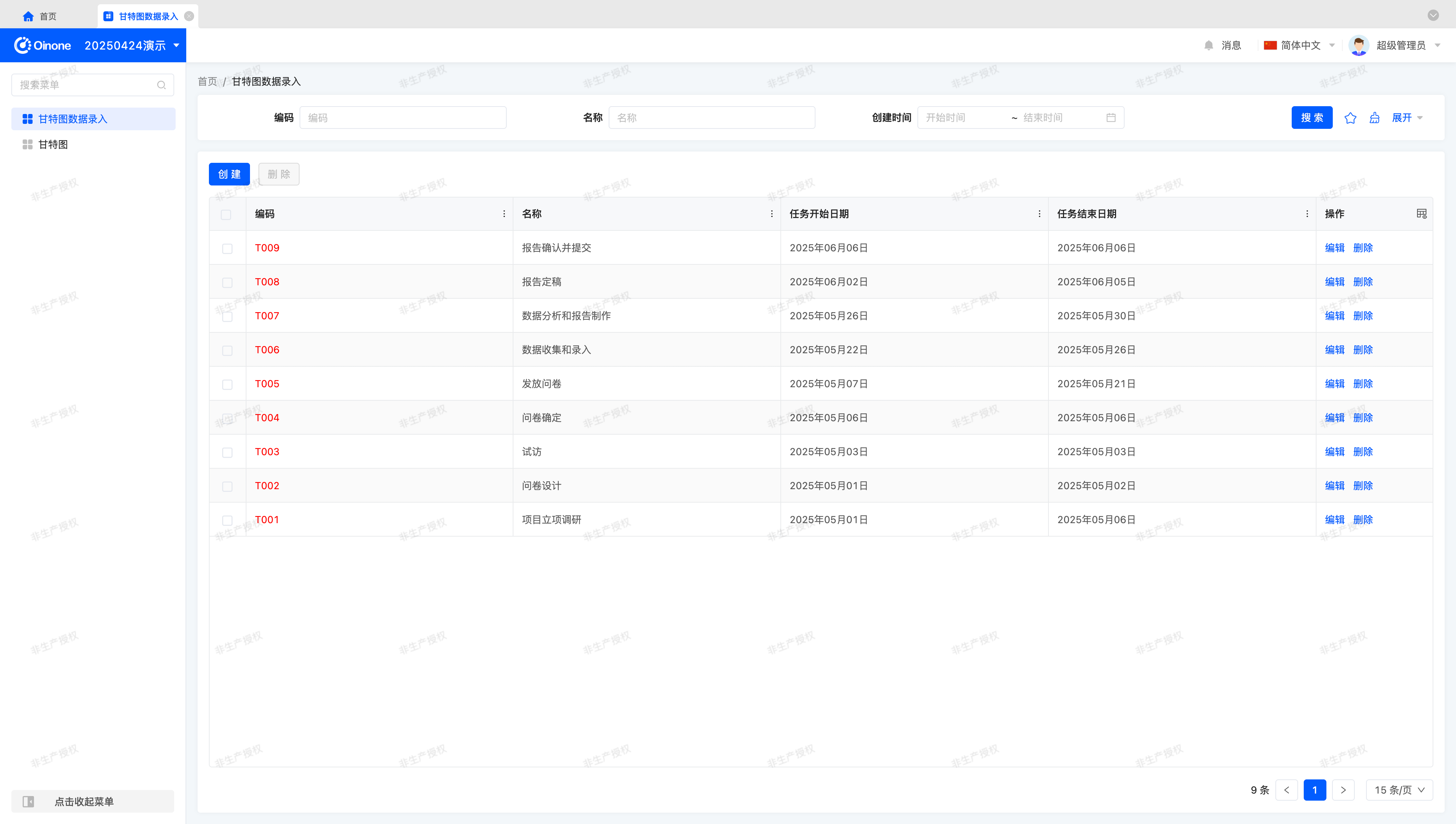
Remember the Gantt Chart Data Entry page we used in the "Create a Gantt View" chapter? It contains complete CRUD functions. Let's use the RedInput component on the Code Field in the corresponding Table View and Form View.
First, enter the design page of the Table View from the designer, which may look like this:

Just like the component switching we encountered before, after selecting the "Code Field", click the "Component Switch" icon, and you can see the component name "Red Input Box" in the drop-down menu:
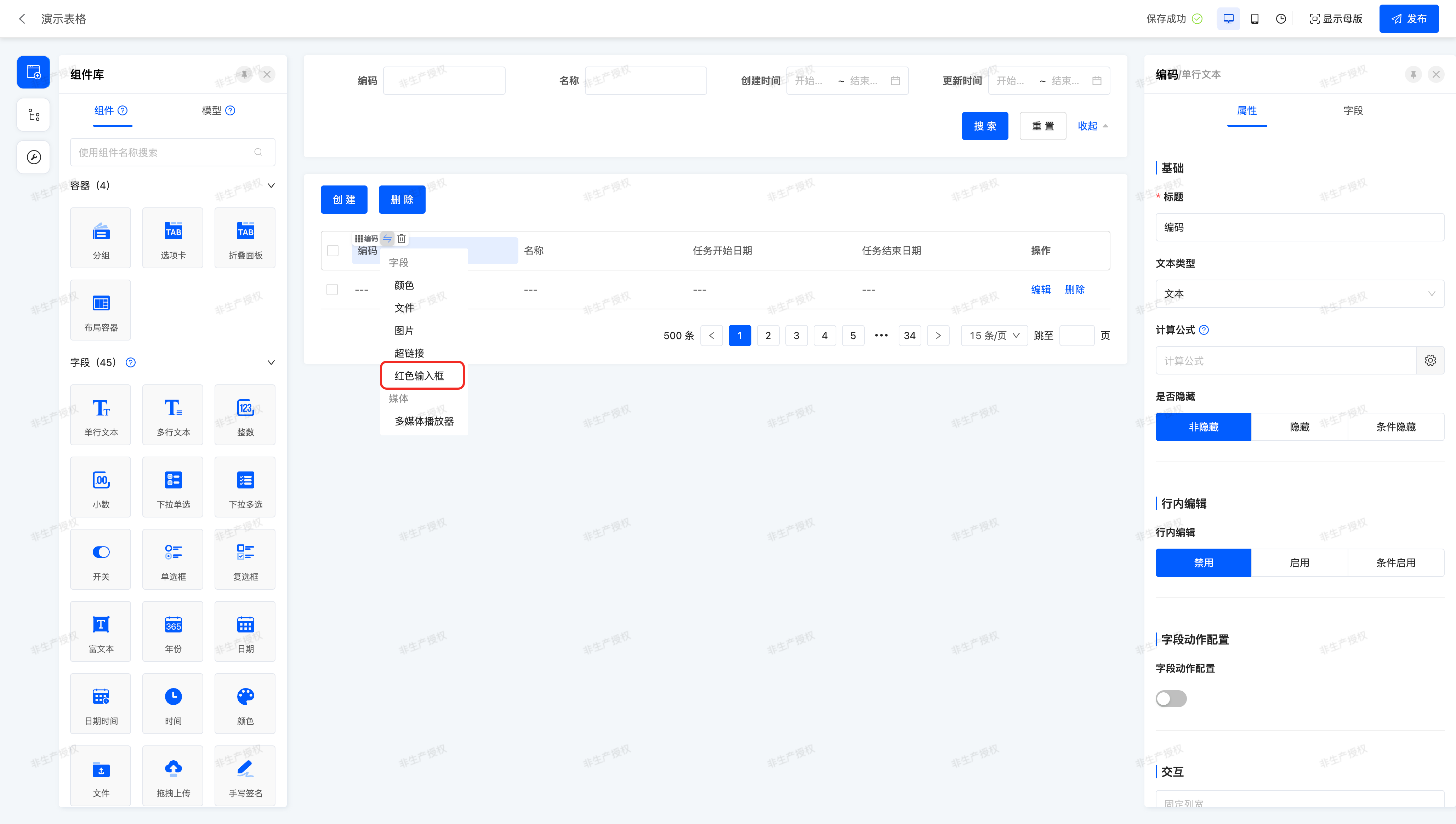
Select "Red Input Box" to switch, and you can see that the component has been successfully switched in the title of the right property panel:
Tip
Don't forget to click the "Publish" button in the upper right corner to make the page take effect~
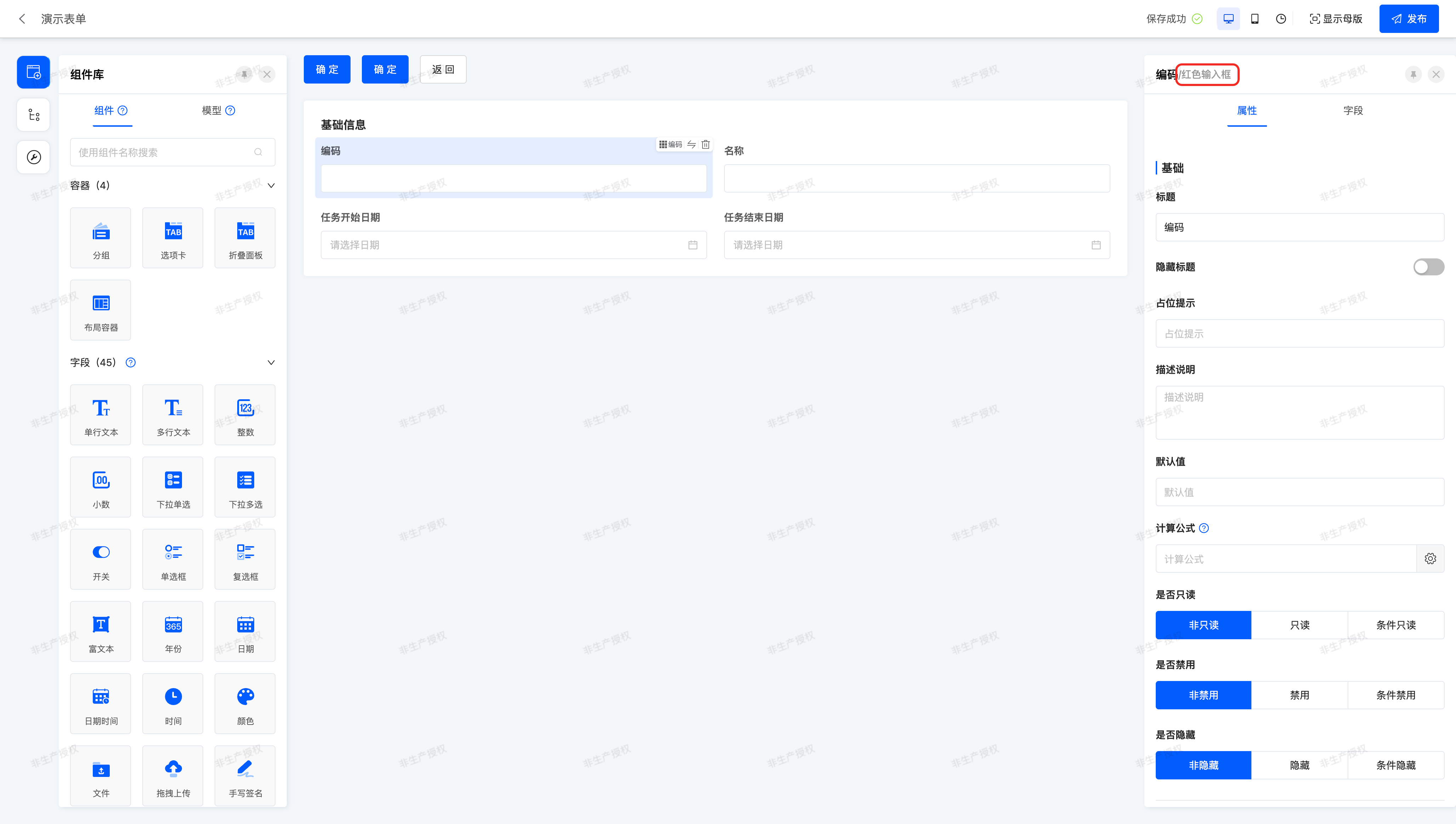
Next, you need to operate by yourself to switch the component of the "Code Field" to "Red Input Box" in the "Form View":
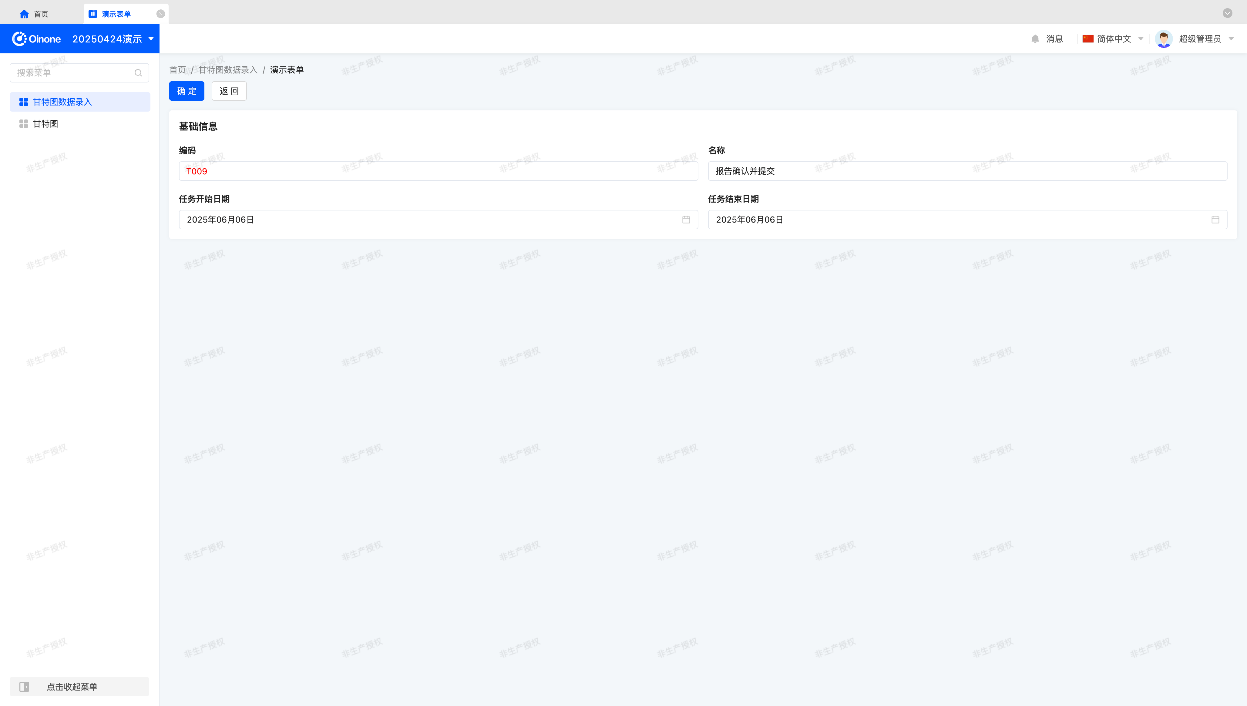
Let's take a look at the final effect on the "Gantt Chart Data Entry" page~
(Ⅴ) Low-code and No-code Integration
As developers, we know that any component must be supported by corresponding code. In Oinone, the Interface Designer collectively refers to functions such as view design and component/element management as no-code, and collectively refers to RedInput components implemented through code in the project as low-code. The low-code and no-code integration function provided by the interface designer refers to the function of adding to the delivered business system through the method of uploading code to achieve secondary development.
Before introducing, we need to make some conventions on some deployment structures or concepts.
If you started the designer image through a docker container and started the front-end project locally for code development, your local deployment structure and access address may be like this:
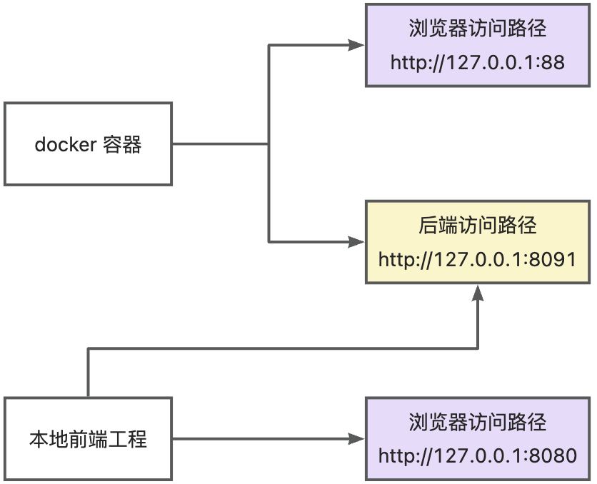
You will find that accessing the docker container (http://127.0.0.1:88) and the local front-end project (http://127.0.0.1:8080) from the browser can both see the "Gantt Chart Data Entry" page, but when accessing the docker container, the RedInput component is not displayed correctly. This is because the docker container is started through the built code, which does not include the RedInput related code, resulting in the component corresponding to the "Code Field" still being the default "Text Input Box" component.
In this case, is there a way to make the two access paths see exactly the same page? The answer is yes.
Below, we will detail the usage steps of the low-code and no-code integration function and give our recommended best practices.
1. Generate SDK and Download Template Project
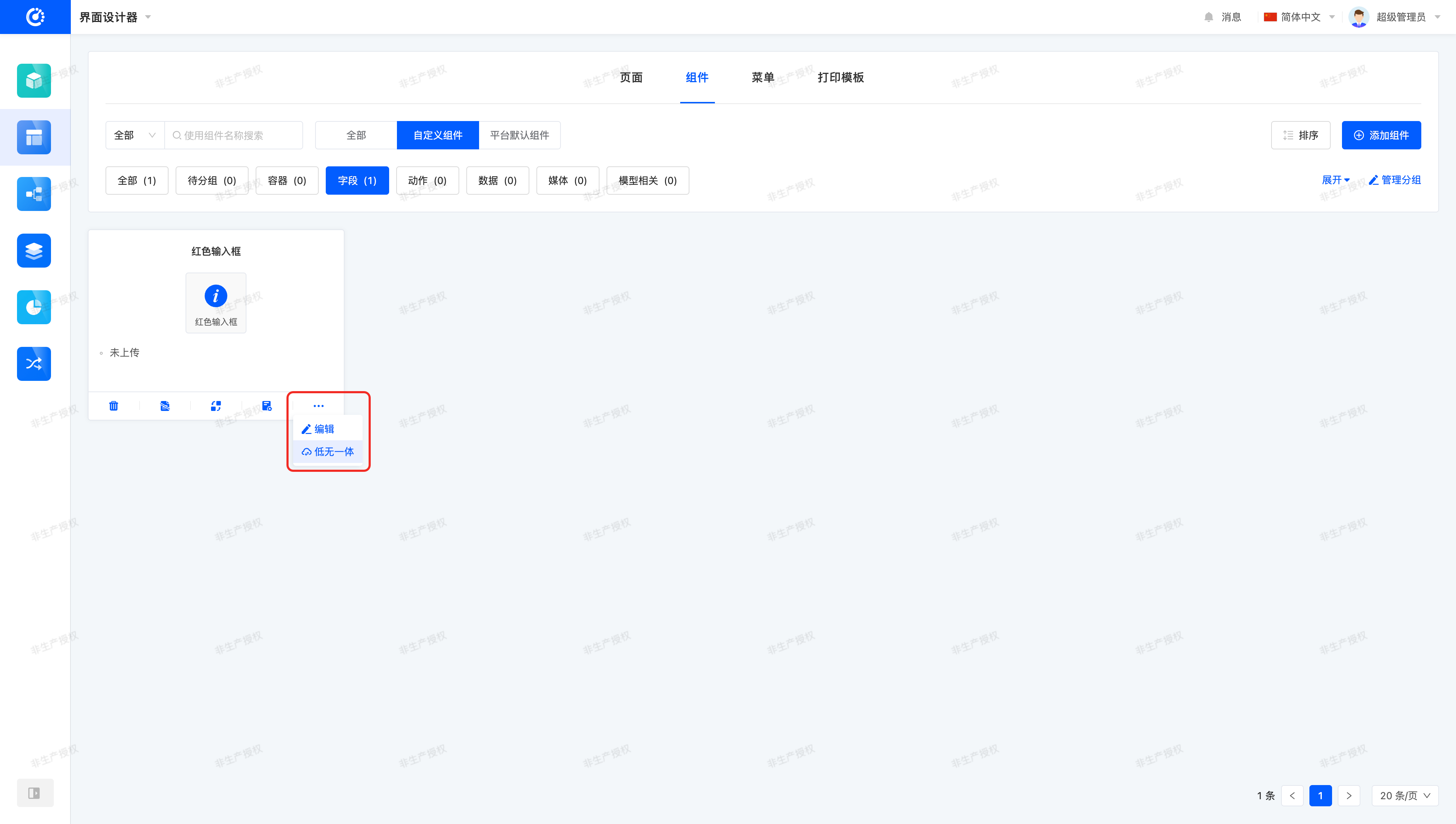
Let's open the pop-up window by selecting "Low-code and No-code Integration" from the "Component Management" page:
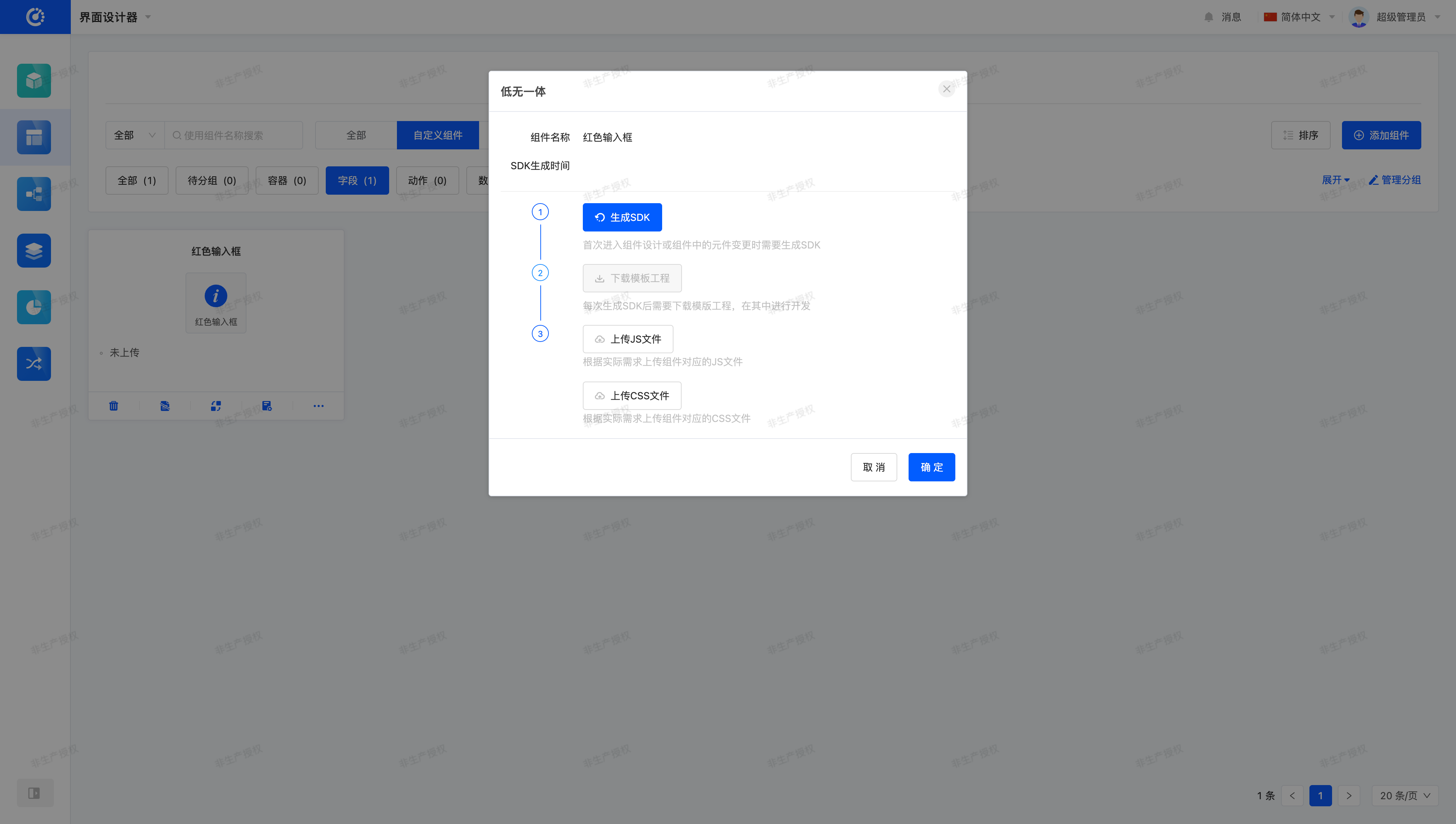
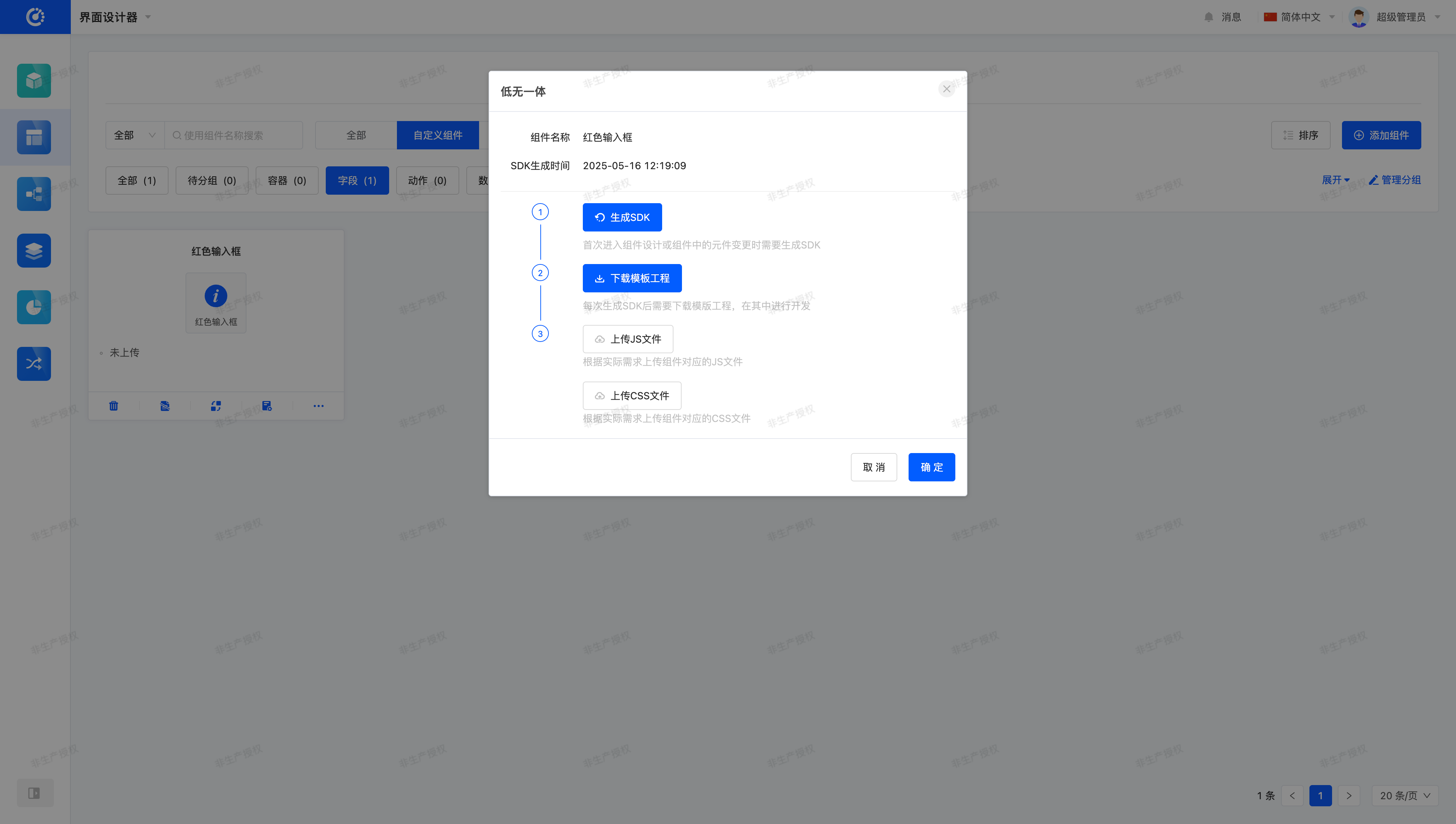
In the opened pop-up window, click the "Generate SDK" button, and the system will generate the corresponding "template project" according to the currently created element information:
Then, by "downloading the template project", you can get a "kunlun-sdk.zip" compressed package with built-in component registration information. After unzipping it, we can get a front-end project that can be used for development, and the directory structure is similar to the following:
├── packages
│   ├── kunlun-boot
│   └── kunlun-plugin
│       ├── src
│       │   ├── field
│       │   │   ├── form
│       │   │   │   ├── RedInput
│       │   │   │   │   ├── FormStringRedInputFieldWidget.ts
│       │   │   │   │   ├── index.ts
│       │   │   │   │   └── RedInput.vue
│       │   │   │   └── index.ts
│       │   │   ├── table
│       │   │   │   ├── RedInput
│       │   │   │   │   ├── index.ts
│       │   │   │   │   ├── red-input.scss
│       │   │   │   │   └── TableStringRedInputFieldWidget.ts
│       │   │   │   └── index.ts
│       │   │   └── index.ts
│       │   └── index.ts
│       ├── index.ts
│       └── package.json
├── lerna.json
├── package.json
└── README.MD2. Development and Packaging
The template project is a front-end project that can be started and run directly. We can view the specific development steps through "README.md", which is not something we need to pay special attention to in this section, so we will not introduce it in detail.
After the development is completed, we can get a dist directory in the kunlun-plugin directory through the npm run build command. This directory contains the kunlun-plugin.umd.js and kunlun-plugin.css files required for front-end operation. Just like the directory structure shown below:
├── packages
│   ├── kunlun-boot
│   └── kunlun-plugin
│       ├── dist
│       │   ├── kunlun-plugin.css
│       │   ├── kunlun-plugin.css.map
│       │   ├── kunlun-plugin.scss
│       │   ├── kunlun-plugin.umd.js
│       │   └── types
│       │       ├── index.d.ts
│       │       └── src
│       └── package.json
├── lerna.json
├── package.json
└── README.mdLet's "upload" the js and css files in the "Low-code and No-code Integration" pop-up window and click OK:
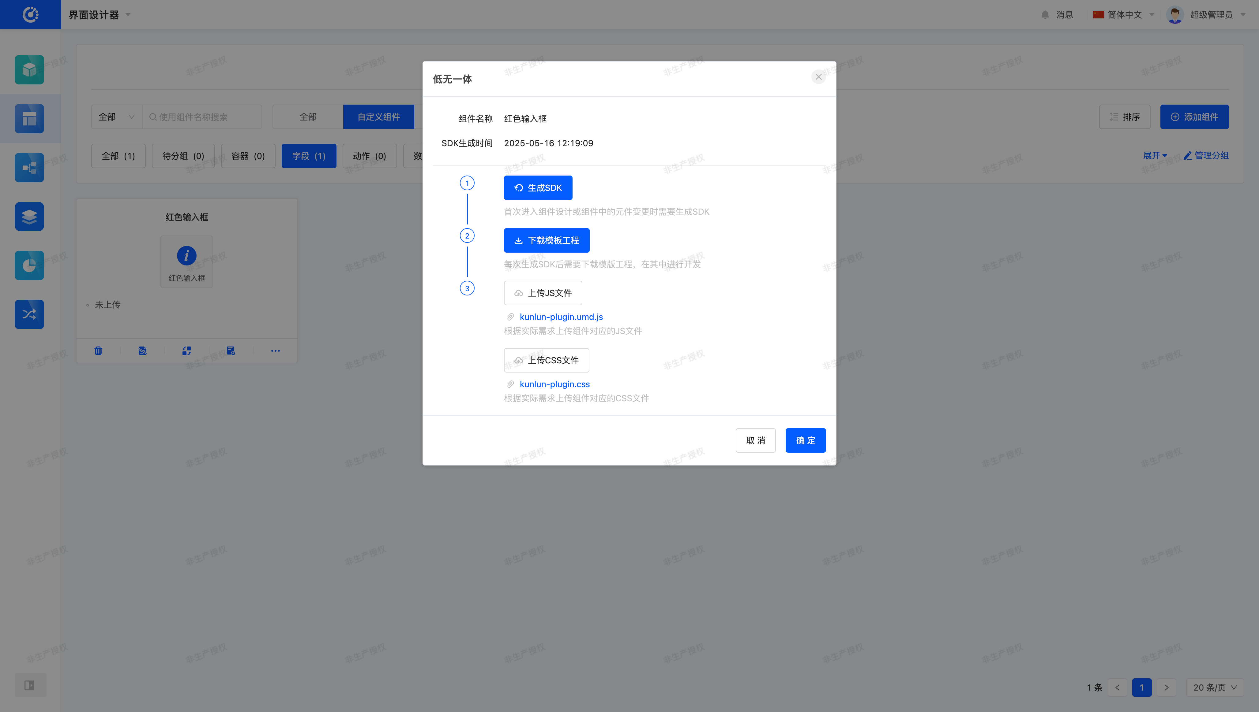
On the "Component Management" page, we can see that the component status has changed from "Not Uploaded" to "Uploaded".

Finally, let's go to the "Gantt Chart Data Entry" page to see if the component is running correctly on the page.
3. Best Practices
In past practices, we have found that most developers will upload the corresponding js and css files separately according to "components", resulting in management confusion and even component operation errors when there are too many components. For example:
- Uploading js with the same component definition multiple times, resulting in conflicts between new and old versions.
- Due to the random import order, the old component overwrites the new component, resulting in the component being unable to update normally.
- Developing by importing all code into one project, and finally splitting it into each SDK project when uploading, resulting in inconsistent operation results. (Such as global variables cannot be shared, import order changes, etc.)
To solve this problem, we recommend managing all components in a front-end project through engineering management, and finally building a set of js and css files containing all components. In the interface designer, you can upload it in any of the components.