This interface is mainly divided into four areas: the operation bar, the component bar, the data dashboard preview area, and the style bar.

I. Operation Bar
(Ⅰ) Zoom and Adaptation
1. Function Introduction
It supports zooming operations on the data dashboard. You can adjust the display ratio of the data dashboard according to actual needs to better view and analyze data details.
2. Operation Method
Click the zoom button or "Full Screen" to zoom the data dashboard.

(Ⅱ) Save
1. Function Introduction
It supports archiving and saving the data dashboard design. Even if the data dashboard design is not yet complete, you can choose to save the current design progress. When you enter the data dashboard design page next time, the system will automatically load and display the previously saved design page, which is convenient for continuing to improve the data dashboard.
Note
The save operation can only be performed when the title component of the data dashboard contains valid content.
2. Operation Method
Click "Save" to archive and save the current design progress.
II. Component Bar
(Ⅰ) Components
1. Function Introduction
The components include two parts: charts and other components:
- Charts: All charts supported for reference in "Data Visualization".
Tip
Adding a chart to the dashboard can be integrated with the already set border.
Other Components: General components provided by the system.
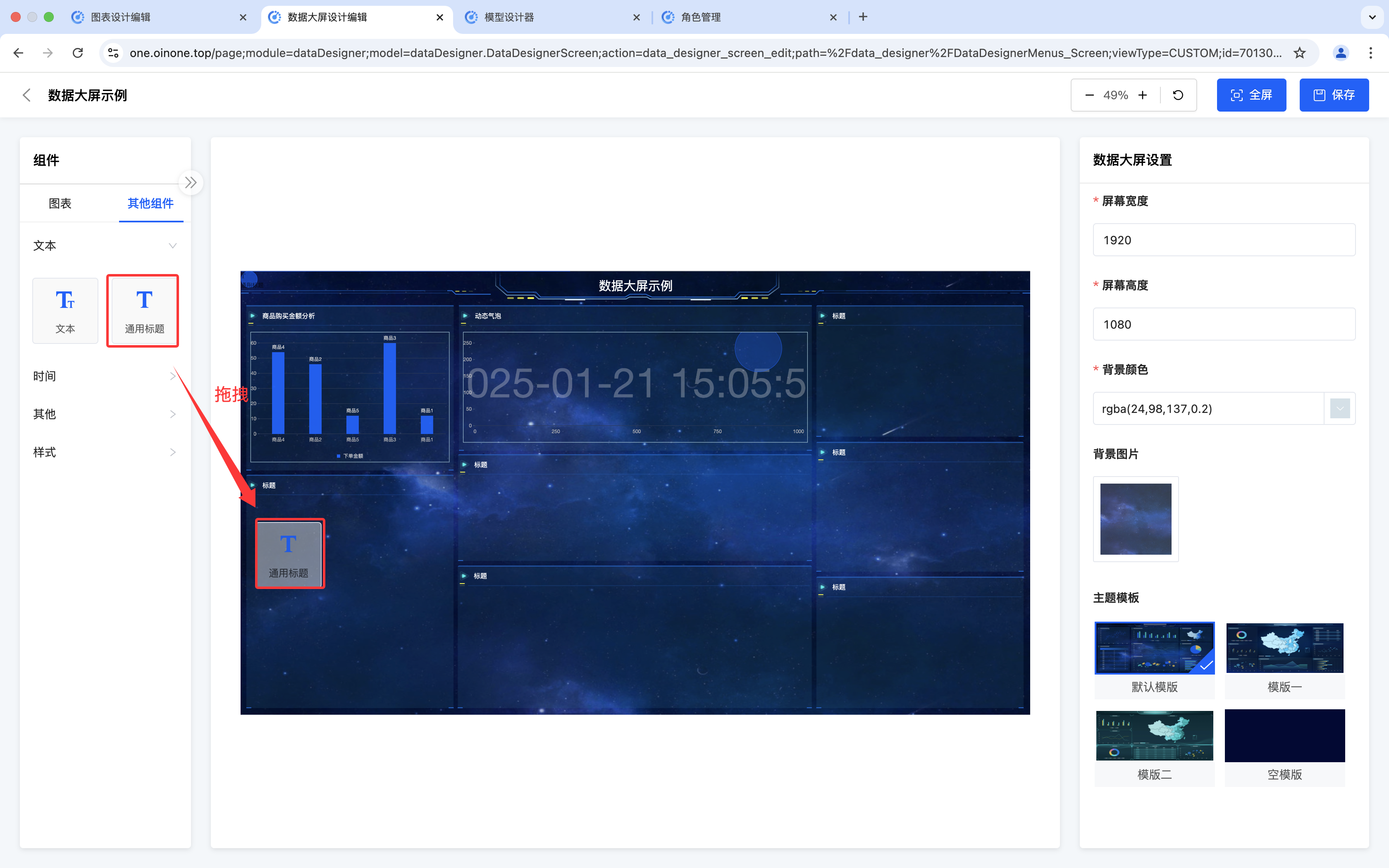
- Text: Can display custom text information.
- General Title: As the display title of the data dashboard, at least one must be included.
Note
Even if there are multiple general titles added to the data dashboard, all of them must contain valid content.
- Countdown: Provides a countdown function and can set a specific time for countdown display.
- Timer: Displays the current time in real-time, which is convenient for keeping track of time information.
- Image: Supports inserting image elements to enrich the visual display effect of the dashboard.
- Slideshow: Can set multiple images for slideshow display to increase the dynamic visual effect.
- Video: Supports embedding video content to make the dashboard display more vivid.
- Style: Provides a variety of style options to meet different display needs.
2. Operation Method
Click or drag the component to add it successfully.
(Ⅱ) Data Dashboard Outline
1. Function Introduction
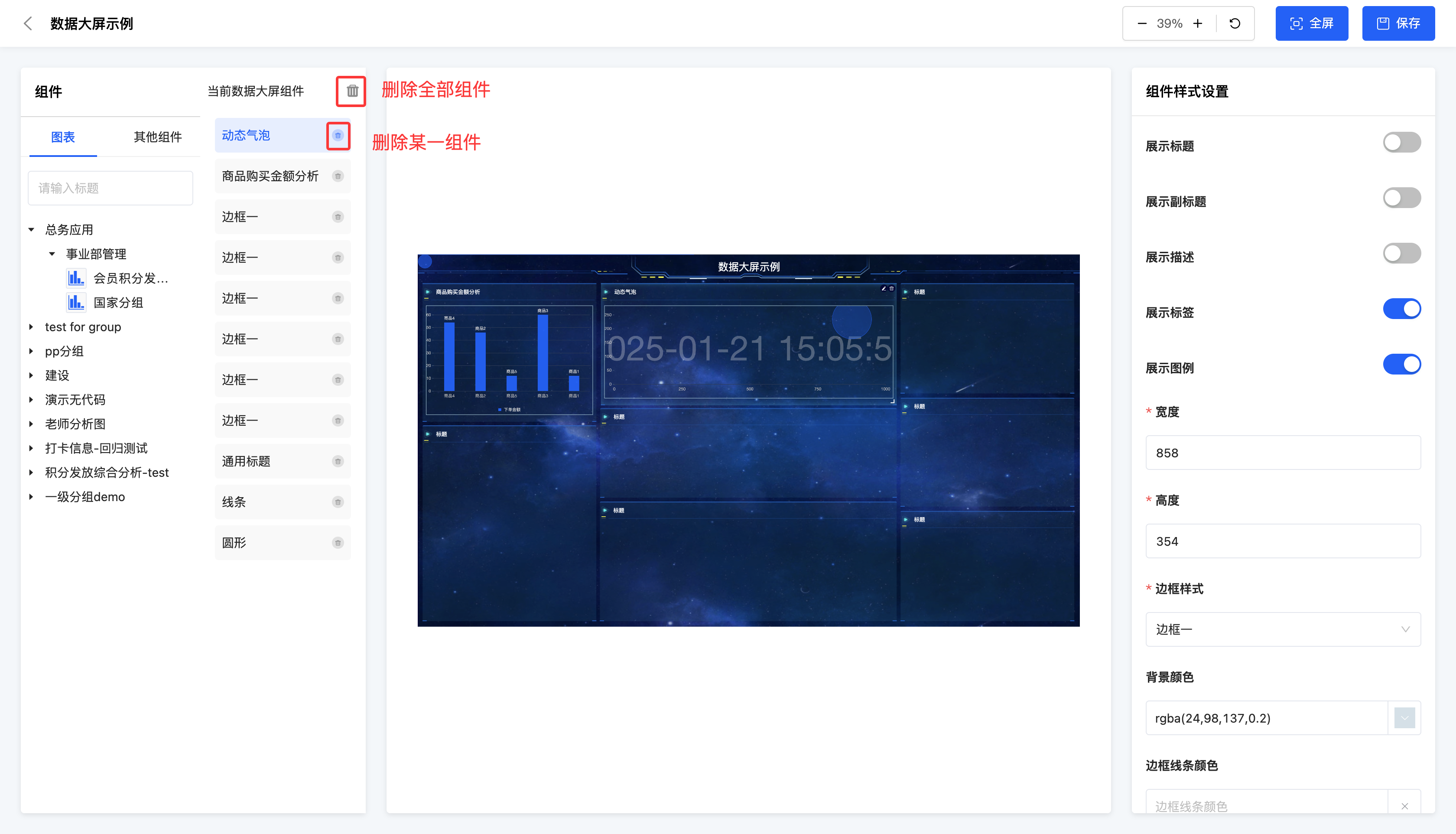
It supports viewing the outline, which intuitively displays the existing components of the data dashboard in a list. You can delete a component in the outline or view the component style.
2. Operation Method
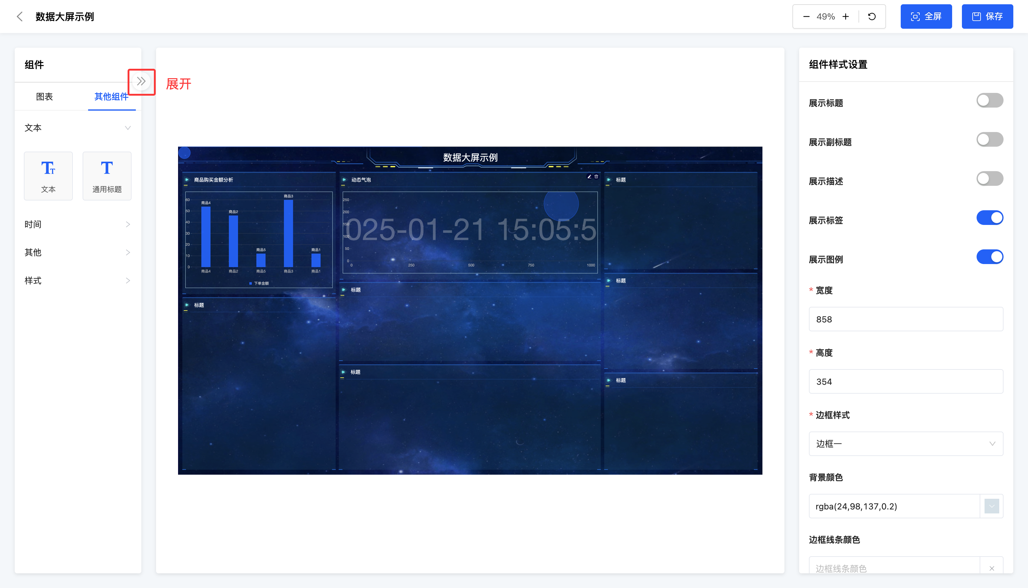
- Click the "Expand" icon to display the outline.
- Select a component, and its style will be displayed in the style bar.
- Select a component and click the "Delete" icon to delete the component.
- Click the "Delete All" icon to delete all components in the data dashboard.
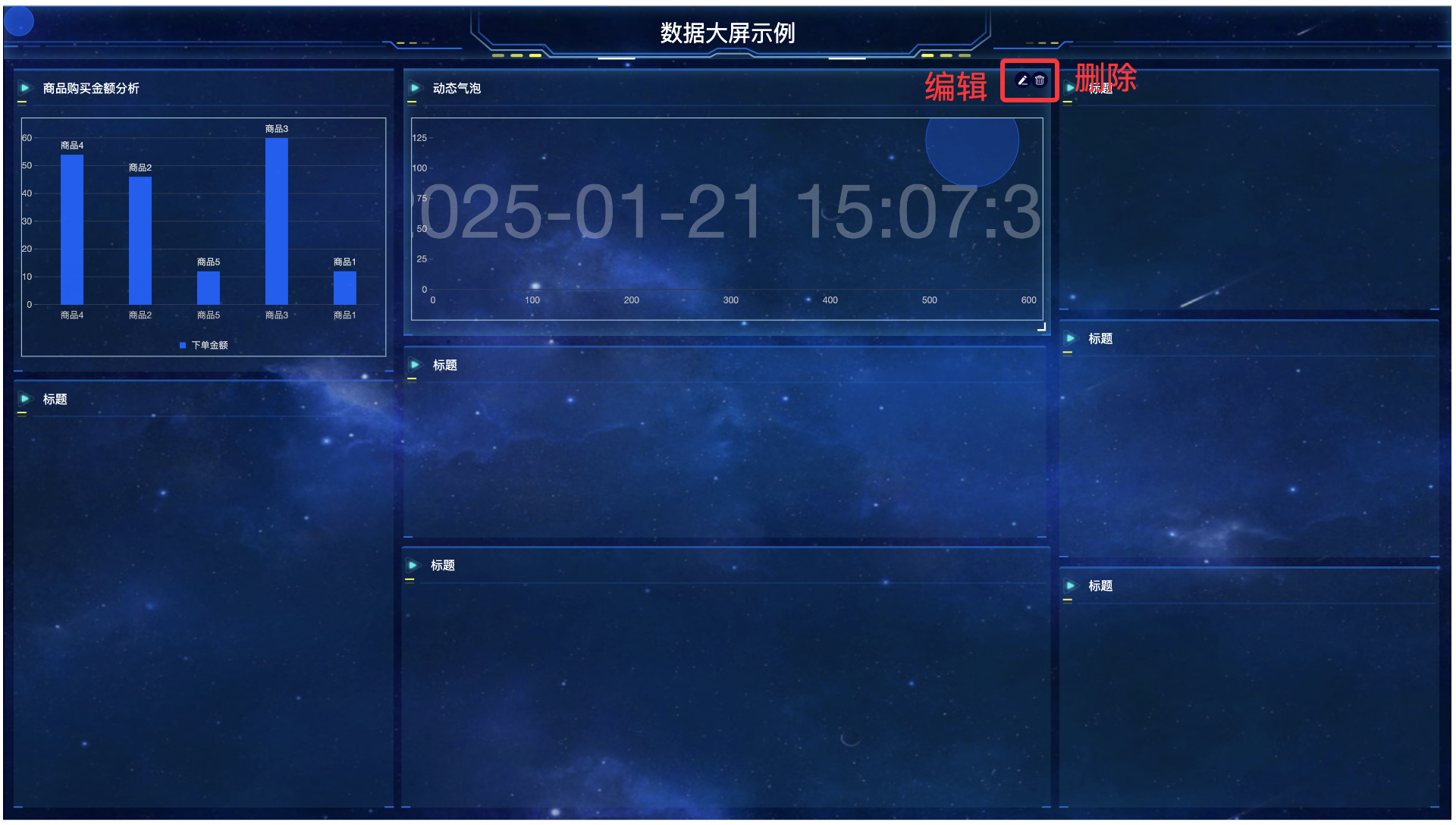
III. Data Dashboard Preview Area
1. Function Introduction
After a component is added to the data dashboard, you can flexibly edit and delete it in the dashboard environment. You can not only adjust the position and size of the component to meet the overall layout requirements, but also when the component is a chart, it provides a convenient shortcut entry. You can quickly jump to the chart design interface through this entry to further modify and improve the chart content.
2. Operation Method
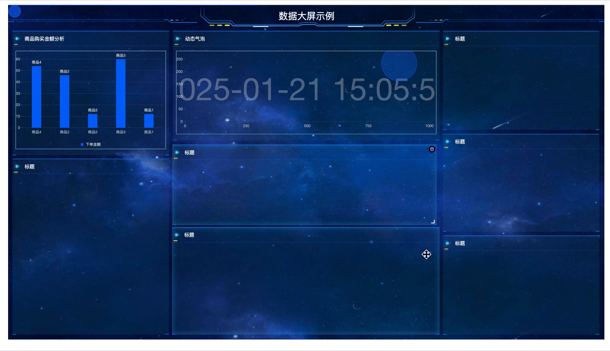
- Drag a component in the dashboard to change its position.
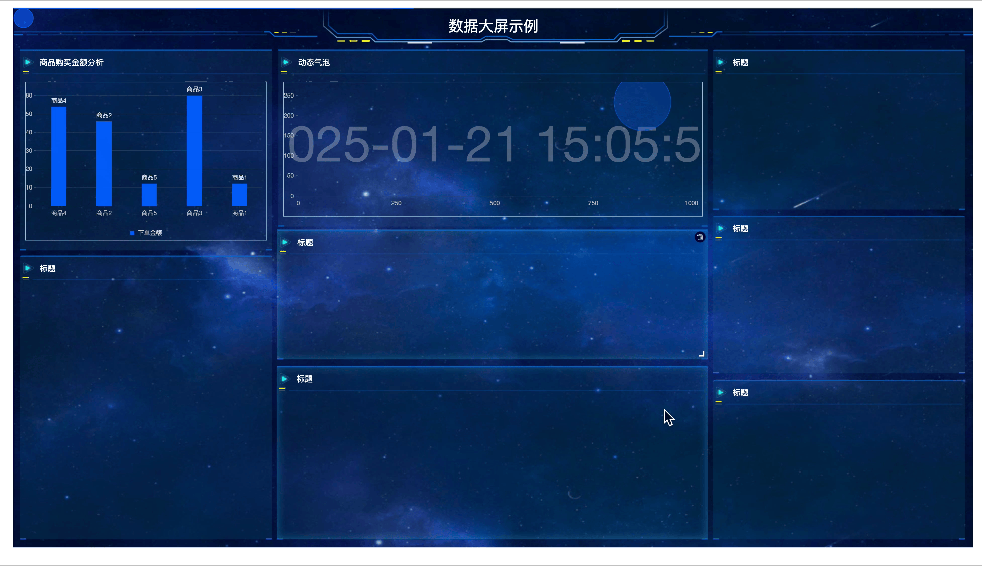
- Select a component and move the mouse to the lower right corner of the component to change its size.
- Select a component and click the "Delete" icon to delete the component.
- Select a chart component and click the "Edit" icon to jump to the chart design interface.
IV. Style Bar
1. Function Introduction
It supports configuring styles for components, including the data dashboard, charts, and other components.
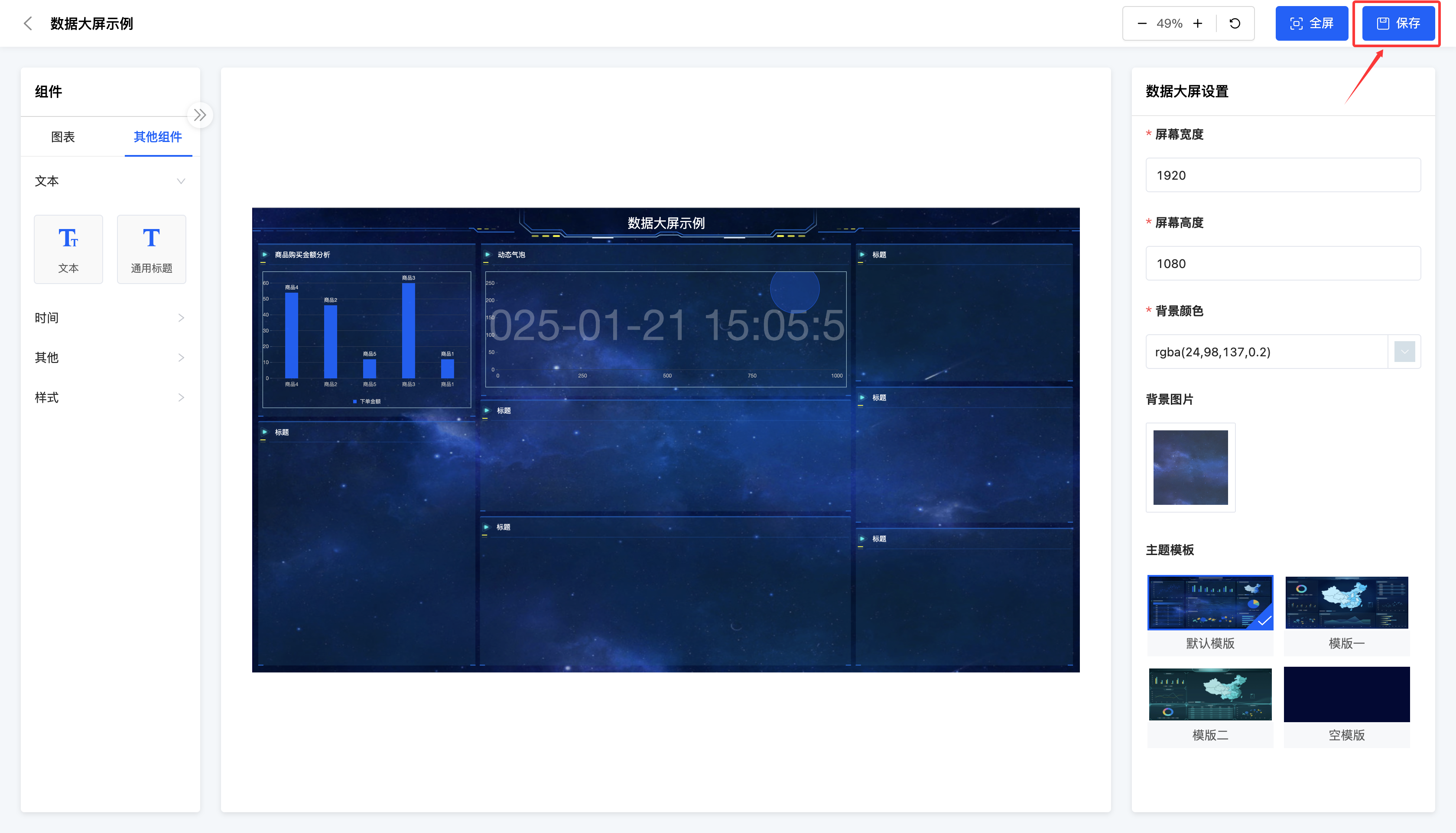
- Data Dashboard: When setting the data dashboard, you can set the width and height of the screen, background color, background image, and theme.
- Width and Height: Set according to the screen size where the data dashboard needs to be displayed.
Note
To ensure that the designed data dashboard can be fully displayed on the screen (achieving a full-screen effect), it is necessary to set reasonable screen width and height parameters.
It is particularly important to note that the screen width and height values need to be divided by the device pixel ratio (DPR, i.e., Device Pixel Ratio); otherwise, display abnormalities may occur.For example, when needing to fully display a data dashboard on a screen with a resolution of 2880×1800 (DPR=2), the actual screen width and height should be set to 1440×900 to ensure the image properly fills the screen.
- Background Color: Adjust the background color when the data dashboard has no image background.
- Background Image: Support uploading an image as the background for the data dashboard.
- Theme Template: You can choose any one of the templates, but please make sure to select the template before starting the design work.
Note
Make sure to select the template before starting the design work. Because if you modify the template after the design is completed, all the selected components will be cleared to avoid unnecessary losses and duplicate work.
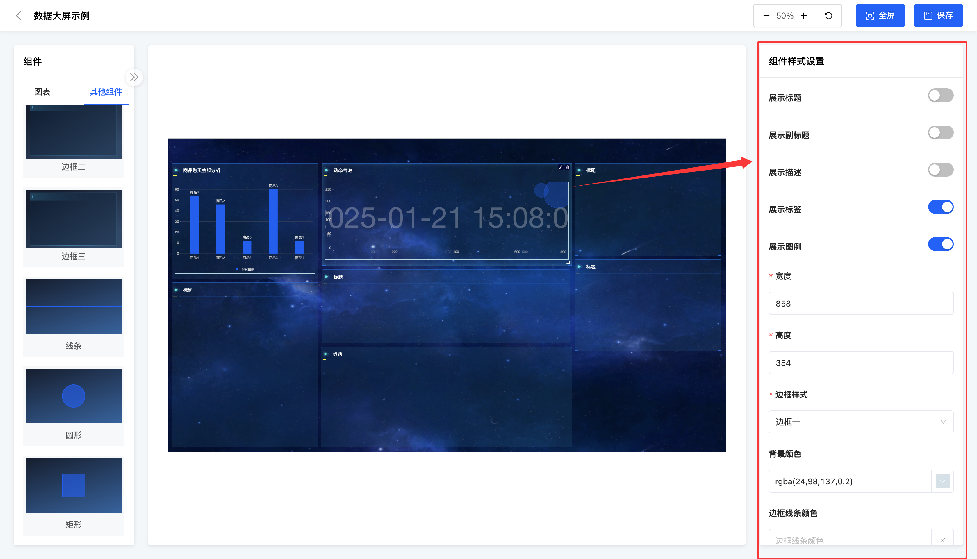
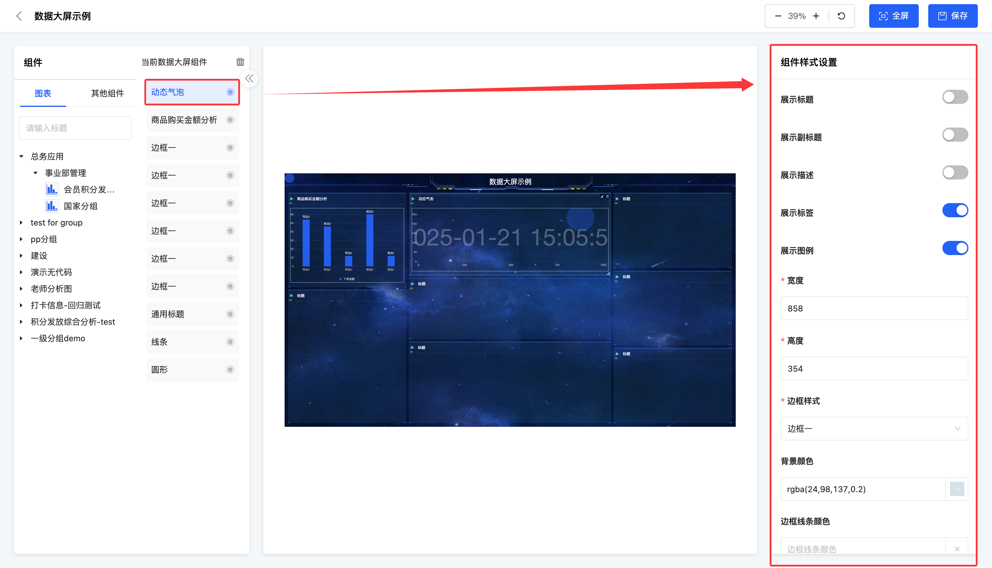
Charts: Set the display content, border information, animation effects, and refresh frequency of the charts.
- Chart Display Content: Display the title, subtitle, description, labels, legend, and the number of items displayed on one screen.
Note
The content that originally exists in the chart will be displayed on the data dashboard after being set to display. The content that does not exist in the original chart will not take effect after being set to display.
- Border Information: Includes border style, background color, border line color, display of border title, border title content, border title color, and border title font size.
- Animation Effects: Support setting automatic slideshow, and you can set the pause duration after the slideshow ends, speed, and switching form.
- Refresh Frequency: Support setting the frequency for automatically refreshing to obtain data and can set the refresh frequency.
Text: You can set the content, alignment, font size, font boldness, font color, background color, border style, whether the text scrolls, pause after scrolling, and speed.
Note
When text scrolling is enabled, the text will be displayed in one line. You can control the text scrolling effect by setting the pause after scrolling and speed.
- General Title: Set the content and title style. If you choose a custom style, you need to set the font size, alignment, font color, font background color, etc. of the title.
Note
By default, the title style is displayed according to the theme, and you can choose to customize it.
- Countdown: You need to select a future time and can set the font size, color, background color, and border style.
- Timer: You can set the arrangement, font size, color, background color, and border style.
- Image: You need to upload an image and can set a link for the image. Clicking on it will jump to the link.
- Slideshow: You need to upload images according to the set number of images. Each image can be set with a corresponding link, and you can set the slideshow effect.
Note
If you choose the non-automatic slideshow mode, you need to manually perform the switching operation. If you set it to the automatic slideshow mode, you need to specify the slideshow speed and effect to ensure smooth and expected display.
- Video: You need to upload a video and can set a link and playback effect for the video.
- Style: Includes the settings for border one, two, three, as well as lines, circles, and rectangles, which can be used to customize the data dashboard when not using the theme template. You can set the border style, color, etc. for the components in the style.
2. Operation Method
Select a component and set the corresponding style in the style bar according to the component type.